People can forget names, slogans, and even logos. But the right color? That sticks for a long time.
Colors shape perception, bring out different emotions, and influence decision-making. Studies show that up to 90% of snap judgments about products can be based on color alone. In branding and design, your color palette is one of your most powerful tools. Color psychology draws attention to how hues, tones, and accents affect human behavior.
If you think about it, the right colors can communicate trust, excitement, elegance, or eco-friendliness visually. Understanding how color impacts emotions and associations gives your logo design depth and relevance.
This blog will guide you through the principles of color theory, show you how colors influence perception, and help you make informed choices when selecting your brand’s color palette. Whether you’re starting from scratch or refreshing an existing identity, you’ll walk away with the tools to make your brand unforgettable.
What is Color Theory in Logo Design?
Color theory focuses on how colors combine and create harmony or contrast. It uses artistic and psychological principles to help designers select the right colors in branding and design. By applying color theory, you can pick a combination that is only visually appealing and conveys certain meanings or emotions. An understanding of color theory allows designers to create effective branding strategies, where every color in a logo elicits an emotional response.
In visual design, color theory makes it easier to choose ideal color combinations that will make an impact on the target audience. And you should consider this when you are designing a versatile logo.
The Psychological Impact of Color
Color psychology shapes perception in branding and plays a key role in people’s decisions to invest in brands. The way you think of a color and what you associate with it depends on culture and personal experiences.
But you might be aware of some common associations:

Color and the usual meaning viewers interpret from it
- Red: Passion, Energy, Urgency, Power, Love
- Orange: Enthusiasm, Creativity, Warmth, Adventure, Friendliness
- Yellow: Optimism, Happiness, Clarity, Youthfulness, Attention-grabbing
- Green: Growth, Health, Nature, Wealth, Calmness
- Blue: Trust Stability Professionalism Serenity Intelligence
- Purple: Luxury Spirituality Mystery Wisdom Imagination
- White: Purity, Simplicity, Cleanliness, Peace, Freshness
- Black: Sophistication, Power, Elegance, Mystery, Authority
- Brown: Earthiness, Reliability, Warmth, Stability, Natural feel
- Pink: Femininity: Compassion, Playfulness, Romance, Innocence
- Gray: Neutrality, Balance, Sophistication, Formality, Practicality
- Coral: Vitality, Energetic, Playfulness, Refreshment, Sociability
- Teal: Balance, Sophistication, Tranquility, Openess, Healing
- Peach: Warmth, Approachable, Innocence, Joy, Soft energy
- Gold: Prestige, Luxury, Innocence, Celebration, Timelessness
- Navy: Authority, Trust, Responsibility, Maturity, Intelligence
- Olive: Earthiness, Peace, Tradition, Balance, Strength
- Silver: Innovation, Modernity, Grace, Next-gen, Chic
These color associations are essential to the core values and message of a brand.
How Color Influences Emotions and Perceptions
The color choices in a logo can greatly affect how customers feel about a brand and what they think of it. It’s not just about picking a color that looks good. You have to select a color that aligns with your brand’s personality and niche.
For example, blue is a favorite color among tech and finance logos as it’s associated with feelings of stability and trust.

Different blue-colored business logos influence perceptions and emotions
Businesses that go with red in their logos may evoke excitement and urgency. It is commonly used by brands in food and beverage or retail. Here are a few ways that colors influence emotions and perceptions.
- Brand Recognition: Colors create immediate associations in the consumer’s mind
- Brand Personality: A logo’s color palette reflects the brand’s character and personality
- Emotional Engagement: Effective use of color can increase customer loyalty
Take a look at some of the examples of recognizable brand logos and the colors they have used in their logos.
• Coca-Cola
Coca Cola logo, along with the color codes used in the logo
The bright red color attracts attention and helps establish lasting connections with the audience.
• Starbucks
Starbucks Coffee logo with the color codes used to design it
The green communicates the company’s connection to nature and is quite inviting.
• Tiffany
Tiffany and Co. logo, with the color codes used to design it
Tiffany’s iconic blue is a symbol of luxury, exclusivity, and sophistication.
Warm vs. Cool Colors
Such colors play a significant role in how we emotionally perceive visual content. Warm colors like red, orange, and yellow tend to feel energetic, bold, and inviting. They can be a good choice for brands that want to attract attention or evoke excitement. In contrast, cool colors like blue, green, and purple are associated with calmness, trust, and professionalism, which is why they’re widely used in tech, finance, and medical industry logos. Choosing between warm and cool tones helps align visual identity with brand personality.
Hue, Saturation, Brightness (HSB)
These are key concepts in color theory that help define a color’s look and feel. Hue refers to the base color itself, such as red, blue, or green. Saturation indicates how vivid or muted a color appears; high saturation looks intense, while low saturation appears more subdued. Brightness (also called value) measures how light or dark a color is. By adjusting these three properties, designers can craft color palettes that convey mood, hierarchy, and brand tone with precision and clarity.
Tints, Shades, and Tones
Tints, shades, and tones are variations of a color created by adding white, black, or gray. A tint (color + white) results in a lighter, softer version, often used for airy or delicate branding. A shade (color + black) creates a darker, more intense look, adding depth or seriousness. Tones (color + gray) produce muted, balanced hues that work well in sophisticated or neutral designs.
Understanding these variations enables brands to expand their palette while maintaining visual harmony and emotional resonance.
The Color Wheel and Its Importance
Colors on the color wheel are categorized into three main groups. Here’s a brief introduction to all of them, and you may already be familiar with most.
Primary Colors:
These are the foundational colors from which all other colors are created.

Color wheel with the primary colors (yellow, blue, and red) highlighted
- Red
- Blue
- Yellow
Secondary Colors:
These are formed by mixing two primary colors:

Color wheel with three secondary colors (green, purple, and orange) highlighted in it
- Orange (red + yellow)
- Green (blue + yellow)
- Purple (red + blue)
Tertiary Colors:
Created by mixing a primary color with a secondary color:

The tertiary colors (Amber, Vermilion, Magenta, Chartreuse, Teal, and Indigo) are highlighted on a color wheel
- Red-orange
- Yellow-green
- Blue-violet, etc.
Keeping these categories in mind helps in selecting balanced and harmonious color palettes for branding.
How Color Schemes Work in Logo Design?
If you think about it, the color schemes in logo design can make or break it. It is important to understand the pairing of different tones, hues, and accents. To create a cohesive design that makes a strong visual impact, you need to know the color schemes really well. Here are some of the main ones and how they work in logo design.
Monochromatic Colors
With its various tones, shades, and tints, this color scheme emphasizes a clean, professional appearance. It’s great for brands looking to convey minimalism or elegance and build a cohesive identity without the distraction of multiple colors.

Two examples of using monochromatic colors (PayPal and Animal Planet) are shown
- The Animal Planet logo uses multiple shades of green.
- The PayPal logo builds trust with soothing blues.
Complementary Colors
Opposite colors on the wheel (like blue and orange) offer strong contrast, making logos pop and stand out. Ideal for grabbing attention, emphasizing duality, or highlighting energy.

The Los Angeles Lakers and Tide logo to share examples of using complementary colors
- The Lakers’ Team logo uses complementary yellow and purple.
- Tide’s logo uses the traditional combination of blue and orange.
Analogous Colors:
These colors sit next to each other on the color wheel, offering a more harmonious and calming effect. This scheme creates a unified look in logo design, perfect for brands wanting to feel approachable and stable.
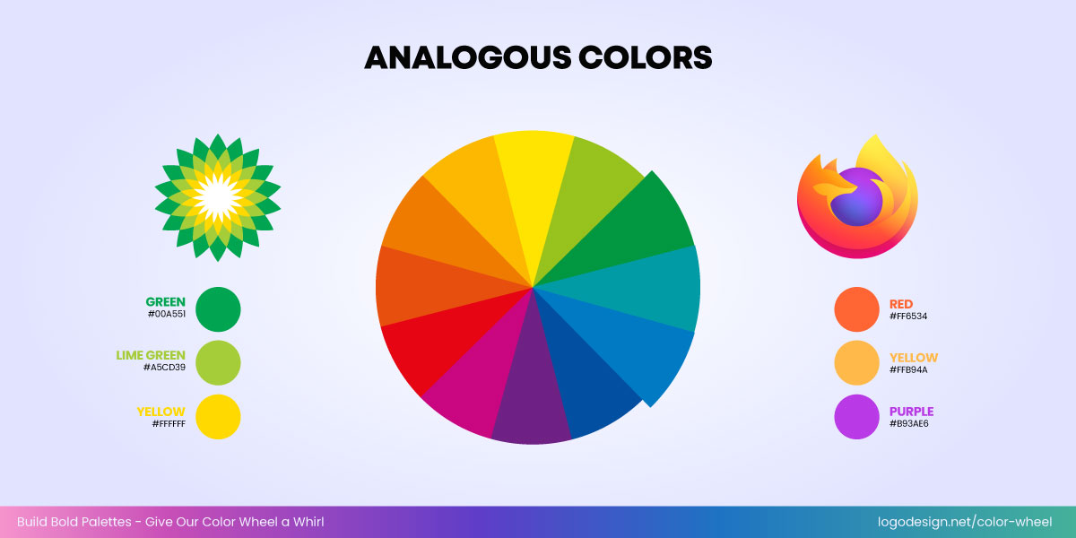
Using analogous colors used to design logos of British Petroleum and Mozilla Firefox
- British Petroleum logo that uses an analogous color scheme from green to yellow
- Mozilla Firefox logo with warm analogous color palette, blending red through yellow
Triadic Colors:
A triadic scheme uses three colors that are evenly spaced on the color wheel, creating a vibrant yet balanced design. This is great for logos that want to appear dynamic and energetic.

Fanta and Burger King logos by using Triadic Colors
- Fanta logo with colors that are evenly spaced around the color wheel, forming a triadic color scheme
- Burger King logo that achieve strong contrast and high visual impact.
Split Complementary Colors
It builds visual interest by creating a subtle contrast in design elements. This color scheme is great for sophisticated logos as it provides more balance.

Split Complementary Colors to design Seven-Eleven and Taco Bell logos
- Seven Eleven logo that uses a combination of green, orange, and red color.
- Taco bell logo where a combination of purple, magenta, and yellow color can be seen.
Compound Colors
It allows for dynamic color palettes that are bold yet do not overwhelm the viewers. Great for logos that want to maintain energy while avoiding harsh clashes.

Crush and FedEx logo, designed by using the compound colors
- Crush grape logo which shows a splash of purple color and a green border on the text. Yellow and orange color are also seen.
- FedEx office logo, where the first part is written in purple and last bit is written in light blue. The icon has a mixture of green and orange.
Tetradic Colors
Such hues and tones provide flexibility in design since they are ideal for logos that wish to represent complexity with harmony.

The tetradic colors used to design Google and eBay logos
- Google logo, with equal color weightage of red, yellow, green, and blue.
- eBay logo where each alphabet is written in different color, red, blue, yellow, and green.
Square Colors
Since the colors are well-spaced in this scheme, it works well for modern, creative, or tech brands. The palette helps express diversity without compromising on visual stability.

AVG and Google Drive logos, designed using the square colors
- AVG logo, which has a combination of orange, blue, red, and green on the icon, along with black color fonts.
- Google Drive logo, where each stroke is a different color: blue, green, yellow, along with a red border.
Double Split Complementary
It can be a bit complex as there are color variations involved. Great for logos seeking to convey depth, dimension, or multidimensional identity.

Double-split complementary colors are used to design the Wipro and Slack logos
- Wipro logo, which has dotted layers of different color schemes like green, blue, yellow, and dark pink
- Slack logo with various bold lines in yellow, green, dark pink, and blue colors.
How to Choose the Right Colors for Your Brand
Here’s a step-by-step guide to help you choose the best color palette for your brand. By following these, you can make sure your logo connects with your audience and highlights your brand values.
1. Understand Your Brand Personality
The first step in selecting your brand colors is understanding who you are as a company. Your brand’s personality is the foundation upon which you will build your entire color strategy. It should reflect your core values, the tone you wish to convey, and the emotions you want to evoke.
Ask these questions:
- Is your brand playful or serious?
- Are you modern or traditional?
- Are you friendly and approachable, or more corporate and formal?
- Do you want to evoke trust, excitement, luxury, or energy?
Playful brands are more likely to go for bright, energetic colors like yellow, orange, or green, which convey a sense of joy and fun (think Nickelodeon or Fanta). Serious or professional brands prefer deep, calm colors like blue, grey, or black, which communicate trustworthiness and reliability (think IBM or law firms). Minimalist palettes with neutral tones, with occasional accent colors, are also popular with many businesses today.
Choose your colors with your brand’s personality and make sure the visual identity reflects the experience and emotions you want customers to have.
2. Run an Analysis of Your Target Audience
The demographics and their behavior are very important in color selection and getting a positive response.
Bold and neon colors that seem energetic and fun could appeal to younger audiences, like Gen Z. A kids’ gaming app might use vibrant blues and lime greens to evoke energy and excitement. In contrast, a high-end skincare brand targeting older women may opt for soft beige and blush tones to communicate calm and luxury.
Colors also have specific associations with cultures across the globe. For instance, in many Asian cultures, red symbolizes luck and prosperity, which is why it is commonly used in weddings and celebrations. Whereas in South Africa, red is associated with mourning and is used in traditional rituals.
Since culture shapes color choices, it’s essential to research your target audience’s background, age, and location to avoid any issues later on. Conduct surveys, focus groups, or A/B testing to get an insight into how your audience perceives different color options.
3. Go for A Simple Color Palette
By keeping your color palette simple, you make it easier for people to recognize your brand and recall it later on.
So use two to three primary colors for clarity and simplicity. Too many colors can create confusion and a cluttered look. Fewer colors result in a more cohesive, memorable brand identity.
Even if you are going for an elaborate illustration in your logo, limit your color selection as much as you can. Since these colors will be featured on your website, branding materials, and social media pages, the choice needs to be clear. Too many different ones could also impact your brand consistency. It is also a good idea to include the colors in your brand guide as well.
A minimal color palette allows your brand identity to be clear and visible across various print and digital mediums. Apple, Chanel, and Tesla are some well-known examples of minimal logos with a limited color palette.
You can also consider high contrast colors as they make your logo more prominent on different backgrounds. For instance, white text on a dark blue background or black on yellow creates a strong contrast, which helps your logo stand out.
While it’s essential to limit your primary color palette, using accent colors can add depth and interest to your brand identity. Take this as an example. A simple blue logo can be enhanced with an accent of yellow or green. If you consider famous logos, NBC and eBay have multiple colors that make a strong visual impact.
4. Define Emotional Responses from Your Brand
Before you choose any colors, it’s crucial to define the emotions you want your brand to evoke. Consider key questions like what you want your audience to feel when they see your logo and colors. Defining an emotional response beforehand will help you figure out the right choice of logo colors.
- Do you want your brand to make people feel excited, relaxed, or inspired?
- Should your brand evoke feelings of trust, happiness, or confidence?
- Are you aiming to create a sense of luxury, exclusivity, or empowerment?
Once you have clarified this, you can finalize a color palette that brings out the desired emotional response.
An infographic that shows the psychology behind different famous logos
For instance, if you expect your logo to be associated with emotions like trust and stability, hues of blue paired with neutrals could be a good choice. Consider Bench Accounting here which communicates professionalism and credibility with its color palette. Bright colors like orange in Couchsurfing work well as it symbolizes friendliness and warmth. Identifying the response, in the beginning, can help you expect and predict the response your brand will get.
5. Opt for Trendy but Authentic Colors
It’s important to stay on top of current trends, but following them without thinking about it is a common logo color mistake many make. That’s because going for something too trendy could lead to the logo colors losing out on their relevance once the trend goes away and something new comes in.
Choose colors that seem trendy at the time but are also valuable for long-term recall. Instagram’s gradient update in 2016 shifted from a vintage camera to a sleek icon that reflected its new creative identity in a better way. So, whether you choose flat vs. gradient logo colors, make sure to stay updated on popular color palettes and color predictions from experts that consumers are likely to prefer in the future.
Consider incorporating current color trends to keep your brand fresh, but don’t jump on the bandwagon just for the sake of it. Gap’s 2010 logo change moved away from its iconic blue box, leading to immediate public disapproval and a rollback within a week. If your brand is based on tradition, authenticity, or heritage, you may want to avoid overly trendy or fleeting color choices.
For example, pastels may be trending in the world of fashion logos, but if your brand is rooted in luxury and strength, opt for darker, richer tones instead.
6. Consider the Psychological Impact of Color Combinations
Now, this can be a bit tricky to understand at first. That’s why you need to pay attention to the psychology of colors in logo design from the very first day. Just like individual colors have a psychological impact, it’s essential to look at how color combinations work together as well. Their impact can also influence the perception of the audience. Like in the food industry, restaurants could go with red and yellow as a popular color combination in their logos.
These two are likely to create an appetizing combination, making people think of food or the specialty of the business.
While monochrome and multi-color logos are both trendy, let’s take a look at how different color combinations in logos can impact psychologically.
1. Meta – Blue
Meta Logo, along with the color codes used to design it
Blue communicates trust, reliability, and calmness. Meta’s blue logo fosters a sense of safety and community, important for a platform based on social connections.
Mcdonald’s – Red & Yellow

McDonald’s logo is on the left, and its color codes are on the right
Red stimulates appetite, while yellow conveys happiness and friendliness. Together, these colors create urgency and joy, making them ideal for attracting attention and making customers feel cheerful and hungry.
3. Apple – Monochrome/Black
The famous, half-eaten Apple logo with the black color code
Apple’s minimalist black or silver logo represents sophistication, luxury, and simplicity. Its clean symbol logo design gives off a sense of premium quality, innovation, and timelessness.
4. Spotify – Green
The Spotify logo, along with the green and white colors that are used to design it
Green is often tied to growth, freshness, and calm. Spotify’s green evokes vitality and approachability while also showing progress and innovation in how people experience music.
5. Google – Multicolor (Blue, Red, Yellow, Green)
The Google logo, along with the color codes used in it
Google’s playful and diverse color palette reflects openness, creativity, and inclusivity. It conveys a sense of curiosity and joy, fitting for a brand focused on exploration, learning, and information.
6. FedEx – Purple & Orange
The FedEx logo, along with purple and orange color codes used to design it
Purple communicates professionalism and authority, while orange adds energy and friendliness. FedEx uses these colors to balance reliability with friendliness.
7. John Dreere – Green
The John Deere logo with the color codes seen in it
Green suggests relaxation, balance, and nature. The company uses this to evoke a calming response while also aligning with sustainable values and the organic origins of coffee.
8. Trello – Blue/Lochmara
Trello logo with the color codes
This unique hue of blue is exclusive to Trello’s logo. It brings out authenticity, progress, and innovation. The color highlights the purpose and core values of the business.
9. IKEA – Blue & Yellow

IKEA, a home furniture, logo with the color codes
Blue instills trust and professionalism, while yellow suggests cheerfulness and affordability. Together, they reflect IKEA’s mission to provide reliable, fun, and accessible home solutions.
10. Adobe – Red
Adobe’s logo with the red color code
Adobe’s red conveys energy, creativity, and passion—qualities associated with its software tools for designers and creators. It builds a sense of empowerment and action in the user base.
7. Think About Practicality Across Mediums
Colors may look different on screens and printed materials. Focus on choosing logo colors that are consistent across digital platforms as well as in physical form. Your website or social media channels will typically display colors in RGB, while print materials require CMYK. Keeping this in mind ensures your brand looks the same everywhere.
Additionally, consider accessibility in logo design. High contrast and clear color choices not only improve visibility for all users but also ensure your logo is inclusive and easy to recognize, regardless of how or where it’s displayed.
Check for Pantone matches when printing your logo on brochure designs, flyers, and business card designs so that you get high-quality results.
Analysis of the color codes used in each logo
Your colors should offer enough contrast to make sure that your logo and text are readable in all settings. If you have a text logo, test it in different sizes for readability, especially when used on small devices like smartphones or postcard designs.
Colors can look slightly different on various screens (e.g., iPhones, Android phones, and computer monitors), so see how your logo appears across devices to maintain consistency.
8. Focus on the Timelessness of Colors
Colors impact a brand’s long-term identity, and as your brand grows, it will shift directions or diversify. So it’s important to choose a color palette that stands the test of time. If you choose colors that are going to lose their relevance over time, you may have to change or revamp your logo.
This could cause confusion among consumers about your brand’s visual assets. To prevent this, go for a timeless logo color palette that can remain consistent for years in the future. Now, a timeless logo doesn’t mean boring. It’s about choosing colors that never go out of style and can be associated with your brand while still representing your values and personality.
• Classic Blue

Different blue-colored logo, and what they mean
• Crimson Red

Different red-colored logos and what they mean
• Jet Black

The business logos use jet black colors, and what the color stands for
• Pure White

Some examples of business logos using white color, and what they mean
• Gold Yellow

Gold-colored logos used by businesses and what they mean
• Coco Brown

The coco-brown color is used by different businesses in their logos and what they stand for.
• Forest Green

Businesses using forest green in their logos, and what they stand for
• Royal Purple

The royal-purple colored logos, along with additional information about this color
Think ahead about how your brand might expand or change its focus. Will your color choices still make sense if you expand into new markets or launch new products? For example, the color scheme of a tech startup might be relevant in the present and make sense too. But it should hold its value later on if it enters different sectors like AI or health tech.
And that’s what you have to keep in mind when choosing logo colors. In case more products or services are added, will the colors represent those as well? If the answer is yes, then you have made the right choice.
9. Test and Get Feedback
Conduct A/B tests for your website or use different color variations in your marketing materials. Analyze which colors or combinations perform the best with the audience. This helps you get a direct answer to what appeals to your audience and your target demographic.
Put together focus groups or create surveys for those who represent your ideal customer. Ask them what emotions the colors develop, and if they match the message you want to communicate.
You can see what your colors will look like in specific designs and solutions, which will help you make more informed decisions.
You can also get feedback from your team members or experts, if possible. This will help you choose a color palette that is relevant for a long time and requires minimal changes over the years. Getting opinions from real people is a good way to get ahead of how your audience is going to perceive your brand and feel when they see your logo.
10. Align Colors with Brand Storytelling
Each color choice should represent the story you want to tell about your brand. The emotional and visual experience your brand provides should be consistent with the message.
Are you an established brand with a long tradition, or are you an emerging startup in the market? Colors like gold or navy blue can reflect heritage, while neon or gradient colors may reflect innovation.
If your brand story is about sustainability, colors like green, earth tones, or even a subtle combination of blue and brown might be a good choice. If you’re telling a story of luxury, shades of purple or gold might be appropriate.
For brands with a mission like supporting social causes, the logo colors should align with that mission.
For example, green for eco-conscious brands or red for activism and passion-driven causes. Seventh Generation uses green tones to symbolize nature, renewal, and eco-consciousness. This color choice highlights the brand’s dedication to sustainability, plant-based products, and environmental responsibility.
11. Colors and Industries
Color choices in branding often follow industry patterns due to their psychological impact. Different industries use different colors in logos and branding. For example, blue is dominant in tech logos and finance logos because it signals trust and security, while red is common in food and retail for its energy and appetite appeal.
Green suggests growth and health, making it popular in eco and wellness brands. Luxury and fashion brands often rely on black or gray for sophistication. Orange and yellow are used to communicate playfulness and approachability in startups or logistics. Aligning color with industry expectations helps reinforce credibility while enhancing recognition.
These are some of the ways that you can apply color theory in logo design to choose a palette for your brand that people remember. Keep in mind your core values, message, and story that you want to tell. These are the key factors that make or break your logo design in the long run. Always focus on timelessness instead of trends, so you do not have to change or refresh your brand identity quickly.
Key Takeaways:
- Choose colors that align with your brand’s core values and story.
- Use color theory to evoke the right emotions and associations.
- Prioritize timelessness over trendy palettes for long-term recognition.
- A well-chosen color scheme can make your logo more memorable and meaningful.
- Consistency in color use strengthens brand identity across all platforms.