Music moves ears—your logo moves eyes. Learn how to create a visual identity that’s bold, memorable, and perfectly in tune with your sound.
Music connects with people on a deeply personal level, whether it’s a catchy pop hit, a soul-stirring ballad, or an underground rock anthem. While talent, lyrics, and performance make a musician or band memorable, there’s another way to make a lasting impression: a standout logo.
You might think, “Do I really need a logo? Isn’t the music enough?” The answer is yes—because a logo is a visual signature, a way for fans to instantly recognize a band, musician, or entertainment company. From album covers and streaming thumbnails to merch like hoodies and hats, a well-designed music logo conveys the artist’s personality and gives the brand a consistent, professional look.
Create a Logo That Hits the Right Note!
Build a visual identity that matches your music’s genre, style, and audience.
Whether you’re a solo artist, part of a band, or running a music production company, a strong logo can amplify your identity, make your work more memorable, and even create a deeper connection with your audience.
Why Music Logos Matter?
A logo is the visual identity of a band, artist, or label—a symbol that makes fans instantly recognize your brand. While the music draws people in, the logo is what sticks in their memory, appearing on album covers, posters, merchandise, and social media.

Twenty One Pilots circle-and-slash icon defines their recognizable identity.
Take Twenty One Pilots: their simple circle-and-slash icon is immediately recognizable and closely tied to their identity.

Imagine Dragons’ angular wordmark reflects energetic, intense, genre-blending identity.
Imagine Dragons uses a bold, dynamic wordmark and emblem system that reflects their energetic, genre-blending sound, with angular shapes and type that convey movement and intensity.

Coldplay evolves its wordmark while preserving cohesive visual identity.
Coldplay adapts its wordmark with each album, reflecting new creative directions while maintaining a cohesive visual identity.

Ninja Tune’s geometric logo reinforces credibility across vinyl, digital, media.
Logos are just as important for labels and production companies.
Ninja Tune’s clean, geometric logo design works across vinyl, digital, and social media, reinforcing credibility and professionalism.

Sub Pop’s boxed arrow logo delivers bold, instantly recognizable presence.
Sub Pop features a bold, black-and-white boxed logo with sharp arrows integrated into the rectangular frame, giving it a strong, iconic presence that’s instantly recognizable in the indie music scene.

Matador Records’ ribbon logo feels funky, dynamic, and memorable.
Matador Records uses a playful red ribbon motif with wavy contours, two stars on either side, and a wordmark adjusted to follow the ribbon’s curve, creating a distinctive, dynamic logo that feels both funky and memorable.
Solo artists can’t ignore this either. Even a simple wordmark or stylized initials can make a singer or producer instantly recognizable.
Dua Lipa’s evolving logo reflects each album’s distinct aesthetic.
Dua Lipa’s logo is fluid and versatile, with sharp, clean lettering that evolves with each album era, reflecting the unique aesthetic of releases such as Future Nostalgia and Radical Optimism.

Billie Eilish’s Blohsh symbol reflects her edgy, modern pop identity.
Billie Eilish’s Blohsh symbol—a minimal, lopsided stick-figure silhouette—perfectly matches her edgy, modern pop persona and appears prominently on merchandise and online platforms.
Travis Scott’s cactus logo creates iconic, memorable fan-recognized visual identity.
Meanwhile, Travis Scott’s cactus logo became iconic on merch and album covers, almost like a badge fans wear to show they “get” the brand. A thoughtful logo gives your audience a visual anchor—something they’ll remember long after the first listen.
Factors to Consider When Designing Your Music Logo
Creating a memorable music logo isn’t just about picking a cool font or icon—it’s about aligning your logo with your music, your fans, and your brand.
Several factors influence how a logo feels, performs, and connects with your audience:
1. Genre and Musical Style
A band or artist’s genre plays a big role in logo shapes and psyschology. Logos is more than decoration—it visually communicates the sound, attitude, and energy of the music.
• Pop:
Pop logos typically lean toward clean, contemporary typography with simple, polished symbols or wordmarks. They often feel sleek, confident, and fashion-forward, favoring clarity over ornamentation. Visual identities in this space are frequently adaptable and stylistically fluid.

Taylor Swift’s signature script logo conveys personal, sophisticated, narrative-driven identity.
Taylor Swift often uses a signature script logo. The flowing, hand-lettering logo style conveys a personal, intimate touch, while its simplicity ensures legibility. The subtle flourishes in the lettering reflect her sophisticated, narrative-driven brand identity.

Bruno Mars’ bold, geometric logo reflects energetic, stylish pop-funk persona.
Bruno Mars takes a more dynamic approach. His fluid text logo is clean and minimal, using a bold, all-caps font that makes a strong impact. The strong geometric lettering feels energetic and stylish, perfectly matching his upbeat, versatile pop and funk persona.
The Weeknd’s XO logo blends modern, personal style with bold simplicity.
The Weekend’s XO logo uses a sleek, connected script that feels modern yet personal. The flowing letters give a sense of continuity and intimacy, while the bold stroke weight ensures visibility. Its simplicity makes the logo scalable and adaptable across multiple applications without sacrificing impact.
Doja Cat’s neon logo reflects playful, quirky, energetic, and versatile personality.
The Doja Cat logo features a vibrant neon lavender color, paired with stylized whisker-like accents around the text. The playful elements hint at her quirky, energetic persona, while the rounded, bold typography keeps the cat logo readable and versatile.
The Ultimate Collection of 100+ Cat Logos
• Rock:
Rock logos are usually bold, expressive, and slightly rebellious in tone. They favor distressed, angular, or hand-drawn lettering, often paired with striking symbols or graphic marks that feel raw and high-energy.
The Rolling Stones’ tongue-and-lips logo embodies bold, rebellious, playful rock identity.
The Rolling Stones’ iconic tongue-and-lips logo is instantly recognizable worldwide. The bold, red tongue and lips convey attitude and rock ’n’ roll rebellion, while the exaggerated, rounded shapes make it playful and highly memorable.
Nirvana’s smiley-face logo combines playful, edgy grunge with readable wordmark.
Nirvana’s logo pairs a clean serif wordmark with the iconic “smiley face” icon, featuring Xs for eyes and a wavy mouth. The quirky, slightly chaotic icon mirrors the band’s grunge aesthetic and counterculture vibe, while the serif wordmark adds stability and readability. Together, they create a logo that is playful, edgy, and instantly tied to the band’s identity.

Foo Fighters’ FF monogram logo conveys bold, energetic, unified circular identity.
The Foo Fighters’ FF monogram logo features interlocking letters inside a circular emblem. The clean, slightly condensed lettering feels energetic and bold, while the circular shape provides balance and cohesion. The emblem-style layout reinforces the band’s strong, unified identity.

Red Hot Chili Peppers’ crimson asterisk logo embodies bold, intense, recognizable style.
Red Hot Chili Peppers features a crimson asterisk logo, enclosed in a circular form, doubles as a wordmark container and a symbolic punctuation mark. Its geometric symmetry, combined with the bold red color, creates a striking, recognizable symbol that embodies the band’s intensity and distinctive style.
All Set to Visualize Your Sound?
Your music moves ears; let your logo move eyes with a distinct, eye-catching design.
• Hip-Hop & Rap:
Hip-hop logos often prioritize powerful typography, sharp line work, and culturally coded visual styles such as graffiti, monograms, or emblematic icons. The aesthetics tend to feel confident, minimalist, and symbol-driven rather than decorative.
Snoop Dogg’s graffiti logo reflects rhythmic, laid-back, street-rooted energy.
Snoop Dogg’s logo is a fluid graffiti wordmark rendered in smooth, looping strokes that feel effortless and rhythmic, much like his flow. The connected letters create continuous movement across the name, giving the mark a laid-back, street-rooted energy while still being highly legible from a distance.
Kendrick Lamar’s blackletter logo conveys intense, serious, intellectual storytelling identity.
Kendrick Lamar’s logo features a tightly spaced custom blackletter (modern gothic) wordmark that conveys a serious, controlled, and intellectual tone rather than a flashy one. The compressed vertical lettering creates intensity and gravity, reflecting the weight and depth of his storytelling.
Cardi B’s bold, geometric logo creates minimalist, fashion-forward visual impact.
Cardi B’s logo is set in an all-caps, geometric sans-serif typeface with clean, sharp edges and even spacing. The stark white-on-black execution is bold, fashion-forward, and minimalist, letting the name itself serve as a powerful visual stamp.

Migos’ serif wordmark with slashed “G” blends classic and modern hip-hop.
Migos uses a traditional serif wordmark where the “G” is cut through with a diagonal slash, giving a classic letterform a disruptive, modern twist. The mix of old-school serif structure with a contemporary graphic mark mirrors the group’s blend of heritage and innovation in hip-hop.
• K-Pop:
K-pop logos tend to be sleek, highly controlled, and visually symmetrical. Many use geometric marks, abstract letterforms, or minimalist emblems that feel modern and polished.
BLACKPINK’s pink-and-black logo blends feminine elegance with bold, fashion-forward identity.
BLACKPINK’s logo pairs a soft pastel pink with solid black, creating a sharp contrast between femininity and strength. The custom wordmark subtly flips the C and N, introducing a controlled visual twist that makes the name feel distinctive without sacrificing elegance. The overall mark feels fashion-forward, refined, and perfectly aligned with the group’s high-end, luxury-adjacent image.

EXO’s hexagonal logo combines futuristic geometry with hidden letter symbolism.
EXO’s logo centers on a minimalist hexagonal emblem formed from interlocking diamond-like facets. Within the geometry, the lines subtly suggest the letters E–X–O, allowing the shape to serve as both an abstract symbol and a hidden alphabet logo. The clean, metallic finish gives the mark a futuristic, unified, and almost architectural presence.
NewJeans’ colorful, rounded logo conveys playful, youthful, approachable, genre-blurring identity.
NewJeans uses a colorful, rounded wordmark with bubbly, playful letterforms that evoke a youthful, nostalgic feel. The thick strokes and soft curves make the logo approachable and friendly, while the multi-color logo treatment reflects the group’s fresh, experimental, and genre-blurring identity.
LE SSERAFIM’s bold logo and crown emblem convey confident, powerful, regal identity.
LE SSERAFIM uses a bold, tightly spaced black wordmark, accompanied by a sharp, minimalist crown-like emblem formed from angular lines. The rigid geometry and high contrast give the logo a confident, powerful, and slightly regal tone that matches the group’s polished, fearless image.
• Electronic & EDM:
EDM logos commonly feature abstract forms, geometric patterns, or futuristic letterforms that visually suggest motion, rhythm, or sound. The style is often minimal yet high-tech in feeling.
David Guetta’s angular wordmark conveys kinetic, high-energy, festival-ready identity.
David Guetta’s wordmark is built from sharply cut, angular letters that appear digitally sliced. The breaks and slashes in the type create tension and speed, giving the name a kinetic, high-energy feel that mirrors his pulsating, festival-ready sound.
Tiësto’s geometric wordmark conveys futuristic, architectural, polished EDM identity.
Tiësto’s logo is a structured geometric wordmark made from uniform, grid-based letterforms. The stacked “T” and clean, symmetrical construction give the name an architectural, futuristic feel, aligning with his evolution from trance roots to polished, mainstream EDM.

Marshmello’s rounded logo and XX face convey playful, electronic, stage-ready energy.
Marshmello uses a soft, rounded, almost inflatable wordmark paired with his signature “XX smile” face icon — a playful yet slightly cryptic mask-like symbol. The contrast between the bubbly lettering and the minimalist crossed-out eyes gives the brand a childlike, cartoon energy while still feeling unmistakably electronic and stage-driven.

Daft Punk’s distressed logo conveys raw, mechanical, dynamic, era-evolving identity.
Daft Punk’s logo is a bold, distressed wordmark that feels intentionally raw and mechanical. The gritty texture suggests analog hardware and underground club culture, while its frequent color shifts across albums and visuals allow it to morph with each musical era, keeping the identity dynamic rather than static.
Create a Logo That Hits the Right Note!
Build a visual identity that matches your music’s genre, style, and audience.
2. Artist Persona
An artist’s persona is one of the strongest influences on their logo. The way an artist speaks, performs, dresses, and engages with fans shapes whether their logo feels bold, minimalist, expressive, mysterious, or spiritual. Different personas call for different design approaches in typography, symbols, color, and composition.
• The Pop Icon
Pop icons tend to favor clean, polished, and highly recognizable logos. Their marks are often minimal, bold, and versatile so they can function seamlessly across album art, visuals, and branding. Typography is usually modern and refined, while symbols (if used) are simple and iconic rather than complex.

Ariana Grande’s signature logo conveys elegant, personal, soft, flowing pop identity.
Ariana Grande uses a fluid, signature-style wordmark built around a looping “A” that flows into the rest of her name. The tall, narrow letterforms feel elegant and feminine, while the continuous stroke gives the logo a sense of softness and movement. The handwritten quality makes it feel personal and intimate, yet controlled enough to function as a strong pop brand mark.

Katy Perry’s KP monogram conveys glossy, playful, contemporary celebrity energy.
Katy Perry uses a bold “KP” monogram rendered in a glossy, metallic gradient finish, giving the mark a high-shine, celebrity feel. The reflective chrome-like effect makes the logo look contemporary and commercial, while the warm tangerine-orange background adds energy and playfulness.
• The Storyteller
Artists who center their identity around narrative and emotion often use more poetic or artistic logos. These may include handwritten lettering, subtle imagery, or expressive typography that feels personal and intimate rather than corporate or commercial.

Joni Mitchell’s signature logo conveys poetic, introspective, folk-inspired, hand-crafted identity.
Joni Mitchell uses a delicate signature-style wordmark in a muted, earthy brown tone. The loose, flowing strokes feel hand-drawn, giving the logo a reflective, diary-like quality that mirrors her deeply poetic songwriting. The warm, natural color subtly evokes nostalgia and craftsmanship, reinforcing her identity as an introspective, folk-rooted storyteller.

Sam Smith’s elegant wordmark and anchor icon convey grounded, emotional, refined identity.
Sam Smith employs a refined wordmark paired with a simple anchor icon. The tall, elegant letterforms feel graceful and emotionally poised, while the anchor adds a symbolic layer of steadiness and grounding — reflecting themes of love, resilience, and emotional anchor points in Sam’s music.
• The Visionary
Visionary artists lean toward conceptual or futuristic logos. Their designs often feature abstract symbols, geometric forms, or experimental typography that suggests innovation, creativity, and forward-thinking rather than tradition.

Yves Tumor’s distressed logo conveys raw, industrial, avant-garde, genre-blurring identity.
Yves Tumor uses a heavily distressed, textured wordmark that looks intentionally eroded and fragmented. The uneven edges, noise-like grain, and warped letter shapes give the logo a raw, industrial, almost post-digital feel — mirroring the artist’s genre-blurring sound and avant-garde persona.

Caroline Polachek’s interlocking logo conveys fluid, transformative, futuristic typographic identity.
Caroline Polachek features an abstract, interlocking typographic mark that blends letters into a sculptural form rather than a straightforward wordmark. The mirrored, geometric structure creates visual ambiguity — it reads as both text and symbol — suggesting fluidity, transformation, and futurism.
• The Street Figure
Street-influenced artists typically use bold, high-contrast typography, graffiti styles, or emblematic marks. Their logos emphasize attitude, authenticity, and cultural edge rather than refinement, often feeling raw, confident, and visually aggressive.

Lil Uzi Vert’s key emblem creates cryptic, iconic, compact badge-like identity.
Lil Uzi Vert uses a dynamic key-shaped emblem that doubles as a typographic frame for his name. The vertical key silhouette feels like a personal insignia — both cryptic and iconic — while the tightly stacked lettering inside gives the mark a compact, badge-like quality.

Metro Boomin’s jeweled logo conveys luxurious, flashy, high-energy producer identity.
Metro Boomin employs a bold, jeweled wordmark that looks like logo carved from diamonds. The heavy, blocky letterforms appear faceted and glossy, suggesting luxury, status, and “bling” culture. In animated versions, subtle sparkle and shimmer effects make the logo feel alive, mirroring Metro’s high-energy, larger-than-life producer persona while still reading clearly as a typographic mark.
• The Conscious
Conscious or socially aware musicians tend to prefer meaningful symbols, earthy color palettes, and balanced typography. Their logos often feel grounded, thoughtful, and purpose-driven rather than flashy or trend-based.

Nina Simone’s flowing script logo conveys elegant, soulful, handcrafted artistic identity.
Nina Simone uses a flowing script logo that feels elegant and personal, evoking her timeless voice and artistry. The connected letterforms and smooth curves give the wordmark a handcrafted, soulful quality, reflecting both sophistication and emotional depth.
Talib Kweli’s bold logo with stars conveys grounded, socially conscious identity.
Talib Kweli employs a bold wordmark paired with subtle star motifs, giving the logo a patriotic yet grounded aesthetic. The typography is strong and geometric, balancing seriousness with approachability, while the stars nod to broader cultural identity and civic awareness — reinforcing the conscious, socially engaged persona of the artist.
• The World-Builder
Artists who create immersive universes around their music — through visuals, mythology, or concept albums — often use symbolic or system-based logos. These marks may evolve over time but maintain a core visual language that ties everything together.

Gorillaz’s graffiti logo conveys edgy, dynamic, animated, rebellious multimedia identity.
Gorillaz uses a graffiti-inspired wordmark with a warm orange-to-yellow gradient. The hand-drawn, edgy lettering reflects the band’s animated, rebellious persona, while the gradient adds depth and energy, giving the logo a dynamic, almost 3D feel that complements their multimedia storytelling.

David Bowie’s lightning bolt logo conveys bold, theatrical, innovative global identity.
David Bowie employs a distressed, angular wordmark paired with his iconic red-and-blue lightning bolt motif. The bolt — officially known as the Aladdin Sane lightning bolt — has become a globally recognized symbol, instantly linking his visual identity to his music. The logo’s bold contrasts and sharp edges convey innovation, theatricality, and a larger-than-life persona that defines Bowie’s world-building approach.
• The Rebel
Rebellious artists favor unconventional, distorted, or rule-breaking designs. Their logos may intentionally challenge typographic rules, use gritty textures, or feel deliberately imperfect to reflect their defiance.

Green Day’s grunge pink logo conveys punk energy and rebellious persona.
Green Day uses a grunge-style pink wordmark with rough edges and uneven strokes. The texture and hand-drawn feel convey punk energy and irreverence, perfectly aligning with the band’s rebellious persona.

Rage Against the Machine’s red distressed logo conveys raw, urgent, revolutionary identity.
Rage Against the Machine employs a bold red wordmark in a distressed, all-caps typeface. The striking red conveys urgency, anger, and activism, while the grunge texture reinforces the band’s raw, confrontational attitude and revolutionary ethos.
All Set to Visualize Your Sound?
Your music moves ears; let your logo move eyes with a distinct, eye-catching design.
• The Messenger
Faith-oriented artists usually lean toward calm, respectful, and meaningful visual identities. Their logos often use softer brand color palettes, traditional typography, or subtle symbolism that reflects spirituality, hope, and devotion rather than trendiness.

Killer Mike’s cross logo conveys bold, minimalist, spiritually rooted identity.
Killer Mike incorporates a minimalist cross icon in his logo, directly reflecting his faith while maintaining a bold, recognizable design. The cross communicates his spiritual values without overwhelming the overall identity.
Bethel Music’s BM monogram and icon convey welcoming, faith-centered community identity.
Bethel Music features a bloated, stylized BM monogram paired with a subtle reindeer icon. The letterforms’ rounded, harmonious shapes and the gentle iconography convey a sense of community, worship, and faith, making the logo feel welcoming and spiritually grounded.
• The Entertainer
Performers who position themselves primarily as entertainers often use dynamic, energetic logos. These may include playful typography, vibrant colors, or rhythmic compositions that visually echo performance, movement, and showmanship.
Usher’s sleek wordmark with stylized H conveys rhythm, energy, and personality.
Usher’s logo is a sleek sans-serif wordmark with a custom, stylized H that adds subtle motion and energy to the otherwise clean design. The modified letterform gives the logo personality, hinting at rhythm and fluidity that aligns with his performance style.

Black Eyed Peas’ bold logo with stylized A conveys energetic, playful identity.
Black Eyed Peas use a bold, modern wordmark with a distinctive stylized A that punctuates the name. The angled cut and geometric flair of the letter injects movement and vibrancy, reflecting the group’s energetic, eclectic, and playful musical identity.
• The Enigma
Mysterious or avant-garde artists typically choose minimal, ambiguous, or experimental logos. Their marks often avoid literal symbolism, instead relying on abstract forms or unconventional logo typography that invites interpretation rather than clarity.
The Knife’s angular, gradient logo conveys edgy, hypnotic, experimental musical identity.
The Knife logo uses highly stylized, angular typography combined with a psychedelic color gradient. The sharp, jagged letterforms evoke an edgy, unsettling energy, while the gradient adds a surreal, almost hypnotic quality. This combination reflects the duo’s experimental, boundary-pushing approach to music.
ZHU’s glittery monogram logo conveys glamorous, bold, contemporary, crafted identity.
ZHU’s logo features glittery, metallic typography with a custom monogram-like design. Each letter is carefully shaped and interconnected, giving the logo a sense of exclusivity and crafted elegance. The sparkling texture emphasizes glamour and performance artistry, signaling a bold, contemporary persona.
3. Target Audience
A music logo is shaped as much by the artist’s target audience as by the music itself. Different artists attract different audiences — by age, culture, lifestyle, and values — and their logos need to resonate with those audiences visually. A mark that feels sophisticated to one audience may feel dull to another, while something playful to younger fans might seem unserious to an older demographic.
• Kids
Music logos aimed at children tend to use playful typography, bright colors, and friendly characters or cartoon-style symbols that feel fun, energetic, and easy to recognize.
The Wiggles’ rainbow logo conveys playful, rhythmic, fun, and inclusive identity.
The Wiggles logo is vibrant and highly dynamic, built around bright rainbow lettering that feels almost musical in itself. Each letter shifts slightly in size and position, giving the wordmark a bouncy, rhythmic quality that mirrors the group’s playful performance style. The multicolor palette reinforces fun, inclusivity, and movement—precisely what young audiences associate with the music.
Pinkfong’s fox logo conveys cheerful, cute, playful, and instantly recognizable identity.
The Pinkfong logo is a cheerful combination mark featuring a stylized fox character with big, rounded eyes and a friendly smile. The fox icon sits alongside a soft, bubbly custom wordmark, creating a balanced relationship between character and text. The consistent use of bright pink makes the brand instantly recognizable while communicating warmth, cuteness, and childlike wonder.
• Teens
Music logos targeting teen audiences often use bold, expressive typography, high-contrast colors, and symbols that reflect identity, individuality, or a sense of belonging within music culture.

Olivia Rodrigo’s purple logo and heart convey energetic, compact, recognizable identity.
Olivia Rodrigo uses a custom purple wordmark set inside a slightly slanted oval, paired with a simple heart icon. The slant gives the logo a subtle sense of motion and energy, while the monogram version distills the brand into a compact, instantly recognizable mark that works well everywhere.
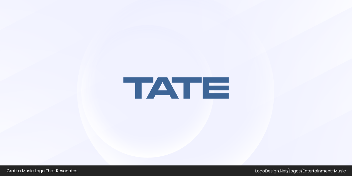
Tate McRae’s minimalist blue logo conveys modern, youthful, versatile pop identity.
Tate McRae features a minimalist geometric wordmark in soft blue. The clean, angular letterforms create a modern, youthful aesthetic, and the restrained color palette keeps the logo versatile yet distinctive, reflecting her contemporary pop style.
• Millennials
Logos for millennial audiences tend to be clean, minimalist, and aesthetically “cool,” often blending simplicity with subtle symbolism or storytelling.
Beyoncé’s condensed wordmark conveys bold, precise, timeless, and iconic identity.
Beyoncé uses a condensed, sans-serif wordmark that is both bold and understated. The minimalist letterforms give the logo a timeless, versatile quality, while the tight spacing and sharp edges convey precision and strength, perfectly reflecting her confident, iconic persona.
Ed Sheeran’s handcrafted logo with paw conveys playful, personal, approachable identity.
Ed Sheeran features a handcrafted wordmark with a whimsical, slightly irregular style. A small paw symbol is integrated into the design, adding a personal, playful touch that reinforces his approachable, down-to-earth brand and makes the logo distinctive and memorable.
• Adult/Mainstream
Mainstream audiences favor logos that are polished, balanced, and trustworthy, typically using refined typography and custom color palettes that convey maturity and credibility.

Adele’s minimal wordmark conveys modern, elegant, confident, and refined identity.
Adele uses a minimal, condensed sans-serif wordmark with tall, elegant letterforms. The thin strokes and carefully spaced typography give the logo a modern, sophisticated feel, projecting both confidence and approachability, perfectly matching her powerful yet refined musical persona.

John Legend’s gothic wordmark and monogram convey elegant, classic, contemporary identity.
John Legend employs a modern gothic serif wordmark with strong, slightly elongated letterforms that feel classic yet contemporary. He also uses a JL monogram with bold, interlocking letters — a compact, versatile mark that reinforces brand recognition while maintaining a sense of elegance and authority.
• Street Culture
Street-oriented music logos often rely on bold, high-impact typography, graffiti-inspired lettering, or emblematic symbols that feel raw, confident, and culturally rooted. The style typically prioritizes attitude, contrast, and visual punch over refinement or polish.
21 Savage’s graffiti logo conveys gritty, assertive, underground, street-authentic identity.
21 Savage uses a graffiti-style wordmark in stark black and white. The thick, hand-sketched letterforms feel intentionally rough and assertive, giving the logo an underground, street-authentic energy. The high contrast and loose lettering make it instantly recognizable while reinforcing his gritty, no-nonsense persona.

Chief Keef’s blocky, fragmented logo conveys aggressive, bold, street-dominant identity.
Chief Keef features a heavy, block-style wordmark with sharp cutouts and fragmented letter shapes. The carved-out negative spaces make the typography feel aggressive and angular, almost like a stencil or street tag. The weight and density of the letters communicate power and dominance, aligning closely with his bold, confrontational image in hip-hop culture.
• Global
Logos designed for a global audience prioritize simplicity, neutrality, and visual universality — avoiding overly local symbols, slang, or culturally specific imagery. They tend to use clean typography and abstract or minimal icons that can be easily understood across different cultures and languages.

Shakira’s sleek logo conveys modern, glossy, approachable, and globally accessible identity.
Shakira uses a sleek, modern sans-serif wordmark with a glossy, glass-like gradient finish. It gives the logo a contemporary, high-production feel while keeping the overall structure simple and readable. The smooth, rounded letterforms make the name feel approachable and international, reinforcing her image as a globally accessible pop artist.

BTS’s minimalist logo conveys open, connected, abstract, and universally recognizable identity.
BTS uses a highly minimalist system built around a black, door-like geometric icon paired with a clean, spaced-out sans-serif wordmark. The symbol suggests openness, connection, and invitation — aligning with the group’s themes of communication and community — while remaining abstract enough to work universally.
• Faith-Based
Faith-oriented music logos often lean toward calm, balanced design, using meaningful symbols, softer color palettes, or traditional typography to communicate reverence, hope, and spiritual purpose rather than trend-driven aesthetics.
Lauren Daigle’s golden logo conveys graceful, hopeful, faith-inspired, and uplifting identity.
Lauren Daigle, a prominent faith-based artist, uses a condensed sans-serif wordmark in a gentle golden-yellow tone. The slender, upright letterforms feel composed and graceful, while the warm yellow color suggests light, hope, and divine presence — visually aligning with themes of faith, healing, and worship in her music.
TobyMac’s bold logo conveys clear, authentic, grounded, and faith-centered identity.
TobyMac employs a bold, straightforward black sans-serif wordmark. The strong, even lettering conveys clarity, authority, and conviction, reflecting his grounded, ministry-driven identity. The absence of embellishment gives the logo a sense of sincerity and authenticity that suits his faith-centered brand.
• Creative Niche
For niche creative audiences, music logos tend to be artistic, unconventional, and concept-driven — prioritizing originality and visual expression over mainstream appeal. These logos often feel like design statements rather than traditional branding.
Rosalía’s high-contrast serif logo conveys elegant, flamenco-inspired, modern-traditional identity.
Rosalía uses a high-contrast serif wordmark with dramatic thin-and-thick stroke variation. The sharp serifs and elongated letterforms give the logo a sculptural, almost flamenco-inspired elegance, blending tradition with contemporary edge — much like her fusion of classic Spanish influences and modern pop.
Lorde’s experimental logo conveys mysterious, introspective, avant-garde, boundary-pushing identity.
Lorde features an unconventional, experimental wordmark that distorts traditional letter shapes. The irregular proportions and artistic spacing make the logo feel mysterious, introspective, and deliberately non-commercial, reflecting her avant-garde musical identity and boundary-pushing aesthetic.
4. Cultural & Global Sensitivity
Many artists work across borders, building brands that resonate with diverse audiences worldwide. Some, however, intentionally take a culturally sensitive approach, preserving local languages, traditions, and heritage while avoiding cultural flattening. These artists collaborate respectfully across cultures, creating authentic global appeal without compromising their roots.
The type of music and cultural focus often shapes an artist’s branding.
• Global-Focused Artists
Music artists aiming for a worldwide audience often use clean, minimalist, or abstract logos. These designs prioritize universality and legibility, avoiding culturally specific references so the logo can be instantly recognized and understood across different regions. The result is a professional, versatile visual identity that feels modern and broadly appealing.
Major Lazer’s bold logo conveys dynamic, energetic, geometric, instantly recognizable identity.
Major Lazer uses a bold geometric wordmark with strategic cutouts and diagonal slashes in the letters, giving the logo a dynamic, energetic feel that reflects the group’s electronic-dance style while remaining instantly recognizable.
Stromae’s S icon and sleek wordmark convey modern, precise, architectural identity.
Stromae combines a stylized “S” icon with a sleek wordmark. The icon features geometric double-line strokes that create depth and movement, giving the logo a modern, architectural quality that mirrors the artist’s precise and design-forward music persona.
Diplo’s grunge logo with red accent conveys edgy, bold, experimental identity.
Diplo’s logo is a grunge-inspired wordmark with a subtle red accent splashed across the letters. The distressed type adds an edgy, tactile energy, while the red highlight draws focus and conveys boldness, reflecting Diplo’s eclectic and experimental electronic style.
Create a Logo That Hits the Right Note!
Build a visual identity that matches your music’s genre, style, and audience.
• Culturally Rooted Artists
Music artists who celebrate local heritage or traditions often incorporate native scripts, regional motifs, or symbolic elements into their logos. These choices create authenticity and a strong sense of place, helping the audience immediately connect with the artist’s cultural roots while still maintaining a distinctive visual identity that can resonate beyond their local community.
Angélique Kidjo’s bold red logo conveys energetic, passionate, timeless Afrobeat identity.
Angélique Kidjo uses a bold red wordmark with clean, modern typography. The vibrant red reflects energy, passion, and vitality, qualities associated with her Afrobeat and pan-African musical heritage, while the simple lettering keeps the logo timeless and instantly recognizable.

Dhafer Youssef’s minimalist logo conveys elegant, spiritual, culturally rich musical identity.
Dhafer Youssef, a Tunisian Oud and Sufi jazz musician, employs an all-caps wordmark paired with a subtle abstract icon that evokes sound waves or a stylized Oud shape. The minimalist design balances elegance with cultural specificity, reflecting the spiritual and musical depth of his work.
Loreena McKennitt’s textured serif logo conveys artisanal, mystical, Celtic-inspired identity.
Loreena McKennitt, who draws on Celtic traditions from Ireland and Canada, uses a serif wordmark with a gently textured, slightly distressed effect reminiscent of hand-carved lettering. This effect adds an artisanal, historical feel, echoing the roots-inspired and mystical quality of her music.
5. Competition
In music, artists targeting similar audiences often influence each other’s logo choices, balancing genre conventions with the need to stand out. Competing logos may share visual cues—like serif wordmarks for emotional singer-songwriters or bold display fonts for metal bands—but subtle differences help define each artist’s identity.
• James Blunt vs. Shawn Mendes
Both embrace the singer-songwriter vibe.
James Blunt’s serif logo conveys elegant, refined, emotive musical identity.
James Blunt’s logo is a refined display serif with subtle flares on key letters, giving it an elegant, emotive feel.
Shawn Mendes’ serif logo conveys clean, expressive, and balanced musical identity.
Shawn Mendes uses a serif wordmark with contrasting thick and thin strokes, creating a clean yet expressive presence.
Both communicate sophistication, but the flourishes in Blunt’s logo make it slightly more personal, while Mendes’s feels contemporary and polished.
• Metallica vs. Iron Maiden
Both Heavy metal legends use dramatic, blackletter-inspired typefaces.
Metallica’s angular logo conveys intense, dynamic, and powerful musical identity.
Metallica’s logo features sharp, angular letterforms that suggest intensity and motion.
Iron Maiden’s red logo conveys bold, edgy, street-style energy.
Iron Maiden’s red-lettered logo includes outlined edges, giving it a bold, street-style energy.
Both are instantly recognizable, yet their subtle differences reinforce each band’s unique persona within the same genre.
• Joyner Lucas vs. Eminem
Fast-flowing, narrative-driven rap acts rely on distinctive wordmarks.
Eminem’s E-lettermark conveys sharp, aggressive, and edgy musical identity.
Eminem’s E-lettermark incorporates a sharp, knife-like element that conveys edge and aggression.
Joyner Lucas’s hand-scripted logo conveys personal, artistic, and distinctive identity.
Joyner Lucas’s hand-scripted logo includes a silhouetted figure, adding a personal, artistic touch.
Both logos reflect speed and storytelling, but one emphasizes grit, the other individuality.
Competition drives artists to refine logos that feel familiar enough to fit the genre while maintaining distinctiveness to stand out in a crowded musical landscape.
6. Longevity & Flexibility
A strong music logo must not only capture the artist’s identity but also stand the test of time. Some logos become iconic because they remain consistent for decades, reinforcing brand recognition and loyalty.

AC/DC’s lightning bolt logo conveys electrifying, powerful, rebellious rock identity.
The classic AC/DC wordmark with the lightning bolt has remained largely unchanged since 1977, becoming a symbol of rock energy and rebellion. Its sharp, angular lettering and bold bolt convey power and electrifying performance.
Motown Records’ simple wordmark conveys timeless, professional, and influential musical identity.
Established in 1959, Motown Records’ wordmark has stayed simple yet instantly recognizable. The clean, geometric typography communicates professionalism and timeless musical influence.
KISS lightning logo conveys theatrical, edgy, and powerful rock identity.
The stylized lightning “SS” in the KISS logo has been consistent since 1973, perfectly reflecting the band’s theatrical, edgy persona and hard rock identity.
Blue Note’s circular logo conveys sophisticated, elegant, timeless jazz identity.
The Blue Note logo, in use since 1939, features a minimal, circular emblem and classic sans-serif wordmark. Its simplicity and geometric form convey sophistication, elegance, and lasting influence in jazz music.
How To Design A Music Logo – A Practical Guide
Designing a music logo doesn’t have to sound like following rigid rules. You must be able to translate sound, personality, and attitude into something visual. A good logo should feel like it belongs to the artist behind it, whether that artist is a solo singer, a band, or an entertainment brand. The steps below keep the process simple and flexible, so creativity stays at the center.
Great music logos visually express artist personality, sound, and identity.
Step #1: Start With the Artist, Not the Artwork
Before you open any design tool or sketch a single idea, take time to understand the music and the person behind it. What does the artist sound like? What emotions come through in their songs? Are they loud and raw, polished and pop-driven, or stripped-back and intimate?

Mood keywords guide cohesive, intentional, and visually aligned music logo design.
Write down keywords that capture the mood. These might include colors, places, feelings, or visual styles that match the music. This becomes your reference point. Every design decision later on should connect back to this foundation.
Step #2: Get Ideas Out Fast and Without Pressure
This is the stage where overthinking can ruin good ideas. Grab a pen and paper and sketch quickly. The goal is not perfection. Its volume. Simple shapes, rough lettering, or basic symbols are more than enough at this point.

Sketch freely first to discover unexpected, strong music logo ideas.
Most strong logos start simple. By sketching freely, you give yourself room to explore ideas you might not arrive at if you jump straight into software. Some sketches will be bad. A few will surprise you. That’s exactly how it should work.
Step #3: Lock in the Building Blocks, aka the Colors, Fonts, and Symbols
Once a few ideas look promising, it’s time to consider the logo’s elements. This includes the logo’s typeface, color palette, and any graphic symbol you might use.

Choose wordmark or symbol based on artist identity and musical fit.
Many solo artists lean toward wordmark logos, using their name as the logo with a distinctive font. Bands and labels often combine text with a symbol. Neither approach is better than the other. What matters is whether it fits the music. Try a few combinations and see which one feels natural, not forced.
Step #4: Check for Originality
A logo should feel familiar, but not borrowed. Before settling on a final direction, take a look at other artists in the same genre. This helps you avoid designs that look too similar, especially when it comes to fonts and symbols.

Music logos should stand out while staying true to their scene.
Music logos have more creative freedom than most industries, but that doesn’t mean anything goes. The goal is to stand out without looking disconnected from the scene you’re part of.
Step #5: Build the Logo in a Digital Format
At this point, the logo needs to live beyond paper. You can scan a hand-drawn design and recreate it digitally, build it from scratch using design software, or use a logo maker like LogoDesign.Net to refine your concept into a finished mark.

Music logos must be scalable, clean, and usable everywhere.
What matters here is usability. A good logo should work on streaming platforms, social media, posters, and merchandise. Clean lines and scalable logo formats will save you problems later.
Step #6: Get Feedback Before You Commit
Before the logo goes public, get a second opinion from people who are not emotionally attached to the project. Friends and family often mean well, but they are not always honest.

Test music logos with fans or clients to refine direction.
For musicians designing their own logos, sharing a few options on social media and letting fans vote can be surprisingly helpful. If you’re designing for a client, this is the stage to listen carefully, take notes, and refine the design without losing the original intent.
All Set to Visualize Your Sound?
Your music moves ears; let your logo move eyes with a distinct, eye-catching design.
The Building Blocks of a Powerful Music Logo
A music logo is far more than decoration — it is a visual translation of sound, mood, and identity. In a crowded music industry where thousands of artists compete for attention, a well-crafted logo becomes a crucial tool for standing out and being remembered. Before a listener even hears a single note, the logo sets expectations about the artist, the genre, and the emotional experience of the music.
Every design choice — from typography and color to symbols and composition — helps position the artist within (or apart from) their musical landscape. These elements signal whether an artist feels polished or raw, experimental or traditional, mainstream or niche. When used intentionally, they allow musicians to differentiate themselves within the same genre while remaining authentic to their sound.
When all these elements work together harmoniously, a logo does more than represent a name — it becomes a visual shorthand for the artist’s identity, making it instantly recognizable and emotionally resonant with their audience.
1. Colors
Did you know? 81% of consumers are more likely to remember a brand’s color than its name.
Choosing colors for a music logo is exciting, but it can also feel like too many options at once. Colors set the mood before anyone hears a single note, so the goal is not to chase what looks good today, but to build a brand color palette that feels right for the artist and can grow with the music.
These tips keep the process focused and intentional.
• Let the Music Lead the Mood
Start with the sound. A logo should visually echo the music behind it.
Dark, aggressive, or experimental genres often lean toward deeper tones like black, charcoal, or muted reds. Pop, indie, or upbeat electronic music usually works better with brighter, warmer shades.

Marilyn Manson’s red wordmark conveys intense, provocative, and dangerous shock-rock identity.
Marilyn Manson — a shock rock and industrial artist — uses a saturated, almost blood-red in his wordmark, reinforcing themes of intensity, danger, and provocation that run through his music and persona.

Two Door Cinema Club’s soft blue-grey logo conveys cool, modern, dreamy identity.
Two Door Cinema Club — an upbeat indie-pop band — uses a soft blue-grey wordmark that feels cool, modern, and slightly dreamy, matching their clean, melodic, and danceable sound rather than anything heavy or abrasive.
The key is alignment. If the music feels intimate or raw, overly glossy colors can feel out of place.
• Use Color Psychology as a Guide, Not a Rulebook
The psychology of colors plays a real role in how people react to a logo. Red can signal energy or intensity. Blue often feels calm or reflective. Yellow can suggest optimism or youth. That said, music branding has more freedom than corporate branding.

The Wombats’ powder-blue logo conveys playful, contemporary, approachable indie identity.
The Wombats use a soft powder-blue wordmark. The light, airy tone feels playful and contemporary rather than melancholic, matching their danceable, slightly ironic indie sound while keeping the logo clean and approachable.
MUNA’s red logo conveys bold, high-energy, confident, and stage-ready identity.
MUNA takes the opposite route with a saturated red backdrop behind a minimalist white wordmark. The red feels confident, high-energy, and emotionally direct, giving their sleek typography a bold, stage-ready presence that contrasts with The Wombats’ cooler, more laid-back mood.
Both artists operate in a similar indie-pop space, yet their color choices create distinctly different emotional impressions—proving that color theory is most powerful when used intentionally within a musical context, not treated as a rigid formula.
• Pay Attention to Fresh Color Trends in Your Genre
Every genre has its own visual rhythm. Looking at fresh color trends can help you understand what feels current without copying anyone outright. For example, many modern indie artists favor muted pastels or earthy tones, while hip-hop and electronic artists often lean toward high-contrast palettes or neon accents.
Peach Pit’s muted yellow logo conveys relaxed, sun-soaked, mellow indie identity.
Peach Pit’s logo uses a softened, slightly dusty yellow rather than a bright primary tone. This muted warmth feels relaxed and sun-soaked, aligning with their mellow, reflective indie sound while still remaining visually distinct and modern.

Flint Institute of Music’s colorful logo conveys playful, structured, fresh, professional identity.
The Flint Institute of Music by Minelli uses a multi-color lettermark that feels playful yet highly intentional. Each color occupies a defined structural space within the typography, creating visual rhythm rather than chaos — a contemporary approach that feels fresh while still controlled and professional.

Sony Music’s refreshed red logo conveys modern, sophisticated, and recognizable brand identity.
When Sony Music refreshed its identity, it kept the brand’s signature red but shifted to a deeper, more muted shade rather than a bright corporate red. This subtle adjustment modernized the logo, making it feel more sophisticated and aligned with current design trends while preserving brand recognition.
Trends are useful for inspiration and context, but the strongest music logos borrow selectively from them rather than letting them dictate the entire visual identity.
• Build a Palette, Not Just a Favorite Color
A strong music logo rarely depends on one standalone color. Instead, it works within a thoughtfully built palette — a primary tone supported by complementary shades and grounded by neutrals.

Melanie Martinez’s muted pink logo conveys vintage, soft, and distinctive identity.
Melanie Martinez has built her visual identity around a muted, vintage pink — closer to a dusty rose than a bright bubblegum tone.

Melanie Martinez’s logo palette conveys theatrical, whimsical, retro, and dark pop identity.
Her logo reflects this soft, nostalgic color direction, and her website extends the palette with shades of brown, cream, and black. The result feels theatrical, doll-like, and retro, perfectly aligning with her dark, whimsical pop aesthetic.

Glass Animals’ deep green and psychedelic palette conveys vibrant, trippy, modern identity.
Glass Animals take a different approach by centering their branding around deep greens paired with psychedelic blues, purples, and black.

Glass Animals’ saturated palette conveys immersive, experimental, atmospheric, and layered identity.
Their logo and website visuals consistently use these saturated, slightly surreal tones, reinforcing the band’s experimental, atmospheric sound. The layered palette creates depth and visual immersion rather than relying on a single flat color.
• Choose Colors You Can Live With Long-Term
This part matters more in music branding than in most industries. Artists live with their visuals for years. If a color feels forced or uncomfortable, it will eventually show. The best brand color palette is one that the artist genuinely likes and feels connected to.

STRFKR’s peach-and-black logo conveys warm, modern, flexible, and timeless identity.
STRFKR uses a soft peach-toned wordmark set against black, creating a subtle yet distinctive contrast. The peach isn’t loud or neon; it’s warm, slightly muted, and flexible. Paired with black, it feels modern and evergreen rather than trend-bound — a combination that works across posters, vinyl sleeves, and digital platforms without feeling dated.

MGMT’s muted grey logo conveys timeless, adaptable, understated, and psychedelic identity.
MGMT’s muted grey logo reflects a similar long-term sensibility. The understated tone avoids flashy color trends entirely, allowing the typography and psychedelic visual direction of the band to evolve around it. The neutrality of the grey gives the logo longevity, making it adaptable to different album aesthetics while remaining recognizable.
When the colors feel personal, the branding feels authentic.
2. Fonts
Typography carries just as much personality as color, sometimes more. In music branding, a font often becomes the logo, especially for wordmarks. Whether it’s a band name, a solo artist, or an entertainment company, the right typeface sets expectations before anyone presses play.
There isn’t a single “best” font for music logos. What works for a jazz trio would feel wrong for a trap producer. Instead of chasing popular choices, focus on how the font sounds visually and whether it reflects the artist behind it.
• Look for Personality, Not Perfection
Music logos thrive on character. Unlike corporate branding, where ultra-clean typography is often the goal, music identity benefits from expressive letterforms that feel human, imperfect, and emotionally charged. Clean does not have to mean bland, and decorative does not have to mean unreadable — the real danger lies in fonts that feel generic or overly polished.
Grouplove’s distressed logo conveys raw, energetic, bold, and recognizable identity.
Grouplove’s logo uses a custom, slightly distressed typeface with a grunge texture that gives it raw energy. The filled-in “O” letterforms act as bold visual anchors, breaking the rhythm of the wordmark and making the identity instantly recognizable. The imperfections feel intentional.

Karol G’s glossy logo conveys glamorous, bold, stage-ready reggaeton-pop identity.
Karol G, by contrast, uses a sleek, customized wordmark with a glossy, metallic finish — often referred to as a chrome or high-shine effect. The reflective, almost jeweled surface gives the logo a glamorous, reggaeton-pop presence that feels bold and stage-ready.
A font with subtle quirks, uneven strokes, or custom spacing often feels more alive and more connected to music culture.
• Keep It Distinct and Recognizable
Uniqueness matters, especially in crowded genres. If a font has been used by dozens of artists, it loses impact. Customizing a typeface, even slightly, can make a big difference. Adjusting letter spacing, modifying a single character, or combining two styles can help the logo feel owned, not borrowed.

Korn’s distressed logo with reversed “R” conveys unsettling, dark, intense identity.
Korn’s logo is a powerful example. The nu-metal band uses a rough, childlike, distressed typeface that feels unstable and unsettling — mirroring the psychological intensity of their music. The reversed “R” is the defining detail: it disrupts the word visually, making the logo instantly recognizable and slightly off-balance in a way that reinforces the band’s dark identity.
Angus & Julia Stone’s script logo conveys intimate, organic, personal acoustic identity.
Angus & Julia Stone take a completely different approach with a flowing, custom script wordmark. The handwritten style feels intimate and organic, reflecting their acoustic, emotionally driven sound. The connected strokes and natural rhythm of the lettering make the logo feel personal — almost like a signature — which strengthens its recognizability.
Yussef Dayes’ refined wordmark conveys elegant, premium, contemporary, and distinctive identity.
Yussef Dayes uses a clean, refined wordmark built on elegant, well-spaced typography. The letterforms are simple yet intentional, giving the name a premium, contemporary feel. Its strength lies in restraint — subtle styling and balanced spacing make the logo distinctive without unnecessary decoration.
Distinct logos are rarely about complexity. They are about ownership. A small but intentional typographic twist can turn a name into a lasting visual mark.
• Make Sure It’s Easy to Read Everywhere
A music logo must perform across formats — from massive stage backdrops to tiny streaming thumbnails. If the name becomes illegible on Spotify, Instagram, or a mobile screen, the typography is working against the artist. Testing scalability is essential: reduce the logo to icon size, place it against different background colors, and check whether the letterforms still hold clarity.
Jeremy Zucker’s clean wordmark conveys readable, scalable, crisp, and versatile identity.
Jeremy Zucker’s logo is a strong example of readable, scalable design. The clean sans-serif wordmark uses generous spacing and simple letterforms, ensuring the name remains crisp and recognizable even at very small sizes. There are no unnecessary flourishes or tight overlaps that could blur on digital platforms.
Beabadoobee’s rounded logo conveys playful, expressive, clear, and highly legible identity.
Beabadoobee’s logo, despite the length of the name, maintains clarity through consistent stroke weight and clear letter separation. The rounded, slightly playful typography feels expressive without sacrificing legibility, allowing the full name to remain readable across merch, posters, and profile images.
• Font Styles That Work Well for Music Logos
While personal taste always plays a role, certain font styles consistently perform well in music branding. The right typography helps signal genre, personality, and emotional tone before a listener hears a single track.
Below are font categories that frequently appear in successful artist logos — along with real examples.
1. Bold Sans-Serif Fonts
Bold sans-serif typefaces feel modern, confident, and highly adaptable. They work especially well for pop, R&B, electronic, and contemporary indie artists. These fonts rely on even stroke widths, geometric construction, and strong vertical lines. They scale well and feel confident without unnecessary decoration.

Giveon’s all-caps logo conveys clean, minimalist, smooth R&B identity.
Giveon uses an all-caps, evenly weighted sans-serif wordmark with generous letter spacing. The clean geometry reinforces his smooth, minimalist R&B identity.
JMSN’s textured logo conveys bold, raw, emotional, and structured identity.
JMSN logo features a bold sans-serif base that’s subtly textured and softened, giving the otherwise structured letterforms a raw, emotional finish.
Khalid’s rounded logo conveys approachable, youthful, and friendly musical identity.
Khalid’s logo features a thick, rounded sans-serif style. The slightly softened terminals make the logo feel approachable and youthful rather than rigid.

Parcels’ blue logo conveys clean, balanced, legible, and recognizable identity.
The Parcels logo features a crisp blue sans-serif wordmark with precise, balanced proportions. The structured letterforms keep the name clean, legible, and instantly recognizable.
2. Serif Fonts
Serif fonts introduce contrast, tradition, and refinement. They often work well for folk, jazz, classical-inspired, or emotionally driven music. Serifs add visual rhythm through thick-and-thin stroke contrast and small finishing strokes at the ends of letters, which can evoke heritage or storytelling.
Parcels’ blue logo conveys clean, balanced, legible, and recognizable identity.
Iron & Wine uses a classic serif wordmark with traditional letter proportions, giving the logo a timeless, literary tone.
Hollow Coves’ serif logo conveys warm, authentic, and acoustic musical identity.
Hollow Coves’s wordmark is restrained serif with subtle contrast, reinforcing warmth and acoustic authenticity.
Billie Marten’s serif logo conveys elegant, introspective, and refined singer-songwriter identity.
Billie Marten logo is elegant serif styling with refined stroke contrast, aligning with introspective singer-songwriter aesthetics.
Sango’s logo blends classic serif structure with modern, contemporary musical identity.
Sango blends serif influence with modern weight, creating a bridge between classic structure and contemporary production style.
3. Handwritten or Script Fonts
Script logos mimic handwriting and often feel intimate, expressive, and personal — especially effective for solo artists. Connected strokes, fluid curves, and varying line thickness create movement and individuality, making the logo feel like a signature.
AURORA’s script logo conveys mystical, ethereal, and flowing musical identity.
AURORA logo is a flowing, custom script-style wordmark with organic curves that feel mystical and ethereal.
SAL’s handwritten logo conveys artistic, loose, and understated musical identity.
SAL uses a loose handwritten-style logo that feels artistic and understated rather than overly polished.
Alina Baraz’s cursive logo conveys sensual, smooth, and atmospheric musical identity.
Alina Baraz uses a smooth, cursive-inspired script with soft curves, reinforcing her sensual, atmospheric sound.
Galimatias’s handwritten logo conveys dreamy, delicate, and electronic musical identity.
Galimatias’s logo is a delicate handwritten wordmark with slightly elongated strokes, giving the logo a dreamy, electronic feel.
4. Geometric Fonts
Condensed and geometric fonts use structured shapes and tighter proportions, making them strong and visually impactful — popular in alternative, rock, and electronic genres. Condensed forms create vertical intensity, while geometric construction (circles, straight lines, sharp angles) adds modern sharpness.
CHVRCHES’ geometric logo conveys sleek, sharp, and modern synth-pop identity.
CHVRCHES uses a geometric, all-caps sans-serif with tight spacing and sharp angles, reinforcing their sleek synth-pop identity.
Kehlani’s bold logo conveys clear, strong, and impactful musical identity.
Kehlani’s wordmark logo features a bold sans-serif typography with strong vertical strokes, giving clarity and presence.
Rhye’s minimal logo conveys refined, intimate, and geometric musical identity.
Rhye uses a minimal geometric sans-serif wordmark with restrained spacing, reflecting the band’s refined and intimate sound.
London Grammar’s clean logo conveys structured, balanced, and atmospheric alternative identity.
London Grammar’s logo is a clean, structured sans-serif wordmark with balanced proportions, aligning with their atmospheric alternative style
5. Grunge & Gothic Fonts
Distressed and gothic-inspired fonts amplify aggression, drama, or darkness — often seen in metal, hardcore, and experimental genres. Irregular strokes, sharp serifs, exaggerated angles, and distressed textures create emotional intensity and visual tension.

City Morgue’s jagged logo conveys chaotic, raw, and abrasive musical identity.
City Morgue uses jagged, chaotic letterforms with uneven edges, visually echoing raw, abrasive sound.
Scarlxrd’s angular logo conveys sharp, intense, and trap-metal musical identity.
Scarlxrd has a sharp, angular, metal-inspired typography with exaggerated strokes and slashes that amplify his trap-metal aesthetic.
Motionless In White’s gothic logo conveys dramatic, dark, and theatrical rock identity.
Motionless In White features a gothic-style letterforms with dramatic strokes that reinforce theatrical, dark-rock themes.

Ghostemane’s industrial logo conveys aggressive, mechanical, and intense rap-metal identity.
Ghostemane uses heavy, industrial-style lettering with sharp, blocky edges that feels mechanical and aggressive, perfectly matching his dark, intense rap-metal style.
• Always Test Font and Color Together
A font might look great on its own, but fall apart once color is added. Make sure your typeface holds up against your color choices and stays readable across light and dark backgrounds. The best results come when typography and color support each other, not compete for attention.
Next, we’ll look at how graphics and symbols can enhance a music logo without overpowering it.
3. Graphics
When it comes to graphics, this is where music logos really get room to breathe. Unlike many other industries, bands and artists are not boxed into safe or predictable visuals. A graphic can be symbolic, abstract, emotional, or even a little strange, as long as it connects back to the music and the story behind it.
The best place to start is always the artist’s identity. Look at recurring themes in the music. Are there symbols hidden in lyrics? Visual ideas that keep showing up in album art, stage design, or interviews? These details often make the strongest graphic marks because they already mean something to the artist and their audience.
A classic example is Pink Floyd’s pig, which appeared repeatedly across albums, live shows, and artwork. It worked as both a visual symbol and a loose mascot, tied directly to the band’s themes and worldview. It was never just decoration. It carried meaning.
Run-D.M.C.’s bold red bars convey iconic, strong, and impactful hip-hop identity.
Another example is Run-D.M.C.’s bold red bars. Run-D.M.C. uses their iconic bold red bars as a graphic signature. The simple, geometric design frames the name, making it instantly recognizable while reflecting the group’s strong, impactful presence in hip-hop.
• Let the Music Shape the Visual Style
Different genres naturally steer artists toward specific visual languages in their logos. These choices are rarely random — shape, symbol, and structure often reflect sound, energy, and cultural context.
For example, rock bands frequently lean on bold, iconic symbols that mirror their raw energy.

The Who’s target logo conveys dynamic, bold, and forward-moving rock identity.
The Who’s logo combines a classic target motif — concentric circles in red, white, and blue — with a bold, stacked wordmark and an upward arrow integrated into the “o” of Who, hinting at dynamic movement and forward momentum that matches their powerful rock legacy.
In jazz and related forward-thinking jazz fusion, artists often embrace minimal or abstract symbols that evoke atmosphere rather than aggression.
The Comet Is Coming’s logo conveys cosmic, exploratory, and improvisational musical identity.
The Comet Is Coming uses a clean comet graphic as a simple but evocative mark, suggesting cosmic exploration and improvisational soundscapes.
BadBadNotGood’s wordmark conveys rhythmic, geometric, and subtly distinctive musical identity.
Similarly, BadBadNotGood plays with letterforms — using simple “O” shapes in their wordmark to create a distinct rhythm within the typography itself — a subtle yet effective geometric approach.
Electronic music, which often emphasizes precision and futuristic sound design, routinely adopts geometric or metaphorical symbols.
Illenium’s bird logo conveys balanced, geometric, and digitally clear musical identity.
Illenium’s logo features a stylized bird-like symbol with clean geometry, visually balancing organic form with digital clarity.
Odesza’s bold logo with hexagon glyph conveys versatile, modern, and flexible identity.
Odesza pairs its bold wordmark with a modest hexagon-like glyph that can flex across merchandise, album art, and digital badges.

San Holo’s arrow-percentage logo conveys dynamic, simple, and electronic music identity.
San Holo integrates an arrow-and-percentage symbol into the mark, offering a dynamic yet simple graphic that feels at home across electronic genre visuals.
That does not mean these rules cannot bend, but they are useful starting points.
Meanwhile, some DJs and producers build logos that speak directly to motion and rhythm.
DJ Hardwell’s logo conveys rhythmic, dynamic, and waveform-inspired electronic identity.
DJ Hardwell’s logo uses extended horizontal lines that visually echo beat progression and waveform continuity, making the type itself more than just a name.
Carl Cox’s mask logo conveys performative, persona-driven, and iconic DJ identity.
Carl Cox stands out by incorporating a masquerade mask-like icon alongside his name — a nod to the performative and persona-driven culture of DJing, where identity and spectacle go hand in hand.
Artists whose music bridges genres often reflect this hybridity in their branding. For instance, a folk band experimenting with electronic textures might push toward more modern symbols than traditional acoustic acts.

Mumford & Sons’ heraldic logo conveys organic, elevated, and folk-inspired identity.
Mumford & Sons have used winged or heraldic elements in some iterations of their visual identity — subtle, organic, yet elevated — linking folk roots with broader artistic ambition.
Eivør’s slashed “o” logo conveys organic, handcrafted, and contemporary musical identity.
Similarly, Eivør has used a circle with a slash integrated into the “o” of her wordmark, blending linguistic play with handcrafted simplicity — a graphic choice that feels both organic and contemporary.
This isn’t to say any artist must fit a strict category — hybrid sounds mean hybrid visuals — but genre tendencies can provide a useful starting point when thinking about how shape, symbol, and style help communicate sonic identity at a glance.
• Graphic Ideas That Often Work Well
Some graphic directions tend to translate well across music branding when used thoughtfully.
Below are a few with examples:
1. Musical Elements
Icons inspired by instruments or music gear can instantly communicate the artist’s craft. Simplifying and stylizing drums, keyboards, or turntables turns familiar objects into strong, versatile symbols.

Drum with sticks and piano key logos by LogoDesign.Net.
2. Studio-Related Symbols
Headphones, speakers, mixers, or sound waves can visually express the production side of music. These graphics emphasize sound, creativity, and technical skill, connecting the audience to the process behind the music.

Music note with piano and mixer bars in headphones logos by LogoDesign.Net.
3. Silhouettes
Silhouettes of performers, dancers, or audiences capture energy, motion, and engagement. These designs convey the live experience and the physical connection between artist and crowd.

DJ at turntable and dancing figure logos by LogoDesign.Net.
4. Location-Based Symbols
Graphics referencing cities, neighborhoods, or landmarks tie a musician to their roots or the community where they built a following. This adds context and personality to the brand.

City skyline with dancing crowd and equalizer-in-apple logos by LogoDesign.Net.
5. Abstract Forms
Abstract symbols can represent rhythm, movement, or mood without depicting literal objects. Circles, lines, or geometric patterns allow for flexible, versatile logos that feel modern and conceptual.

Rotating music notes in a yellow circle and abstract lined camera logos by LogoDesign.Net.
These ideas work best when they are interpreted creatively, not copied directly.
• Don’t Default to Obvious Music Symbols
It can be tempting to use a piano or drum logo element simply because it feels logical. In many cases, those choices are too obvious and end up blending in with hundreds of similar logos. Music branding thrives on personality, and overly literal graphics often dilute that.
Instead of showing what the artist does, focus on how the music feels. A symbol that hints at emotion, attitude, or atmosphere will usually say more than a literal instrument ever could.
• Keep It Simple and Flexible
No matter how creative the graphic is, it still needs to function as a logo. It should work at small sizes, look good in one color, and feel natural next to the typography. If the symbol cannot survive without explanation, it may be better suited for album art than a logo.
MassiveMusic’s logo conveys clean, vibrant, and sound-inspired visual identity.
MassiveMusic features a clean sans-serif wordmark paired with a vibrant orange waveform icon. The wave doubles as a visual representation of sound while remaining simple enough to scale across platforms.
Music Publishers of Canada’s geometric “M” logo conveys dynamic, versatile, and adaptable identity.
Music Publishers of Canada uses a subtle yet highly versatile logo built from overlapping geometric shapes forming a stylized “M.” The design is dynamic — the icon can rotate, resize, or be used independently of the wordmark, making it effective across print, web, and event signage.
Music Masters’ logo conveys minimalist, flexible, professional, and sound-inspired identity.
Music Masters employs a minimalist wordmark accompanied by a simple circular icon with layered lines suggesting both a record and sound waves. The design is flexible, working seamlessly in one color, small sizes, or alongside other branding elements while maintaining a strong, professional identity.
A strong music logo graphic does not shout. It resonates.
Common Logo Design Mistakes in the Music Industry
Music logos have to work everywhere — streaming thumbnails, merch, tour posters, social media, and stage visuals. When they fail, it’s usually because of one of these three issues:
1. Overcomplicating the Design
Trying to visually express every aspect of an artist’s personality often leads to clutter. Excessive textures, multiple symbols, intricate illustrations, or layered effects reduce clarity and memorability. In practice, overly detailed logos lose impact at small sizes and become difficult to reproduce consistently on merch or print. Strong music logos focus on one clear idea and execute it boldly.
2. Ignoring Scalability and Versatility
A logo must work as a tiny Spotify avatar, a festival lineup listing, and a large stage backdrop. Thin typography, overly horizontal layouts, and heavy gradients often break across formats. Without simplified variations (icon-only, wordmark-only, stacked versions), the identity becomes difficult to apply consistently. Flexibility is essential in today’s multi-platform music landscape.
3. Misaligned Genre or Audience Perception
Visual style sends an immediate signal about genre and attitude. Sharp, aggressive forms suggest intensity; soft scripts suggest intimacy; geometric minimalism often signals electronic influence. When the visual language doesn’t align with the music’s tone or target audience, the brand feels disconnected or inauthentic. Even genre-bending artists must create a visual identity that feels believable.
Ultimately, effective music logos prioritize clarity, adaptability, and authenticity over decoration.
Create a Logo That Hits the Right Note!
Build a visual identity that matches your music’s genre, style, and audience.
Make Your Music Seen as Well as Heard
Your songs get people’s ears. Your logo gets their eyes. A good music logo is a little piece of your vibe, your story, your personality, all in one. Fans should see it and instantly think of you.
So why wait? Grab your ideas, play with fonts, colors, and graphics, and create a logo that actually feels like your music. It’s time your visuals hit as hard as your tracks!