Is your logo feeling a little…meh? Time to design one that actually gets noticed, in all the right ways.
Aren’t logos funny? They take up barely any space, but somehow carry the weight of your entire brand. Before someone knows what you sell or how great your service is, they’ll see your logo. That’s where the first impression begins.
Designing one doesn’t have to be complicated, nor does it require you to be a designer. But it does take some thought. Also, a lot of decisions revolve around colors, fonts, layout, and symbols. There are so many iconic logo examples out there that we don’t even have to name, you just see them and your brain recollects the memory.
We’re here to help you do just that – create a timeless logo that looks good, feels right, and fits wherever your brand shows up. We’ll take it from the top and walk through the full process, plus all the tips to keep your design on track and a few best practices to avoid mistakes along the way.
What is a Logo?
A logo is a visual shortcut for your brand. It can be a symbol, a wordmark, or a fusion of both. But at its core, it’s how people see you at a glance, and that’s probably one of the main reasons why your business needs a logo.
Whether it’s on a signboard, a website, or a social post, your logo is what people remember and recognize. It doesn’t need to explain everything about your business; it just needs to represent it clearly and consistently.
What Makes a Good Logo?
If you think a good logo is about how flashy or artistic it looks, you’re mistaken. A good logo is as good as it works. While personal taste plays a role, all famous logos tend to have a few things in common.
- Simple enough to be recognized instantly
- Memorable, so it sticks after one look
- Unique, so it doesn’t get lost in the crowd
- Versatile across print, digital, and even small sizes
- Relevant to your industry and audience
- Timeless, so it still looks great years from now
Talking about great logos, we definitely can’t miss Apple’s iconic, immediately recognized logo. It doesn’t forcefully try to explain what the company does; it simply represents the brand with clarity and confidence.
The simple and minimalist Apple logo that shows the brand’s confidence
The cherry on top is that it’s versatile enough to appear on everything from product packaging to websites and still hold its own.
Mastercard, Google, Starbucks, and Instagram went from having detailed logos to simpler ones
Now, think of brands like Mastercard, Starbucks, Google, and Instagram—all of which once had more detailed or illustrative logos. Over time, they’ve embraced simpler and bolder designs that are easier to scale and instantly connect with. These changes weren’t just aesthetic but strategic.
What are the Types of Logos?
With bazillions of logos out there, you’d think they’d all be different. But in reality, almost every logo fits into one of the main categories. Each logotype has its strengths and design personality. What works for a bank might not suit a kids’ cereal brand and vice versa.

The brands using Emblem, Pictorial, Wordmark, Monogram, Abstract, Mascot, and Combination logos to meet their identity
Choosing the right logotype depends on your brand’s values, tone, and how you want to be seen.
1. Emblem Logos
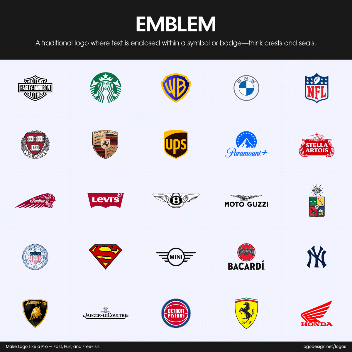
Emblem logos of brands recognized by symbols and badges
Emblems combine text and imagery into a single, enclosed shape, giving off a traditional and established vibe. Brands like Harley-Davidson, Bacardi, Superman, Levi’s, and Starbucks use emblems to create a sense of heritage and authority, though these designs can get tricky to scale down for small screens or labels.
2. Pictorial Marks (Logo Symbols)
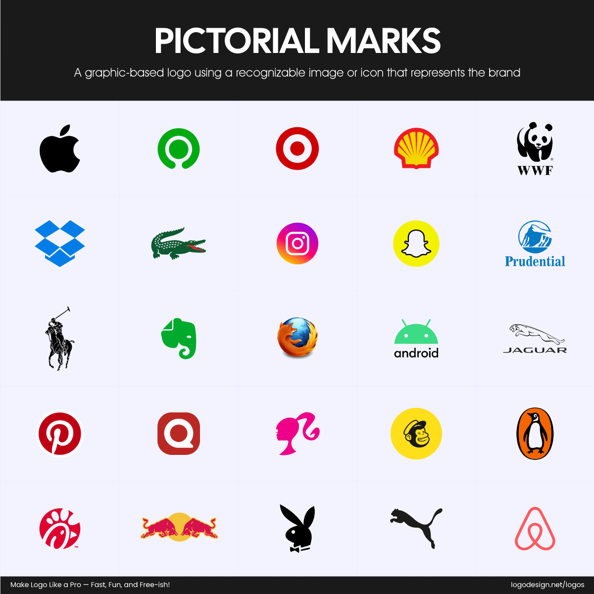
Pictorial logos of brands recognized by images and mascots
Pictorial marks rely on a single image to represent the brand. Think of Shell’s iconic seashell or X, formerly Twitter’s bird, which is simple, memorable, and globally recognized. These pictorial or symbol logos work best when the brand is already well-known, as there’s no text to explain what it stands for.
3. Wordmark Logos
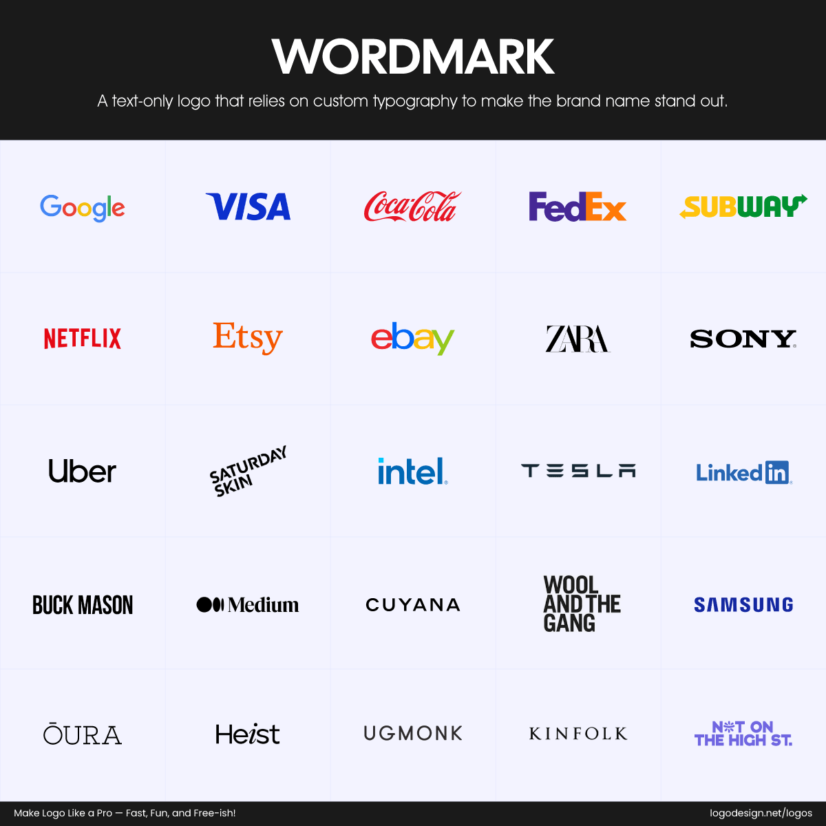
Wordmark logos of brands recognized by custom typography
Wordmarks use the brand name itself as the logo. Wordmark or text logos are shaped through strong, distinctive typography. Subway, intel, SONY, Samsung, Medium, and Disney all lean into this style, turning their names into visual identities that are instantly recognizable across the world.
4. Monogram Logos (Lettermarks)
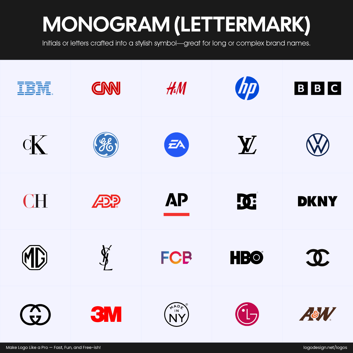
Lettermark logos of brands recognized by initials and symbols
Monograms, often known as lettermarks or alphabet logos, are created using initials, ideal for companies with long names that want something clean and compact. IBM, LG, 3M, Chanel, MG Motors, YSL, CNN, and HBO use this style effectively, relying on strong brand awareness to make their letters instantly identifiable.
5. Abstract Logo Marks
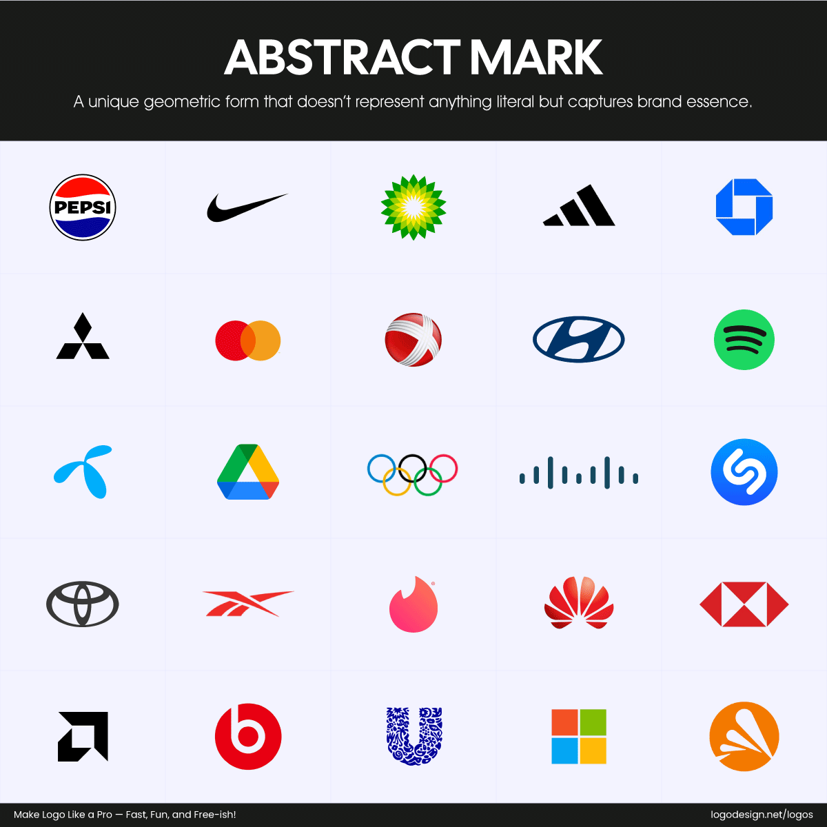
Abstract logos of brands recognized by geometric form
Abstract logos use unique shapes or forms that don’t depict anything literal but still carry meaning through design. Google Drive’s Möbius strip-inspired triangle and Adidas’s stylized stripes both communicate identity without needing a specific image or word.
6. Mascot Logos
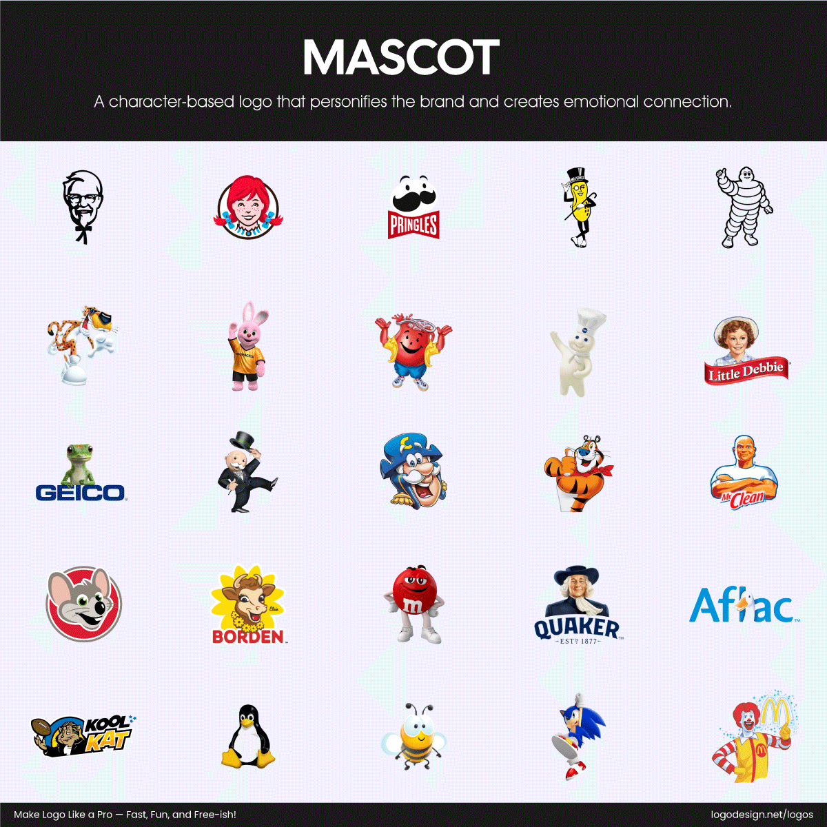
Mascot logos of brands recognized by characters
Mascots bring brands to life through illustrated characters. See how Reddit’s alien Snoo and the smiling face on every Pringles can both add personality and friendliness to their logos. Mascot logos are perfect for brands targeting families or younger audiences.
7. Combination Marks
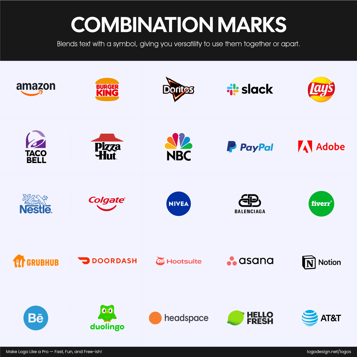
Combination mark logos recognized by a text and symbols
A combination mark blends text with a symbol for a flexible, all-in-one logo. Lacoste’s crocodile alongside its brand name or Doritos’ bold text paired with its triangle icon are great examples of how imagery and words can work together to build a strong identity.
How to Create a Logo Using LogoDesign.Net’s Logo Maker
Now, let’s get into the fun part—actually creating your logo. Whether you’re building a brand from scratch or giving your current look a much-needed refresh, LogoDesign.Net’s free logo maker helps you design something professional without complicated tools or creative stress.
Here’s a step-by-step guide to walk you through the process:
Step 1: Start With a Few Key Words
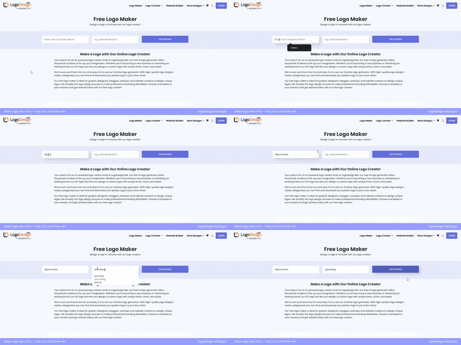
Typing in the keyword to search for a logo template on an AI-powered logo maker
Head over to the free logo maker and enter your business name. If you’re still figuring that part out (try using our AI-powered business name generator for ideas).
Next, enter keywords related to your industry. This helps the tool generate logo concepts that match your niche. For example, if you’re designing a plumbing logo, you could type in:
“Pipe, faucet, drain, wrench, water leak, plumbing service, shower, heater, sink,”—anything that reflects your food style or brand vibe. You can even include multiple keywords to get a broader variety of designs.
Once you’ve added your keywords, click “Get Started,” and the logo maker will instantly generate a gallery of ready-to-customize logo concepts.
Step 2: Browse and Pick a Logo That Fits Best
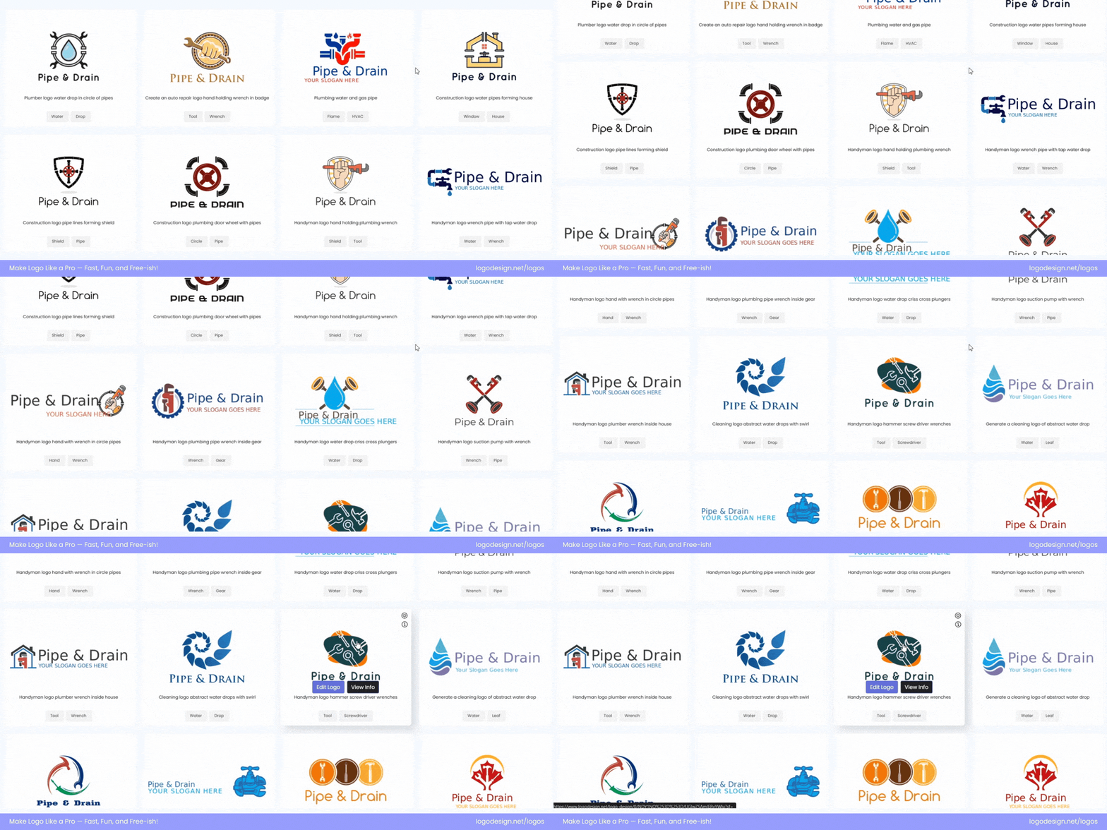
Scrolling through various logo templates to find the one you’re looking for
Here comes the exciting part: browsing through logo designs. You’ll see a mix of styles, fonts, colors, and layouts. So, how do you choose the best one? And by the best one, we mean choosing what aligns with your business perfectly.
Keep these tips in mind while selecting:
- Know your audience: Think about who you’re trying to attract. A kids’ brand and a construction firm should not have the same design language.
- Refer back to your logotype: Remember the types of logos we talked about earlier? Emblem, wordmark, pictorial, etc. Choose a structure that suits your brand’s voice.
- Think long-term: Pick a design that stands the test of time and can grow with your brand, not just what looks trendy today. Delta Faucet and Laufen’s plumbing logos are great inspirations.
- Consider where it’ll appear: Will it work on a website header, social media profile, product packaging, or even in black and white? Also, consider logo versatility.
- Avoid overused visuals: Steer clear of icons that feel too generic or heavily used in your industry (like a dripping faucet or pipe in case of plumbing logos). Aim for something with a little edge or personality.
- Check the vibe: Your logo should feel like your brand—fun, sleek, serious, modern, nostalgic—whatever tone you’re going for.
Once you’ve found a logo that checks all the right boxes, click to customize it.
Step 3: Customize Your Logo Design
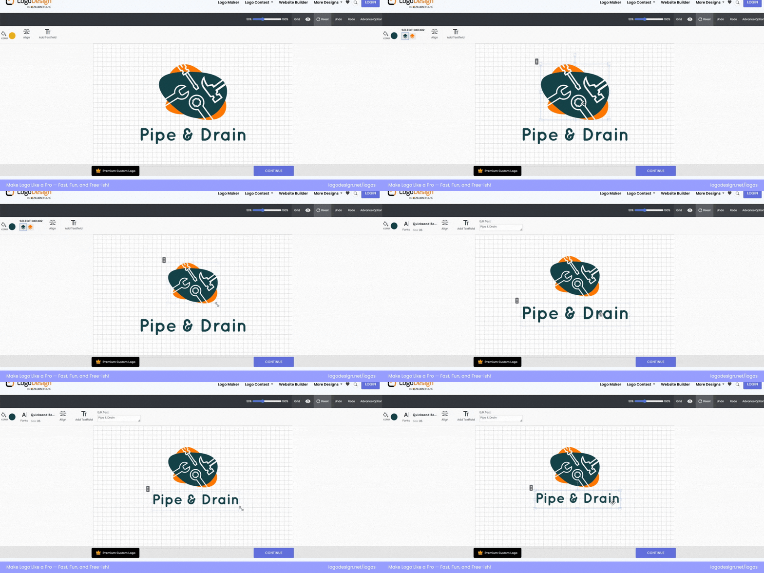
Customizing the design template on the logo editor
This step is where your logo starts taking shape. Once you’ve picked your favorite concept, you’ll land inside the LogoDesign.Net editor, aka your creative playground. Everything here is built to help you make quick yet impactful changes, whether you want a little color switch or a total style shift.
Let’s walk through the main tools you’ll find and how to use them without overthinking it.
Color Control: Pick What Pops

Change the color of an element from the logo template
Your brand colors are more than just pretty tones; they tell your story. Learn the color theory behind logo design and choose brand colors that best suit your audience and industry. In the logo editor, you can:
- Change the color of the logo symbol or text
- Try solid shades or experiment with gradients for a modern vibe
- Preview different combinations easily, no need to commit right away
If you wish to keep the focus on your name, you can choose completely different colors for your company name and slogan.
Font Play: Choose Your Voice

Update the font type that looks well with your logo
Just like colors, typography says a lot, even before the words do. Your choice of logo font can significantly impact how your brand is perceived. Use the logo editor to:
- Pick from a wide range of fonts: classic, quirky, handwritten, and more
- Adjust font size to balance proportions
- Add more text fields if you want to include multiple brand elements
You can also position the text exactly how you like it. For example, keep the name right under your icon or shift it to the side for a sleek look.
Add Your Slogan (or Don’t)
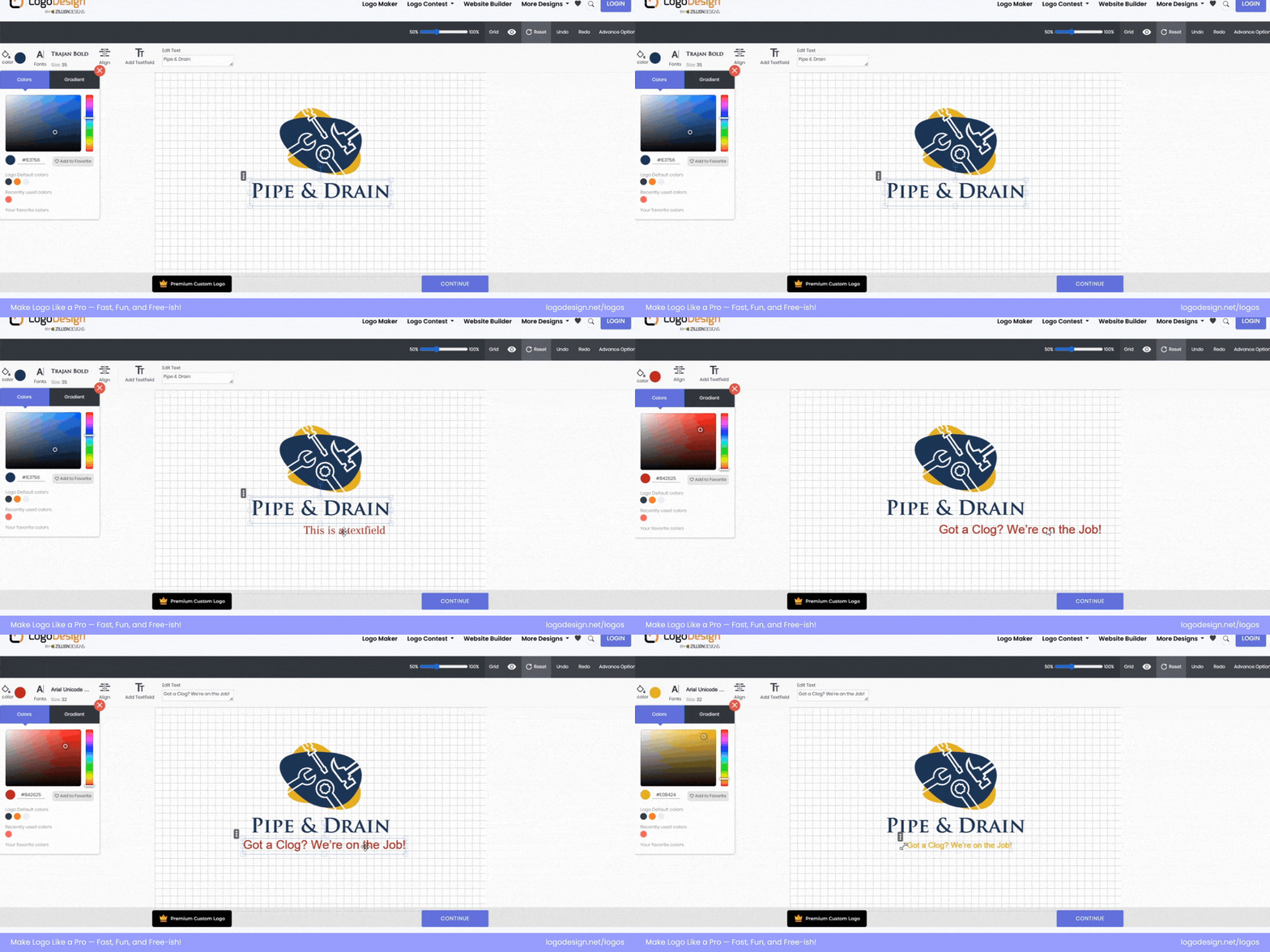
Add suitable taglines or slogans to make your logo standout
A slogan isn’t always necessary, but when done well, it adds personality or clarity to your brand.
- Think of short, catchy lines like “Fresh Bites Daily” or “Brewed with Love”
- Add your slogan as a separate field
- Resize or re-position it wherever it fits best
Alignment Tools: Layout Your Way
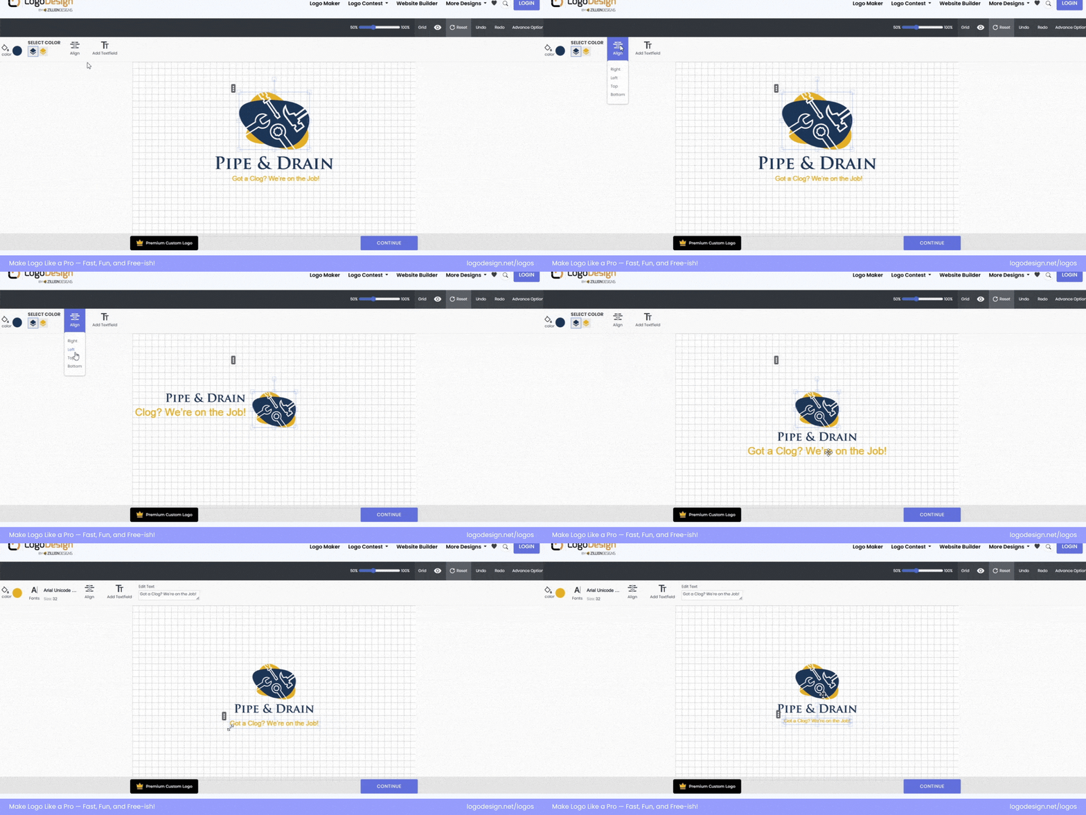
Change the alignment of your logo text and creative icons
You don’t need design experience to get the layout just right. You can:
- Move your company name to the top, bottom, left, or right of the symbol
- Center everything perfectly with the alignment tools
- Use the undo and redo buttons if things get messy; no need to stress
Advanced Edits (Optional but Powerful)
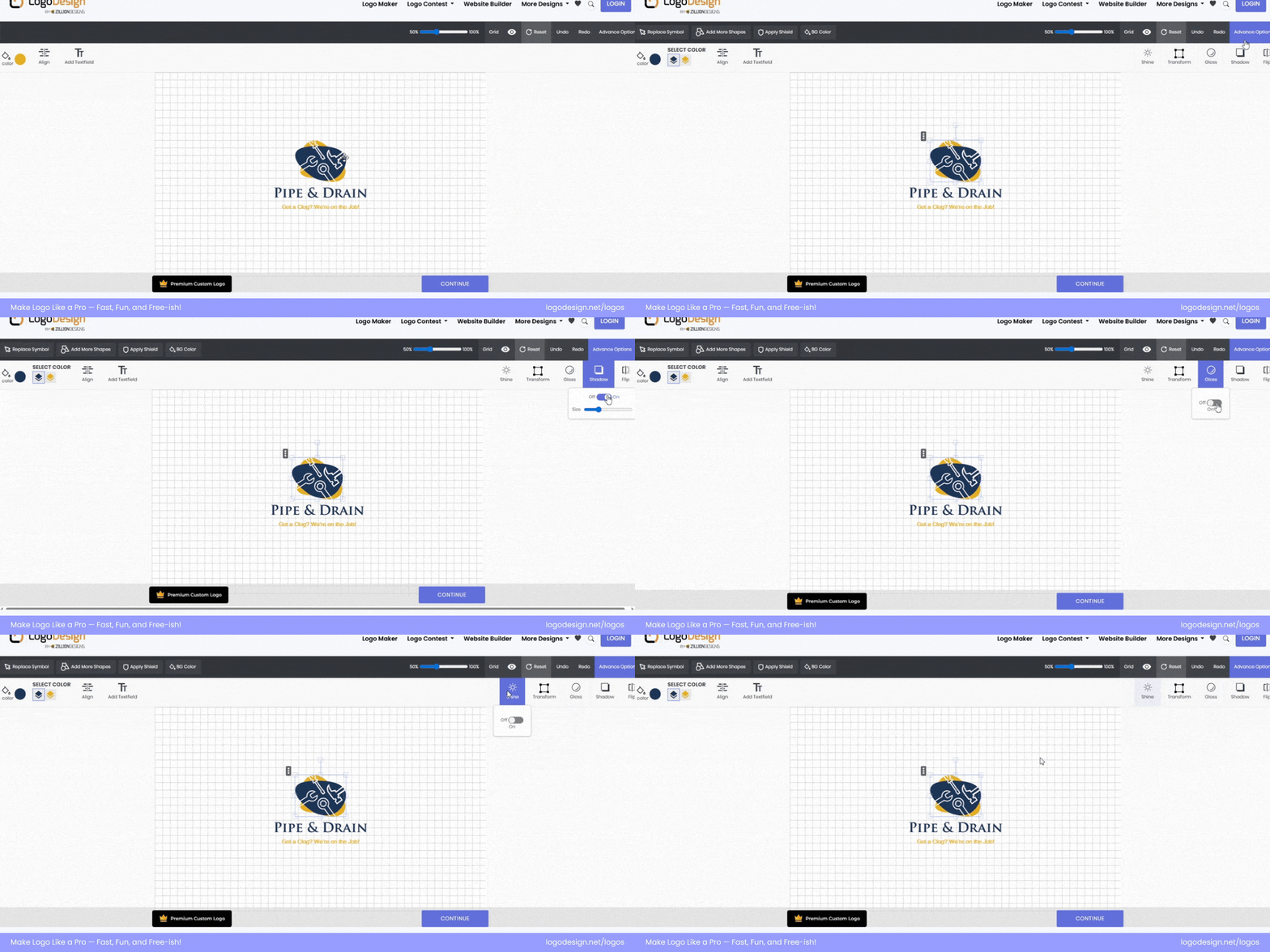
Take advantage of the advanced features to make the logo more appealing
Do you still think your logo is missing that spark? Don’t fret, a few advanced features in the tool can come in handy. These tools give you extra flexibility:
- Transform: Stretch, rotate, or resize both text and symbol
- Shadow: Add soft shadows for depth
- Shine: If matte isn’t your vibe, go for shine
- Gloss: Make your logo pop with a modern finish
- Flip: Switch the direction (horizontal or vertical)
- Replace symbol: Found something better? Easily swap your icon
- Add shapes: Build more complex layouts with extra design elements
- Apply shield: Choose from varying shapes and give your logo a badge-style look
- Stroke: Experiment with text strokes to create a sense of depth
- Offset: Try offset for a unique look
- Background color: Preview your logo on different backdrops
Take your time here. There’s no “perfect,” only what matches your brand’s vibe. Once you’ve finished polishing the details, you’re all set to move to the next step.
Step 4: Preview Your Logo in Action
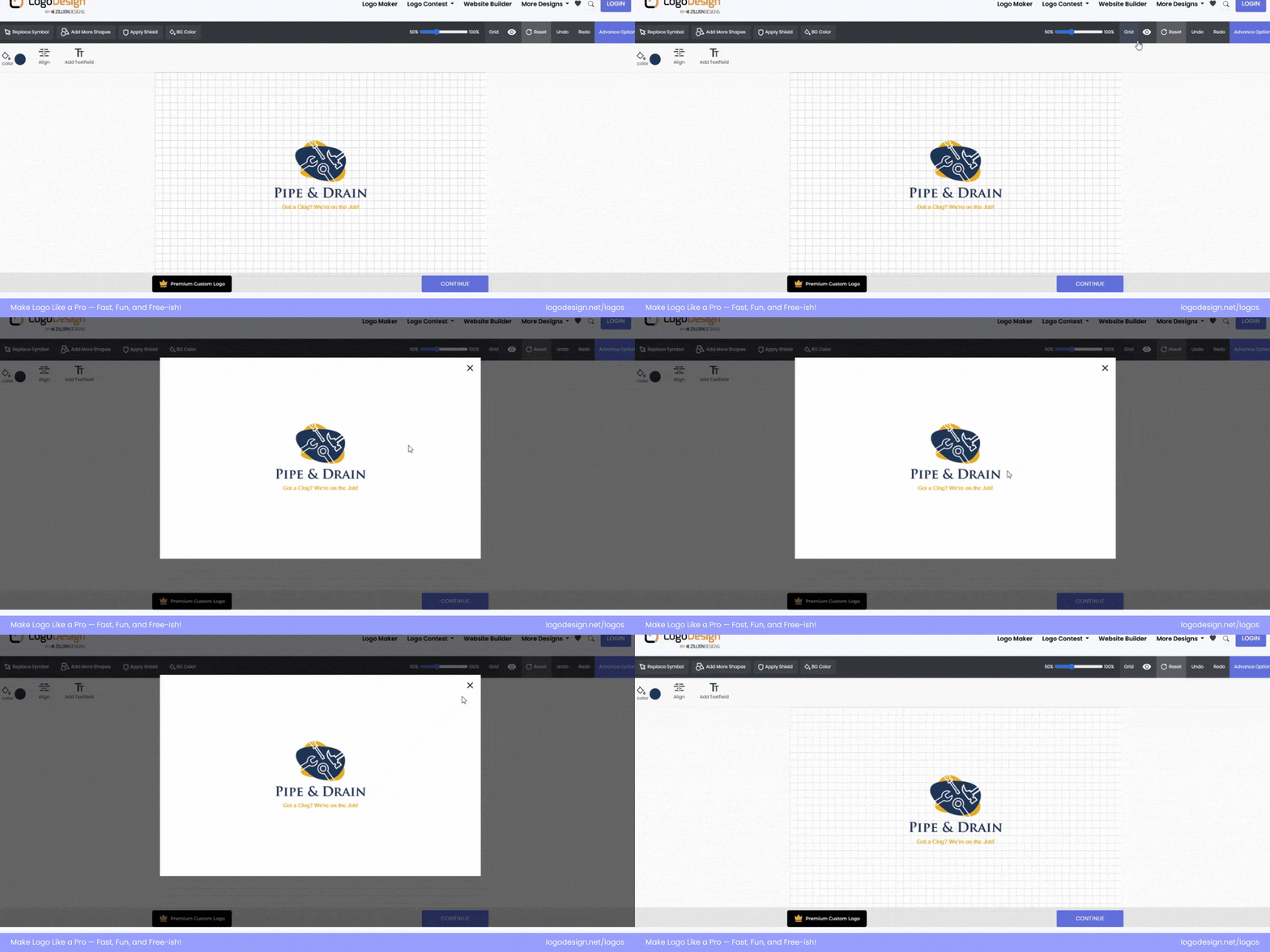
Preview how the logo looks before downloading it
Before you hit download, take a moment to see your logo through a wider lens. The preview step helps you step back and view your design as a whole, for example, how the colors, fonts, and layout come together. It’s your final checkpoint to catch any small details you may have missed earlier.
But it’s not just about spotting typos or color mismatches. With LogoDesign.Net’s preview tool, you can also see how your logo will look on real branding materials like business cards, t-shirts, letterheads, flyers, and even digital mockups. This gives you a feel for how your logo will perform in the real world, not just on a screen.
If something feels off, no worries, you can hop right back into the editor, tweak what needs fixing, and preview again. Once everything looks and feels just right, you’re ready for the final step.
Step 5: Download and Start Using Your Logo

Once satisfied, proceed with downloading the logo
If you’ve reached this stage, you’re probably happy with your final design. It’s time to make it official. Just hit the download button, pay a small one-time fee, and your logo is yours to keep.
You’ll get high-quality logo files in multiple formats like PNG, PDF, and others, so you can start using your logo wherever you need it, like websites, social media, packaging, business cards, signs, merch, and more.
With your new logo ready to go, your brand now has a visual identity that’s uniquely yours. Whether you’re launching a new business or giving your existing one a fresh face like Golden Hour Lens did to improve its branding, it’s a big step and you’re ready for it.
Logo Design Best Practices to Keep in Mind
Colors and fonts are just the tip of the iceberg; creating a logo involves much more. If you’re a beginner designing a logo, we’ve rounded up some of the essential tips to help you get things right from th e start.
1. Let Shape Psychology Do the Talking
Shapes carry subtle messages, and choosing the correct one can instantly support your brand’s personality. Here’s a breakdown of common shape logos:
• Circular Forms
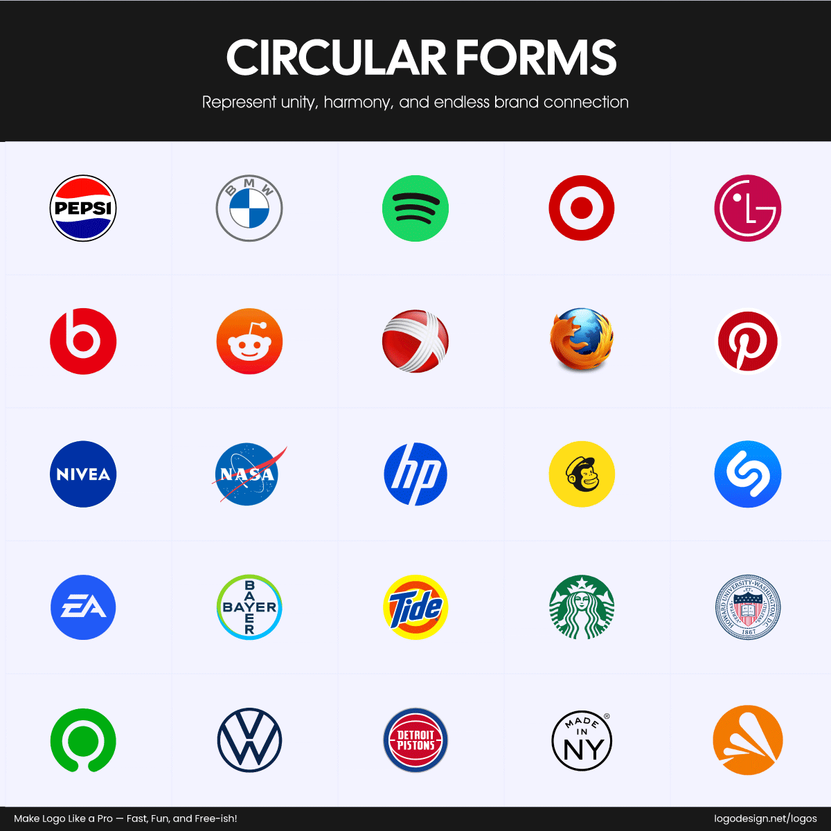
Brands with circular logos that represent unity and harmony
Circles give off warmth, unity, and safety. They are great for friendly and approachable brands. Pepsi, Nivea, and Vodafone all use circular logos to appear welcoming and modern, with a soft, balanced feel.
• Rectangular Forms
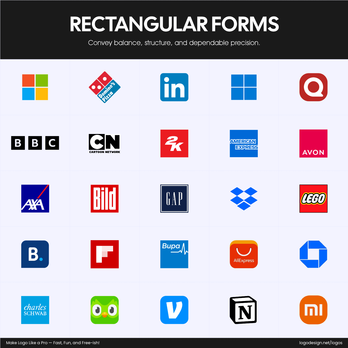
Brands with rectangular logos to highlight dependability and balance
These suggest strength, structure, and reliability, which is ideal for corporate or established businesses. Brands like Microsoft, BBC, and LinkedIn use squares and rectangles to signal order, stability, and trust.
• Triangular Forms
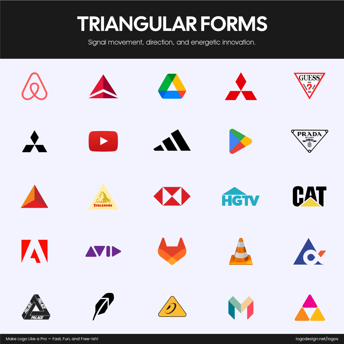
Brands with triangular logos that signal energy and movement
Triangles convey energy, motion, and direction. They work well for tech or performance-driven brands. Citgo, Behringer, and Google Play use triangle-based or pyramid designs to reflect movement, innovation, and progress.
• Organic Forms
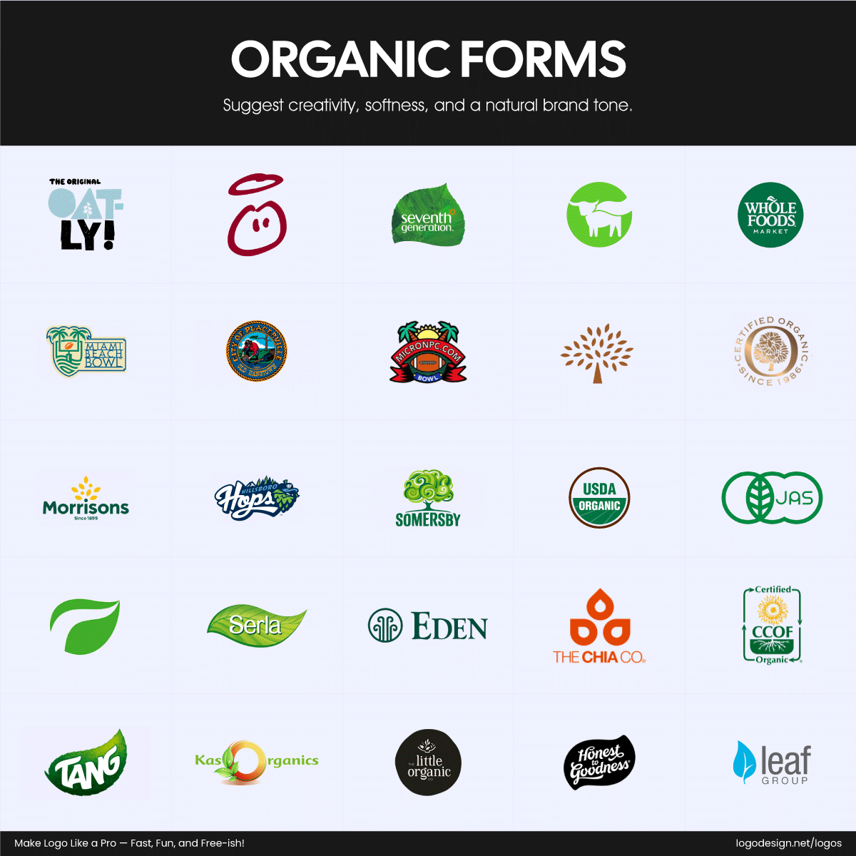
Brands with organic logo designs to highlight creativity and a natural tone.
Blobs, waves, or hand-drawn lines create a more relaxed, human, and creative tone. See Airbnb’s looped heart symbol, Spotify’s flowing wave icon, or BP’s helios logos, all give a casual, warm vibe.
• Orientation Matters Too
Don’t forget the layout direction.
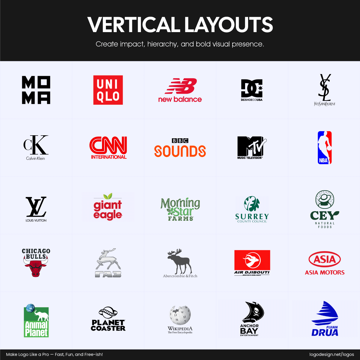
Vertical layout logos of brands showing high impact and bold visual presence
- Vertical Layouts often feel bold and confident.
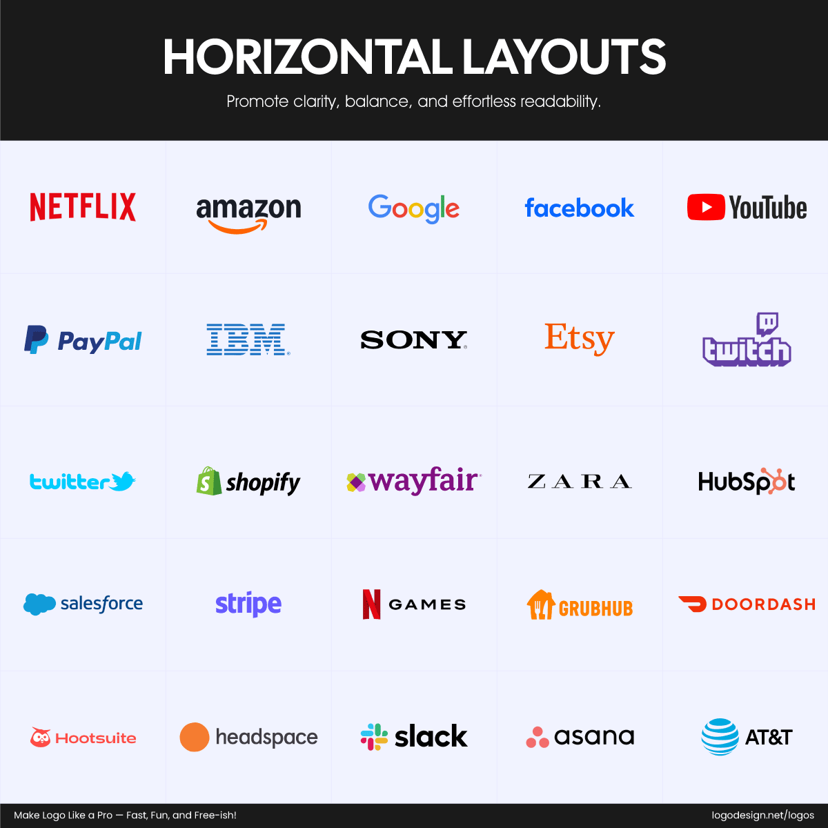
Horizontal layout logos that focus on clarity and readability
- Horizontal Layouts are more grounded, stable, and calm.
2. Design for the Tiniest Version First
A logo should work at every size, from a massive billboard to a tiny browser favicon. That’s why smart designers start small. If your logo still looks sharp and recognizable at 16×16 pixels (like a favicon or app icon), it’s a strong design.
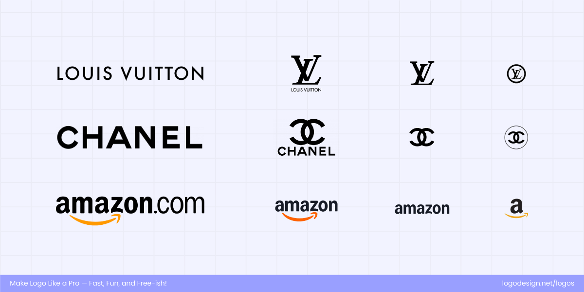
Different logo versions for favicons, billboards, and various platform sizes
Think of how the Louis Vuitton or Amazon logos remain clear even on the smallest screens. Avoid relying on thin lines, complicated patterns, or tiny text that could disappear when scaled down. Simplicity in design is your best friend here.
Designing with the smallest version in mind forces you to focus on what’s essential. Once you’ve nailed that, you can build out a more detailed version if needed, but the core should always be clean and recognizable in miniature.
3. Don’t Underestimate Whitespace
Whitespace or negative space isn’t empty; it’s breathing room. It helps your logo stand out and stay readable, especially in busy environments like social media feeds or crowded packaging designs.
Too many logos try to cram everything in, making the design feel cluttered or overwhelming. Giving your elements space to “breathe” makes your logo look polished, professional, and balanced. Take a cue from famous logos like Nike and Facebook; their simplicity, paired with generous whitespace, is a big part of why they are so memorable.
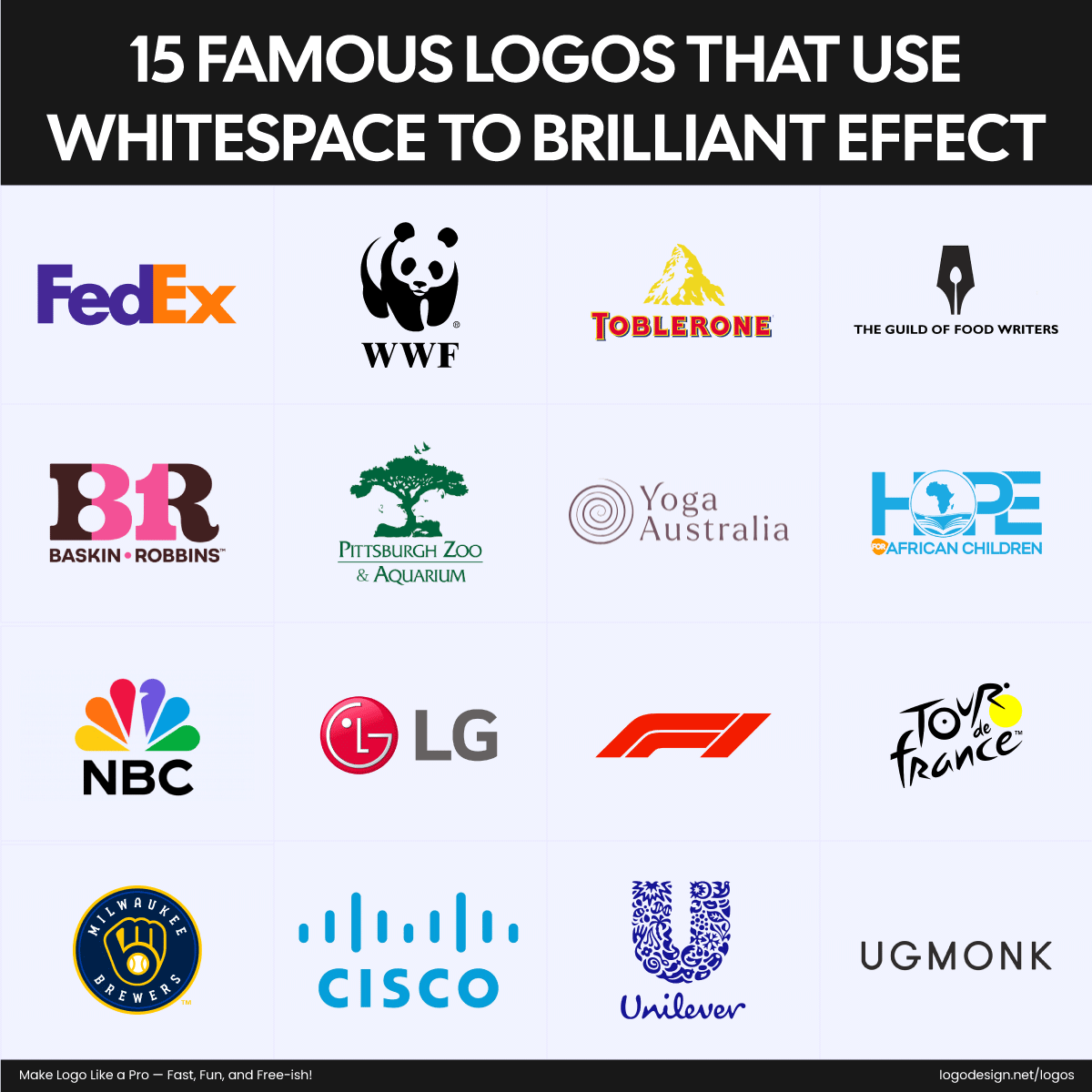
15 brand logos that expertly use the whitespace
It’s also useful for versatility. A well-spaced logo adapts better across different sizes and backgrounds. So don’t treat whitespace as an afterthought; embrace it as an important part of your design.
4. Limit Your Color and Font Choices
Too many fonts or colors can instantly make your logo feel chaotic. A smart, focused selection gives your brand a professional look.
When it comes to fonts, stick to one. Two max—if they contrast nicely and serve a purpose (like separating a slogan from your brand name). A clean sans-serif font gives off a modern, minimalist feel, while a serif font can lend a more classic or elegant vibe. Choose fonts for your logo smartly. Take inspiration from how Google keeps it simple with one easy-to-read typeface, or how Vogue uses a serif font to feel timeless and refined.
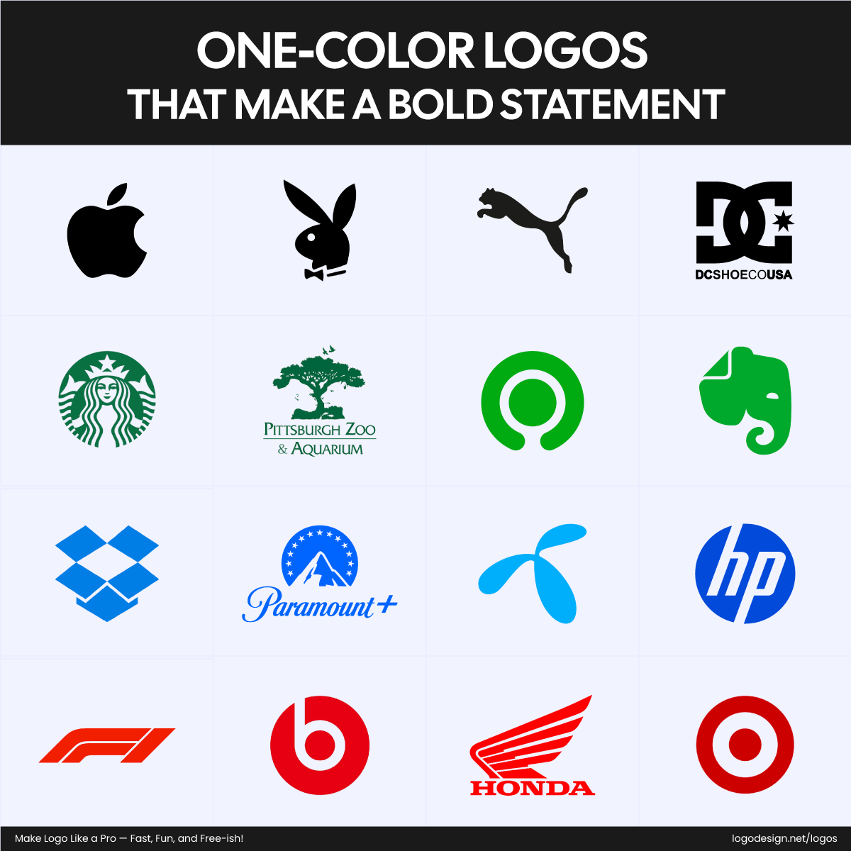
Brand logos using one color for a minimalistic and sophisticated feel
As for colors, keep the palette tight. One to three colors is usually enough. Choose hues that reflect your brand’s personality and work well together. Bold colors can make a statement, while muted ones feel sophisticated. Brands like IKEA or FedEx use just two colors and still make a big impact.
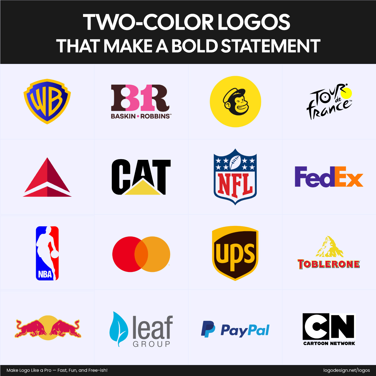
Brand logos that use two colors that complement each other to make a bold statement
The more focused your design, the stronger it’ll be across all formats.
5. Avoid Trend Traps
Logo design trends come and go, but your logo needs to stick around. Chasing what’s currently “hot,” like 3D effects, neon gradients, or glitch art, might look cool now, but can feel dated in just a few months. Instead, aim for timeless design.
Timeless doesn’t mean boring. It means choosing strong, clean elements that won’t go out of style. Logos like Heinz, Twinings, and Coca-Cola have lasted decades with minimal changes.
That’s because they focused on core brand values over passing aesthetics.
Ask yourself:
- Will this still look good in 5 or 10 years?
- Will it still make sense if the trends shift?
If the answer is no, it’s time to simplify. Let your brand’s story lead your design, not a TikTok trend.
6. Design a Flexible Logo System
Sometimes, designing a one-size-fits-all logo isn’t the solution. From mobile apps to billboards, your logo needs to appear consistently and clearly, no matter the space.
That’s where a logo system comes in. It’s a collection of variations: a full version, a simplified icon, a stacked layout, a horizontal layout, maybe even a monochrome version. Together, they ensure your brand stays recognizable whether it’s on a phone screen or a tote bag.
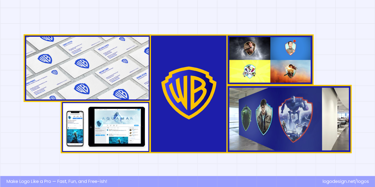
Warner Bros logo system, displaying the iconic shield design for different screen sizes – Source: Pentagram.com/work/warner-bros
Warner Bros. presents a good example of a logo system. Since its 2019 rebrand by Pentagram, it has used a core shield logo with various adaptations, including different textures, colors, and versions for use in its sub-brands (like Warner Bros. Pictures, Television, and Games).
Visa also has a flexible visual identity with different logo treatments (full name, symbol-only, and responsive versions) tailored for print, digital, and mobile applications.
These flexible logo sets feel cohesive across different contexts. Designing with flexibility in mind means your logo works everywhere without losing its identity.
Start Designing a Logo!
Equipped with these logo design tips and best practices, you’re set to create a logo that helps people remember you, trust you, and choose you. You can craft a strong identity without the usual design fuss. LogoDesign.Net’s logo maker gives you the freedom to experiment, refine, and land on a design that fits your brand like a glove.
So, go ahead and turn your business idea into a visual story. Happy designing!
