Designers love detail, but screens don’t. Let’s talk about how to design a scalable logo that survives shrinking, stretching, and every screen in between.
Research in marketing psychology shows that consumers make judgments about a brand within 90 milliseconds of seeing its logo. The geometry, curves, and symmetry of that design all play a role in shaping trust and recognition. This is where logo scalability comes in. It refers to how a design appears legible, recognizable, and visually appealing at every size and across every medium.
A scalable logo is essential for a strong brand identity. Those that scale well create a professional, cohesive presence, while some that don’t may lose out on brand awareness. Let’s explore why scalability matters and the importance of getting a versatile logo designed to build a future-proof brand.
What is Scalability?
Scalability means a design stays clear, balanced, and effective at any size.
Scalability in graphic design refers to how well a visual element maintains clarity, proportion, and visual impact when resized. A scalable design remains effective across different formats and sizes without losing quality, balance, or legibility.
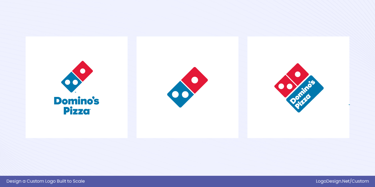
In logo design, scalability ensures a logo remains clear, legible, and recognizable at any size.
In logo design, scalability means the logo can be scaled up or down while preserving its core identity. A scalable logo works consistently across all applications, from favicons and app icons to packaging, signage, and large-format advertising. If a logo doesn’t scale well, details may blur, text can become unreadable, and visual hierarchy may collapse, indicating the need to rethink the design.
Why Scalability Matters in Logo Design?
Scalability directly influences how a brand is perceived, remembered, and trusted. A logo that scales well protects brand equity across platforms, industries, and time.
Here are some key reasons why it’s so important.
1. Protects Brand Recognition Across Touchpoints
Modern brands appear everywhere: mobile apps, social media avatars, websites, packaging, invoices, billboards, and physical products. A logo that fails at small sizes risks becoming unrecognizable at the exact moments where visibility matters most—such as app icons or profile images.
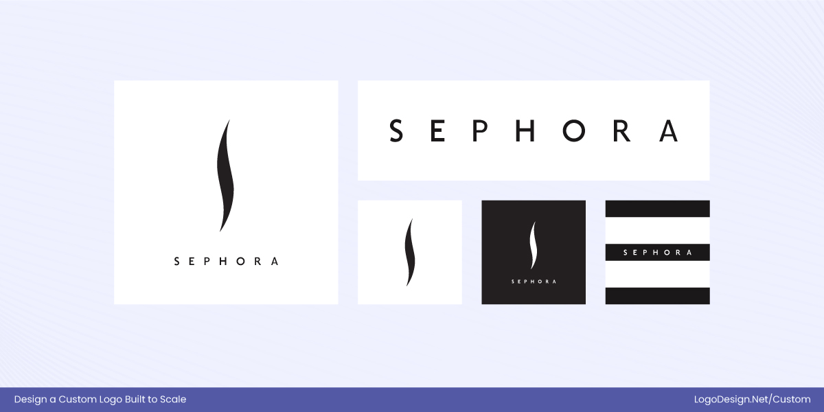
Sephora logo’s bold, high-contrast design stays recognizable at any size.
Sephora is a strong example of scalability in practice. Its bold, high-contrast wordmark and iconic black-and-white visual identity remain instantly recognizable across touchpoints.
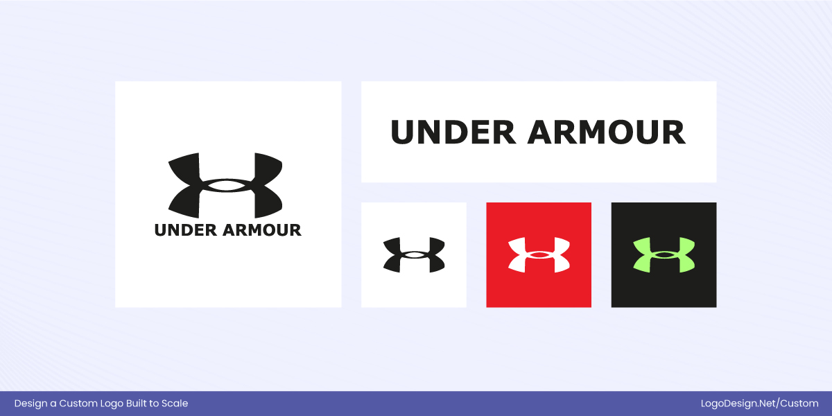
Under Armour’s interlocking “UA” logo stays legible and impactful at any size.
Under Armour demonstrates scalability through its interlocking “UA” symbol. Designed as a compact, symmetrical mark, it maintains legibility and impact at very small sizes, making it effective for all sorts of application.
The logo’s simplicity ensures clarity even in small or constrained formats.
2. Reduces Long-Term Redesign Costs
Logos that are not scalable often require frequent redesigns as brands expand into new formats, devices, or markets. These redesigns are not just expensive in design fees—they also involve updating signage, packaging, digital assets, and marketing materials.
Mastercard’s simplified circles logo remains effective across sizes and applications.
Mastercard offers a powerful example. By simplifying its overlapping circles and eventually removing the wordmark in many applications, Mastercard created a system that works seamlessly across digital payments, cards, and global signage.
Nike Swoosh logo’s simple form scales effortlessly and remains timelessly adaptable.
The Nike Swoosh, introduced in 1971, has remained structurally unchanged for over five decades. It’s simple, adaptable form scales effortlessly.
A scalable logo is a cost-saving investment that prevents brand fragmentation over time.
3. Builds Professionalism and Trust
Consumers subconsciously associate clarity with credibility. A logo that blurs, distorts, or becomes illegible at different sizes sends an unintentional signal of inconsistency or inexperience. Scalable logos, on the other hand, appear deliberate, controlled, and professional.
American Express logo stays sharp, legible, and authoritative across all sizes.
American Express demonstrates this principle well. Its logo maintains sharp edges, legibility, and authority whether printed on a credit card, displayed on a payment terminal, or shown in a mobile app. This visual stability reinforces trust.
Allianz Care logo’s crisp design conveys stability, trust, and professionalism worldwide.
Allianz Care similarly benefits from visual stability that supports its reputation. As one of the world’s most valuable insurance brands with consistently high global brand valuations and strong rankings among the most trusted insurance companies, its simple, crisp insurance logo contributes to a perception of security and competence.
Scalability helps logos look confident, not compromised.
4. Enables Flexible Brand Systems
Modern branding relies on systems rather than standalone logos. Scalable logos are designed with flexibility in mind, allowing brands to create icon-only versions, wordmarks, and monochrome or multi-color variants without losing identity.
Spotify logo’s circular sound-wave icon works independently, ensuring versatile recognition.
A strong example is Spotify. Its circular sound-wave icon works independently of the wordmark, making it versatile across app icons, wearable devices, social media, and other digital touchpoints while maintaining instant recognition.
Similarly, MIT Media Lab demonstrates flexibility through its dynamic logo system, where geometric shapes and colors can change for different projects or contexts, yet each variation remains clearly part of the same brand identity.
5. Future-Proofs the Brand
As technology evolves, brands must adapt to new mediums like smartwatches, AR interfaces, digital wallets, and immersive environments. Logos that rely on fine detail or fixed layouts struggle to survive these transitions.
Foot Locker logo’s bold design stays clear and recognizable across all platforms.
Foot Locker uses a bold, simple logo that remains instantly recognizable across digital platforms, app icons, social media, and interactive AR campaigns, ensuring the brand stays clear and authoritative even in emerging mediums.
Strava logo’s minimal ‘V’ ensures legibility on small wearable screens.
Strava’s logo is designed for wearables and smartwatch screens, with a minimal ‘V’ shape and high contrast that maintain legibility in tiny, round interfaces.
Scalable logos are not tied to today’s platforms alone—they are built to remain effective in mediums that do not yet exist.
Key Factors for Creating a Scalable Logo
A scalable logo is not just a visual asset—it is a functional identity system designed to perform across constant resizing, reproduction, and changing contexts.
True scalability is achieved through deliberate design choices, technical precision, and real-world testing.
The following factors explain how scalable logos are built, why they work, and how successful brands apply them in practice.
1. Simplicity
Simplicity is not about making a logo plain; it is about removing everything that does not serve recognition. As logos shrink, the human eye prioritizes shape over detail. Excessive textures, gradients, shadows, and intricate illustrations quickly collapse at small sizes, turning a logo into visual noise. Scalable logos rely on bold geometry, micro vs. macro space, and instantly readable forms.
Simplex logo’s bold arrow and clean type remain clear and dynamic at any size.
The Simplex logo uses a bold, angular arrow‑like mark in solid orange paired with clean typography, creating a minimal but dynamic symbol that stays clear and recognizable at any size.
Vertical Aerospace logo’s hummingbird-inspired symbol conveys flight and clarity across formats.
Vertical Aerospace refreshed its identity around a simplified hummingbird‑inspired symbol that abstracts flight and upward motion into a smooth, streamlined shape, paired with a technical wordmark that ensures clarity across digital and physical applications.
Gemini logo’s rounded star and gradient ensure legibility on small screens.
For Gemini, the updated visual identity embraces a rounded star‑like form and vibrant freeform gradient tied into Google’s broader design system, with softened points and balanced shapes that enhance legibility even on tiny smartwatch interfaces or compact app icons.
2. Clear Typography
Typography in logos must survive reduction without losing character or legibility. Thin strokes, condensed letter spacing, and decorative typefaces often fail under real-world conditions, especially on screens where resolution and lighting vary. Scalable logos avoid common typography mistakes and use balanced stroke widths, open counters, and stable proportions.
Vimeo logo’s connected script forms a unified shape that scales gracefully.
Vimeo transforms its playful, rounded script into a distinctive brand symbol. The connected, flowing letters form a custom typographic logo that feels approachable and unified, functioning as a single continuous shape that scales gracefully from app icons to large-format applications.
NOVA logo’s geometric type maintains clarity and modular structure at any size.
NOVA leverages a bold, geometric sans-serif typeface to turn each letter into a modular element. The open counters and strong strokes create a clean, architectural structure, allowing the fonts to strengthen brand influence and act almost like a symbolic grid that retains clarity at any size.
Superhuman logo’s high-contrast, extended letterforms ensure sleek, scalable recognition.
Superhuman uses slightly extended letterforms and high-contrast strokes to craft a type-driven symbol that feels both sleek and dynamic. Its distinctive spacing and weight give the logo an iconic silhouette that reads clearly even when reduced, turning color and font pair into a scalable visual identifier.
3. Color Flexibility
Color enhances brand recognition, but scalable logos cannot depend on color alone. Real-world applications frequently require logos to appear in black and white, grayscale, or single-color formats due to printing limitations, background conflicts, or cost constraints. If a logo loses meaning when color is removed, its scalability is compromised.
Affinity logo’s bold green monogram stays distinct and recognizable at any size.
Affinity uses a bold green monogram with a clean, geometric shape. Even without brand color palette, the arrow-like “A” mark remains distinct and instantly recognizable, proving that the form itself carries the brand’s identity.
Furl logo’s flowing wordmark stays legible and distinctive even at small sizes.
Furl features a simple, flowing wordmark with a subtle, dynamic shape. While its blue color adds vibrancy, the logo’s streamlined letterforms and spacing ensure it remains legible and distinctive in monochrome or small-scale applications.
Weight Watchers logo’s bold wordmark and circle remain recognizable in any color.
Weight Watchers updated its identity with a bold, clean wordmark paired with a simple circular emblem. The logo is effective in full color, following the fresh color trends and yet the strong geometry and spacing make it instantly recognizable even in black-and-white or single-color contexts.
4. Geometric Strength
A strong logo relies on clear, balanced geometry to maintain structure and recognition at any size. Geometric logos provide visual stability and ensure the mark doesn’t collapse when scaled down or viewed from a distance.
NoteGPT logo’s geometric blue icon and wordmark stay clear and recognizable.
NoteGPT combines a minimalist wordmark with a geometric icon featuring swirling shapes in blue. The icon’s clean, circular geometry in logo design complements the letterforms, creating a cohesive visual system. The consistent curves and optical adjustments ensure that both the icon and wordmark remain clear and recognizable across screens.
Codes Health logo’s compact, geometric mark ensures clarity and trust across sizes.
Codes Health features a compact mark with clean, structured elements that hint at precision and technology. The logo’s geometric balance — with evenly weighted multiple shapes and consistent spacing — reinforces trust and legibility, making it adaptable from tiny interface icons to larger display formats.
SAPO logo’s geometric frog symbol stays recognizable across digital and print formats.
SAPO integrates a geometric mascot symbol alongside its wordmark. The frog‑inspired symbol is constructed with simplified shapes that create a distinctive silhouette. These geometric qualities, with strategic visual hierarchy, ensure the logo mark remains recognizable whether on a browser tab, app interface, or printed material.
5. Negative Space
Negative space allows a logo to “breathe,” giving shapes definition and improving readability, especially at smaller sizes. Thoughtful use of negative space in logo design also creates hidden meaning or visual cues that make a logo more memorable and easier to recognize in smaller contexts.
Houston Zoo logo’s negative-space “Z” enhances recognition and scales well.
The Houston Zoo logo smartly uses negative space within its organic mark to reveal a subtle “Z” shape at its heart, embedded between two hand-like forms that also suggest care and protection. This embedded letterform strengthens recognition even when the zoo logo is reduced for app icons or signage, proving that space can be a functional part of the symbol itself.
Xbow logo’s intersecting “X” with open spaces stays clear and legible at any size.
The Xbow logo features an “X” icon built from intersecting lines and open spaces. The intentional gaps within the geometry help distinguish each stroke, creating a clear, angular form that remains legible and impactful at small sizes—especially important for digital interfaces and security software icons where clarity is key.
Parkinson’s UK logo’s tulip in negative space stays recognizable at small sizes.
Parkinson’s UK integrates its tulip symbol within the curve of the “P,” using the space inside and around the shape to form the flower rather than adding it as a separate graphic. This clever use of negative space reinforces the healthcare logo and makes it instantly identifiable even when scaled down for web icons and social placements.
6. Icon Adaptability
Scalable logos must work as standalone icons, wordmarks, or stacked variations depending on context. Being able to break a logo into adaptable pieces allows a brand to maintain recognition across digital apps, social media avatars, signage, and interactive platforms. A flexible logo system ensures the visual identity remains consistent yet versatile, whether it’s a tiny app icon or part of a larger brand expression.
Yelp logo’s burst icon works independently, ensuring recognition at any size.
The Yelp logo combines its distinctive burst icon with clean wordmark typography. The burst symbol can be used independently as an app or favicon icon, allowing the brand to maintain identity in very small spaces while the full lock-up works well for wider placements.
The Container Store logo’s box icon works independently while maintaining brand recognition.
The Container Store identity includes a modular box-inspired symbol alongside a structured wordmark. The icon element, reminiscent of a container or box frame, can function on its own in digital contexts like app icons or badges, while the full mark can be used in signage and retail environments.
Airtel logo’s fluid icon works standalone while remaining clear across applications.
Airtel updated its identity with a blobby, almost fluid icon that sits comfortably beside a simple wordmark. The icon’s distinct shape works well as a standalone symbol for digital interfaces or mobile app icons, while the combined lock-up fits broader brand environments such as packaging or advertising. This simplified, bold silhouette of a phone company logo helps the brand adapt across varying contexts with clarity.
7. Brand Distinctiveness
A scalable logo must stand out and be memorable, even when reduced or seen briefly. Unique shapes, typography, and forms help logos remain recognizable in crowded visual environments.
Rappi logo’s mustache icon adds personality and ensures recognition across mediums.
The Rappi logo combines a playful, rounded lowercase wordmark with a stylized mustache element beneath it. This quirky symbol injects personality into the design and ensures the logo sticks in memory — the mustache icon is simple yet distinctive, giving the mark an emotional and human touch that makes it stand out on busy mobile screens and delivery bags alike.
Slim Chickens logo’s bold lettering and chicken icon ensure quick, clear recognition.
The Slim Chickens logo features bold, custom lettering paired with a graphic representation of a chicken (often included as part of the overall lockup or supporting assets). The combination of strong typography and a thematic icon reinforces the brand’s identity quickly — the bold, friendly forms help the fast food logo remain recognizable across menus, signage, and digital platforms whether it’s seen briefly or from afar.
Rhodes Trust logo’s bird-in-“R” monogram ensures distinctive recognition at any size.
For Rhodes Trust, the identity incorporates a refined bird symbol derived from the historical Zimbabwe bird motif, paired with a modern wordmark. The bird sits within or alongside the letter “R,” creating a unique visual monogram that’s both symbolic and immediately identifiable. This distinctive form helps preserve recognition even when the non-profit logo is scaled down for digital interfaces or embroidered on apparel.
How Scalability Works in Practice?
Scalability in logo design is not a single design choice but a system built from multiple elements working together. From file format and geometry to responsiveness and legibility, each component ensures a logo performs consistently across sizes, platforms, and real-world applications.
The following elements explain how scalable logos succeed in practice.
1. Vector vs. Raster
A logo’s scalability starts with the format in which it is created. Vector graphics are built using mathematical equations that define shapes, lines, and curves, while raster graphics are composed of fixed pixels. This difference has a direct impact on how a versatile logo performs across different sizes and mediums.
| Feature / Aspect | Vector Logos | Raster Logos |
| File Formats | AI, EPS, SVG, PDF | PNG, JPG, GIF, BMP |
| Scalability | Infinite scaling without loss of clarity or sharpness | Enlarging beyond the original resolution causes blurriness or pixelation |
| Detail Preservation | Maintains sharp edges, proportions, and shapes at any size | Fine details may be lost when resized, especially if larger than the original |
| Best Uses | Logos, illustrations, signage, large-format print, embroidery | Web images, digital graphics, photographs, social media images |
| Editing Flexibility | Easy to modify shapes, colors, and sizes without quality loss | Limited; resizing or editing can degrade image quality |
| Production Suitability | Ideal for printing, laser cutting, engraving, and merchandize | Limited to small-scale digital use or fixed-resolution prints |
| Brand Consistency | High consistency across mediums due to precise geometry | Inconsistent if scaled or printed at different sizes |
Because of their flexibility, precision, and reliability, vector files are the go-to format for logos. They are widely preferred by designers and brands for both digital and physical applications, ensuring that a logo remains sharp, professional, and consistent across every use case.
2. Responsive Logo Design
Beyond format, a scalable logo must also adapt to different contexts, which is where responsive logo design comes into play. Rather than relying on a single fixed logo, responsive logos use multiple variations—such as a full logo, simplified version, or icon-only mark—that maintain the same core visual identity. This approach ensures that the logo is recognizable across varying screen sizes, layouts, and digital environments.
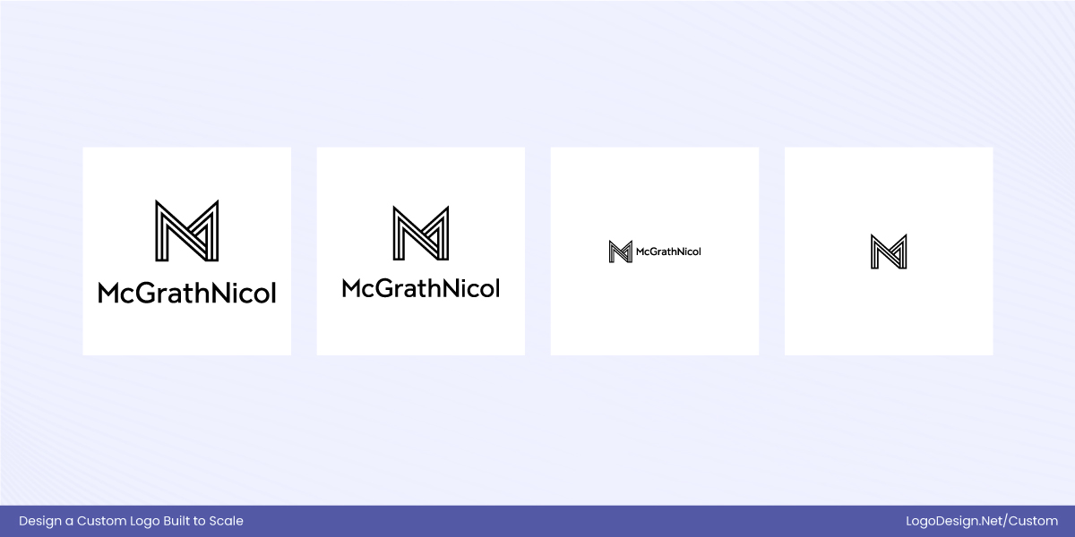
For example, McGrathNicol’s logo adjusts across platforms by using a full wordmark on desktop and print materials, while its simplified symbol or monogram can appear in compact digital spaces, maintaining clarity and recognizability.
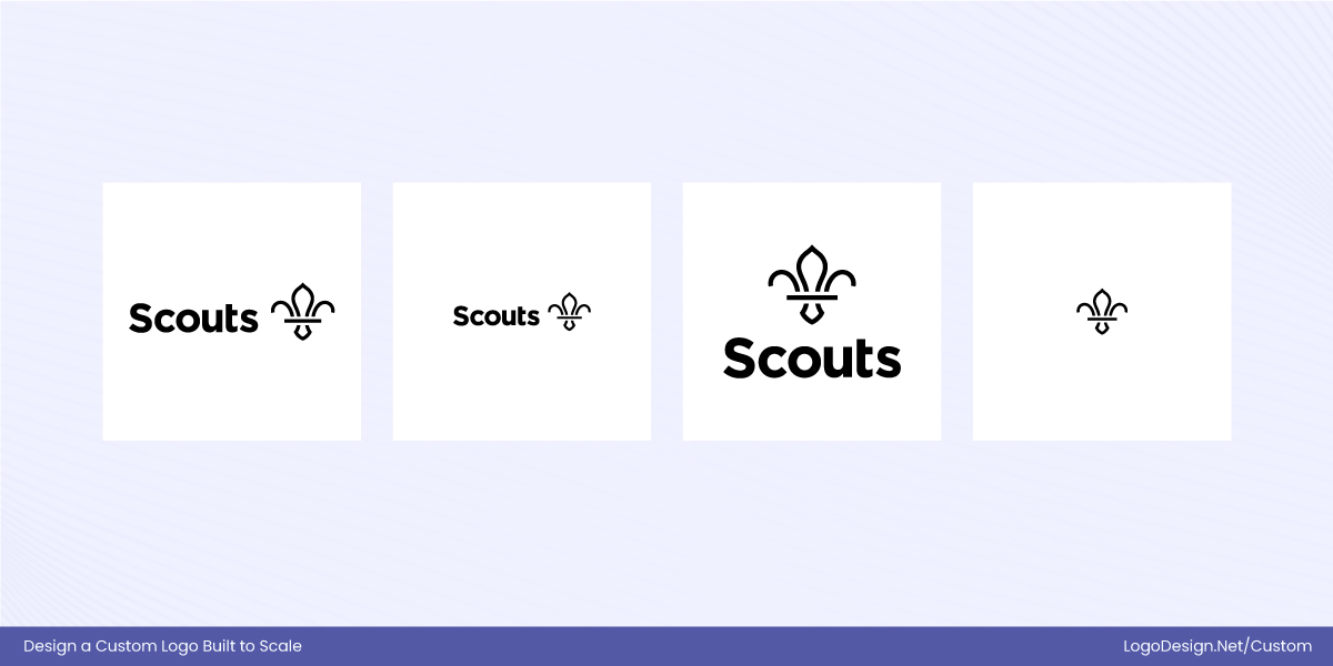
Similarly, the Scouts UK uses a responsive system where its full emblem is deployed in print and signage, while a simplified fleur-de-lis symbol functions as a compact icon for mobile apps, social media, and digital headers.
The need for responsive logos is growing: more than 70% of brand interactions now occur on mobile devices, making it crucial for logos to perform well at both large and small scales while preserving brand recognition. By designing logos with responsiveness in mind, brands can maintain consistency and clarity across all touchpoints, from websites and apps to physical signage, ensuring that the identity remains professional and cohesive in every context.
3. Shape Psychology and Scalability
According to 3M research, the human brain processes visuals up to 60,000 times faster than text. This is why shape-driven logos maintain clarity and impact across different mediums. Shape psychology explores the emotional and cognitive responses triggered by visual forms, helping designers create logos that are not only visually appealing but also effective and functional at any size.
Simple, well-defined shapes scale far more effectively than complex designs, as strong silhouettes remain recognizable and impactful even at smaller sizes.
Logo Shapes and How They Affect Scalability
Circles:
Circle logos suggest unity, friendliness, and inclusivity. Their continuous, smooth edges scale extremely well and remain clear at small sizes, making them ideal for app icons, social media, and signage.
Squares and Rectangles:
Square or rectangular logos convey stability, professionalism, and reliability. Their predictable geometry reproduces cleanly across sizes, especially for structured digital layouts or print formats.
Triangles:
Triangle logos imply movement, energy, and ambition. Simple, minimal triangles scale well, but sharp points or intricate angles can lose clarity at smaller sizes.
Ovals and Ellipses:
Oval and eclipse logos offer a softer, approachable look. Like circles, they scale smoothly but require careful proportion management to avoid distortion.
Organic/Abstract Shapes:
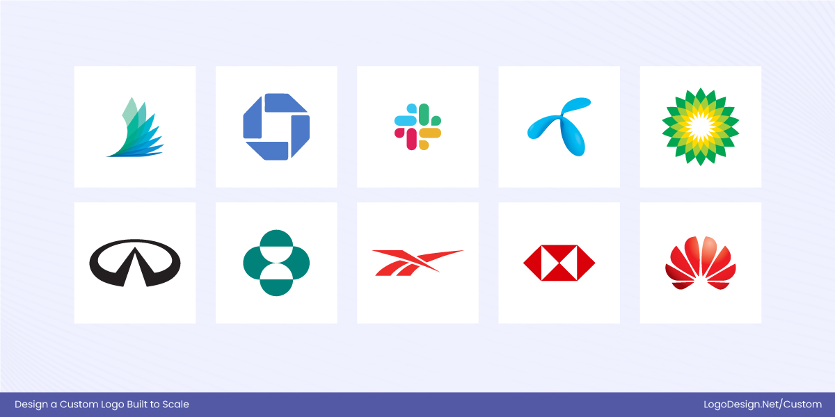
Organic and abstract shape logos represent creativity, flexibility, and uniqueness. They can remain recognizable at small sizes if simplified into strong silhouettes rather than intricate details.
Lines and Geometric Patterns:
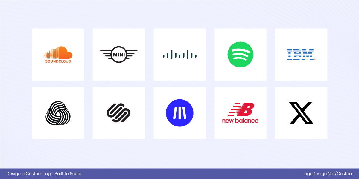
Lines and geometric patterns in logos convey precision and modernity. Thick, clean lines in logos scale well, while overly thin lines can disappear in smaller applications.
Hexagons and Polygons:
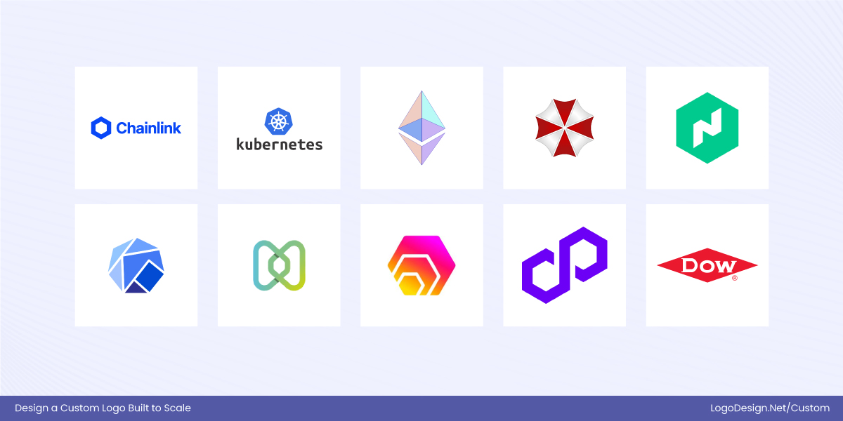
Hexagons and polygons in the logo communicate structure and innovation. They scale effectively if kept simple, but excessive detail in edges or corners can affect legibility.
Dos and Don’ts for Using Shapes in Logo Design
Using shapes effectively is crucial for logo scalability. The right shapes can make a logo instantly recognizable at any size, while the wrong choices can make it cluttered or illegible.
Following clear guidelines ensures that your logo maintains visual impact and consistency across digital, print, and physical applications.
| Dos: | Don’ts: |
| Keep shapes simple and bold for easy recognition at small and large sizes. | Avoid excessive details, gradients, or fine lines that disappear at small sizes. |
| Use strong, clean silhouettes to maintain clarity in any medium. | Don’t rely on complex intersections of multiple shapes that can confuse the eye. |
| Test logos at multiple scales—favicon size, mobile app icons, print, and billboards. | Avoid stretching or altering the shape disproportionately across mediums. |
| Ensure geometric balance so shapes don’t look distorted when resized. | Don’t overcomplicate abstract or organic shapes; they should remain identifiable even in miniature formats. |
4. Minimum Size and Legibility
Even with the right format and shape, a scalable logo must remain legible at its smallest size. Minimum size refers to the smallest dimension at which a logo can be reproduced while staying clear and readable. Factors like typography, stroke thickness, spacing, and visual balance are critical to ensure the logo works in compact applications such as favicons, product labels, stamps, or mobile interfaces. A logo that looks perfect on a billboard may fail if its text disappears or details blur when scaled down.
Luxury brands often solve this by using simplified monograms for small applications while reserving detailed wordmarks for larger formats.
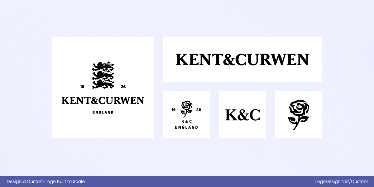
Kent & Curwen employs a clean, understated monogram for compact uses, ensuring clarity and recognizability at small sizes. For larger applications, the brand introduces a more detailed secondary logo featuring its iconic rose motif, adding heritage and richness without compromising scalability.
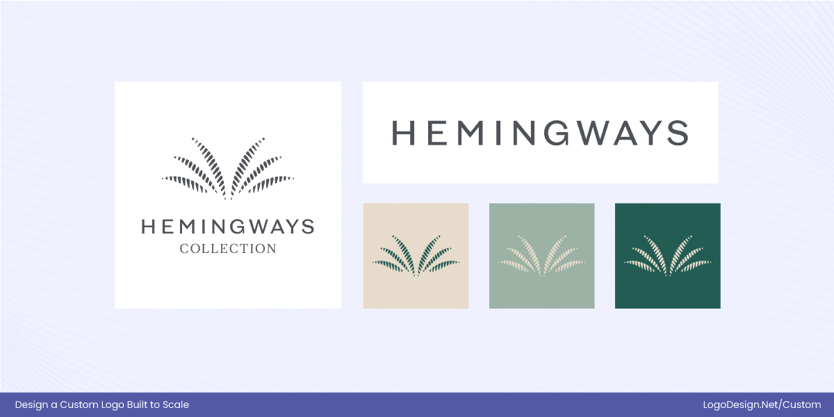
Hemingways Collection balances simplicity and sophistication through a restrained core mark supported by refined typographic and graphic elements. This approach allows the brand identity to remain elegant and legible across everything from digital touchpoints to large-scale physical applications.
Tech companies often enforce strict minimum size rules within their brand guidelines to ensure clarity and legibility across all devices and digital environments.
Arteche has maintained its logo with minimal change for decades, prioritizing consistency, clarity, and technical precision. Its enduring design reflects a mark built to perform reliably at various scales rather than follow short-term visual trends.
Flexe demonstrates how contemporary tech brands design logos with scalability in mind from the outset. Its clean, geometric identity is supported by clear usage rules that protect legibility at small sizes, ensuring the logo remains effective across digital platforms, interfaces, and applications.
Research and industry guidelines consistently show that without clearly defined minimum size and scaling rules, logos are far more likely to lose clarity, become distorted, or be misused, which ultimately weakens brand consistency and recognition.
| Logo Size / Application | Dimensions | Description / Usage |
| Favicon / App Icon | 16–48 px | Tiny digital icons, often simplified to a symbol or monogram for legibility. |
| Social Media Profile | 50–200 px | Circular or square formats for avatars; requires strong silhouettes. |
| Website Header / Email Signature | 100–300 px width | Often includes the full logo with wordmark. |
| Print Materials | 1–3 in (2.5–7.5 cm) | Business cards, brochures, and small print applications must remain clear at small physical scales. |
| Large Print / Signage | 3–50+ ft (1–15 m) | Billboards, posters, and large signage; full logo with fine details is usable, and scalability ensures proportions remain correct. |
By designing logos with minimum sizes in mind and defining usage rules for different scales, brands can ensure their logos remain professional, legible, and visually consistent across every platform and application.
5. Motion and Interactive Contexts
Scalability today goes beyond static designs—logos must also perform in motion and interactive environments. Motion or interactive logos are used to enhance brand engagement, guide user attention, and create a memorable experience across digital platforms. They appear in animations, transitions, loading screens, app interfaces, and websites, making it essential that they remain clear, recognizable, and legible as they move.
Where Motion and Interactive Logos Appear:
- App launch screens and splash pages
- Website loading animations or page transitions
- Interactive dashboards or user interface elements
- Social media animations and video intros
- Digital signage or interactive kiosks
By incorporating motion and interactivity into the design process, logos become dynamic, scalable assets that adapt to modern digital platforms while maintaining clarity, recognizability, and brand consistency.
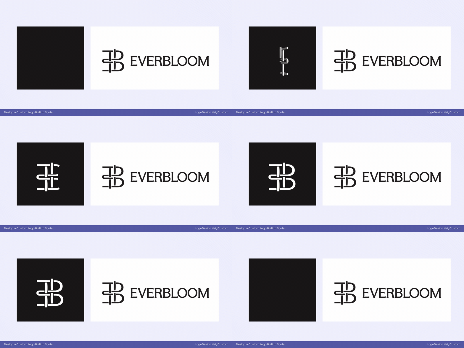
Everbloom’s animated icon and logo system are designed to respond fluidly across digital touchpoints, using motion to reinforce the brand’s identity rather than distract from it. The animation adds depth and personality while preserving a simple, recognizable core form that scales effectively across platforms.
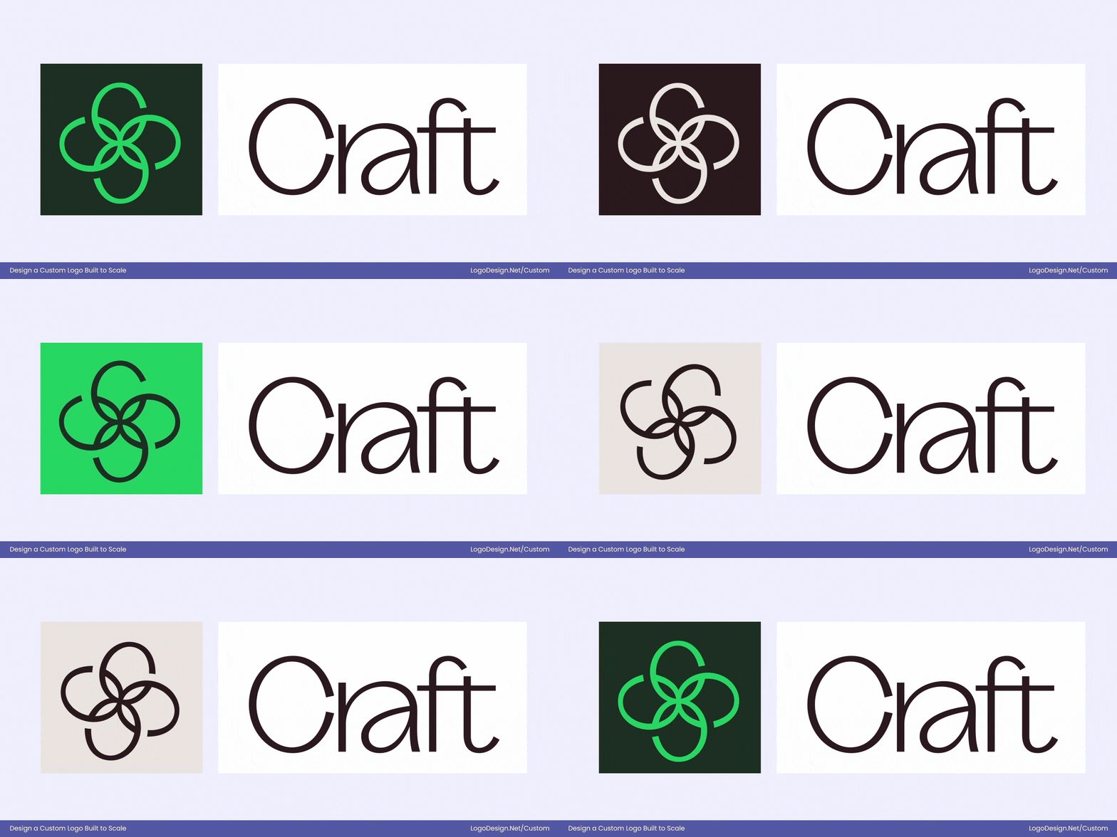
Craft illustrates how motion can enhance a logo’s flexibility and usability. The identity system incorporates subtle animation and responsive behavior, allowing the logo to shift and adapt depending on context while retaining a consistent visual language. This ensures the brand remains engaging and modern without sacrificing legibility or cohesion.
Common Scalability Mistakes to Avoid
Even well-designed logos can fail if scalability isn’t considered early. Here are some of the most common mistakes that prevent logos from performing well across different sizes and platforms:
• Overly detailed icons
Intricate details may look impressive at large sizes, but they quickly turn into visual noise when scaled down. Fine lines, textures, or complex illustrations often blur or disappear, making the logo hard to recognize.
• Thin strokes that disappear at small sizes
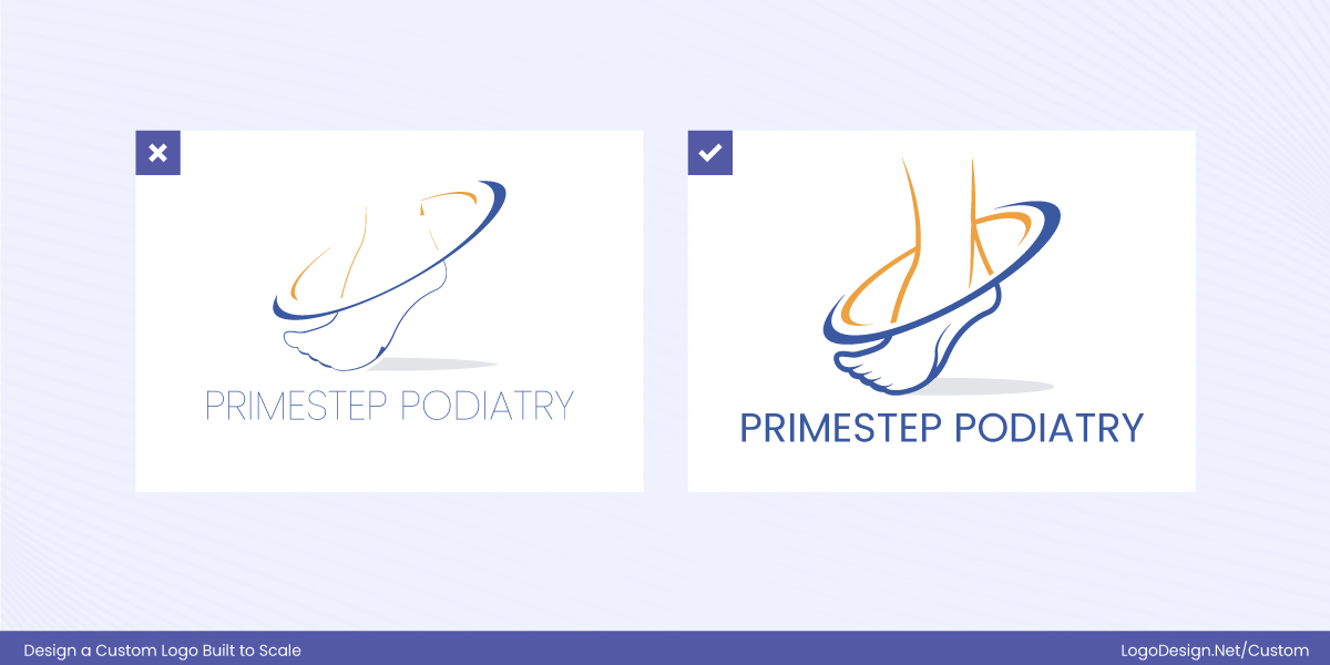
Very thin lines and delicate typography may vanish when the logo is reduced for favicons, app icons, or social media avatars. A scalable logo uses stroke weights that remain visible and balanced at any size.
• Relying too much on gradients or effects
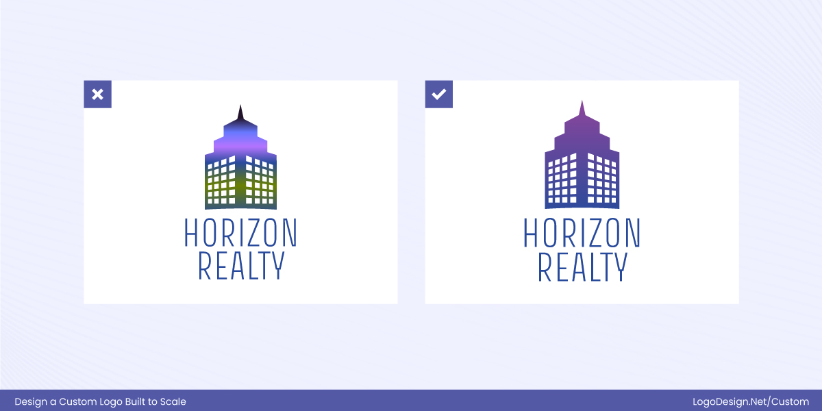
Heavy gradients, shadows, and special effects can break down when resized or reproduced across different mediums. They may also cause inconsistencies in print, embroidery, or monochrome applications.
• Poor spacing that breaks at small scales
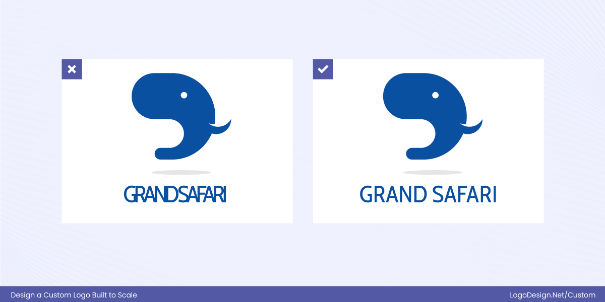
Tight spacing between letters, icons, or elements can cause the logo to feel cramped or illegible when scaled down. Proper padding and breathing room are essential for maintaining clarity at smaller sizes.
• Logos that only work in one orientation
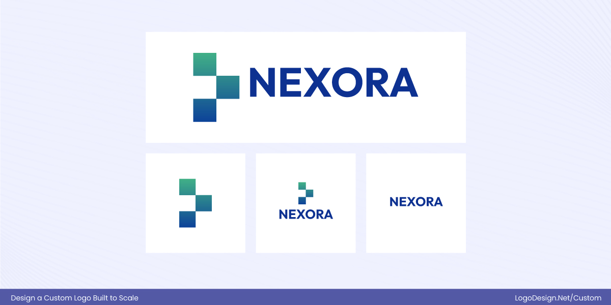
Logos designed only in a horizontal or vertical format limit flexibility. A scalable logo system includes alternate layouts—such as stacked, icon-only, or simplified versions—that adapt seamlessly to different placements.
Avoiding these pitfalls ensures your logo remains clear, recognizable, and effective—whether it’s displayed on a billboard or a mobile screen.
Logo Scalability Across Real-World Applications (and How to Test It)
Logo scalability becomes truly important when a design moves from concept to real-world use. A logo must stay clear, recognizable, and consistent across dozens of touchpoints—often at drastically different sizes. Understanding where logos appear and how to test them ensures they perform reliably everywhere.
Where logo scalability matters most?
1. Website headers vs. favicons:
On a website, the header logo is typically wide and prominent.
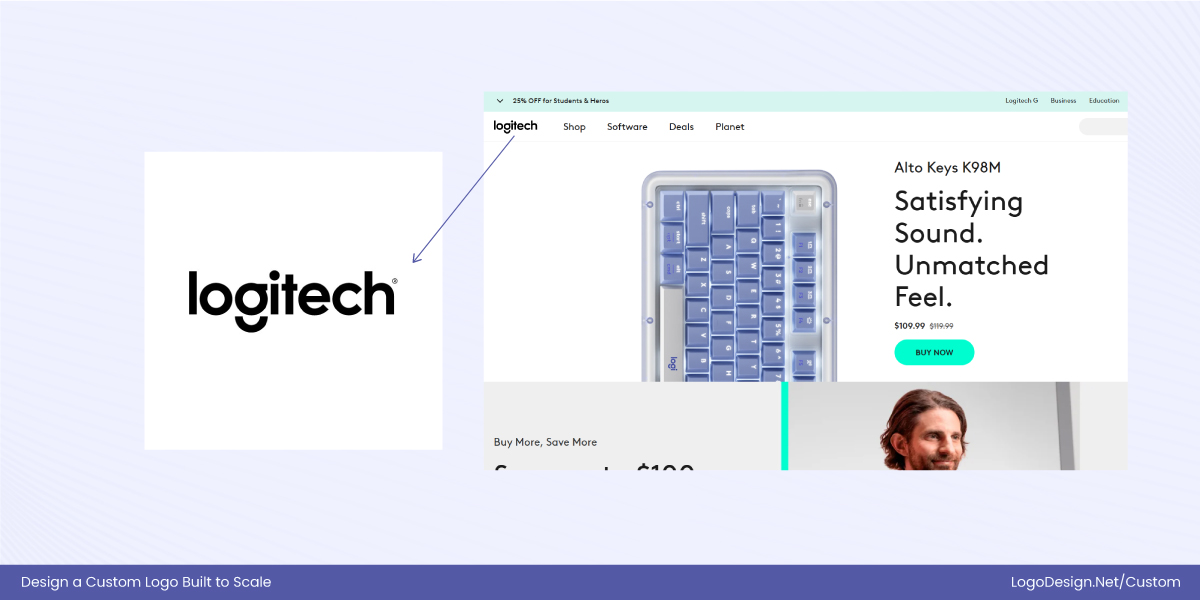
For example, Logitech prominently uses its clean, geometric wordmark in the header of its site, where there’s room for the full text to clearly communicate the brand.
When reduced to a favicon (the tiny icon in a browser tab), only the simplest form of the mark can work — often just a minimal graphic or a simplified initial that remains legible even at very small dimensions.
Without this adaptability, detailed elements or long text would be lost or blurred in favicons, undermining recognition.
2. Social Media Avatars
Platforms like Instagram and Facebook require square or circular profile avatars, with very limited space.
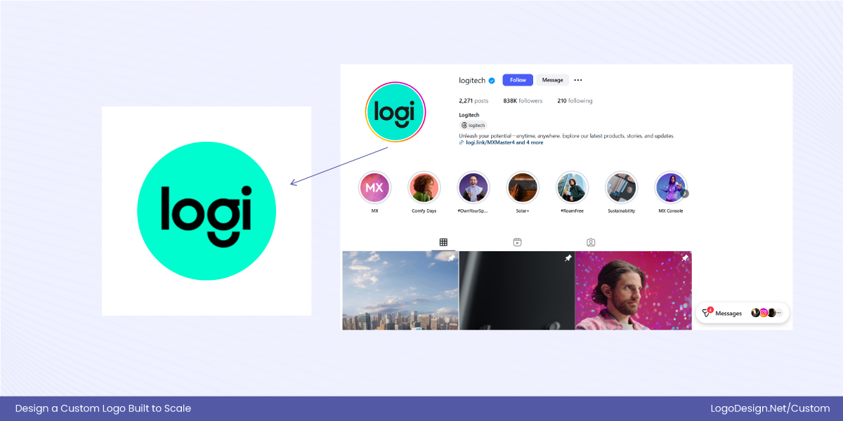
Logitech’s Instagram account display a simplified, high-contrast version of the logo that fits neatly within these constraints and remains instantly recognizable even at thumbnail size — something that requires planning beyond just shrinking the full logo.
A logo that isn’t designed or tested for these sizes can look cramped, illegible, or visually inconsistent across platforms.
3. Mobile apps and splash screens
On mobile devices, where screen sizes vary and attention is limited, a logo must stay crisp and balanced on splash screens and app icons. This requires strong shapes, clear spacing, and sometimes simplified or icon-only versions.
The Logitech Control app uses a simplified, high-contrast icon that remains recognizable even at small sizes, ensuring consistency across digital touchpoints. This compact app mark aligns consistently with Logitech’s broader identity principles, ensuring the logo remains clear and recognisable across all digital touchpoints.
4. Print materials and merchandise
In print, such as business cards or packaging, logos often scale down substantially, and in signage or large-format displays, they scale up.
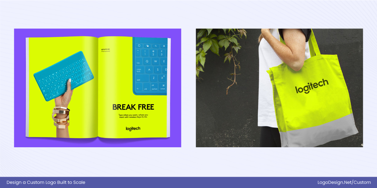
Logitech’s wordmark is crafted with even stroke weights and geometric precision so that it maintains visual balance whether reduced on a label or enlarged on a tradeshow booth banner — avoiding awkward spacing or disproportionate elements that would distract at larger sizes.
How to test a logo for scalability?
A logo may look perfect in a large mockup, but real-world use exposes its true strength. Testing scalability ensures a logo remains recognizable, consistent, and effective across every application—from tiny icons to giant signage.
Here’s how to test a logo for scalability:
Step 1: Shrink it to favicon size
Reduce the logo to a few pixels. If it stays recognizable, the design is strong. If not, consider a simplified version.
Step 2: Check in grayscale and black-and-white

Remove color to see if the logo relies too heavily on hue rather than shape, contrast, and form.
Step 3: Test on different backgrounds
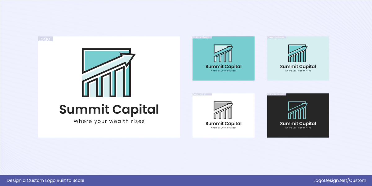
Place the logo on light, dark, textured, and photographic surfaces. A scalable logo should remain clear without needing heavy outlines or effects.
Step 4: Print at extreme sizes

Print the logo very small and very large to reveal spacing issues, thin strokes, or proportions that fail outside digital screens.
Step 5: Review on mobile screens
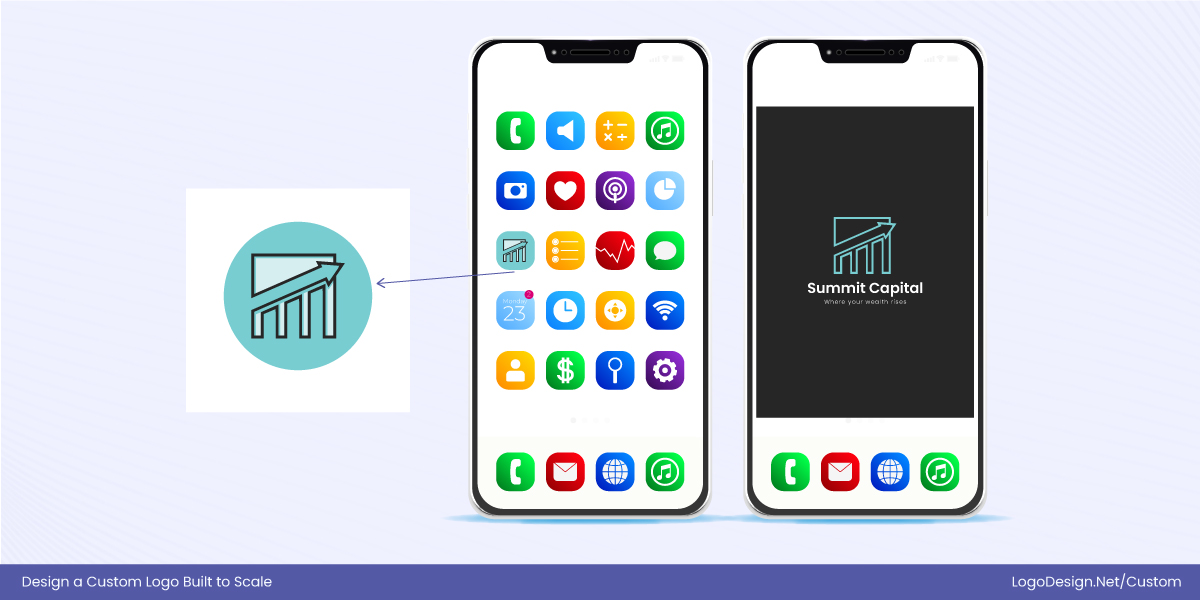
Since most users encounter brands on phones, ensure the logo remains clear and uncluttered at small sizes.
By testing for scalability in real-world scenarios, designers can ensure a logo is not just visually appealing, but functional, flexible, and future-proof across every platform.
Brand Consistency and Scalable Logo Systems for Digital-First Brands
Scalability doesn’t work in isolation—it’s most effective when supported by a well-structured logo system. Rather than relying on a single logo file, strong brands design a family of logo variations that adapt to different sizes, platforms, and contexts while maintaining recognition.

1. Primary Logo
The primary logo sits at the core of the brand system and is used in high-visibility placements where space allows, such as website headers, packaging, and printed materials. It represents the brand in its most complete and expressive form.
2. Secondary Logo Versions
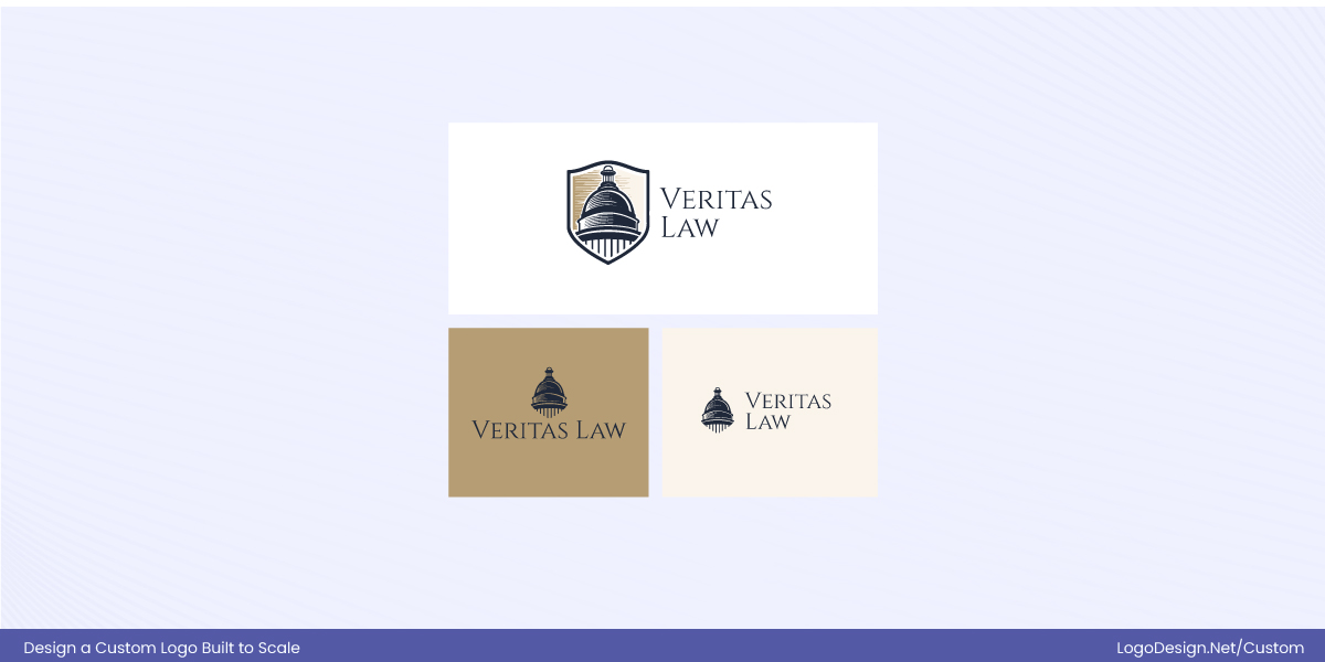
Secondary logos—often arranged horizontally or vertically—support the primary mark by adapting to tighter layouts. They maintain clarity and balance without sacrificing brand recognition.
3. Icon & Symbol Marks
For extremely small spaces like favicons, mobile app icons, and social media avatars, simplified icon or symbol marks are essential. These versions are designed to remain recognizable at minimal sizes.
4. Wordmark-Only Version
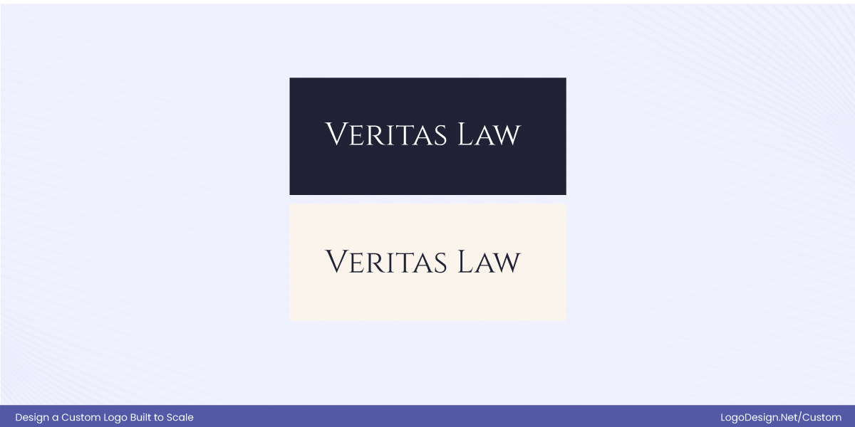
Some brands include a wordmark-only logo for editorial layouts, co-branded environments, or minimal compositions. This version prioritizes simplicity while preserving brand tone.
5. Color Variations & Lockups
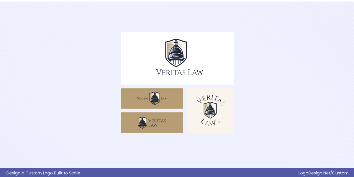
Logo systems define approved lockups and color variations—full color, black, white, and monochrome. These ensure consistency and legibility across different backgrounds and use cases.
6. Spacing & Clear Space Rules
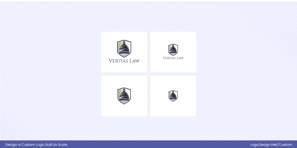
Clear spacing rules protect the logo from visual clutter. Defined margins help maintain balance and readability across all platforms and formats.
7. Responsive & Digital-First Adaptations
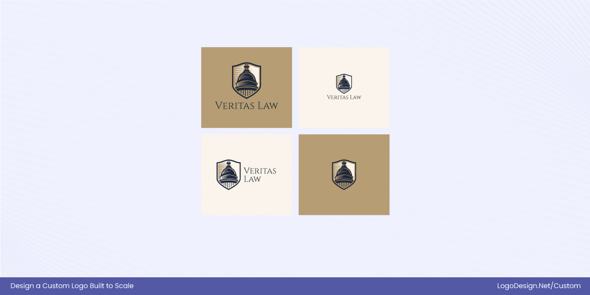
Modern logo systems account for responsive environments, including dark mode, UI constraints, and micro-branding needs. Simplified versions ensure usability across screens of all sizes.
8. Motion-Ready Variations
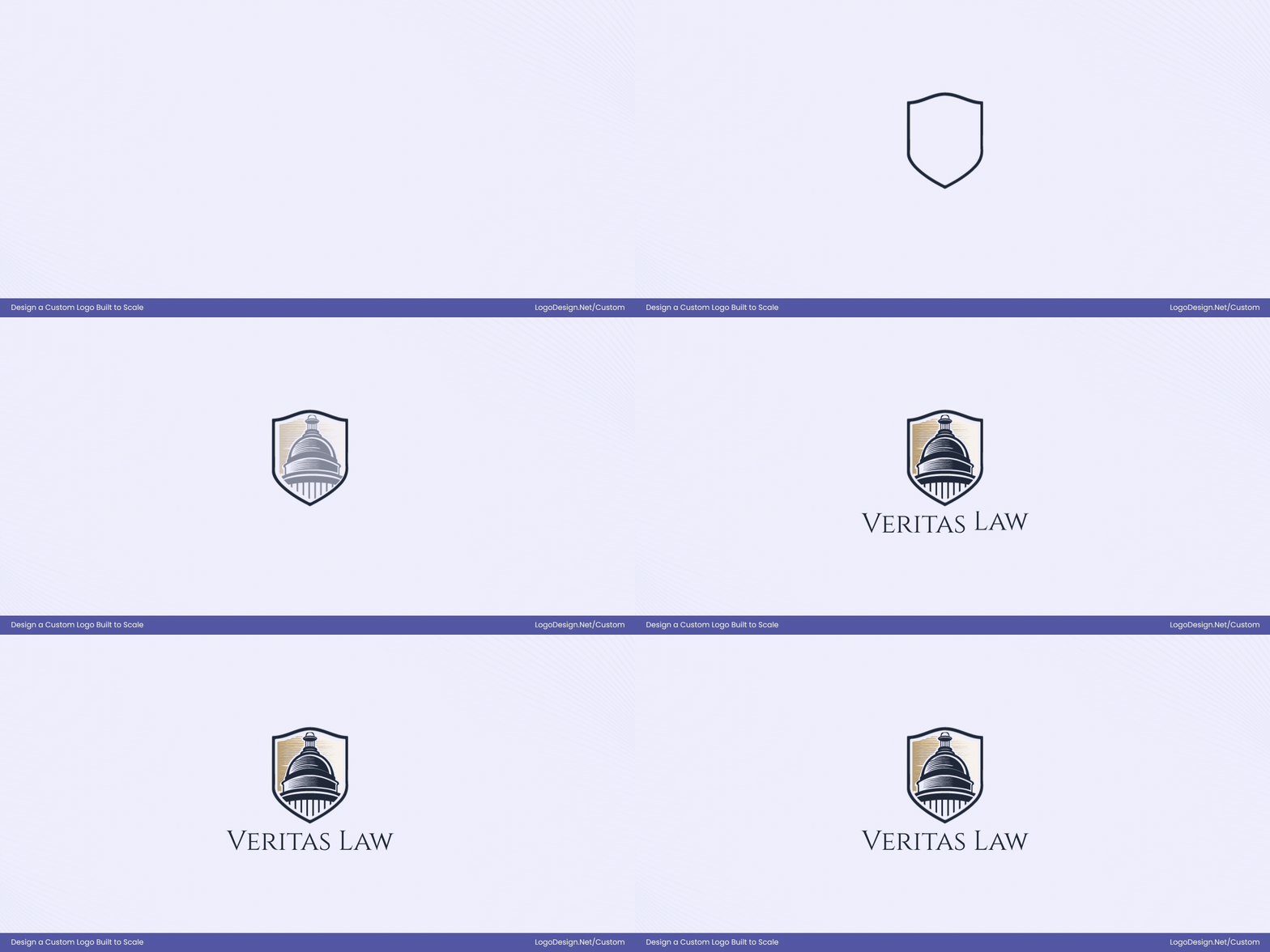
Some brands extend scalability with motion-friendly logo variations. These are designed for animations, app loading screens, and video—enhancing engagement without altering the core identity.
By designing logos as a flexible system rather than a single static mark, brands ensure consistency, clarity, and recognition at every size—no matter where or how the logo appears.
When to Redesign Your Logo for Scalability?
Before jumping into a logo refresh or full redesign, it’s important to evaluate how well your current logo performs in real-world conditions. As brands grow, expand into new platforms, and adopt digital-first strategies, logos are pushed into more sizes and formats than ever before. What once worked on print materials or large signage may no longer hold up on mobile screens, app icons, or social media profiles.
Use this checklist to determine whether your logo needs a scalability-focused refresh or redesign:
- Loses clarity at small sizes: Becomes unreadable or unrecognizable in favicons, app icons, social media avatars, or UI elements.
- Contains too much detail: Fine lines, thin strokes, or intricate elements disappear when scaled down.
- Struggles across new platforms: Doesn’t adapt well to mobile apps, video overlays, wearables, or digital products.
- Was designed for print-first use: Works on signage or stationery but fails in responsive layouts, dark mode, or screen-based environments.
- Breaks in different orientations: Only works in one layout (horizontal or stacked) with no flexible alternatives.
- Lacks a scalable logo system: No secondary marks, icon-only versions, or simplified lockups for smaller applications.
- Requires constant manual adjustments: Needs frequent resizing, redrawing, or visual fixes to work in real-world use.
- Brand has evolved: The logo no longer reflects the brand’s size, digital presence, or direction.
- Unclear whether to refresh or redesign: Minor refinements (spacing, typography, simplification) may be enough—or a full redesign may be needed if the structure no longer holds.
If several of these apply, it’s a strong signal that your logo needs to be redesigned—or at least refined—to scale effectively across modern brand touchpoints.
Final Thoughts!
As brands operate in increasingly diverse environments, the ability of a logo to perform at any size directly impacts how professional and trustworthy the brand appears. By focusing on simplicity, strong shapes, vector design, and real-world testing, designers can create logos that remain clear and impactful regardless of scale. Scalable logos reduce the need for constant redesigns, support brand longevity, and make it easier to adapt to new platforms and technologies as they emerge.
Ultimately, a well-scaled logo does more than look good—it works hard for the brand. It communicates clearly, adapts effortlessly, and reinforces brand identity wherever it appears, making scalability one of the most valuable principles in effective logo design.
