Roughly 300 million people worldwide live with some form of color vision deficiency. If your logo isn’t accessible, your brand’s message could be lost to millions.
Think of your logo as a symbol meant to convey identity, trust, and recognition in a single glance. But here’s an important question: can everyone see your logo the way you want?
Today, accessibility is no longer an option; it’s a necessary element of design. Being inclusive ensures that your brand reaches everyone, including people who experience some form of visual impairment or color vision deficiency.
For many people, your logo’s carefully chosen colors may appear faded, distorted or even completely invisible. Whether you’re a designer, brand strategist, or business owner, understanding how to apply accessibility best practices for logo colors is key to the success of your brand.
Let’s discuss this in detail here.
Key Principles of Accessible Logo Colors
Accessibility in logo design is about creating a brand identity that everyone can recognize and connect with. These principles can help you understand the process for designing logos that are inclusive and effective across all platforms.
1. Use High Color Contrast in Design
When you are working on a logo, not paying attention to contrast is one of the common logo design mistakes people make. And not just between the foreground and background, but every visual element. If the contrast isn’t clear, details blur, text becomes unreadable, and icons lose their impact.
So here are some factors to keep in mind with this.
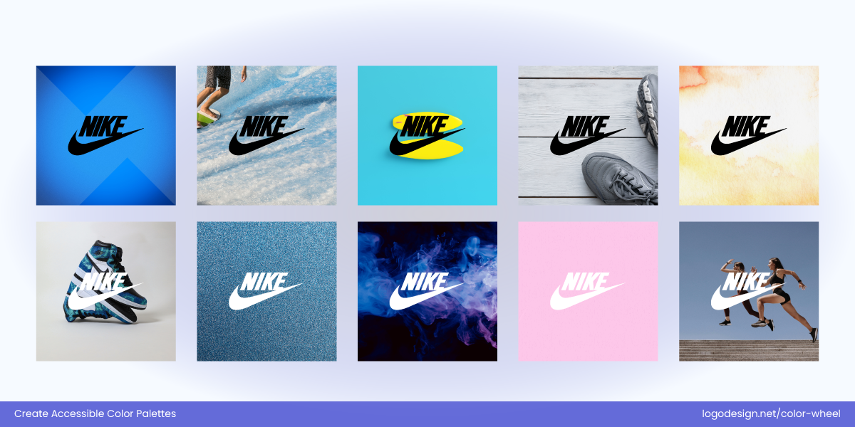
Nike’s logo adapts its colors to stay visible on any background.
- Go for a strong contrast between text, icons, and background colors to maintain visibility in both light and dark. That’s what we see in the Nike logo, as the black background ensures clear visibility to view the white swoosh and brand name.
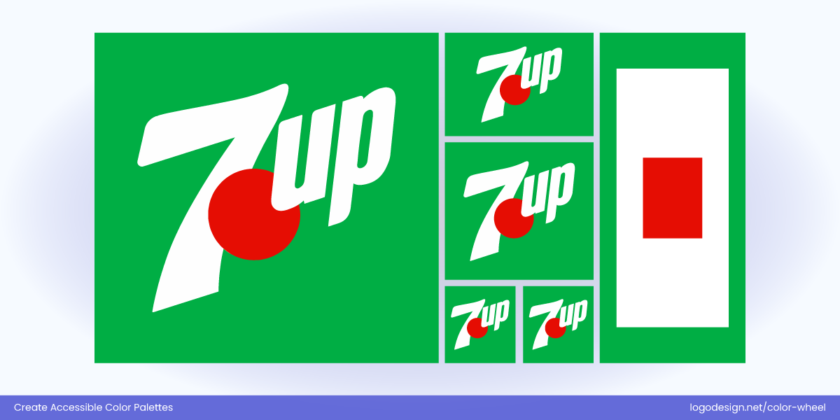
The 7Up logo’s green, white, and red offer a strong contrast, meeting WCAG standards.
- Follow WCAG 2.1 guidelines, which recommend a minimum contrast ratio of 4.5:1 for normal text and 3:1 for large text. When talking about the right contrast ratio, the 7UP logo has a Green on White contrast ratio of about 5.8:1, and a Red on White contrast ratio of 4.5:1. Both of these ratios meet the WCAG 2.1 guidelines, making them easily readable.
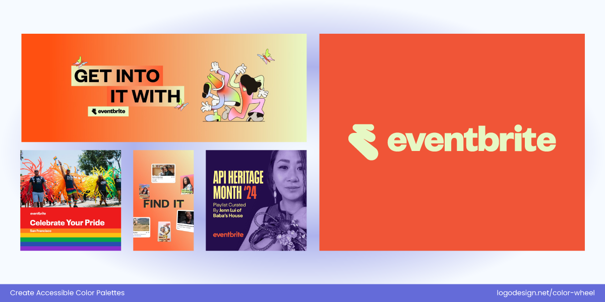
The Eventbrite logo uses high‑contrast colors for clear readability.
- High-contrast design also supports outdoor visibility, small-size legibility, and display on lower-quality screens (e.g., projectors or older devices). In this Eventbrite logo, we can see a high contrast that ensures better viewing of the words and reliable clarity in digital and physical (outdoor) environments..
2. Establish a Strong Color Hierarchy in Your Logo
For color theory in logo design to work, it is important to focus on color hierarchy. This guides the viewer’s attention to core brand elements and creates a balanced visual experience. Start by using a primary brand color, as this should be the most recognizable one in your logo. It can become the pillar of your brand’s visual identity in print and on digital mediums.
Here are a few steps to follow to make sure that you follow a color hierarchy in logo design:

Wheat Leaf Logo by LogoDesign.Net
- Add secondary or accent colors that match to support the primary color. These can highlight secondary design elements or offer flexibility in different contexts (e.g., dark mode, seasonal themes).
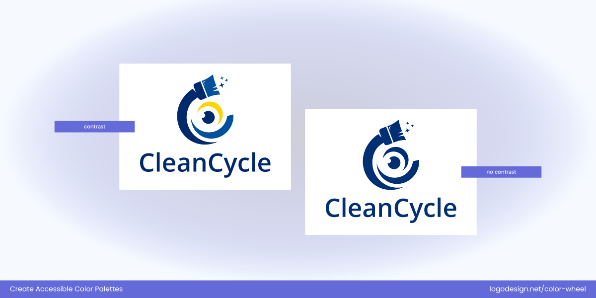
Abstract Cleaning Logo by LogoDesign.Net
- Use color contrast to make the brand name or symbol more visible than icons or shapes.
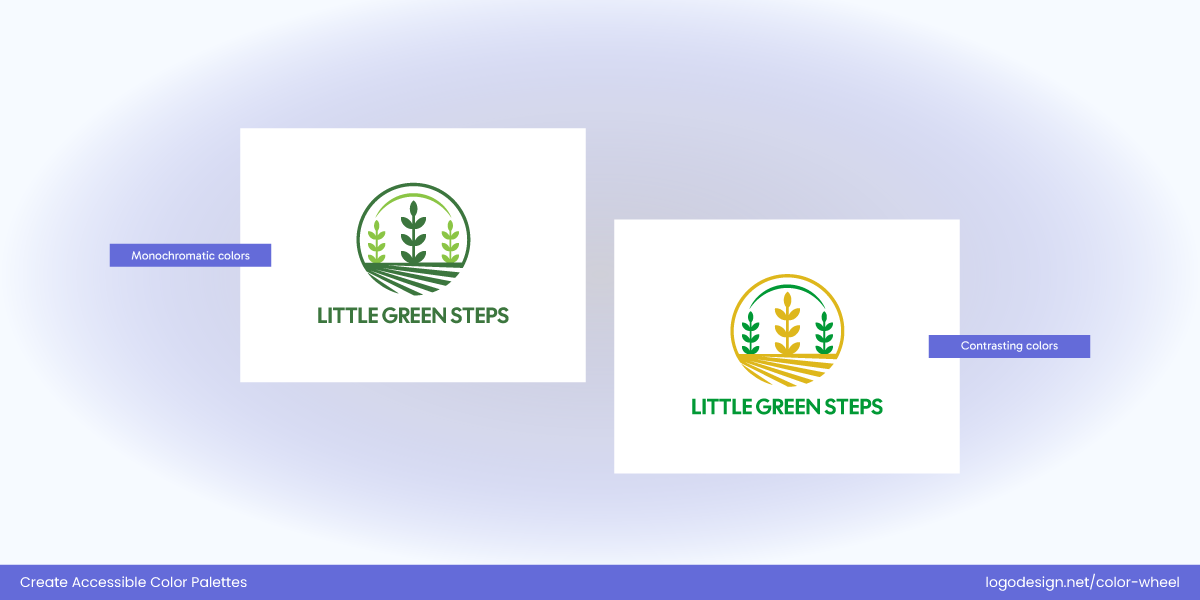
Wheat Farm Logo by LogoDesign.Net
- Avoid using colors that may appear similar, as that can create confusion.
By creating a structure in your design, you can make it accessible for viewers with color vision deficiencies too.
3. Test Your Logo in Greyscale and Monochrome
A simple way to identify color inclusivity in your logo is to convert it to greyscale during the design process. This reveals whether your logo still works when color is removed or in monochrome styles. It’s also a great way to evaluate how monochrome and multicolor palettes in logos or branding hold up in different contexts, such as how it might appear to people with severe color blindness or in non‑color formats like photocopies and newspapers.
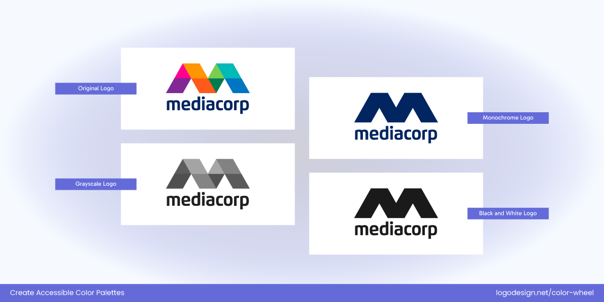
MediaCorp Logo in different color scales
With a balanced contrast and strong geometric form, the MediaCorp logo passes the greyscale and monochrome test, becoming easily visible in almost all sizes and forms.
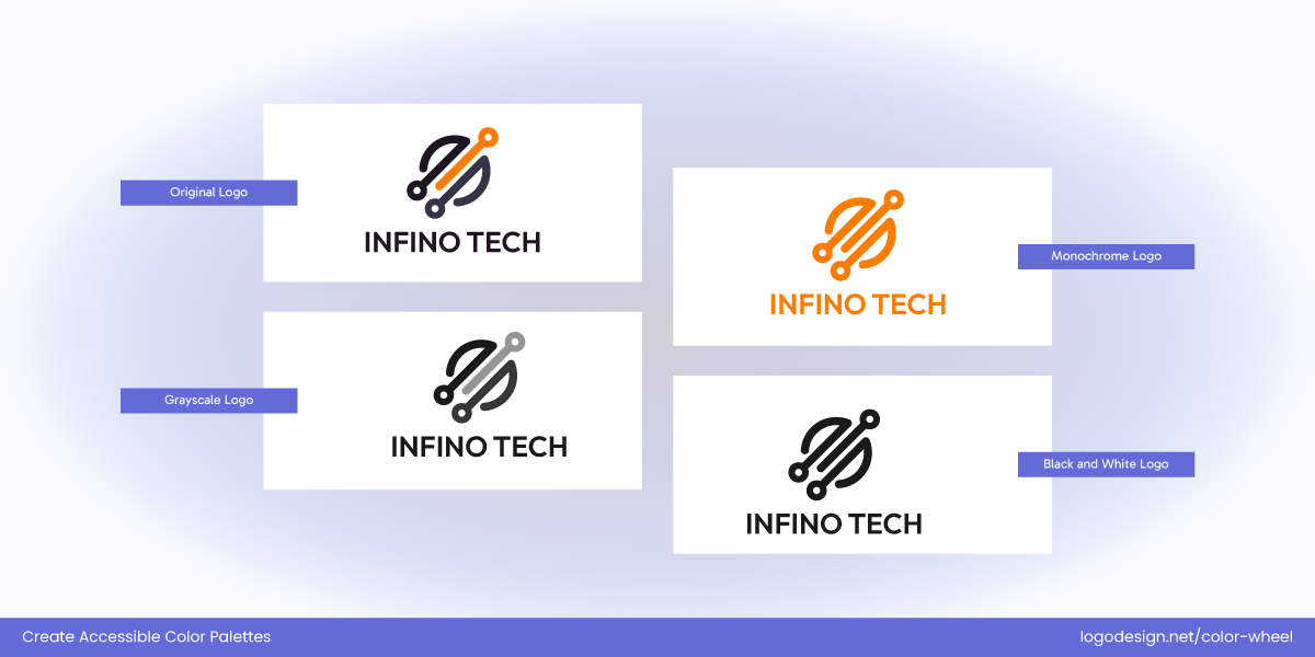
Circuit Wiring Logo by LogoDesign.Net
A well-designed and versatile logo should maintain its form, contrast, and recognizability in black and white. This is also useful for printing on promotional items like stamps, labels, or for embossing.
4. Limit Your Color Palette to Distinctive Colors
A cluttered or overly complex color palette can overwhelm users and reduce accessibility for a wider audience. You also need to think of potential consumers with vision impairments.
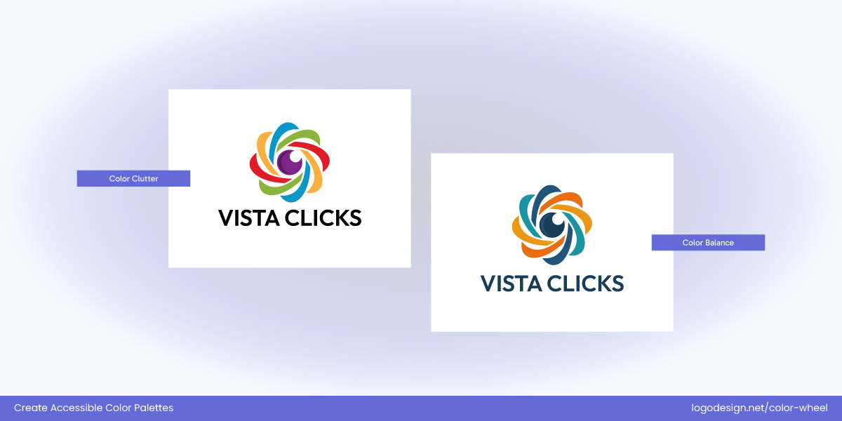
Photography Logo in multicolor by LogoDesign.Net
Go with fewer colors that contrast well to draw focus and maintain a clean, memorable design. Try to limit the use of subtle variations or bright gradients that can clash with the background. When considering flat vs. gradient color choices in logo design, flat colors often work better for accessibility because they stay consistent and clear across different screens, while gradients—if overused—can make elements harder to distinguish for viewers with contrast sensitivity or CVD.
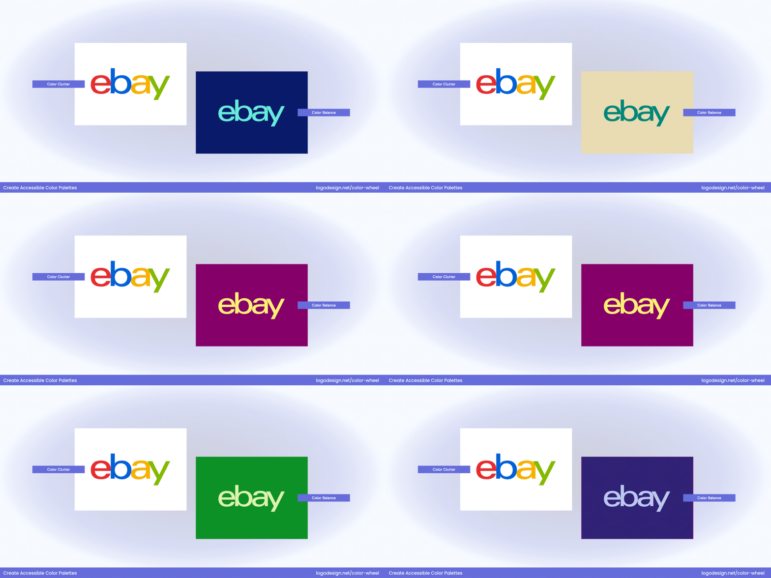
A simplified palette also makes it easier to maintain consistency across brand assets. eBay went from a playful typography with colored words jumbled together to a logo without overlapping alphabets. While they retained the colored alphabets, the thinner strokes made the logo easier to read on different backgrounds.
5. Design for Scalability in any Size and Resolution
Your logo should be as effective on display in 16×16 pixels as it is on a billboard. You may already know that screen sizes and resolutions are very different. And legibility at smaller sizes is key. At reduced dimensions, fine details and thin strokes disappear, especially if colors don’t contrast enough.
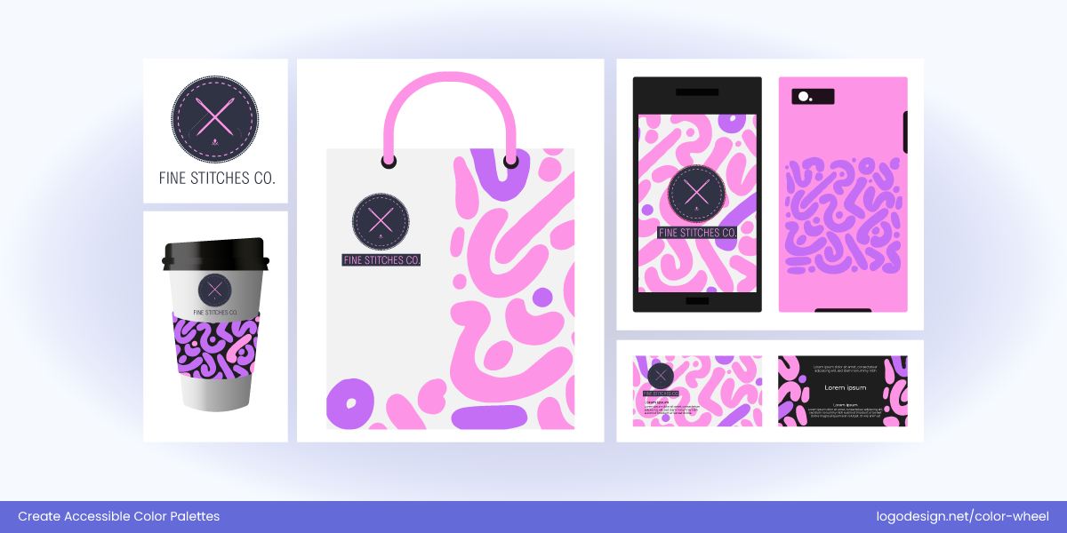
Embroidery or Stitching Company Logo by LogoDesign.Net
Test your logo on mobile, desktop, favicon, and print to ensure it maintains clarity across contexts.
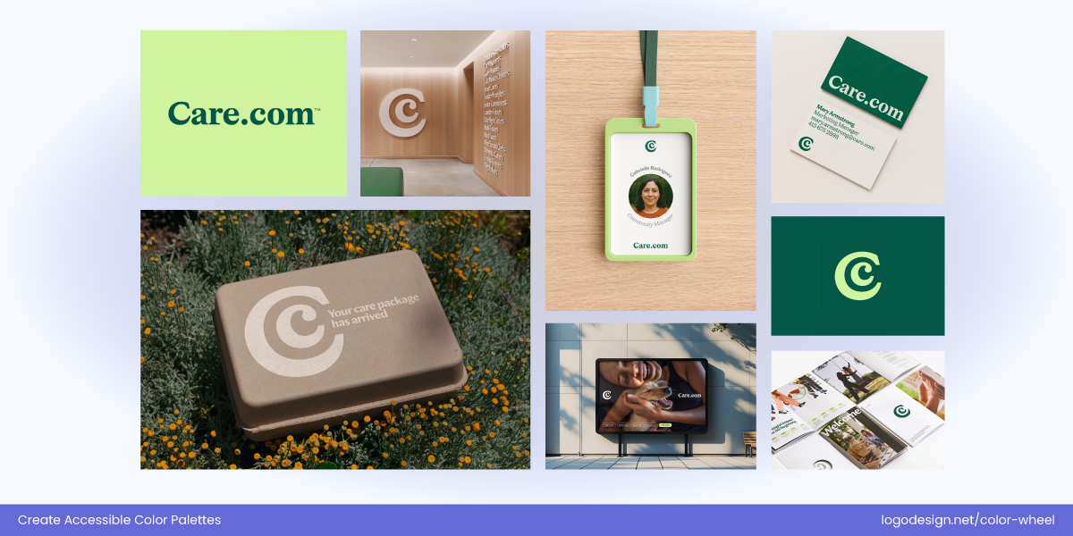
Care Logo – on different platforms
The vector-based structure, high contrast, and clear typography make the Care.com logo scalable and easier to recognize, whether it’s on digital or print platforms.
Create alternate versions of your logo (e.g., icon-only, initials, or simplified marks) for tiny spaces while retaining brand identity.
6. Check Logo Visibility on Multiple Backgrounds
A logo should look good and remain legible no matter where it appears. Be it in dark mode, light mode, print, embroidery, or signage. Use background-compatible design and do test it on light, dark, colored, and photographic backgrounds.
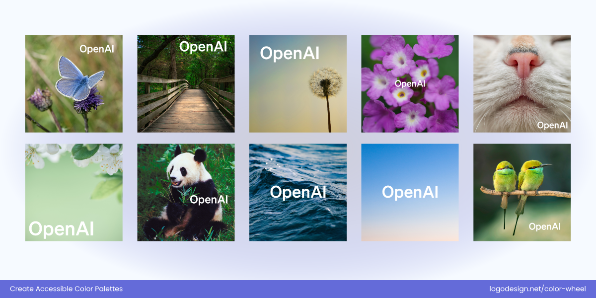
OpenAI logo on different backgrounds
Using strong negative space and monochrome compatibility ensures that OpenAI offers high visibility and stands out across most complex backgrounds and solid shapes.
In cases where visibility is at risk, use background shapes, padding, or contrasting outlines to frame your logo and preserve contrast.
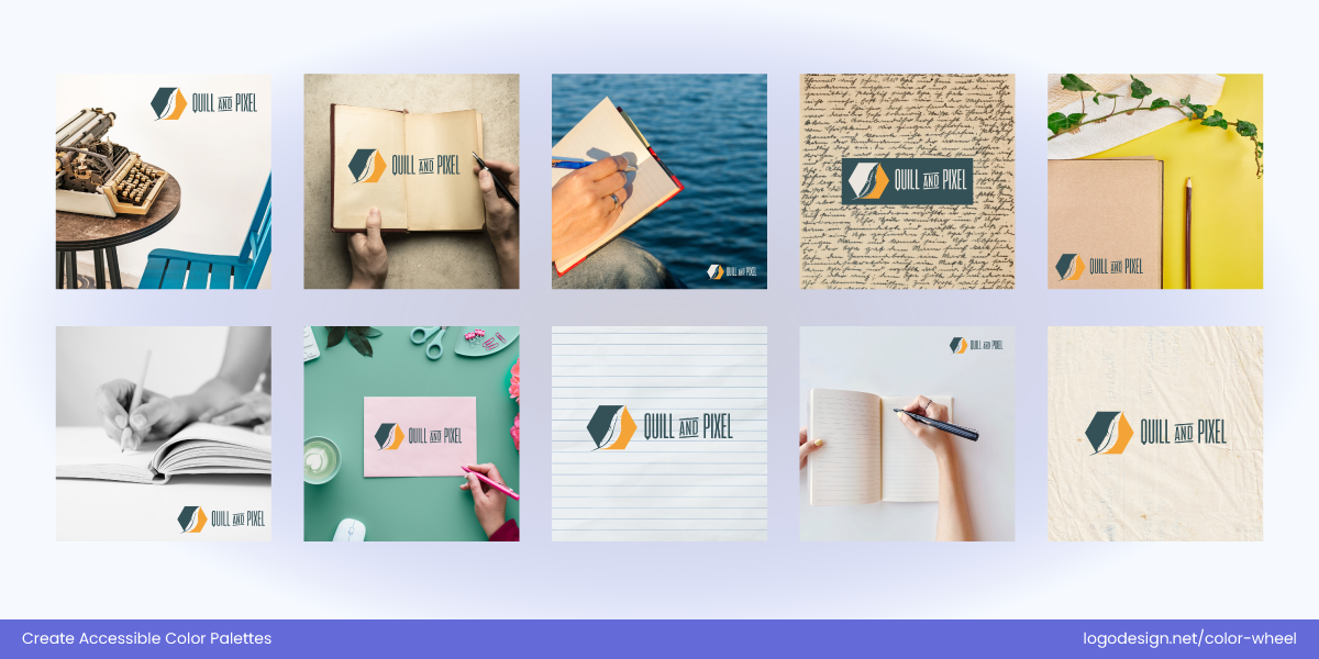
Writing Company Logo by LogoDesign.Net
Don’t forget to test in environmental settings, for instance, see how your logo looks on fabric, merchandise, or store signs in direct sunlight or dim lighting.
7. Design a Flexible Logo System that Adapts
Responsive design isn’t just for websites, your logo should also be responsive in form, color, and complexity based on the platform.
Build a logo system that includes variations for light and dark backgrounds, high-contrast as well as single-color versions. You also need to add simplified logo styles for mobile or social media app icons.
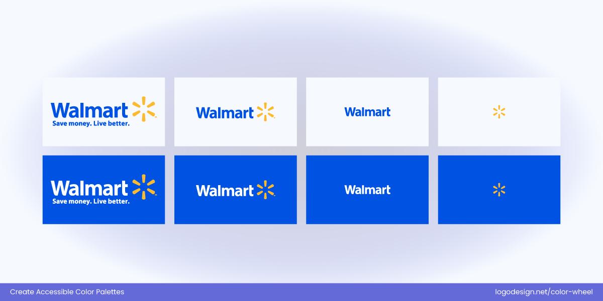
Walmart Logo – responsive across platforms
Make sure your color choices scale across devices like phones, tablets, desktops, and even wearables.
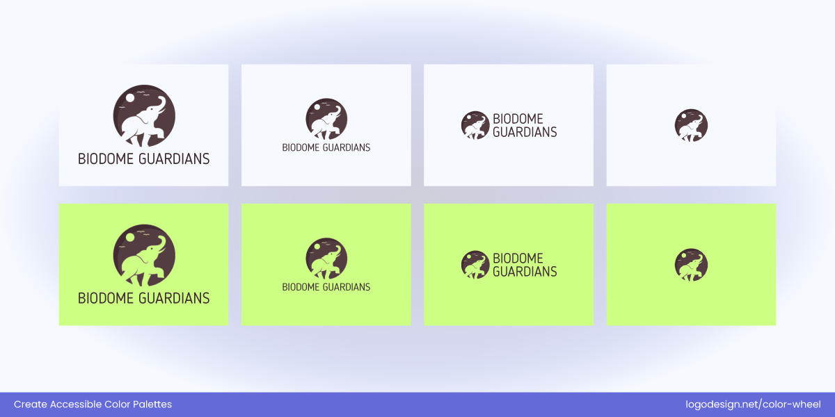
Responsive Wildlife logo by LogoDesign.Net
Responsive logo design allows you to create wider brand recognition while maintaining accessibility on all screens and materials.
8. Keep Visual Clutter Away from Your Design
Even a great logo can fail if it’s placed on a busy or incompatible background that interferes with its visibility. Try to avoid using your logo directly over detailed photos, textures, or clashing colors unless it’s designed to work with those conditions.
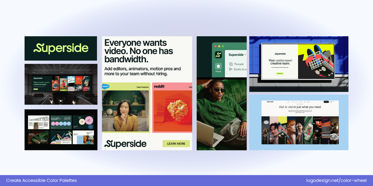
Superside logo – Simple colors
The superside logo has a simple geographical form and a minimal color palette, adding to the negative space. This gives a clear and professional brand voice that’s focused on creativity without clutter.
Use containers, borders, drop shadows, or contrast buffers for visual integrity. Always preview your logo in isolation and its actual application as well.
It is important to check that your logo appears in its original design on social media banner designs, product labels, or signage.
9. Respect Cultural Color Associations
Before finalizing your palette, research the cultural meanings of your colors, especially if your brand has an international presence. You need to know that the associations and meanings change with cultures. Like black, for example, which is connected to both power and authority, as well as mourning in most countries.
A culturally aware palette shows thoughtfulness, inclusivity, and global sensitivity, which in turn fosters deeper brand trust and loyalty.

Google Doodle celebrates ramen, a flavorful Japanese noodle tradition.

Google Doodle Tribute for Argentina Independence Day 2025

Google Doodle honors Australia’s famous Big Mango landmark.
Color hierarchy makes your logo visually appealing but also readable and immediately identifiable.
Best Practices for Choosing Accessible Logo Colors
These best practices will help you choose logos colors for your industry that are inclusive, timeless, and functional for all audiences.
1. Simulate Color Vision Deficiencies
Color-blind simulators like Coblis, Color Oracle, or built-in design tools can help you get a clear idea of how users with color vision deficiencies perceive your logo. You can see the results for conditions like Protanopia (red-blind), Deuteranopia (green-blind), and Tritanopia (blue-yellow blind).
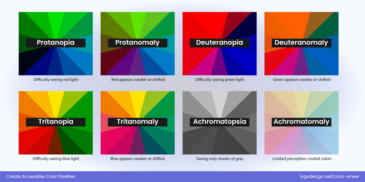
Check how well your logo holds up across different types of color blindness.
| Type of Color Blindness | What It Affects | Common Impact on Logos |
| Protanopia | Inability to perceive red light | Reds may appear brown or dark gray. Red-green contrast disappears. |
| Deuteranopia | Inability to perceive green light | Green and red tones blend; poor red/green separation. |
| Tritanopia | Inability to perceive blue/yellow | Blues become greenish; purples look red. Yellows may fade. |
If crucial visual information is lost in any simulation, change the color palette or add supporting design cues (shapes, spacing, or labels).
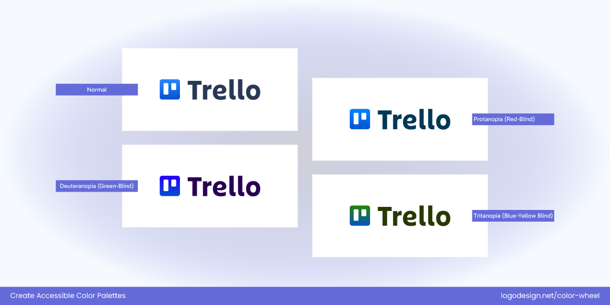
Trello Logo and visual accessibility
Trello updated its branding in 2016 and again subtly in recent years. Its logo is designed with accessibility and clarity in mind. The logo uses a monochromatic blue palette, avoiding problematic combinations like red/green or green/orange.
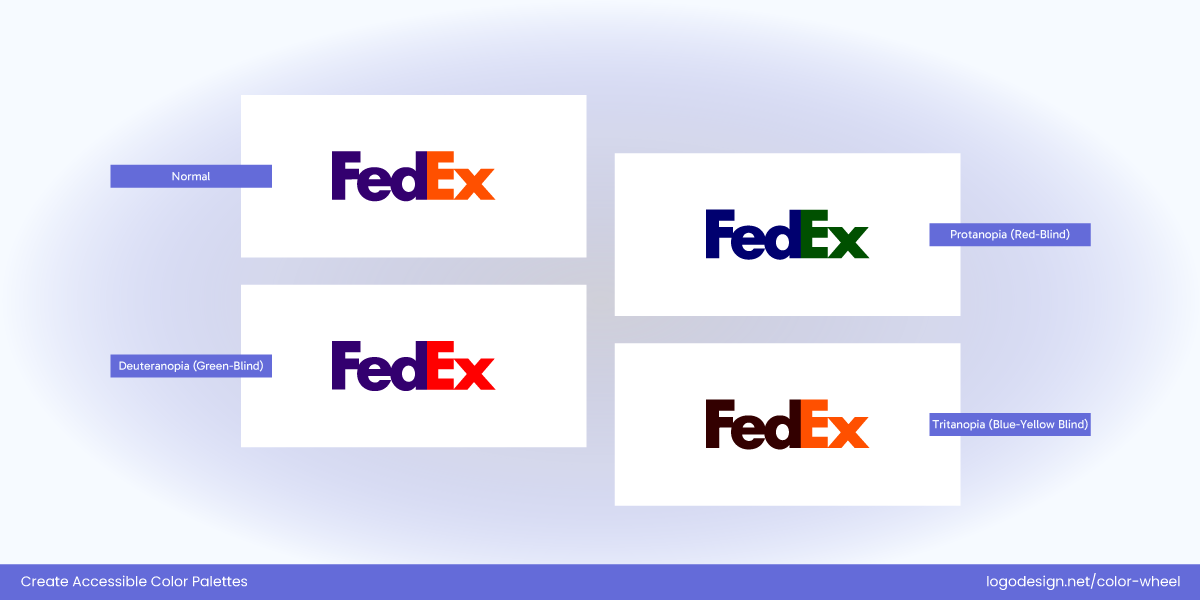
FedEx Logo and visual accessibility
The FedEx logo expertly uses the negative space and various shapes in hue colors, making them mostly visible for people with vision deficiency.
2. Look for Stable Colors for Screen Types
It is a good idea to take a look at colors that don’t lose their originality on different screen types (e.g., OLED vs LCD). Some device screens display color differently and change the final result slightly. Apple, Samsung, and desktop monitors can all alter the tone and brightness.
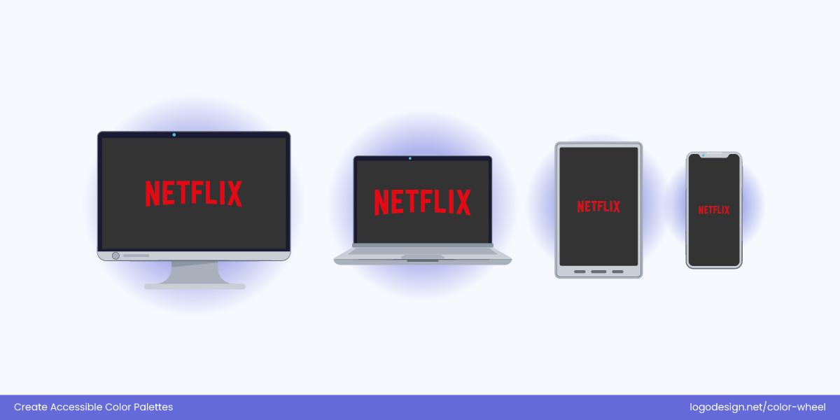
Netflix Logo across screens
Netflix uses pure red and black/white in some places. Red is known to be a slightly unstable color across screens, but they chose a hue that remains bold and visible without becoming neon (Samsung) or muddy.
The red lettermark on a black background has a strong contrast, even on OLED screens where black is ‘true black’. On OLED (Samsung, LG), where contrast is exaggerated, Netflix’s red pops but doesn’t bleed.
3. Opt for Universally Relevant Color Combinations
Mostly, your choice may depend on color psychology in logos, and that’s important as well, since most hues and tones draw an emotional response from the viewers. But choosing accessible logo colors goes beyond that. It means selecting combinations that are different from each other in hue, brightness, and saturation.
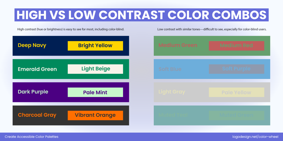
This is just about color psychology but more about color perception for most viewers. You may find this surprising, but red vs. green is a combination that’s almost indistinguishable for users with deuteranopia (the most common form of CVD).
Accessible Logo Color Combos (Warm + Cool) |
||
| Warm Color | Cool Color | Why It Works |
| Warm Red | Navy Blue | Bold red contrasts with dark blue for strong visibility |
| Sunset Orange | Cobalt Blue | Energetic and fresh combo with excellent brightness difference |
| Muted Coral | Cool Slate Blue | Stylish but clear—used for modern branding aesthetics |
| Gold | Teal Green | Feels premium and approachable; good readability |
| Terracotta | Turquoise | Warmth meets clarity; earthy yet bright combo |
| Marigold Yellow | Indigo | Balanced brightness and contrast; works across dark and light backgrounds |
| Crimson | Seafoam Green | Bold and calm tones contrast both in hue and value |
| Rose Pink | Steel Blue | Soft yet high-contrast, friendly and tech-savvy |
| Burnt Orange | Aqua | Vintage + vibrant combo; eye-catching across formats |
| Beige/Blush | Forest Green | Clean, sustainable feel; strong emotional pairing |
| Warm Plum | Ice Blue | Playful vs. cool-toned calm; very effective on dark mode UIs |
| Mustard | Charcoal Blue | Retro meets tech; high contrast with personality |
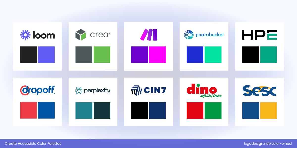
Logos with accessible color combinations
For more accessibility in design with logo colors, you should consider pairing warm and cool tones that contrast in brightness too.
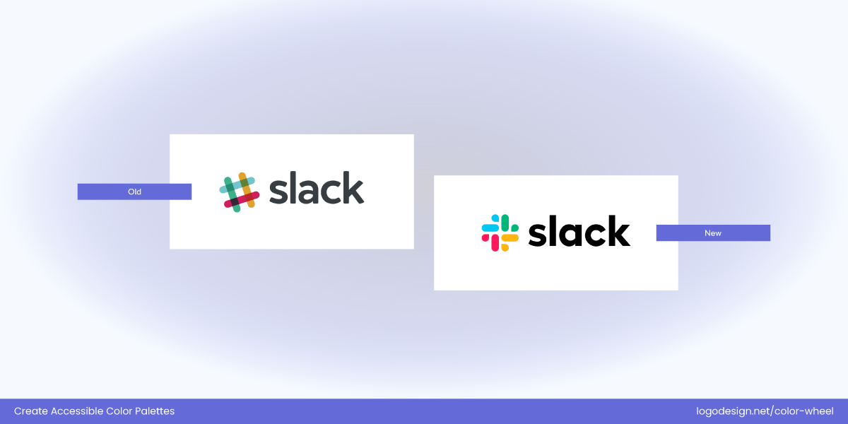
Slack logo with complex and simplified color palettes
Slack’s old logo had 11 colors and relied on red, green, and blue lines which were difficult for some viewers to identify. The new logo has a more simplified palette, using accessible purples and teals.
4. Avoid Thin Fonts and Light Colors
Typography plays a major role in logo legibility. Thin or ultra-light fonts, especially when paired with pale colors, can vanish against bright or dark backgrounds. Opt for medium to bold font weights in logo designs, especially for smaller applications like app icons or watermarks.
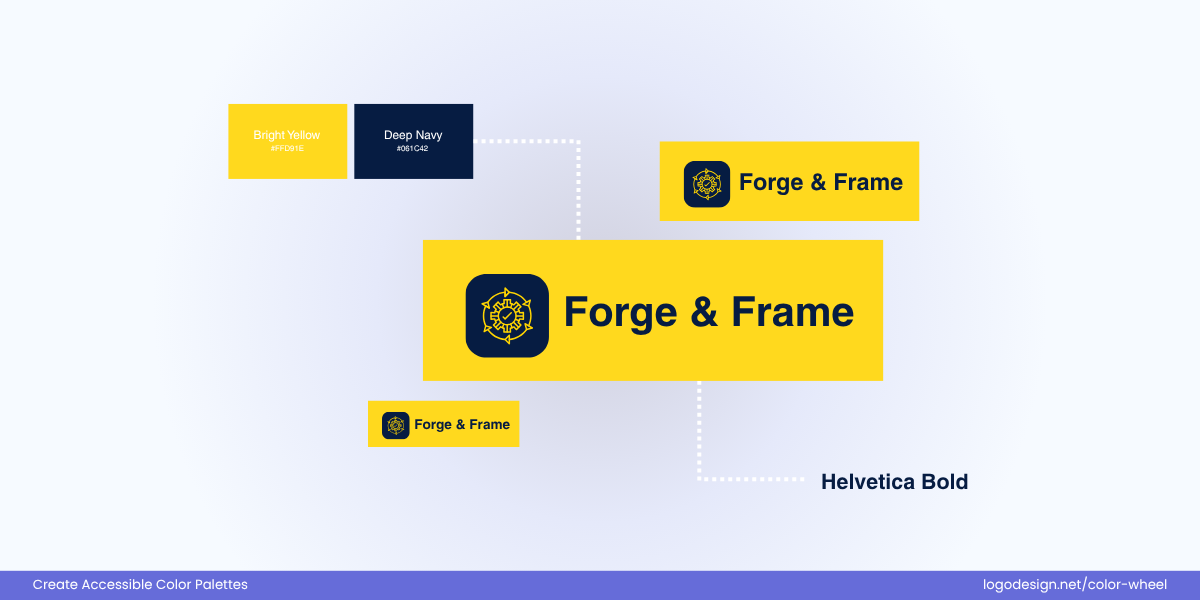
Strong contrast and a bold sans‑serif font make the text easy to read even at small sizes.

High contrast between dark gray and white, with clean letterforms that maintain legibility.
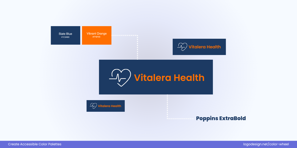
Bright warm color pops against a dark cool tone, and Poppins’ geometric style is very readable.
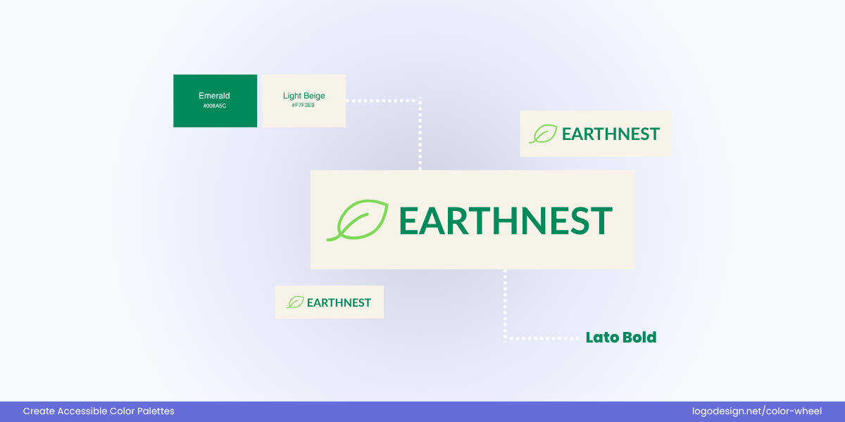
Strong luminance contrast and a friendly, open‑shaped sans‑serif improve readability.
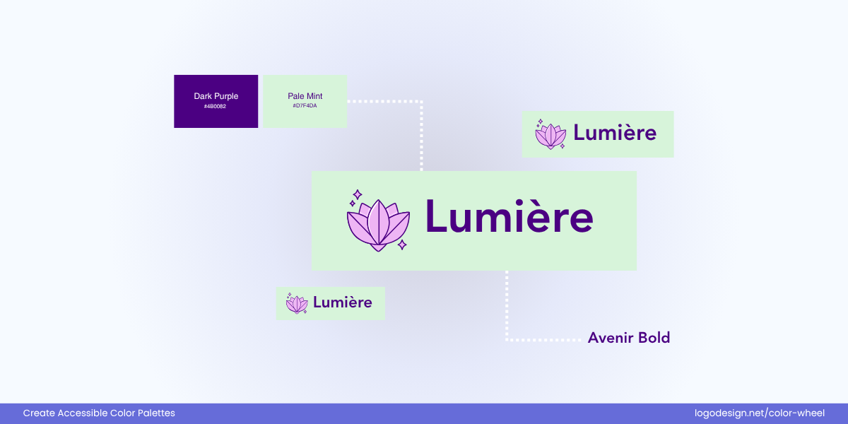
Distinct hue separation with a bold, modern font for clarity.
Avoid pairing light text with light backgrounds or dark-on-dark combinations unless you’re using strong outlining or shadowing techniques.
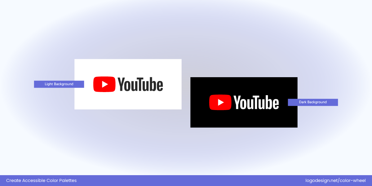
YouTube Logo – Dark and Light background
YouTube’s wordmark uses a heavy sans-serif font that maintains high readability. The logo is featured with white text on a red background, or black text on white, both of which are high-contrast combinations.
This makes the logo fully accessible (passing WCAG contrast ratios) and visible as itacross different display types (LCD, OLED, AMOLED).
Stick to Timeless Hues instead of Trendy
Knowing the color trends makes the logos feel fresh, but they often lack the contrast, saturation, or clarity needed for long-term use and accessibility. Choose clear, saturated colors that convey your brand personality while still performing well across screen types and for users with visual differences.


Timeless palettes, like navy, forest green, or charcoal, tend to stay accessible and avoid going out of style. You can use trendy colors as secondary or accent tones, but try to avoid for primary logo colors. Instead, choose colors that capture the right emotions for your brand.
Instagram’s old app icon vs. New app icon
Instagram’s original rainbow gradient became nearly unreadable in small sizes or on dark backgrounds. Their updated app icon keeps the gradient but simplifies and deepens the color range for better visibility.
Get Feedback from People with Accessibility Needs
Conduct usability tests, design reviews, or soft launches with individuals who have visual impairments or accessibility experience. You’ll gain insight into how real users perceive your logo and where potential breakdowns occur. Consider partnering with accessibility consultants or communities for deeper, more informed feedback loops.
Include Accessibility Guidelines in Brand Style Guide
Your brand guidelines should not only showcase color values but also include accessibility documentation. Specify acceptable color combinations, contrast minimums, and alternative logo usage to maintain consistency in all internal and external design work.
Include guidance for developers, designers, and third-party vendors to make sure your logo always meets accessibility expectations.
Here’s What Matters
Here are the Takeaways to design an inclusive logo:
- Color alone isn’t enough, follow key principles for accessibility
- Ensure high contrast between text, icons and background colors in logo design
- Establish visual hierarchy and test logo in greyscale or monochrome
- Stick to accessible color palettes and design for visibility/scalability
- Respect cultural meanings when choosing logo colors
- Apply best practices when choosing colors in logo design
- Avoid problematic color pairs and simulate colors for visual deficiencies
- Be cautious with combinations like: Red/Green, Green/Brown, Blue/Purple
- Find stable colors for screens and universal pairings
- Get feedback from people with visual deficiencies
