Your logo sets the tone—so pick the logo type that speaks your brand’s language. One type doesn’t fit all.
Whether you’re launching a new business or rebranding an existing one, the right logo type can set you apart from competitors and create a lasting connection with your audience. But with so many design options, how do you choose the types of logos that truly represent your business and resonate with your audience? Well, there are quite a few factors that you need to consider. These include the industry, brand values, vision, and personality.
Think of any famous brand like Nike or Adidas here. Their logos are distinct and memorable across the world. While one chose a simple swoosh, the other went with an abstract design that is meaningful for the brand. Both represent the brands very closely and are popular in the sportswear industry too. Choosing the right logo is essential if you want to scale your business and make it last. Let’s dive into how you can select a type and create a logo that makes an impact.
Types of Logos and How to Choose the Right One
You will find various logo styles or types across different industries. It can be a bit difficult to find one that is just perfect for your brand. To make this easier for you, take a look at the main types of logos and understand how to choose one.
Wordmark (Logotypes)
This is a font-based logo that focuses only on the brand’s name as its main visual identity. Unlike symbols, images, or abstract icons, the wordmark is completely typographic. It might be stylized with custom typefaces, personalized hand-lettering, or colors, but it always draws the focus on the name. There’s no image or icon that goes along with it as the name works alone.
Here is a set of wordmark logos that represent different companies
Wordmarks are especially powerful when a business name is distinctive, memorable, or short. They convey the brand message and personality with strong typography and layout. So with styles like serif, sans serif, handwritten or calligraphic, such logos can show you everything that you may need to know about a business.
When to Choose
Think about your industry first and take a look at competitor logo styles. They can work well in food and beverage, technology, legal, construction and finance. You’ll find quite a few businesses using wordmark logos for their scalability and versatility. It’s important to define your brand’s personality and then go with fonts and typography that represent it closely. For elegant and upscale, you can go with serif font styles like Garamond, Georgia or Didot.
If you are looking to show a fun and quirky personality, then handwritten or custom styles could be the right choice. Wordmark logos focus on legibility and recognition. With the right typography, even the simplest wordmark can become iconic and timeless.
Here are a few examples of popular text-based logos.
The iconic and widely recognized Coca Cola logo
Coca-Cola: The nostalgic, calligraphic logo style draws attention to tradition, warmth, and emotional connection. It is perfect for a brand that’s all about shared moments and heritage.
This is the logo of Google, the global tech giant
Google: Its playful colors and clean font reflect Google’s innovative and accessible brand. The simplicity makes it instantly recognizable worldwide.
This is the Uber logo, one of world’s leading ride-hailing app
Uber: Sleek and modern, this design reflects the brand’s transformation into a high-tech service.
Lettermark (Monogram Logo)
Instead of spelling out the full business name, lettermarks use a minimalist approach, offering a powerful and short version of a brand’s identity. A lettermark logo or monogram uses the initials of a company name mostly two or three letters. These logos do not include any other element except the first letters of your brand name, featured in a custom or unique style.
The image displays a set of logos of different companies
The clarity in the lettermark logo can be quite valuable, especially when your full company name is long, complicated, or hard to remember. One or two letters can turn complexity into simplicity.
When to Choose
If you want a modern, professional, and minimalist logo that connects with your audiences instantly without giving too much away, then a lettermark could be the right choice. As the design only has letters, the typography is the key visual element in the logo types. A customized font or effect can make even the simplest initials feel dynamic and unique.
Just think about how these brands have increased brand recognition and awareness on a global scale with their lettermark logos.
The logo of IBM, a leader in the technology industry
IBM: The bold, blocky typography reflects stability and strength and conveys a strong message, showing its position as a global tech leader.
Logo of a leading news channel, CNN
CNN: It features connected letters to symbolize flow and connection in communication. You can take inspiration for a C letter logo for instance and create a stylize variation for your brand.
This is the logo of HBO, a renowned entertainment channel
HBO: The ‘O’ shows a camera lens or screen that merges with the lettermark. For an entertainment company, this grabs attention and makes it easier for people to spot the logo.
Pictorial Marks
Pictorial marks are quite different from letter or text logos. The brand’s identity into one strong visual that is fairly simple yet quite memorable. This makes them ideal for brands with a clear concept and strong visual storytelling. These logos are all about creating instant recognition through visual elements.
These are multiple companies that have pictorial logos
Brandmarks or pictorials rely on just imagery to make an instant impact. And when executed well, it pays off too. Take the example of the Apple logo, old Twitter bird (before Elon Musk’s rebrand), or the Nike swoosh. Even without the brand name or text, people immediately recognize the brands.
When to Choose
Pictorial logos or brandmarks are a good choice if your business already has established brand recognition. With a clean, minimalist style, these icons offer a sleek and modern look that works very well across digital and print mediums. So for companies in tech or retail, you can consider going with a pictorial logo. Here are a few examples to keep in mind here.
The classic Apple logo, that shows subtle creativity
Apple: The iconic half-bitten apple represents simplicity, creativity, and sophistication.
This is the logo of Target’s store
Target: Its red bullseye is simple, and striking, and clarifies what the brand is all about to viewers across the globe.
Abstract Logos
These types of logos focus on unique shapes that may not quite be obvious and remain open to interpretation. For instance, the Pepsi globe communicates energy and globalization, but there are different meanings associated with it. As pictorial marks are obvious, abstract logos maintain the mystery around the visuals.
This image shows a series of different abstract logos of companies
It could be a geometric shape or visual form that does not represent anything you may recognize like an animal or a structure. But abstract logos still showcase a brand’s purpose and core message with shapes, colors, or elements like lines and effects.
When to Choose
Abstract logos can help you make a memorable first impression as they can get your audience talking about your brand. With custom shapes, you can make sure that your logo is unique to the business and stands out among competitors. They also offer flexibility and can represent different ideas at once. So if you offer services that keep changing or improving, an abstract icon could be the right choice. It’s why lifestyle, design, tech, or consulting brands go with such designs.
This is the Airbnb logo, a renowned vacation rental company
Airbnb: It’s ‘A’ is a one-of-a-kind symbol that’s very memorable and highlights the brand’s mission of belonging anywhere.
The logo of Spotify, a famous music streaming platform
Spotify: It’s clean, and modern and represents their purpose without any music notes.
Combination Mark
When it comes to logo types for brands, these are the most popular with most companies. This combines a wordmark with imagery, icons, symbols or monograms. You’ll see many businesses pairing up visuals with text as they can be quite flexible and balanced. The icon and text can be stacked, side by side, or even integrated into a single shape.
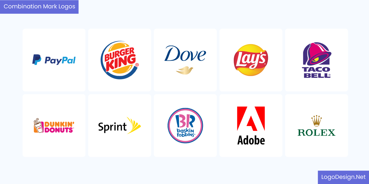
These are 10 combination mark logos of different businesses
This makes it easier for customers to associate the name with the symbol from the start. Once they are recognized, quite a few brands remove their name or texts from the combination logos. The symbol can be identified on its own.
When to Choose
Combination logos are a wise choice if you’re building a new brand, as they help establish both name and symbol recognition from the start. They offer great flexibility, allowing you to use the icon on its own later for things like social media profiles or app icons while maintaining consistency. This format also strikes a perfect balance, providing the clarity of a brand name alongside a memorable graphic element. It can help strengthen your visual identity without sacrificing readability.
The iconic three-bar logo of Adidas
Adidas: It uses a combination of its name in a sleek, lowercase sans-serif font with its famous three-stripe icon. The logo symbolizes performance, challenge, and athleticism.
The logo of Lacoste, which shows the crocodile with an open mouth
Lacoste: The combination logo features its elegant crocodile symbol alongside a simple wordmark. It has built trust and recognition with the combination logo and now features the crocodile alone on shoes or clothes.
Emblem Logos
This type of logo style has the text within a symbol or icon, mostly a badge, crest, or seal. This style gives off a classic, authoritative vibe and is commonly used by schools, government institutions, sports teams, and craft-based brands.
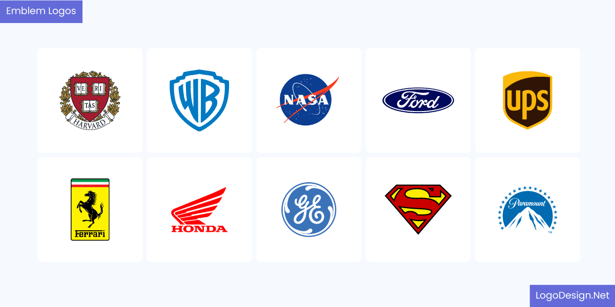
These are the companies that have emblem logos
For emblems, the text and symbol appear together, as a single image. Think of it like a famous crest or a wax seal. It showcases history and tradition, including multiple detailed elements. You will find these logo types to be quite different from others. You may also find metallic logo styles as emblems since the shield or badge works well for the effect.
When to Choose
Emblem logos are ideal when you want to convey a sense of tradition or heritage, making them a strong choice for established or legacy-focused brands. They are particularly popular in sectors such as education, sports, and luxury goods. An emblem can create an immediate sense of exclusivity and craftsmanship that sets your brand apart.
The logo of the National Football League, one of the biggest sporting events in the world
NFL: Shaped like a shield, it incorporates eight stars, a football, and red and blue stripes representing both the sport and roots of American football.
The luxury car brand, Porsche’s logo
Porsche: It includes elements from the Stuttgart city seal, like a horse and stripe, which are both symbols of power and elegance.
Logo representing the Coat of Arms of Yale University
Yale University: The logo features an open book and text in an elaborate circular design. This emblem showcases the university’s history while also making it clear what it stands for.
Mascot Logos
Such logos are illustrated in a fun or memorable style and include a character, figure, or animal that can be associated with the brand. Mascot logos are designed to draw attention to a business’s purpose, values, and personality. They are usually colorful, friendly, and approachable, and are often used to create a strong emotional connection with audiences.
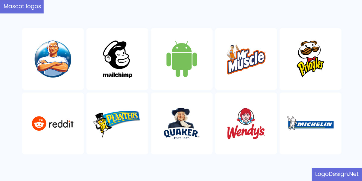
These are the businesses that have Mascot logos
Mascots can help brands humanize their services, build a community, and make a lasting first impression. Just think of popular characters such as Mr. Peanut from Planters. The brand is known for its mascot more than anything else globally.
When to Choose
They work well for sports teams, food businesses, restaurants, educational services, and associations where building emotional connections is key. A mascot logo can become a recognizable and relatable character that brings your brand to life. It’s also easier to recall and remember playful or interesting figures that represent business. Take a look at a few examples here.
The Logo of Kentucky Fried Chicken (KFC), displaying Colonel Sanders
KFC: Colonel Sanders is a classic mascot that creates trust and familiarity among children and adults.
This is a logo of Pillsbury, known for providing baking products
Pillsbury: The Doughboy adds friendliness and approachability to the brand’s image.
Duolingo logo – the platform that helps people learn languages
Duolingo: It has become one of the most recognized mascots everywhere. The owl plays a key role in creating recognition and attracting new customers, especially among Gen Z.
Dynamic Logos
When it comes to logo design types for brands, these may not be that commonly seen. Dynamic logos are highly interactive and can adapt or change based on specific settings or occasions, like the Google Doodle. While static logos remain unchanged on display across print and digital mediums, these responsive logos are more flexible. They maintain a consistent core element, such as a shape, symbol, or typography, but can feature variations in color, pattern, layout, or motion.
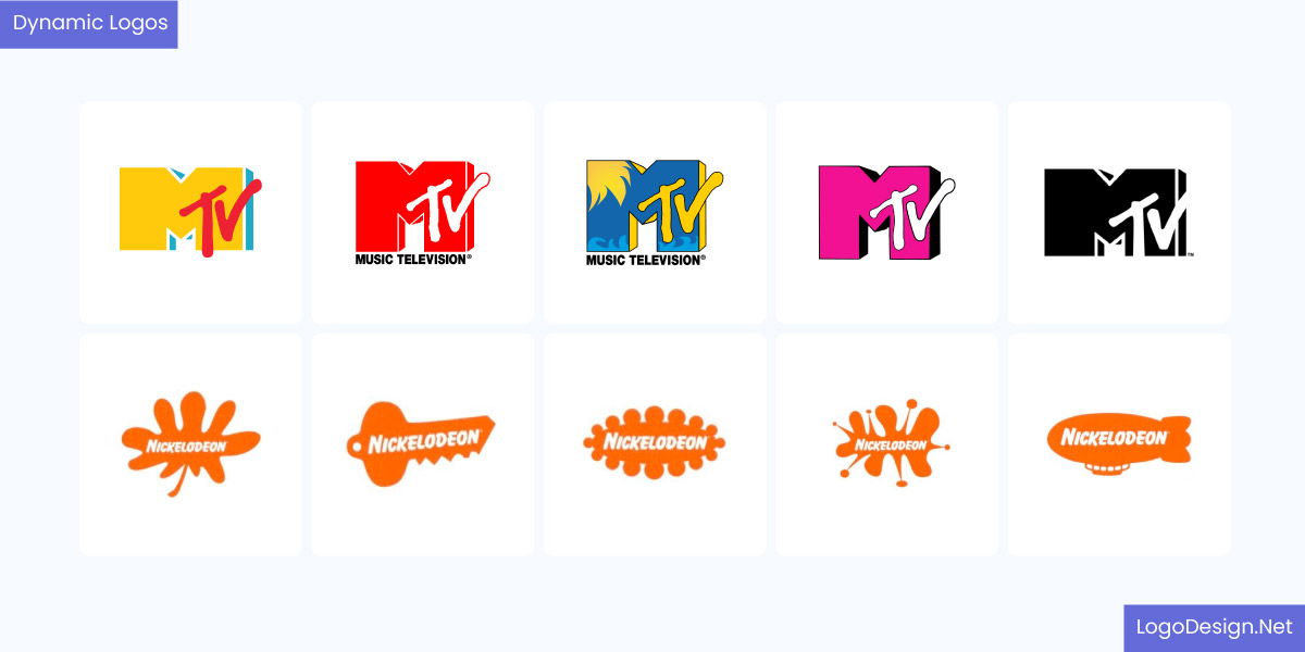
This image shows the logo evolution for MTV and Nickelodeon
This helps the brand stay relevant and connect with a diverse audience across different platforms. For marketing campaigns, you can easily change your logo to draw attention to a new product, feature or service.
When to Choose
Brands can use dynamic logos to keep attention for a long time and show their creativity. You can go with this logo style in industries like technology, apparel, or crafts. Show variations of your logo when launching new content, campaigns, or collaborations. A dynamic logo communicates flexibility and relevance without compromising brand recognition.
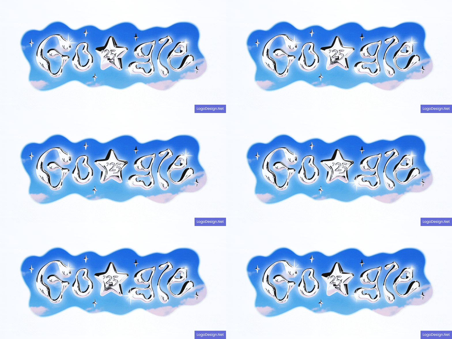
Google Doodle, that changes based on different events and worldwide happenings
Google Doodle: The wordmark changes through Google Doodles to celebrate global events, holidays, and culture.

This is a wrapped and dynamic Spotify logo
Spotify Wrapped: It introduces variations of its brand elements with ‘Wrapped’ that comes out at the end of every year. The campaign focuses on personalization and lasting connections.
3D Logos
With visual elements like lighting, perspective, shadow, gradients, and textures, 3D logos create a real, dimensional appearance. Instead of a static visual or image, a 3D design can be quite versatile. They can have animated versions in video formats or include holographic effects as well.
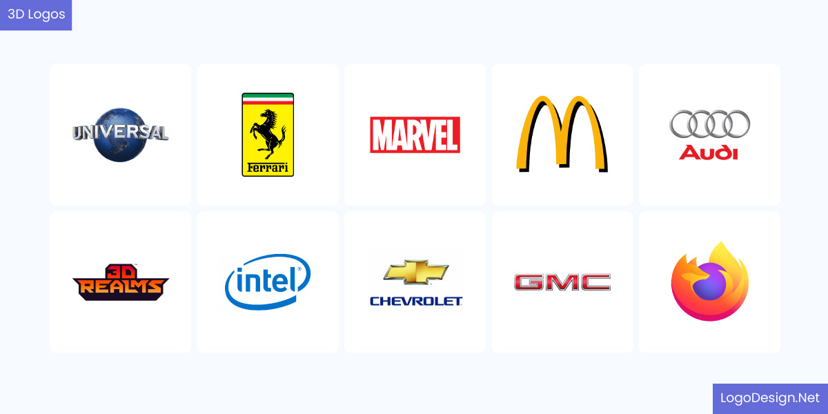
This images shows 10 businesses having 3 logos
It’s easier to enhance packaging and outdoor signs with 3D logo designs too. The symbol is not just seen but felt in a way.
When to Choose
A 3D logo is just the right choice for businesses that want to convey a bold and innovative image. These designs have a strong visual impact in industries like gaming, VR/AR platforms, film production, automotive, and tech products. If your business is mostly based across digital platforms such as apps, social media or websites, then you could go with 3D logos.
But keep in mind that you may find it a bit challenging to display such designs in smaller sizes or on print materials. So, it would be a good idea to also create a flat variation of your logo for promotional campaigns. To give you a better understanding of 3D icons, here are a few recognizable designs
This is the Xbox logo, a famous video game brand
Xbox: The circular ‘X’ symbol uses dimension to show a futuristic appearance and communicate their expertise in innovation.
This is the Ford logo, a renowned vehicle brand
Ford: Its historic logo has a 3D metallic effect that draws attention to the brand’s industry and core message
Negative Space Logos
Negative space logos use empty or white space to create shapes, letters, or symbols. This clever use of space can include a hidden message or imagery in the logo. It’s a subtle yet powerful style that makes the logo memorable and attractive.
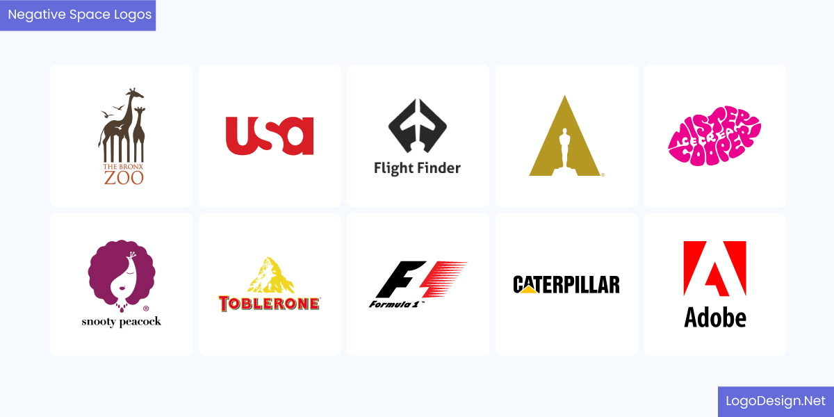
These are the 10 logos with minimalist layouts and negative spaces
These logos can have clean, minimalist layouts that keep the focus on the negative space and what it creates within the design.
When to Choose
You’ll find negative space logos being used across industries. Businesses like architecture firms, creative agencies, fashion brands, and tech startups that want to get people talking with their messaging choose these logotypes.
Since they are simple and easy to scale, negative space logos can maintain their quality and resolution on business cards, billboards, or mobile app icons. You can design a negative space logo and choose this style to tell a powerful story that remains in memory for a long time.
This is a logo for FedEx, a logistics company known around the world
FedEx: The hidden arrow between the ‘E’ and ‘X’ symbolizes speed and precision, and is known to be a great example of negative space logos
This is a CNBC logo, that illustrates peacock wings
NBC: It has a white space between the colored feathers to show a peacock and represent its position in broadcasting.
These are the key types of logos that you will find commonly find in every industry today. It’s important to choose the right type that represents your business closely and does not create any confusion among the target audiences. While the combination logo is a popular choice, you can also go with logo design styles that are experimental and creative.
Frequently Asked Questions
What are the main types of logos, and how do they differ?
The main types of logos are:
- Wordmark: Only has text or name as the logo
- Lettermark: Includes just two or three letters
- Pictorial: A single image that represents the brand’s purpose
- Mascot: A character or figure associated with the brand
- Combination: Has both image and text in the design
How do I choose between a text-based logo and a symbol-based logo?
Consider your goals, industry, message, and purpose. Text-based logos can help your brand name get recognition from the beginning and be clear. A symbol-based logo could be a good choice if your brand already has a strong position, as you can use it alone without any text or name.
Which logo style works best for small businesses and startups?
Combination logos are a great choice since they have both imagery and text. But you can opt for minimal, 3D, or negative space logos that draw attention to your business’s values, personality, and niche.
How does industry type influence the choice of a logo design?
Different industries have requirements or preferences that influence logo choices. Companies in the tech or digital space often opt for minimalist logos, such as monograms, abstract icons, or simple wordmarks. The food and beverage industry has businesses choosing logo styles that are creative, pictorial, mascots, or illustrations.
What are the key factors to consider when selecting a logo type for long-term branding?
Focus on memorability, simplicity, versatility, and relevance before anything else. These are the key factors that make it easier for your logo to last for years and create recognition with long-term branding.
