Colors drive brand awareness and memorability. Make the right choice for print-ready postcard designs.
Whether you’re creating a postcard, brochure, or any other printed material, the colors you choose can bring out emotions and send a strong message. It is important to understand that the way colors appear on a screen is different from when they are in print. This is where color profiles, specifically CMYK and RGB come in.
While RGB (Red, Green, Blue) is used for digital media and screens, CMYK (Cyan, Magenta, Yellow, Key/Black) is the standard for print. Understanding different color models and how they work together can help you achieve print-ready postcard designs in a short time.
What Are Color Profiles?
A color profile differentiates between how a device captures or displays color and where the color is printed or seen. They are used to manage how colors are represented and viewed across different devices.
| Profile | Gamut Size | Best Use |
| sRGB | Standard | Web, general use |
| Adobe RGB | Wide | Photography, print |
| ProPhoto RGB | Very wide | Professional photo editing |
| CMYK | Print-specific | Commercial printing |
| Display P3 | Wider than sRGB | Modern screens, HDR design |
| ICC Profiles | Varies | Device-specific color accuracy |
| Rec. 709/2020 | Video-specific | Video production and broadcasting |
These profiles ensure that the colors are consistent and accurate, no matter the platform or material. If you want check the design in different-colored backgrounds, you can run the monochrome vs. multicolored test to ensure the design is clearly visible.
The Role of Color Profiles in Postcard Design
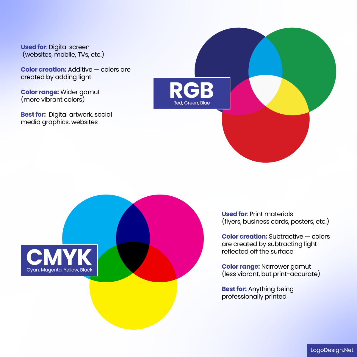
It can be tricky to go from digital to print with the right color profile, as colors that look bright and bold on a screen may not appear the same in print. Digital screens use the RGB color profiles for display, while print media relies on ink and the CMYK model. This is why you see a difference between the colors on your screen and the final printed output.

Wide range of RGB and CMYK color shades to add light and use on digital screens and print materials
Colors in postcard design grab attention and make your message clear. Bold colors like red or yellow create a sense of urgency. Softer tones such as blue or green, think trust and calmness, are what your audience will respond to. To make your postcard really stand out, you need to get the contrast between text and background just right. That means choosing colors that reflect your brand identity and also make your message shine through.

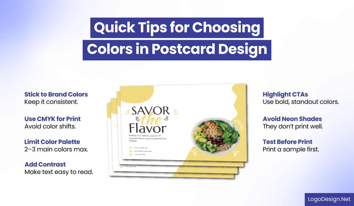
Tips for choosing the right color for a postcard design to make readable on digital screens and print materials
If you don’t use the right color profile, you might end up with faded or darker results. CMYK produces the vibrant, accurate colors you see in print. RGB is optimized for screens, where colors appear in their original format. But here’s what you need to keep in mind: CMYK has its limitations compared to RGB. You need to consider those when you’re printing designs. And when you’re proofing your print materials, you want to catch any color discrepancies before they go out the door. Digital postcards can look more vibrant on screens.
By using an accurate color profile, you make sure that your design will look as good on paper as it does on screen.
Color Choices in Print and Digital Postcards
When designing postcards for print, it’s incredibly important to understand how different color models affect your final version. The two most common models, RGB and CMYK, cannot be used in place of each other. Each has its purpose, and using the wrong one can result in inaccurate colors being presented in the postcards after printing. Also, take the cultural impact of colors into account, as the same colors might be perceived differently in various locations.
Let’s take a look at each model in detail, how they work, and how they impact your postcard designs.
RGB (Red, Green, Blue) – An Additive Color Model

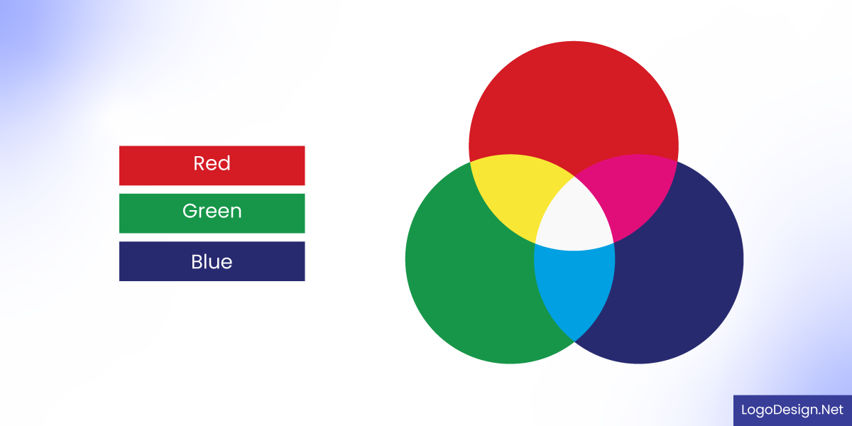
Light hues that can be achieved by adding RGB colors
RGB is used in digital displays and works by adding colored light together to produce various hues. When all three colors (red, green, and blue) are combined at full brightness, they create pure white. Think of it like mixing colored spotlights.
- Used for Screens
This color model works with anything that has a backlight: websites, phone screens, laptops, TVs, and digital images. It’s ideal for digital postcard designs as the colors show in their original format and sometimes brighter too.
- Produces Bright Colors
Since RGB works with light, it’s capable of producing intense colors, like electric blues or neon greens, that are often impossible to create in print. This makes RGB ideal for eye-catching visuals on digital platforms.
CMYK (Cyan, Magenta, Yellow, Key/Black) – A Subtractive Color Model

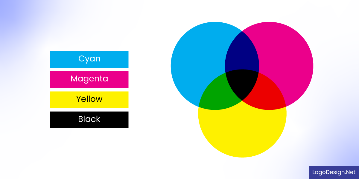
Cyan, Magenta, Yellow, Black, a subtractive color model to give darker color shades
Unlike RGB, CMYK works by subtracting light. It begins with a white canvas (such as paper), and each layer of ink blocks or absorbs certain wavelengths of light. Combining all the colors results in a darker color, which is why black is added to enhance depth and contrast.
- Used for Physical Printing
CMYK is the standard color model for all printed materials, be it postcards, brochures, flyer designs, packaging, posters, and magazines. Commercial printers mix these four inks to reproduce your design on paper. When it comes to printed postcard design, this is a good choice as your colors do not get distorted.
- Reflective Color, Less Vibrant Than RGB
Since printed colors rely on reflected light rather than natural light, they typically appear more muted or softer than what you see on your screen. The vibrant color is affected by ink and paper type, making it important to design with print limitations in mind.
You need to make a choice depending on your medium. For postcards in print, the CMYK model might be the better choice, and RGB will work well for digital designs. This is why different industries use colors according to their medium.
How Color Models Influence Postcard Designs
Designing postcards that appear perfect from screen to print requires an in-depth understanding of color theory and models. From choosing the right model to communicating about your expectations with your printer, every detail matters.

Comparison between the RGB and CMYK model, with one being lighter and the other being darker
To help you get the desired results, let’s take a look at some of the key considerations of color models that influence postcard designs.
• CMYK Requires Precision for Printing
If you think about it, cyan, magenta, yellow, and black inks are commonly used to create colors. Now, designing in this profile allows you to see a more accurate version of how your colors will appear when printed but you will have to be precise.
Consider all factors such as the tones, hues, and materials for printing very carefully. If you want a glossy or matte finish in print, choose colors accordingly. When it comes to the RGB profile, your colors are quite vibrant on screen, so for muted color palettes, you may have to make adjustments in your digital postcards.
• Accurate Colors with Pantone System
Think about using Pantone colors to see exact colors where required, such as for visual assets in print and digital postcard designs. The Pantone Matching System (PMS) helps you maintain brand consistency across various printers, materials, and on screens. With such colors, you can create versatile logos and graphics that are consistent everywhere. They provide a precise color match, unlike the CMYK model, which can have a few differences.
• RGB Supports Wider Range of Colors
This color profile works well with digital postcard designs, as you can use a variety of colors. It supports highlights, neon colors, gradients, and additional effects, too. In CMYK, you do not have a lot of room to be creative, as brighter colors or shadows are not visible in print postcard designs. So, if you are only going to be designing digital ones, you can opt for the RGB color profile for a more inclusive and accessible design. Converting to CMYK later on could present a few challenges, as the colors could appear faded or less vibrant.
For print, start working in CMYK and stick to that with solid tones or hues. Adding effects or complex gradients may not be a good idea in this color profile.
• Color Proofing for Consistency
Before you finalize your postcard designs, always do color proofing. This can be a digital proof or a physical test print from your printer. It helps you catch the common color mistakes, like any color mismatches or image quality issues, before you go ahead. If you’re working with a professional printer, they may offer a soft proof or hard proof to give you a realistic preview of how your design will print.
• Screen and Print Resolutions
You have to follow the specifications for color reproduction on screen and in print to get the desired results.
- Preferred file formats (such as PDF/X-1a for press-ready PDFs
- Bleed and margin sizes (typically 0.125 inches for bleed)
- Required resolution (at least 300 dpi for print-quality images)
- Color profile settings (some printers may require specific ICC profiles)
- Paper type and finish options
• File Sizes for Color Profiles
It is essential to note that color profiles affect both file size and output. For digital postcard designs, the RGB profile enables easy file sharing. You can go with PNG and JPEG and PDF to make it simpler for your audience to save and share the postcard designs. These formats are lightweight and can work well in newsletter campaigns or websites. Since the file size is smaller, the loading time or page speed does not get affected.
In CMYK, the file size is larger since a higher resolution is required. To be printed with accurate color, postcards have to be shared in TIFF, PDF, or AI formats. So you need to consider that it could impact the output if the file is compressed or in a different format.
• Paper Stock and Finishes
The type of paper you choose can make a huge difference in how your postcard design looks once printed. Paper weight and finish (matte, glossy, textured) will affect both the look and feel of your postcards, along with impacting how they are perceived. For example, glossy finishes are a trend that makes colors pop, while matte finishes look more elegant. Before opting for this color trend, be sure to ask your printer about the options and how your design will work with different paper types.
It is essential to understand color profiles for your print and digital postcard designs. Make sure you know which color model is better for the desired results. It is a good idea to communicate your requirements beforehand and then get your postcards printed. Start working in CMYK on your own to see how the colors will appear first. Once you have a clear idea of that, you can partner up with a reliable printer for your printed postcards.
Key Takeaways
- The correct color profile helps you make sure that the postcard’s colors appear as they are across different devices and formats.
- Digital postcards should use an RGB color profile as it provides a wider color range for screens. Printed postcards require a CMYK profile for accurate colors on paper.
- Designing a print postcard in RGB can lead to distorted or faded colors. And using CMYK for digital use can limit vibrancy and clarity on screens.
- Always soft-proof digital postcards using RGB and check the print output with CMYK proofing tools in your design software.
- Whether your postcard is viewed on a mobile screen or on paper, color profiles help maintain brand consistency.
