Who knew circles, triangles, and squares could carry so much personality? Let’s decode how these simple shapes stick in your head (and heart) and secretly build the world’s most unforgettable brands!
If you think about it, geometric logos stand out for their simplicity, versatility, and timeless appearance. They include shapes like circles, squares, and triangles, to name a few. Geometric logos use basic forms to communicate complex ideas and make a strong visual impact. Their clean lines and structure make them instantly recognizable.
But why do geometric logos work so well? What meanings do these shapes carry, and how can designers implement the psychology of shapes to get their message across? Well, there are quite a few ways. So let’s explore the visual and practical advantages of geometric logos and outline a step-by-step approach to designing them well.
What Counts as a Geometric Logo (and What Doesn’t)?
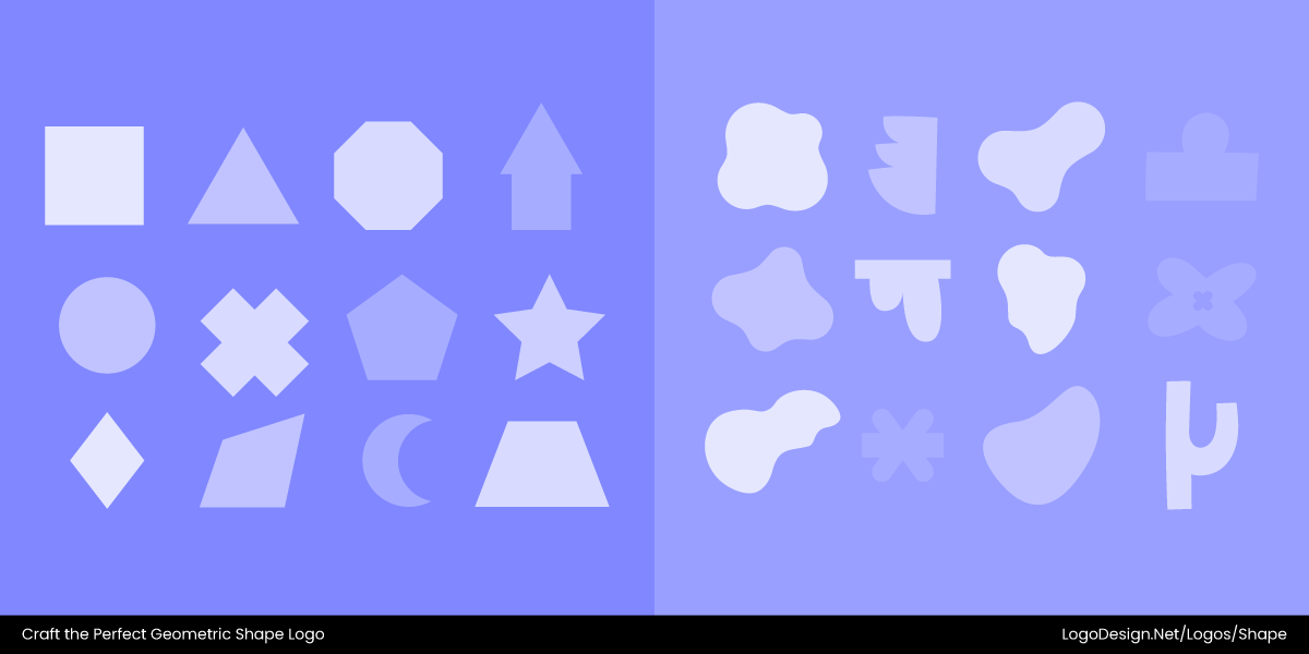
Geometric shapes like circles, squares, triangles, polygons, and more, whereas non-geometric shapes have freeform and abstract curves
A geometric logo is one that has basic shapes like circles, squares, triangles, lines, or polygons. The design is based on precision, symmetry, or proportion, giving it a structured and timeless feel.
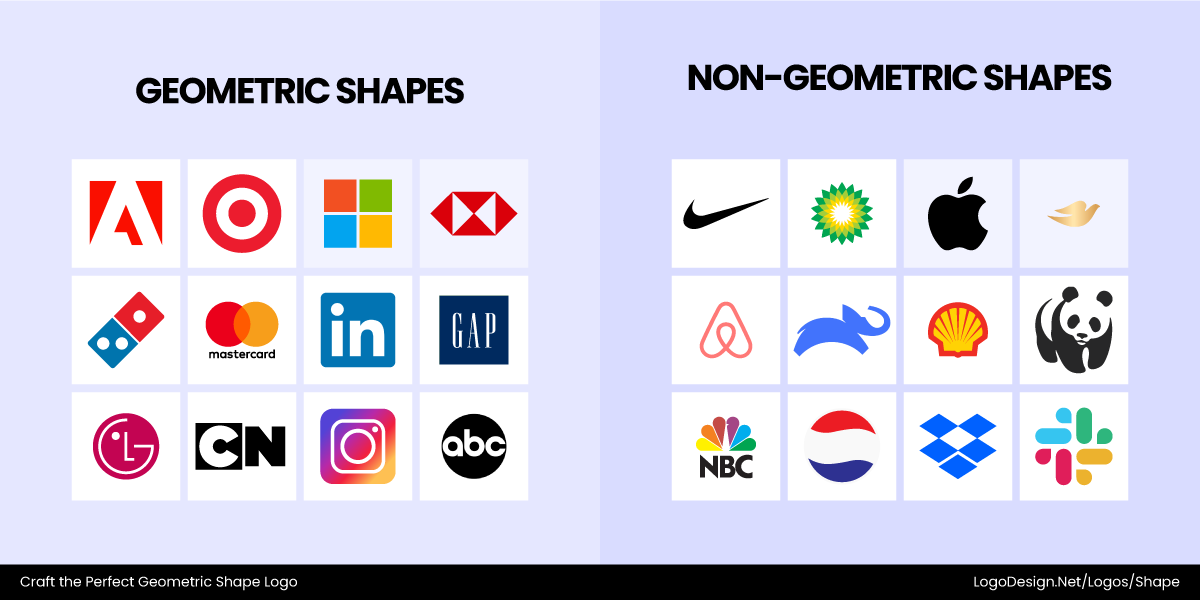
Geometric-shaped logos like Adobe, Target, Microsoft, and more, and the non-geometric-shaped logos like Nike, Airbnb, Shell, and others
Geometric logos are defined by clarity and reduction. They strip visuals down to essentials. If a logo feels painterly, sketch-like, or deliberately irregular, it’s not geometric. A very precise one that seems proportional and balanced is definitely geometric.
Why Geometric Logos Work?
Here are a few factors that will help you understand how these geometric logos make the right first impression.
• Cognitive Clarity
Geometric logos use simple, clean shapes that the human brain processes almost instantly. Because our minds naturally recognize circles, squares, and triangles, these designs achieve exceptional cognitive clarity—they’re easy to recall and identify at a glance. This clarity makes geometric logos especially effective in crowded industries like tech, construction, and retail, where quick recognition is essential. Whether displayed on a bustling street sign, a small app icon, or a moving ad, their structured simplicity ensures instant impact.
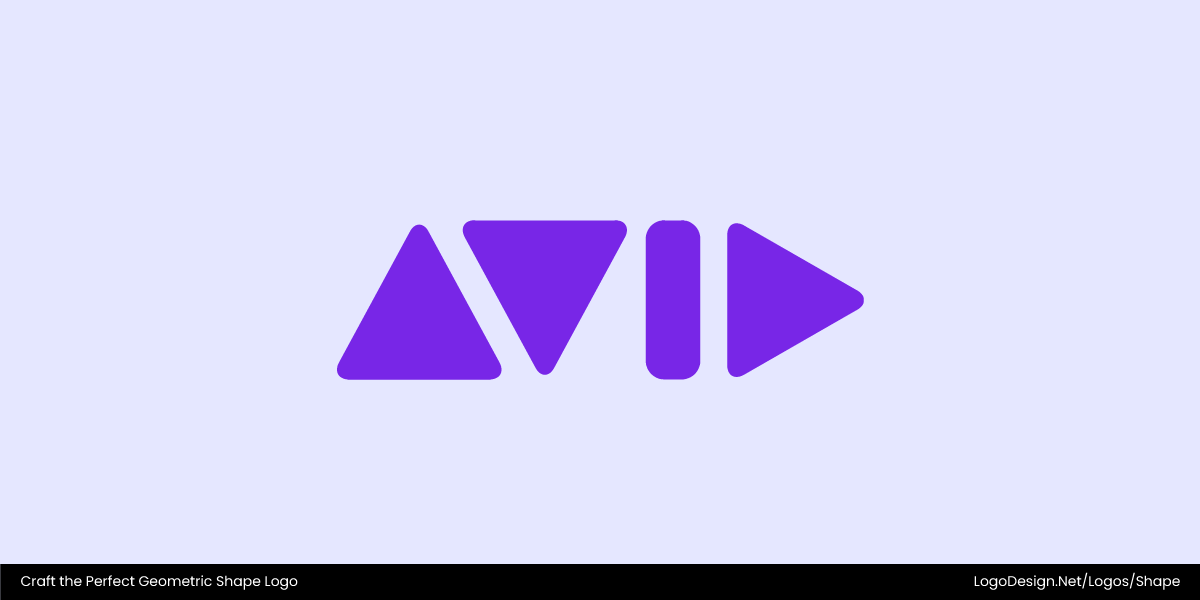
A perfect example is Avid Technology’s triangular and rectangular shapes, which form the company’s name through pure geometry. The precise angular construction not only reinforces the brand’s connection to creativity and technology but also ensures instant recognition across digital and media applications.
• Visual Flexibility
Geometric logos offer exceptional visual flexibility, adapting effortlessly across all media and formats. Their scalable shapes preserve clarity and meaning whether displayed as a tiny favicon, a large billboard mark, or a sleek motion graphic. With clean lines and precise proportions, they can be resized, cropped, or layered without losing their visual strength.
Mitsubishi logo with three interlocking diamond shapes that show adaptability and balance
The Mitsubishi logo, composed of three interlocking diamonds, perfectly demonstrates this adaptability—its sharp geometry and balanced form ensure instant recognition in any size or setting.
• Timelessness
Geometric logos achieve a sense of timelessness through their abstract and universal nature. By avoiding overly stylized trends, they remain visually relevant and adaptable across generations. These designs use simple, universal shapes to express enduring human values such as trust, unity, energy, and innovation. A circle, for instance, conveys wholeness and connection, while a triangle suggests direction and progress. This balance of simplicity and meaning allows brands to maintain a consistent, lasting identity without frequent redesigns.
Target’s logo with two circular shapes, showing a timeless appeal that’s clearly recognizable
Target’s concentric circles embody this timeless appeal perfectly—clear, bold, and instantly recognizable across decades.
• Ease of Production
Detailed logos often lose clarity when resized or reproduced on various materials. Geometric logos, however, simplify production with clean, scalable shapes that retain their integrity across every format. Their minimal details make printing, embroidery, and digital rendering seamless, ensuring the logo always looks sharp and consistent.
Domino’s Pizza logo has two tiles of different colors, hinting at a pizza box
Domino’s tile-inspired design demonstrates this efficiency—its bold geometry reproduces flawlessly on everything from pizza boxes to storefront signs.
Bonus Read: Find out how another aspiring Pizza brand created a new logo to get the attention of Pizza lovers.
The Meaning Behind Core Geometric Shapes
Let’s take a look at some of the most common shapes and what they are associated with.
1. Circle / Oval
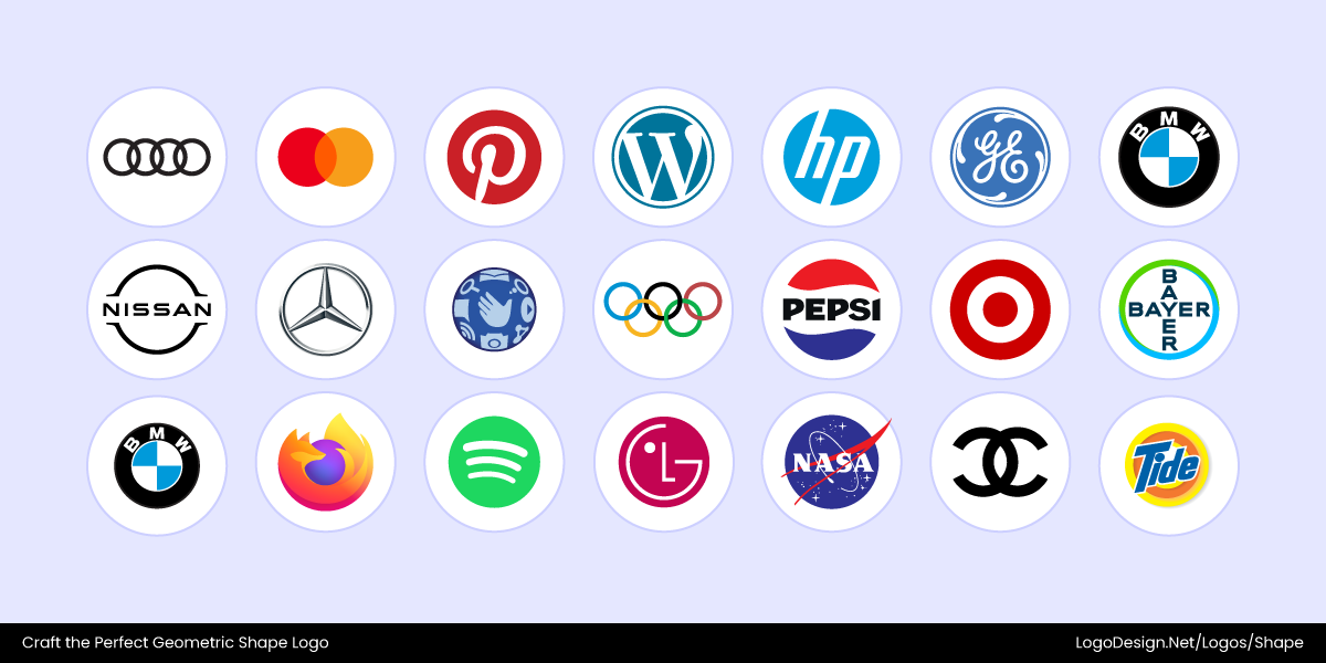
Brand logos that use a circle/oval shape that have rounded edges, showing unity and friendliness
The circle is universally connected with ideas of unity, friendliness, and community. It has no beginning or end, showing continuous movement. With soft, rounded edges, the shape feels welcoming and inclusive.
The power of circle logos can be seen in brands that want to send a message of social connection, harmony, or timelessness. They are commonly found in seals, social media platforms, and organizations that want to appear as approachable and for everyone.
2. Square / Rectangle
Brand logos using square shapes to suggest stability and reliability
Squares and rectangles convey stability, reliability, and order. Their balanced, right angles suggest structure and trustworthiness. As they’re foundational and solid, these shapes are known to be dependable and grounded.
These shapes are popular with corporate brands, financial institutions, and tech company logos. They’re also used to communicate professionalism and strength.
3. Triangle
Brand logos that use triangular shapes to suggest energy and direction
The shape is associated with energy, direction, and progress. Their pointed angles naturally show movement and forward momentum. But you need to keep the orientation in mind, too. An upward triangle means stability and power, and a downward one might show caution or danger.
Triangles are common in innovation-driven sectors like cloud computing, cybersecurity, and sports logos. They communicate speed, agility, or forward-thinking.
4. Line (Horizontal / Vertical / Diagonal)
Brand logos that use horizontal, vertical, and straight lines to show strength and authority
Horizontal lines show calmness and stability, vertical lines evoke strength and authority, and diagonal lines in the design are used for dynamism and action. They are featured as separators in layouts or to subtlety hint at motion and direction.
5. Polygon / Star / Hexagon
Brand logos that use polygon, star, and hexagon shapes to show sophistication and craftsmanship
Polygons and complex shapes are associated with sophistication, complexity, and craftsmanship. The hexagon, for example, can mean efficiency and creativity because of its appearance and properties like a honeycomb. These shapes are perfect for brand logos in engineering, science, or product ecosystems where structure and precision matter.
6. Negative Space
Brand logos that have negative space in them to show creativity and multiple messaging
Clever use of negative space creates hidden meanings and adds an element of surprise or discovery to a logo. It shows intelligence, creativity, and dual messaging. Negative space is used to hide letters, symbols, or shapes inside the logo. This makes it memorable, but it’s important to keep in mind that the meaning is clear.
How to Design Bold Geometric Logos?
When focusing on geometric logo design, a structured and thoughtful process is essential. Here’s how to design such icons to build an iconic brand and some of the factors to keep in mind.
Step 1: Define Your Audience and Brand Brief
It’s very important to understand the brand and its audience. What are its personality traits, core values, tone of voice, and target customer? Who are the competitors, and how is the brand positioned within its industry? These elements make up the brand brief as well.
- Personality and Values: A serious financial brand might use strong, stable shapes, while a creative tech startup could use dynamic, flowing forms.
Minnesota Family Magazine logo uses a heart-shaped icon to show warmth, care, and emotional connection
Minnesota Family Magazine uses a heart shape to symbolize warmth, care, and emotional connection—qualities that align perfectly with its focus on family life and nurturing relationships.
Star Tribune uses a star shape icon to show authority and guidance
In contrast, the Star Tribune features a star shape, representing aspiration, guidance, and authority—traits that reflect its role as a trusted source of news, insight, and direction in the public sphere.
- Tone of Voice: The logo should convey this. Round, soft shapes or sharp, angular ones influence people’s understanding of what the brand is trying to say.
Beyond Sport logo uses rounded, overlapping shapes that show inclusivity and connection
Beyond Sport uses rounded, overlapping shapes in its logo that convey connection, inclusivity, and shared purpose—reflecting its role as a global platform uniting organizations through sport.
The PeacePlayers logo uses icons of various shapes to show energy and collaboration
PeacePlayers, by contrast, uses more dynamic, angular figures to express movement, energy, and collaboration, capturing the brand’s focus on action, teamwork, and breaking down barriers through play.
- Target Audience: A logo for a Gen Z audience will likely differ significantly from one for a more mature demographic.
Retirable logo has a rectangular border with a circular icon inside, showing simplicity and steadiness
Retirable relies on simple, steady shapes that project stability and reassurance. The clean horizontal layout and balanced proportions reflect a sense of structure and calm — qualities that resonate with an older audience seeking security and dependability.
GoHenry logo uses rounded and bubbly shapes to show movement, openness, and fun
GoHenry’s logo uses rounded, bubbly shapes that feel fun, open, and full of movement. The circular forms convey wholeness, friendliness, and creativity, perfectly matching a brand aimed at young users learning to manage money with confidence and enjoyment.
- Competitive Analysis: This is mostly about finding inspiration from similar businesses and the rules of logo design in your industry.
The Sprouts Farmers Market logo uses gentle and rounded curves to show a natural cycle of growth
Sprouts Farmers Market uses gentle curves and a rounded composition that echoes the natural cycle of growth and freshness.
The Whole Foods Market uses a circular background to show a community appeal
Whole Foods Market incorporates circular balance and soft contours to project warmth, community, and natural abundance.
The Organic Valley logo has an oval-shaped seal showing the horizon and farmland
Organic Valley’s farm logo features an oval seal that recalls the horizon and farmland, reinforcing purity and trust.
Many competitive brands in this space follow similar circular forms because these shapes feel organic, nurturing, and universally comforting — mirroring the industry’s focus on sustainability and well-being.
Step 2: Run a Semiotic Audit
A Semiotic Audit examines how shapes and symbols operate across a brand’s industry to reveal shared visual codes and opportunities for differentiation. If most competitors use circular forms to express inclusivity and balance, introducing a square or triangle can convey groundedness or forward motion instead.
In wellness branding, where smooth, rounded shapes and soft geometry often prevail, introducing a hexagonal pattern can convey interconnectedness and structural strength. The hexagon — frequently referenced in sacred geometry and found in nature’s designs like honeycombs and crystals — symbolizes harmony, balance, and the unity of parts forming a whole. These associations lend depth and meaning to a brand’s visual identity while setting it apart from more conventional forms.
Cultural associations further shape how we perceive logos: blue and circular shapes often suggest trust, care, and calm—qualities ideal for health and wellness brands.
Circle Medical, NimbleRX, and Maia logos, showing different variations of the circular shape
For instance, Circle Medical uses a soft circular mark to represent holistic care and connection; NimbleRx incorporates rounded, flowing forms that imply smooth, reliable service; and Maiafeatures circular balance that conveys support and harmony.
Arrow Tool Group, Apex Tool Group, and Max Tools using angular arrows and dark tones to show strength and performance
In contrast, angular arrows and dark tones project strength, precision, and performance—common in industrial and tool sectors. Arrow Tool Group uses sharp arrow forms to communicate direction and technical expertise; Apex Tool Group employs a bold, angular emblem symbolizing advancement and engineering precision; and Mac Tools features pointed geometry and strong contrast to express durability and power.
Understanding these semiotic signals enables designers to align logo shapes with brand meaning while maintaining distinction in a crowded visual landscape.
Step 3: Create Moodboards with Visual References
Find inspiration around you, like within architecture, patterns in nature, product designs, or existing geometric marks. Moodboards help clarify direction and build lasting creative connections.
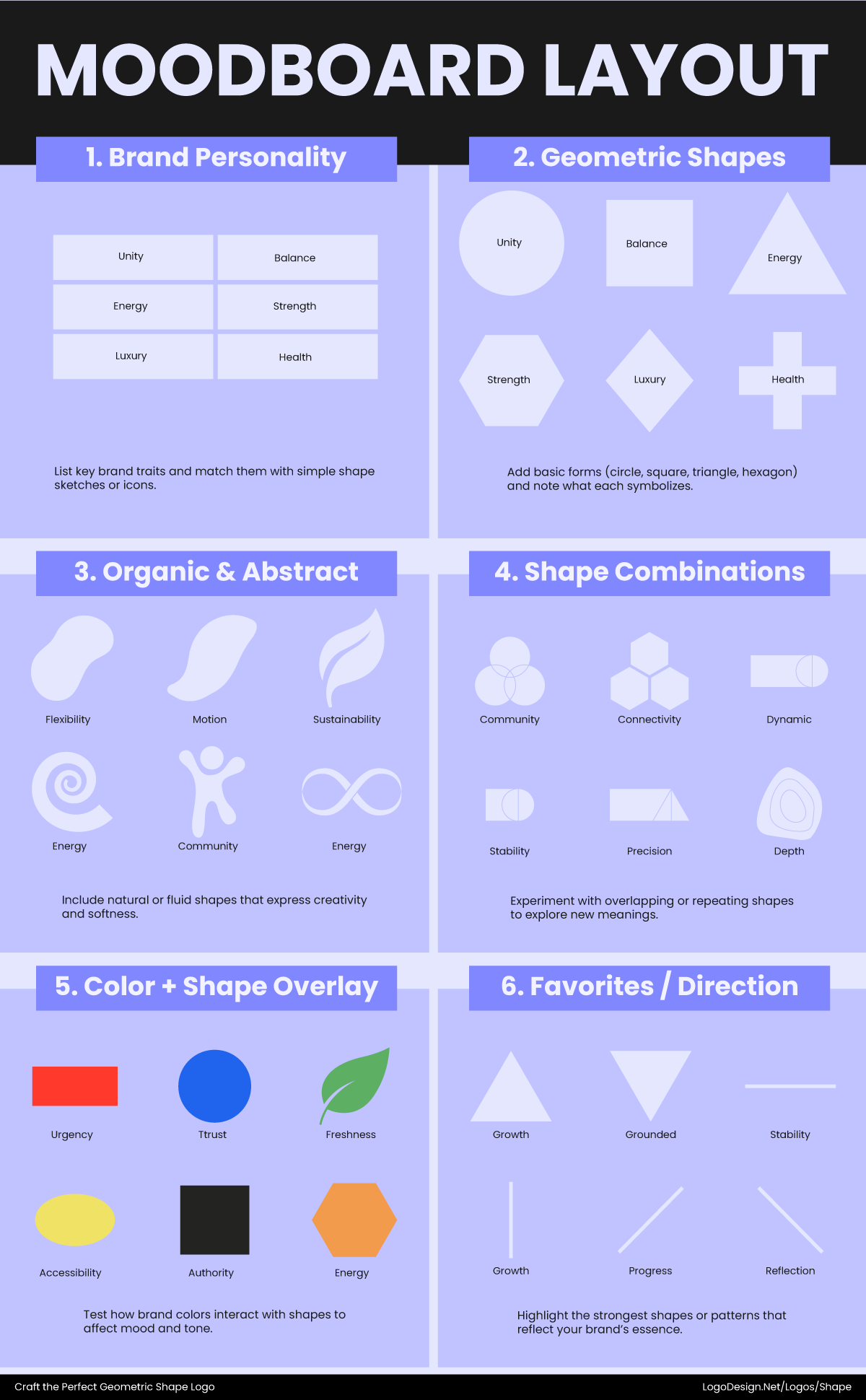
Logo moodboard shows brand personality, along with the geometric, organic, and abstract shapes, as well as shape combinations patterns
A moodboard helps you define the feeling of the brand. Is it sleek and minimalist? Is it complex and intricate? This collection of images acts as a visual guide so you can make sure that all your design ideas are aligned with what you want.
How to Create a Moodboard for a Brand Logo
Creating a moodboard helps you visualize the personality and tone of your brand through shapes, which are a key part of logo design. Here’s a step-by-step approach:
• Define Your Brand Personality
Decide what your brand should communicate: trust, energy, friendliness, innovation, etc. Shapes carry meaning—circles suggest unity and approachability, triangles imply direction and progress, squares convey stability.
• Collect Shape References
Look at logos, icons, patterns, and even architecture or nature for shapes that reflect your brand values. Save examples of geometric forms (circles, hexagons, triangles) and organic or abstract shapes.
• Group by Emotional Effect
Arrange the shapes by the feelings they evoke. Rounded forms = approachable and friendly; sharp angles = bold and dynamic; intersecting or repeated patterns = interconnectedness and complexity.
• Compare Industry Trends
Include competitor logos and note which shapes dominate the category. This helps you see where you can align with or stand apart from common visual codes.
• Experiment with Combinations
Mix shapes to explore unique compositions. Overlay, rotate, or combine geometric and organic forms to see how they affect perception and brand personality.
• Refine Your Visual Language
Choose the shapes that best represent your brand’s values and tone. These will guide the final logo design, ensuring it communicates clearly and stands out.
Step 4: Consider Wordmap → Shape Mapping
Translate the brand’s keywords and concepts into shapes. Start with the brand’s core keywords such as connected, dynamic, stable, and innovative. Once you associate them with the shapes, it becomes easier to pick a geometric one that matches your design concept and industry as well.
• Connected
A brand that is connected can be represented with circles, interlocking rings, or network-like shapes, suggesting unity and collaboration.
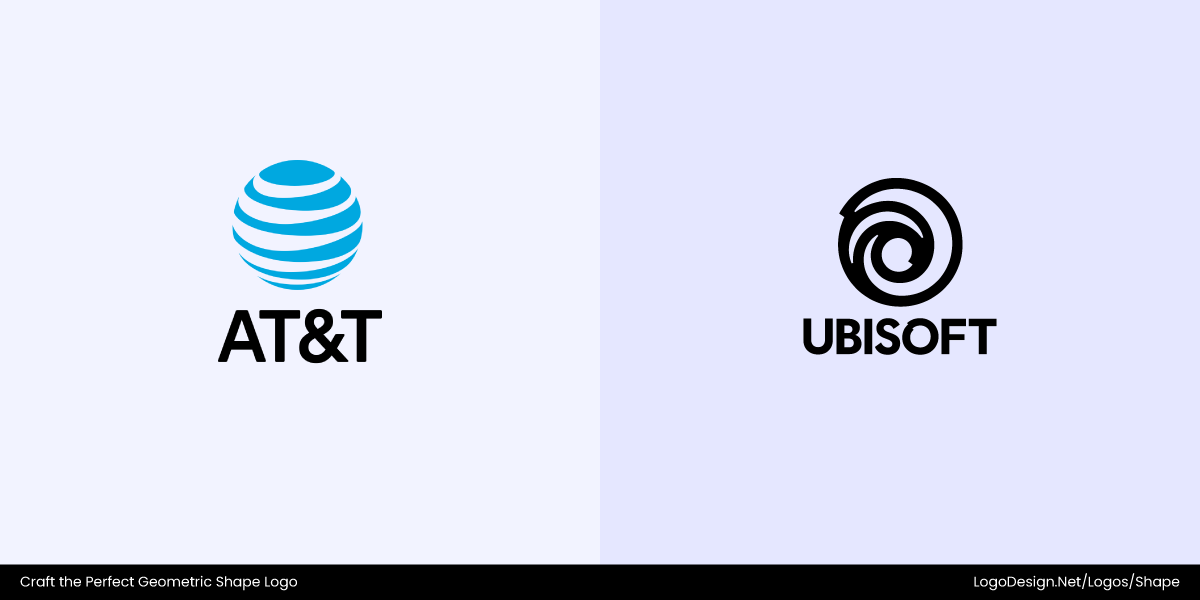
Ubisoft’s swirling circular logo conveys connection and movement within a creative ecosystem, while AT&T’s globe of curved lines symbolizes global communication and interconnected networks.
• Dynamic
A dynamic brand might use triangles, arrows, or spirals, which convey movement, energy, and forward momentum.
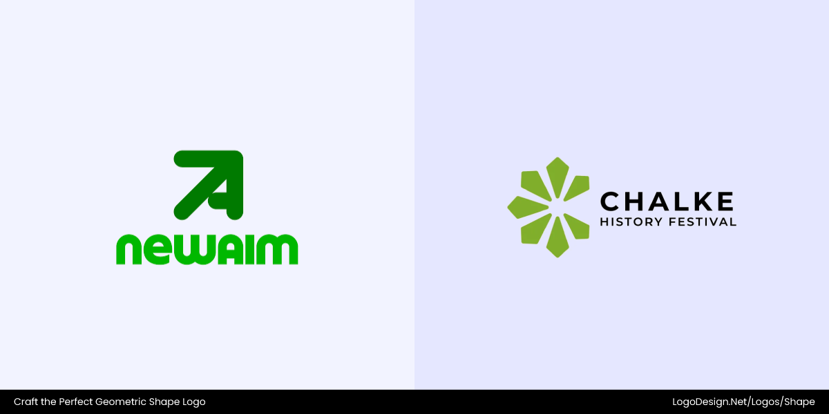
Chalke Festival’s upward, angular form reflects creativity and the lively exchange of ideas, while New Aim’s forward-pointing arrow embodies progress, ambition, and constant evolution.
• Stable
To express stability, squares, rectangles, or pyramids work well, as they communicate reliability and strong foundations.
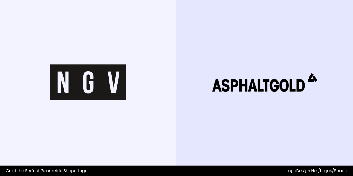
NGV has bold framing and AsphaltGold solid block-style graphics to identify toughness and consistency
NGV’s bold rectangular framing and structured layout give a sense of cultural gravitas and trust; AsphaltGold’s solid block-style graphics ground its streetwear identity in toughness and consistency.
• Innovative
Brands that are innovative can explore hexagons, stars, or asymmetrical shapes, reflecting creativity and forward-thinking ideas.
The HIVE logo has an asymmetrical hexagon-inspired emblem, and Google Gemini uses a stylized star-shaped motif
Google’s Gemini logo uses a stylized star motif with gradient hues to suggest futurism and a spark of insight. At the same time, Hive Home’s emblem leans into an asymmetric honeycomb/hexagon-inspired form to evoke smart, modular, and inventive home energy systems.
• Friendly
A friendly or approachable brand can use rounded squares, soft circles, or ovals to feel welcoming and safe.
The Freely logo uses soft curves and gentle edges, and the Fork logo uses a rounded shape that feels inviting
Freely’s logo and design use soft curves, circles, and gentle edges that suggest ease and comfort, while TheFork’s emblem employs rounded shapes (especially in its icon/button-elements) that feel inviting, familiar, and easy to use.
• Professional
Professional or corporate brands often benefit from rectangles, vertical lines, or shields, which convey trust, authority, and stability.
TwelveLabs logo uses horizontal lines in its icon that convey a structure, and the American Home Shield logo has a shield and house icon to reinforce protection
American Home Shield’s pairing of a house and shield shapes reinforces protection through grounded, interlocking geometry, while TwelveLabs’ use of horizontal, linear bars conveys a sense of layered structure, precision, and technical authority.
• Growth
Brands focused on growth or progress can be represented by arrows, upward-pointing triangles, or rising curves, symbolizing advancement and success.
New Leaders’ logo uses an upwards arrow to show progress, and the Treetops Adventure logo has an arrowhead on a vertical stem to suggest elevation
Treetops Adventure’s logo combines a triangular arrow-head sitting atop a vertical stem in the form of a stylized tree, clearly pointing upward to denote aspiration and elevation; while New Leaders’ logo incorporates a clear arrow motif that emphasizes progress, direction, and forward leadership.
• Trustworthy
A trustworthy or secure brand is well-suited to shields, squares, or circles with lock-like motifs, evoking protection and reliability.
The La Presse logo has a red square to show stability, and the EdgeCore logo uses square blocks to suggest dependability
La Presse uses a bold red square, a shape often tied to stability and trust, giving the brand a sense of reliability and authority. EdgeCore features stacked square blocks, reinforcing its identity as a secure and dependable infrastructure brand built on structure and strength.
• Tech
For tech or digitally connected brands, hexagons, network grids, or circuit-inspired lines convey modernity, innovation, and connectivity.
The Linksys logo uses lines to suggest a connection with networks and data, and the Open Knowledge logo has a circular spiral, showing openness to share
The Linksys logo uses lines to suggest a connection with networks and data, and the Open Knowledge logo has a circular spiral, showing openness to share
Linksys’ logo uses thin lines and nodes that evoke network connections and data flow, giving a sense of interlinked devices and digital infrastructure; Open Knowledge’s logo uses a swirling circular spiral, suggesting openness, flow, and an ever-expanding network of shared knowledge.
Step 5: Work on Thumb-Nailing and Quick Ideation
Start with small sketches focusing on relationships between shapes — how they interact, align, or contrast. This is the most hands-on part of the process, where you prioritize generating many different ideas.
Begin by drawing with basic shapes like circles, squares, triangles, and lines, exploring combinations, overlaps, and how negative space can emerge. For instance:
The Visual Electric logo uses an eye-shaped icon that shows exploration
Visual Electric’s logo uses a geometric “eye” form built from interlocking, circuit-inspired lines and curves. Its exploration of angular and curved paths seems like the outcome of thumbnailing experiments in line tension and modular forms.
The DocuSign logo uses overlapping rectangles and arcs that suggest a clear message
DocuSign’s mark features clean, overlapping rectangles and arcs forming a “D” shape; such a symbol likely evolved from quick sketches of overlapping geometric forms and alignment tweaks.
Kilow’s logo uses negative space after the ‘K’ and includes two square-shaped and two diamond-shaped icons
Kilow’s mark, based on its redesign by Yorgo & Co, is built from monogram shapes and negative-space “K” / angular blocks rather than circles or curves — suggesting its thumbnailing phase explored block forms, modular geometry, and how implied lines form letters.
Do your sketches create interesting negative space? Do they suggest new forms or hidden symbols when shapes overlap or intersect?
Don’t fixate on one idea. Fill pages with as many shape experiments as possible — combining squares, triangles, slashes, modular blocks, or arcs. This rapid iteration mirrors how refined, modern logos (like Visual Electric, DocuSign, Kilow) often emerge from many small thumbnail sketches.
Step 6: Construction Techniques and Systems
It’s the use of structured systems and techniques that brings clarity, balance, and scalability. These change simple shapes into powerful brand logos that work seamlessly everywhere.
• Grids and Modular Systems
Grids provide proportion, balance, and visual logic, making designs feel harmonious at any scale. Some designers use the Golden Ratio, relying on mathematical proportions to shape circles and rectangles. Others work within modular grids, such as an 8-unit or 12-unit system, to keep spacing and alignment consistent across elements.
National Geographic’s logo uses a yellow, rectangular-shaped icon that has instant recognition
National Geographic’s yellow rectangle is based on proportion rules. The rectangle’s ratio and spacing were chosen for timeless appeal and recognition.
Warner Bros’ logo uses a shield-shaped icon to maintain legibility across platforms
Similarly, Warner Bros.’ shield uses underlying proportions and grid alignment in its crest, ensuring the emblem maintains visual harmony even as it is scaled or simplified across different media.
• Geometric Primitives and Boolean Operations
Geometric logos often start with basic forms — circles, triangles, and squares. Through Boolean operations (union, subtract, intersect), designers can merge, carve, and overlap these shapes to explore multiple outcomes from the same idea.
Take Mastercard’s overlapping circles as an example here. The design features two intersecting shapes that create a dynamic middle space showcasing connection.
The Adidas logo uses three rectangular-shaped stripes to suggest clarity and creativity
Similarly, Adidas’s three stripes are built from simple rectangles that are placed at an angle to form a rising mountain. Boolean operations give logos both clarity and creativity, letting simple shapes tell interesting stories.
• Ratio, Proportion and Rhythm
Proportion gives a logo its personality, while rhythm ensures the composition feels balanced and consistent. Designers often use proportional systems like the Golden Ratio or simple 1:2 and 2:3 ratios to maintain visual harmony.
Thin, even strokes suggest elegance and minimalism, while thicker ones convey confidence and energy.
The Olympics logo, with five circular rings connected together to show global unity
For instance, the Olympics’ five rings are not just circles put together. They are proportionally consistent, creating a rhythmic repetition that means global unity.
The IBM logo uses horizontal lines to show speed and digital innovation
IBM’s striped wordmark uses repeating horizontal lines to convey speed and digital innovation, establishing rhythm through both proportion and spacing.
• Symmetry and Asymmetry Systems
The choice between symmetry and asymmetry shapes the emotional tone of a logo. Symmetry conveys trust, stability, and tradition; asymmetry feels more dynamic, modern, and expressive.
Audi’s logo features the iconic four interlocking rings that communicate unity
Audi’s four interlocked rings demonstrate perfect symmetry, communicating precision and unity.
The British Petroleum logo uses a circular sun-like icon that shows movement
In contrast, BP’s sunburst logo builds on a circular form but introduces asymmetry through its uneven petal spacing and tonal variation. This subtle irregularity gives the design movement and vitality, turning a static geometric form into one that feels organic and radiant.
• Corner Radii and Humanization
Corner treatments can completely change how a logo feels. Sharp corners communicate strength, precision, and confidence. Rounded corners, on the other hand, soften the form, making it appear approachable and human.
The BBC logo uses black blocks with square edges to show professionalism and trust
BBC’s block logo relies on clean, square edges and strict geometry, expressing professionalism, clarity, and trust.
The Instagram logo uses rounded square icons with softening edges to show creativity and a personal connection
In contrast, Instagram’s rounded square icon uses softened edges and curves to evoke friendliness and creativity, making it feel personal and easy to connect with.
Even slight adjustments to corner radii can dramatically shift a logo’s emotional tone — from corporate confidence to casual approachability.
• Negative Space Construction
Negative space is a subtle but powerful system in geometric design. It’s about shaping the empty areas between or inside forms to reveal secondary meaning.
Think of FedEx’s arrow formed between the “E” and “x” — a perfect example of hidden geometry that suggests speed and precision.
Similarly, Parkinson’s UK’s new logo hides a tulip within the curve of the letter “P”—the tulip emerges via negative space, embedding symbolism (growth, life, identity) into the mark itself. This approach turns geometry into storytelling.
• Constructed Typography
Many geometric logos incorporate type built from the same structural systems. Using grids, circles, and consistent stroke weights ensures the typography aligns with the symbol’s geometry.
Google’s wordmark, for instance, is built on circular geometry — with rounded letterforms and even spacing that feel open and friendly.
In contrast, Squarespace’s logo features squared, modular letterforms that mirror its structured icon, expressing balance, order, and digital precision.
Both approaches show how geometric construction — whether round or angular — keeps typography and symbol unified under one visual system.
• Variable or Responsive Forms
Modern logo systems rely on adaptable geometry — a strong shape foundation allows designs to scale or simplify without losing identity.
Slack, for instance, uses its grid-like octothorpe symbol as a standalone mark in compact spaces, while the full logo with type appears in larger applications.
Sundance Institute follows a similar principle: its bold circular emblem can flex between being a dominant brand symbol or a subtle supporting element, depending on context.
These responsive forms maintain consistent proportions and geometry, ensuring each variation feels cohesive and instantly recognizable.
Step 7: Color, Contrast, and Texture
The psychology of colors influences how audiences emotionally connect with a geometric logo design. A simple square or circle can feel bold, playful, or sophisticated, depending on the brand’s color palette, contrast, and texture, too.
• When Geometry Meets Color Psychology
Color is what gives geometric logos their emotional power — transforming simple forms into meaningful symbols. Bold, flat hues communicate confidence and modernity, while gradients introduce motion and depth.
Take CVS Pharmacy’s deep red geometric heart — a perfect blend of warmth and structure that evokes care, compassion, and trust.
Marvel’s bright red rectangular wordmark, on the other hand, channels energy, action, and excitement, mirroring the pulse of its cinematic universe.
Whether you use circles for inclusivity, triangles for momentum, or squares for dependability, color amplifies the geometry by turning shapes into stories.
• The Power of Contrast and Legibility
In geometric logos, clarity comes from the perfect balance of contrast and legibility. Strong color contrast ensures every edge and shape remains distinct, even when the logo is viewed at smaller scales or in low-light conditions. Without enough contrast, the geometry can blur, weakening readability and brand impact.
Chupa Chups’ bright red-and-yellow pairing enhances legibility by keeping its scalloped geometric frame visible and joyful across all sizes.
Black+Decker’s bold orange-and-black contrast, set within soft-edged rectangles, delivers instant recognition and strength while maintaining text clarity.
High contrast doesn’t just make logos eye-catching — it makes them readable, memorable, and unmistakably geometric.
• Texture, Pattern, and Visual Rhythm
When geometric logos extend into textures or patterns, they transform from static symbols into dynamic brand systems. Overlapping circles can evolve into rhythmic motifs, while diamond or grid-based symbols can create distinctive, repeating identities across digital and physical touchpoints. Maintaining rhythm, consistency, and spacing in logos ensures that they feel intentional, never chaotic.
Open Research’s geometric mark, built from interlocking circles, translates beautifully into a repeating pattern that conveys openness and collaboration.
Mayda’s triangular and angular shapes, when extended into grid-like arrangements, form textured visuals that communicate structure and innovation.
A well-constructed geometric pattern turns a logo into a living design language — one that feels both cohesive and infinitely adaptable.
Step 8: Typography Pairing
The right typography and font pairing make the logotype and symbol feel like an entire system instead of two separate parts. It is essential to consider geometry, weight, proportion, and alignment to ensure that the type doesn’t overpower or clash with the symbol.
• Choosing a Typeface to Match Geometry
The typeface you choose can either reinforce or soften the geometry in your logo. Geometric typefaces like Futura or Avenir mirror the precision of circles, squares, and grids — enhancing logos built on clean mathematical structure. Meanwhile, more humanist or rounded typefaces can balance hard-edged symbols by adding warmth and approachability.
For instance, Paired’s minimalist, rounded wordmark harmonizes with the smooth, heart-shaped symbol — both built from circular geometry that expresses connection and care.
In contrast, Extantia’s angular, modular type reinforces its sharp, forward-pointing geometric emblem, amplifying its sense of innovation and progress.
• Matching Weight and Proportion
Typography must match the density and proportion of the logo’s shape to maintain visual stability. When a logo’s form is bold or tightly constructed, using a thin or airy typeface can make the design feel disconnected.
Chase Bank’s solid sans-serif letters echo the octagonal mark’s weight and spacing, giving both elements equal visual gravity.
Similarly, GOBI Cashmere’s refined wordmark complements its clean geometric frame, using balanced stroke widths that make the symbol and text feel like they belong to the same design system.
• When Type Becomes Shape
In some logos, the typography itself becomes part of the geometric composition, merging word and symbol into one cohesive shape. The key is to design the type so it aligns with the logo’s geometry in proportion, rhythm, and spacing.
Kleenex’s soft, flowing script curves mirror the rounded contours of its layout, turning the wordmark into a shape that conveys comfort and fluidity.
On the other hand, The Home Depot’s bold stencil letters, confined within a perfect orange square, transform typography into structure — showing how type can define and fill geometric space with purpose and strength.
Step 9: Scalability and Application
A geometric logo only becomes truly iconic when it remains flexible and consistent across every medium. Don’t think of it as a single static file. Instead, design a scalable system that adapts beautifully whether it’s displayed on a billboard, business card, mobile app, or embroidered fabric.
• Minimum Size and Clear Space Rules
Establishing clear rules for minimum size ensures that the logo remains legible at its smallest variation, whether in pixels or millimeters. Likewise, defining clear space around the logo prevents visual clutter, giving the mark enough breathing room to stand out in every layout.
• Cross-Media Testing
A geometric logo’s strength lies in its performance across multiple applications. Test it in print, digital, motion graphics, packaging, and embroidery to ensure it retains clarity, proportion, and recognizability across all formats — from detailed high-resolution uses to simplified, minimal renditions.
• File Deliverables and Brand Consistency
A scalable geometric logo system is only complete with properly prepared deliverables. Always include vector masters (AI and SVG) for infinite scalability and PNG files in standard screen sizes. Provide color variants in full color, black-and-white, monochrome, and negative, along with a comprehensive brand guide that defines clear-space rules, minimum sizes, and color usage.
Checklist: How to Assess a Geometric Logo
- Recognizable at 16×16 px
- Works in one color without losing identity
- Matches with brand personality keywords
- Distinct from competitors in the category
- Has a clear system for spacing, minimum size, and variants
- Animates as it is in digital formats.
Key Takeaways
Geometric logos work really well when they balance precision with personality. The best designs aren’t just clever shapes; they’re designed to scale, adapt, and last. Ultimately, a well-constructed geometric logo becomes more than a symbol. It becomes a universal language for the brand, recognizable across cultures, mediums, and decades.
- Geometric logos use simple shapes like circles, squares, and triangles to communicate complex brand ideas clearly and precisely.
- Shapes carry distinct meanings: circles show unity, squares reflect stability, and triangles express energy and progress.
- Clean geometry ensures timelessness, versatility, and easy scalability across print, digital, and motion formats.
- Negative space, proportion, and symmetry transform simple forms into clever, memorable brand symbols.
- Color and typography pairing enhance the geometric logo design’s emotional impact and balance.
- A structured design process creates truly iconic geometric logos, from audience research to shape mapping and testing.
