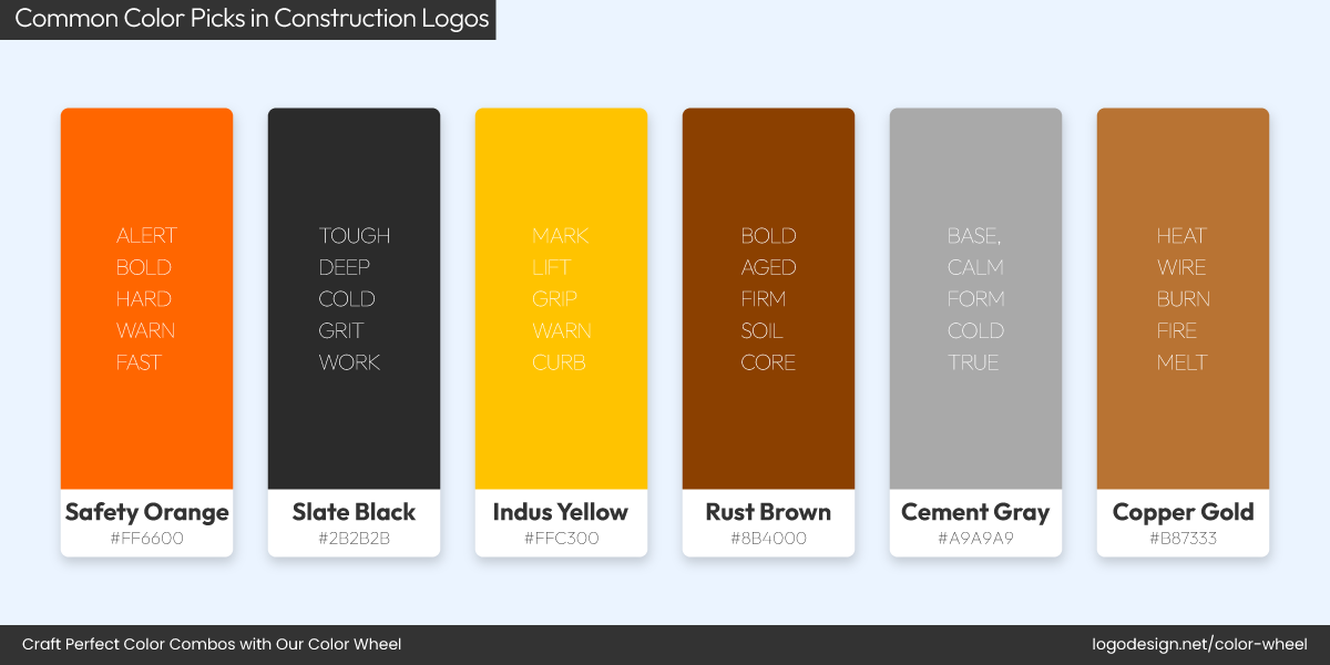
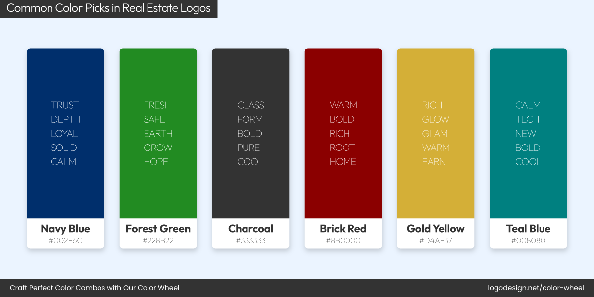
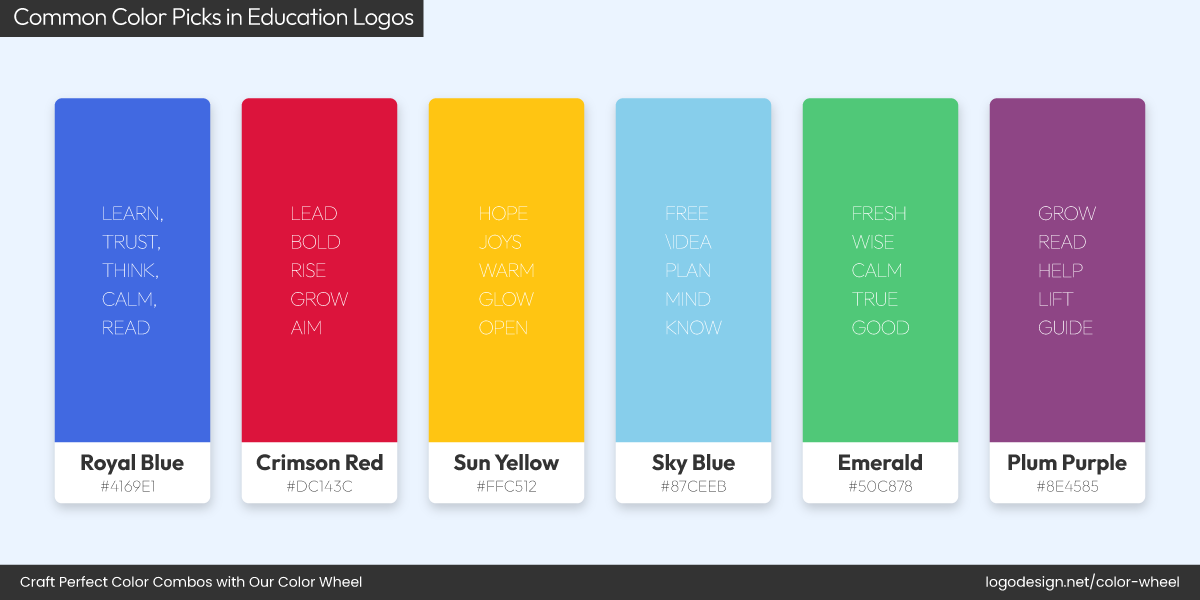
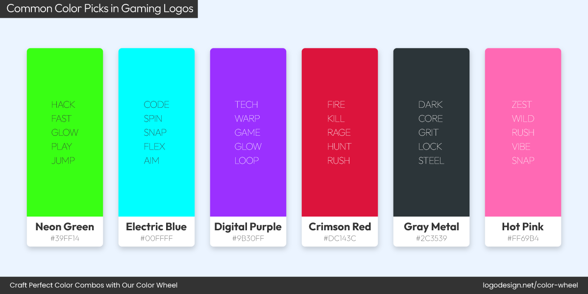
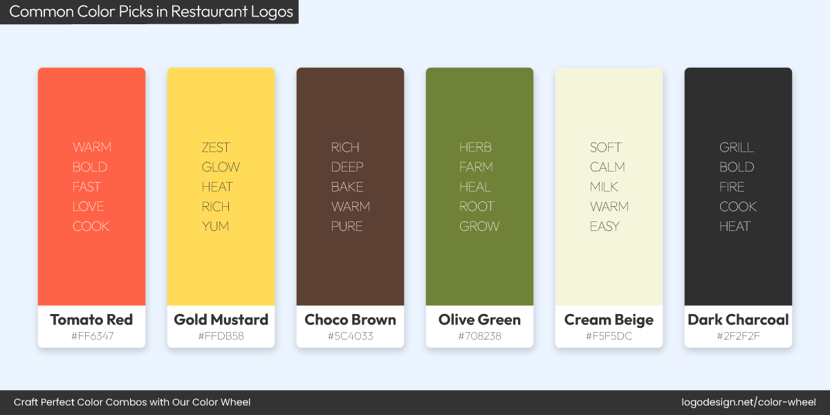
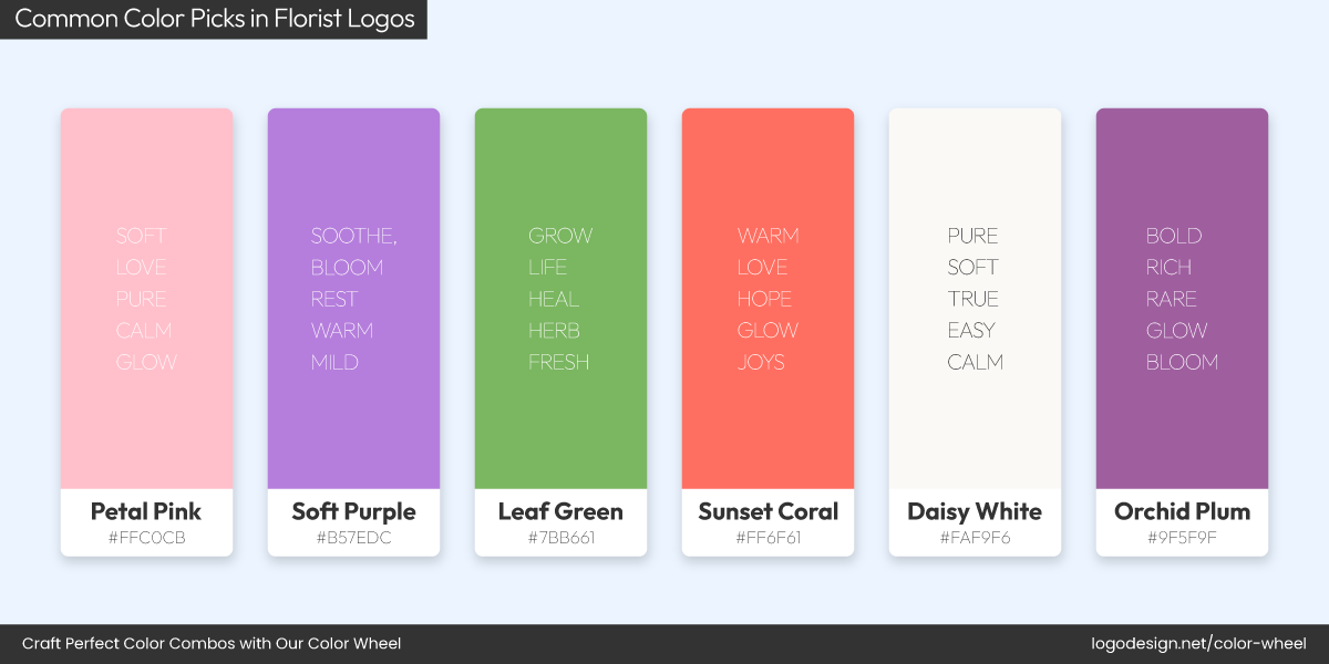
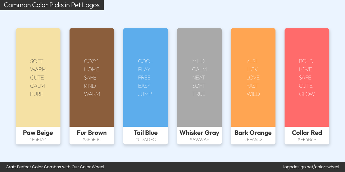
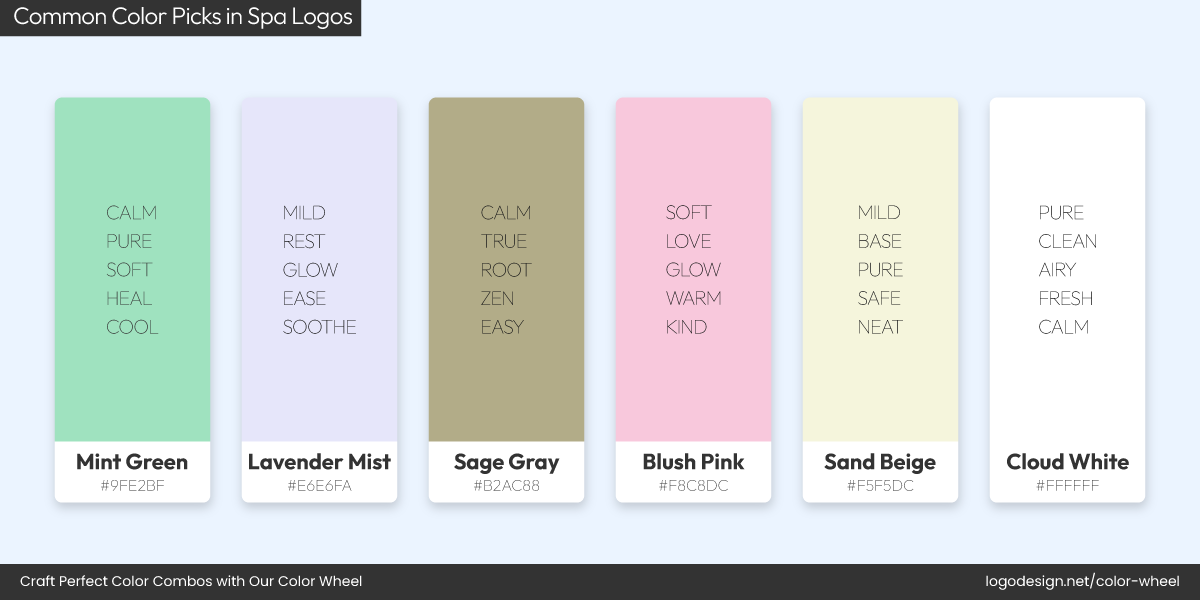
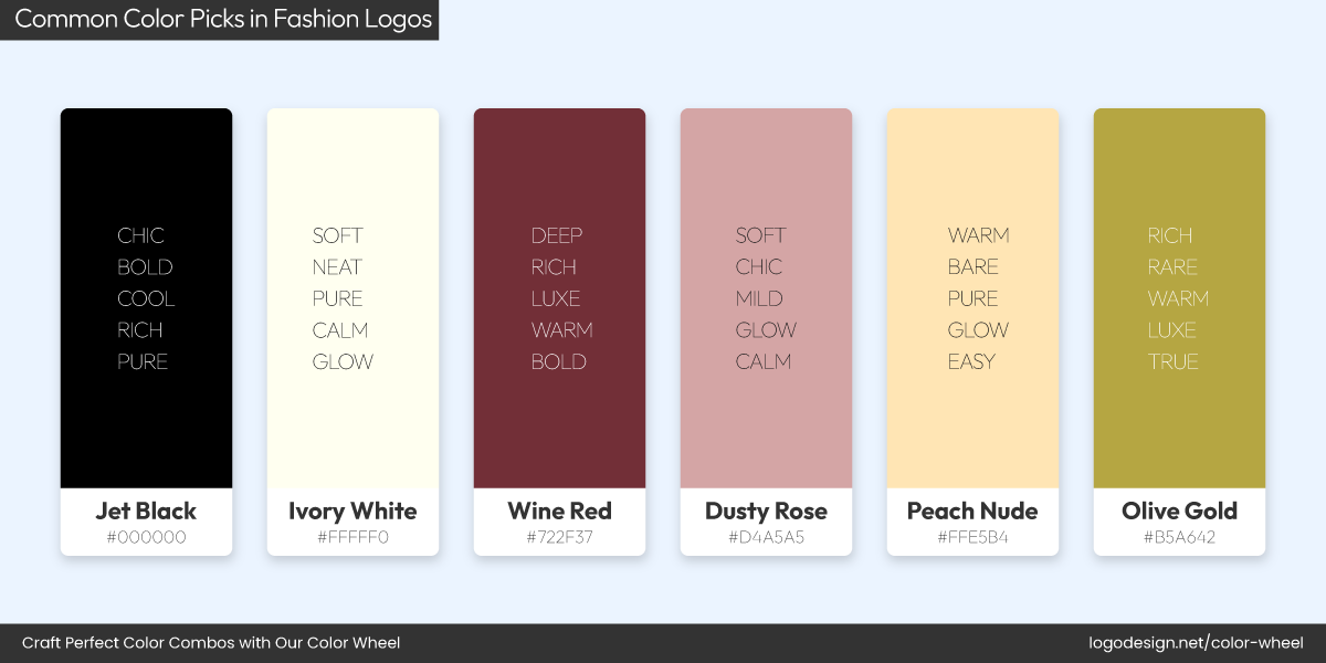
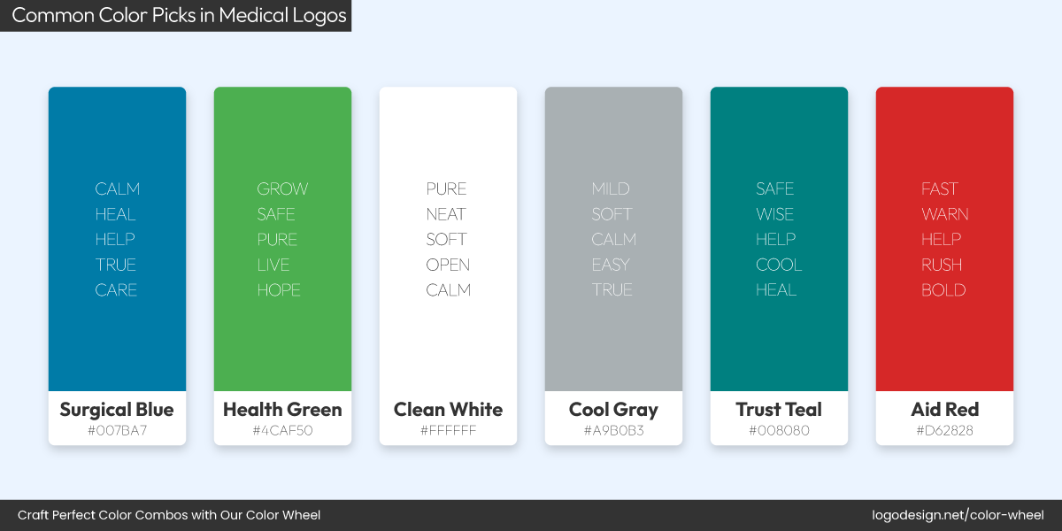
Torn between teal and tangerine? From bold to subtle, your palette defines the vibe. Let’s learn how to pick brand colors that win!
Building a color palette for your brand sounds simple until you actually sit down to do it. You open a color picker, get lost in fifty shades of “not quite,” and end up second-guessing everything from your favorite hue to your life choices.
That’s because choosing colors for your brand isn’t just a visual decision; instead, it is rooted in color psychology (more on that later). The colors you choose show up everywhere: your website, packaging, ads, app icons, email headers, investor decks, maybe even the welcome mat at your office. They’re your brand’s first impression, emotional tone, and personality wrapped in color codes.
The silver lining here is that you don’t need to be a designer or an artist to get it right. All you need is a clear process, a bit of insight into how color works for brands (aesthetically and strategically), and a color wheel to experiment with endless combos.
How to Build a Brand Color Palette, Step by Step
Let’s talk about all things colors, step by step!
Understand the Psychology of Color
We know the urge to use a particular color you’ve already fallen in love with. But before you lock in brand colors, take a step back and think: What would this color say about my brand?
Colors don’t only decorate your brand, they signal emotion, energy, and intention. And your audience picks up on those signals faster than you think. A study on the impact of color confirms this. It takes only 90 seconds for a consumer to form a judgment about a new product and environment, and 62% – 90% of those initial impressions are based on colors.
That’s one reason why understanding how colors affect emotions and behavior is so important when building a palette.
Here’s a quick look at what some of the most commonly used brand colors typically represent:
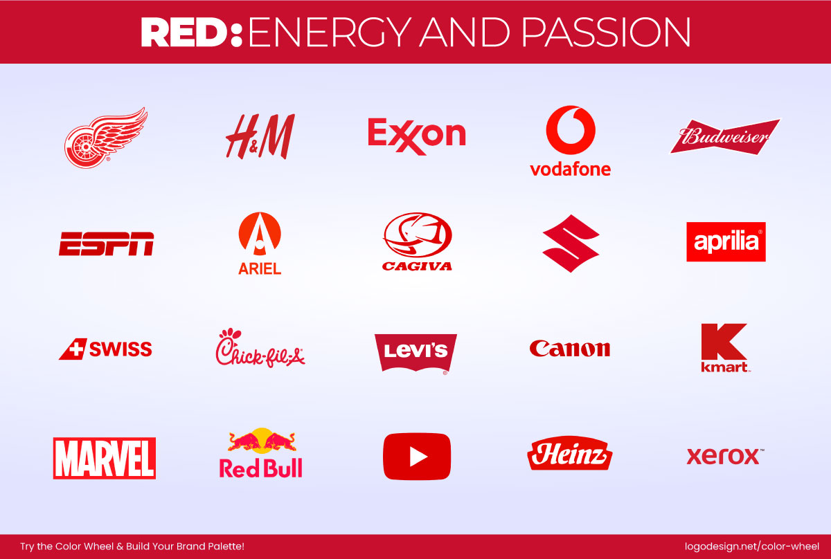
Some companies with red-colored logos to show energy and passion
- Red: Red shows up when something needs attention. It’s bold, assertive, sometimes loud, and always high-energy, like Coca-Cola and YouTube.
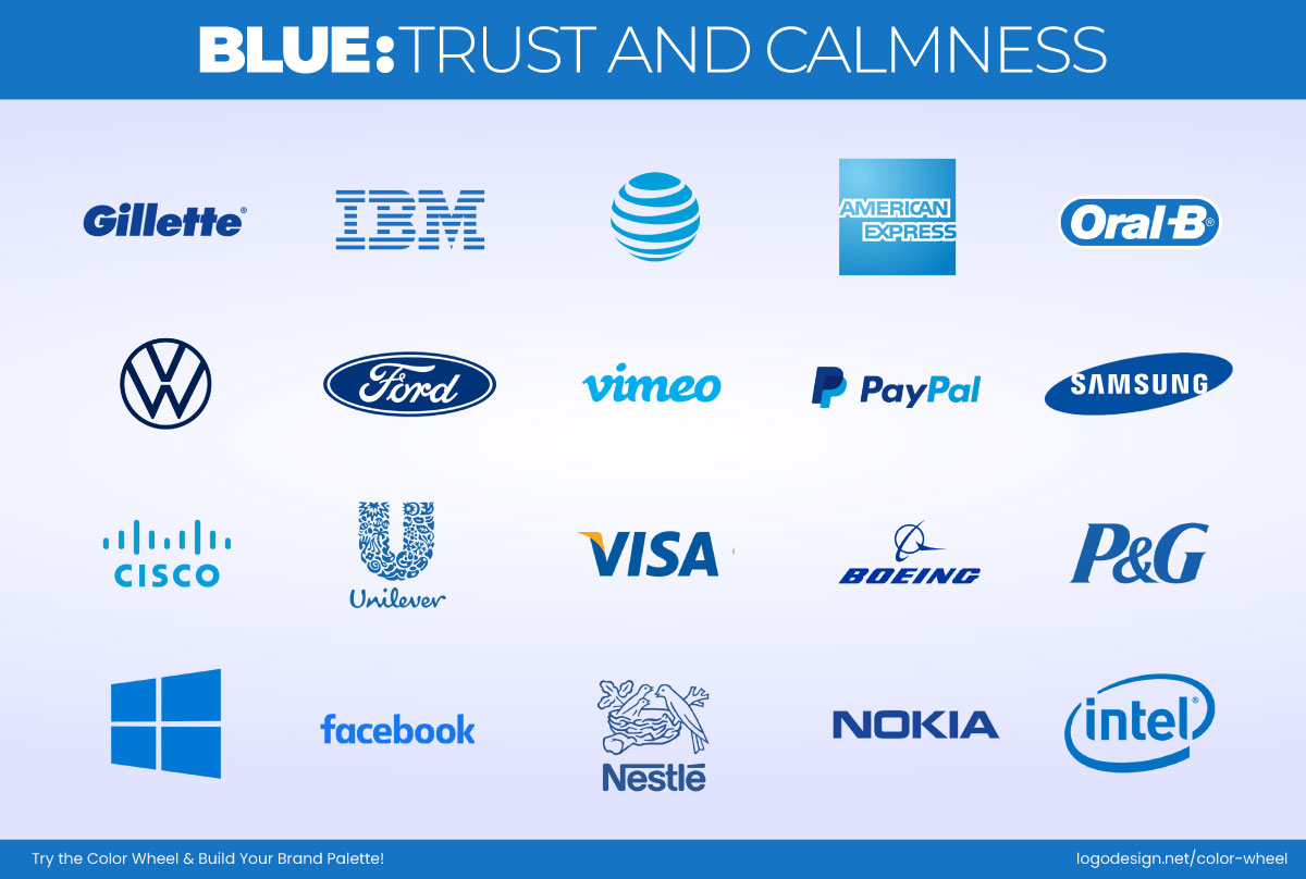
Some companies with blue-colored logos to show trust and calmness
- Blue: Blue is calm and reassuring. It’s a go-to for brands that want to feel established, credible, and stable, for instance, LinkedIn and American Express.
Some companies with green-colored logos to show nature and growth
- Green: Green evokes freshness, growth, and balance. It’s the color of nature and often signals sustainability and renewal, used by brands like Starbucks and Tropicana.
Some companies with yellow-colored logos to show optimism and warmth
- Yellow: Used right, yellow is more than sunny. It’s clever, youthful, and just a little bit rebellious, like Snapchat and IKEA.
Some companies with purple-colored logos to show luxury and spirituality
- Purple: When you want to feel imaginative or a bit luxurious, purple walks in, used by brands like Cadbury and Twitch. It is deep, bold, and mysterious.
Some companies with orange-colored logos to show energy and friendliness
- Orange: Friendly and full of life, orange doesn’t take itself too seriously. It’s a color that says, we’re approachable. Fanta and SoundCloud use orange in their logos.
Some companies with pink-colored logos to show warmth and compassion
- Pink: Pink isn’t just sweet and feminine. Depending on the shade, it can be edgy, playful, romantic, or bold, like Charlotte Russe and Barbie.
Some companies with brown-colored logos to show stability and reliability
- Brown: Brown gets overlooked, but it shouldn’t. It’s dependable, earthy, and grounded. It’s ideal for brands rooted in heritage or craft, such as M&M’s and Hershey’s.
Some companies with black-colored logos to show luxury and spirituality
- Black: This is where brands go when they want to feel premium. It’s timeless, elegant, and sharp. Chanel and Nike are great examples.
Some companies with white-colored logos to show simplicity and cleanliness
- White: White clears the noise. It signals simplicity, focus, and often a minimalist, modern aesthetic, like Apple and The Ordinary.
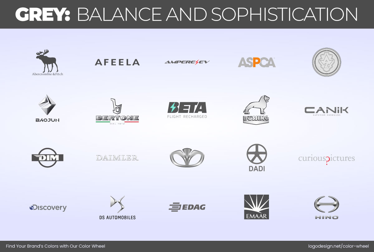
Some companies with gray-colored logos to show balance and sophistication
- Grey: Neutral and balanced, grey feels mature and composed. It’s used by brands that want to be taken seriously without being cold, such as Wikipedia and Mercedes-Benz.
However, don’t pick colors based on popularity. Understanding how your audience subconsciously responds to color is a foundational piece of building your palette and a key principle in color theory in logo design.
Know Your Brand Personality
If color is how your brand feels, then personality is the foundation of that feeling. Before you even think about which shades to use, you need to get brutally honest about what your brand is all about.
Is it playful or polished? Bold or understated? Earthy, edgy, elegant? Start with adjectives, not colors. Describing your brand like you would a person makes it way easier to match the right visual tone later.
A smart way to do this is by leaning into brand archetypes, a proven framework that helps clarify your brand’s role in the world and the emotional space it occupies.
The concept was inspired by psychologist Carl Jung’s theory of universal characters and later adapted to branding by Margaret Mark and Carol S. Pearson in their book The Hero and the Outlaw.
Each of the 12 archetypes connects to deep, instinctual human desires, and understanding yours can guide everything from your messaging to your color palette.
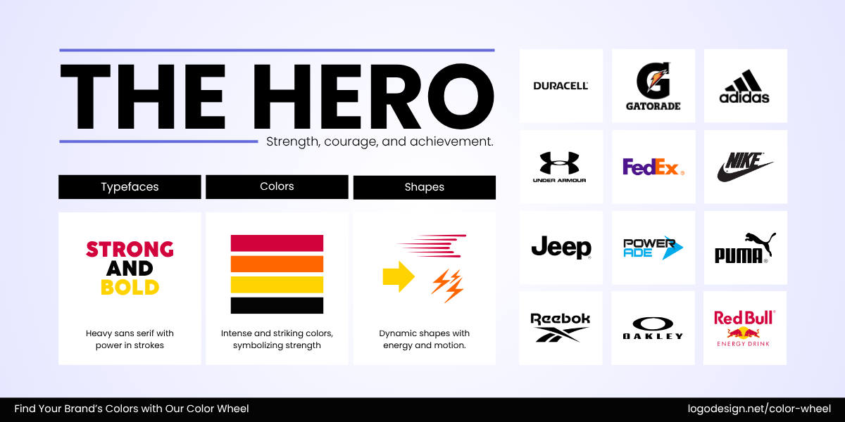
The Hero archetype to show strength, courage, and achievement
1. The Hero: Strives for impact, achievement, and making the world better. Brands like FedEx and Under Armour reflect this by delivering results with strength and confidence, often matched with bold, energetic colors like reds, deep blues, or metallics.
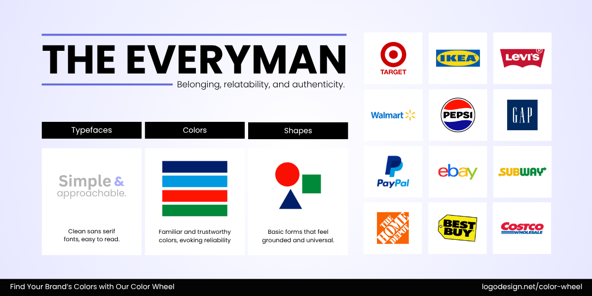
The Everyman archetype to show belonging, reliability, and authenticity
2. The Everyman: One who’s relatable and down-to-earth, just like Levi’s and eBay, which offer everyday value and connection without pretence. These brands lean on warm neutrals and approachable tones that feel honest.
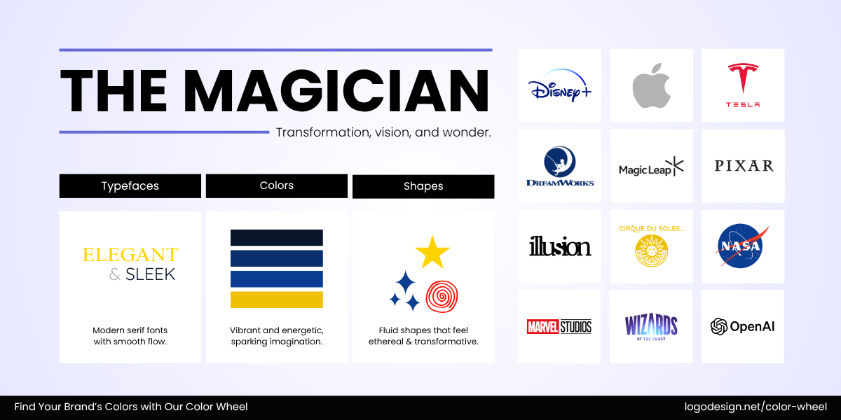
The Magician archetype to show transformation, vision, and wonder
3. The Magician: Capitalizes on transformation, vision, and creating the impossible. Think of Dyson’s reinvention of home tech or the immersive magic of Disney+. These brands often use purples, teals, or dark blues to reflect mystery and vision.
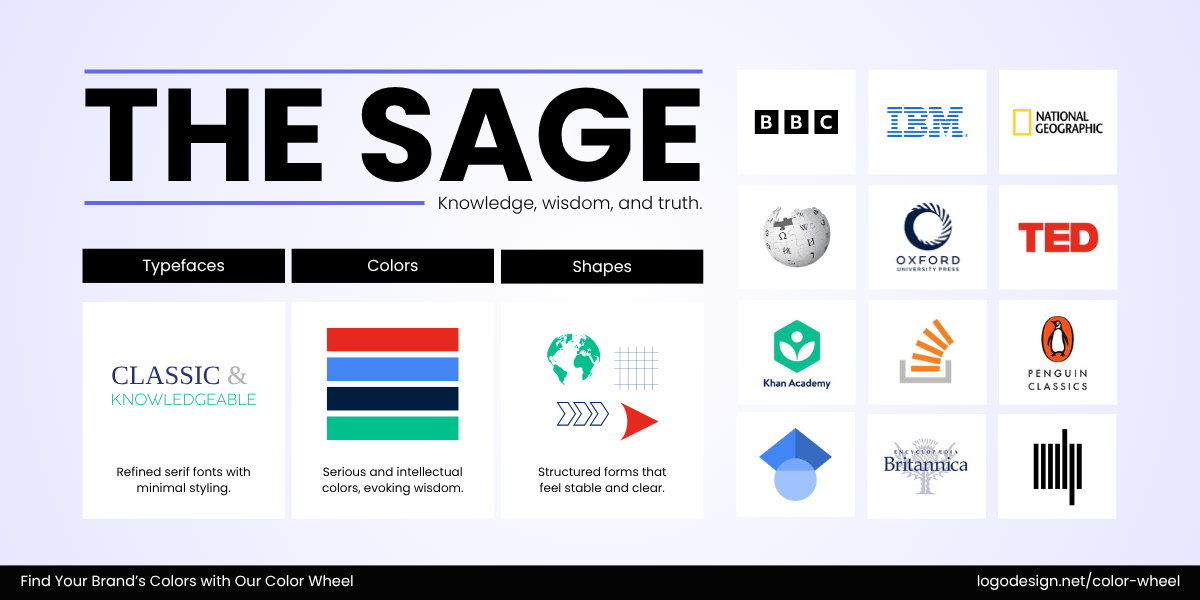
The Sage archetype to show knowledge, wisdom, and truth
4. The Sage: Shares knowledge and insight, examples include brands that guide and inform, like Khan Academy and National Geographic. Their palettes gravitate toward cool, composed palettes that evoke logic and thoughtful communication.
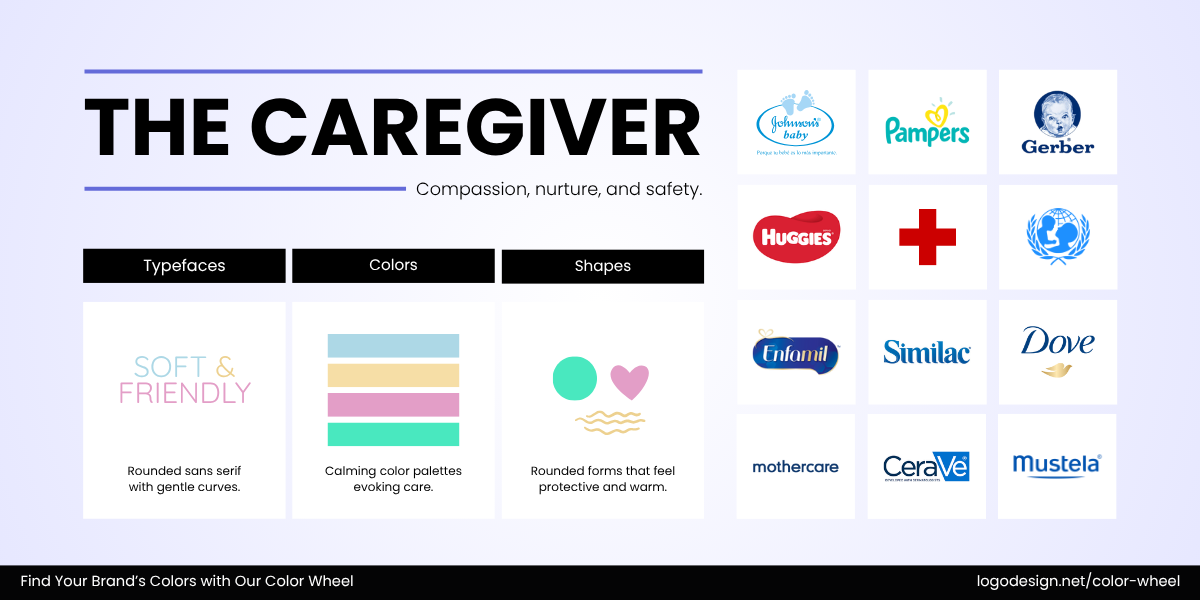
The Caregiver archetype to show compassion, nurture, and safety
5. The Caregiver: All about nurture, protection, and compassion. Pampers and Allstate do this through care-driven messaging and service, often supported by soft pastels, calming blues, or gentle greens.
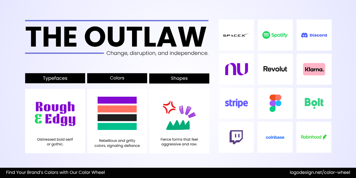
The Outlaw archetype to show change, disruption, and independence
6. The Outlaw/Rebel: The rebel who breaks the rules to spark change. Brands like Harley-Davidson and BrewDog thrive on rebellion and bold identity, visually represented through dark, high-contrast palettes.
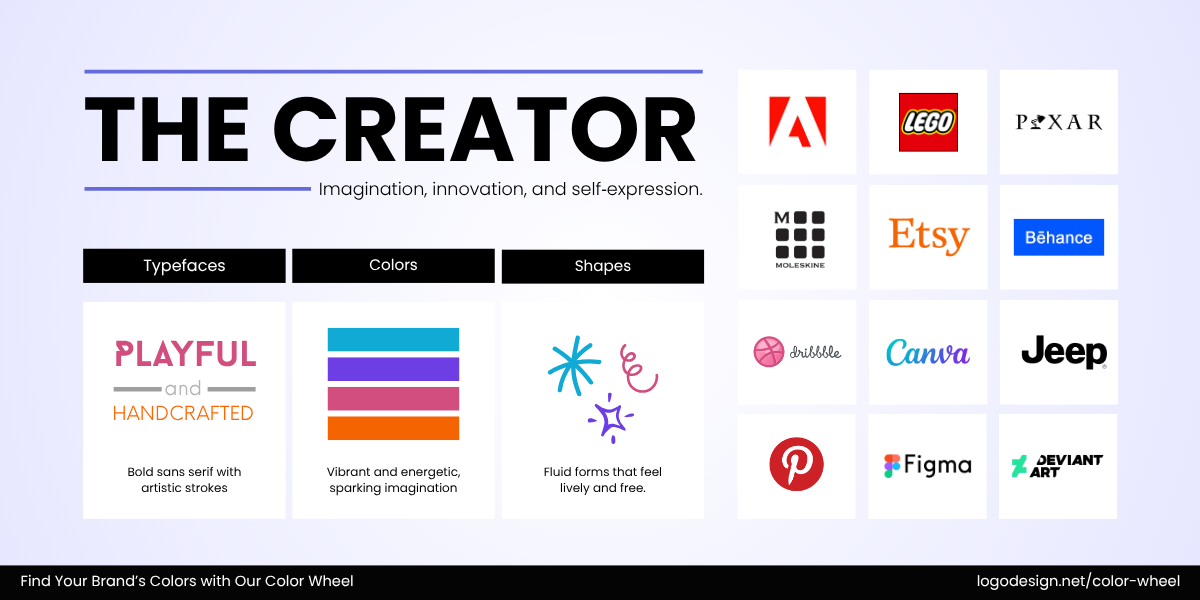
The Creator archetype to show imagination, innovation, and self-expression
7. The Creator: Values imagination, innovation, and originality, shown through Adobe’s creative tools and LEGO’s imaginative play. Their color palettes tend to be vivid, diverse, and experimental.
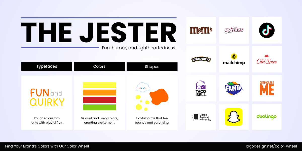
The Jester archetype to show fun, humor, and lightheartedness
8. The Jester: Keeps things light, spontaneous, and entertaining, from the humour of Old Spice to M&M’s playful charm. Expect bright, saturated colors like yellows, oranges, or multicolor palettes that scream fun and mischief.
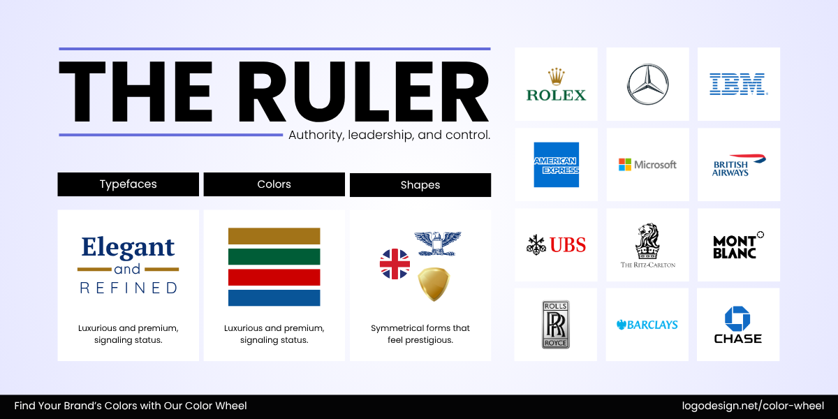
The Ruler archetype to show authority, leadership, and control
9. The Ruler: Commands authority, structure, and order. Rolex exudes timeless power, while British Airways communicates prestige and order. These brands prefer rich and classic tones like navy, burgundy, or gold.
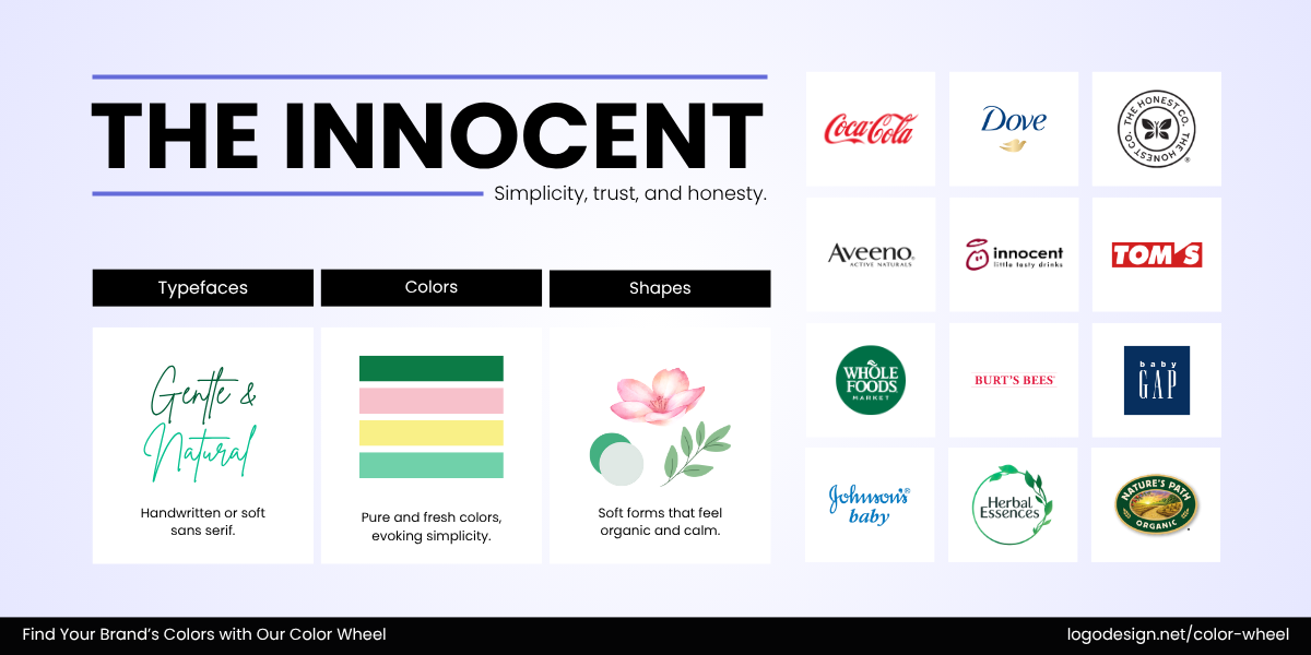
The Innocent archetype to show simplicity, trust, and honesty
10. The Innocent: Lives for simplicity, optimism, and honesty, seen in Dove’s gentle tone and Innocent Drinks’ careful, wholesome vibe. Their palettes are light, airy, and clean with whites, soft blues, and pastels.
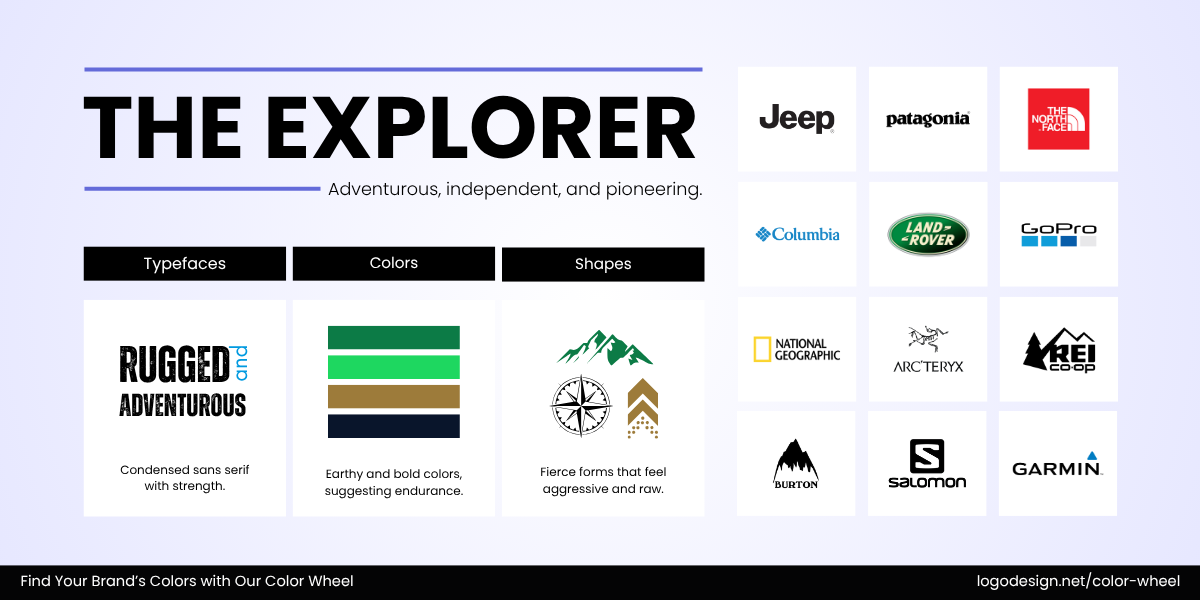
The Explorer archetype to show adventurous, independent, and pioneering
11. The Explorer: Seeks adventure, freedom, and discovery. Think of Jeep’s call to adventure or The North Face’s rugged inspiration. Such brands often thrive in earthy or rugged tones like green and brown.
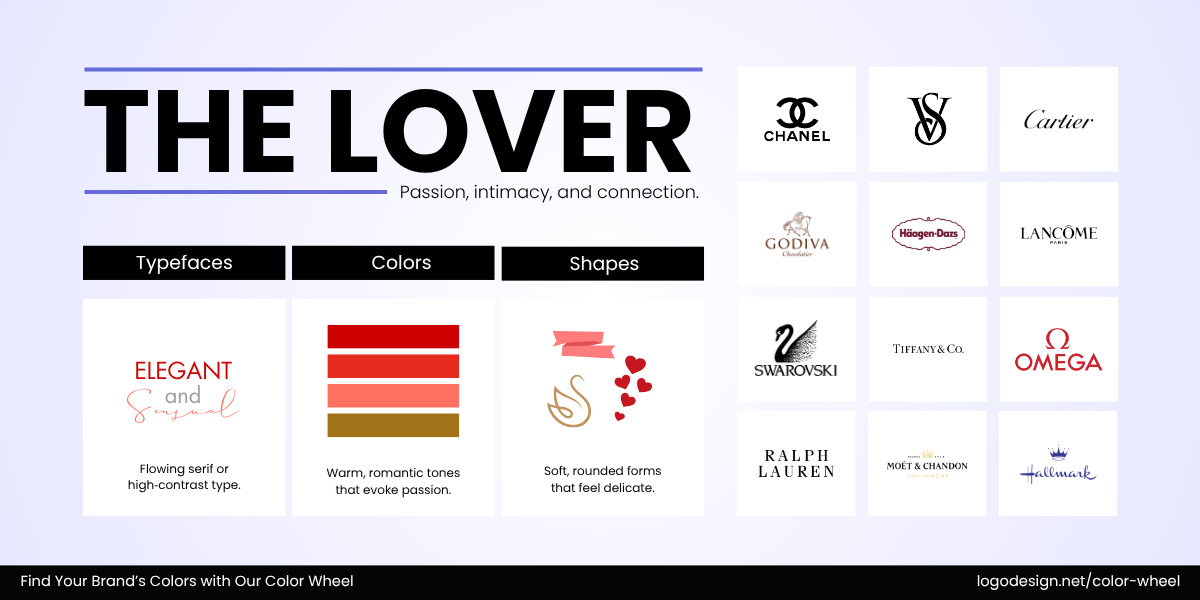
The Lover archetype to show passion, intimacy, and connection
12. The Lover: Evokes passion and indulgence. Häagen-Dazs delivers a rich sensory experience, while Victoria’s Secret leans into allure and intimacy. Their go-to palette includes reds, pinks, and golds that amplify sensuality.
With your brand defined, the next step is to study the factors influencing color choices.
Study Your Audience: Factor In Industry, Culture, and Demographics
Several elements influence which colors will resonate with your audience, and it’s not just personal taste. Industry expectations, cultural associations, and age demographics all matter.
How people from different parts of the world see colors
Culture shapes color choices more than we often think. For example, red may signal excitement in Western markets but may signal warning or spirituality elsewhere. Similarly, younger audiences often gravitate toward bold, high-contrast colors, while older generations may prefer softer, traditional tones.
Logo colors in industries also follow common visual patterns. Tech logos of brands like Dell and Intel rely on cool tones to communicate precision and trust. Meanwhile, organic and wellness brands such as Whole Foods Market often stick to earthy greens and neutrals to evoke nature and purity.
Studying competitor palettes helps you see what’s overdone—and where there’s room to break away while staying relevant to your category. Suppose you’re launching a brand in the childcare industry.
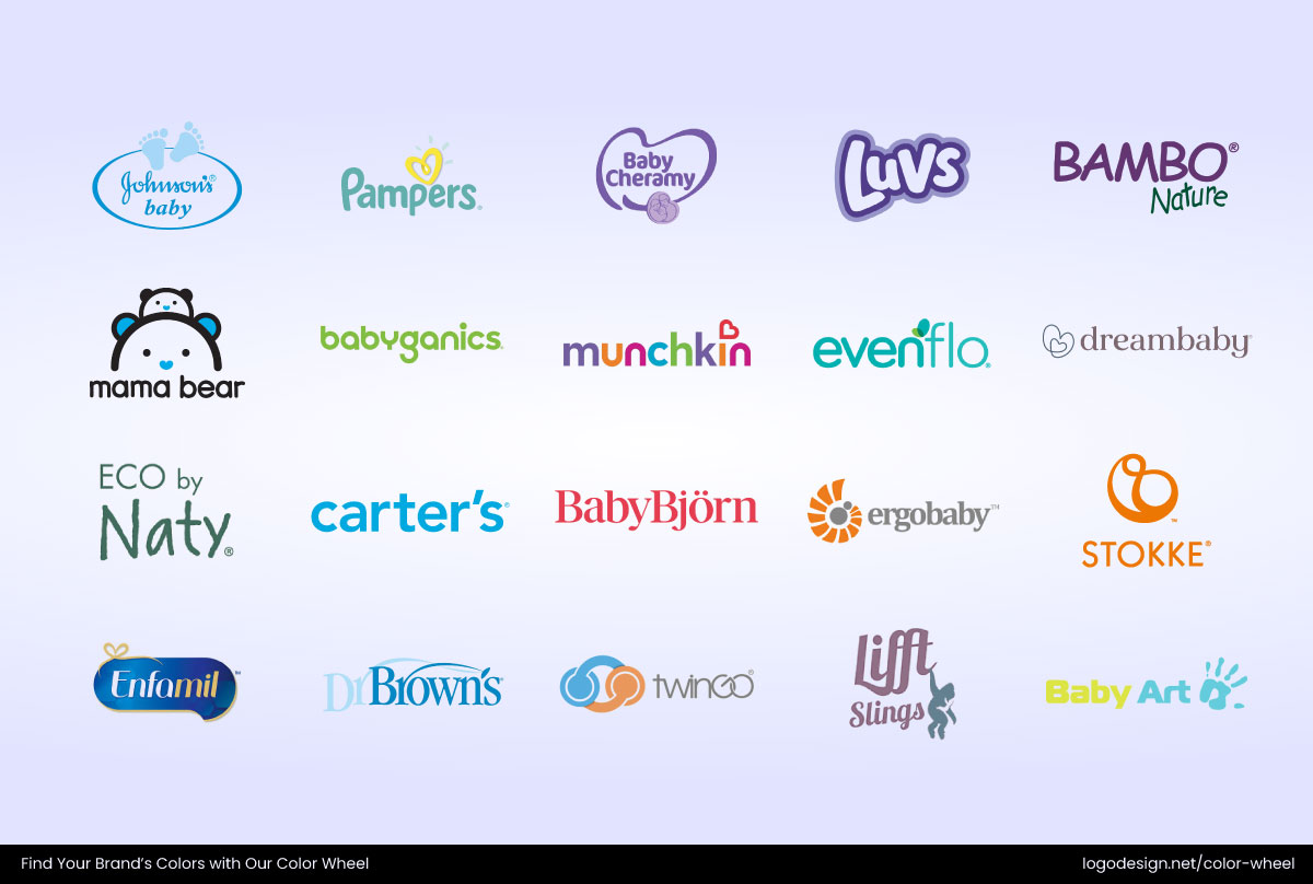
Some common childcare company logos using light colors
Most competitors lean toward soft pastels, particularly light blues, and mint greens—colors that feel safe, gentle, and nurturing. Childcare logos from Little Me, Babyganics, Johnson’s Baby, Pampers, and Fiffy show this palette clearly. These hues create trust and emotional comfort for parents. Understanding this color trend helps you avoid logo color mistakes and decide whether to blend in for familiarity or use a different color approach.

Some common company logos from the entertainment industry using bold colors
Now, let’s say you’re entering the entertainment industry. Entertainment industry logos often lean into bold reds, blacks, and whites, colors that command attention and convey drama. Netflix, YouTube, HBO, CNN, and Marvel are perfect examples. If everyone’s using red, consider how you can stand out while still staying relevant. Maybe black with a bold accent, or a creative twist on red tones.
By observing patterns in your category and the psychology of colors together, you can build a palette that feels relevant but also cuts through the noise. Even a slight shift in tone or contrast can help your brand stand out while staying industry-aligned.
Choose a Base Color (Your Primary Brand Color)
By now, you’ve dug into the emotional weight of color, industry trends, and how archetypes influence perception. Now comes the heart of your palette, the base color.
This core color should express the main emotion or value your brand stands for. Is it trust? Go blue. Innovation? Try a bold purple. Calm and care? Consider soft teal or muted pink. And if you’re willing to challenge the industry norms, experiment with your brand color palette, just as these brands did.
Taco Bell – Unexpected Purple in Fast Food
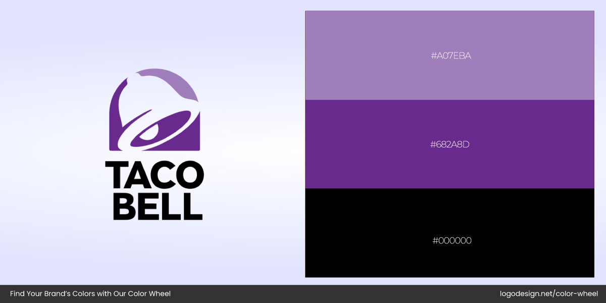
Taco Bell logo and the 3 different shades used in it
While most fast food giants (like McDonald’s, KFC, and Burger King) use reds and yellows in their restaurant logos and branding to stimulate hunger and urgency, Taco Bell rebranded in bold purple and black. This gave the brand a more youthful, edgy, and late-night vibe, setting it apart in a saturated market.
Notion – Monochrome in Productivity Tech
Notion logo with the two color shades used in it
Most productivity tools use blues or bright tones (e.g., Trello, Asana, Google). Notion stood out with its clean black-and-white, minimalist logo, which speaks to clarity and focus, a counterintuitive, yet highly effective contrast to its colorful competitors.
Candid – Soft Pastels in Dental Health
Candid Pro logo with the red color shade used in it
Oral care and dental logos typically stick to clean whites, bright blues, or clinical greens to feel sterile and trustworthy. Candid, a direct-to-consumer clear aligner company, went for soft blush pinks and warm neutrals—inviting, gentle, and distinctly modern. It broke the “cold” medical mold and felt more lifestyle-oriented.
The color you choose now will be your anchor color, and the rest of your palette will be built around it. So, take your time, compare options in real use, and make sure it resonates not just with you, but with your audience.
Add Supporting Colors (Secondary and Accent)
Once you’ve locked in your primary color, it’s time to build out the rest of the palette. Supporting (or secondary) colors help bring versatility to your visuals—for packaging, web layouts, icons, or branded social content. They also provide balance and allow you to build contrast without straying too far from your core identity.
Accent colors, your boldest shades, are usually used in small amounts: for call-to-action buttons, link highlights, or areas where you want to direct attention.
This is where color harmonies come in—strategic relationships between colors on the color wheel that create pleasing combinations. In brand design, they help ensure everything works together without clashing, even when you’re introducing variety.
Here’s a quick breakdown of key color harmonies:
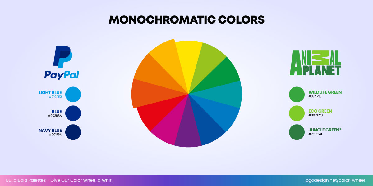
Monochromatic color shades used in the logos of PayPal and Animal Planet
- Monochromatic: Different shades and tints of a single hue. Clean, controlled, and cohesive—ideal for minimalist, focused branding.
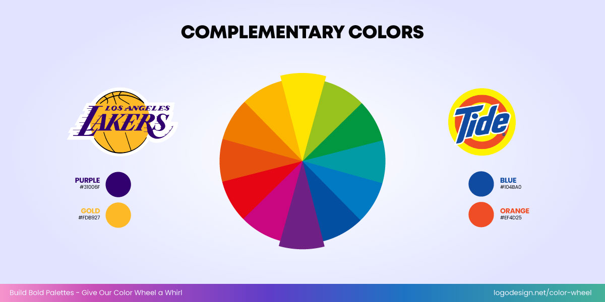
Complementary color shades used in the logos of the Los Angeles Lakers and Tide
- Complementary: Opposite colors (like blue and orange) that create strong contrast and energy.
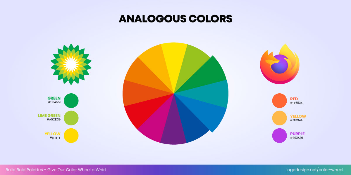
Analogous color shades used in the logos of BP and Firefox
- Analogous: Neighboring colors (like green, teal, and blue) that flow naturally and feel balanced.
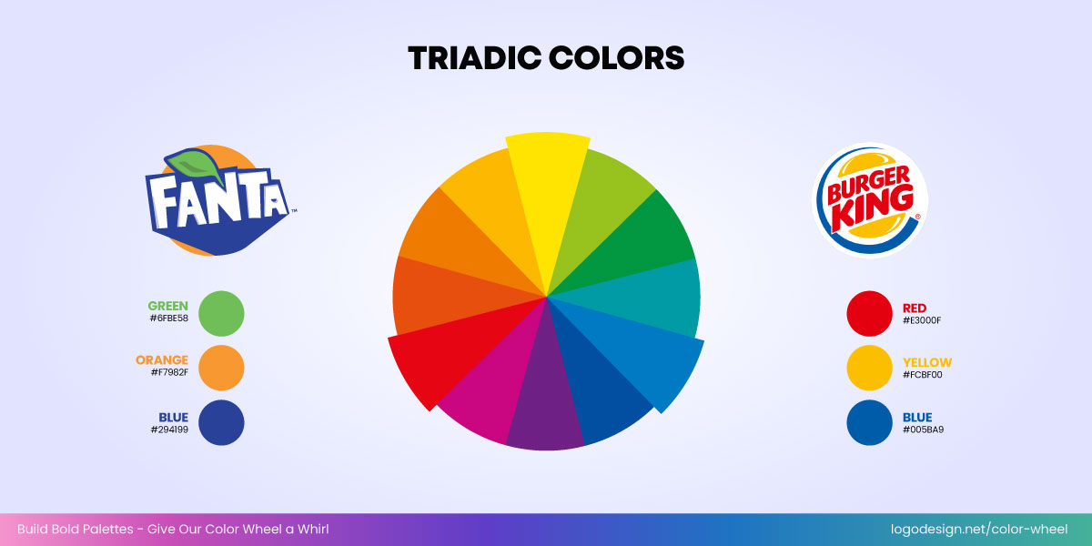
Triadic color shades used in the logos of Fanta and Burger King
- Triadic: Three colors evenly spaced (like red, yellow, and blue) that create vibrant, bold palettes.
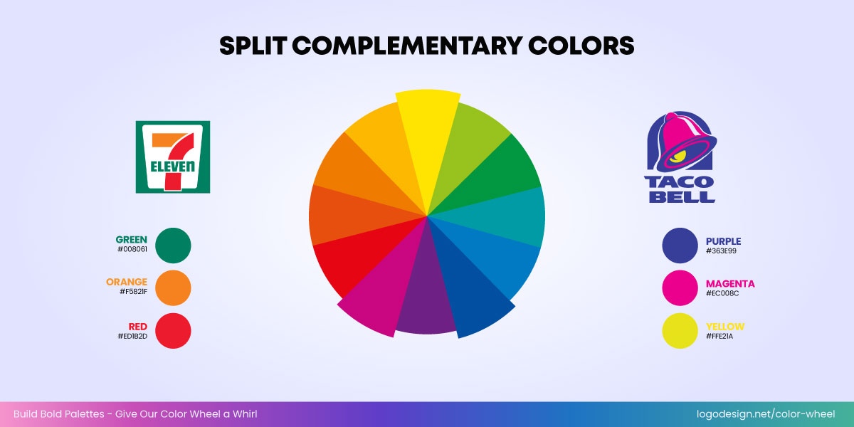
Split Complementary color shades used in the logos of 7-Eleven and Taco Bell
- Split Complementary: A base color with the two adjacent to its complement, adds variety without being too loud.
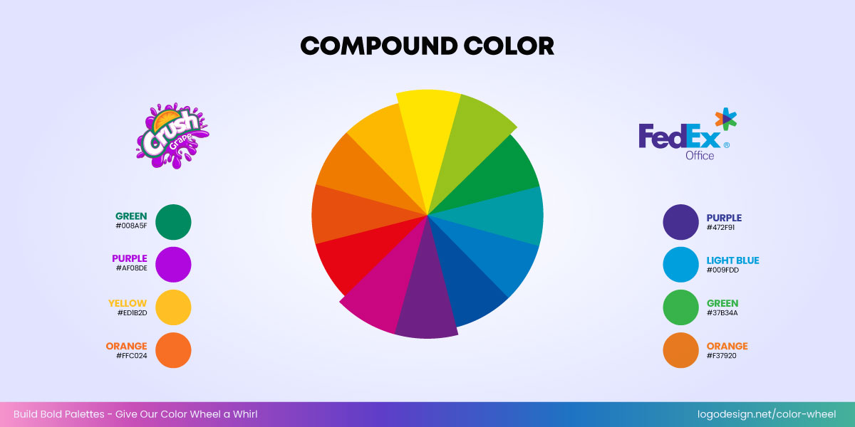
Compound color shades used in the logos of Crush Grape and FedEx
- Compound: A blend of complementary and analogous schemes, great for subtle depth.
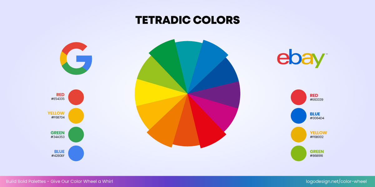
Tetradic color shades used in the logos of Google and eBay
- Tetradic: Two pairs of complementary colors—harder to balance, but dynamic when done well.
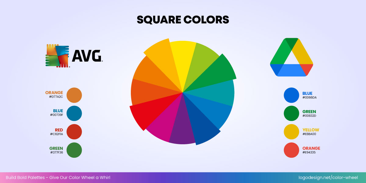
Square color shades used in the logos of AVG and Google Drive
- Square: Like tetradic, but with evenly spaced colors. Works best with one dominant color and the rest as accents.
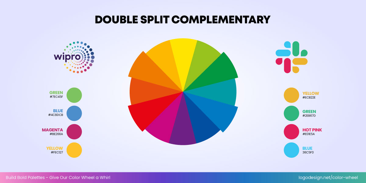
Double Split Complementary color shades used in the logos of Wipro and Slack
- Double Split Complementary: A twist on split complementary using four colors—adds contrast while keeping visual harmony.
You can use tools like LogoDesign.Net’s color wheel to generate palettes and explore harmonies automatically.
Whether you choose a monochrome logo or a multi-color logo, the key is knowing when to stick to simplicity or lean into multi-color branding. Brands like Slack or Figma use multiple colors but maintain visual balance through harmony. Blamain and Puma usually stick to a monochrome palette for their logo and branding for structure and a minimalist aesthetic.
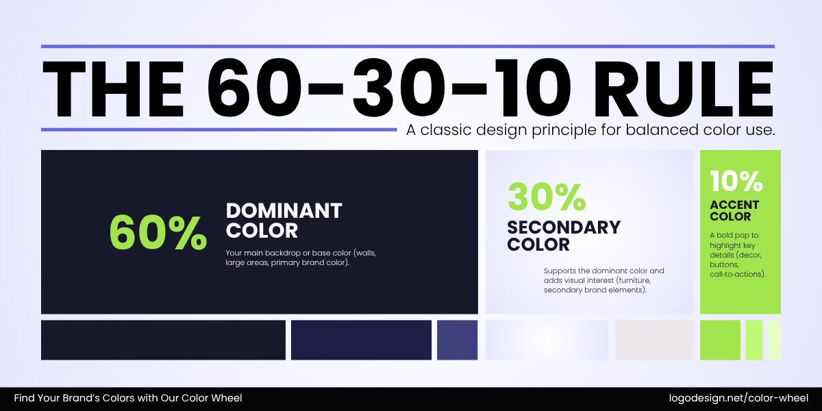
How the 60-30-10 rule works to create a design principle
The 60–30–10 rule is a helpful guide here: 60% for primary, 30% for secondary, 10% for accents.
Ensure Accessibility and Versatility
Once your color palette looks great, ask yourself: Does it work for everyone and everywhere? Accessibility in logo design isn’t just a nice-to-have; it’s essential, especially on digital platforms where readability and usability can make or break a user’s experience. Colors that pop beautifully on a mockup might fall flat when viewed on mobile or against the wrong background.
Contrast plays a key role here. If your palette lacks enough contrast, text and key elements may become unreadable, especially on smaller screens. Use tools like WebAIM Contrast Checker to test your combinations and meet accessibility standards like WCAG for contrast.
Here are some quick tips for choosing light/dark background variations and grayscale adaptability:
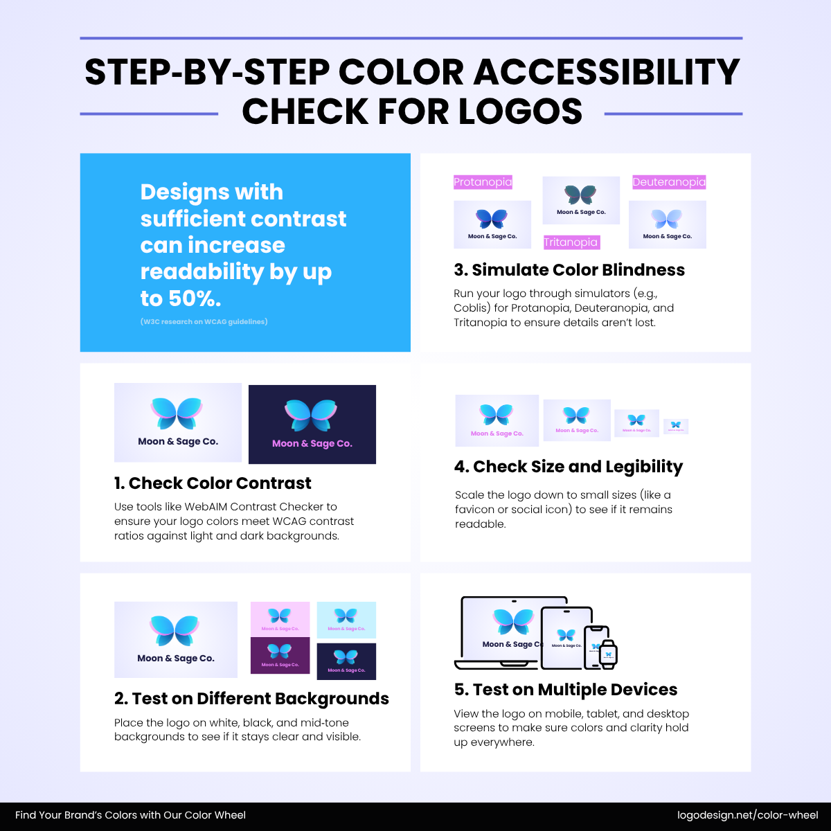
Step-by-step process to check color accessibility
- Test logos on both white and black backgrounds to ensure they retain clarity and balance.
- Create light and dark versions of your logo to keep your brand flexible across media.
- Avoid overly light or pale colors as text on light backgrounds, unless paired with dark accents.
- Check how your color palette performs in grayscale—make sure there’s still visible contrast between elements.
- Preview designs in different lighting conditions (like dark mode) to spot visibility issues early.
- Use neutral tones or strong accents for key text or icons—they adapt better across various backgrounds.
- Test your full brand palette in mockups for social media, packaging, or websites to ensure consistent impact.
Design flexibility is essential. Your chosen flat or gradient logo colors and brand color palette should work just as well on a billboard as it does in a profile picture or app icon.
Refine and Finalize Your Brand Color Palette
By now, you’ve chosen your primary color, supporting hues, and accent tones, and checked for accessibility. But a collection of colors isn’t a usable palette—yet.
This stage is where you create a color system that works across different brand elements.
- Assemble your palette: Organize your chosen hues into a clear structure—primary, secondary, and accent. Make sure each has a distinct role in your brand visuals.
- Mock it up: Apply your palette across brand elements like your business logo, website headers, packaging, and marketing graphics. You’ll spot imbalances or awkward contrasts much faster this way.
- Test tone and emotion: Does this palette reflect the brand voice you’re going for? Are your supporting colors diluting or enhancing the primary tone?
- Draw from visual inspiration: Still unsure? Refine with help from art, interior design, nature, or editorial spreads. Real-world palettes can offer a fresh perspective without starting over.
Document and Apply Your Color Palette Consistently
Now, the colors you pick need to be used consistently to build recognition and trust. That’s where documentation comes in.
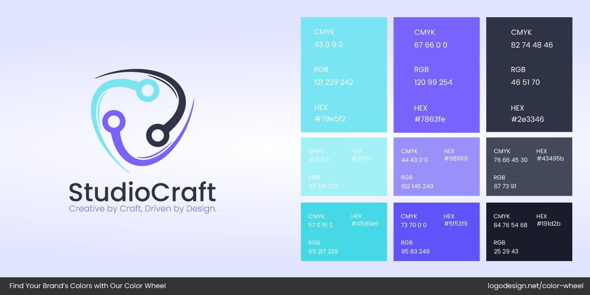
12 different color shades used in the Studio Craft logo
Create a color guide: For each color in your palette, note down its HEX, RGB, and CMYK values. This ensures your designer, printer, or developer can all work from the same source.
- HEX (hexadecimal): A six-digit code (like #4A90E2) used mainly in web and digital design. It tells screens exactly what color to display.
- RGB (Red, Green, Blue): A mix of red, green, and blue light, represented in values like 74, 144, 226. It’s used for anything viewed on a screen.
- CMYK (Cyan, Magenta, Yellow, Black): A four-color process used in printing. For example, a shade of blue might be 69, 34, 0, 0. It ensures your printed materials match your brand colors as closely as possible.
Assign roles to each color: Specify how each should be used—for example, your primary blue might be reserved for headers and buttons, while a soft beige works as a background. Gradients? Define where and how they appear, too.
Set usage rules: Outline what not to do, like placing text over a color with poor contrast, or overusing your accent shade.
Stay consistent across platforms: Your brand should feel seamless whether it’s on Instagram, your business card, postcard designs, packaging, a billboard, or your email footer. Same colors, same hierarchy.
A simple color guide might seem small, but it bridges a great palette and a recognizable brand identity.
How Real Brands Use Color to Tell Their Story
Let’s examine how real brands craft color palettes that align with their identities and resonate with their audiences.
Mailchimp logo using two color shades to show creativity and confidence
Mailchimp
Mailchimp uses a bold mustard yellow as its signature, paired with deep black and neutral tones. The company’s marketing logo colors are unconventional for the tech and marketing space, but it works. The palette feels creative, confident, and a little quirky, just like the brand’s tone of voice.
Oatly
Oatly Group logo using two color shades to give an eco-friendly feel.
Oatly opts for muted, almost grayscale-inspired tones with subtle pastels. This quiet, understated palette mirrors its minimalist packaging and tongue-in-cheek messaging. The colors in their food and beverage logo feel earthy and real, appealing to eco-conscious and health-savvy consumers.
Aesop
Aesop logo using a single black color to show earthiness and luxury
Aesop, a premium skincare brand, leans into warm taupes, soft browns, off-blacks, and off-whites across its beauty logo, packaging, and digital spaces. The palette evokes calm, earthiness, and understated luxury, aligning with its apothecary-inspired, thoughtful identity.
These brands prove that a well-chosen palette becomes more than just color—it becomes voice, attitude, and experience.
How to Create a Color Palette Using Our Color Wheel
Building a custom brand palette with LogoDesign.Net’s color wheel is simple, visual, and fun. Just follow these three easy steps to get started:
1. Choose a Primary Color
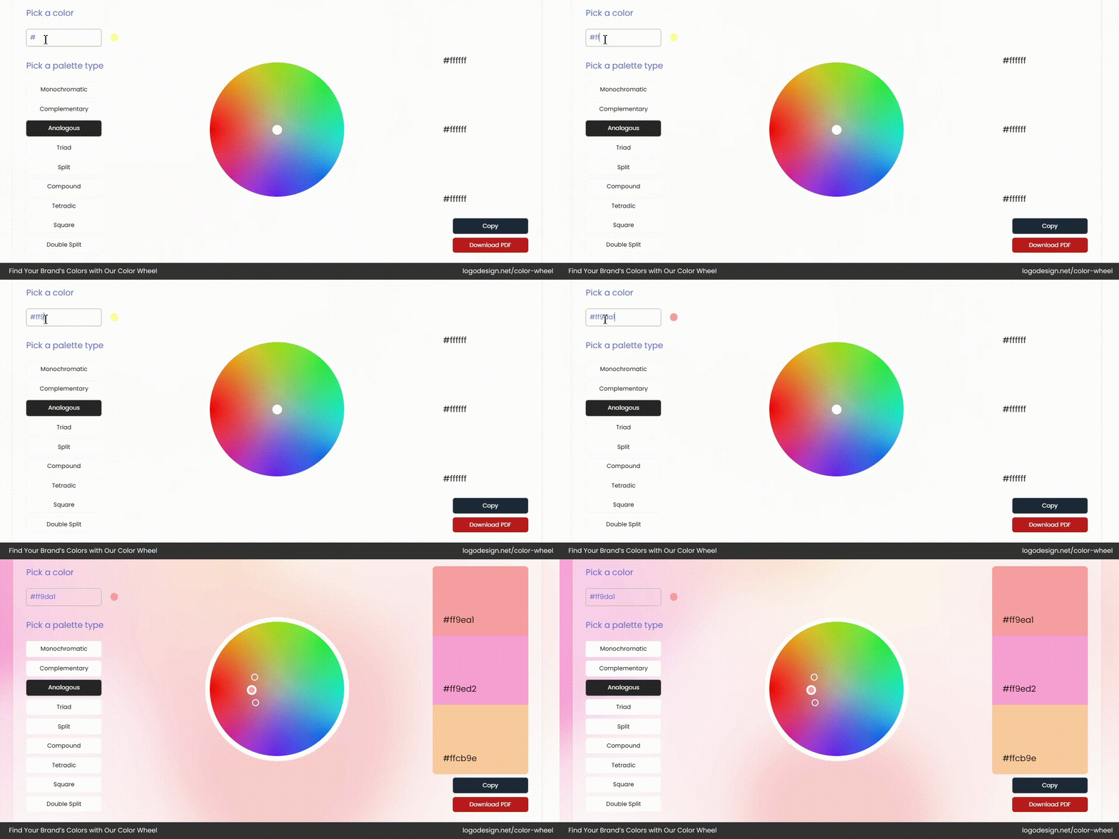
Choosing a shade from the color wheel by LogoDesign.Net
Start by heading to our interactive color wheel. Move the cursor around to explore shades and pick your base or primary color. For example, we selected #FF9DA1—a soft, reddish-pink that radiates warmth, energy, and a touch of playful charm.
2. Pick a Palette Type
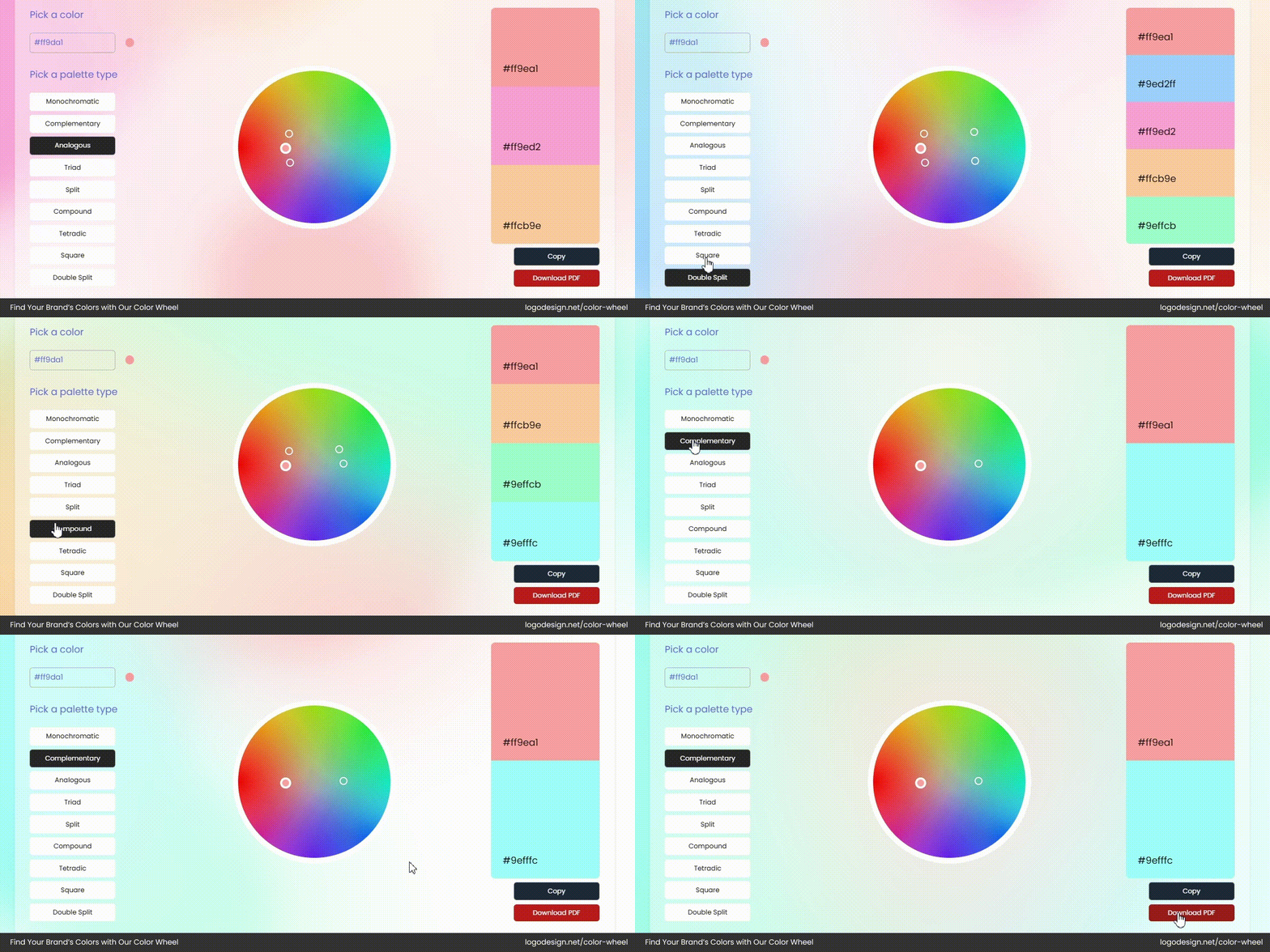
Picking a color palette type you want to use
Next, choose the kind of color harmony you’d like—monochromatic, complementary, analogous, triad, and more. It helps ensure balance and visual appeal across your brand. For this demo, we chose a complementary palette, pairing our pink with #9EFFFC, a bright pastel aqua that adds freshness and contrast.
3. Download Your Palette
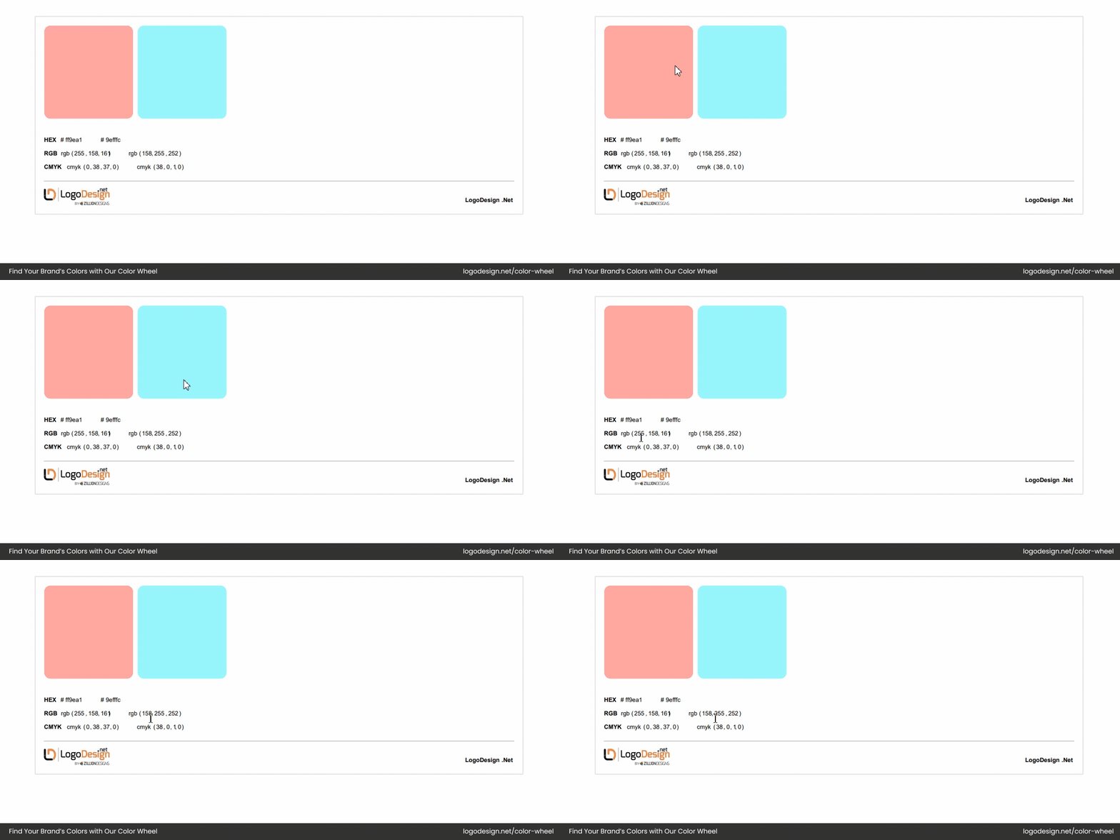
Downloading the color palette.
Once you’re satisfied with your selection, simply copy or download the color codes. You can now start using your palette to create a logo and apply it across the website, social media, packaging, and stationery for a unified and memorable brand identity. Use ours or create your own now!
Key Takeaways
- Brand colors shape perception and set the emotional tone across all platforms.
- Understand what each color communicates—choose one that reflects your core brand values.
- Define your brand’s personality or archetype to guide color decisions.
- Consider industry norms, cultural meaning, and audience preferences before selecting colors.
- Choose a primary color that anchors your palette, followed by secondary and accent colors using color harmonies like triadic or analogous.
- Apply colors using the 60–30–10 rule for balance.
- Make sure your palette works in light/dark modes and meets accessibility contrast standards.
- Document HEX, RGB, and CMYK values and set rules for consistent use.
