Your nonprofit is doing amazing things—but does your branding do justice? Here’s how smart branding, playful visuals, and a striking logo can make hearts open before wallets do.
Nonprofit organizations do not sell products in the traditional sense. What they ask for is trust. Trust to donate, to volunteer time, or to believe in a cause strongly enough to stand behind it. That trust is built long before someone clicks a donation button, and branding plays a quiet but decisive role in that process.
A nonprofit’s brand is not just a logo or a color palette. It is the feeling people get when they see your name on social media, receive your email, or walk past your banner at a fundraiser. Strong branding helps your organization feel credible, human, and worth supporting. Weak or inconsistent branding does the opposite, even if the mission itself is powerful.
This guide covers the essentials of nonprofit logo design and branding, and shows how modern nonprofits communicate today.
Your Complete Manual for Nonprofit Logos and Branding
A nonprofit logo is often the first visual cue people associate with your mission. Whether you are creating a logo for a charity, foundation, or community initiative, the design choices you make convey a great deal about your purpose and values. Fonts, colors, symbols, and even spacing work together to communicate who you are and who you serve.
Most nonprofit brands rely on symbolism rather than abstraction alone. A well-chosen symbol can express care, hope, protection, education, or urgency without a single line of text.
The following steps break down how to approach nonprofit branding in a way that feels thoughtful rather than forced.
1. Define Your Brand Story & Core Message
Every strong nonprofit brand starts with a clear story. Before sketching a logo or selecting brand colors, you need to define the problem you exist to solve and why it matters. People connect with causes that feel real and specific, not vague statements about “making the world better.”
Your brand story should answer simple questions. Who are you helping? What change are you trying to create? Why should someone care enough to support you? Once the story is clear, your visual identity can reinforce it rather than compete with it.
Campfire Circle is a good example. The nonprofit organization supports children undergoing cancer treatment by providing joyful camp experiences. Their childcare logo uses warm colors and playful typography that feels hopeful rather than clinical. It reflects childhood, safety, and optimism without needing a long explanation.
Another strong example is Save the Children. Its logo uses a simple figure enclosed within a circle, symbolizing protection and care. The design aligns closely with the organization’s mission and works across fundraising materials, emergency response campaigns, and digital platforms without losing meaning. The key is clarity. A clear story makes your brand easier to remember and easier to trust.
2. Select a Logo Style That Fits Your Brand
There is no single logo type that works for every nonprofit. The right choice depends on your cause, your audience, and the emotional response you want to create. A logo should feel natural to the mission it represents. What feels warm and inviting for a children’s charity may not suit a healthcare organization’s logo or a human rights foundation.
Below are the most commonly used nonprofit logo types, along with examples of how and when each works best.
• Wordmark Logos
A wordmark logo focuses entirely on the organization’s name, using a custom typeface to build recognition. This style works well for nonprofits seeking clarity, authority, and easy recall, especially those operating at the national or global level.
UNICEF is a strong example of a wordmark used effectively. Its clean typography feels trustworthy and professional, allowing the organization’s name to stand confidently on its own.
Another fitting example is Oxfam, whose bold, straightforward wordmark helps maintain clarity and recognition across campaigns, reports, and digital platforms.
• Pictorial Logos
Pictorial logos use a clear, recognizable symbol to represent the cause. These logos are especially effective when the mission can be communicated visually and emotionally.
The World Wildlife Fund’s panda is one of the most recognizable nonprofit symbols in the world. It instantly conveys a commitment to conservation and care for wildlife.
Feeding America also uses simple imagery to represent nourishment and support, making the mission easy to understand at a glance.
• Combination Marks
Combination marks bring together text and imagery, offering flexibility across different uses. The symbol can stand alone when space is limited, while the full logo reinforces brand recognition when clarity is needed.
Amnesty International is a well-known example. Its candle logo, wrapped in barbed wire, symbolizes hope amid oppression, while the accompanying text ensures the organization remains identifiable in formal and advocacy settings.
The American Cancer Society also uses a combination approach, pairing its name with a strong caduceus logo to build credibility.
• Mascot Logos
Mascot logos feature a character or illustrated figure to make the organization feel friendly and approachable. This style is commonly used by nonprofits working with children, families, or community-based programs. Educational charities and youth-focused initiatives often rely on mascots to reduce emotional distance and build trust.
The Happy Hippie Foundation is a perfect example. Its logo uses playful illustrations and a vibrant, fun hippie mascot to appeal to vulnerable youth and the LGBTQ+ community.
Similarly, Goodwill’s logo is a stylized mascot. The "Smiling G" transforms the letter "g" into a cheerful human face, symbolizing the dignity and happiness of the people they help.
• Abstract Logos
Abstract logos use shapes and forms rather than literal symbols. They are often chosen by nonprofits that represent broad ideas such as global development, innovation, or social impact. This style allows for creative interpretation but requires strong, consistent branding to build meaning over time.
For example, Kiva uses a stylized "K" shaped from two leaves, representing growth and agricultural roots.
Similarly, Mind, a mental health charity, features a convoluted, scribbled line abstract form that unfolds into the word "mind," symbolizing the unraveling of mental health struggles.
When selecting a logo style, always consider where it will be used. Your website, social media profiles, donation platforms, email campaigns, and printed materials all place different demands on a logo. A strong nonprofit logo should remain clear, recognizable, and meaningful in every setting.
• Emblem Logos
An emblem logo places the organization’s name inside a defined shape such as a badge, seal, crest, or shield. This style conveys tradition, stability, and authority, making it especially suitable for faith-based, service, or heritage organizations that want to appear established and trustworthy.
The Fellowship of Christian Athletes uses an emblem-style logo that blends symbolism with identity. The shield-like structure reinforces ideas of strength, faith, and protection, aligning well with its mission to integrate athletics and Christian values.
The Salvation Army’s emblem reflects its long history and mission-driven work. The structured, badge-like design communicates discipline, service, and legitimacy, helping the organization maintain a recognizable and respected presence across charitable programs and community outreach.
• Lettermark Logos
A lettermark (or monogram) logo uses initials instead of the full organization name. This lettermark logo style is ideal for nonprofits with long or complex titles, as it simplifies branding while maintaining professionalism and memorability.
The United Service Organizations’ lettermark is bold and straightforward, making it easily recognizable across military bases, events, and digital platforms. The compact initials make the brand feel strong, unified, and efficient.
Hadassah’s lettermark helps streamline a lengthy organizational name into a clear, powerful visual identity. The simplified initials make the brand more modern and versatile while still representing its longstanding mission and impact.
100+ Lettermark Logo Collection
3. Choose a Color Palette With Purpose
Color plays a powerful role in how people emotionally respond to a nonprofit brand. Different colors evoke different feelings, which directly influence trust, empathy, and willingness to support a cause. Using principles of color theory — such as complementary, analogous, and triadic color schemes — helps ensure your palette is visually harmonious, accessible, and aligned with your message. Choosing the right colors as per your industry is less about personal preference and more about alignment with your mission.
While nonprofits use many different palettes, five colors consistently appear across the sector because of what they represent:
- Blue conveys trust, stability, and professionalism, making it ideal for nonprofits in healthcare, education, and humanitarian work where credibility and reliability are essential.

The Covenant House logo places a stylized dove silhouette and hands within a blue square, with the blue wordmark below. The blue anchors the logo and gives visual strength to the shelter imagery, suggesting calm support and reliable care for young people in need.
Compassion International’s logo uses blue for both the upward‑reaching abstract figure and the wordmark, making the human shape and name feel like one unified symbol. The blue gesture of the figure next to the name visually expresses movement and uplift, reflecting the organization’s mission of growth and support.
In the Boys & Girls Club logo, a bold blue fills both the interlocking hands icon and the text, tying the symbol of connection directly to the name. The consistent blue makes the logo feel solid and familiar, reinforcing the club’s role as a dependable community space for youth.
The Humane World for Animals logo features a blue circle of running and flying animal silhouettes that form a globe-like logo shape. The blue shapes give the animals a sense of motion and unity, visually representing the nonprofit’s global mission to protect animals of all kinds.
- Green symbolizes growth, renewal, and sustainability, aligning perfectly with environmental, conservation, and socially responsible organizations.

Good 360’s logo applies green across both its circular symbol and wordmark, giving the entire mark a fresh, active look. The green circle appears to be an open-loop movement, visually suggesting the flow and redistribution of goods to communities.

The Nature Conservancy places green in its leaf icon, making the environment logo feel rooted in nature. The full-green treatment of the symbol and text visually connects the organization directly to the environment it works to protect.
ChildFund International’s logo uses green to color the globe‑like icon and name, visually linking the idea of the whole world with the nonprofit’s child-focused mission. The green makes the global shape feel alive and nurturing.
The Samaritans logo uses a simple single green tone for both its symbol and text, creating a clean, unified mark. The visual calm of the green across the logo reflects the nonprofit’s role in providing a supportive presence.
- Red communicates urgency, action, and compassion, helping nonprofits focused on disaster relief, emergency response, or advocacy immediately capture attention and convey care.
The American Red Cross uses red to communicate urgency, action, and care in moments of crisis. It is immediately noticeable and emotionally charged, which is essential for an organization focused on emergency response and disaster relief.
The Doctors Without Borders logo places red into the stylized human figure icon and portions of the wordmark, giving the symbol urgency and visibility. The red figure feels like motion and readiness, echoing the nonprofit’s life‑saving work.
Mercy Corps’ logo uses red on the abstract symbol next to a neutral wordmark, making the red shape a powerful visual point. The contrast gives the logo dynamism and presence.
In the Special Olympics logo, red fills the figure elements and accent text, creating a dynamic, celebratory mark. The red figures appear to be in motion, visually conveying energy and inclusion.
Browse Our Collection of 100+ Red Logos
- Yellow evokes hope, optimism, and resilience, making it an excellent choice for awareness campaigns, advocacy groups, and organizations inspiring positive change.

In the Livestrong Foundation logo, the yellow background behind the bold black type makes the name stand out visually. The high-contrast yellow field creates a signature look that is visually unmistakable and widely recognized.

The World Resources Institute’s logo features a bright yellow circular emblem set against a neutral wordmark, making the yellow shape stand out as the focal element. The bold yellow orb visually anchors the symbol, signaling forward‑looking work on sustainability.
The International Rescue Committee logo uses yellow primarily in its icon accent next to the wordmark, giving the symbol a bright emphasis but letting the name stand clearly in neutral tones. The result feels vibrant without being overwhelming.
Charity: Water highlights its drop icon in yellow against a neutral wordmark, making the symbol the visual anchor of the logo. The yellow drop draws the eye and reinforces the focus on essential water resources.
Explore 100+ Yellow Logos for Inspiration
- Orange represents enthusiasm, encouragement, and community, often used by organizations focused on empowerment, education, or programs that drive positive social action.
The Second Harvest Food Bank logo applies orange to both the food basket icon and the name, giving the logo warmth and energy. The orange shapes feel inviting and active, mirroring the nonprofit’s hands-on hunger-relief work.
In The Arc’s logo, orange fills the arc symbol and the wordmark, uniting them visually with a bold, inclusive presence. The orange arc appears as a forward curve, echoing support and momentum.

Care International uses orange on its circular emblem alongside a neutral wordmark, making the orange symbol appear dynamic and human‑centered. The visual contrast ensures the logo feels active and engaging.

World Vision’s logo incorporates orange in its sunburst symbol next to the name, giving the emblem a sense of hope and forward movement. The orange star logo radiates warmth and optimism, reinforcing the nonprofit’s mission to uplift communities worldwide.
When selecting a brand color palette, consistency matters more than variety. A focused palette helps your brand feel reliable and recognizable across every platform.
4. Choose Fonts That Reinforce Your Voice
Typography shapes how your nonprofit’s voice is perceived. Fonts can feel formal, friendly, modern, or traditional, and an inappropriate choice can subtly undermine your message. Most brands choose between serif and sans-serif fonts.
Here’s how nonprofits use serif fonts:

Mathew 25: Ministries uses a classic serif wordmark that feels grounded and trustworthy. The subtle serifs give the logo a sense of tradition and stability, reflecting the nonprofit’s longstanding commitment to feeding, clothing, and providing for those in need.

Mercy Ships also uses a serif font, which lends a sense of authority and professionalism. The serif treatment reinforces the organization’s dedication to providing medical care with precision and care, creating a reassuring presence in the logo.
The Wounded Warrior Project wordmark uses a serif font with strong, varied strokes, making it bold yet approachable. The distinctive lettering mirrors the organization’s mission to honor and support veterans, combining strength with compassion.
Solace Crisis Treatment Center’s serif logo conveys calm authority and a sense of safety. The traditional lettering conveys reliability and care, qualities important for a nonprofit offering emotional support in crises.
A glimpse into the use of sans-serif fonts for nonprofit logos:
World Central Kitchen uses a clean, modern sans-serif font that feels direct and action-oriented. The simplicity and clarity of the type reflect the nonprofit’s mission to respond quickly and effectively to hunger crises around the globe.
The American Kidney Fund’s sans-serif logo is clean and approachable, conveying clarity and accessibility. The straightforward font aligns with the organization’s goal of educating and supporting patients with kidney disease.
The Atlanta Community Food Bank uses a bold sans-serif wordmark, giving the logo energy and visibility. The strong, modern lettering mirrors the nonprofit’s hands-on, community-driven approach to fighting hunger.
The Marine Toys for Tots Foundation logo employs a playful, sans-serif typeface that feels approachable and friendly. The clean, simple letters complement the iconic train and toy imagery, reflecting the nonprofit’s joyful mission to bring gifts to children.
The key is to use readable fonts that stay consistent across all sizes. Avoid mixing too many typefaces or choosing decorative fonts that distract from your mission. Your typography should support your message, not compete with it. When selecting font pairs, pair a primary font for your logo or headings with a complementary font for body text to maintain harmony and readability. For logos, choose fonts that reflect your brand’s personality—whether bold and modern, elegant and serifed, or friendly and approachable—so the typeface communicates your mission at a glance.
5. Use Shapes & Symbols Intentionally
In nonprofit logos, shapes and symbols do more than decorate—they tell a story visually. A well-chosen shape can convey mission, audience, and impact instantly. Circle logos can suggest community, continuity, and inclusivity; arrows can imply growth and progress; organic shapes like leaves or drops can represent nature, care, and life. When combined with typography and color, symbols anchor a nonprofit’s brand and make it instantly recognizable.
Even simple geometric or figurative shapes carry meaning: a triangle can suggest stability and support, a spiral can evoke growth or transformation, and combining multiple shapes can indicate collaboration or connection. These visual cues help audiences connect to a nonprofit’s purpose without reading a single word.
- Heart: A universal symbol of care and compassion, often in rounded, approachable forms.
CaringBridge’s logo uses a simple heart icon integrated with the brandmark, centering the visual on care and connection. The heart shape feels open and welcoming, visually reinforcing the nonprofit’s role in helping families and caregivers stay emotionally connected during health challenges.
The Mended Hearts logo places a heart at its core, making compassion and healing immediately visible. The heart graphic directly reflects the organization’s focus on supporting heart disease survivors and their families.
- Hands: Open or cupped shapes convey giving, protection, and community support.
United Way’s logo (often called the “Circle of Hope”) combines a helping hand, a human figure, and a rainbow-like arc. The hand cradles the figure, symbolizing community uplift and support, while the circular shape around them suggests inclusivity and unity — visually echoing the nonprofit’s mission to bring people together to strengthen communities worldwide.
Hands For Charity uses stylized open hand shapes as the primary symbol in its logo. The hands feel supportive and active, projecting giving, care, and direct engagement with the people and communities the nonprofit serves.
- Bird: Silhouettes of birds or doves in flight symbolize peace, freedom, and hope (e.g., Covenant House).
The National Audubon Society logo features a distinct bird silhouette in mid-flight, making the shape itself the focal point of the design. The bird conveys freedom, nature, and active protection — visually aligning with the nonprofit’s mission to conserve birds and their habitats.
The Peregrine Fund’s logo often shows a peregrine falcon in flight, giving the mark a sense of precision and dynamic motion. This specific bird shape directly ties the visual icon to the nonprofit’s focus on preserving falcons and other birds of prey.
- Sun / Rays / Circles: Circular or radiating forms convey optimism, warmth, and forward movement.
The Smithsonian’s logo uses a stylized sunburst within a circle, with radiating lines that resemble both a sun and an open book. This geometric symbol communicates enlightenment, knowledge, and discovery — fitting for a broad educational and research institution.

Sunrise Association uses an iconic rising sun with rays, giving the logo a literal visual interpretation of the “sunrise.” The shape feels hopeful and forward-looking, reinforcing the nonprofit’s emphasis on positive life transitions and support.
- Water droplet: Organic droplet shapes signal life, purity, and essential resources.
The Water Trust logo centers on a water droplet shape, making it the key visual element. The smooth, organic drop immediately signals the nonprofit’s focus on life-sustaining resources and water security.
One Drop’s logo features a distinctive water-drop motif set against clean typography, making the droplet the primary visual anchor. The shape feels purposeful and fluid, visually communicating the organization’s mission of bringing sustainable water solutions to communities.
- Globe / Sphere: Rounded, world-shaped icons communicate global presence, reach, or connectivity (e.g., ChildFund International).
The Global Fund logo often features a circular shape that suggests a globe, making its global impact immediately clear. The rounded form conveys global reach and collective effort to combat diseases across multiple continents.

Bread for the World’s logo incorporates a circular emblem with grain or earth-like shapes, subtly suggesting nourishment and community. The sphere-like form reinforces the nonprofit’s global mission to end hunger and advocate for justice.
- Animal silhouettes: Recognizable animal shapes symbolize environmental stewardship, wildlife protection, or species advocacy (e.g., WWF, Humane World for Animals).
The Dian Fossey Gorilla Fund logo features a recognizable gorilla silhouette, making the gorilla the visual centerpiece. The strong, grounded shape reflects the nonprofit’s dedication to protecting mountain gorillas and their ecosystems.

Oceana’s logo uses marine life shapes and wave-inspired forms that evoke the sea. These fluid silhouettes visually tie the design directly to ocean protection and marine biodiversity efforts.
- Geometric shapes: Triangles, arcs, and interlocking forms can represent stability, growth, or collaboration, depending on context.
Mount Sinai’s logo uses interlocking geometric shapes that form a balanced, structured emblem. The crisp, architect-like form conveys stability, precision, and a connected system of care — visually supporting the nonprofit’s role as a comprehensive health provider.

Dana-Farber’s logo incorporates clean, overlapping geometric elements that suggest collaboration and layered expertise. The shapes feel purposeful and strong, representing the nonprofit’s integrated approach to cancer research, treatment, and care.
• Cultural Sensitivity
Symbols do not exist in a vacuum—they carry cultural and social meanings that vary across regions and communities. A symbol that seems positive in one context may be offensive, confusing, or misinterpreted in another. Nonprofits must research and test both icons and color choices in the context of culture to ensure their visual identity resonates appropriately and communicates their mission clearly across diverse audiences.
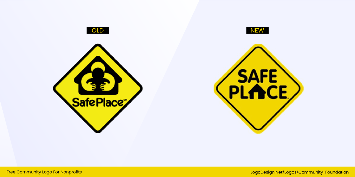
The original National Safe Place logo featured a figure and shelter-like imagery that some design critics have described as inappropriate because of its implied shapes rather than its clear conveyance of safety and protection. In some interpretations, the visual relationship between figures raised concerns that it did not align sensitively with its mission to protect young people in crisis, prompting revisions to make the imagery clearer and more appropriate for its context.
The former Arlington Pediatric Center logo, intended to portray care for children, became infamous because the arrangement of shapes could be misinterpreted as suggestive, rather than nurturing. Design critiques highlight this as a cautionary example of how figure arrangements within a symbol — especially when representing people or services for children — can be perceived very differently by audiences than intended.
The Royal British Legion uses the red poppy as its central symbol of remembrance. While deeply meaningful in the UK and Commonwealth as a mark honoring veterans, the poppy has also been seen as politically or culturally loaded in certain contexts — for example, in Northern Ireland and among some Irish nationalists, where a red poppy can be interpreted as a symbol of British nationalism rather than solely remembrance. This illustrates how a powerful emblem can resonate strongly with some audiences while being perceived as exclusionary or controversial by others.
6. Test Logo Usage & Scalability
A strong nonprofit logo is not just beautiful — it must also be functional. Nonprofits rely on their logos across many platforms, from websites and social media to donation pages, event banners, printed reports, and merchandise. If a logo does not perform well across formats, it can weaken recognition, reduce credibility, and make communication inconsistent.
• Digital vs. Print
Nonprofit logos need to perform equally well on screens and in physical spaces. On digital platforms, logos appear in small spaces such as social media profile images, email headers, and website navigation bars. If a logo is too detailed, thin, or complex, it may lose clarity at these sizes.
In print, the logo must remain clear on materials such as flyers, annual reports, fundraising letters, signage, and T-shirts. Colors can also shift between digital (RGB) and print (CMYK), so nonprofits must ensure their logo remains recognizable in all environments. A flexible logo helps maintain a consistent brand presence, no matter where it appears.

New York Road Runners’ logo features a clear geometric shape and clean, bold type, making it legible and recognizable, whether on the web or on race-day signage. The abstract torch-inspired symbol paired with the strong wordmark works well in digital environments like their homepage, email headers, and social feeds — and just as effectively on printed materials such as race banners, bibs, and brochures, where sharp shapes and high contrast ensure visibility at a distance.
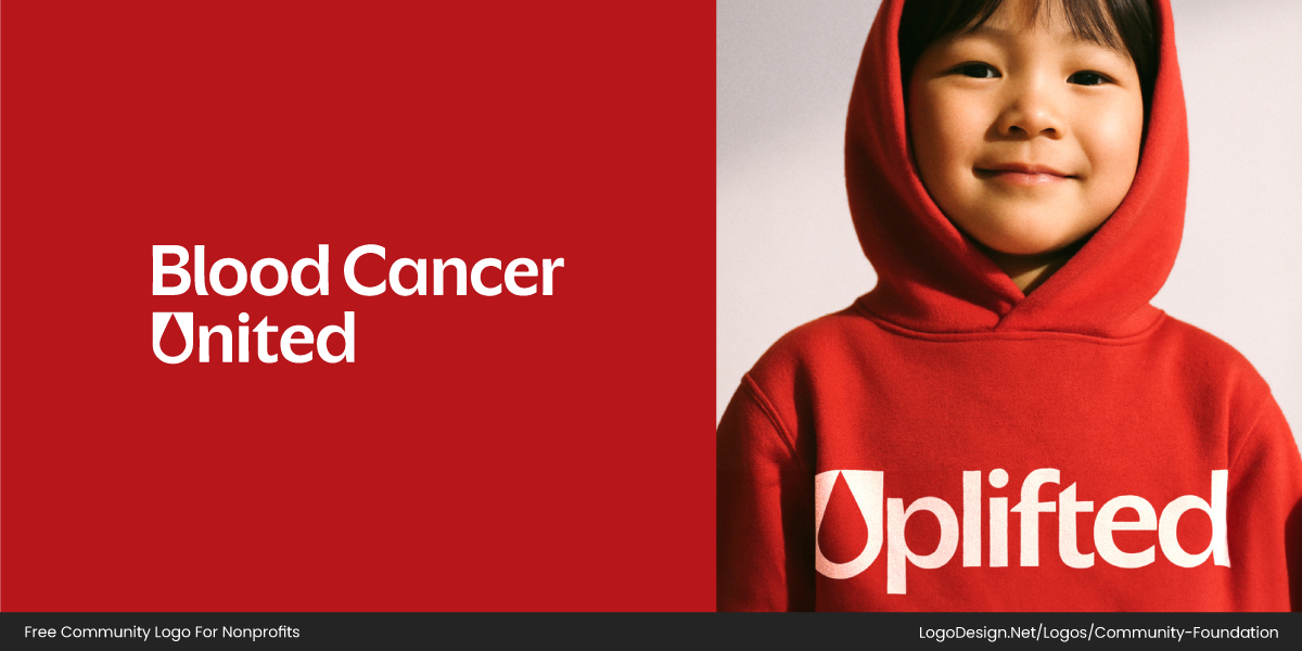
Blood Cancer United’s logo adapts beautifully across digital and print. Its simplified blood‑drop motif, formed from the letter “U” in the wordmark, appears clean and distinctive on the organization’s website and social graphics. When printed on apparel, posters, and event signage, the bold red shape maintains its presence and emotional impact, remaining identifiable even without extensive text.
• Scalability
A nonprofit logo should be legible whether it appears on a small mobile screen or on a large billboard. This is especially important for nonprofits, whose logos often appear in crowded spaces alongside other sponsors, partners, or event brands.
Many successful nonprofit logos include a simplified version that can be used in black and white or a single color. The logo’s scalability ensures it remains effective when printed on limited budgets, used on stamped materials, or reproduced in low-quality environments.
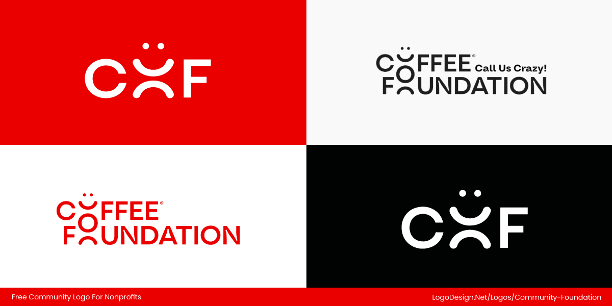
The Coffee Foundation identity shows strong scalability: its warm brown, coffee-inspired palette and clean geometric forms stay clear at small sizes, while the logo also works effectively in black and white without losing contrast or meaning. Simplified versions — including a standalone bean icon and compact wordmark — allow the logo to perform well on small screens, social media avatars, and mobile formats, keeping the brand consistent and recognizable across all uses.
Planted’s logo features a clean, simple sans-serif wordmark that is easy to read at any size, giving the brand a modern, approachable tone. The accompanying minimal circle icon serves as a clear, standalone mark—simple enough to be instantly recognizable across websites, apps, and social media —while reinforcing the brand’s focus on growth and sustainability.
• Responsiveness
Modern nonprofits need responsive logos — flexible visual systems that adapt to different sizes, formats, and platforms. While a full logo might include both a symbol and a wordmark for large displays, simplified versions such as an icon or stacked lockup are essential for mobile apps, social media avatars, favicons, and other small placements where space is limited.
The Malecare identity system uses a range of lockups and color variations that support responsiveness. The full logo pairs a bold, geometric wordmark with a distinct icon, while alternate stacked and simplified versions work well in tight spaces or monochrome applications, ensuring the brand remains clear and recognizable wherever it appears.
Similarly, the San Diego Zoo Wildlife Alliance logo system includes multiple variations to adapt to context and scale. The full horizontal logo works on websites and banners, while more compact lockups and icon-only elements perform effectively in social profiles, badges, and mobile interfaces. Color variations further increase flexibility without sacrificing brand coherence, helping the nonprofit maintain a strong visual presence in diverse environments.
7. Document Everything in Brand Guidelines
Brand guidelines act as a reference point for everyone who represents your nonprofit, both internally and externally. As organizations grow and more designers, marketers, volunteers, and partners contribute to communications, clear guidelines ensure the brand remains consistent rather than fragmented.
Strong branding guidelines define how the logo should be used, which colors are approved, what fonts are acceptable, and how the brand should speak in written communication. This consistency helps a nonprofit feel reliable and recognizable across social media, campaigns, fundraising platforms, reports, and printed materials. It also saves time by providing teams with a clear visual and verbal framework, enabling them to focus on impact rather than reinventing the brand with every new project.
The UN World Food Programme (WFP) demonstrates this well. Its wheat symbol and wordmark are used consistently in structured lockups, while a disciplined blue-and-white palette creates a trustworthy, unified presence across reports, digital platforms, and advocacy campaigns. Modern, readable typography supports clarity, and their communications balance factual updates with human stories, reinforcing both credibility and empathy.
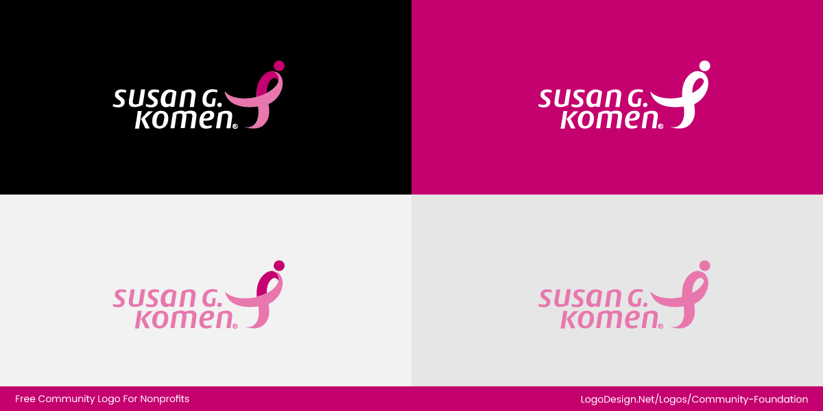
Susan G. Komen shows how guidelines strengthen recognition and emotional resonance. The pink ribbon symbol and approachable wordmark remain consistent across all touchpoints, while a carefully chosen pink palette signals hope and energy. Confident yet friendly typography, combined with motivational and supportive messaging across campaigns and events such as Race for the Cure, keeps the brand coherent and instantly recognizable wherever it appears.
Key Elements of Successful Nonprofit Branding
Effective nonprofit branding balances emotion with clarity. Your identity should feel human but also credible. Since donations and support are driven by trust, every visual and message should reinforce reliability.
Core elements to focus on:
- Audience Research: Understand what your supporters care about and how they perceive similar organizations.
- Visual Identity: Logo style, colors, and typography should work together to communicate the mission.
- Tone and Voice: Messaging should feel consistent across websites, campaigns, emails, and social media.
- Storytelling: Use visuals, icons, and short narratives to show impact clearly.
- Consistency Across Platforms: Ensure materials remain recognizable, professional, and trustworthy.
Across successful nonprofits, a few patterns remain constant: intentional color choices, readable typography, suitable logo styles, consistent tone, and clear storytelling. When all elements work together, supporters immediately recognize, understand, and trust the organization.
Final Thoughts
Nonprofit branding is not about looking trendy or polished for its own sake. It is about communicating purpose clearly and consistently. A strong brand helps people understand your mission, trust your work, and feel motivated to support you.
With a clear story, thoughtful design choices, and consistent guidelines, your nonprofit can build an identity that grows with your cause. The work takes time, but when branding is done right, it becomes one of your strongest tools for long-term impact.
Why wait? Design a logo that makes supporters pause, smile, and take action right away.
