Color seems simple, until it’s not. These are the logo color mistakes most brands make (and regret) and how to dodge them before your brand gets stuck.
What color do you like?
That’s definitely not the right question to begin with. When you’re building a brand color palette, what matters is what your ideal customers like. Color work can be tricky, and it’s pretty common for brands (big or small) to make mistakes.
It’s easy to go with your gut or stick to what’s trending, but logo color isn’t about personal preference but rather building trust, recognition, and the right first impression. The wrong color choice can backfire. It can dilute your message and even make your logo hard to read. But these mistakes are totally avoidable.
Today, we’ll break down where brands go wrong with logo color, and how you can sidestep those mistakes. If you’re building a logo or refreshing an old one, this is worth a read.
Logo Color Mistakes to Avoid at All Costs
Plenty of logo design mistakes exist, but here we’re talking specifically about those related to color. These are the most common slip-ups that can send mixed signals or worse, make your business logo forgettable.
1. Ignoring Color Psychology
Colors are visual, but more than that, they are emotional. They tell people how to feel about your brand before they read a single word. Ignore color psychology, and you risk sending the wrong message.
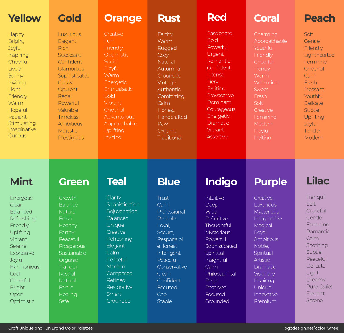
The message each color delivers to the audience
For example, using red for a meditation app or black for a children’s toy brand might create confusion or misalignment.
How to Avoid It
Think about what you want people to feel when they see your brand. Calm and trust? Blue might work. Creativity and playfulness? Try orange or purple. But don’t just choose what feels right to you; consider the color theory in logo design to select the right colors based on your audience and your industry.
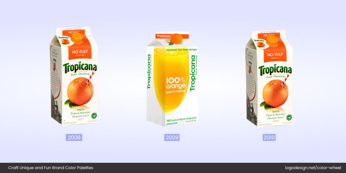
Tropicana rebranded in 2009, letting go of the classic orange straw. They reverted the design in 2010.
Tropicana once learned this the hard way. When they rebranded in 2009 with a sleek, minimalist logo in cooler tones (ditching their classic orange and straw), sales plummeted. Why? Customers no longer associated the packaging with freshness or the iconic orange juice experience. So do your color homework because one wrong shade could cost more than just aesthetic points.
2. Picking Colors That Don’t Align with Brand Personality
If your logo colors don’t match what your brand stands for, you’re sending mixed signals. Imagine a luxury jewelry brand logo using neon green, or a fun, youth-focused brand going with dark navy and grey. It creates a disconnect between how you want to be perceived and how people actually see you. Colors tint emotions and carry meaning; when they clash with your core identity, the result feels confusing or off-brand.
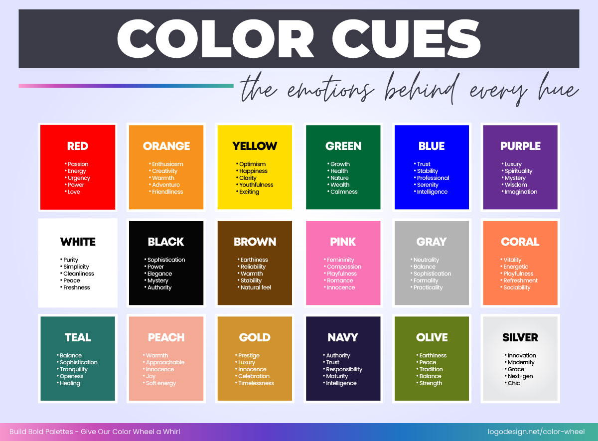
The emotions each of the colors represents
How to Avoid It
Define your brand’s personality in a few words. Are you playful, professional, bold, or calm? Then pick colors that reflect those traits. For instance, earthy tones work well for sustainable or organic brands, while bright, saturated colors suit creative or energetic ones.
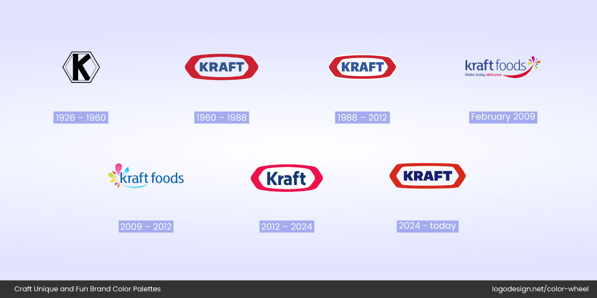
The evolution of Kraft Foods’ logo, showing the 2009 logo design, didn’t last long
Kraft Foods’ logo journey is a perfect illustration. Their 2009 logo rebrand was a complete miss. The colorful burst logo felt too fun and casual for a food conglomerate known for trust and reliability. The design didn’t last long before being revised under the Kraft Heinz umbrella.
3. Skipping Cultural/Regional Color Meaning
Colors don’t speak the same language everywhere. Culture shapes color choices in branding, for example, a color that feels bold and lucky in one culture might feel cold or even offensive in another.
Understanding what different colors mean to people from various cultures
Skipping research into how your logo colors are perceived globally can lead to confusion—or worse, alienate the very audience you’re trying to connect with.
How to Avoid It
If your brand serves international markets (or plans to), take the time to understand color associations across regions. For example, white represents purity in many Western cultures but is associated with mourning in parts of East Asia. Red is bold and energizing in most Western contexts but has deep cultural and political meanings elsewhere.
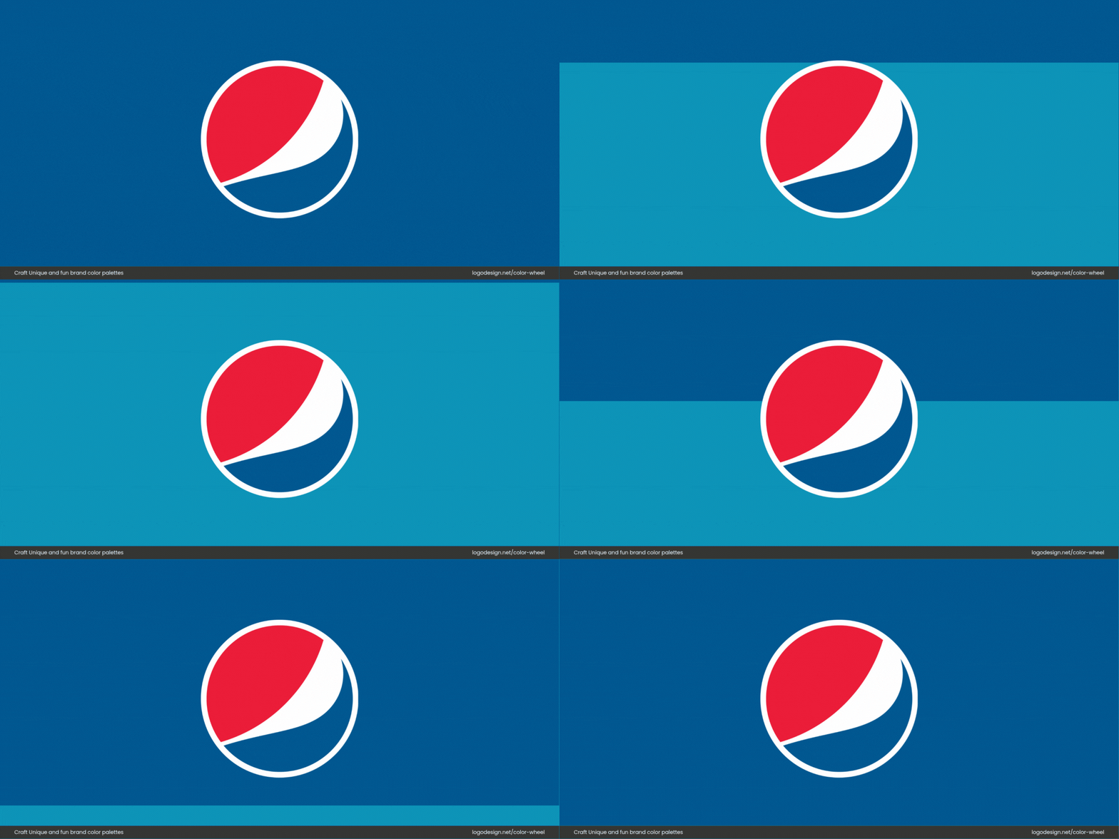
Pepsi adopted a lighter shade that didn’t sit well with South Asian people, as it symbolizes mourning.
Pepsi famously learned this tough lesson when it changed its branding from royal blue to a much lighter shade in parts of Southeast Asia. Light blue is associated with death and mourning in those regions, an association the brand clearly hadn’t anticipated. Always consider cultural implications before settling on logo colors. Your palette should resonate, not repel.
4. Following Trends Blindly
Trends are fun… until they aren’t. Jumping on the latest design fad like gradient overlays, neon hues, or muted clay tones might make your logo feel fresh today, but what about next year? Or five years from now? Trend-chasing often leads to logos that age poorly or blend in with everyone else using the same aesthetic.
How to Avoid It
Use color trends in logo design as inspiration, not instruction. Ask yourself: Will this still make sense for my brand in three years? Design with longevity in mind, not just short-term buzz. If you’re rebranding, focus on clarity, meaning, and flexibility over what’s “in,” much like the flat vs. gradient logo debate.
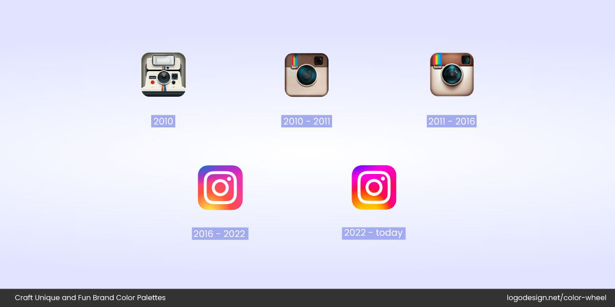
The Instagram logo evolution showing that the 2016 version lacked the original charm.
Take Instagram, for example. Their original camera-inspired logo had personality, but in 2016, they followed the flat-gradient trend with a minimalist shape. While visually modern, the logo change was met with confusion. Many users felt the new icon lacked the warmth and charm of the original. The lesson? Don’t ditch your identity for likes. Build a visual presence that can evolve, without disappearing into the design crowd.
5. Using Too Many Colors
A colorful logo isn’t always a better logo. While brands like Google or NBC make multicolor work due to their broad reach and legacy, most businesses risk looking chaotic rather than cohesive when they add too many hues. Too many colors can water down your brand identity and make it harder to reproduce across different platforms.
How to Avoid It
Stick to one dominant color and one or two supporting tones that reflect your brand’s personality. The key is clarity and balance. That’s what Golden Hour Lens ensured when updating their logo, making sure the color was according to their industry.
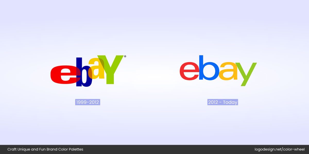
The original eBay logo, jumbled and overlapping, was redesigned in 2012 to a cleaner design
eBay is a perfect example. Their early logo featured jumbled, overlapping letters in bold red, yellow, blue, and green that screamed 90s internet chaos. In 2012, eBay simplified the logo with four colors but used a flat, consistent, and clean typeface. Oftentimes, the war isn’t between multi-color or monochrome logos but instead choosing colors wisely.
6. Copying Competitors’ Color Palette
In a crowded industry, it’s tempting to look at what the top players are doing and do the same. But borrowing colors directly from your competitors doesn’t make you credible. It makes you invisible. When every fintech brand is blue or every organic food label is green, it becomes harder to tell them apart.
How to Avoid It
Explore your industry’s color norm and study your competitors, not to mimic, but to differentiate. Think about how you can make your color palette stand out while still being relevant to your industry. You can stay in the right color family without being a copy. Add an accent color. Try a slightly unexpected tone. Or use iconography and typography in logos to push the difference further.
The Duolingo logo uses a bright green color to become easily identifiable
Duolingo is a great example. Many educational apps lean blue, but Duolingo chose a quirky, bright green that’s instantly identifiable.

MasterClass uses a salmon pink color, taking inspiration from many other brands
MasterClass also took a different path with its deep salmon pink monochrome logo. Being inspired is fine. But blending in too much means no one remembers you. And that’s a branding fail you can’t afford.
7. Colors That Clash or Compete
Just because two colors look cool on their own doesn’t mean they’ll look great together. Many logos suffer from palettes where colors fight for attention instead of working as a team. The result? Visual chaos.
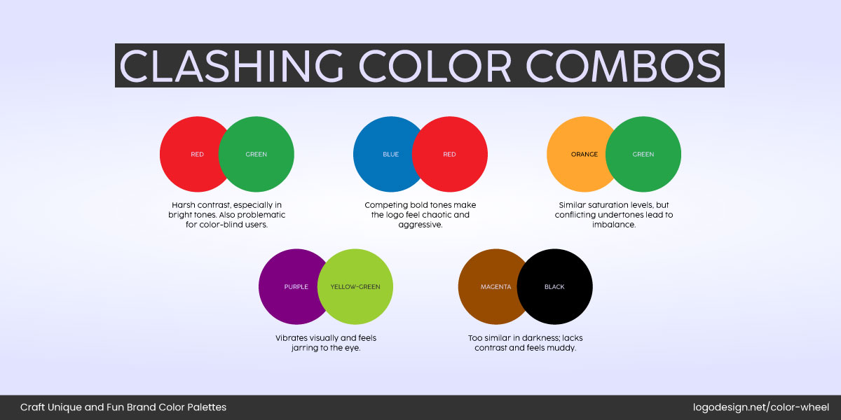
Colors that don’t complement each other and clash in a logo design
A clashing color combo can confuse your message, overwhelm the eye, and even make your logo harder to read.
How to Avoid It
Start with a dominant color and build your palette around it. Use the 60-30-10 rule: 60% primary color, 30% secondary, and 10% as an accent. Consider hue, saturation, and contrast when combining shades.
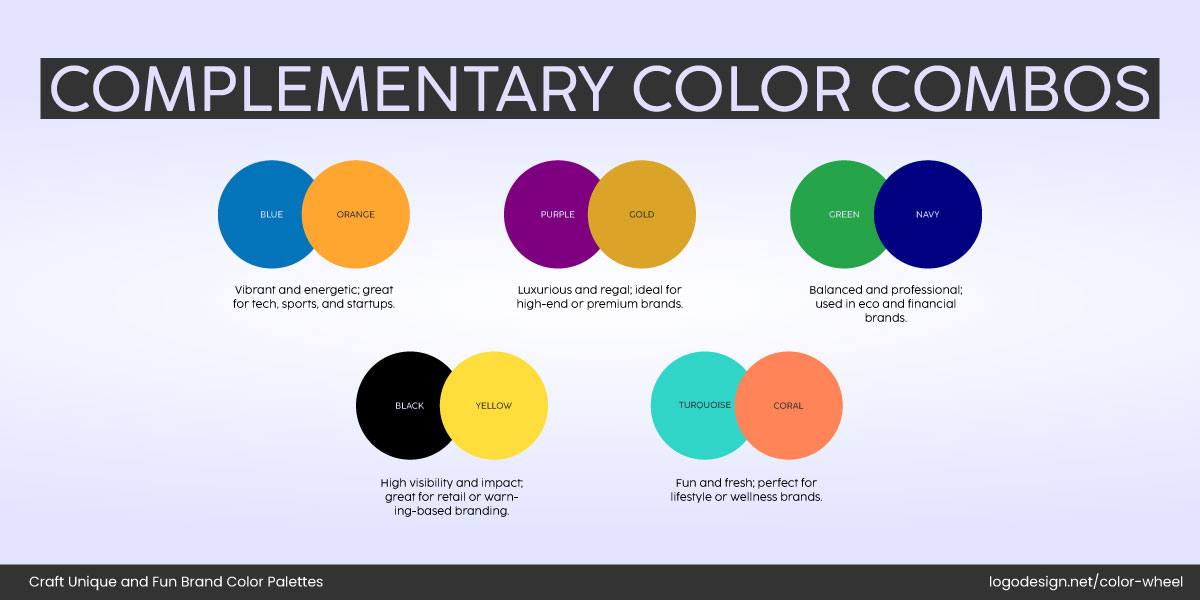
Complementary color combinations that work well in logo designs
Tools like LogoDesign.Net’s color wheel can help you test harmonious combinations.

Color Wheel by LogoDesign.Net to test the color combinations
Avoid pairing saturated tones that compete in brightness or hue, like neon green with bright magenta, unless you purposefully want tension. Your logo colors should support each other, not fight for attention.
The Slack logo changed the color combinations used in the design for a more balanced approach
Slack’s original logomark once featured oversized, overlapping vibrant stripes in red, yellow, blue, and green, which looked playful but often cluttered at a small scale. Over time, Slack reorganized its palette with more controlled color placement and balance, reducing visual overload while maintaining brand personality.
8. Poor Contrast or Readability Issues
A logo might look stunning on a white background, but what happens when it’s on a dark banner, a T-shirt, or a mobile app icon? Poor contrast and hard-to-read text are some of the most common (and damaging) color mistakes.
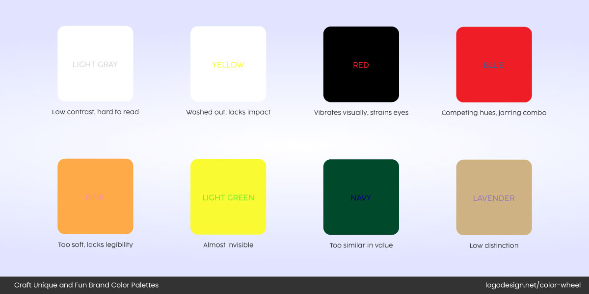
Examples of background and text colors that feel unreadable
If your logo disappears when scaled down or feels unreadable on certain backgrounds, it’s not doing its job.
How to Avoid It
Test your logo across every possible surface and size. Make sure it pops just as clearly in black and white as it does in full color.
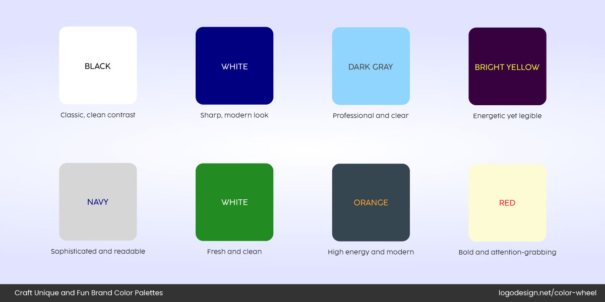
Strong contrast color combinations to improve readability
Stick to color combinations with strong contrast, like white on navy, or charcoal on cream. Avoid pastel-on-pastel or anything too faint.
The newer version of Yahoo logo using a cleaner and bolder logo design
Take Yahoo! as an example. In earlier iterations, their purple logo sometimes struggled with contrast, especially on digital displays. With newer versions, they’ve opted for cleaner, bolder tones that are easier to spot on any screen. Since your logo’s job is to communicate at a glance, give it the clarity it deserves.
9. Overusing Gradients or Effects
It’s tempting to use gradients, glows, and shiny 3D effects to make your logo pop. But in most cases, these do more harm than good. Overused effects tend to make logos look dated or overly complicated, especially on smaller screens or low-res prints. What seems eye-catching at full size often turns into visual noise when scaled down.
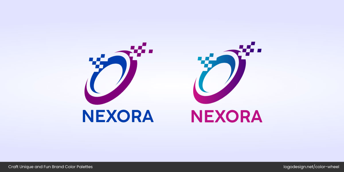
Two versions of the Nexora logo using gradients and other effects
Gradients can muddy up contrast, and shadows or bevels may interfere with readability. The resulting logo is one that lacks clarity, consistency, and staying power.
How to Avoid It
Keep effects minimal and purposeful. If you’re using a gradient, make sure it enhances the shape, not hides it. Try testing your logo in flat color and grayscale; if it still reads well, you’re on the right track. Think of effects as subtle accents, not the main event.
The Bing logo uses a metallic gradient that is flat and meets the modern design language
The earlier Bing logo leaned heavily on metallic gradients and beveled edges, giving it a techy but outdated look. Microsoft later redesigned it with a clean, flat style that aligned better with its modern design language. It proves that simplicity in logo design wins in today’s digital-first world.
10. Neglecting Black and White Versions
Color brings life to your logo, but your logo shouldn’t depend on it to function. One of the biggest oversights in logo design is not testing how it looks in black and white. Whether it’s for print, embossing, photocopying, or simple brand versatility, a logo should be just as recognizable without color.
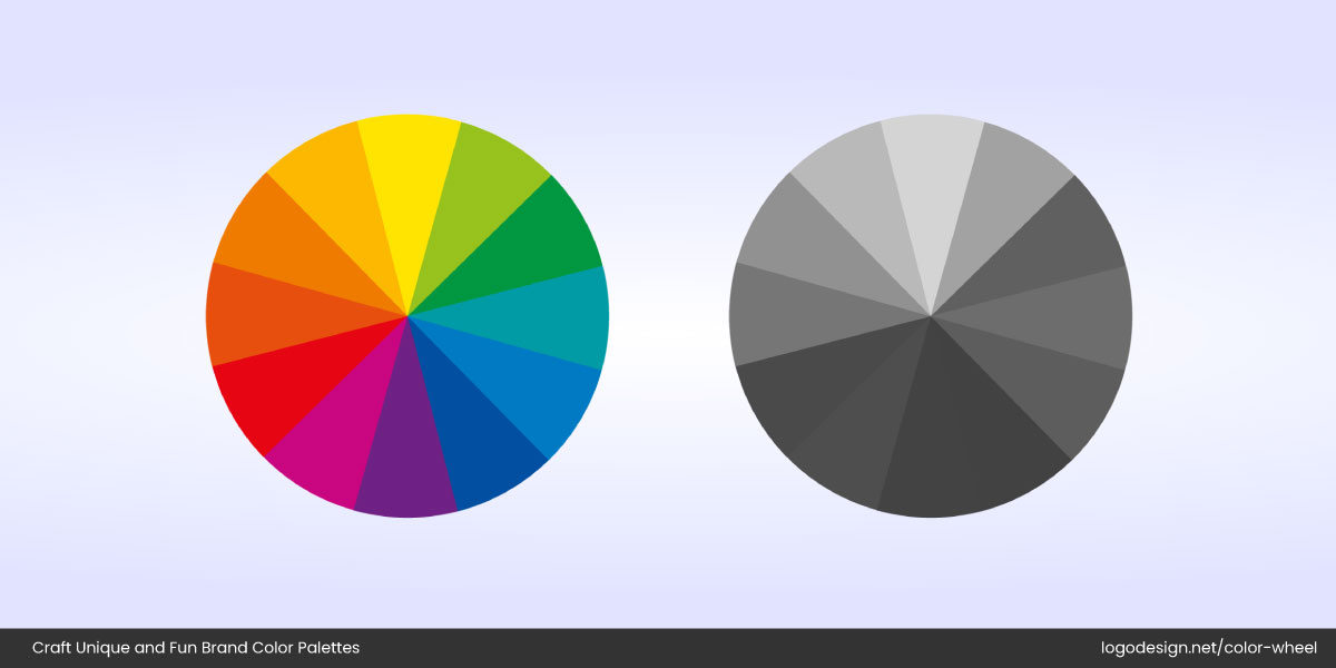
Two color wheels with monochromes and colored shades
Some designs rely too heavily on gradients, subtle color differences, or effects that completely vanish in monochrome versions, making the logo look incomplete or confusing.
How to Avoid It
Before finalizing your design, strip away all the color. If your logo still holds its shape, clarity, and brand feel, you’re good. If not, simplify elements, thicken lines, or remove fine detail that won’t translate well.
Airbnb logo shows versatility across different platforms
A solid logo should work in full color, grayscale, and single color without losing impact. Airbnb’s logo is an excellent example of versatility. The symbol remains distinct and memorable across every format, whether in coral pink, black, or white.
11. Not Considering Accessibility
It’s easy to get swept up in theories, psychology of colors in design, and brand aesthetics, but if your logo isn’t visible to everyone, it’s not doing its job. One in 12 men and one in 200 women experience some form of color blindness. That means a sizable chunk of your audience might not see your logo the way you do, especially if there’s low contrast or colors are too similar.
How to Avoid It
Design with inclusivity in mind. Avoid color combinations that are hard to distinguish for those with red-green color blindness (like green text on a red background). Use contrast-checking tools and grayscale tests to see how your logo holds up. Also, make sure your logo still communicates clearly even when viewed in black and white.

The Trello logo uses a strong contrast that’s readable for everyone
Trello does this well. Their logo uses strong contrast and clear, simple shapes, which remain readable even for users with visual impairments. A beautiful logo means nothing if it’s invisible to part of your audience. Choose accessible colors and design for real-world visibility.
12. Choosing Web-Only Friendly Colors without Print Consideration
Your logo looks stunning on screen, but what happens when it’s printed on a business card, postcard design or a shipping label? Often, colors that glow beautifully on a digital display fall completely flat or dull in print. That’s where a lot of brands go wrong: they design for screens only, forgetting that real-world materials behave differently.
How to Avoid It
Design in CMYK (for print) and RGB (for digital). Always test your logo on both mediums before finalizing. Bright neons, ultra-saturated hues, or colors with heavy gradients often don’t translate well when printed. If your brand uses effects like glows or shadows, consider simplified versions for print use.
The updated Dropbox logo uses soft purple to be visible on print assets and digital platforms.
A smart example? Dropbox. Their updated brand colors include soft purples and gradients online, but they also use flat, high-contrast versions for printed assets to ensure consistency across platforms. Your brand doesn’t just live online. It lives on receipts, packaging, letterheads, and more. So don’t let your logo fall apart in the real world; design with everywhere in mind.
Key Takeaways
Even the most passionate can fall into the trap of common logo design mistakes business owners make, especially when designing a logo that checks all the boxes. The good news? With the right strategy, research, and restraint, you can create a logo that looks good and works hard for your brand.
- Don’t let personal preferences override your audience’s expectations
- Too many colors can overwhelm; aim for a balanced, intentional palette
- Always test logos on different backgrounds, black/white versions, and screen sizes for versatility
- Avoid trendy shortcuts; your logo should stand the test of time
- Make sure your design is accessible to all, including those with visual impairments
- Gradients and effects should be used sparingly and never compromise clarity
- Research color meanings in different regions to avoid miscommunication
- Choose colors that reflect your brand, not just what your competitors use
- Don’t forget to test how your logo looks in print as well as digital
- Simplicity paired with strategy is the real secret to a memorable logo
