SALES / SUPPORT : 844-232-4816
12 Logo Design Mistakes That Are So Easy to Avoid
In the brand design universe, major business changes are usually always reflected through a change in identity visuals, too. For example, when Apple wanted to move away from the image of a friendly, approachable tech company and wanted to be perceived as an innovation-power house, it adopted a sleeker and more sophisticated logo.
The move not only transformed Apple’s status as a brand but also conveyed its philosophy going forward. A well-executed logo design is also a brand ambassador. You use them to separate your business from the rest, grab your audience’s attention, and as a symbol that fosters brand loyalty.
With so much riding on a business logo, you’d think people will always design it flawlessly. Alas, brands old and new do not always get it right. In addition to poorly thought-out designs, countless other mistakes plague brand identity concepts.
Below, we have rounded up 12 of such common mistakes and what you can do to ensure your brand is shielded from them.
- Cardiology Logos
- Aviation Logos
- Startup Logos
- Trust Logos
- Steakhouse Logos
- Gift Shop Logos
- Equestrian Logos
- Reiki Logos
- Festival Logos
1. Too Inspired
It may seem obvious advice but you’d be surprised to learn how many obscure startups have tried to copy the Starbucks logo. The most famous of them is a small South Korean coffee company, Starpreya.
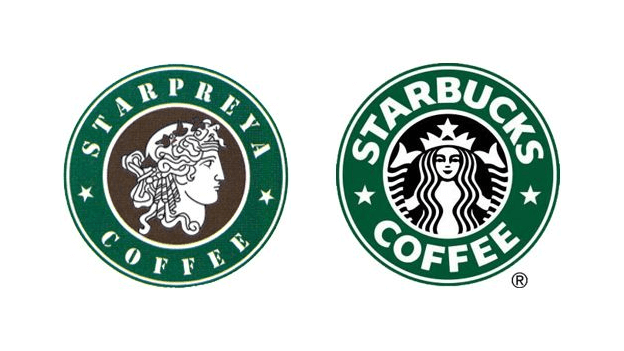
The South Korean company began its business in 1999 when Starbucks first arrived in the country. So, it is a bit suspicious that the local business just happened to create a logo that was so similar to a well-known international brand in the same industry, especially considering the growing importance of international phone numbers for global business communication.
But we can’t say much on the topic as the coffee giant lost its copyright infringement claim against the local business.
With that being said, would you forever like to be known as a brand that is too similar to another brand? If you do, you’re giving up on a unique identity, a chance to be known as a brand with integrity, and a loyal customer following.
Our Advice:
- Don’t be too inspired.
- Explore your brand journey and reflect it through an original logo.
Brand That Got it Right: Amazon
Though you’ll hardly ever find a famous brand that has copied its logo from another, there is one brand that stands out when we talk about originality and creativity.
2. Noisy Colors
Colors have a lot of influence on human emotions and psychology. A common mistake that we see in brand designs all the time is the use of bold and bright colors without much thought behind it.
Clashing colors, colors that are too loud, and shades that do not have a lot to do with your brand message are lazy ways to get customer attention. If you want people to notice your logo immediately, be more inventive. Don’t throw brighter and bolder colors at the canvas and call it design.
Our Advice:
- Consider the context. If your brand image/message does not naturally require a loud voice, perhaps a softer, calmer shade is what you want.
- When choosing brand colors, try different combinations to ensure the choices aren’t clashing.
Brand That Got it Right: Firefox Browser
The Firefox browser logo is bold, bright, and has gradient but it is spot on for the brand.

Image: Firefox
3. Chaotic Typography
A lot of new designers do not worry about typography as much as they should.
Typography not only makes the text in design coherent and legible but also amplifies your brand message. Think of Coca-Cola’s logo for a moment. If it gave up its popular cursive today and went for a straighter, Serif typeface, the effect would immediately go from friendly to serious and more business-like.
That’s the power of typography. It binds the design together and makes your brand message more visible and, of course, readable.
Our Advice:
- Certain typography rules direct the use of typefaces in logos and other graphic design. Learn them so they become a second language to you.
- Do not pair more than three typefaces together. Ideally, you should stop at just two. But gun on the head, if you have to choose more, three is the limit.
Brand That Got it Right: Chanel
The Couture font used in the Chanel logo is simple, clear, and neutral. In its simplicity, it looks graceful and organized.
4. Clashing Elements
Harmony is an essential concept of design. While each element needs to be perfect on its own, collectively, they need to work together. It’s an ensemble cast; there are no heroes. Each of your elements needs to be generous enough to let other elements join in and work for the common goal.
If your icon is a bit bigger, a smaller-looking company name won’t fit nicely. Also, avoid using an all-caps brand name if you are using a cursive font. If your logo icon is a bit complex, keep the color palette basic and simple. If your logo shape is edgier and angled (a triangle, for instance) then flat colors with no gloss can help create a unified design.
Our Advice:
- Go binary. If one element is domineering, pick the other one that’s happy to stay in the background.
- Use negative space generously. It allows for a balanced and streamlined design.
Brand That Got it Right: Dropbox
The complexity of the 3D icon is beautifully offset by a simple font in the wordmark.
5. Raster Images
Another common mistake that new designers may fall prey to. Using a raster image renders the logo virtually un-scalable. Since a raster image is based on individual pixels, when you try to scale it up or down, at some level, it uses its sharpness or event coherence. The pixels either go too far apart or get too close. Either way, the shape can’t remain intact and discernable.
Here is a great tutorial on how to take your logo design from sketch to vector on Adobe Illustrator.
Our Advice:
- Always choose a vector program to create your logo designs. Adobe Illustrator is our best recommendation.
- If you are not a designer and cannot afford one, our logo design library offers nothing but vector-based logo designs that’ll scale from tiny business cards to giant billboards.
Brand That Got it Right: Michael Jordan’s Jumpman
The Jumpman logo is based on a lifelike vector of Michael Jordan’s actual photograph and isn’t a raster image.
Image: Wikipedia
- Welfare Association Logos
- Hair Salon Logos
- Dry Cleaner Logos
- Meat Butcher Logos
- Boutique Logos
- Blacksmith Logos
- Legal Logos
- Tailor Logos
- Nutritionist Logos
6. Minuscule Details
Do you know what the primary purpose of a logo design is? Sure, it is identifiability, distinguishability, and all that. But what comes even before that?
The answer: legibility.
Your design needs to be seeable and readable. If people can’t see it and it’s all tiny and blurry then it isn’t doing anything for your brand identity. Compact fonts, thin lines, and small-case brand names that aren’t properly sized, lose the luster when design needs scaling up.
Our Advice:
- Focus on kerning, size, and weight. Keep things readable.
- Check multiple layouts (horizontal and vertical) and formats (digital and paper) to ensure the logo is proper and legible.
Brand That Got it Right: Unilever
Countless minuscule icons depicting different forms of life make the curve of the letter U of the logo.
7. Obscure Monograms
Monograms are classic, the most sophisticated kind of logo design you could ask for. But for startups and businesses that are not too well-known they could be counterproductive. Fashion brands are the guiltiest of this charge.
See, for a new or newer brand, the main focus is to make their business name a household slogan. Monograms kind of rob you of this chance. Of course, if you have the kind of budget that’ll allow you to advertise and market yourself extensively, sure, go ahead with your monogram. But if you are creating a logo for a fashion startup, for example, and do not have the budget for such aggressive marketing, perhaps a wordmark or a combination logo is most suitable.
Our Advice:
- Wordmarks – the full name of your brand as your logo – are more advisable.
- If you still want a monogram, make sure that your brand name is spelled out underneath, inside the logo.
Brand That Got it Right: Louis Vuitton
8. Lazy Proofing
Don’t swap your eyes for a hawk’s – that’s too extreme – but you do need a keen eye to make sure your final design doesn’t contain any flaws. While you may think proofing is such an obvious thing and of course everyone does it, but really, we’ve seen enough typos and missed details on official logo designs that it’s hard to remain mum.
Mistakes such as missed vowels, skewed kerning, or icons that look like something else when viewed from a certain angle or distance are all avoidable mistakes. Sending your client a final logo file with an error in it is hugely embarrassing. So let this one be a mistake of others that you learn from and avoid doing yourself.
Our Advice:
- Proof, proof, and then proof some more.
- Do not start looking for mistakes immediately; you may not find them. The design is still too familiar. Check it after a gap of few hours or a couple of days. Errors will be glaring then.
Brand That Got it Right: Google
There was a time when Google’s logo wasn’t as perfect as it is today. In 2014, the brand tried to correct its kerning in its most recent design (2013 version). The G moved one pixel to the left and the L moved down and left one pixel.
9. Forgetting Your Audience
Who should you design for: your brand, market, or budget?
All of them. But mostly, design for your audience. Consider the example of a real estate company. Its purpose is to provide smooth, secure, and profitable investment options to its customers. All of these speak of serious business goals. As a designer, you may think of reliable colors and responsible fonts.
The audience, however, is millennial first-time homeowners. This audience demands approachability, authenticity, and not too much pomp. If you go too serious in your brand representation, you may lose this audience.
Our Advice:
- Do your market research to find out what your audience is looking for.
- Brainstorm with your team before you get sketching for the most relevant ideas to get to the surface.
Brand That Got it Right: Durex
Reading the room right, the condom brand gave its logo a fresh new look to reflect a sex-positive and inclusive attitude that the company stands for.
Image: Durex
10. Not Enough Research
Nobody likes to do it, yet it is essential. Research not only helps you with idea fertilization but can help you avoid common pitfalls. For example, if it is a software logo you are designing, looking at industry standards can help you figure out common threads of designs. From them, you can gauge what to do, what not to, and what has been done too much already.
Doing your homework before you start to design also includes learning the correct art terms, familiarizing yourself with your client’s industry, and doing som\e analysis
Our Advice:
- Research your competition. Look at their logo, brand vision, and see how the two align.
- When you conduct market research, ask the right questions. What you are here for, the value you provide, what do you do, and how?
Brand That Got it Right: Target
Target’s logo is timeless, perfectly encapsulates the idea behind the brand, and is attention-grabbing. A result that you can only achieve when you research is without holes.
11. A Crowd of Concepts
As a new designer, you may be tempted to send your client a whole hoard of design concepts. It’s understandable; you want them to see your range. You want to show off your talent and prove the different ways your imagination can go.
But to a keen and professional eye, all this variety signifies a lack of a solid concept or idea. It can also confuse the clients. Remember, as a designer your job is not only to create a good design but also to educate your clients. They may know what they are looking for, but it’s you who can tell them the best way to get there.
Our Advice:
- Don’t send more than 3 concepts, with strong reasoning and logic behind each.
- Fight (read: convince and educate) for your designs. Show your clients how your design can help them achieve their objectives.
Brand That Got it Right: Yahoo
In 2013, the brand tried to crowd-source its logo design and the attempt, understandably, was a disaster. Later, the company had to redesign the logo itself and finally got it right.
12. Disruptive Layout
The layout plays an important role in how the logo or brand will be perceived. If your logo is a bit tilted or looks skewed, it’ll get noticed immediately, sure. But at what cost?
While disruptive design layouts or the ones that run on a lack of symmetry may get people’s attention, but this attention won’t be long-lasting. People will see it as a lazy gimmick or may find the design too distracting. They may also find it too complicated to decipher and decide they want nothing to do with it.
Properly presented designs are great for the mind. The brain loves order and symmetry. So, do not aim for bizarre disruption to achieve some vague goals. Keep things straight.
Our Advice:
- Don’t go for asymmetrical or non-traditional layouts just because.
- Ensure that everything you do in your logo design stems from your brand purpose.
Brand That Got it Right: Medium
The publishing brand has come a long way from its disruptive, geometric, weird 3D logo of 2015. It did nothing for the brand. The most recent one is interpretive and iconic.
Image: Medium
Over to You
People will tell you perfection is an illusion. But don’t listen to them when you are developing brand identity designs. Here, errors can mean anything from brand ridicule to drop in sales. While in most cases pursuit of perfection is quite exhausting, in brand identity designs, it’s the only thing that matters. So, bookmark this page and create a checklist off of it. Before and after you complete a design, go through this list and make sure you’ve ticked all the boxes.
Happy designing!
- Sailing Sailboat Logos
- Nurse Logos
- Warehouse Logos
- Ngo Logos
- Private Investigator Logos
- Property Management Logos
- Florist Logos
- Gym Logos
- Event Planner Logos

