Color and typography aren’t individual logo design choices. They are like a duet—one out of tune, and the whole song falls flat. Create the best logo by perfectly nailing this harmony!
What makes a logo extraordinary? Sure, it’s the shape, the simplicity, maybe even a clever hidden symbol – but more often than not, it’s the perfect pairing of color and typography that makes it stick.
Color sets the emotional tone. Typography speaks your brand’s personality. Put them together, and you’ve got a logo that looks aesthetically pleasing and functionally sound. But these two elements don’t just have to look great on their own; they need to work in sync. A bold, playful font might clash with a serious navy blue. A pastel color palette can make an elegant serif typeface feel out of place. And that’s where many logo designs fall flat.
When color and type don’t complement each other, your logo risks looking amiss, which is something no brand can afford.
Why Color and Typography Pairing Matters
Color and typography in logo design are the first two things people notice. It’s often the fastest way to communicate your brand’s tone. Together, they set the stage for how your business is perceived. A good pairing creates clarity and trust, while a bad one creates confusion, even if the viewer can’t explain why.
Spotify Logo with vibrant green color and rounded sans-serif fonts for a fresh look
Think about Spotify’s vibrant green paired with a simple, rounded sans-serif font that feels fresh, tech-savvy, and made for a younger audience.
Tiffany & Co. Logo with ribbon egg blue that gives a luxury feel
On the other end of the spectrum, Tiffany & Co.’s elegant serif typography paired with that iconic robin egg blue says luxury and timelessness without trying too hard. Both brands use entirely different tones, but in each case, the typography and color reinforce each other perfectly.
When the color and type support each other, your brand identity becomes effortless and memorable. But if they pull in different directions, you’re left with confusion and missed connections. That’s why this pairing isn’t a creative afterthought. It’s the foundation when selecting fonts and building a brand color palette.
Understanding Typography Personality
Typefaces are letter shapes that speak on your brand’s behalf. Whether you want to appear classic, modern, or expressive, following essential typography rules helps you stay consistent and intentional. Here’s a breakdown of the three main styles and how they tend to communicate:
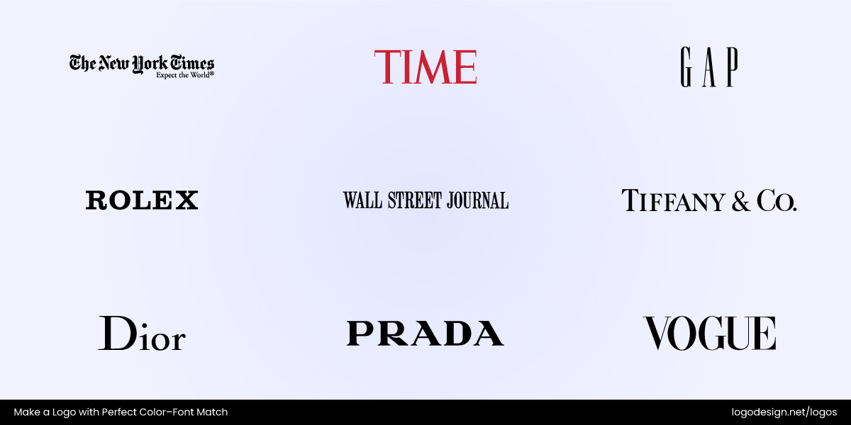
The brand logos that use serif fonts to communicate tradition
- Serif Fonts: With their little “feet,” these fonts tend to communicate tradition, reliability, and formality. Serif fonts are used by brands that want to evoke a sense of legacy and professionalism, such as The Wall Street Journal’s serious, credible, and established image or Canon’s refined vibe.
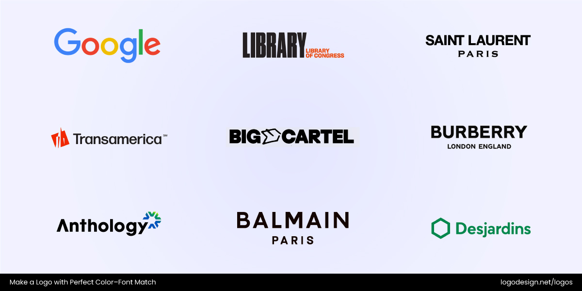
The brand logos that use sans-serif fonts to communicate modernity and a clean look
- Sans-Serif Fonts: These are clean, modern, and versatile. Tech and lifestyle brands like Lululemon and Google use sans-serif fonts to signal simplicity, accessibility, and innovation.
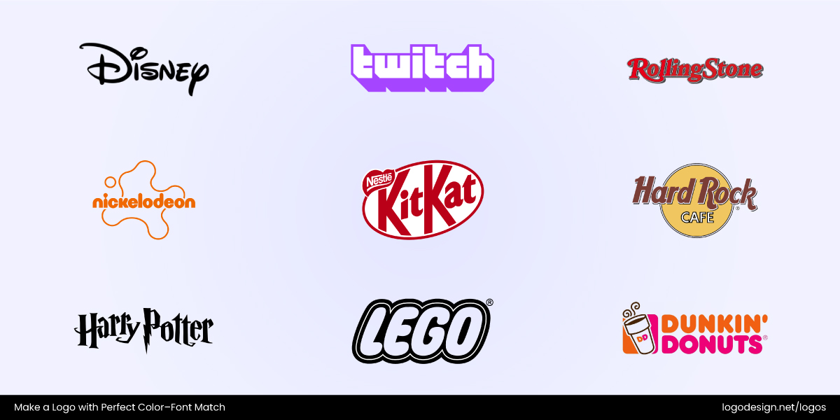
The brand logos that use display fonts to show personality and flair
- Display Fonts: Such fonts are bold, stylized, and decorative. They’re great for brands that want to stand out and show personality (like Disney or Glossier), but they need to be used with care. Too much flair can easily feel forced or hard to read.
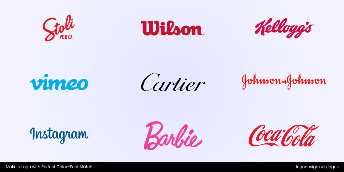
The brand logos that use hand-drawn fonts to give a personal touch and authenticity
- Hand-Drawn Fonts: These fonts feel personal, creative, and authentic. Brands like Kellogg’s and Ford use handwritten styles to appear friendly, approachable, and human. It’s perfect for conveying warmth and individuality.
The goal here isn’t to impress with complexity but rather to communicate clearly. Simplicity in logo design often wins because it lets your brand voice shine without distraction.
The Psychology of Colors in Logos
Did you know that the same wordmark logo can feel bold or calm, premium or playful, depending entirely on its color? That’s because colors are emotional triggers, and color psychology shapes perception more than we often realize.
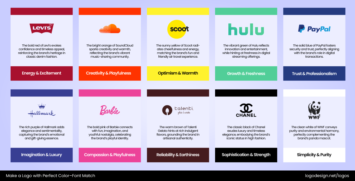
10 different brand names and the message highlighted by the color shades they use
According to color theory in logo design, every shade carries certain psychological cues. Red conveys energy and passion, and Blue signals calm and professionalism. Green brings thoughts of nature, health, and sustainability, while yellow feels optimistic and friendly. Orange is used to evoke fun and creativity, while black is sleek and timeless. Pink can be bold and edgy, while purple leans into luxury and imagination.
Two examples of logos using a combination of blue and green color shade
But context matters. A color that works well for a fitness brand logo might fall flat for a financial institution logo. Choosing the right palette depends on your audience, cultural/regional color preferences, how different industries use colors, and the emotional tone you want to project.
Smart Tips for Pairing Color and Typography in Logos
Don’t start with picking a pretty color or jumping on fresh logo design trends. See how various elements work together and strive to maintain a balance. The balance between tone, legibility, and emotion is what separates forgettable branding from something iconic. Here are five smart, real-world-backed tips to help you get that color–type harmony just right.
1. Don’t Let Bold Fight Bold
Pairing a loud typeface with an equally bold color can lead to visual chaos. If your font already demands attention through thickness, size, or shape, consider toning down the color to let the type shine. On the flip side, if your color is doing the heavy lifting (like a bold red or bright yellow), a simpler font can bring balance.
Netflix logo using binge red color and custom serif font
Netflix uses a dramatic custom wordmark in bold sans-serif, but its simple red-on-black color pairing keeps it powerful but not overpowering. This shows how a restrained palette lets bold typography take center stage.
Wish logo using deep black color and a custom sans-serif font with angular edges
Wish used to pair bold blue text with a bulky sans-serif. The logo often looked heavy, especially on mobile. The lack of visual contrast made the whole thing feel clunky and outdated, which they updated in 2022 with a new black wordmark on green background.
2. When in Doubt, Prioritize Readability
No matter how beautiful your design is, it fails if people can’t read it. High contrast between your text and background ensures legibility, especially on small screens or outdoor signage. It also plays a big role in accessibility in logo design, making sure people with visual impairments can interact with your brand.
The New York Times logo using solid black color and a blackletter style font to give a classic look
The New York Times sticks to a high-contrast blackletter font on white backgrounds. It’s classic, readable, and instantly recognizable, which is proof that legibility and personality can coexist.
TikTok logo using shades of Neon Aqua, Hot Pink, and Deep Black, along with a custom font
TikTok previously faced scaling challenges with its quirky, thin typeface and neon gradient, so they refined the design by adding stronger contrast, thicker lines, and clearer typography to ensure legibility across screens and print.
3. Match Font Personality to Color Emotion
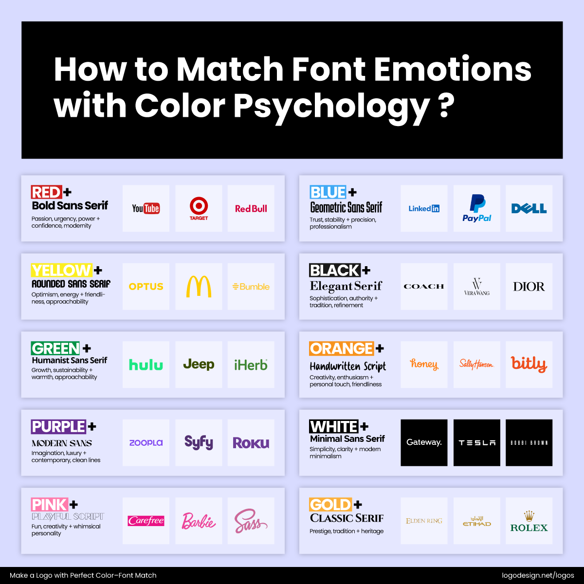
Different color shades used by various brands and what they represent
Typography has tone, and so do colors. The trick is pairing them thoughtfully. A luxury serif doesn’t pair well with neon orange. A bubbly script font feels off in grey. Think of it as pairing flavors, do they enhance or clash?
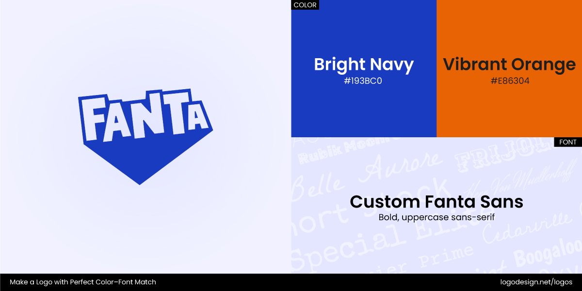
Fanta logo using bright navy and vibrant orange colors and a custom sans-serif font
Fanta’s logo is a masterclass here. It pairs an upbeat, playful typeface with bright orange and blue colors that signal youth, energy, and creativity. The result is a cohesive tone that feels both fun and expressive.
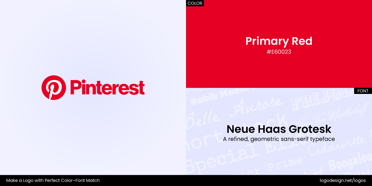
Pinterest logo using a primary red color and a sans-serif font
Tech giant Pinterest evolved from a cursive-inspired “P” in subtle red to a cleaner, more geometric “P” upfront, paired with a slightly deeper hue. Consistency between shape, style, and color now reinforces the brand’s modern, energetic vibe.
4. Let Color Theory Guide the Pairing
Your color scheme should enhance, not compete with your chosen font. Analogous colors (those next to each other on the color wheel) offer a calming, harmonious feel. In contrast, complementary colors (opposites on the wheel) create strong visual contrast and energy. Choose colors that match your brand’s tone and purpose.
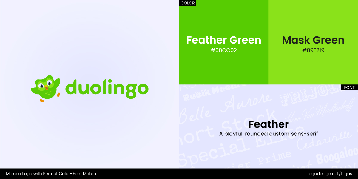
Duolingo logo using feather green and mask green colors, with a playful font style
Duolingo pulls off a complementary pairing with its bright green mascot and deep, clean sans-serif typography in black. The contrast makes the name pop, while the green brings in a playful, friendly vibe that reflects its learning-based brand.
Oatly logo using earth black and soft blue colors, with a custom font style
Oatly, on the other hand, leans into an analogous palette. It pairs cool grays, off-whites, and a soft blue with bold, blocky, custom typography. It feels casual yet confident, matching the brand’s witty tone while staying readable across platforms.
5. Balance Personality and Professionalism
Some brands want to be bold. Others need to feel trustworthy. Either way, avoid going too far in both font and color at once. One should ground the other. Stick to clean, readable serif or sans-serif font with a pop of personality in color—or vice versa.
Adobe logo using a pigment red color and a custom sans-serif font style
Adobe is a perfect example. It uses a clean, angular sans-serif that leans creative but professional. Paired with its signature red, it communicates confidence and innovation without shouting. It’s a subtle but powerful balance that works across industries.
Mastercard logo using sunset gold, bright red, and vibrant orange colors, with a geometric sans-serif font.
Similarly, too much flair can undermine trust. In its early days, Mastercard’s logo featured loud gradients and overlapping circles that competed visually. A clean redesign in flat red and yellow paired with simpler typography helped streamline its messaging and convey brand reliability.
6. Design for All Formats – Digital or Print
Logos need to function everywhere, from app icons to packaging, dark mode, light mode, and printed boxes. This is where flat vs. gradient logo colors come into play. Gradients may look stunning online, but they’re tricky in print. Similarly, thin fonts might disappear at small sizes. Think about adaptability early on.
Slack logo using a multicolored hashtag, having pulse pink, flow blue, collab green, and idea gold colors, and a sans-serif font
Slack overhauled its logo from a multi-color hashtag with complex gradients to a simplified symbol with clean geometry and flat colors. The aim was to scale well across digital platforms, dark interfaces, and mobile screens, all without losing its spark.
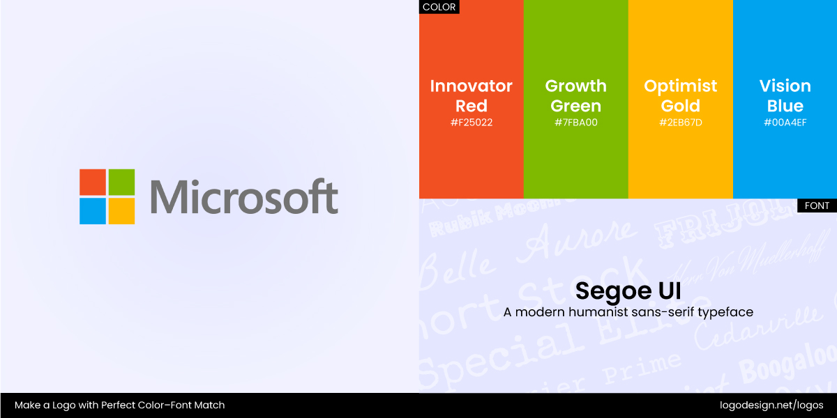
Microsoft logo using shades of red, green, gold, and blue colors, and a segeo UI font style
Microsoft also refined its messy multi-colored Windows logo into a flat blue Windows symbol with minimalist type. This change improved their scalability and consistent usage across digital and physical assets.
So what’s the bottom line? Color and typography should collaborate with each other, not compete.
Common Mistakes to Avoid When Pairing Color and Typography
Not all brands get the logo color-typography combination right. Many designers and business owners make mistakes in logo colors and typefaces that are quite easy to avoid. Let’s spot these mistakes and learn what to do (and what not to).
Mistake #1: Pairing Loud Colors with Decorative Fonts
When both your font and color fight for attention, the result is noise. Decorative typefaces can be expressive, but pairing them with bold neons or highly saturated hues overwhelms the eye. This is especially tricky with multi-color or monochrome logos that lack balance.
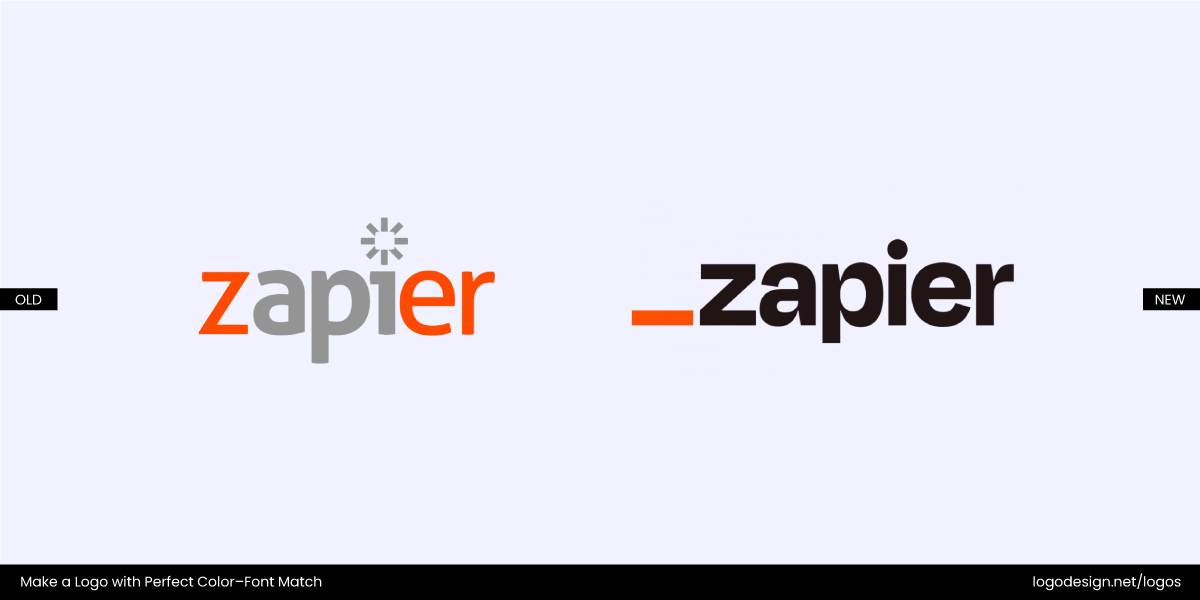
The original version of Zapier logo that was designed in 2022
Zapier’s original branding featured bold orange and twitchy typeface. As part of its 2022 redesign, the color was refined (a calmer "international orange") and paired with a clean, modern sans-serif to create balance and brand personality.
Mistake #2: Low Contrast Between Text and Background
Contrast is the unsung hero of legibility. If your logo’s text blends into the background, your message gets lost. Subtle or minimalist designs can feel sleek, but poor contrast lowers legibility, especially in small formats or digital use.
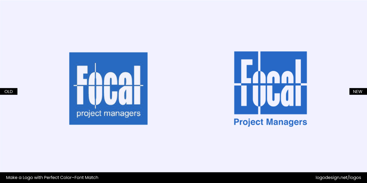
The original Focal logo and the updated version, focusing on the project manager wordmark
Focal PM, a project management consultancy in Greece, redesigned its logo to fix this. The redesign strengthened the “Project Managers” wordmark by increasing the font size, adjusting proportions, and deepening the blue color by adding contrast to make the logo crisp and readable.
Mistake #3: Typography Too Thin for Light Colors
Thin fonts can look elegant, but not when paired with soft or pastel hues. They vanish and undermine visibility, especially on mobile or lighter backgrounds.
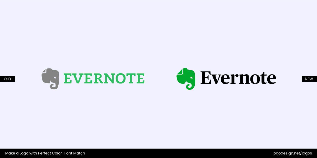
The original version of the Evernote logo, using thin typography, and the redesigned version with a heavier and richer font
Early versions of Evernote’s logo featured a slim serif font in lighter green tones. The redesigned logo uses a weightier, geometric sans-serif paired with richer green shades. The new logo ensures better contrast without losing brand identity.
Mistake #4: Inconsistency Across Branding Materials
No matter how great a logo is, it loses its power if it appears in different colors, fonts, or proportions on business cards, social media, and packaging. It leads to confusion and weakens brand recognition.
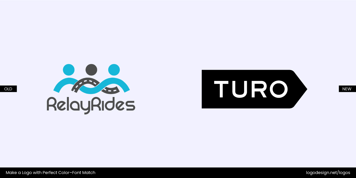
Turo’s logos were different across various platforms. They redesigned it to have a consistent black and white palette
Turo, a peer-to-peer car rental platform, once had different visual treatments of its logo on its app, print ads, and website. The current clean sans-serif wordmark and consistent black-and-white palette solved those mismatches.
Brands with Great Color + Typography Combos
We’ve covered how to pair thoughtfully, what pitfalls to avoid, and how the psychology of color and typography together shape perception. Now, let’s look at a few brands whose logos master the balance between font emotion and color tone:
1. Bumble
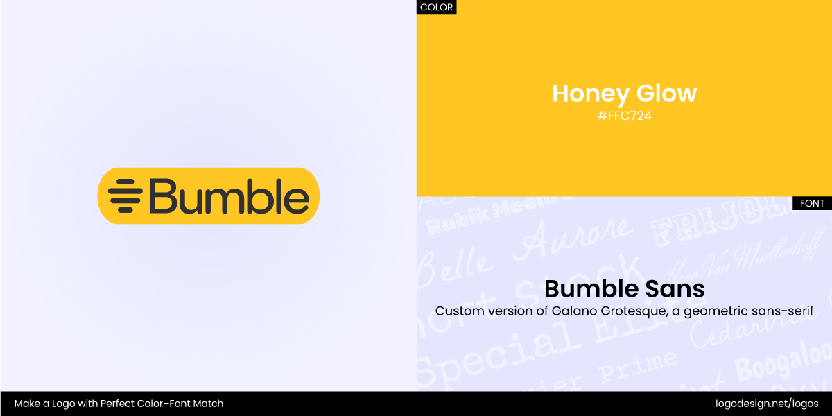
Bumble using a shade of yellow in the background, and a custom font
Color: Yellow (#FFC629) and White (#FFFFFF)
Font: Bumble Sans – Neue Haas Grotesk (customized)
Bumble’s logo pairs a bold sans-serif typeface with a warm honey-yellow color. The color reflects warmth, optimism, and friendliness, all central to a dating/social app that emphasizes kindness and empowerment. The font’s rounded letterforms feel approachable, clean, and gender-neutral, helping the brand appeal broadly across dating, BFF, and networking platforms. The cheerful yellow with soft but confident typography is a combo no one can miss!
2. Headspace
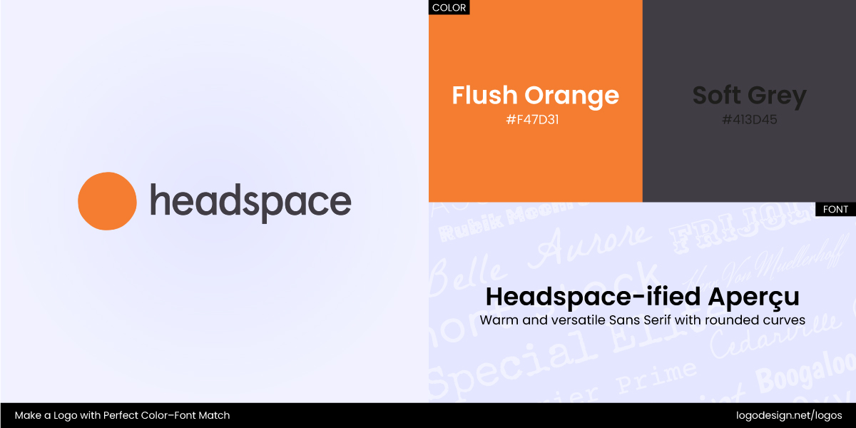
Headspace using orange and grey color shades and a custom font style
Color: Flush Orange with the hex code #FF7300
Font: Circular Std (a geometric sans-serif)
In a space where peace of mind is the product, the Headspace logo’s pairing perfectly reflects the outcome users are looking for. Their logo pairs a calming orange with a light, rounded sans-serif font. Orange evokes energy and motivation, but the specific muted tones leans into gentle encouragement over loud motivation. The typography reinforces this; it’s smooth and unintrusive, just like their app experience.
3. Bon Appétit
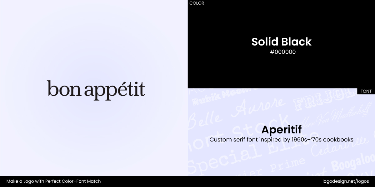
Bon Appétit logo using a black shade and a custom font style
Color: Solid Black #000000
Font: Aperitif (a custom serif font designed exclusively for Bon Appétit by MCKL)
Bon Appétit’s logo is a great example of how a simple color and typography pairing can carry major personality. The brand uses an oversized black serif typeface that is confident, clean, and undeniably editorial. It instantly tells you this isn’t just any food magazine but one with authority and a point of view. The black-on-white palette adds to that clarity, creating high contrast without relying on any decorative frills.
4. Patagonia
Pantagonia logo using color shades of orange, blue, purple, and black, along with a bold font style.
Color: Dark Violet: #8a07bd, Bright Blue: #080aef, Safety Orange: #f56407, Standard Black: #000000
Font: Belwe Bold (a bold, condensed serif)
Patagonia’s logo is rooted in storytelling. The bold serif typeface reflects durability and heritage (the key brand qualities), while its blocky, condensed letterforms offer visual strength. The mountain stripes in blue, orange, and violet evoke a Patagonian sunset, hinting at adventure and connection to nature. Together, the clean type and high-contrast color palette ensure the logo is versatile: it stands out on gear, apparel, tags, and digital interfaces without losing its character or clarity.
5. Teabox
Teabox using a bold green color shade with a custom font style
Color: A range of bold colors is used to differentiate between tea types like black, green, white, oolong, and blends on a white backdrop
Font: Teabox Stencil (custom typeface inspired by lettering found on tea crates)
Teabox combines a sturdy, stencil-style font with vivid blocks of color, giving each tea its own signature while ensuring brand coherence across the board. The robust stencil letterforms hold visual weight even when printed at small sizes, perfect for packaging and labels. Bright hues pop against white, making product categories instantly understandable, for instance, chai in tawny brown, green tea in sea-foam green, etc. Together, the typography and palette evoke precision, freshness, and a distinctly modern take on heritage.
Color + Typography Pairing Ideas to Inspire Your Logo!
If you’re brainstorming your next visual identity and are ready to create a logo, here are some tried-and-true combos that balance personality, function, and flair.
- Helvetica + Blue/Green: A trustworthy and clean combo ideal for tech, finance, or medical logos looking to appear dependable and sharp.
- Montserrat + Contrasting Color: Its geometric clarity thrives in bold settings. Try it with electric purple, red, or teal for a punchy modern vibe.
- Bodoni/Didot + Gold/Black: This timeless and elegant combination screams high-end and is perfect for luxury fashion logos or editorial brands.
- Open Sans + White/Light Gray: It’s clean and soft. Works great for wellness brands or SaaS startups that want to feel friendly and easy to navigate.
- Poppins + Earth Tones: Rounded yet structured, Poppins feels grounded when paired with clay, olive, or terracotta tones.
- Futura + Orange: Bold, modern, and attention-grabbing—ideal for brands that want to feel energetic without being chaotic.
- Playfair Display + Navy Blue: Classy and professional with just the right amount of character, perfect for consultancy or publishing logos.
- Raleway + Coral or Mint: A pair that’s sleek but fun. Use this combo for creative agencies, boutique stores, or DTC brands.
- GT Walsheim + Warm Yellow: A friendly, well-designed font with a sunny color—it’s quirky, confident, and made for lifestyle brands.
- Lora + Forest Green: A refined serif meets a rich, natural tone. Great for eco-conscious, thoughtful brands with a story to tell.
Lumina Investments logo using shades of purple with a bold black font style
Lavara Living logo using white and gray color shades with a bold font style
Veyra Recycling logo using earth color shades with Poppins font style
Buzzed Barrel logo using an orange color and Futura font style
Atlas Press logo using blue shade with a platfair display
Darling Threads logo using red and gray shades with Raleway font style
Prism & Co. using yellow color shades with GT Walsheim font style
The Green Horizon Alliance logo using a green color shade and a Lora font style
Key Takeaways
- Color and typography should reflect your brand’s tone, values, and personality, not just look trendy or pretty
- Serif, sans-serif, and display fonts each convey different traits—choose based on your brand message and audience
- Balance is key: avoid pairing bold fonts with bold colors unless designed for contrast
- Contrast and legibility matter, especially for accessibility and small-scale uses like mobile screens
- Consistency across formats (print, digital, dark mode) ensures a professional and cohesive identity
- Avoid common mistakes like poor contrast, clashing hues, or ignoring cultural color meanings
- Successful brands fine-tune their pairings over time—redesigns often aim for clarity, harmony, and longevity
