Behind every iconic logo lies a formula. We’re breaking down six design principles and 30 real-world examples that show how it’s done. Slip on your inspiration cap!
Logos are everywhere, literally—from your morning coffee mug to phone screens and even the shoes on your feet. While some logos stick in your brain like a catchy song, others fade faster than last year’s TikTok trend. Behind every great logo is a set of design principles working quietly in the background like seasoning in cooking. You don’t always see them, but you definitely feel them.
Research shows that people form a first impression of a brand within just 10 seconds, and up to 90% of snap judgements are influenced by color alone. That means you have seconds to make or break your brand’s first impression.
Ready to see it work? We’re wading into the principles of good design, brought to life by 30 famous logos that totally nail them. Oh, and because seeing is believing, we’ve also put together a quick video roundup so you can experience these logos in action. Scroll down and hit play.
30 brands that have ensured a positive first impression with the six principles of a great logo design
The Six Principles of Good Design
Before we jump into the principles themselves, let’s rewind a little. The idea of logos and “good design” isn’t new; it’s been evolving for centuries. In fact, what’s considered the first modern logo dates back to 1876, when Bass Brewery registered its iconic red triangle, making it the very first trademarked logo in history. Simple, bold, and unmistakable, it nailed principles we still talk about today.
As design matured through the 20th century, pioneers like the Bauhaus school began shaping the foundation of what we now call the principles of good design: simplicity, balance, clarity, and functionality. Originally tied to product and industrial design, these ideas have since been absorbed (and reshaped) by the world of branding.
With the rise of digital media and global brands, logos aren’t tied to recognition alone; they carry personality, values, and cultural relevance. That’s why these principles have had to adapt and blend timeless design wisdom with modern branding needs.
Now, let’s break down the six principles of good design and see how today’s logos bring them to life.
Principle #1: Simple

The logo needs to be simple to be easy to recognize
The golden rule to create a logo? Keep it simple. Clean lines and uncluttered shapes make a logo instantly recognizable. In a world where attention spans are shrinking, simplicity helps your brand cut through noise and stick. A simple logo doesn’t have to be boring; it can be powerful, adaptable, and easy to remember across platforms, as the mentioned brands prove.
1. Dropbox
Dropbox using a simple wordmark logo with a box-like symbol that shows storage
Dropbox’s logo works because it reduces a complex idea (for example, file storage in the cloud) into the simplest symbol possible: a box. The geometric design feels neat, tidy, and effortless, exactly like the service itself. It’s proof that when you strip a design down to its core, you often end up with something timeless.
2. Apple
The half-bitten Apple logo with sleek curves, showing sophistication and being recognizable
Apple’s bitten fruit is a masterclass in simplicity. There are no words, no clutter, just an instantly recognizable shape. Its sleek curves echo the brand’s design philosophy: minimalism with sophistication. Decades later, it’s still one of the most iconic logos ever, showing that a logo’s simplicity can convey more.
3. Miro
Miro logo with a yellow backdrop and bold typography to avoid becoming overwhelming
Miro’s bright yellow and bold black logo is a splash of creativity without becoming overwhelming. It’s simple enough to recognize instantly, but the jagged edges hint at playful brainstorming energy. By keeping the design minimal yet dynamic, Miro captures the spirit of collaboration without overcomplicating the visuals.
4. Chobani

Chobani’s logo giving a warm, human-like appeal with a clean wordmark logo
Chobani proves that simplicity can be warm and human too. The clean wordmark in a custom serif font feels organic and approachable, echoing the brand’s wholesome identity. No extra icons, no flashy graphics, just thoughtful typography that makes yogurt feel like something crafted with care instead of mass-produced.
5. Zara

The Zara’s wordmark logo with sharp edges, giving a simplistic and clean appeal
Zara’s text logo feels sleek, sharp, and fashion-forward. Its bold yet simple approach ensures it adapts easily across clothing tags, storefronts, and digital screens. By avoiding unnecessary symbols, Zara lets typography do all the work, showing how simplicity can still carry personality when executed with elegance.
Principle #2: Memorable
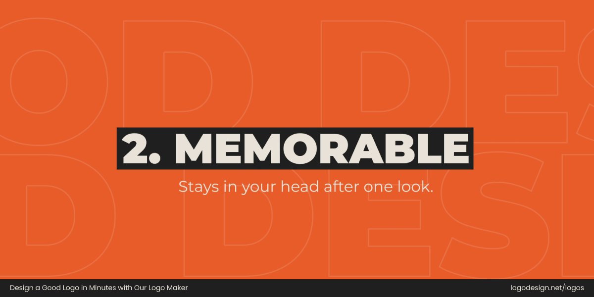
The logo needs to be memorable to stay in the heads of people
This principle focuses on how your logo not only needs to be seen but also remembered. The best logos stick in your mind after just one glance. Shapes, colors, and originality all play a role here. A memorable design connects instantly and keeps your brand top of mind long after the first impression.
6. TikTok

The TikTok logo, with vibrant color shades, gives an energetic feel that is hard to ignore
TikTok’s logo feels alive. The neon-blue-and-pink note, set against black, vibrates like music pulsing through a speaker. That dynamic energy makes it impossible to ignore. With one look, you know this brand is about rhythm, fun, and creativity, an identity so bold it lingers in your head long after the app closes.
7. Lush

The Lush logo using a handwritten typography to give a nature-first appeal
Lush’s custom typography logo looks handwritten, raw, and almost messy, but that’s the point. It captures the brand’s commitment to natural, handmade products. Instead of sleek polish, it’s memorable because it feels authentic and rebellious. One glance tells you this is not just another beauty brand; it’s one with a voice.
8. Gopuff

The Gopuff logo using bold blue fonts with rounded letters to show approachability
Playful, bubbly typography makes Gopuff fun and approachable. The rounded letters almost feel like they’re bouncing off the page, perfectly reflecting the brand’s quirky personality. It’s simple enough to remember but carries a friendly charm that keeps it from fading into the crowd. That balance makes it instantly memorable.
9. Behance

The Behance logo using a clean wordmark that is instantly recognizable
At first, Behance looks like a clean wordmark, but the accented “é” is where the magic lies. That subtle twist makes the logo distinct and instantly recognizable in the creative community. It’s memorable because it’s not overdone, just a small detail that adds character while still keeping the design minimal.
10. Welly

Welly’s logo has a bright green wordmark with rounded edges, showing a health-conscious identity
Welly’s bright, cheerful wordmark feels like it belongs in a childhood storybook. The rounded, playful letters match its fun, health-conscious brand identity. It’s memorable because it doesn’t feel like corporate design. It feels personal, almost like a friend reminding you to take care of yourself. A simple logo with staying power.
Principle #3: Unique

The logo needs to be unique to stand out among the competitors
Uniqueness is about standing apart from the crowd. In a sea of logos, the ones that succeed look and feel different. A unique logo doesn’t follow design trends blindly; it makes its own rules. That individuality builds curiosity and lasting brand recognition, turning logos into brand statements.
11. Liquid Death

The Liquid Death logo using a different hardcore skull type font to give a rebellious look
Liquid Death throws every logo expectation out the window. While most water brands stick to soft blues and clean waves, it leans into hardcore skulls and gothic type. That rebellious twist makes it instantly unique. It’s shocking, bold, and unforgettable, showing how breaking category rules can make your brand iconic.
12. Away

The Away logo is minimalist, using a simple typography with a calm and sophisticated appeal
Away’s minimal logo feels unlike most travel brands, which often lean on airplanes, globes, or luggage icons. Instead, it uses simple, confident typography in a box, reflecting calm sophistication. Its uniqueness lies in restraint and choosing not to scream “travel” but instead creating a sleek identity that feels modern and stylish.
13. A24

The A24 logo using gives a unique appeal with bold typography
A24’s chopped and edgy typography perfectly mirrors its unconventional storytelling. Unlike traditional film studio logos that feel polished and grand, A24’s logo feels raw, artsy, and independent. Its uniqueness comes from its confidence in being different. It turned a simple type treatment into a symbol for boundary-pushing cinema.
14. Tony’s Chocolonely
The Tony’s Chocolonely logo using oversized and colorful fonts to give a nostalgic appeal
Tony’s Chocolonely screams loud and proud with oversized and playful typography. Unlike other chocolate brands that try to be elegant or nostalgic, Tony’s embraces fun chaos. The unique lettering style reflects its mission-driven, people-focused approach. It’s unapologetically different, which is exactly why it has become so recognizable.
15. Frank Body
Frank Body logo using a lowercase handwritten typography to stand out with a friendly look
Frank Body’s lowercase, conversational wordmark feels more like a text from a friend than a corporate brand. That unique choice makes it approachable and relatable in the beauty industry. By stripping away the glossy polish, Frank Body builds trust with its audience through personality-packed simplicity.
Principle #4: Versatile

Versatility is important as the logo with be displayed on different platforms
A good logo is consistent whether it’s displayed on a billboard, an app icon, or embroidered on a t-shirt. Versatile logos that work everywhere adapt without losing impact. The best ones look just as strong in black and white as they do in color, in any size or medium. Below are some brand logos that perfectly fit into this context.
16. Notion
The Notion logo using a box symbol and simple black typography to scale perfectly
Notion’s simple “N” in a box is as adaptable as it gets. It works perfectly on tiny app icons but also scales beautifully on posters and presentations. Its versatility lies in its simplicity, no gradients, no chaos, just a bold and functional mark that fits every format with ease.
17. Patagonia
The Patagonia logo using a mountain symbol with bold typography that’s visible on different backgrounds
Patagonia’s mountain silhouette, paired with a bold wordmark, is versatile enough to appear on jackets, hats, digital campaigns, and packaging without losing identity. Whether in color or monochrome, it still feels strong. The design works because it ties back to nature while staying flexible in different contexts.
18. Mailchimp
Mailchimp logo using a friendly mascot to create a charming appeal on different platforms
Mailchimp’s cheerful mascot logo, Freddie, is as versatile as he is charming. The brand uses him both as a full illustration and a simplified icon. Paired with the clean wordmark, Mailchimp can adapt depending on the medium—fun and playful on one hand, professional and minimal on the other.
19. Obey Clothing
Obey logo using a simple and bold typography that ensures the brand name gets all the attention
Obey’s blocky, propaganda-inspired typography is versatile because of its boldness. Whether it’s plastered on posters, graffiti, or t-shirts, it never loses impact. The logo adapts seamlessly across rebellious streetwear formats, keeping its attitude intact no matter where it’s seen.
20. Milanote
Milanote logo using a clean and minimalist wordmark, avoiding unnecessary details
Milanote’s clean, minimal wordmark feels right at home in any format from app interfaces to creative tools. Its strength lies in its adaptability. By avoiding unnecessary details, it becomes a canvas that works across digital and print, scaling effortlessly while retaining its modern feel.
Principle #5: Relevant

The logo has to be relevant to the audience and industry
Logos should feel like they belong to their industry and audience. That’s where relevance comes in. From typography to imagery, a design should reflect what the brand does and who it serves. Relevance doesn’t mean boring; it means aligning smartly with context, often guided by color theory in logo design.
21. Loomly
Loomly logo using a thin typography and a symbol with vibrant color that the audience would like
Loomly’s logo reflects its role as a marketing tool with its vibrant palette and clean typography. The color-type pairing and friendly design make it relevant for creators and social media managers. It feels approachable while still professional, striking the right balance for its creative audience.
22. Everlane
The Enerlane logo using a minimalist brand identity with no flashy colors, giving calm and clarity
Everlane’s logo is the definition of relevance. It’s simple, no-frills typography perfectly matches its brand identity: minimalist, sustainable fashion. No flashy icons or bright colors. Just calm clarity that tells you everything about the brand’s values at first glance.
23. BetterHelp
Betterhelp logo using a green color to show the brand’s effort toward wellness and support
The heart-shaped leaf in BetterHelp’s logo speaks directly to wellness and mental health. It’s a gentle, caring design that reassures the audience instantly. The relevance lies in the subtle symbolism. It shows help, support, and growth without needing words.
24. Zendesk
The Zendesk logo using a “Z” like logo with building blocks to give an approachable feeling
Zendesk’s geometric “Z” feels like building blocks, making it relevant to tech and customer service. The logo feels professional yet approachable, balancing seriousness with warmth. Its relevance comes from its ability to feel both innovative and trustworthy.
25. Italic
The Italic logo using a minimalist feel for an audience looking for style and affordability
Italic’s elegant, minimal typography matches its brand promise of accessible luxury. The logo feels sophisticated without being intimidating, which makes it relevant for a modern audience that values both style and affordability.
Principle #6: Timeless

Timelessness in a logo is important to ensure that a logo lasts for a long time
Trends come and go, but timeless logos endure. A design that lasts decades avoids gimmicks and focuses on fundamentals: balance, clarity, and elegance. Timeless logos often become cultural symbols, proving that restraint and thoughtful execution never go out of style.
26. IBM
The IBM logo using multiple strips that have lasted throughout many decades, since 1970
IBM’s striped logo, designed by Paul Rand, has survived since the 1970s with barely a tweak. Its strength lies in its clarity and adaptability, making it feel modern even today. It’s proof that timeless logos are built on smart design foundations, not passing fads.
27. The New York Times
The New York Times logo using a gothic-style wordmark for timeless consistency
The gothic-style wordmark has been around for more than a century, yet it still feels powerful. Its timelessness comes from consistency. It hasn’t tried to chase trends but relied on heritage and authority. The New York Times logo is so iconic that it’s practically synonymous with journalism itself.
28. Leica
Liaca logo using a red, circular background with the brand name inside
Leica’s flowing red script inside a circle is instantly recognizable across generations. Its elegance and consistency make it a timeless symbol of photography. The brand never needed to reinvent its logo, which proves that when you get it right the first time, it lasts forever.
29. Rolls-Royce
The Rolls-Royce logo using a RR monogram that has been untouched throughout the decades
Rolls-Royce’s interlocking “RR” monogram embodies luxury and refinement. The minimalistic design has remained largely untouched for decades, becoming an emblem of excellence. Its timelessness lies in its simplicity, paired with elegance that transcends design trends.
30. Tiffany & Co.
Tiffany & Co. using a simple wordmark with sharp strokes and creates a connection with the viewer.
Tiffany & Co.’s wordmark is simple, but the iconic robin’s-egg blue is what makes it timeless. The color is so tied to the brand that it doesn’t need gimmicks to stand out. This shows how timeless logos can go beyond design to own an emotional connection.
Design Your Logo Today!
Great logos don’t happen by chance; they’re built on design principles that make them simple, memorable, unique, versatile, relevant, and timeless. These six rules aren’t only a part of theory, but they’re what separates a forgettable logo from one that lasts decades. If you’re ready to put these principles into practice, try our free logo maker today.