Not sure if your logo needs flair or simplicity? Serif and sans-serif fonts each tell a unique story. See which suits your brand best.
The typeface you choose in a logo can communicate professionalism, creativity, modernity, or tradition. It all depends on the style you go with. Among the different types of fonts, two main ones dominate the logo design toolkit: serif and sans-serif. To create a timeless brand, it is essential for you to choose the right font style. The wrong choice could affect the longevity of your brand and confuse the audience about your niche and purpose.
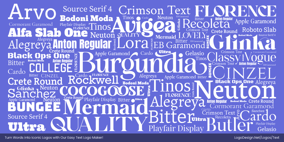
Serif fonts, with their decorative strokes or ‘feet,’ bring a sense of tradition, elegance, and authority.
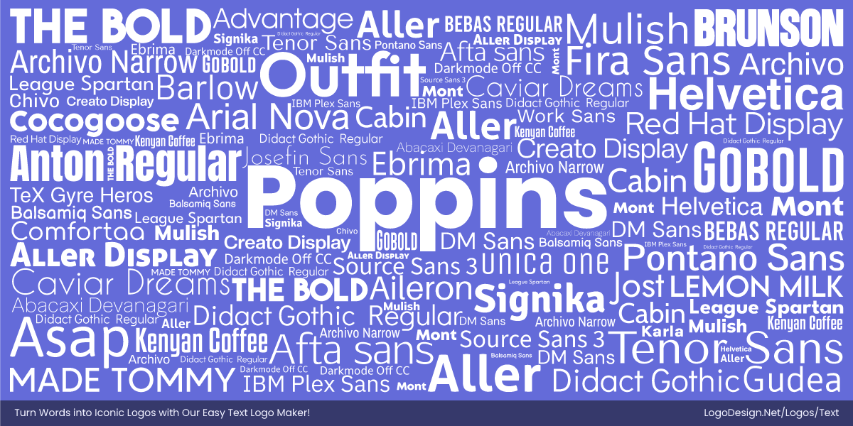
Sans-serif fonts take away embellishments for a clean, modern, and straightforward look.
Each has its own advantages, and knowing which typography in logo design to go for can make or break it.
Let’s explore the differences between serif and sans-serif typefaces, how they influence branding, and which one works best for your logo.
What to Look for in Your Logo Typeface?
Here are some factors to consider when picking logo fonts and making the right choice for your brand.
• Readability and Legibility
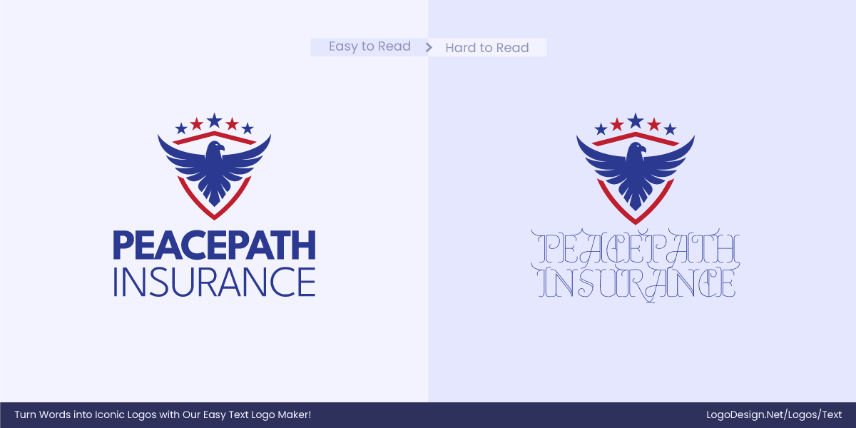
If fonts aren’t readable in various formats like mobile screens, billboards, packaging, or social media, the brand can lose out on recognition and credibility. Readable typography helps the brand stay strong and effective everywhere it’s seen.
• Brand Personality Match
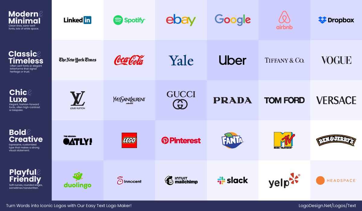
The font style needs to draw attention to the brand’s tone, whether bold and modern, elegant and classic, or friendly and playful. Fonts influence first impressions and match visual identity with brand values, building emotional connections quickly.
• Scalability and Versatility
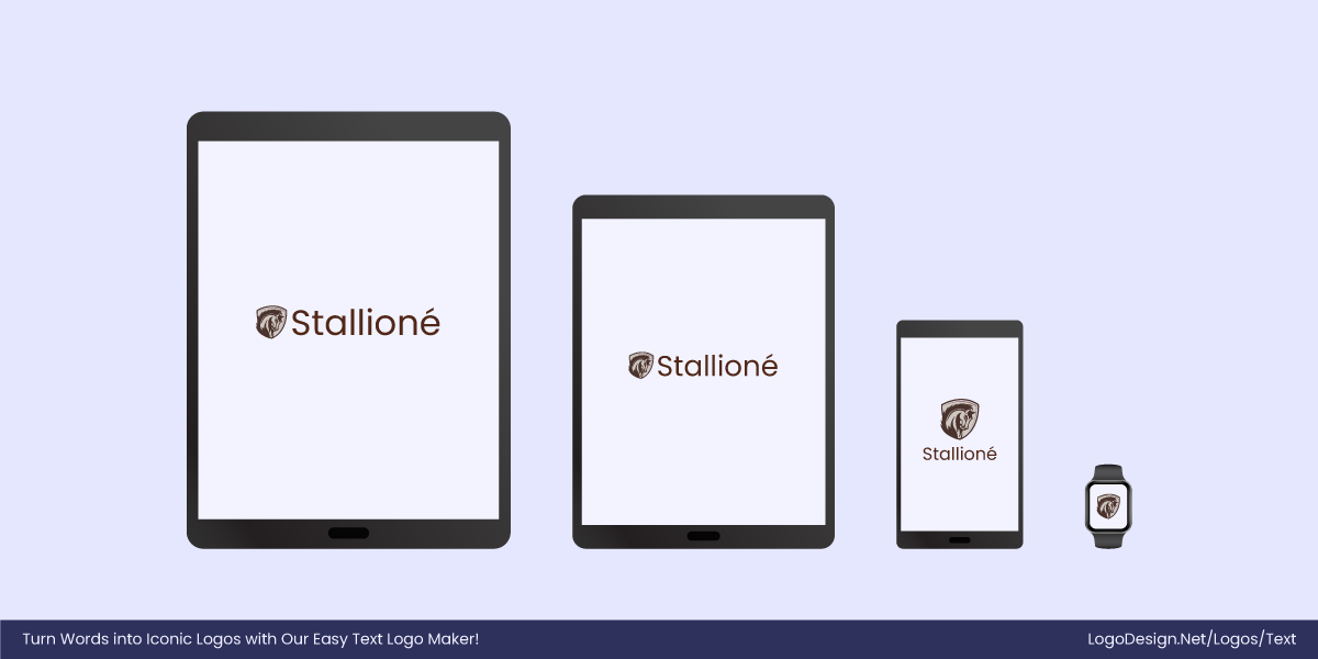
Fonts have to maintain clarity when scaled up for billboards or down for app icons and business cards. A versatile typeface makes your brand look professional and consistent across all platforms and sizes, without any disruptions.
• Uniqueness and Memorability
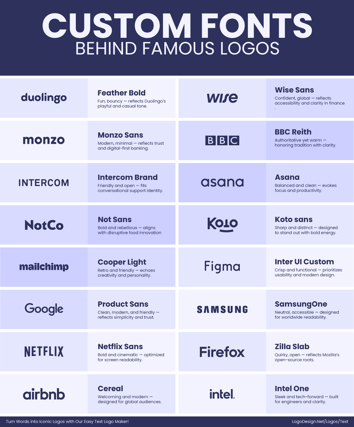
A distinctive font can make your logo instantly recognizable and stand out in a crowded marketplace. Unique typography improves brand recall, helping consumers remember and prefer your brand over others.
• Accessibility and Cross‑Platform Use
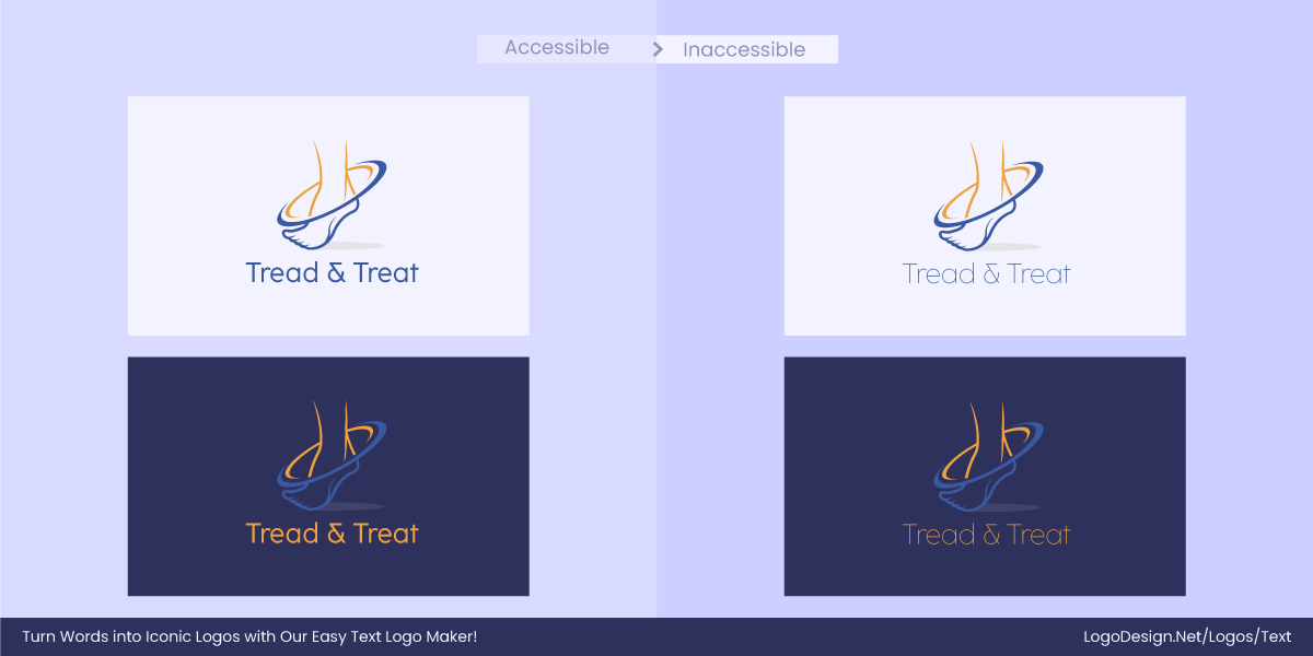
Fonts should be legible to consumers everywhere. Accessible typography helps you reach a wider audience and ensures a positive, inclusive brand experience everywhere.
• Timelessness
Fonts should avoid trends that come and go and instead focus on design principles that keep the brand looking relevant for years. A timeless typeface reduces the need for rebranding, builds long-term brand equity, and maintains credibility over time.
Serif vs. Sans-Serif – How to Choose the Right Font for Your Logo?
When choosing between serif and sans-serif fonts for a logo, aesthetic appeal is just one factor. You also have to think of others factors like visual traits, brand personality, industry trends, digital mediums and font psychology, as they all play a major role in the versatility of a logo.
1. Visual Characteristics
Serif fonts, recognized by their decorative strokes at the end of characters, can have complex details. While these often add personality and tradition, they can compromise readability when scaled down.
For example, The Guardian newspaper’s serif logo looks authoritative and classic in print but can lose sharpness when reduced for smaller digital placements.
Sans-serif fonts feature clean lines without any other visuals, making them more legible at various sizes, like in business card designs. Now, you can go with either; just keep the readability and scalability in mind.
The Harper’s Bazaar magazine uses a serif logo that works beautifully in print, but pairs it with simpler sans-serif fonts for smaller digital headlines to maintain legibility.
2. Brand Personality and Perception
Serif and sans-serif fonts send very different messages, so your choice needs to align with the core traits you want your brand to have.
Serif fonts make your brand appear established and trustworthy and are great for financial institutions, law firms, or luxury labels.
Brands like Time Magazine use a serif font to reflect heritage and sophistication.
On the other hand, sans-serif fonts are clean, modern, and minimalistic. They are mostly associated with innovation, friendliness, and approachability. It’s why companies in tech, startup, and lifestyle niches use them popularly.
Think of Spotify, whose sans-serif logo feels accessible, bold, and contemporary.
Before choosing a font style, define your brand’s core personality traits and narrow down the style that best reflects them.
3. Industry Trends
You’ll find some font styles being used more commonly across certain industries. This is where font relevancy comes in. Healthcare, technology, and finance sectors prioritize legibility above all else. So, sans-serif fonts work well as they are straightforward and clear-cut.
IBM’s sans-serif logo communicates precision and trustworthiness, which is very important in tech.
For luxury and fashion logos, the go-to can be serif fonts since they are associated with elegance and sophistication.
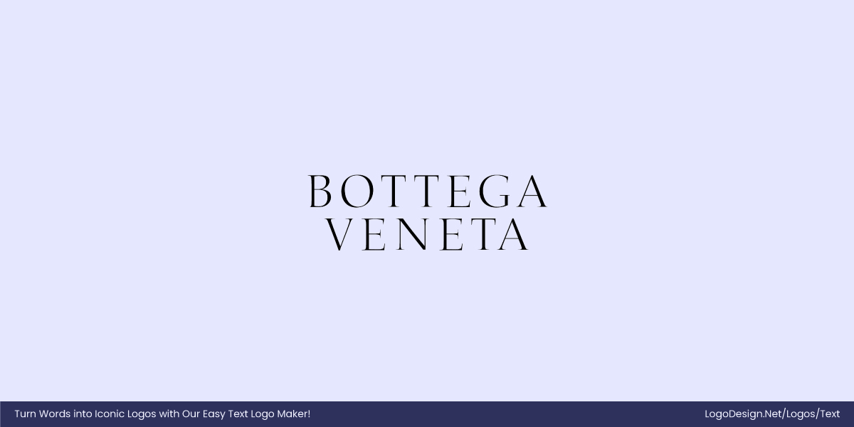
Bottega Veneta uses a classic serif font to contribute to their brand’s image of understated luxury and craftsmanship.
4. Digital vs. Print
How and where you use fonts also matters. Serif fonts can be difficult to understand at times in digital formats, especially on screens with low resolution.
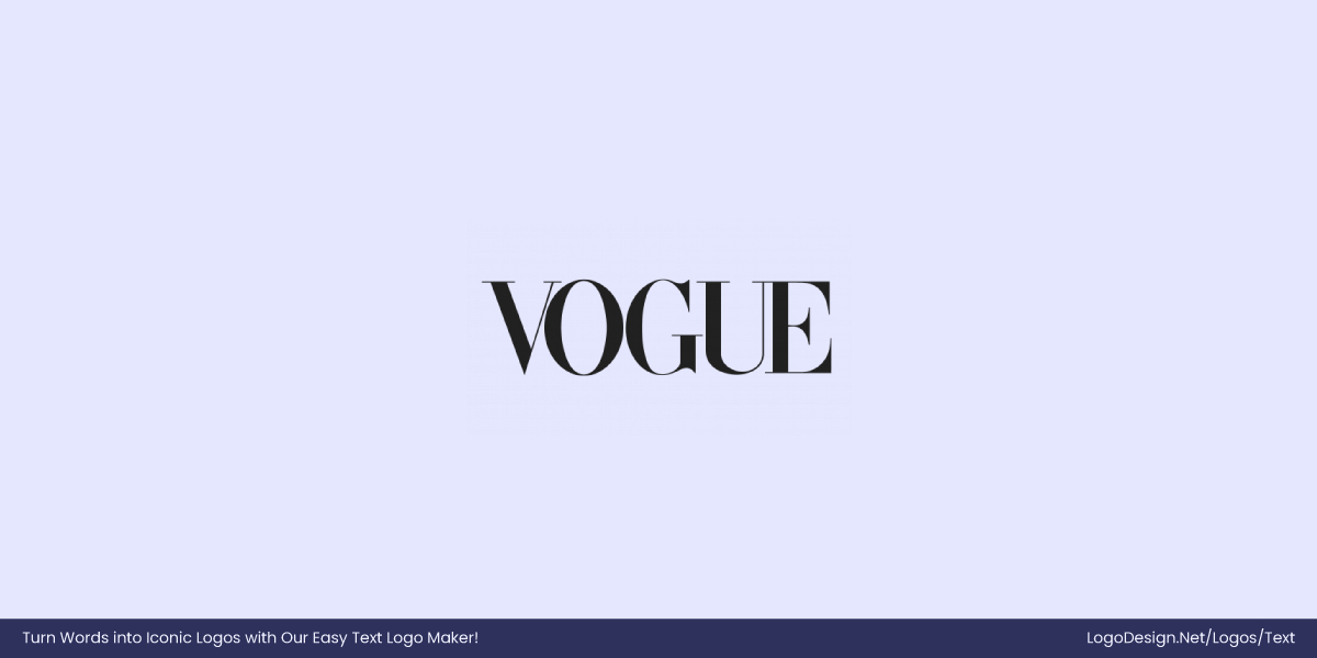
For instance, Vogue’s iconic serif logo looks refined on glossy magazines but requires a high-resolution display to maintain its quality online.
On the contrary, sans-serif fonts scale easily across sizes and mediums. Their uniform strokes help maintain legibility on everything from mobile phones to digital ads.
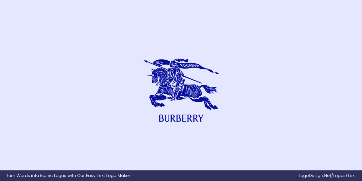
Burberry recently shifted from a serif to a sans-serif logo to improve digital clarity and appeal to younger, digitally native audiences.
5. Typography Psychology
Just like color psychology in logos, font choice influences how people feel about your brand at first glance.
Serif fonts can bring out feelings of nostalgia or seriousness. They feel sophisticated and luxurious, almost historic in a way.
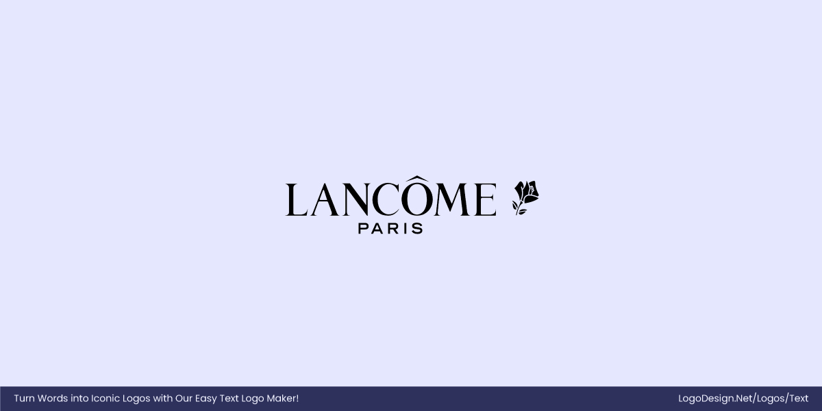
Brands like Lancôme use an elegant serif typeface to convey their luxury and timeless beauty.
And when people come across sans-serif fonts, they mostly get the feeling of honesty, creativity, and friendliness. Their simplicity makes them feel direct and clear, which is ideal for brands that value transparency or speed.
Look at Facebook’s sans-serif logo, which feels open, casual, and user-friendly.
Think about the emotional space your brand occupies. Should your logo feel exclusive or accessible? Choose the font family that reflects the emotional tone you want your audience to experience.
6. Logo Application and Versatility
A perfectly designed logo must be adaptable anywhere, from large desktop monitors to tiny smartwatch faces.
Sans-serif fonts add to the responsiveness in design due to their simplicity and clean lines. Their shapes hold up well when reduced or animated.
For instance, Samsung, with its bold, geometric sans-serif logo maintains clarity and impact across a wide range of formats, from large signage to small mobile screens.
When it comes to the rules of typography, this is a key aspect to consider. Serif fonts do sometimes need simplified versions for smaller sizes or low-res displays.
The luxury brand Hermès uses a serif logo on physical products but adapts it for digital presence with spacing tweaks to ensure readability on mobile.
7. Consistent in Visual Identity
A modern tech brand using a traditional serif font could confuse audiences if the serif showcases traditional values. For example, if a startup like Slack used a serif logo, it might feel out of place to the audience. To avoid any confusion, the company has chosen to create an approachable brand personality with a friendly sans-serif typeface.
Similarly, a brand with years of history and tradition could lose its emotional connection if it changes to a minimalist sans-serif without careful consideration.
Levi’s has chosen a serif font in its wordmark to focus on its legacy.
Consistency in typography across brand touchpoints, from packaging to digital marketing, is essential. A mismatched font choice can impact loyalty and trust in the brand.
Brand Shifts: Who Went Serif, Who Went sans-serif (and Why)
Companies that opt for serif fonts often aim to convey credibility, tradition, and a sense of authority. These timeless typefaces evoke history and stability, making them ideal for brands rooted in heritage. In contrast, businesses targeting younger, digitally savvy audiences tend to choose sans-serif fonts. With their sleek, modern lines, these styles reflect innovation, approachability, and a forward-thinking mindset.
Many brands may move from serif to sans-serif, mainly because it’s easier to display across digital platforms. Similarly, companies can go from sans-serif to serif for a more luxurious look if they are adding more products or services.
• Serif → Sans-Serif
Businesses that seek to adopt a digital-first approach to branding can go from serif to sans-serif for a cleaner, modern look.
Here are some popular examples of brands that made the shift:
1. Google
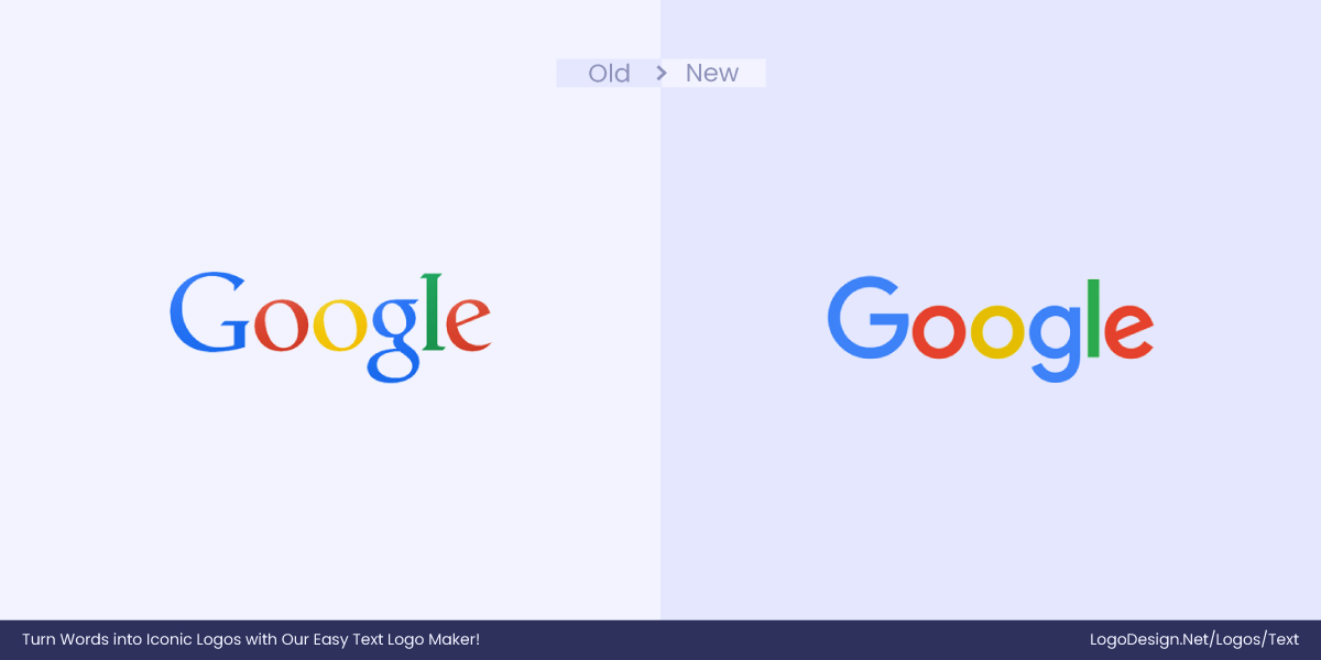
Google was one of the first companies to make the transition, and the results are excellent. The scalability and readability have improved significantly. Previously, the serif font would blur or lose definition of the decorative strokes. After the transition, the logo is not only more readable across all platforms but is also modern, simple, and simply ‘Google’.
2. Big Cartel
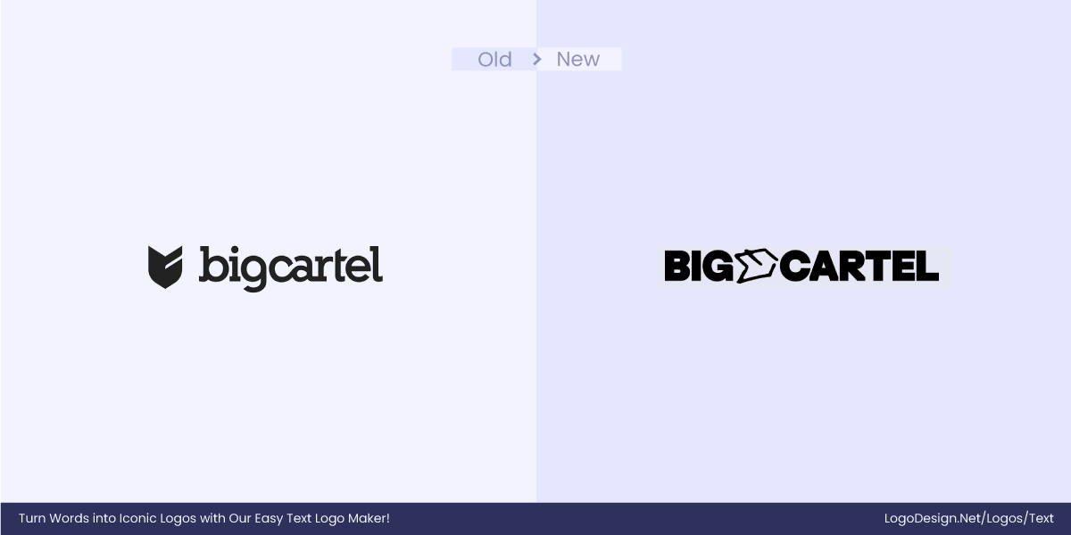
The Big Cartel has completely rebranded to appeal to its audience of artists and makers much better than previously. In their efforts to rebrand, they changed the logo from serif to sans-serif. This change has helped the brand modernize and compete with its newer counterparts. Now, the logo and other branding materials give off a contemporary aesthetic, matching the maker-first vibe.
3. Warner Bros.
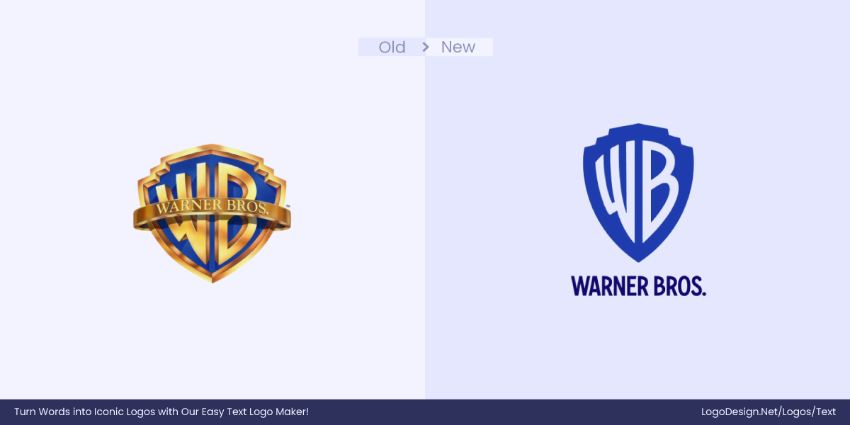
Most brands are trying to be more digital-friendly, and that’s exactly what Warner Bros wanted. Their new logo and branding projects a modern image that is also ideal for all sorts of platforms and gadgets. Since Warner Bros is loved all over the globe, it is only fair to use a logo font with a global appeal rather than heavy Western cultural connotations.
4. Dell
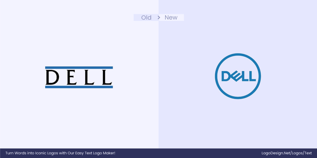
When you take your business global, you must appeal to the worldwide audience with your logo and other branding. By doing so, Dell tapped into the digital global audience. With modern aesthetics, the Dell logo now has clean lines and a simple form, ensuring an accessible brand image. Minimalism is it for logos in 2025!
5. Kia
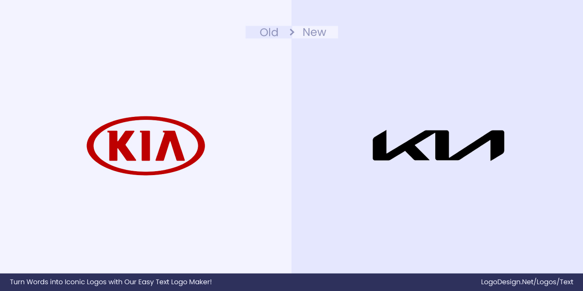
The digital-first approach requires brands to rethink their branding and improve their visual appeal. Learning from Kia’s example, a simple logo change can present you as a forward-thinking brand.
6. Silna Health
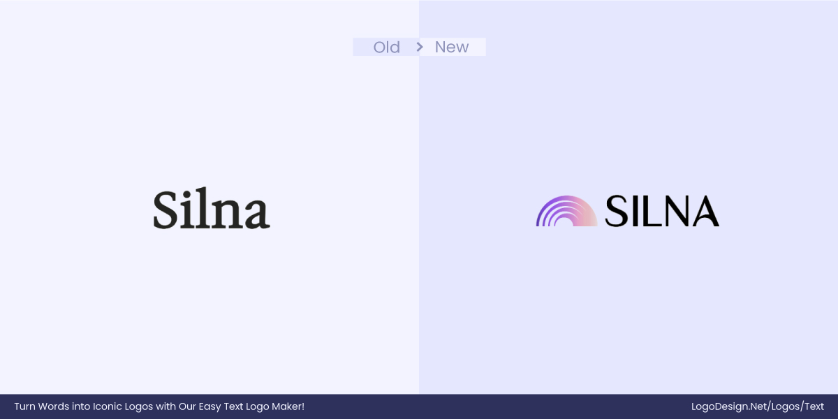
Modernity and clarity—that’s it. That’s the motivation behind Silna Health’s recent rebranding. Silna is on a mission to become an AI-powered platform that brings efficiency and clarity to complex health care administrative processes, which is why they made the big move from serif to sans-serif. The new logo reflects the brand’s latest mission and strategic decision to come off as innovative.
7. The Olympic Museum
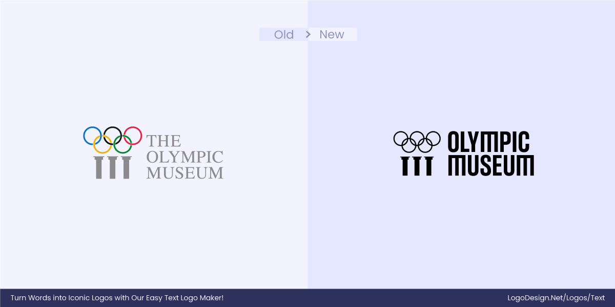
The Olympic Museum and the whole Olympic brand underwent a rebranding to reflect their renewed personality. Unlike the previous traditional outlook, the new font aims to present a more inclusive and contemporary image. With the change, the Olympic Museum is able to blend modernity while staying true to its heritage.
8. The National Ballet of Canada
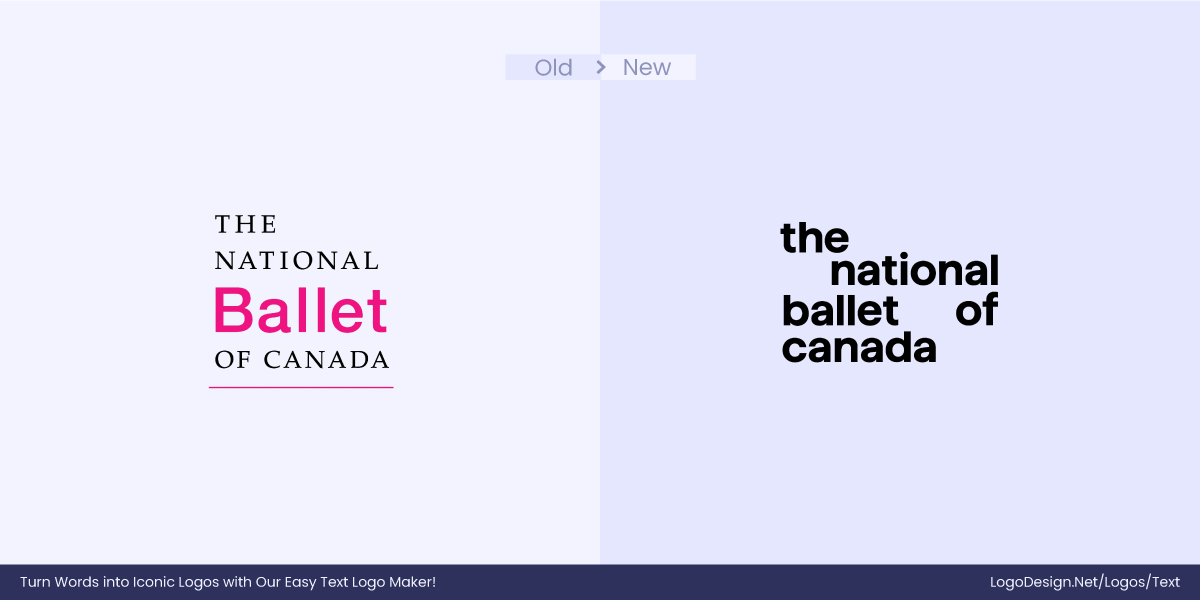
It was about time for the National Ballet of Canada to get a visual update, and in July 2024, after 20 years, they finally rebranded. The logo has been changed to sans-serif to make the brand more accessible and inclusive. The change has been successful as the new logo reflects the renewed ideology of contemporary storytelling with the hope of a dynamic future for ballet.
9. Transamerica
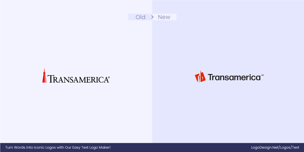
Selling financial services to the newer generation means saying no to a traditional or intimidating logo. Fortunately, Transamerica understood the gravity of the situation and rebranded itself in January 2025. As Transamerica is on its way to executing a growth strategy, it wants more eyes, and a sans-serif font gives you that.
10. Spellbook
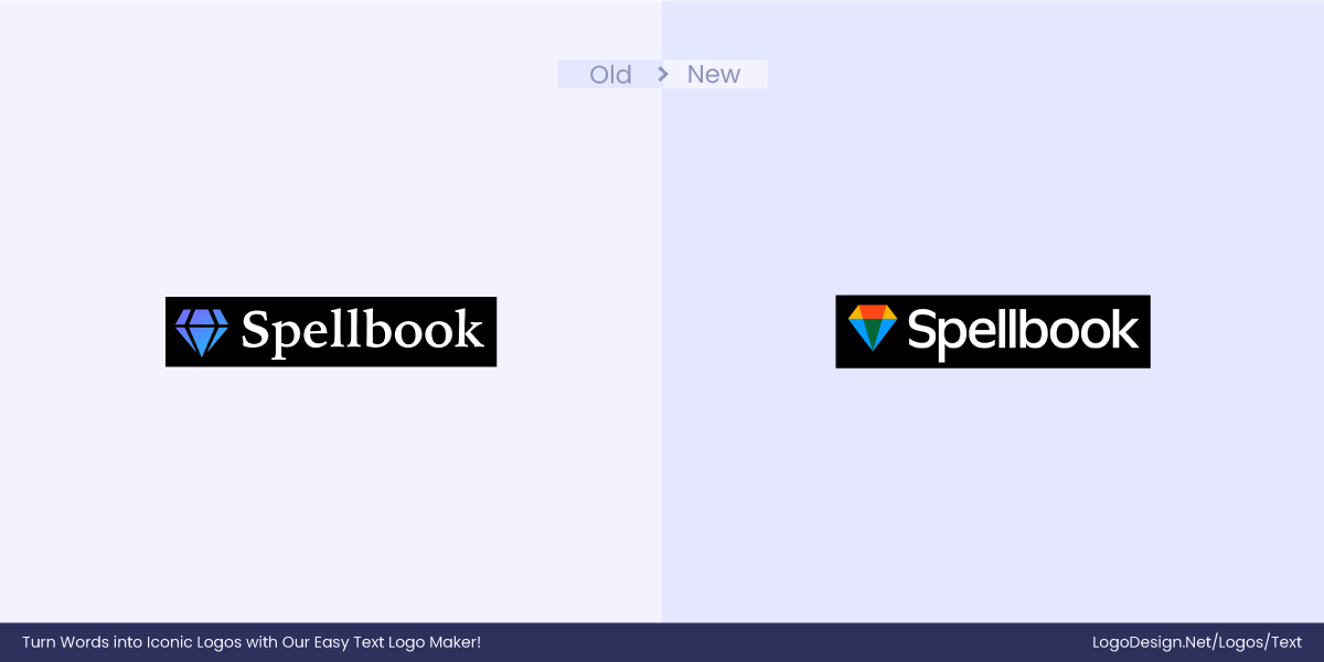
Like other brands, Spellbook wanted to stay relevant to its audience, so it rebranded to look more modern and innovation-led. They are bringing more efficient and precise solutions to all things legal, and this cannot be best portrayed with a traditional logo. That is why they took the strategic step of moving from serif to sans-serif.
11. CDC
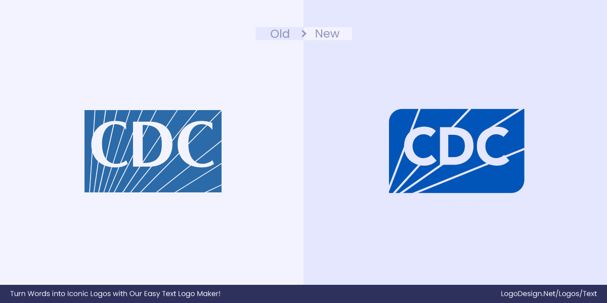
With better readability, a modern aesthetic, and a digital-first approach, who wouldn’t want to shift to sans-serif? CDC‘s rebranding now offers more accessible visual branding, which makes up for its intention to be more relevant.
12. Anthology

Ed-tech is changing the game, and Anthology wanted to show this through their logo. The rebranding reflects back to their forward-looking stance. They are breaking apart from their legacy and building something new. With a clear direction, Anthology’s shift from serif to sans-serif sets the pace for its future.
13. Mississauga Foundation

With an audience as diverse as the Mississauga Foundation, the rebranding was almost necessary. Sans-serif fonts are very inclusive and relatable for people all over the globe. The changed logo is more accessible and conveys a sense of openness.
14. Verbatim
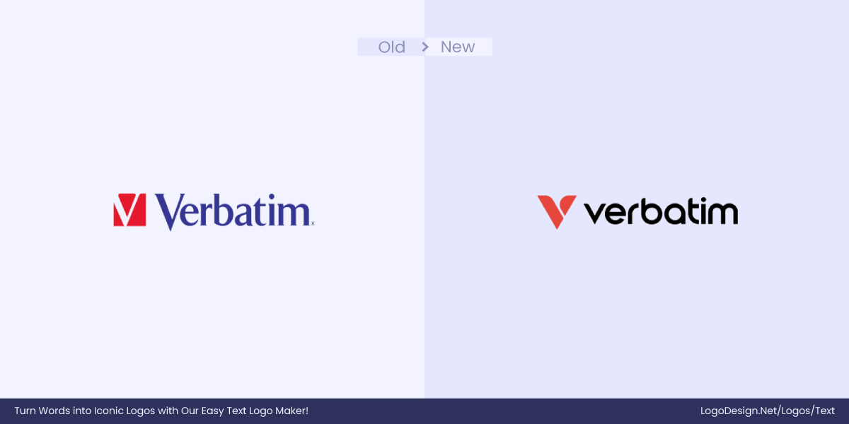
Legacy brands are making a comeback. Verbatim rebranded in 2024 to appeal to the digital-first world. The font now communicates the brand’s turn to modernity and also improves digital readability, making the logo compatible with all sorts of platforms.
15. The Independent
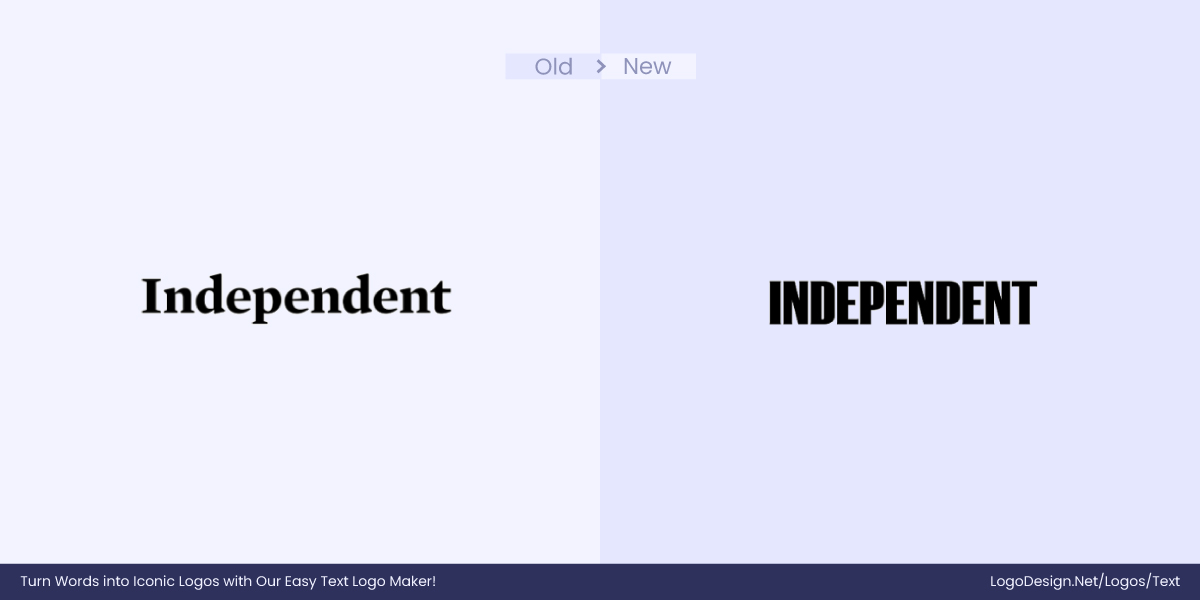
The world is changing, and so should online publications. The Independent has embraced sans-serif with open arms as it aims to transform digitally and become more versatile and appealing for the audience online.
16. Burberry
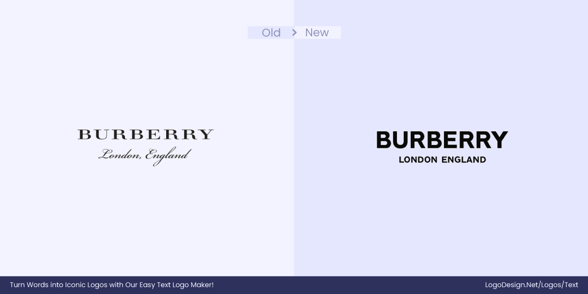
Since the craze for sans-serif fonts gained popularity, brands ended up looking similar, which meant they had no distinct personality. In 2023, Burberry realized that its heritage sets it apart from the competition, and it should embrace its Britishness.
17. Balmain
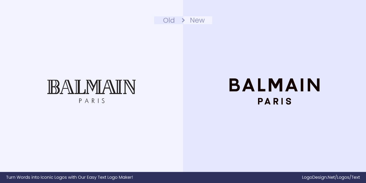
‘It’s just a phase,’ and for Balmain, it was, in fact. The switch to a sans-serif logo marked a bold, modern turn, one that sparked mixed reactions. While some felt it lacked the flair of the original, the current logo leans into minimalism while still aiming to carry the brand’s historic weight.
18. Desjardins
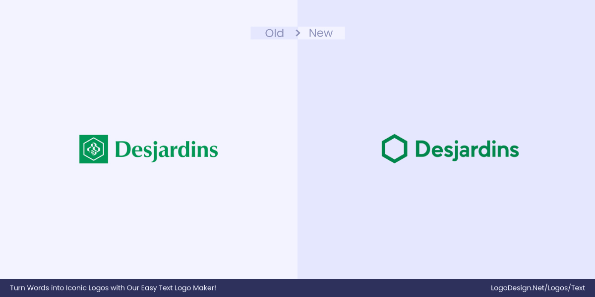
The Desjardins’ logo change is a part of rebranding and was intended to give a more modern, minimalistic, and cleaner look. The logo now has improved legibility and is adaptable to different digital formats.
19. Meridian
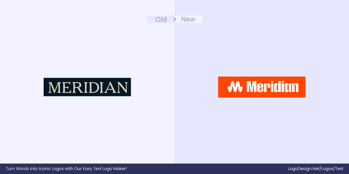
The Meridian changed not only their font but also their entire logo to stay relevant to today’s audiences. The new logo is poles apart from the previous one. It is more visually appealing with a custom font and gives more personality than the previous one.
20. Berluti
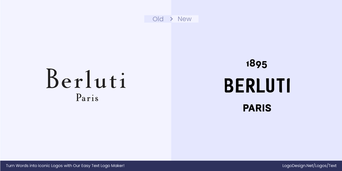
Berluti switched from a serif to a sans-serif logo to better align with the modern world. The new minimal aesthetic improves digital usability on screens, allowing the brand to appeal more to a younger audience.
21. Library of Congress
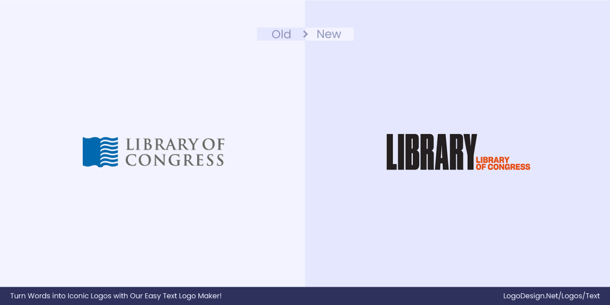
The Library of Congress changed its logo to match global trends, modernizing its visual identity to attract a wider audience. It moves away from the more traditional, institutional look, signaling that the Library isn’t just for scholars, but for everyone in the modern age.
22. Diane Von Furstenberg
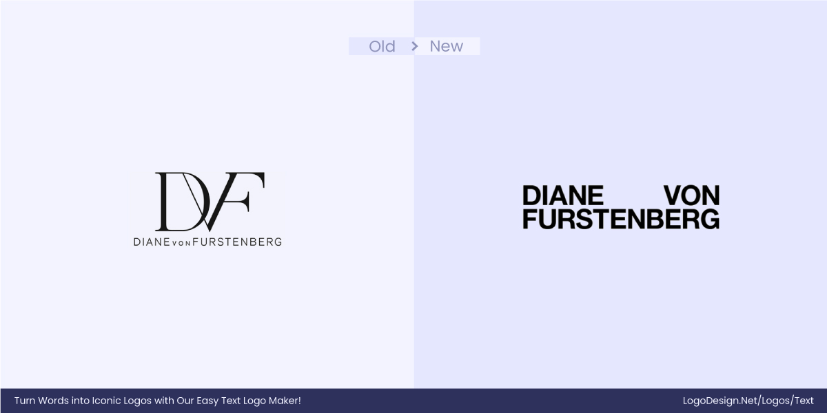
Diane Von Furstenberg changed the logo to sans-serif to give her brand a modern glow. This change was intended to appeal to Gen Z and millennials. Now, the logo is simple but bold, much like what the young ones expect fashion brands to be.
23. Saint Laurent
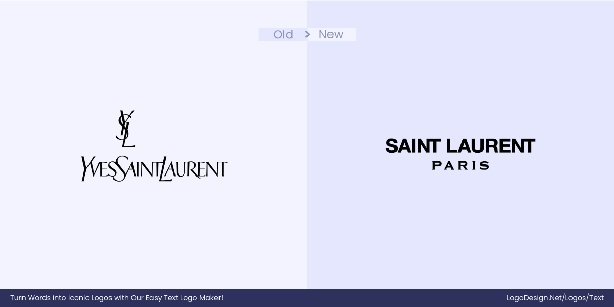
Classic fonts are a thing of the past. The newer generation wants fonts that are simple and digital-savvy. That is precisely why Saint Laurent has revamped its logo to evolve with the evolving world. Many brands treat the sans-serif logo as a youth potion and bid farewell to their traditional identities.
24. HSBC
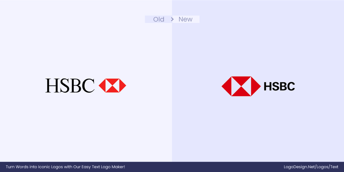
HSBC has made minor but revolutionary changes to its logo. They intended to give the brand a fresher look with a bold sans-serif font and a bigger emblem. This was a strategic move to make the emblem the star of the logo and improve recognizability.
25. Bank Of the Ozarks
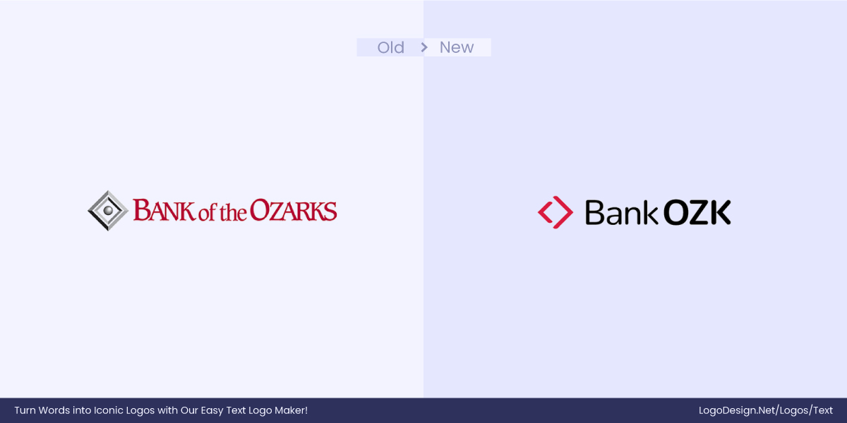
While the bank is very proud of its roots, it wants to evolve and remove all geographical limitations indirectly implied by the “Ozarks.” The Bank of Ozark’s name change and the evolution of the logo from serif to sans-serif are purely to make it more accessible for audiences outside of the United States.
• Sans-serif → Serif
This is less common today, but brands that are looking to add a more timeless and elegant appearance to their logos can go from sans-serif to serif.
Here are some examples:
1. QuiteLike
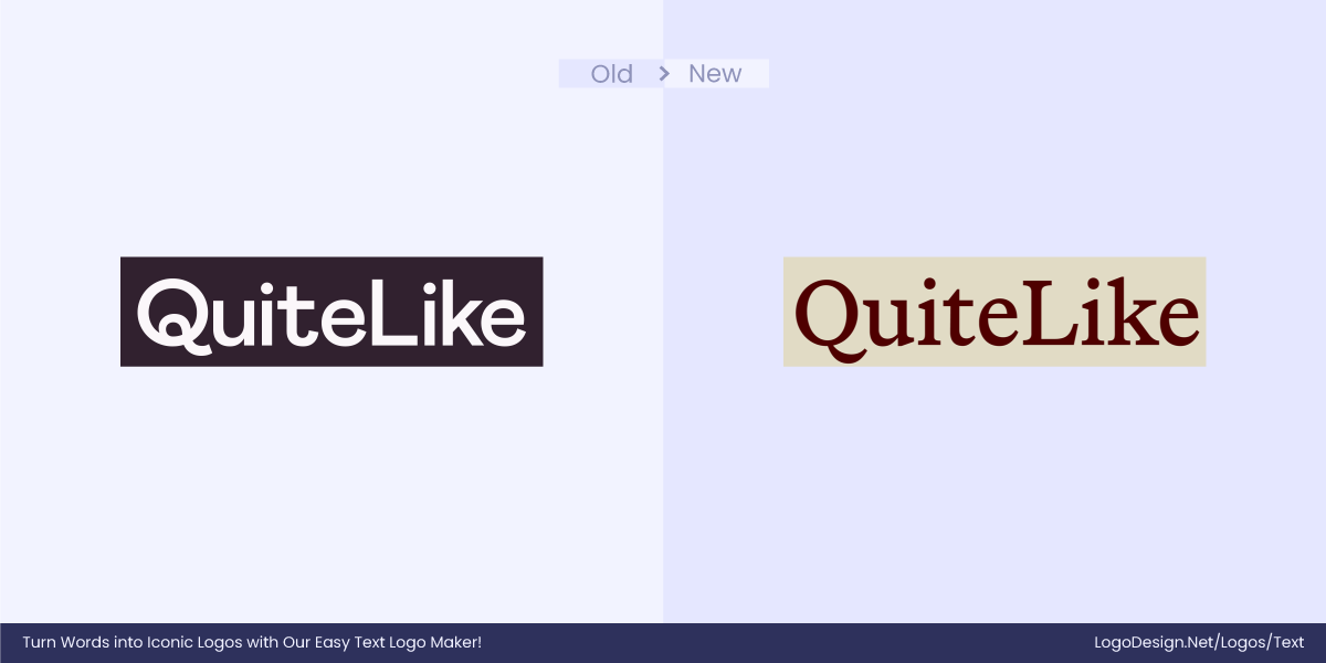
For brands that don’t like to adopt digital-first branding, the best choice is to stick to a font that portrays their distinct personality. For example, QuiteLike wanted to make a name for itself in the culinary world with a sophisticated and warm approach. The serif font gives a more personal look with a touch of pizazz.
2. Sigma
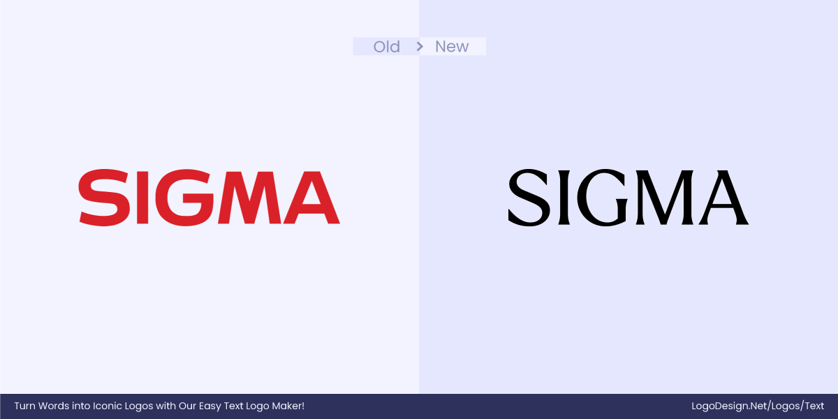
Modernity does not work for all brands or all audiences. Brands committed to their heritage, like Sigma, use fonts that tell the tale of their artistry. Japanese craftsmanship values detail, and the change from sans-serif to serif clearly depicts this attention to detail.
3. Forest Carbon

Fonts have connotations, and serifs are no exception. Serifs are usually associated with institutions that are authorities in their respective fields. Therefore, to boost credibility, Forest Carbon dialed back to serif to show that they are grounded in expertise and work with scientific integrity.
4. Kedrion Biopharma
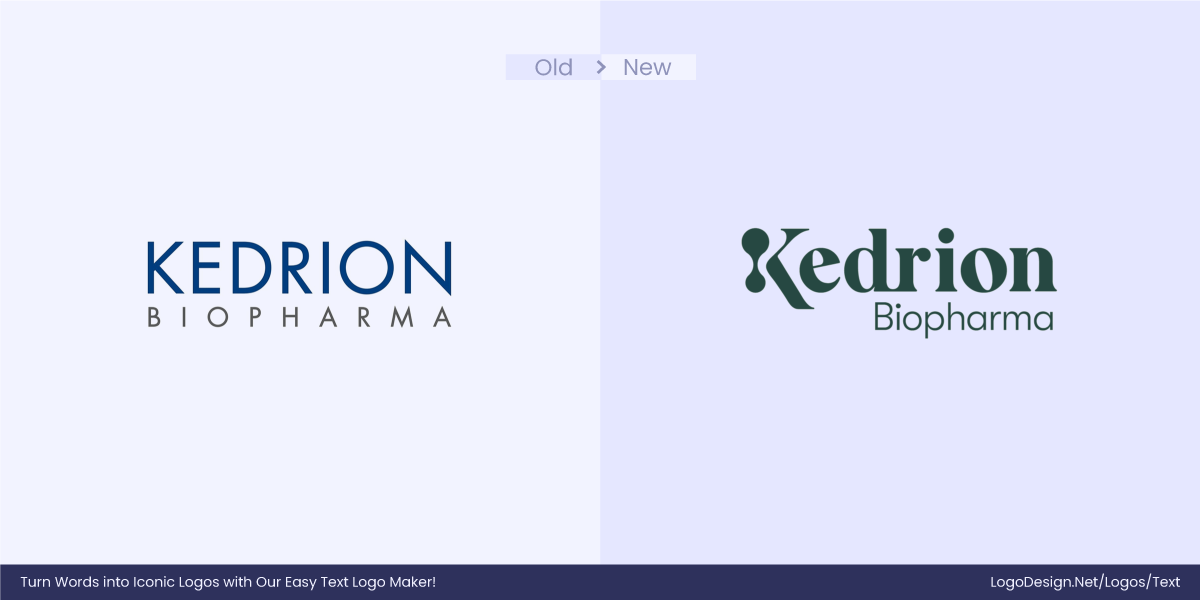
Biopharma is a very impersonal sector, and to build human connections, Kedrion Biopharma uses a serif font so that the logo can have a more human feel. The font also reinforces the company’s authority, highlighting its trustworthiness.
5. Equator
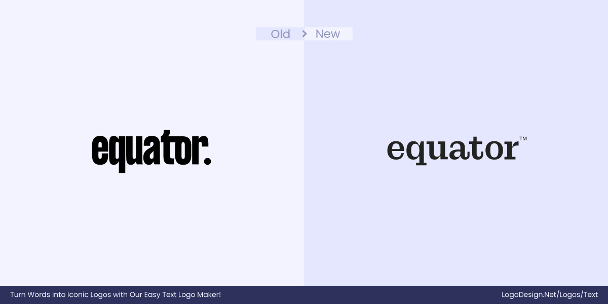
The Equator logo uses serif, which makes it stand out from other AI companies with its curves and swiggles. The font shows character while still staying true to its mission.
6. Katseye
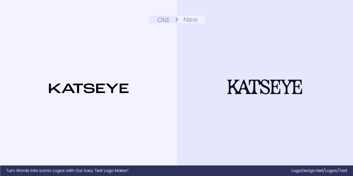
Your visual branding can set the pace for your global presence, and unlike other pop bands, Katseye prefers personality and classic branding over cookie-cutter sans-serif fonts. In line with the Katseye ethos, the typography is made to communicate artistic proficiency.
7. Checkmyfile
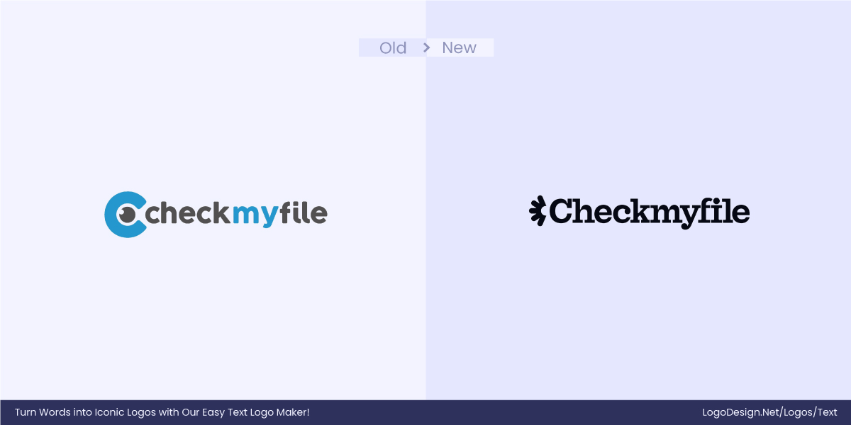
Daunting subjects are often intimidating for the general public. To make the brand more appealing and approachable, consider following the example of Checkmyfile. Their logo change had a big purpose: to humanize something as daunting as credit reports.
8. SWEEP

With a brand that screams personality, SWEEP is making great use of its serif typography. The logo shows out-of-the-box creativity for those who dare to use their disruptive creativity.
9. Edmonton Elks
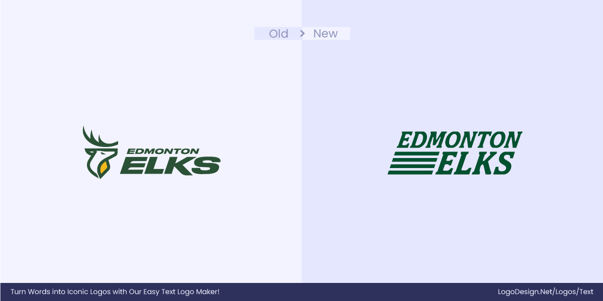
In January 2025, the Edmonton Elks changed the game by returning to their iconic logo. The rebranding has brought back the double E as the logo, reflecting the retro-inspired personality. This is an act of celebration that brought them back to their historical roots, but still sets them apart from the crowd.
10. BORONKAY Studio
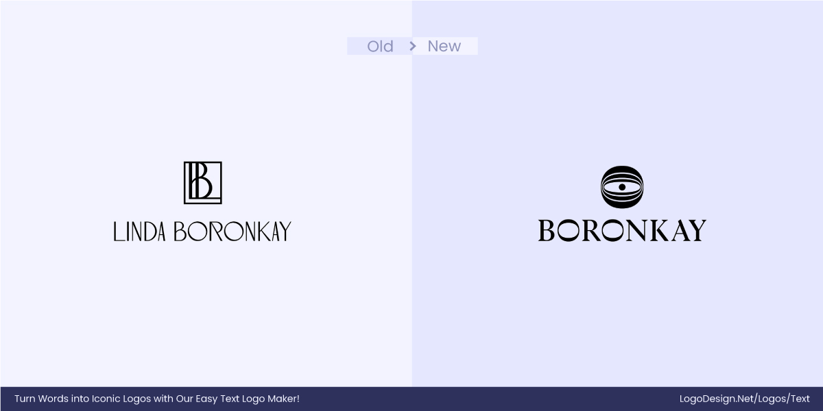
The BORONKAY Studio logo is highly customized, inspired by Art Nouveau and European classicism. It clearly reflects Linda Boronkay’s aesthetic taste and craftsmanship. This typography alone is plenty to differentiate the brand in the market and add personality.
11. Bidetlity
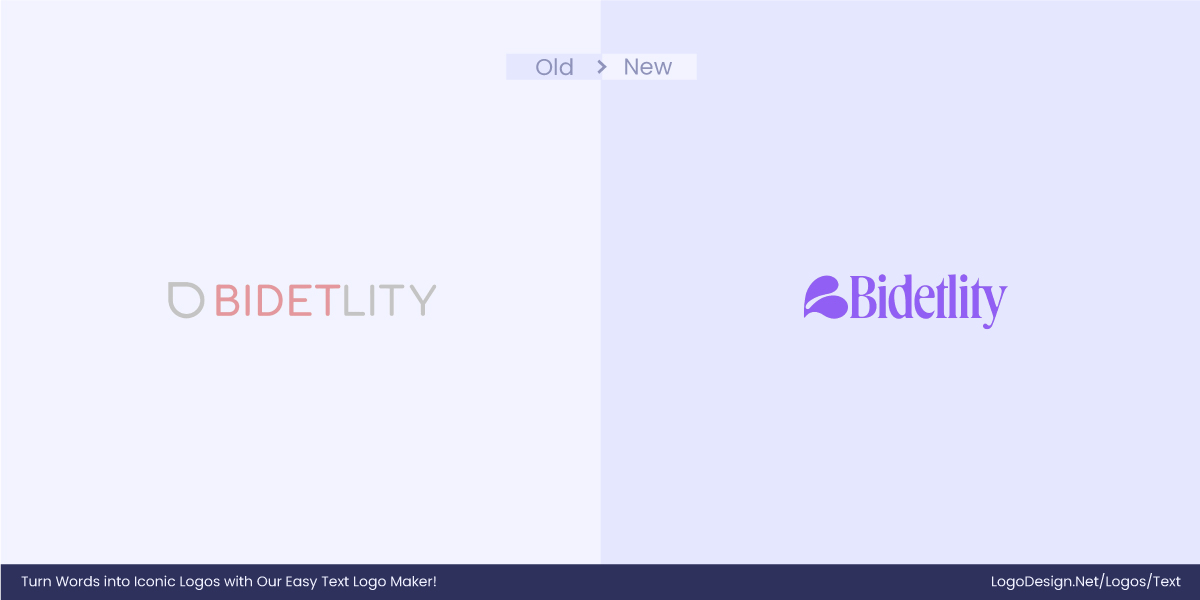
Gentle elegance is the idea behind Bidetlity, and the typography effectively represents that. This is a customized serif typeface that differentiates Bidetlity from the market. It is a great example of how clean, modern fonts might not always be the answer to distinction.
12. La Mansion
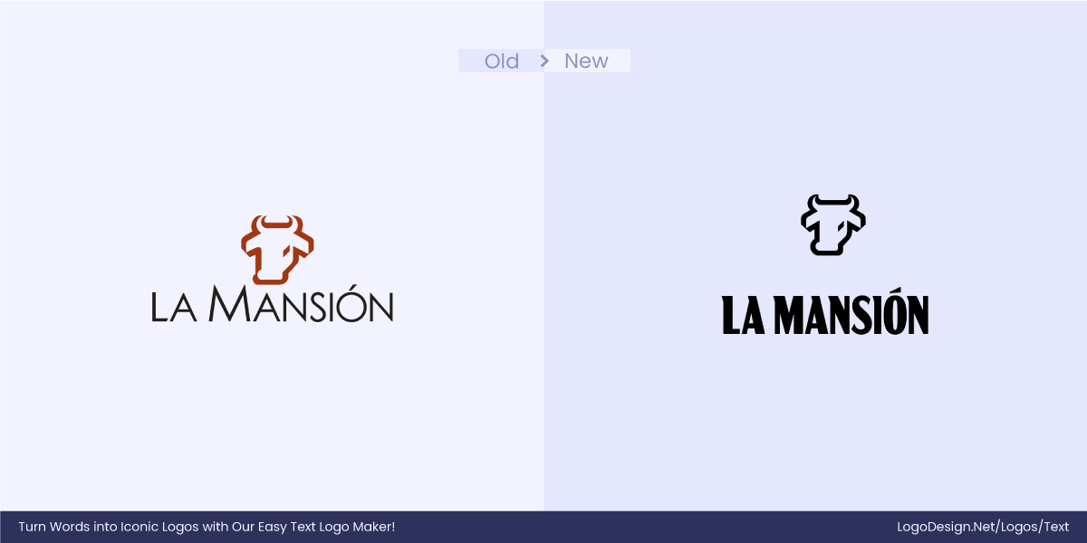
The customized typography for La Mansion follows the serif font, and this change from sans-serif to serif has increased the brand’s visibility.
13. F.C. Como Women
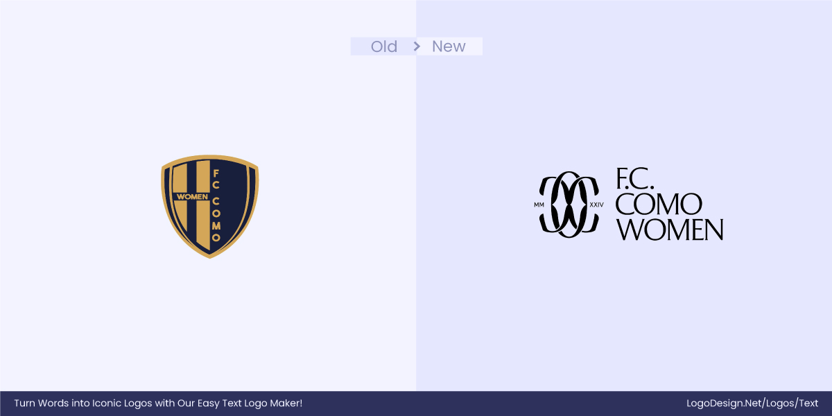
The F.C. Como Women‘s has evolved into the world’s preeminent premium brand, and they want their typography to make a social statement on their behalf. Using a strong serif typeface, they were able to convey premium quality and sophistication.
14. Arclin
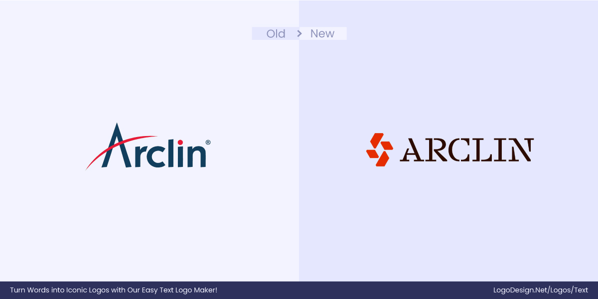
Arclin‘s innovative approach represents its unique ideology. Its customized typeface makes it unlike other brands.
15 Heartful
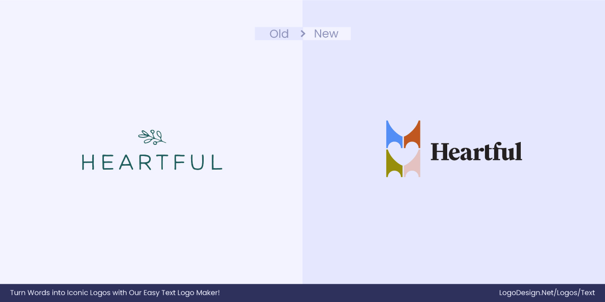
Just like the name, Heartful’s logo might make your heart skip a beat with its cutesy font. The logo is simply timeless and would be remembered by its carefully designed flicks. This could not have been achieved by sans-serif, modern-looking font. A heartfelt holiday leaves a heartfelt impression just like the logo.
16. TalkSpace
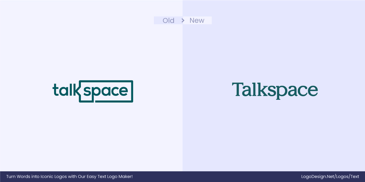
Clarity and creativity can go hand in hand, and that is visible through the TalkSpace logo. Despite being modern-looking, this serif typeface shows warmth and character, inviting people to try out the platform.
17. Emerald Stay
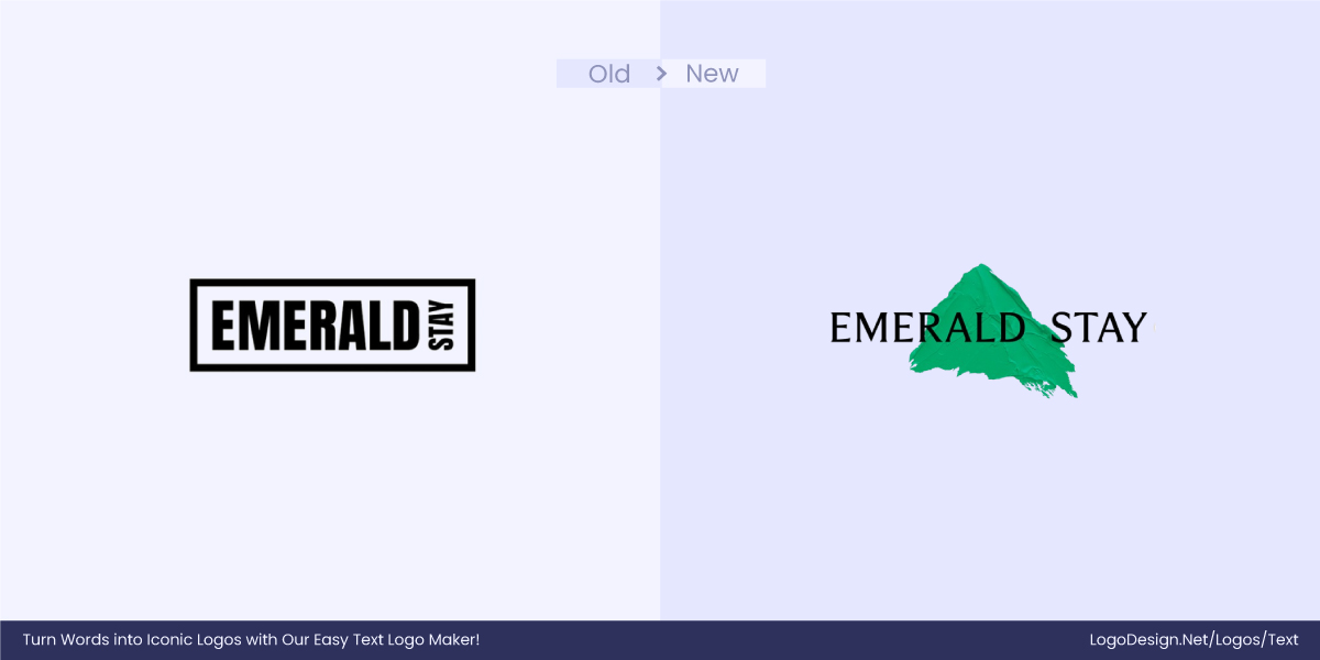
The Emerald Stay logo is a customized serif that encapsulates and reflects the brand’s essence elegantly. The brand offers luxury stays and to convey the luxury of their travel destinations, they have made clever use of the font.
18. Piraeus Bank
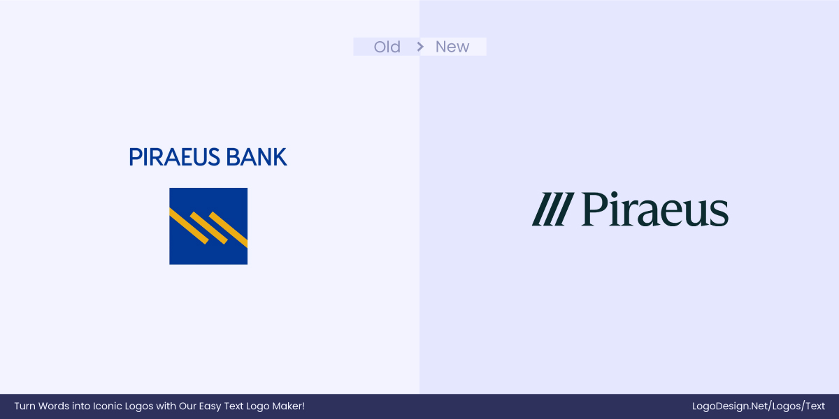
The Piraeus Bank logo proudly features a serif font that sets it apart from other banks. It goes on to show that banks don’t always have to be boring or intimidating. To be more inviting to customers, they can smartly use fonts that give warm vibes and build trust.
19. TAM SON
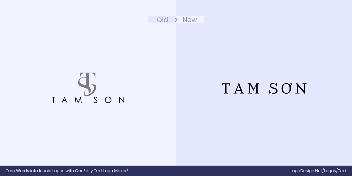
TAM SON repositioned itself in January 2024. The company has created not just a logo but an entirely new identity. This time around, they want to inspire their audience to love more beautifully. This change in ideology is reflected in their logo font, too. For instance, the O in their logo is unique to their national language and celebrates the Vietnamese identity.
20. Vivrelle
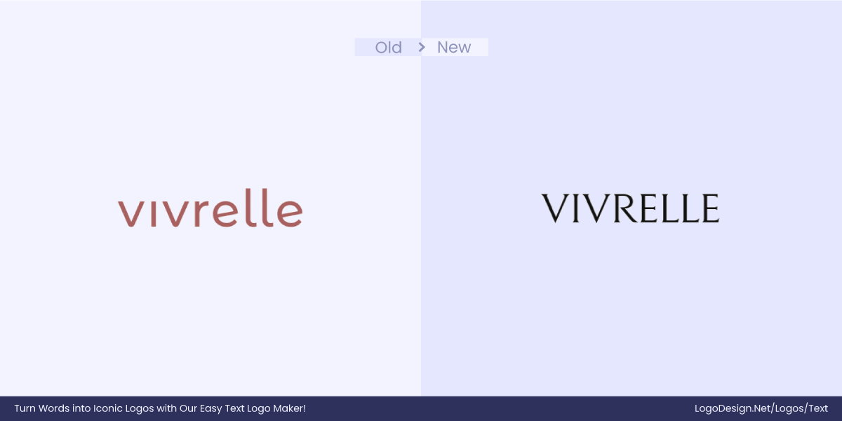
Vivrelle plans to make it luxurious but approachable, which is also the motivation behind their shift to serif. The change perfectly aligns with their modern business model and their plans for the future.
21. Faculty
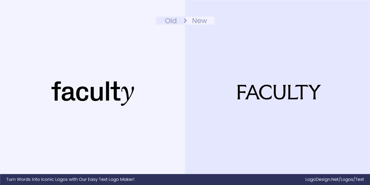
Faculty is repositioning itself as Frontier AI, and to highlight its position at the top, sans-serif is simply not enough. They want to add personality to the mix by using a serif. The logo takes inspiration from carved typography and channels London’s rich history when it comes to innovative legacy in computing.
22. Minimal Company
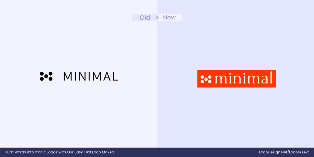
The Minima Company logo has got a not-so-minimal glow-up. The new logo has moved from a simple sans-serif to a serif typeface to add personality. With these changes, the logo has become more memorable as it steps out from the crowd of cookie-cutter sans-serif logos.
23. Nasa
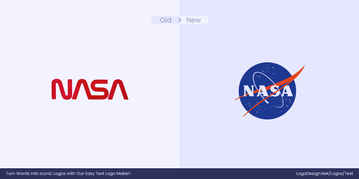
NASA is still sitting on the fence when it comes to logo design. As of today, NASA continues to use both of its ‘Meatball’ and ‘Worm’ logos simultaneously. But we can all tell which one is the favorite. The meatball logo gets the most limelight; it uses a bold serif watermark colored white and is surrounded by the ‘blue’ meatball, making it unique to NASA. On the other hand, the ‘worm’ logo may be confused and is not as recognizable.
24. Mercedes-Benz
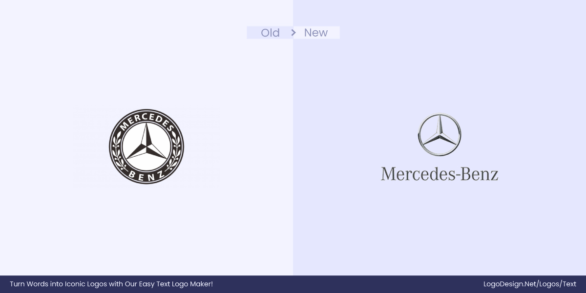
The Mercedes Benz monogram logo just didn’t work in this century, and rebranding was inevitable. The brand wanted to add more of that Mercedes exclusivity in their logo, and that’s why they shifted to serif from sans-serif.
25. Sony Ericsson
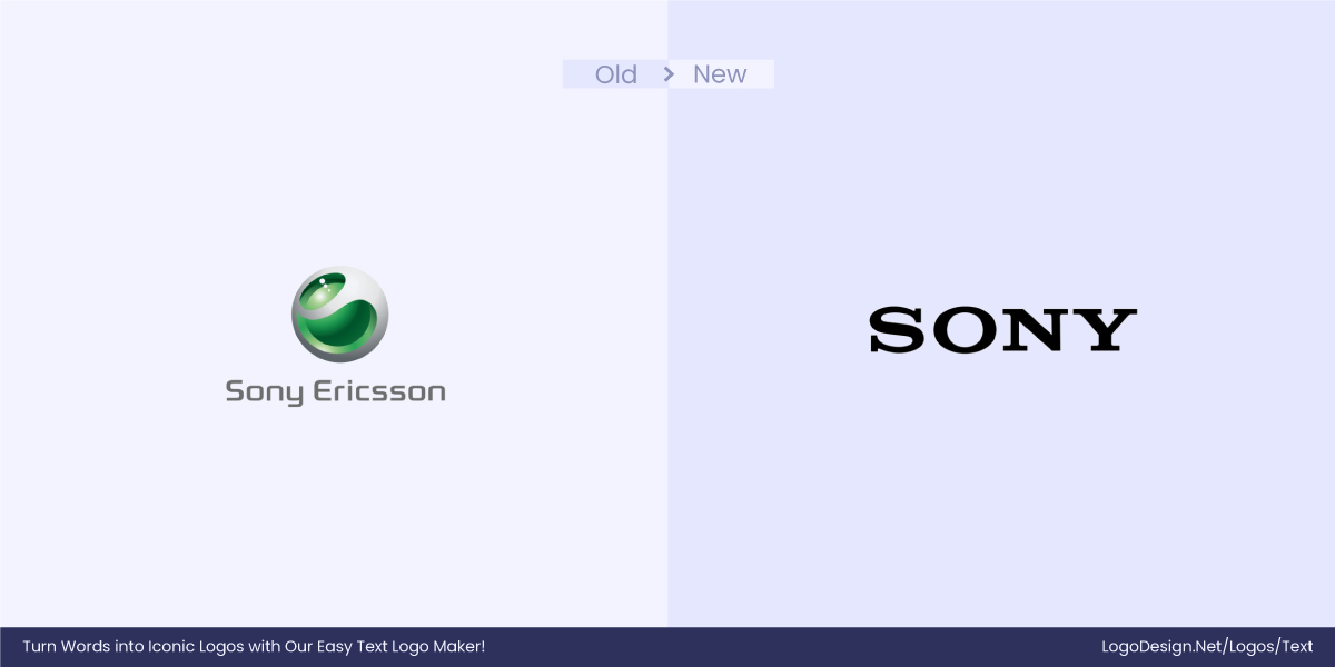
When Sony acquired Ericsson’s 50% stake, the first thing to transform was the logo.
From sans-serif to serif, Sony’s journey has been remarkable. It is part of the biggest One Sony strategy that declares this visual change.
Final Verdict: Serif or Sans-Serif?
There’s no universal solution as the best font for your logo depends entirely on your brand’s identity, audience, and long-term goals. Both serif and sans-serif fonts have unique strengths, and the right choice is ultimately based on the factors mentioned above.
Choose serif fonts if you want to:
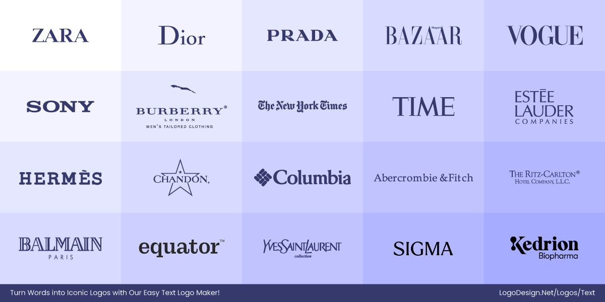
- Communicate tradition, reliability, or sophistication
- Appeal to a more formal or professional audience
- Stand out in tech-heavy industries by bringing a classic edge
- Emphasize heritage, luxury, or craftsmanship
Choose sans-serif fonts if you want to:
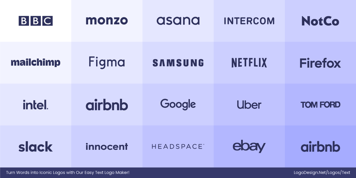
- Communicate modernity, simplicity, or friendliness
- Appeal to a younger or more digital-native audience
- Ensure high readability across screens and small formats
- Align with a clean, minimalist visual identity
Key Takeaways
- Serif and sans-serif fonts each have distinct visual traits and associations
- Serif fonts have small strokes, while Sans-serif fonts are clean and modern
- Font psychology influences how people emotionally connect with your logo
- Readability and scalability are key to the success of a logo design
- Adaptability across devices and use cases ensures consistency
- Tech and creative industries go for sans-serif, while luxury brands may go for serif
- The best font choice depends on strategic brand alignment
- There’s no one-size-fits-all; only what fits your brand best
