Think spacing doesn’t matter? Just ask Gap. Their 2010 logo proves poor spacing can tank even the biggest brands. Typography is art, and spacing is the unsung hero.
Typography in branding isn’t simply selecting a good-looking font. It’s the crucial step to understand how letters play a significant role and how they work together to convey a legible, balanced, and sensible message. In logo design specifically, all things count. Two of the things that fall by the wayside but are actually log-breakers are letter spacing (also known as tracking) and kerning. They’re high-tech sounding names, but they’re the secret sauce in clean, professional-styled, and readable logos salad.
Perception is the end game in graphics, and your logo is the first impression people get of your brand. So, your primary focus should be on a proper logo. If your typography logo letters are too close, too far apart, or spaced out unevenly, they will give a very vague and shady impression, and that’s not something any brand wants. With thoughtfully spaced and professionally designed letter logos, your company will look more professional, high-end, and even more welcoming.
Upon hearing the terms tracking (also known as letter spacing) and kerning, you must be wondering what they really mean. Don’t worry, in this blog, we will discuss what they are, why they matter so much in logo typography, and how they affect the way people perceive your brand. If you’re designing your own logo or working with a designer, attention to minute details can lead to huge improvements in how your brand is perceived.
Understanding Kerning and Tracking (Letter Spacing)
Before we discuss the important points of typography in branding, let us first separate kerning and letter spacing because they are often confused.
• Kerning
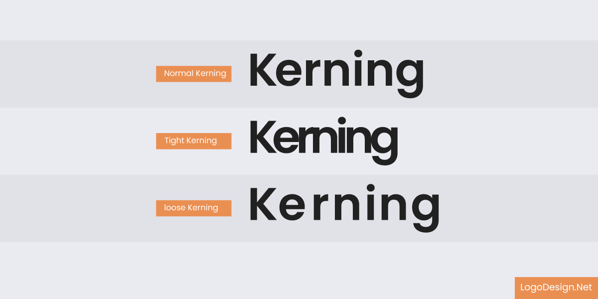
Showing the variation of normal kerning, tight kerning, and loose kerning
Kerning is the adjustment of space between particular letter pairs so that they make a visually harmonious appearance. It means the closeness of two or more characters to correct visually inconsistent distortions.
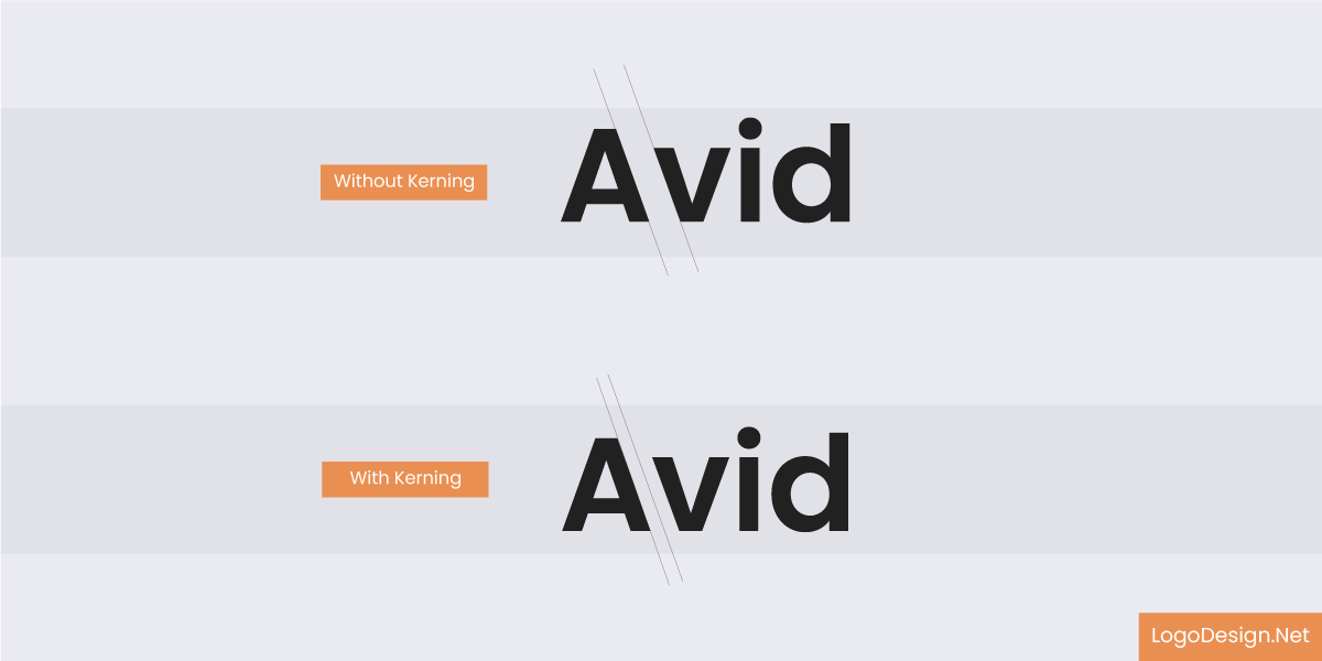
The AV space with and without kerning
For example, the space-looking size between ‘A’ and ‘V’ is usually larger due to their shapes. Kerning corrects this and makes it consistent.
• Tracking (Letter Spacing)
3 samples of text with -100 Tracking, 0 Tracking, 100 Tracking
The letter spacing is the spacing across a free range uniformly between individual characters in a word or block of text. Tracking, unlike kerning, deals with pairs of letters, altering the complete density of the word by tightening or loosening the overall text.
Showing kerning and tracking in their respective texts
The Role of Kerning in Logo Design
Kerning is an important aspect to consider in logo typography, and it helps establish the following:
- Visual Harmony: Good kerning ensures that each letter pair will appear evenly spaced, which contributes to an overall cohesive balance. This uniformity is very important for the visual appeal of the logo.
- Readability: Clumsy kerning can equal misreading words. Typography logo letters that are too close together tend to trick the eye into seeing them as one; letters with too much space look disconnected from the logo.
- Professionalism: Good kerning shows attention to detail and certain types of professionalism and credibility. A well-kerned logo indicates a brand that values quality and precision.
The Impact of Tracking on Logo Typography
Letter spacing governs logo design in many aspects, including:
- Brand personality: Tuning up or down tracking would generate different emotional effects. For example, when letters are closer together it may seem either urgent or modern, whereas when letters are spaced further apart, it brings an air of openness or, sometimes, luxury.
- Readability: Proper letter spacing improves the visibility of logos in small sizes. For example, letters that are contracted too much become indistinguishable from each other. On the other hand, letters oriented in a very open manner lose cohesion as a logo becomes loose.
- Adaptability: Logos are for different media and in different spaces. The letters can be spaced consistently, and the logo will still be legible and recognizable whether it is seen on a business card or on a billboard.
Spacing Psychology: Your Logo Speaks
Letter spacing on words isn’t just an application of the aesthetic principle. It is also a psychological phenomenon that determines how the audience will perceive and react emotionally toward the brand. Letter spacing can influence how trustworthy, contemporary, or approachable their typography logo design feels very subtly.
The Case for Wide Logo Spacing…
The wide spacing generally conveys elegance, luxury, or calm. Commonly, high-end brands use more space in logo design to denote sophistication and exclusivity.
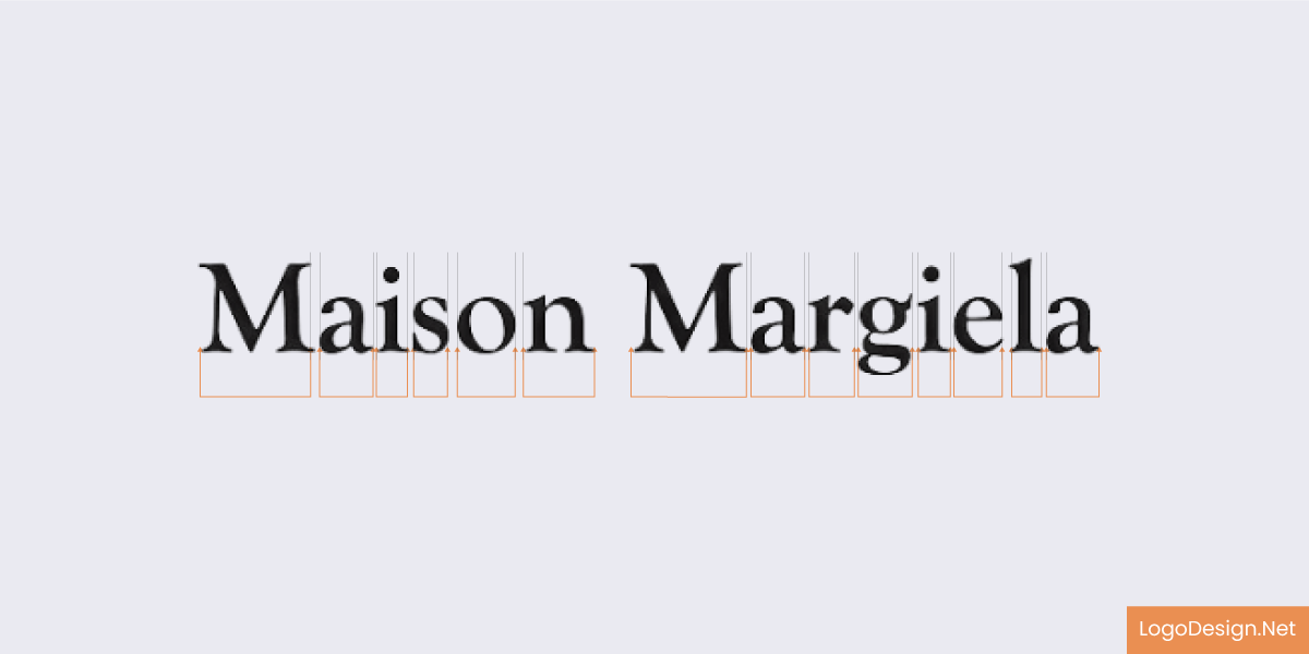
Maison Margiela logo, a fashion house based in France
The Maison Margiela logo is widely spaced, with all the letters significantly away from each other to improve readability. Adding to that appeal, there are also no distracting graphics or elements, which is a bold choice, showcasing the brand’s confidence.
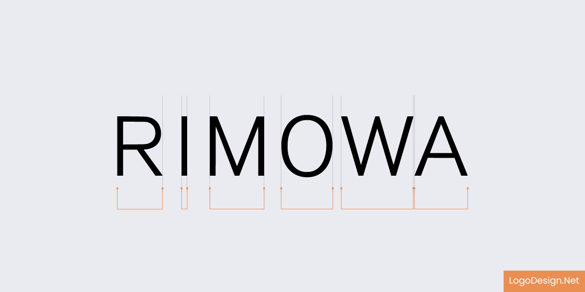
Logo of Romowa, a luggage manufacturer
A well-spaced Rimowa logo with a thin font property that makes the logo user-friendly, uncluttered, and easier to read.
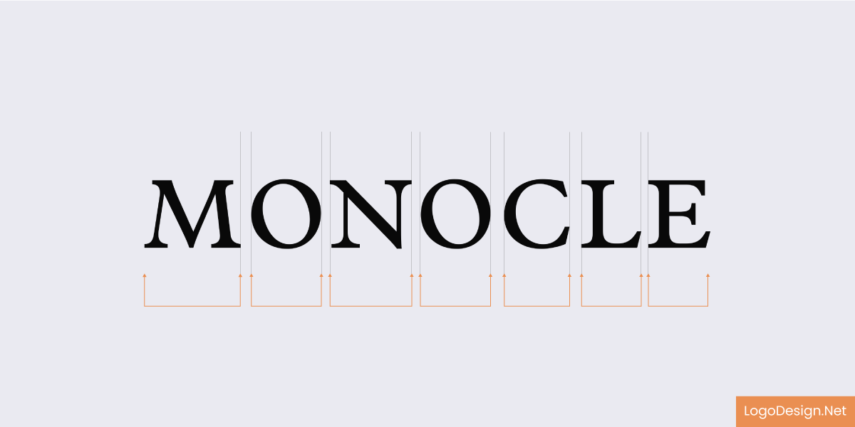
The Monocle Logo, a culture and lifestyle magazine
This Mocole brand logo follows a minimalist approach, with a plain background and using a simple font family. Each letter is well spaced out with no kerning, which ensures people can easily read it.
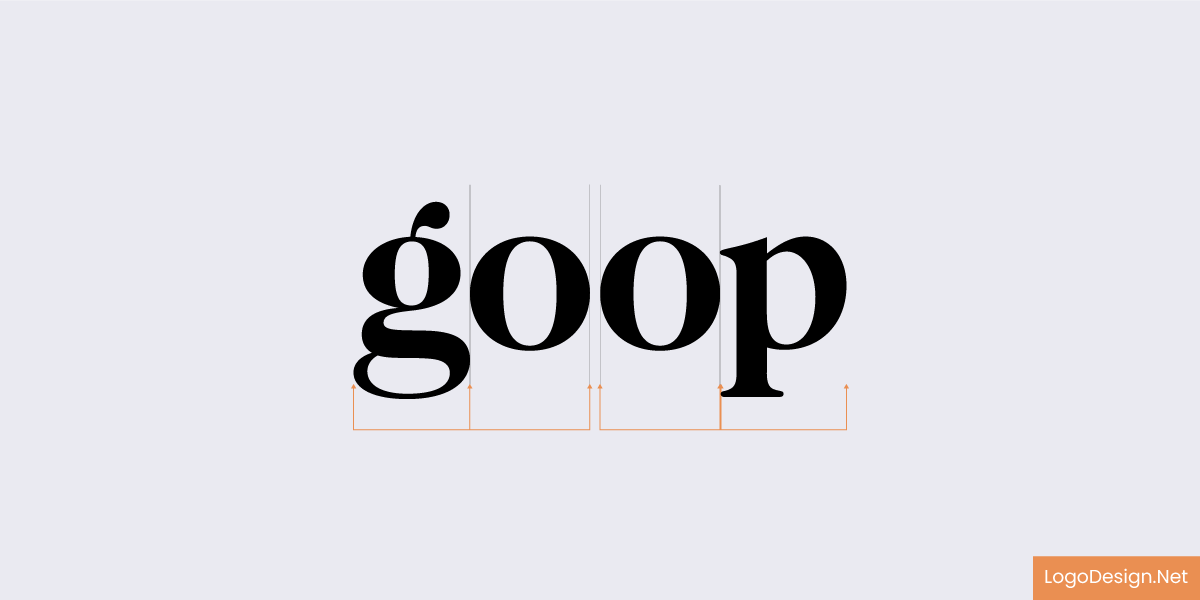
The Logo of Goop, a lifestyle and fashion brand
The Goop logo spells out the brand name in stylized font on a white background. Its slightly curved and thickened letters complement the clean appearance.
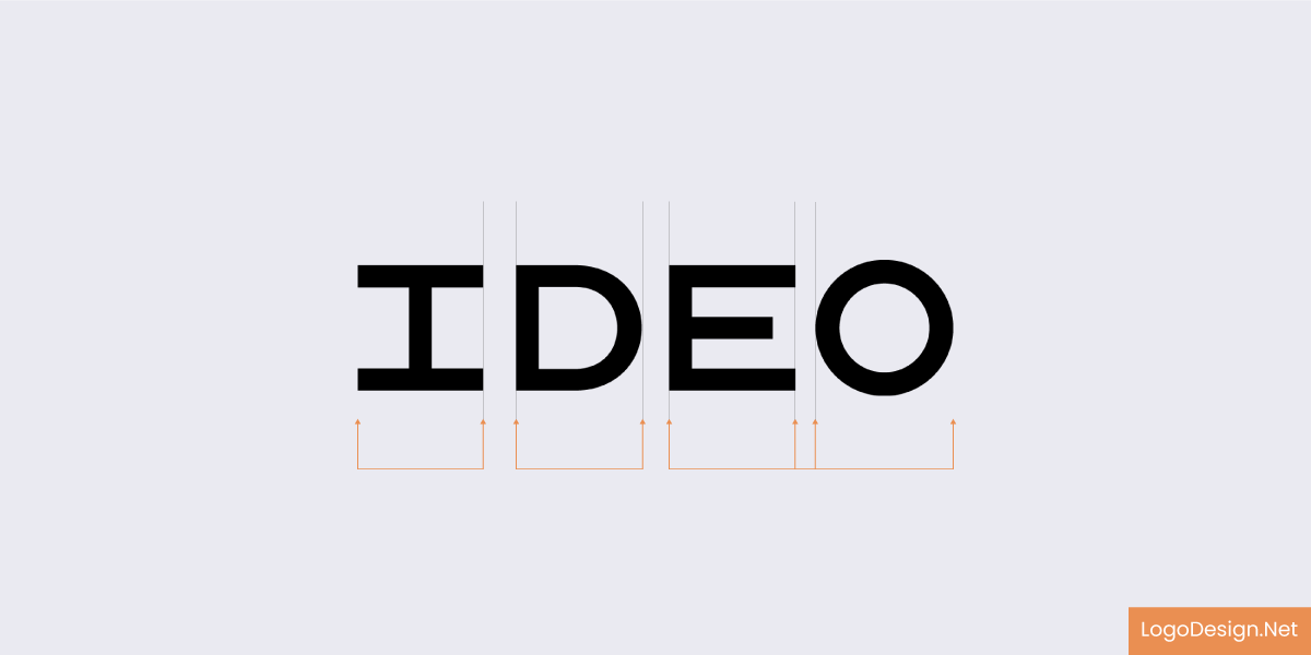
Logo of IDEO, a design company in the US, England, and China
With the IDEO brand name spelled out in uppercase and a clean font typeface, the logo follows a minimalist and simplified approach. No frills and organized design displays creativity, dependability, and value for clarity.

Logo of Foster + Partners, which is an architecture firm
The bold and clean Foster + Partners logo design with dark gray color shows professionalism and seriousness. The plus sign in between and very little white space suggest the brand wants a clean geometry appearance.
The Case for Tight Logo Spacing…
Conversely, tight spacing in logos feel intense, energetic, or aggressive, the perfect antidote for tech startups or athletic brands looking to project such intensity and drive.
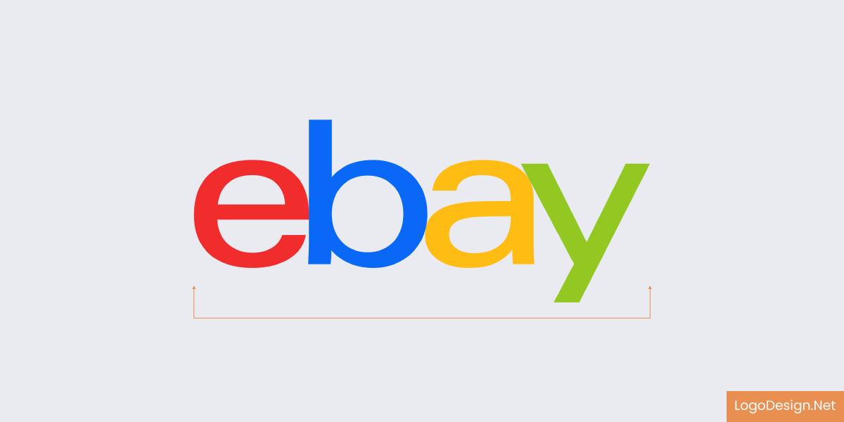
Logo of Ebay, an online marketplace
The eBay logo shows four letters in different colors, making it easier to read. Each letter is tightly attached, with visible kerning, which might make it overwhelming for many to read. The tight spacing can also be an effort to create a memorable identity.
Logo of Zara, a multinational fast fashion brand
With a compact logo design displaying urgency and compactness. Even with or without a uniform kerning, the Zara logo has avoided awkward gaps and overlaps by merging the letters. This ensures the readability remains intact.
Pentagram logo, an independent design company
The Pentagram logo uses a subtle use of kerning for a visually appealing look. There’s no uniform spacing, as some letters have higher spacing than others. All this leads to a creative reading experience.
KIA Logo, an automobile manufacturer
Abstract in nature, this KIA logo suggests focusing more on brand identity instead of smooth readability. Its interlocking form suggests movement, which works well for automotive companies. Instead of space between letters, it displays a single, stylized form.
The VICE logo, a Canadian-American magazine
Following a stylized and informal pattern, the VICE logo has a tight letter spacing that may make it harder to read for people. Even though there’s no uniform kerning, the spacing between specific letters improves the visual appeal.

Intel logo, American multinational and technology company
This Intel logo follows a tighter typography than many other creative designs. With no uniform kerning, there’s a significant gap between the letters, making it easier to read and understand. The blue font size perfectly shows that it’s the logo of a technology company.
Spacing also impacts the words’ readability, subsequently affecting the speed at which your audience can recognize and recall your brand. Suppose the letters feel cramped or awkwardly distant. In that case, the brain has to work harder to make sense of the word, and that tiny bit of effort can lead to disinterest or confusion. Well-balanced spacing feels effortless, polished, and intentional. The darker psychological undertones of business letter spacing can manipulate your audience’s perception, whether you want to be playful and inviting or stark and professional, even before they have read a word. Letter spacing isn’t simply a design element but an extension of your brand voice.
Mistakes Made in Kerning vs Letter Spacing
There are some inevitable typos even the most accustomed of designers make without understanding the importance of typography in branding. Here are a few of the most common mistakes:
- Forget Manual: Relying on the font’s default kerning often causes errors. Only changes may do them justice.
- Overlooking Context: Perceptibility also depends on the background and medium in which the typography logo design appears. A logo on the textured surface might call for a different spacing adjustment as compared to that on a digital screen.
- Uneven Spacing: All must be even; with inconsistent kerning or tracking, a logo can look unpolished and amateur.
Best Practices for Effective Kerning and Letter Spacing
For proper application of kerning and letter spacing in logo typography:
- Use Professional Tools: Software like Adobe Illustrator has sophisticated typesetting controls that enable minute adjustments.
- Make Use of Testing Media: Always view the logo at different sizes and in various contexts to ensure that the logo is versatile, offers legibility, and looks good across platforms.
- Collaborate: Someone else looking at your logo can help point out inconsistencies you’ve overlooked. Work with communities or set up focus groups to obtain input.
- Study Typography Trends:Typography terms change. Stay current, so that you can incorporate present-day practices and learn how to embed space into your logo effectively.
Working With a Designer? Questions to Ask about Typography
When you engage a designer to create your perfect logo, one of the most important aspects you’ll need to nail down in that process is its typography. Yet, it often gets almost completely neglected in the first few conversations. Come prepared with questions like: “Which fonts are you considering and why? What do you think about kerning vs letter spacing? How are you handling letter spacing and kerning? Will the logo remain readable at different sizes?” This way, you have an idea of the designer’s process in focusing on typographic details.
Ask about how your logo will perform across platforms such as print, web, packaging, etc. This is because spacing that looks glorious on a billboard may not do the same justice on a mobile screen. Finally, discuss whether the designer customizes any part of the typography to create a more unique look, custom hand-lettered logo designs, and if visual comparisons of different spacing options could be done upon request. Typography is not just a nice font, but also balance and readability, which makes a memorable statement with every letter.
Conclusion
Kerning and letter spacing in Word may seem like tiny design adjustments, but in reality, they are monumental regarding a logo’s look and feel.
- Kerning is the space between individual letters.
- Letter spacing (or tracking) modifies the spacing across an entire word or phrase.
When these typography design tips are given the utmost care, a logo transforms from “meh” to *wow.* This kerning isn’t just for neatness; good spacing permeates a logo with intention, polish, and an ability to read at any size.
In turn, such good spacing communicates precisely what the brand stands for. Whether it’s luxury, playfulness, minimalism, or abstract creativity. The way the letters sit with one another tells a story.
So, suppose you want nothing less than perfect kerning and spacing. In that case, you aren’t just being nitpicky—you’re actually creating logos that become ingrained into people’s consciousness, logos that impress and woo the heart of a brand.
Bonus Information
1. What is the difference between kerning and letter spacing?
Kerning literally stands for “space between two letters and it is always adjusted individually; this is done for treatment of letter pairing to give an effect of visual harmony”. Letter spacing (also called tracking) is like kerning but with respect to a subset of the alphabet, indeed to an entire word or a range of words.
2. Why is kerning important in logo design?
Kerning spaces ensure the visual balance with which they sit between letters. Bad kerning can make a logo appear amateurish or interfere with reading or unintended moves of the brand name.
3. Can bad letter spacing ruin a good logo?
Yes, bad letter spacing can ruin a good design logic or font in a logo, making it obscure in terms of readability, symmetry, and brand perception. The final output seems either unbalanced or unprofessional.
4. Do all logos have to be kerned manually?
Not all logos have to be kerned manually. However, many professional designers love to do it, since automatic kerning generally works for body text, logos strongly need to have perfect, but lasting impacts.
5. How do I know that the spacing in my logo is correct?
Ask yourself: Is it readable at all sizes? Do the letters feel evenly spaced? Print out your logo and look at it on a computer. If anything looks “off,” it probably needs adjustment.
6. Which tools can help with kerning and letter spacing?
Well-known design tools such as Adobe Illustrator, Figma, and Canva Pro include various facilities to adapt kerning and tracking. For precision work, we recommend using an online typography logo maker or professional software.
