Your logo is your brand’s first impression—make it versatile. Built to scale, adapt, and impress across every screen.
Most people are able to recognize the icons, word marks, and symbols of brands like Nike, McDonald’s, Starbucks, or Walmart anywhere. This is all about having a versatile logo. A logo that functions well across multiple sizes, formats, and platforms while maintaining its core identity goes beyond appearances. Creating one that looks the same in various sizes and across formats is essential. Now, this can be challenging when you are starting in any industry. But it’s something that you have to prioritize. If you don’t focus on versatility, you might end up confusing your audience and missing out on higher brand awareness.
To simplify this for you, let’s break down how to create a versatile logo that works everywhere, whether it’s on a billboard or a business card.
The Core Principles of a Versatile Logo
It is important to keep in mind that versatility is integral to the success of a good logo . Any design that can adapt to different contexts, mediums, and sizes is one that truly stands the test of time. That means your logo needs to look great on every format, be it print or digital.
Here are four core principles to consider from the start.
Keep It Simple – How Simplicity Helps Logos Adapt
A simple logo not only stands the test of time but also prevents distraction. By focusing on clean lines and basic elements, you make a design that’s easier to use in any format and size. Simplicity is a key logo design characteristic and helps your logo stay recognizable as well as effective for digital and print mediums. So people can identify it as an icon for a mobile app or when placed on business cards. Don’t use too many small details that might get lost when the logo is smaller. This way, the purpose of your brand shows through no matter the size.
If you are thinking of an example here, it would be Aesop Skincare’s logo. It is clean, minimalist, and highly recognizable for its simplicity.
The logo of Aesop follows a minimalist approach and is copyrighted.
Scalability – Keeping Things Clear at Any Size
Scalability is just as important as the design elements. Your logo needs to look sharp on billboards, business cards, mobile apps, flyers, and brochures. To start with, you can always consider using software or a tool for a vector-based file logo. This allows designs to be resized without losing resolution.
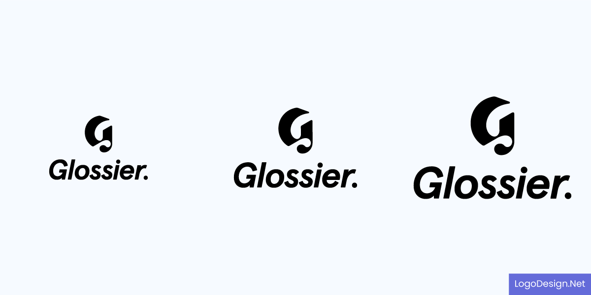
The Glossier logo is displayed in different sizes and dimensions.
Just consider the logo of Glossier here. The icon and wordmark cannot be missed anywhere and instantly tell you about the brand. A scalable logo maintains its integrity and clarity, no matter how big or small it gets.
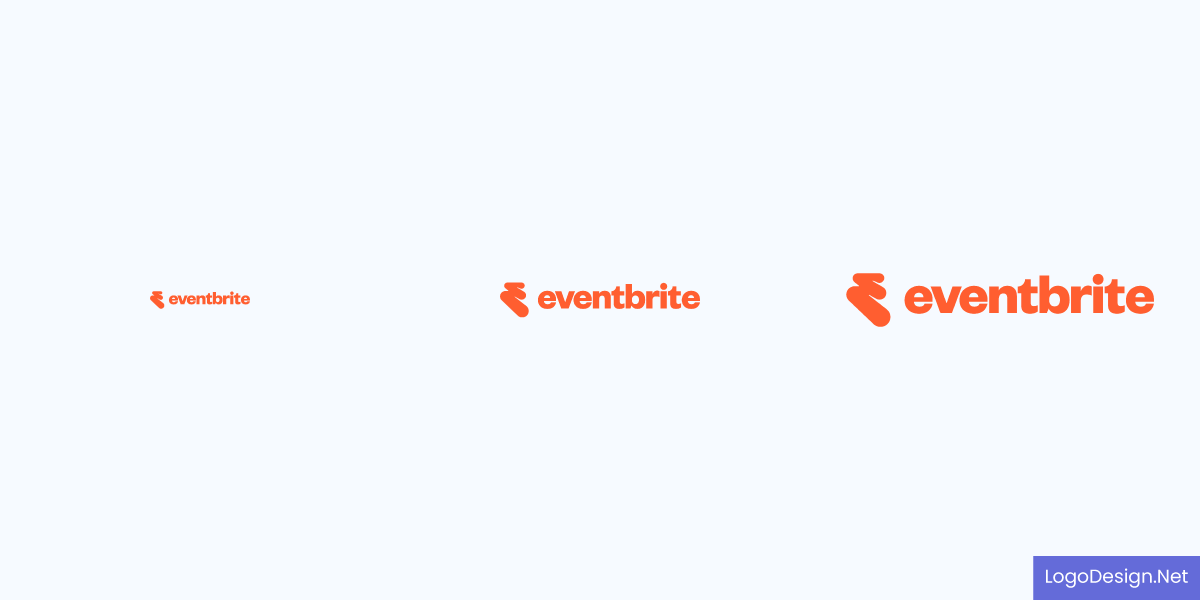
The eventbrite logo, written in orange color, and displayed in different dimensions.
Another great example is Eventbrite’s new logo. The dynamic logo design emanates energy with a bright orange wordmark that moves and shifts across platforms to adapt to different sizes and screens.
Readability – Choosing fonts and elements that remain clear
Font readability can affect your design, as the text may not be easy to understand in some places. Choose fonts and design elements that are easily read, even in small sizes. Avoid overly decorative fonts that lose their impact when minimized. If your logo includes calligraphic text, make sure it’s clear and easily legible. Whether it’s printed on a small business card, promotional item, or displayed across a giant billboard, your logo should be readable at first look.
The Outdoor Voices logo, written in a simple font with a blue color.
When it comes to readability, you want the logo to show immediately. Outdoor Voices is one brand that has mastered this principle in their brand identity design. The lettermark is obvious on digital and print platforms in every size.
Flexibility – Designing for different backgrounds and formats
This is what allows your logo to shine in different contexts. It will appear on a variety of backgrounds and in different formats. That means you should be prepared to create multiple versions of your logo, full-color, black-and-white, and a simplified icon. Your logo should be visible and clear against any background or transparency.
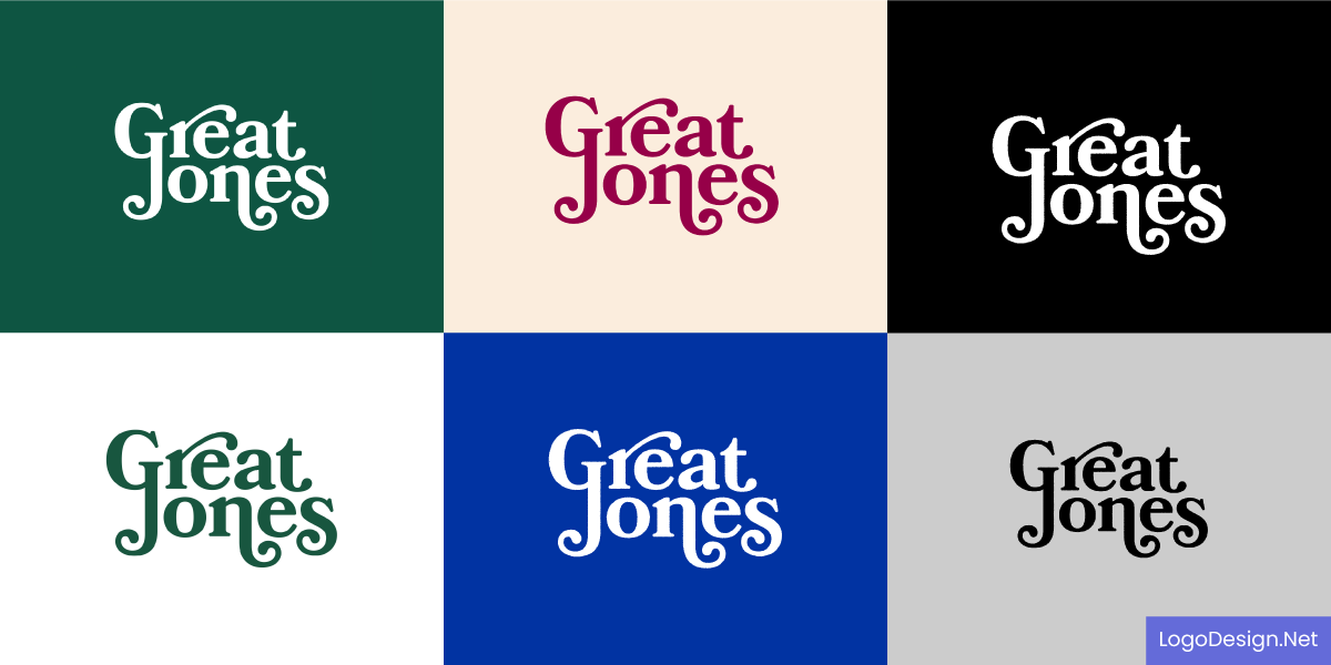
The Great Jones logo, displayed in different font colors and varying background colors.
For flexibility, Great Jones has implemented it well in their logo design. While the font style is decorative, the typeface and lettermark are instantly recognizable in the favicon, website and marketing materials.
Designing for Different Mediums
For a versatile logo, the mediums of display come next. During the first stage of the design process, you need to focus on distribution channels, like all marketing collateral, merchandise and social media platforms. These are some of the key areas where your logo will most likely be displayed. And it should be a top priority to design variations that adapt to such different mediums.
Now, these will include both digital interfaces and print materials, which is why it’s incredibly important to think of their limitations beforehand. For instance, on a smartphone screen, the logo might get pixelated if the resolution is too low or the colors might be distorted. It is a good idea to create variations where the design remains intact for display in both iOS and Android devices.
Business Cards & Stationery – Compact yet impactful design
Begin with these key aspects as your business cards and stationery such as letterheads, envelopes and post cards are one of the first touchpoints for potential customers. These mediums vary in sizes and formats. For business cards, think of both digital and print formats when designing a versatile logo. Similarly, the colors and resolution for stationery have to adapt and scale. This is what Golden Hour Lens made possible by using a design editor to create logos, letterheads, and other stationery designs.
Here are just a few things to keep in mind as you finalize your logo design.
- Clear and bold text: Most business cards, envelopes and stationery materials will feature your logo in a scaled-down variation so the text should be clear in the smallest of size.
- Geometric or abstract shapes: Include these in your logo for a minimalist design that is clearly visible in corners or in between other elements.
- Straight or curved lines: These are hard to miss and can work well when the logo is scaled up or down.
Other than this, you also need to be familiar with sizes and dimensions used commonly in business cards and across stationery.
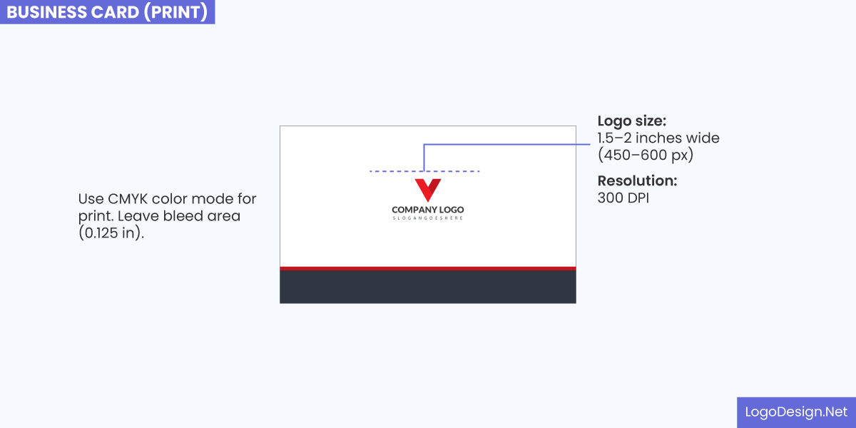
Image mentioning the suggested dimensions for the bleed area, logo size, and resolution for a physical business card
Print Business Cards:
- Standard size: 3.5 inches by 2 inches (89mm x 51mm)
- Logo size: Ideally, the logo should be 1 inch to 1.5 inches wide (depending on the design) for clarity and recognition
- Resolution: 300 DPI
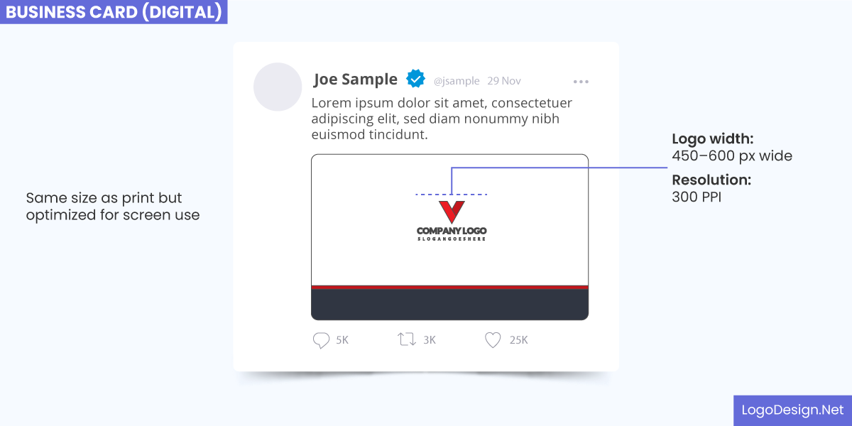
Image mentioning the suggested dimensions for the logo width and resolution for an online business card
Digital Business Cards:
- Standard size: Digital business cards have different sizes depending on the platform (such as LinkedIn or a digital business card app). Common ones are:
- LinkedIn or standard screen format: 1200 pixels x 630 pixels (for optimized resolution)
- Digital card files: 800 pixels x 450 pixels for sharing via email or apps
- Logo size: For digital formats, the logo should be clear at 150–300 pixels in width
- Resolution: 72 DPI for screen display
Letterhead:
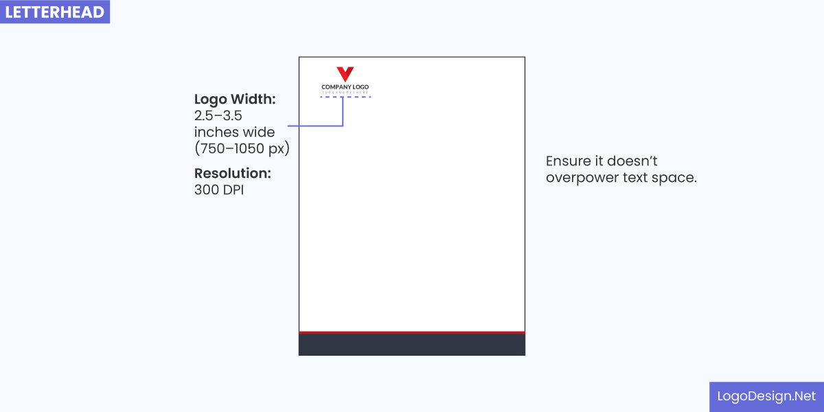
The image shows the suggested dimensions for the logo width and resolution on the letterhead.
- Standard size: 8.5 inches x 11 inches (US letter size) or A4 (8.27 inches x 11.69 inches)
- Logo size: The logo size should range between 1.5 to 2 inches wide, depending on the layout and overall design
- Resolution: 300 DPI
Envelopes:
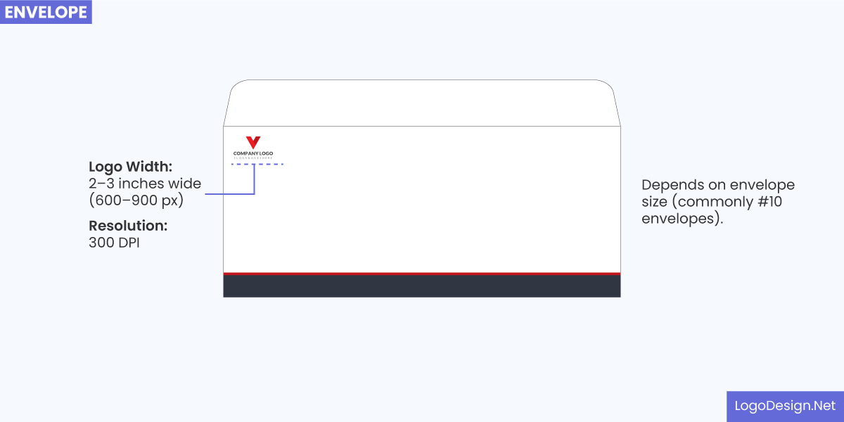
The image shows the suggested logo width and resolution on an envelope.
- Standard size: #10 envelope (4.125 inches x 9.5 inches)
- Logo size: The logo should be placed in the top-left corner of the envelope, typically around 1.5 inches wide
- Resolution: 300 DPI
Notepads:
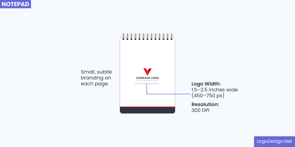
The image shows the suggested logo width and resolution on a notepad.
- Standard size: 8.5 inches x 11 inches or A4
- Logo size: The logo size should be similar to that used on letterheads, around 1.5 to 2 inches wide.
- Resolution: 300 DPI
Website & Digital Media – Optimizing for screen resolutions
As it is with any medium, a versatile logo is scalable and clear on different screen sizes, from desktop monitors to mobile devices. You need to focus on keeping it sharp and well-defined even at any size, especially when displayed in the header or as a favicon. Test it on apps and screens so you have an exact idea of how it interacts with the color scheme and layout of digital media.
This way, you also understand your audience’s perceptions as they view it on your e-commerce app or business website. To make sure that you have a versatile logo optimized for screen resolutions, here are the recommended sizes and resolutions.
Logo for Website Header:
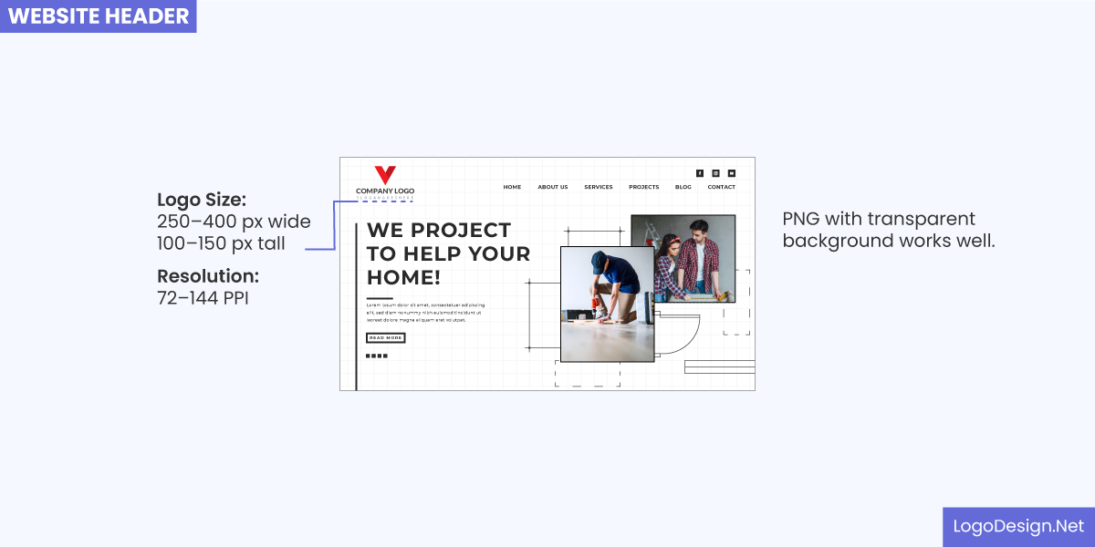
The image shows the logo size and resolution suggestions when designing a website header.
- Standard size: 250px – 400px wide (height varies depending on aspect ratio)
- Resolution: 72 DPI (for digital screens)
Favicon:
The image displays the logo size and resolution for a favicon.
- Size: 16px x 16px, 32px x 32px, or 64px x 64px
- Resolution: 72 DPI
- Format: PNG, ICO, or SVG (for scalability)
Mobile App Icons (Android & iOS):
- iOS:
The image recommends logo size and resolution for the app icons on iOS.
- App Icon size: 180px x 180px for iPhone Retina displays
- Resolution: 72 DPI (for screen display)
- Format: PNG (with transparent background for flexibility)
- Android:
The image tells you the logo size and resolution for the app icons on Android.
- App Icon size: 192px x 192px (Google Play store)
- Resolution: 72 DPI (for screen display)
- Format: PNG (with transparent background)
Social Media Profiles & Thumbnails – Making it recognizable in small sizes
When it comes to these platforms, create vector-based designs that can scale endlessly without losing quality. This will help your logo look great on social media profiles, where it may be resized to fit within a small, circular, or square profile picture.
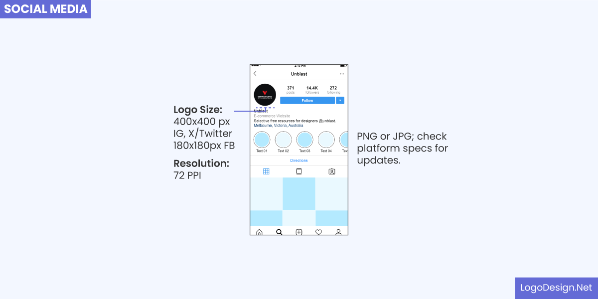
The image suggests logo size and resolution for the logo on social media platforms like Instagram, Twitter, and Facebook.
You want your logo to remain recognizable when scaled down, so keep things simple. Avoid common logo design mistakes, such as excessive text or elaborate details that get lost easily. Get feedback from a focus group on your logo in reduced sizes for various social media platforms. This will help you get an insight into how recognizable or visible it is.
Signage & Billboards – Ensuring visibility from a distance
For large-scale signage and billboards, your logo needs to be visible from a distance. That means using large, clear fonts and bold elements that stand out against the background. Avoid.
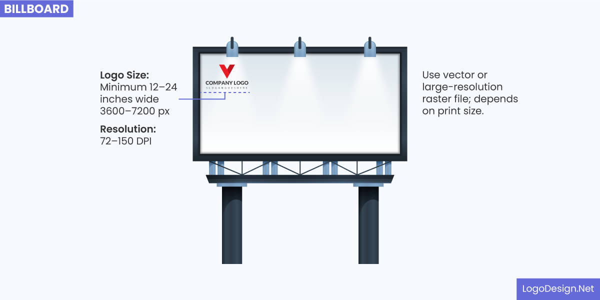
The image displays the suggested logo size and resolution for a billboard.
Choose high-contrast colors that are easy to see from a distance. It is easy to maintain the resolution and display in signage and billboards since the bigger your logo is, the better it is for visibility.
Merchandise & Packaging – Adapting the logo for physical products
Whether it’s a t-shirt, mug, or product box, your logo will need to adjust to fit a range of physical surfaces and sizes. Consider the shape and texture of the product when positioning the logo. As you design the logo, pay attention to how the colors and text will appear in print or when embossed.
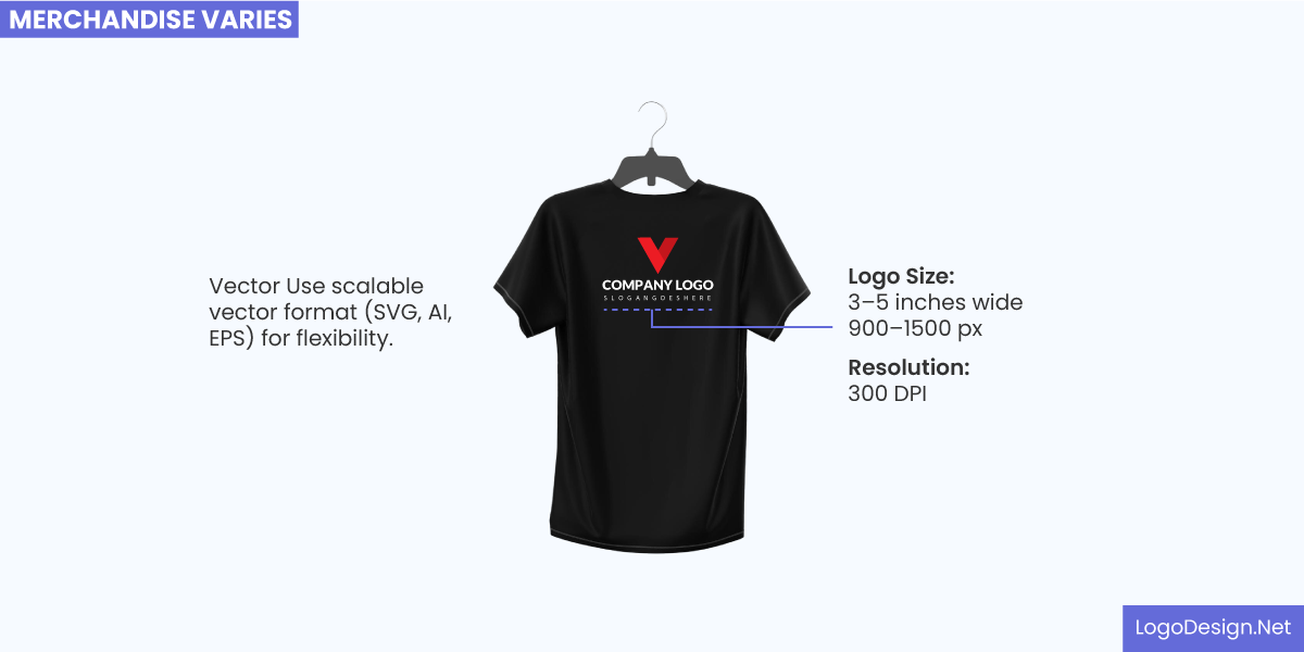
The image suggests the logo size and resolution on merchandise.
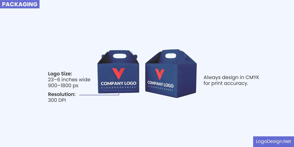
The image recommends the logo size and resolution on packaging.
These are just some of the key factors to consider for a versatile logo. If you are able to add these in your design, then you don’t have to worry about the logo display on smartphones, business cards, or signage. The most important thing is that you can have a design that works everywhere and creates brand recognition among a wider audience.
Frequently Asked Questions:
What design elements make a logo adaptable across different mediums?
Simplicity, color contrast, clear typography, and geometric shapes are the key elements that ensure a logo’s adaptability on different mediums. When you are creating your logo, make sure to keep it as simple as possible, as too many details could overwhelm the viewers.
How can I ensure my logo remains clear and readable at any size?
Use bold text and clear-cut typography instead of complex styles that could be misunderstood in smaller sizes. Focus on Kerning and space out letters so your text in the logo remains readable and does not require a lot of effort to understand.
What file formats should I use for printing and digital display?
These are the commonly used file formats for print and digital display.
For Print:
- EPS
- TIFF
- AI
- PSD
For Digital:
- SVG
- PNG (Portable Network Graphics)
- JPEG
- GIF
How does color choice impact logo versatility?
Simple colors or neutrals are easy to scale up and down as you don’t have to consider a lot of other elements like vibrant backgrounds or images. High contrast also makes for a choice when it comes to versatility and display on billboards or signage.
What are common mistakes to avoid when designing a scalable logo?
These are the common mistakes to avoid when designing a scalable logo.
- Too many design elements
- Elaborate or complex illustrations
- Three or four color palette
- Low readability for text
- Multiple shapes in design
