Color in branding captures attention, brings out feelings, and can instantly communicate a brand’s values and personality. But a brand’s color palette has more to do than just with appearances. It’s mostly psychological and cultural. As brands grow and move across borders, they might find it tricky to create recognition with colors. This is mainly because the meanings and emotional responses associated with colors are not universal.
A hue that shows celebration in one country might symbolize mourning in another. For global companies, understanding these cultural factors isn’t optional; it’s essential.
Let’s take a look at how cultural context affects color choices in branding around the world.
Color Meanings Across Cultures
In Western marketing and design psychology, color theory in logos, for instance, works well as certain color associations are fairly standard. But they vary culturally across countries.
By understanding and respecting the cultural meanings or emotions behind colors, brands can avoid confusion among the audience and build authentic connections with consumers across countries.
Here are some cultural contexts for color choices across cultures.
Red

Red: The color of passion, power, and urgency.
The color is tied to passion, excitement, or even danger. It’s powerful and demands attention at first glance. Think stop signs, clearance sale billboards, and logos for restaurants like Arby’s, Chick-fil-A, and In-N-Out Burger.

Most fast food logos use red to grab attention.
But across cultures, the context can be different than the common association.
Red is one of the most culturally significant colors in China, symbolizing luck, joy, and prosperity. It is dominant in celebrations like the Lunar New Year and weddings.
Whereas, the same color has a more serious meaning in South Africa, symbolizing mourning and sacrifice, particularly in the context of the country’s history.
Coca-Cola uses red to create excitement and energy. And its consistent global use shows how some brands can overcome or blend cultural meanings in just the right way. For Lunar New Year campaigns in China, brands like Apple and Nike often incorporate red prominently to show cultural sensitivity and tap into local sentiment.
White

White: The color of purity, peace, and simplicity.
White is associated with purity, cleanliness, and innocence. It’s an essential color in bridal wear, healthcare, and minimalist branding.
In Eastern cultures such as India and China, white is often associated with death, mourning, and funerals. Adding the color to messaging that focuses on joy or happiness is considered a bad sign.
Brands such as Tiffany & Co. or Zola have made minor changes to their palette and visual messaging when targeting Eastern markets. The aim is to avoid white as a primary color for celebratory materials.
Yellow

Yellow: The color of joy, energy, and attention.
Yellow typically symbolizes happiness, optimism, and warmth, but also caution or danger in some places (e.g., warning signs).
In certain Latin American regions, yellow can represent death or mourning. For instance, in some parts of Mexico and Brazil, dull and pale hues of yellow (such as mustard yellow, muddy gold, or olive yellow) can be linked to loss.
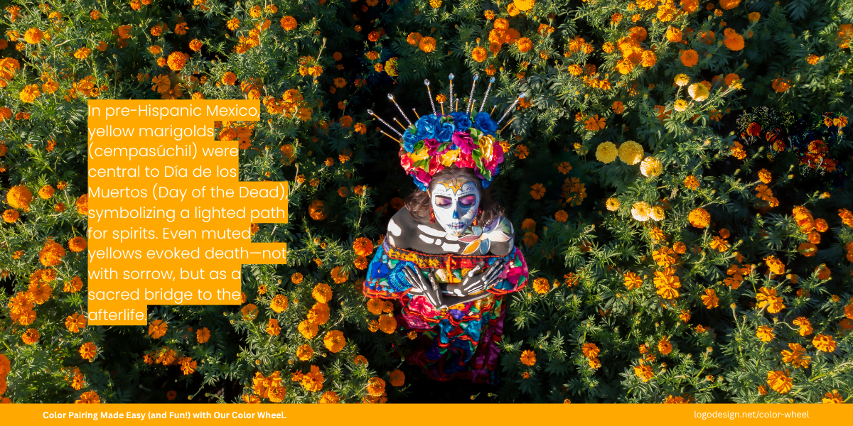
In Día de los Muertos, yellow marigolds guide spirits—symbolizing light, not loss.
In Middle East, yellow shows wealth and growth, but can also be connected with conflict or jealousy, depending on the country and context.
Turkish Airlines often incorporates warm yellow and gold tones in its in-flight branding, uniforms, and advertising, especially during cultural promotions or special service announcements. In Middle Eastern and Turkish culture, yellow and gold hues are associated with hospitality, warmth, and prosperity. These bring out feelings of welcoming energy and tradition.
Green

Green: The color of nature, growth, and healing.
Green suggests nature, growth, health, and sustainability. It is widely used in eco-friendly branding.
In the Middle East, Green holds a sacred meaning. Talking about religious contexts, this color represents paradise, life, and renewal in Islam.
Tropicana uses green in packaging and branding to represent freshness and natural ingredients, universal associations with health and vitality. This stands true for Western and Asian markets, where the color appeals to a wider audience.
Black

Black: The color of elegance, mystery, and authority.
Black can represent sophistication, power, and elegance in luxury brands. But it is also strongly associated with mourning and sadness in many cultures.
For example, in Japan, Black can convey formality and elegance, especially in formal attire and events. At the same time, it is also connected to death or darkness.
Chanel often uses black to communicate timeless luxury and minimalist elegance. In Japan, where black also means formality, Chanel’s branding makes a strong visual impact. Some marketing materials are localized so that the brand doesn’t associate with sadness.
How Cultural Context Impacts Colors in Branding
While many brands rely on standard color psychology, those with a presence internationally must recognize that color meaning varies. Color choice across cultures is shaped by history, religion, social customs, and symbolism.
1. Symbolism Rooted in Tradition and History
Color carries centuries of meaning shaped by tradition, belief, and geography. These meanings often shift over time, but they become deeply woven into identity and values in many cultures.
For brands entering global markets, it’s essential to research these historical associations carefully. A misstep in color choices could lead to mixed messages or offend potential customers. This means adapting everything from packaging to business card designs and marketing materials like postcard designs and flyers.
Here are some commonly used colors in branding and the meanings they’ve carried throughout history and cultural traditions:
- Red carries deep and varied meanings across time and geography. Early humans used red ochre for symbolic purposes as far back as 75,000 years ago in Africa—evidence found in Blombos Cave, South Africa. Ancient Egyptians used hematite (iron oxide) to produce red pigments for tomb paintings and religious art. In Egyptian and Roman cultures, red symbolized life, vitality, and protection. Its boldness made it a color of strength, often used to signal importance, status, or divine power.
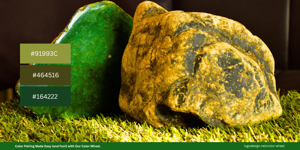
Jade green symbolized life and power in Maya and Aztec culture.
- Green, for instance, symbolized fertility and power in history. The Maya and Aztecs valued jade, a green stone linked to life, fertility, and power. Green was also associated with maize and vegetation, which are and were very important for survival. For the Celtics, green was associated with nature, growth, and immortality, being linked to fertility rituals and seasonal cycles.
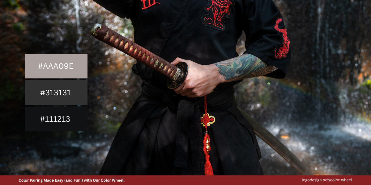
Black in Japanese kimonos symbolizes formality, elegance, and refined beauty.
- Black, on the other hand, can represent very different ideas. In Native American traditions, it’s often associated with the west, death, and spiritual rebirth. In Japan, black has long been a symbol of mystery and refined elegance, often seen in formal attire like traditional kimonos.
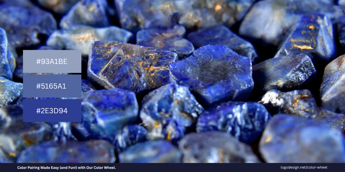
Lapis lazuli in ancient Egypt symbolized royalty, protection, and divine favor.
- Blue, meanwhile, has held sacred and spiritual meanings across many cultures. Ancient Egyptians associated blue with the heavens, and protection—lapis lazuli, a deep blue metamorphic rock prized as a semi-precious stone, was used in burial masks and jewelry. In Judaism and Christianity, blue has symbolized divinity and truth. In Hinduism, deities such as Krishna and Vishnu are often depicted with blue skin to represent infinity, protection, and cosmic depth.
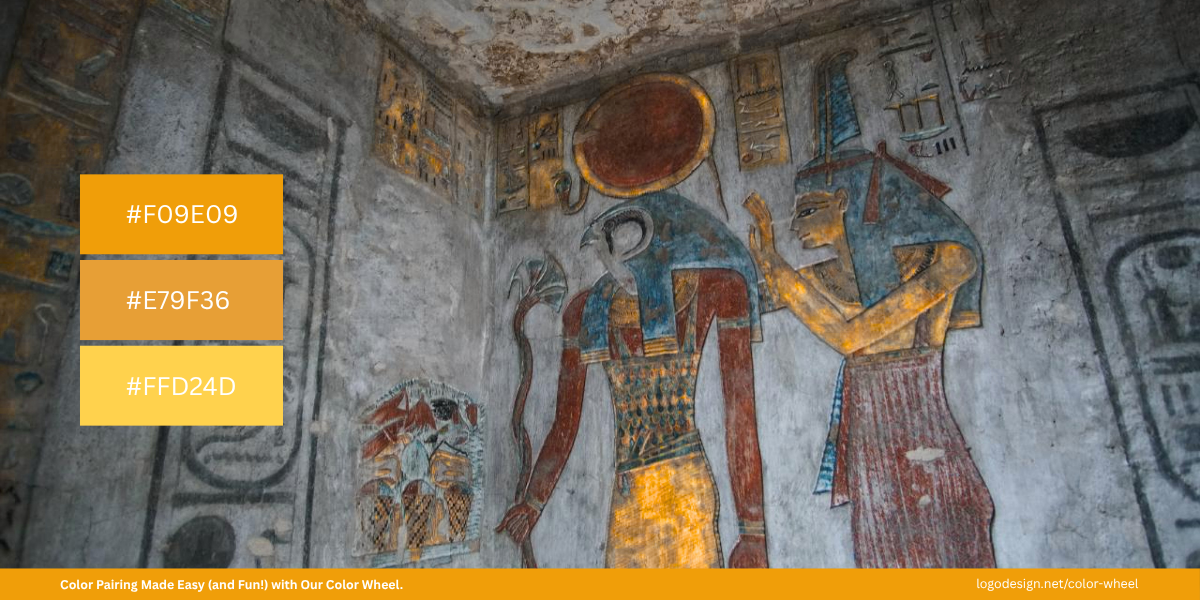
Yellow represented Ra’s divine power in Egypt and imperial authority in China.
- Yellow has deep symbolic roots going back thousands of years. In ancient Egypt, yellow was associated with gold, considered the flesh of the gods, especially the sun god Ra. It represented eternity, indestructibility, and the divine. Tomb paintings often used yellow for the skin of gods to emphasize their immortal nature. Similarly, in imperial China, yellow was reserved exclusively for emperors. Wearing yellow without royal permission was punishable by death, highlighting how sacred and powerful the color once was. Over time, this symbolism evolved but still carries prestige and reverence in many parts of Asia.
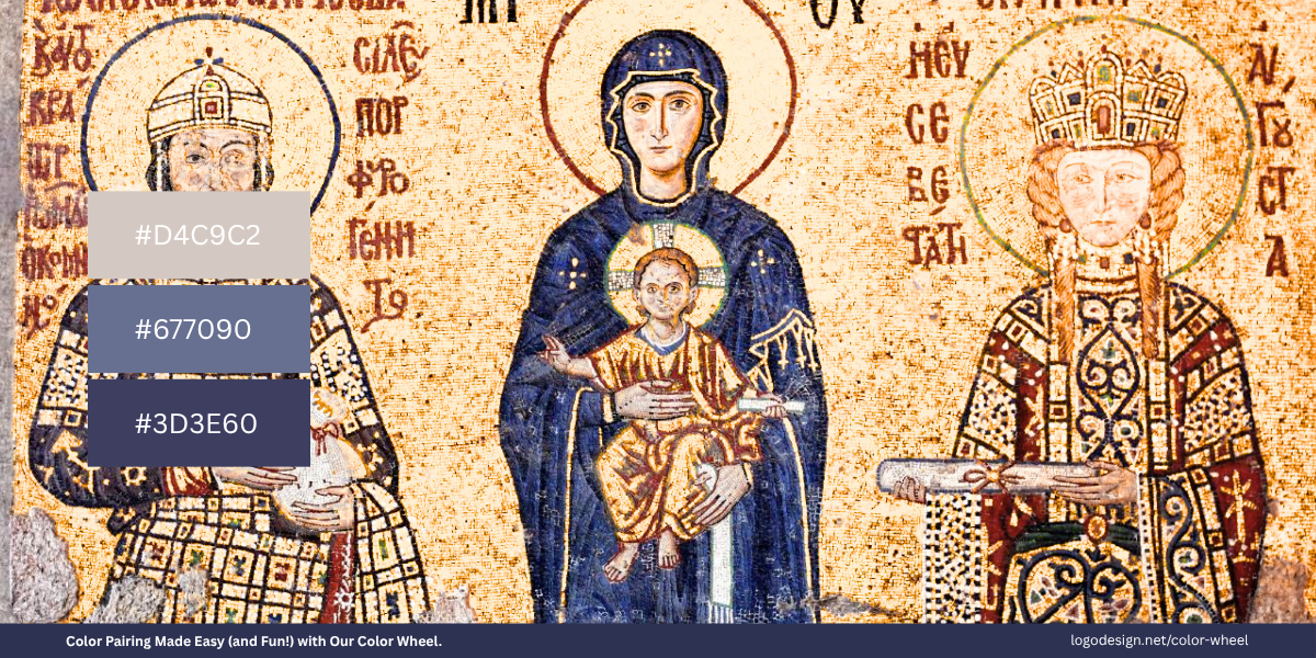
Purple in the Byzantine Empire was reserved for emperors, signifying sovereign power.
- Purple has long been symbolized as royalty, wealth, and spirituality. In ancient Phoenicia, Tyrian purple dye extracted from sea snails was so rare and costly that it became reserved for royalty and high priests. In the Byzantine Empire, "born in the purple" referred to imperial birthright. In Roman Catholic tradition, purple is used during Lent and Advent to symbolize penitence and preparation, giving the color spiritual weight as well. The connection between purple and luxury continues today, often used in branding to convey exclusivity and high value.
Understanding a color’s historical and cultural roots allows brands to make thoughtful choices and connect with audiences in culturally respectful and meaningful ways.
2. Religious Significance
For global brands, understanding these sacred meanings is very important when sending out messages that appeal to their audiences. It also helps avoid any issues later on with different communities.
- Blue – Spirituality, Protection, and Divinity
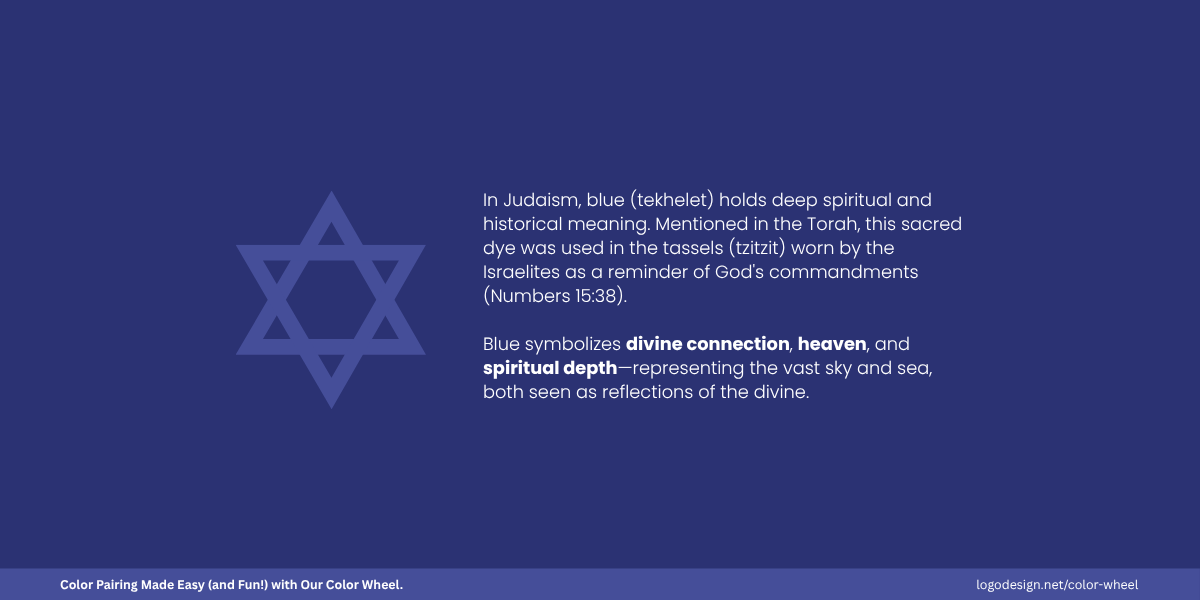
In Judaism, blue shimmers with divinity, echoing God’s commandments. The reason it is a staple in religious and spirituality logos.
In Judaism, blue symbolizes divinity and God’s commandments. It’s used in prayer shawls and the Israeli flag as well. Blue is also associated with the Virgin Mary in Christianity and represents purity, peace or divine grace.
In North Africa and the Middle East, blue is associated with spirituality and is known to protect against evil. It is also seen in amulets like the evil eye one in Turkey.
- Saffron – Holiness and Purity
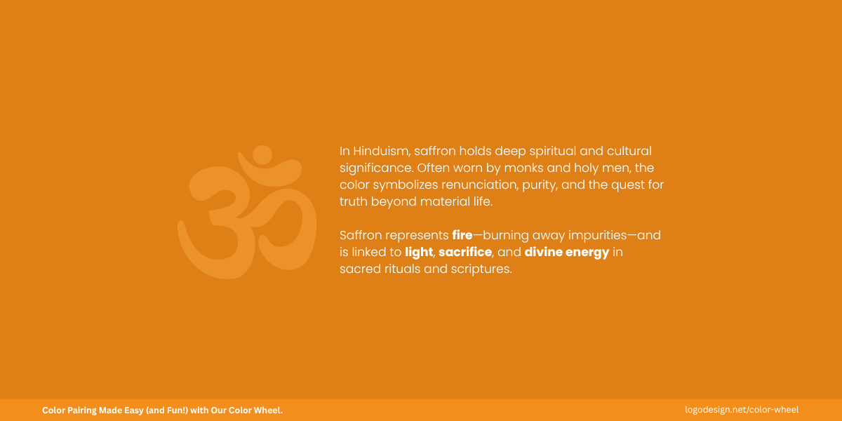
In Hinduism, saffron means devotion and national pride, which is evident in color choices for temple branding and also popular in Buddha logos.
Saffron in Hinduism is very sacred and seen as a national identity as well. It symbolizes purity, sacrifice, and is worn by saints. It also appears on Hindu temples, flags, and altars.
- Purple – Royalty and Spiritual Power
In Christianity, purple signifies royal authority and holy rites, featured in church and community logos.
Purple has been linked to royalty and sacred ritual. In Christian tradition, purple is used as a color of preparation and sometimes sacrifice too. In Buddhism, it represents deep spiritual insight, especially among a few communities.
- Green
In Islam, green represents paradise and steadfast faith, common in mosque logos and Islamic stores.
The color is associated with Islam and is considered sacred. It is commonly seen in mosques, prayer rugs, and in calligraphy as it closely shows Islamic identity. Historically, the color has been quite significant and remain to this day.
3. Emotional Meaning and Aesthetics
The emotional response to color depends on industry preferences as well as on cultural meanings. A color known to bring out warmth and joy for some cultures could have a very different emotional response for others.
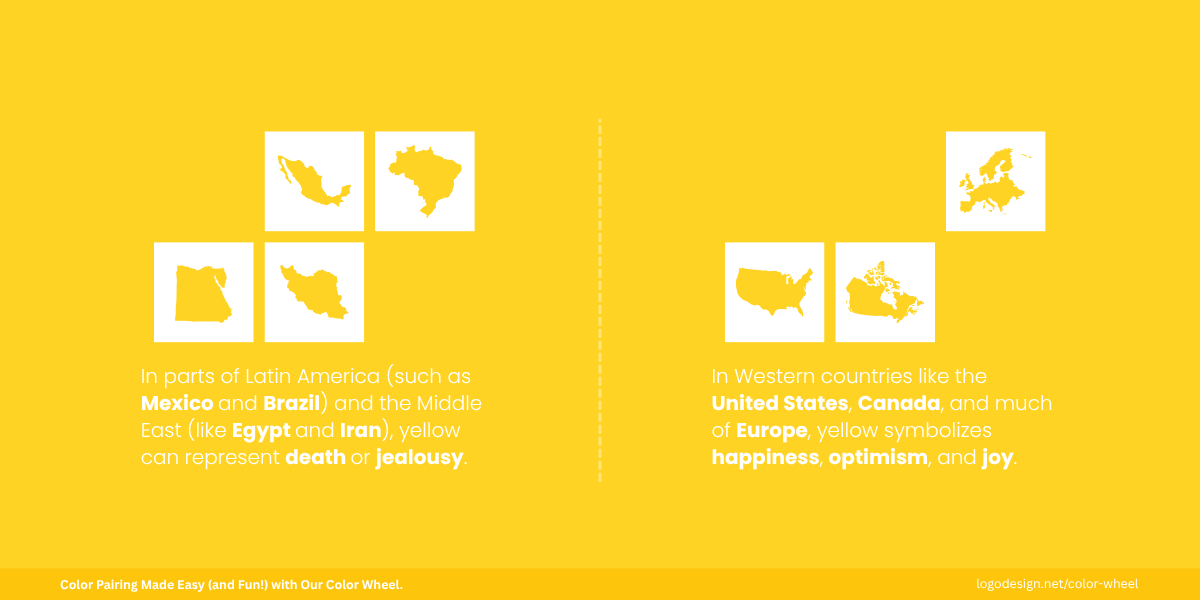
Yellow isn’t only joy; it’s also the color of mourning in some regions.
Yellow is a happy color and is associated with joy in most Western countries, but it can represent death or jealousy in parts of Latin America and the Middle East.
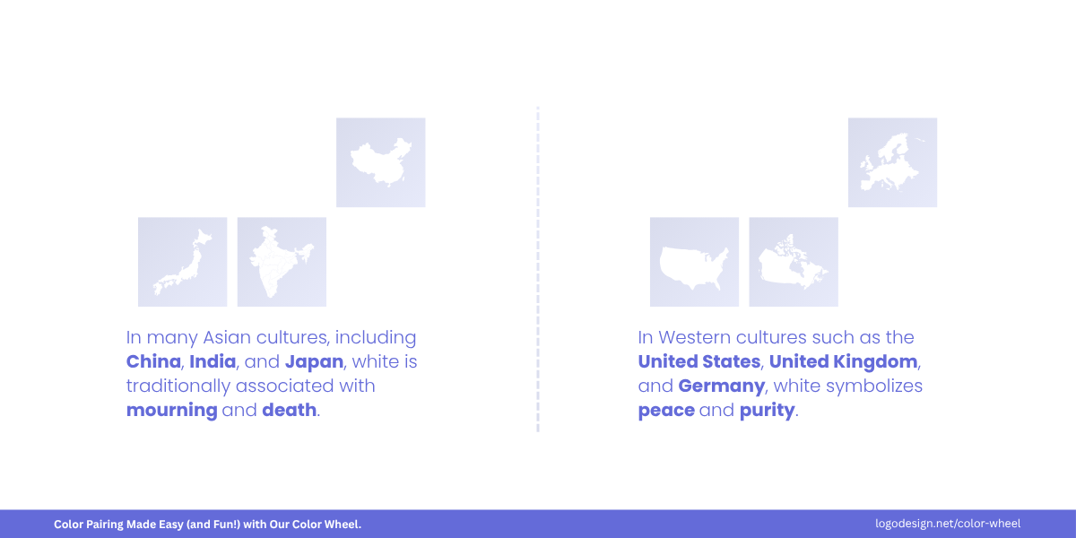
White isn’t only for funerals; it’s central to weddings and festivals.
White is worn during religious ceremonies to invite protection and blessings, as the color brings out a sense of calmness and peace. In Asian cultures, it shows mourning or death, so that’s quite a different emotional response to it.
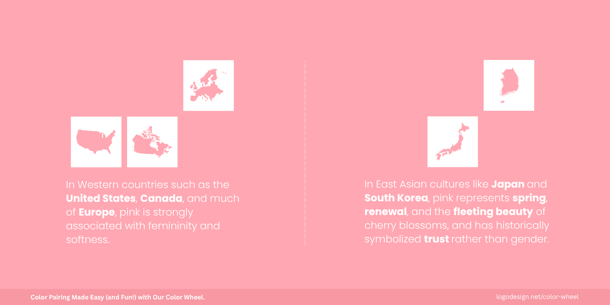
Pink isn’t only sweet; in East Asia, it means renewal and trust.
Have you ever thought about why pink is typically associated with femininity and softness?
That’s the case in the West, but it doesn’t always carry the same meaning globally. In Japan, pink is also linked to spring and the blooming of cherry blossoms, a time of renewal and fleeting beauty. In Korea, it has historically been connected to trust rather than gender.
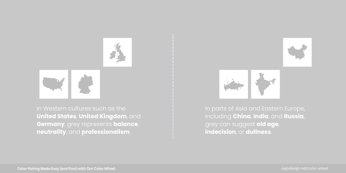
Grey isn’t only neutral; in the West it’s chic, elsewhere it can feel aged.
Now think about Grey, which is often linked to neutrality, balance, and sophistication. It evokes calmness and professionalism, which is why it’s commonly used in corporate branding. However, in some contexts, Grey is often associated with old age or indecision, making it tricky to use depending on the audience and message.
Thinking all viewers will have the same emotional reaction to logo color is a common mistake. These reactions change with beliefs and various other factors. Brands need to test color palettes with local audiences to ensure the intended mood aligns with local interpretation.
4. Regional Market Preferences and Trends
Color preferences are also influenced by regional style, color trends and visual preferences. Scandinavian countries may favor cool, muted palettes, while parts of Southeast Asia prefer bright, vibrant colors. Even within one culture, urban and rural populations may perceive colors differently.
There’s no common or ‘one-size-fits-all’ color scheme. Brands must localize their visual identity, not just language, based on regional tastes and design preferences.
5. Social Customs and Life Events
Colors play key roles in culturally significant events like weddings, funerals, national holidays, and rites of passage. White is worn by brides in the West, but by mourners in East Asia.
Red is used in both Chinese weddings and Western emergency signs, but for very different reasons. Campaigns tied to major life events must reflect appropriate color choices to align with local customs and avoid alienation or offense.
Tips to Choose Colors with Cultural Context
When working across cultures, color isn’t just a matter of taste. Misunderstanding color symbolism can lead to mixed messages, lost engagement, or even public backlash.
Whether you choose flat vs. gradient logo colors, here are key considerations to help designers and marketers make culturally informed, inclusive choices.
1. Don’t Assume Universal Meanings—Context Is Key
Color psychology is not the same in every region or country. What evokes positivity in one culture may convey negativity in another.
Purple signifies royalty in Europe, but can be associated with mourning in Latin American countries like Brazil.

Red in a hot dog brand vs. red in a physical therapy clinic logo. Same color, different meaning. Culture shapes perception.
Pro Tip: Always research the specific cultural and regional context before building a color palette, especially for campaigns tied to holidays, rituals, or life events.
2. Avoid Direct Color Associations Without Research
It may be tempting to directly apply color associations from your home market to others, but that approach can result in tone-deaf or even offensive design.
For instance, a company designing a bridal campaign with all-white visuals may do well in the U.S., but in India or China, this could unintentionally symbolize funerals.

Symbol of a girl in a dress in a wedding planner logo—white vs. vibrant color choices. Same color, different emotion. Context is everything.
Pro Tip: Instead of just using the language of your content, focus on how you can convey the visual language as well, including choosing between monochrome vs. multi-color logos, symbols, and layout preferences.
3. Consider Emotional Impact and Symbolic Meanings
Colors have two main levels: emotional and symbolic. One aspect is the emotional response they elicit, and the other is what a color represents culturally or spiritually.
Green might feel fresh and healthy in many Western countries, but carries sacred Islamic meaning in parts of the Middle East.
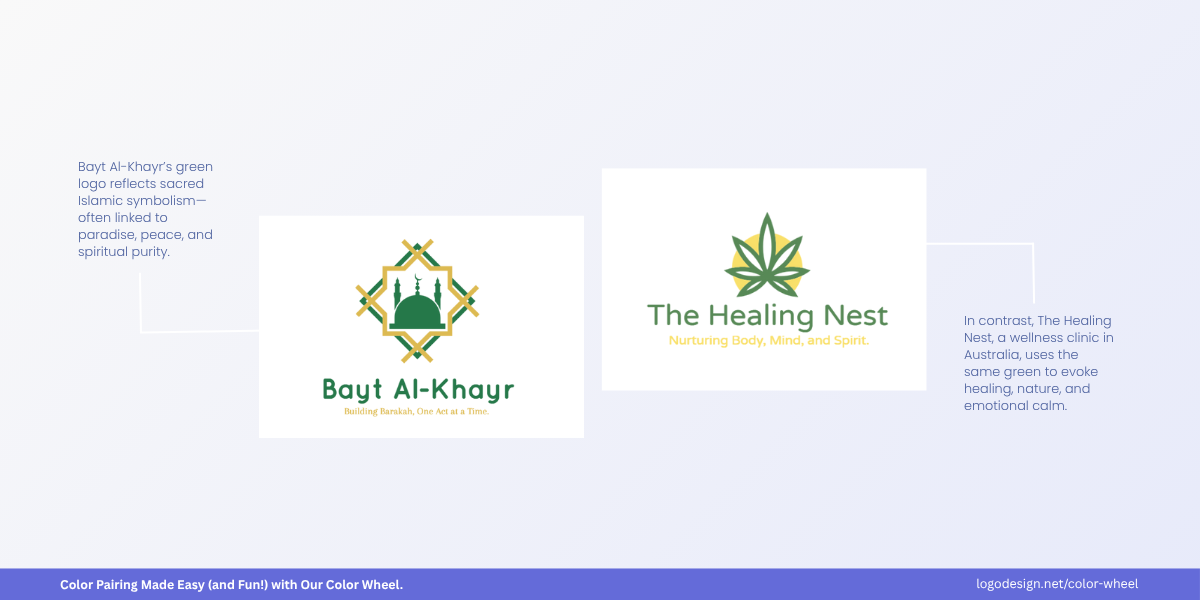
Mosque silhouette vs. cannabis leaf logo—both in green. Green for faith. Green for healing. Color speaks differently.
Pro Tip: Maintain a balance between emotional tone (e.g., calming, energizing) and cultural appeal. Always test how the intended emotion aligns with local interpretations of the color.
4. Keep Accessibility and Color-Blindness in Mind
Around 1 in 12 men and 1 in 200 women have some form of color vision deficiency. Relying on color alone to convey meaning can exclude or confuse users.
Using red and green to signal “stop” and “go” without accompanying text or icons can be ineffective for people with red-green color blindness.

Bar-chart accounting logo in light blue vs. dark blue. Same blue. Different results. Accessibility matters.
Pro Tip: Use high contrast, clear labeling, and iconography alongside color. Tools like WebAIM Contrast Checker or Color Oracle can help you make sure your designs are inclusive and that the logo colors are accessible.
Key Takeaways
- Color meanings aren’t universal — they vary by culture, history, and region
- Red, white, yellow, and other colors can have opposite meanings in different countries (e.g., red = luck in China, danger in the West)
- Religion shapes perception, colors like blue, purple, and saffron carry deep spiritual significance
- Don’t copy-paste palettes, always research local symbolism before launching global campaigns
- Accessibility matters; don’t rely on color alone to convey meaning; use contrast, labels, and icons
