Ever thought about what the top fonts for logo design are? Well, quite a few. And they are loved by designers everywhere.
Typography isn’t just about choosing something that ‘looks good’. The right font communicates tone, adds emotion, and builds recognition. Whether it’s a bold sans-serif that signals innovation or a delicate script that conveys elegance, fonts can speak before words do.
You should choose fonts for your brand not only for their aesthetic appeal but also for how well they align with the tone of voice, values, and audience. Some fonts are timeless and used by iconic brands across industries, while others are fresh, versatile, or loaded with personality.
Let’s explore some of the most popular fonts in logo design and discuss why designers keep returning to them in designing logos.
Top Logo Fonts Designers Love And Swear By
From modern tech startups to heritage hotel logos, designers select typefaces that are visually clear and match the brand’s personality closely.
12 professional fonts used by designers and their descriptions
Let’s take a look at the top choices and where they are being used.
1. Futura
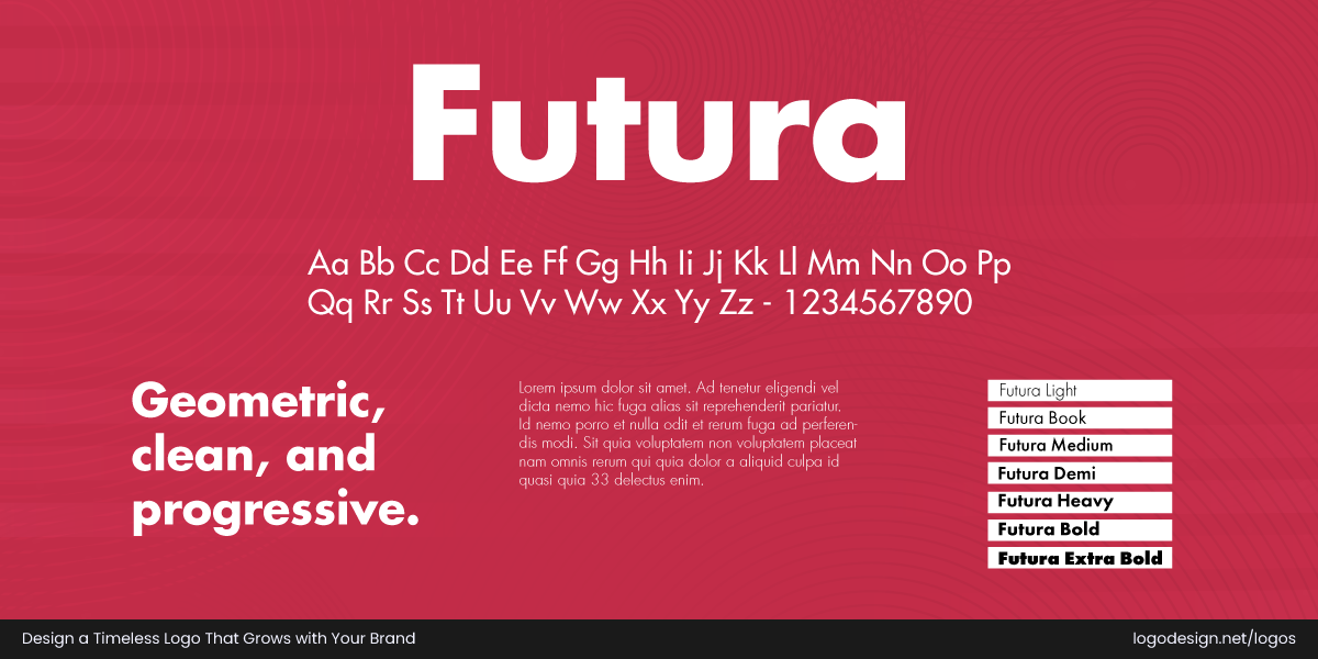
Futura, a geometric Sans-Serif font, is commonly used by tech companies and fashion brands
Font Classification: Geometric Sans-Serif
Origin (Year): 1927
Designer: Paul Renner
Similar Fonts: Avenir, Century Gothic, Neuzeit S
Licensing Details: Commercial licenses available via Monotype, Adobe Fonts
Best For: Tech companies, architecture firms, fashion brands, startups, media agencies
Futura is a geometric sans-serif typeface that shows modernism. With sharp, balanced forms and minimalist style, it’s widely used by brands that want to feel contemporary and clean. It’s both iconic and flexible, suitable for everything from print design to digital signage.
Futura brings geometric precision to memorable branding.
Why It Works in Logos?
When brands use Futura’s font in their branding, they can display a modern and minimalist appeal. The sharpness of this logo gives emphasis to each letter and shows a sense of professionalism.
Party City logo using the Futura Clean fonts to give a modern and playful feel
Futura’s clean, geometric letterforms give Party City’s logo a modern and playful feel. Its bold simplicity lets the vibrant colors shine, reinforcing the brand’s fun, energetic identity while staying clear and readable across all formats.
Aerin logo using the Futura typeface to show a modern and clean brand identity
By using Futura’s typeface in the Aerin logo, the brand shows a clean yet modern personality. This is largely thanks to the geometric sans-serif nature of the font. All these attributes make Aerin’s logo appealing and recognizable, meeting the brand value.
2. Garamond
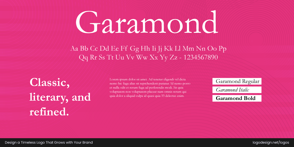
Garamond, an Old-Style Serif font that is commonly used by publishing, educational, and similar organizations.
Font Classification: Old-Style Serif
Origin (Year): 16th century (revived versions in the 20th century)
Designer: Claude Garamond (original), later versions by Robert Slimbach and others
Similar Fonts: Sabon, Goudy Old Style, Bembo
Licensing Details: Available in Adobe Fonts and other font foundries (check variant-specific licenses)
Best For: Publishing, education, law firms, boutique brands, cultural organizations
With origins in the 1500s and numerous revivals since, Garamond is one of the most respected and elegant serif fonts. It’s closely tied to branding in publishing and education due to its historic, scholarly appearance. It’s ideal for branding, offering a refined and graceful touch to iconic brands.
Garamond brings old-world charm to modern branding.
Why It Works in Logos?
The Garamond font displays elegance and intellect. Brands can use this serif font to increase credibility among viewers and give a traditional and sophisticated vibe.
Abercrombie & Fitch logo using the Garamond font to show elegance and heritage, matching the brand’s identity. This old-style serif font uses subtle stroke contrasts that give a traditional image.
The Abercrombie & Fitch logo uses the Garamond font to trigger a sense of classic elegance and heritage, matching the brand’s identity. This old-style serif font uses subtle stroke contrasts that give a traditional image.
Duke University logo using Garamond font to show it as a legacy and educational brand.
Duke University extensively uses Garamond, specifically Garamond LT 3 and EB Garamond, to show the legacy of the brand and give a scholarly feel. The use of this font and the official Duke wordmark in the logo shows the core value that a university wants to display.
3. Avenir
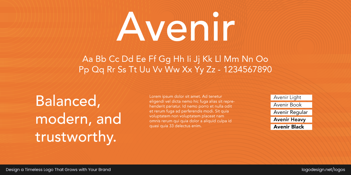
Avenir, a Humanist Sans-Serif font that is commonly used by tech startups and wellness brands.
Font Classification: Humanist Sans-Serif
Origin (Year): 1988
Designer: Adrian Frutiger
Similar Fonts: Futura, Gotham, Proxima Nova
Licensing Details: Licensed via Linotype/Monotype and Adobe Fonts
Best For: Tech startups, corporate branding, wellness, fintech, healthcare
The font was meant to blend the geometric style of fonts like Futura with the warmth of humanist typefaces. Avenir, the name means ‘future’ in French, reflecting its forward-looking yet approachable nature.
Avenir is highly legible, balanced, and neutral without being cold.
Why It Works in Logos?
The Avenir font’s geometric structure gives the viewer a humanist touch. Brands can use this font type to present a clear brand identity and make a bold statement with a minimalist logo design.
Snapchat logo using Avenir Next font to show a classic appearance
Avenir Next in the Snapchat logo uses classical text and presents a sleek appearance. This shows sophistication and aesthetics, enhancing the readability on the various screen sizes. The Snapchat logo also uses Helvetica in its mobile app and website for an appealing user experience.
Bloomberg logo using a heavy Avenir font to be appealing on the digital screens
The Bloomberg logo heavily use a heavy Avenir font for an appealing digital presence. The sans-serif typeface presents a modern and reliable image, important for Bloomberg which is a leading news provider.
4. Bodoni
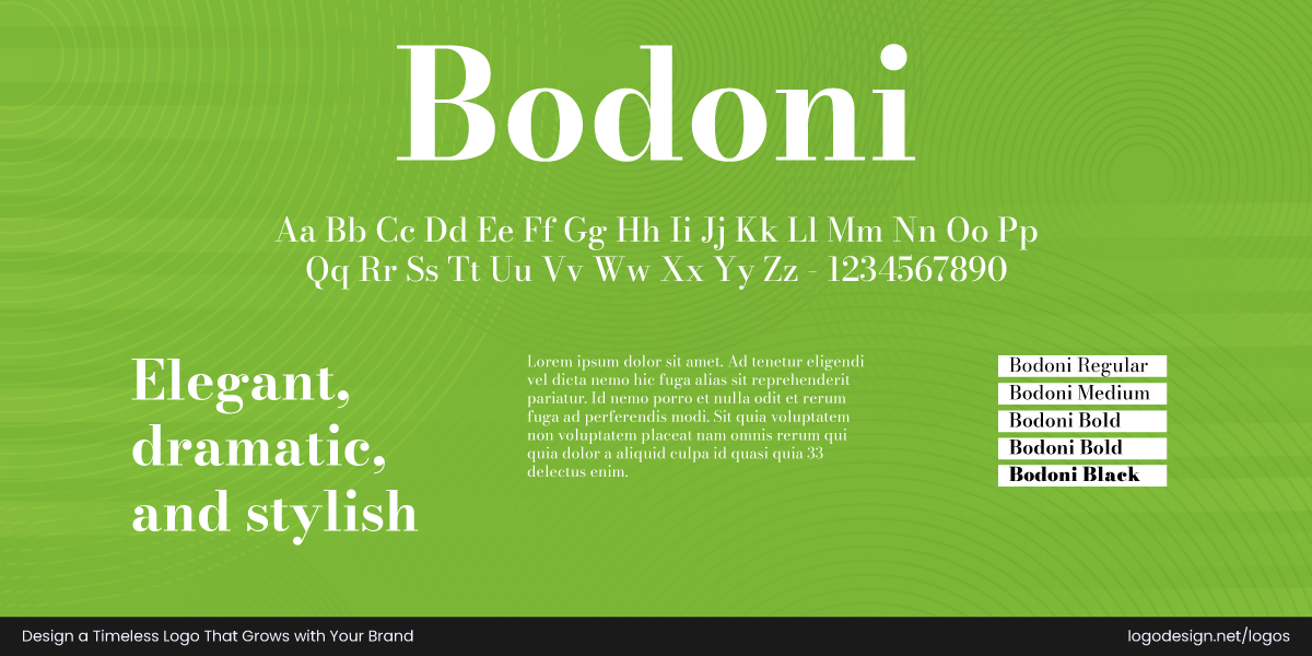
Bodoni, a Modern Serif font that is commonly used by luxury and fashion brands
Font Classification: Modern (Didone) Serif
Origin (Year): 1798
Designer: Giambattista Bodoni
Similar Fonts: Didot, Walbaum, Modern No. 20
Licensing Details: Available via Adobe Fonts, ITC, and Linotype (license depends on version)
Best For: Luxury brands, fashion, beauty, publishing, high-end products
This typeface is known for its high contrast between thick and thin strokes, vertical stress, and hairline serifs. It’s a go-to for fashion and luxury branding due to its dramatic and elegant character.
Bodoni makes a bold visual statement.
Why It Works in Logos?
The high contrast of the Bodoni font type gives an elegant look to the brand identity. The fine serifs help brands display a sophisticated and luxury feel in their logos.
Elizabeth Arden logo using the Bodoni font to show a luxurious brand identity
Elizabeth Arden utilizes the Bodoni font to convey a sense of classic luxury and elegance, meeting the brand’s sophisticated image in the beauty industry. Its high contrast between thick and thin strokes contributes to adding aesthetic to their branding and advertising.
Vogue logo using a customized Didot typeface (similar to Bodoni) to create a sophisticated appeal
The Vogue logo primarily uses a customized version of the Didot typeface, which shares many characteristics with Bodoni. This choice creates a sophisticated aesthetic through its high contrast between thick and thin strokes, along with sharp serifs, showing luxury and high-end fashion.
5. Helvetica
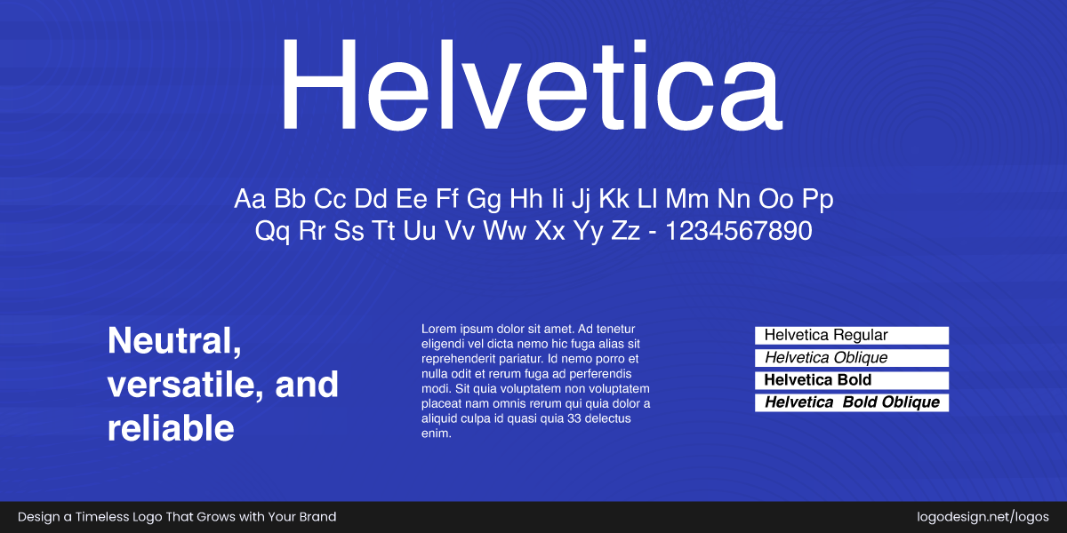
Helvetica, a Neo-Grotesque Sans-Serif font, is commonly used by corporate and technology companies
Font Classification: Neo-Grotesque Sans-Serif
Origin (Year): 1957
Designer: Max Miedinger (with Eduard Hoffmann)
Similar Fonts: Arial, Univers, Neue Haas Grotesk
Licensing Details: Available via Linotype/Monotype; Helvetica Now (newer version) also licensed
Best For: Corporate identities, tech, transportation, government, finance
Helvetica is one of the most widely used sans-serif typefaces globally. Its clean, neutral design with balanced proportions makes it a universal choice across industries. Its simple yet elegant forms adapt seamlessly from print design to digital to signage, providing consistency across all brand touchpoints.
Helvetica is the no-nonsense font that means business.
Why It Works in Logos?
Helvetica is a font type that makes the logos readable in almost all sizes. Brands use this font type to display a modern and minimal look that can be adopted across different industries.
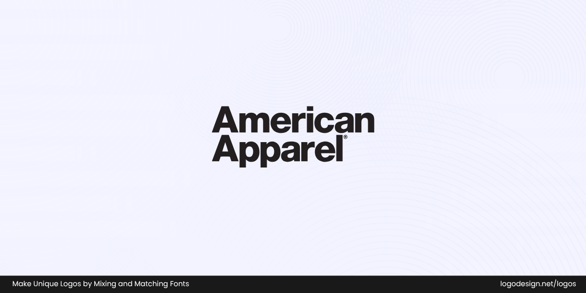
American Apparel logo using Helvetica Black to create a modern visual appeal
The American Apparel logo uses a Helvetica Black, a clean sans-serif typeface, with notably tight letter spacing to create a dense, modern visual statement that meets the brand’s aesthetic. This font size means the logo gets a neutral appeal to identify the brand.
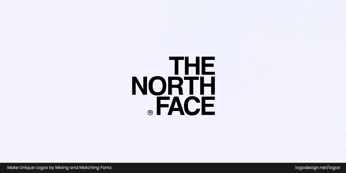
The North Face logo using Helvetica Bold to show a modern brand identity
The North Face logo prominently uses Helvetica Bold, a classic sans-serif typeface with clean lines and geometric shapes. It conveys the much-needed modernity the brand is after, as it produces durable and adventurous outdoor gear.
6. Proxima Nova
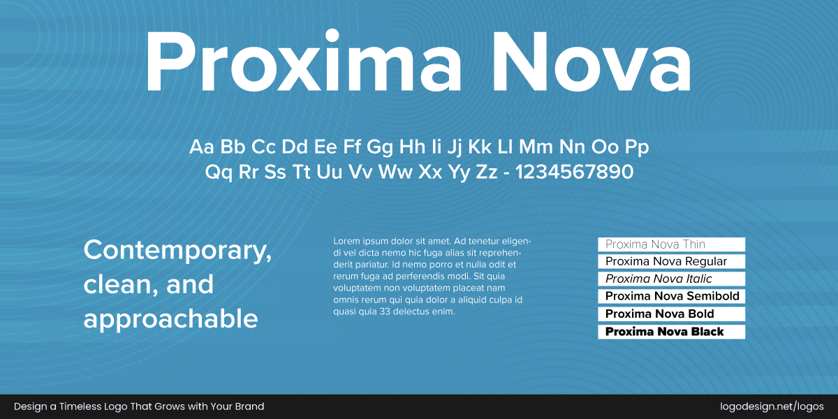
Proxima Nova, a Geometric Sans-Serif font, is commonly used by SaaS and media companies
Font Classification: Geometric Sans-Serif
Origin (Year): 2005
Designer: Mark Simonson
Similar Fonts: Gotham, Avenir, Circular
Licensing Details: Commercial license available via Mark Simonson Studio, Adobe Fonts
Best For: SaaS products, modern retailers, media companies, startups, lifestyle brands
Proxima Nova blends geometric precision with humanist curves. It’s especially popular among modern digital-first brands. It offers the clarity of a geometric sans with a friendlier tone. Proxima is preferred by modern grocery stores, media companies, and lifestyle blogs.
Proxima Nova delivers contemporary clarity with just the right warmth.
Why It Works in Logos?
Proxima Nova is the font type that gives a humanist and geometric touch to the logo. This can be used to present a professional look to the brand identity.
Mashable logo using a modified Proxima Nova Typeface for a digital-focused brand identity
The Mashable logo uses a heavily modified version of the Proxima Nova typeface, a popular sans-serif font known for its clean and geometric appearance. This font choice gives Mashable a modern and digital-focused brand identity, avoiding the common mistake that brands make of not having their logo designs legible across platforms.
BuzzFeed logo using Proxima Nova, which shows an approachable brand identity
BuzzFeed‘s logo uses the Proxima Nova, a versatile sans-serif typeface that combines geometric and humanist design elements. This contributes to a modern and approachable brand identity. Its clear letterforms and range of weights allow for a recognizable visual identity across various platforms.
7. Didot
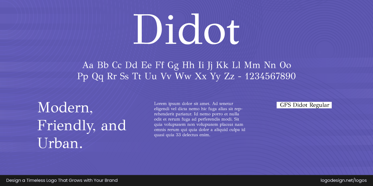
Didot, a Modern Serif font, is commonly used by fashion and luxury brands
Font Classification: Modern (Didone) Serif
Origin (Year): Late 1700s
Designer: Firmin Didot (original); revived by Adrian Frutiger and others
Similar Fonts: Bodoni, Walbaum, Modern No. 20
Licensing Details: Versions licensed by Linotype, Adobe, URW, and others
Best For: Fashion houses, editorial brands, luxury goods, beauty
Didot is a timeless serif typeface beloved by designers for its elegant contrast, structure, and high-fashion appeal. Characterized by its thin hairlines and strong vertical stress, this style brings a sense of luxury, precision, and sophistication to any design.
Didot brings haute couture vibes to your brand.
Why It Works in Logos?
Didot, with its contrast, is the font type that can display a clean visual identity. Brands can use this to show a premium and elegant identity.
Armani Jeans logo using the Didot font to show elegance and sophistication
The Armani logo uses a variation of the Didot typeface, a neoclassical serif font with strong contrast between thick vertical strokes and very thin horizontal serifs. This choice injects sophistication and elegance into the logo, communicating a luxurious brand identity.
Zara logo using a modified Didot font to show the classic aesthetic of the brand
In 2019, Zara adopted a heavily modified version of the Didot font, known for its elegant, high-contrast serifs and classic aesthetic. This shows the sophistication and luxury that a fashion brand wants to communicate.
8. Montserrat
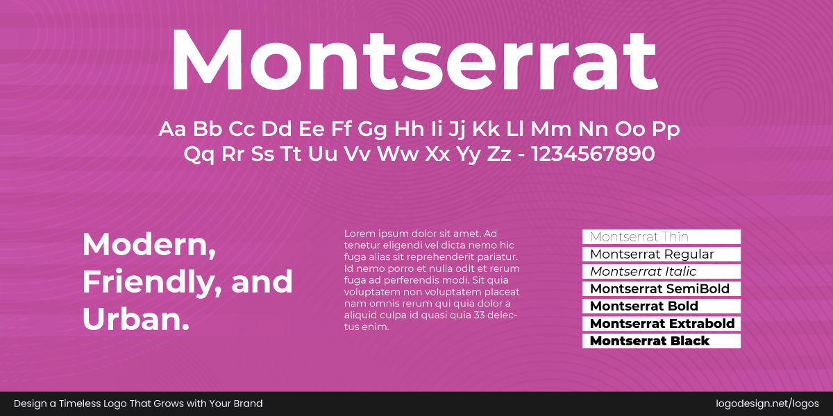
Montserrat, a Geometric Sans-Serif font is commonly used by tech and fitness brands
Font Classification: Geometric Sans-Serif
Origin (Year): 2011
Designer: Julieta Ulanovsky
Similar Fonts: Gotham, Raleway, Nunito
Licensing Details: Free under the SIL Open Font License (via Google Fonts)
Best For: Tech startups, creative agencies, urban brands, fitness, e-commerce
Montserrat is a geometric sans-serif font inspired by the traditional signage of Buenos Aires but designed for the digital age. Its bold forms and open letter spacing make it highly readable and accessible as well. You’ll find that the modern, clean look makes it a favorite for tech startups, entertainment brands, and employment platforms.
Clean lines, bold presence—Montserrat owns the spotlight.
Why It Works in Logos?
When brands are looking for a responsive, digital-first logo, Montserrat is usually a favorite font type. The stylish personality of this font can deliver the right brand message.
Fiverr logo using a Montserrat font to present an accessible brand image
Fiverr utilizes the Montserrat font for its logo, using its geometric, clean, and modern sans-serif characteristics to present an accessible brand image. The font’s versatility, with various weights and a strong presence, contributes to a clear and impactful visual identity that resonates with a broad audience.
Micron Technology logo using a Montserrat font to ensure high readability across platforms
In 2024, Micron Technology used the Montserrat typeface in its logo. This geometric sans-serif is known for its clean, modern aesthetic and high readability across various sizes. This choice conveys a sense of technological advancement and precision, reflecting the company’s focus on semiconductors and memory products.
9. Cooper Black
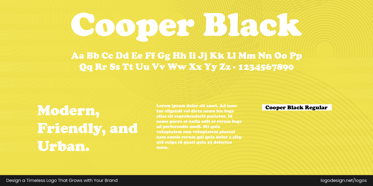
Cooper Black, a Display Serif font, is commonly used by food and beverage brands
Font Classification: Display Serif
Origin (Year): 1922
Designer: Oswald Bruce Cooper
Similar Fonts: Cooper BT, Souvenir, Bubblegum Sans
Licensing Details: Available via Adobe Fonts and commercial font libraries like Linotype
Best For: Food & beverage, retro brands, entertainment, casual apparel, pet care
Known for its thick strokes and soft edges, the serif font catches the eye instantly in logos. Cooper Black has become quite popular over the years because it gives even the simplest text a casual, approachable energy. You’ll see it being used in food and beverage logos, boutique store logos, and with cafe branding that has a vintage feel.
Designers go with it sometimes to include emotional warmth and creativity without needing extra graphics. It works very well for businesses that want to appear fun, artistic, and slightly nostalgic.
Why It Works in Logos?
The Cooper black gives a vintage vibe with a bold presence. This can be the font type for brands wanting to trigger a nostalgic feeling with quirky characters.
EasyJet logo using a Cooper Black font to show a budget-friendly and readable option
EasyJet utilizes Cooper Black in its logo for a bold, confident, and approachable look, reflecting the airline’s identity as a budget-friendly yet reliable option. The font’s distinctive, rounded, heavy letterforms ensure high visibility and a memorable impression.
Tootsie logo using a Cooper Black font to give a nostalgic feeling
The Tootsie logo utilizes Cooper Black, a rounded serif typeface, to trigger a nostalgic feeling, perfect for a sweet brand. Its friendly and approachable appearance makes it effective for a brand aiming for widespread recognition.
10. Raleway
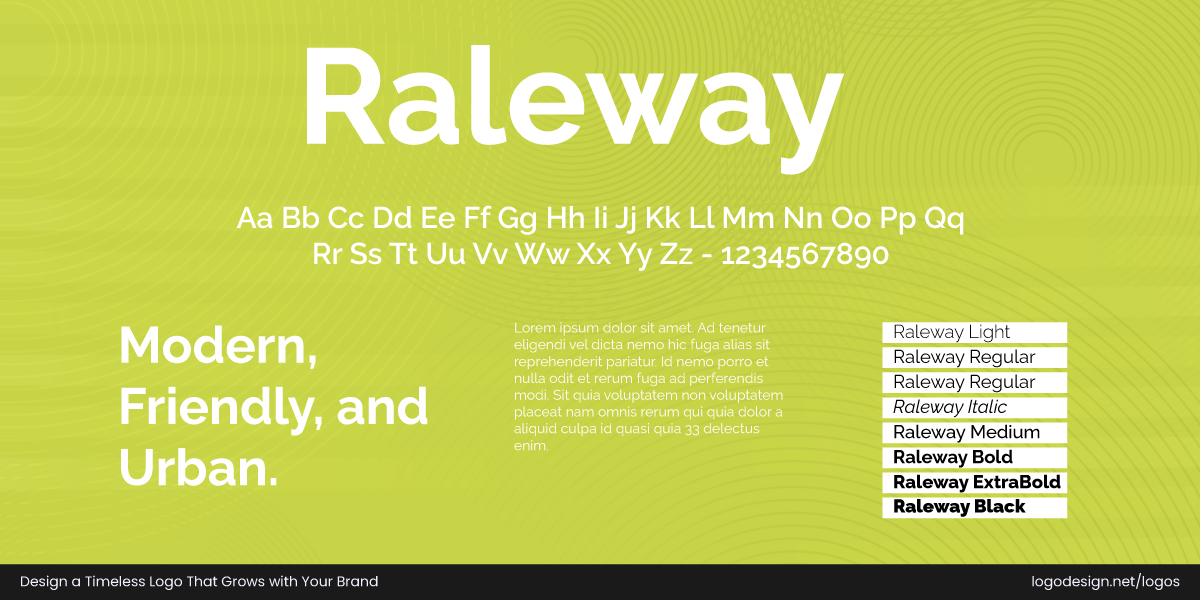
Raleway, a Geometric Sans-Serif font, is commonly used by technology brands
Font Classification: Geometric Sans-Serif
Origin (Year): 2010
Designer: Initially Matt McInerney; expanded by Pablo Impallari and Rodrigo Fuenzalida
Similar Fonts: Montserrat, Avenir, Futura
Licensing Details: Free under the SIL Open Font License (via Google Fonts)
Best For: Tech, education, online platforms, creative portfolios, minimal brands
Originally designed as a thin, elegant display font, it has since evolved into a full family with multiple weights. This makes it suitable for logos and in body text, too. Raleway’s geometric structure and Kerning give it a high-end look, while still feeling accessible and modern. Often paired with serif fonts or lighter sans-serifs, the font works well in luxury branding, wellness logos, and fintech icons.
Raleway adds modern elegance with a light, refined touch.
Why It Works in Logos?
Raleway gives an elegant and modern design to display the brand’s identity and message. This font adapts with bold wordmark logos or a minimalist one, whatever the brand represents.
Open Research logo using Cooper Black font to give a bold appearance
The Open Research logo uses Cooper Black, a heavily weighted serif typeface that displays a bold presence and establishes reliability. Its distinctive rounded forms and thick strokes give a friendly and inviting visual appeal.
Merus logo using a Cooper Black font to give a friendly and bold display
The Merus logo utilizes Cooper Black, a robust and friendly display serif typeface known for its exceptionally bold, rounded forms and soft appearance. This choice lends a feeling of warmth, approachability, and nostalgic charm to the brand’s identity.
11. Gotham
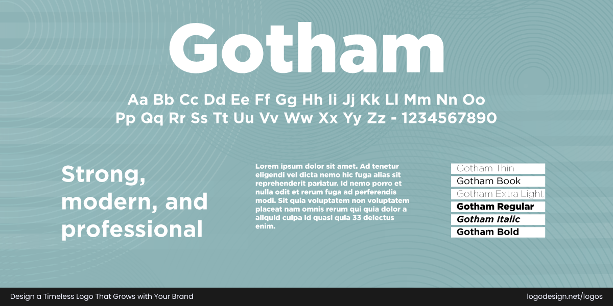
Gotham, a Geometric Sans-Serif font, is commonly used by government and media brands
Font Classification: Geometric Sans-Serif
Origin (Year): 2000
Designer: Tobias Frere-Jones
Similar Fonts: Proxima Nova, Avenir, Montserrat
Licensing Details: Commercially licensed via Hoefler & Co.
Best For: Media, government, retail, political campaigns, real estate
New York’s artistic history inspires its strong lines and structure. Gotham maintains strong legibility as it’s highly versatile and clear. Designers consider this a top choice in branding for political logos to appear professional, modern, and progressive, and for tech branding as well. When the message needs to be clear, clean, and universally appealing, this font is the right choice.
Gotham brings swag to logos—clean, bold, and ready to make a statement.
Why It Works in Logos?
Gotham gives a neutral and confident feeling to the brand identity. Organizations opt for this font in their logo when they are looking to appeal to a broader audience and show reliability.
New York University logo using a Gotham font for a clean and modern style
The New York University logo utilizes the Gotham typeface for a clean and modern look that meets the "no-nonsense" New York City feel. The identity shows a commitment to moving the students forward.
Cartoon Network logo using a Gotham font to show a broad yet playful look
The Cartoon Network logo utilizes the Gotham font for a broad design, followed by a clear and assertive tone. This choice conveys a modern and straightforward aesthetic, aligning with the brand’s playful yet confident identity.
12. Playfair Display
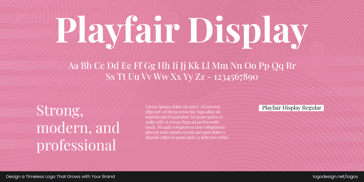
Playfair Display, a Transitional Serif font that’s commonly used by fashion and creative brands
Font Classification: Transitional Serif / Display Serif
Origin (Year): 2011
Designer: Claus Eggers Sørensen
Similar Fonts: Georgia, Didot, Baskerville
Licensing Details: Free under the SIL Open Font License (via Google Fonts)
Best For: Editorial brands, fashion, beauty, creative studios, personal brands
You’ll see that the serif font brings attention to romance and luxury, making it especially appealing for upscale brands, wedding stationery, and boutique services. Its balanced spacing and flowing style give it a sophisticated look.
When paired with clean sans-serifs or minimal layouts, Playfair Display creates a striking contrast that has a substantial visual impact. Its timeless style makes it a favorite among designers who want to add artistic flair to their designs.
Playfair Display brings elegance, charm, and a timeless editorial vibe.
Why It Works in Logos?
When a brand wants eye-catching curves and high contrast in its logo, a Playfair Display can do the trick. This font can give a brand’s logo and identity a sophisticated and vintage look.
Forest Carbon logo using a high contrast Playfair Display font for a classic appeal
Playfair Display’s high contrast strokes and delicate serifs lend an elegant and sophisticated feel to the Forest Carbon logo, subtly triggering a sense of heritage. Its classic yet modern aesthetic complements the organization’s focus on growing and protecting natural assets.
Hotel Wren logo using a Playful Display font to have a strong visual impact
The Playfair Display font, referencing 18th-century typographical styles, gives the Hotel Wren logo a classic elegance and sophistication. Its natural logo look ensures a strong visual impact and reflects luxury.
Wrap-Up: Ready to Choose the Right Font for Your Brand?
Ever wonder why these fonts keep showing up in logos across industries? That’s because they work. They’ve been tested in the real world, on real brands, and they’ve proven their value time and time again. Designers don’t pick them for their looks, but for how well they fit a brand’s message, vibe, and goals.
Some of the fonts we covered are sharp and modern, others are full of character or give off a classic, trustworthy feel. And that’s the beauty of it, there’s something here for every brand personality and how it is perceived by the viewer!
Whether you’re building a logo for a tech startup, a fashion label, or a small local café, think beyond colors and symbols. The right font might be the one thing that makes your brand truly unforgettable. Pick the fonts we’ve covered or mix things up and try your own combos right away.
