Ever wonder why McDonald’s screams yellow or Arby’s rocks red? It’s not random—it’s color psychology at work. Brands don’t just pick pretty colors; they pick emotional triggers.
Whether it’s the bold red of Coca-Cola, the calming blue of Facebook, or the eco-friendly green of Whole Foods, colors can remain in our memory for a long time. Brands strategically use different tones, hues, and combinations to communicate their personality and values, and that also without saying a single word.
Color in branding is a powerful psychological tool that can influence emotions, perceptions, and buying behavior. Research from the Institute for Color Research has found that color can increase brand recognition by up to 80%, making it one of the most effective tools for building a recognizable brand identity.
Let’s break down the psychology of colors in branding here to help you understand and elicit the desired response from potential consumers.
Why Color Psychology Matters?
Color is the first thing we notice and the last thing we forget. While many brands choose colors based on the color trends or personal taste, the most successful ones use color deliberately. They know the right colors can spark emotion, communicate values, and drive action in seconds. Understanding why color psychology matters is also about strategy and not just creativity.
Emotions Drive Purchasing Decisions
Modern branding isn’t about selling a product, it’s about creating an emotional experience with visual elements. Color theory in logo design, for instance, can drive the success of your brand strategy. In most industries, people have to interact with thousands of promotional messages each day. And color is one factor that helps them associate with a brand positively. It can immediately bring out an emotional response before a single word is read.

Fact suggest that the brain reacts faster to color
Neuroscientific studies have revealed that emotional responses to color can occur in as little as 100 milliseconds, and these reactions are almost instant. Brands that understand this use color not just to ‘look good’ but to build lasting connections with their target audience.
For example, wellness brands often use muted greens and soft neutrals, not just for aesthetics, but to reinforce feelings of balance, safety, and restoration.

Some logos of companies use muted green and usually promote wellness
Choosing a brand color is less about preference and more about emotional positioning. What do you want your customer to feel in the first second when they come across your brand?
Color is the Spokesperson of Your Brand
Before a tagline is read or a product is touched, color has already made a statement. More than appearances, color works as something like a non-verbal language. It signals price positioning (think of how matte black or metallics suggest luxury), reflects how culture shapes color choices, and even conveys social values.
Consider how eco-conscious brands go for earthy tones and subtle palettes to show sustainability. These visual elements help customers sort your brand into categories that they relate to.

Logos of companies that use an earthy tone for their eco-friendly approach
Ask questions: What assumptions does your brand’s color scheme lead someone to make? If they saw your logo without knowing any information, would they guess you’re high-end or budget-friendly? Professional or playful?
First Impressions and Brand Recall

Numbers suggest that brands are 80% likely to get recognized if they have the colors
Visual memory is influenced by the consistency of colors. This is why brands that use distinct, consistent colors can increase brand recognition by up to 80%, according to the University of Loyola, Maryland.

Spotify (with its green background) and T Mobile (with its pink background) logos are displayed, side-by-side
Take Spotify’s unique green or T-Mobile’s magenta. These did not get picked without a reason, but have been chosen for the bold hues that help the brands stand out in crowded industries.
Color, when used consistently, becomes part of the brand’s cognitive response as it remains in a consumer’s long-term memory, sometimes even without a logo present.
Today, when attention spans are shrinking quickly, color isn’t just a creative decision. It’s a competitive advantage that can make or break your brand.
Influence of Colors: How it Shapes Perception
Why do certain colors make us feel calm, alert, or even anxious? The answer is simple, it’s all about our perception and influences. Color has been shaped through years and has an impact on everything, from food sources to danger, emotional states, and safe environments.
Understanding this helps explain why specific colors continue to influence human emotion and decision-making today, especially in branding.
1. Color Evolution
Human beings had vision that could categorize colors according to what they saw. So red, blue and green helped people pick out natural foods, identify danger and predict weather conditions.
Over time, this became one of the most important aspects in color associations.
- Red often signaled ripe fruit, blood, or fire, things demanding immediate attention.
- Green indicated vegetation, safety, and fertile environments.
- Blue was associated with water and clear skies.
These remain active in the modern brain, influencing everything from food choices to product packaging.
2. Color Processing
Colors like red and green, or blue and yellow, are considered as opposites. This impacts how we perceive certain colors together and reinforce strong contrasts in branding and design.
Brands often use these pairings to make a visual connection with viewers.
However, color contrasts often create accessibility issues. Being one of the commonly overlooked logo color mistakes, the best tip is to address the issues associated with accessibility in logo colors in order to design for everyone.

A color palette showing different colors like purple, orange, yellow, and blue
Think of logos like FedEx (purple and orange) or IKEA (blue and yellow), which use opposite colors to capture attention and remain memorable..
3. Color Impact
If you think about it, the how color impacts you within seconds, has a lot to do with their basic associations. Brands that align their color palettes with these can make their message relevant and emotionally appealing.
For example:
- A health or wellness brand using green brings feelings of balance and safety.
- A fitness brand using red evokes energy, strength, and urgency.
The Psychology Behind Key Colors in Branding
Each hue carries emotional weight and psychological triggers that can influence how customers perceive your brand, sometimes without realizing it. Let’s discuss in detail some of the key brand colors, their psychological traits, best-use scenarios, and real-world examples to show how color strategy plays out in practice.
Red – Associated with Energy and Passion

These are some of the famous companies with a red logo, indicating energy and passion
Red brings out emotions like excitement, joy, and urgency. It makes people reach quickly and feel excited every time they come across the brand’s visual assets. That’s why it’s commonly used in fast food, convenience stores, and sports, where grabbing immediate attention and impulse decisions are key.
When you consider this color scheme for your industry or business, keep in mind that it should be used in moderation. Too much red can feel aggressive or overwhelming and make potential customers turn away at times. How you use color in industry logos can have a great impact; make sure to choose them wisely.
Blue – Associated with Trust and Calmness

Some well-known companies that have blue logos, suggesting trust and calmness
- Best for: Brands that want to appear reliable, secure, or smart.
- Psychological traits: Calmness, competence, loyalty, logic.
- Brand examples: IBM, PayPal, Facebook (Meta)
This color signals stability, intelligence, and professionalism, which is why it dominates the logos of information technology, finance, and healthcare companies. Its calming nature also makes it a go-to for brands that want to reassure and build long-term trust.
You need to consider that to some viewers, darker blues feel more corporate and authoritative, while lighter blues convey friendliness and approachability.
Green – Associated with Growth and Nature

Green-colored logos that suggest growth and nature
- Best for: Brands focused on health, sustainability, or growth.
- Psychological traits: Balance, vitality, renewal, prosperity.
- Brand examples: Whole Foods, Spotify, Land Rover
Its deep connection with nature makes it ideal for eco-friendly and wellness brands. You will find that the color is also connected to financial progress, and that gives it a place in banking or accounting as well. Bright greens can symbolize freshness and growth in agriculture and farming logos, while darker greens suggest tradition and wealth in luxury and heritage brands.
Yellow – Associated with Optimism and Warmth

Businesses with yellow logos that suggest optimism and warmth
- Best for: Brands that are playful, energetic, or disruptive.
- Psychological traits: Joy, creativity, friendliness, clarity.
- Brand examples: McDonald’s, Snapchat, IKEA
This is the color of sunshine, happiness, and warmth. It catches the eye in seconds, which is why it’s often used for brands that target younger consumers or are in the creative industry. So you’ll find yellow being used in entertainment, advertising, and for arts and craft businesses. Yellow highlights energy and optimism as a brand message.
But it can also show caution if used incorrectly, try and use it as an accent with purple or blues and reds to lift the mood.
Purple – Associated with Luxury and Spirituality
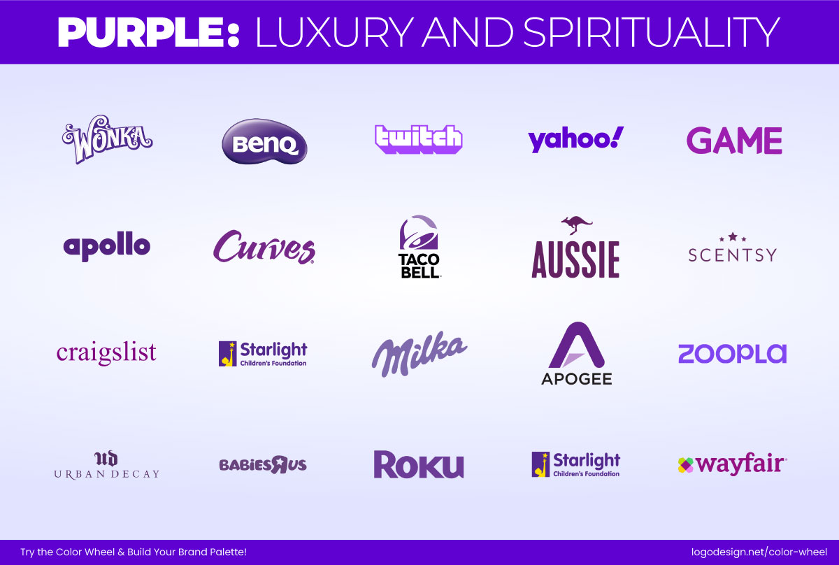
Some purple-colored logo that suggest luxury and spirtuality
- Best for: Brands that want to appear unique, visionary, or upscale.
- Psychological traits: Innovation, wisdom, mystery, extravagance.
- Brand examples: Cadbury, Slack, Yahoo
It combines the stability of blue and the energy of red, resulting in a tone associated with imagination and luxury. Previously, it was only associated with royalty; today, it’s widely used in pastry, beauty, and luxury hotel logos for its ability to signal sophistication with a creative edge. In branding, you can use deeper purples for luxury and lighter lavenders for more calming, spiritual tones.
Black/Gray – Associated with Authority and Modernity

Few black-colored logo of businesses
- Best for: Brands aiming for elegance, strength, or neutrality.
- Psychological traits: Power, timelessness, restraint, clarity.
- Brand examples: Nike, Apple, Chanel
These neutral tones communicate confidence and power. Black works very well in fashion, photography, and transportation, while gray adds professionalism and subtlety in publishing or corporate business spaces. The color can be a bit tricky in a few aspects, as it can also be associated with loss or mourning. So it’s a good idea to maintain balance with whitespace or metallics for a luxurious appearance.
White – Associated with Simplicity and Cleanliness

Logos of businesses that have a black background, a white logo, representing simplicity and cleanliness
- Best for: Brands that prioritize transparency, calm, or minimalism.
- Psychological traits: Simplicity, peace, innocence, focus.
- Brand examples: Apple, Muji, Dove
Like many others, you may also think of clarity and openness when looking at this color. Since minimalist design is such a timeless trend and is going nowhere, white also dominates across industries. It works well in branding, especially for e-commerce, wellness, and luxury travel, where cleanliness and trust are vital. White lets your message and product shine above anything else.
Temperature Effects: Warm vs. Cool – How they affect our perception of the brand
One of the most important factors in color psychology is the difference between warm and cool colors. Each one plays a key role in shaping how we emotionally and psychologically respond to a brand. Once you become familiar with the association or meaning behind such hues and tones, it’s easier to understand how brands use them to build emotional connections.
Warm Colors – Perceived as Bold and Energetic
These colors, like red, orange, and yellow, are commonly associated with heat, sunlight, and physical energy. If you go with such hues, you should know that they bring out strong emotions and are often used to draw attention or generate hype.
Brands that rely on warm colors are typically seen as:
- Energetic and action-oriented
- Playful, passionate, or emotional
- Dynamic and attention-seeking

List of 7 different color shades, along with the various meanings they represent
For example:
- Red creates a sense of urgency and passion, often used by fast food or clearance sales.
- Orange is seen as fun, youthful, and creative. Perfect for childcare and gaming logos.
- Yellow radiates positivity, cheerfulness, and accessibility. Suitable for liquor stores and event planners.
Warm colors make it easier for consumers to feel connected with the brands. Companies like Fanta, Nickelodeon, or Lego use orange and yellow to appear playful, approachable, and full of life. These colors invite interaction and show that the brand is lively and focused on its audience.

Logos of Fanta, Nickelodeon, and Lego
Keep in mind that such colors can be tricky to work with across mediums due to changes in resolution and backgrounds. Warm colors that look great on screen might fall flat in print or feel off when viewed on mobile. Think of color profiles for postcard design in print and digital here. With warm colors, you need to make sure that they appear as they are everywhere.
Cool Colors – Perceived as Trustworthy and Professional
These include blue, green, and purple, colors that can be associated with water, sky, and nature. They are associated with feelings of calmness and reliability. It’s why cool colors are considered the go-to option for brands in industries like healthcare, finance, and technology.
Brands using cool colors are typically viewed as:
- Trustworthy and secure
- Sophisticated and reliable
- Balanced and forward-thinking

Seven different color shades, and lists of meaning that they represent
For example:
- Blue is the most commonly used corporate color because it inspires confidence and dependability. It is widely used by consulting companies, marketing agencies, and more.
- Green is seen as natural, balanced, and connected to growth or sustainability. And popular amongst environment-friendly brands and medical.
- Purple shows luxury, wisdom, or spiritual depth.
Cool tones can help create a more refined, stable, and serious image for brands. They work well for businesses that are focusing on building long-term customer relationships instead of urgency.

Logos of Tiffany & Co., Calm, and Samsung
This is why high-end or wellness brands like Tiffany & Co., Calm, or Samsung often use cool color palettes. They bring out a sense of peace and confidence. Cool hues can be a good choice for brands that want to stay in the background and let their products or services become the focus.
The Right Color Temperature – Aligns with Your Brand’s Purpose
If you are choosing between warm and cool colors, the decision should be based on how you want your brand to be understood. Your color palette should match the personality, values, and core message the brand wants to deliver.
Here’s how temperature supports brand perception:
- Warm tones help you appear more joyful and engaging.
- Cool tones make you come across as trustworthy and calm.
There are also ways to combine both temperatures:
Logo of Soul Stretch, along with the color codes
- A health and fitness brand might use blue for professionalism and go with red accents as a pop of color to energize.
Logo of Zentrix, along with different color codes used in it
- A tech startup could consider hues of purple for a sophisticated look, but add orange elements to feel more approachable.
By choosing the right color temperature, or balancing both, you guide your audience’s perception before they even read a single word. In branding, that one-second impression can be everything.
Famous Logos that use Color Psychology
Here are some examples of commonly recognized monochrome and multi-color logos that use color psychology very well to build recognition.
Figma – Multicolor (Red, Green, Blue, Purple, Black)
Logo of Figma, along with the 5 color codes used in it
- Color Psychology: Creativity, diversity, openness
The colorful appearance reflects collaboration and flexibility, perfect for a design tool focused on shared creation.
Asana – Pink, Orange, Purple Gradient
Asana logo, in addition to the five color codes used in it
- Color Psychology: Warmth, optimism, imagination
Conveys energy and positivity that works for a project management platform which promotes teamwork and collaboration.
Airbnb – Coral
Airbnb logo, along with the red color code used to design it
- Color Psychology: Comfort, warmth, friendliness
The soft coral tone creates emotional warmth and a feeling of belonging, supporting Airbnb’s mission of community and shared experiences.
Dropbox – Blue
The DropBox logo, in addition to the two blue and black color codes that come with it
- Color Psychology: Stability, reliability, calm
Builds trust and shows professionalism that can be associated with a secure, cloud-based collaboration tool.
Glossier – Blush Pink
The Glossier logo, with a black color code
- Color Psychology: Femininity, softness, youth
The blush tone feels personal and feminine, highlighting Glossier’s message of ‘beauty in real skin’ and user-centered skincare.
Ben & Jerry’s – Bold Colors (Blue, Green, Yellow, Black)

Ben & Jerry’s logo, with the three color codes used in it
- Color Psychology: Fun, friendliness, nature
The playful palette reflects joy and activism and works for a socially-conscious ice cream brand that appears friendly too.
Lululemon – Red
Lululemon’s logo, with the two (red and black) color codes
- Color Psychology: Energy, passion, drive
It inspires action and draws focus to Lululemon’s purpose of promoting an athletic and high-performance lifestyle.
Canva – Turquoise
Canva’s logo, with the four color codes that are used to design it
- Color Psychology: Creativity and clarity
Turquoise shows freshness and approachability, both traits that can be associated with a design tool that lets people create easily.
When considering how to apply color, it’s also worth thinking about flat vs. gradient logos, as each style interacts with color psychology in its unique way.
Key Takeaways
Color is often the first impression your brand makes, and sometimes, the only one that counts. Choose it wisely. Understanding the psychology behind color helps brands:
- Connect emotionally with their target audience
- Communicate values non-verbally
- Stand out in a crowded market
- Influence purchasing decisions at a subconscious level