Want your logos to age like Tom Cruise? Learn from these iconic logos from iconic brands. Best part? They don’t gatekeep timeless logo secrets.
If you want to tell your brand story without ever uttering a word, then a logo will do that for you. Much like the concept of a picture speaking a thousand words, a logo is a graphic marvel that tells your brand story for you.
We humans have been using symbols to communicate since the beginning of time. Engraved across cave walls or carved into stone, these symbols speak volumes, telling us about the tales of history. And that’s what an expertly designed logo can do for you; tell your story.
But what kind of a logo should you go for? Do you tap into the timeless strategies and create a logo that will be remembered for decades from now, but slowly build over time? Or do you go for a trendy logo that catches attention immediately and follows modern design? The choice is indeed not as easy as it sounds.
Trendy logos are based on design fads, and that’s the thing about fads: They fade. On the other hand, a timeless logo may not always yield quick results. So, you can either go for timeless or trendy logos, but it all depends on your goals. Do you want to make a short-term impact and create a buzz? A trendy logo will do that for you. But if you want a logo that passes the test of time, you must choose an evergreen design.
Let’s discuss your brand’s needs, how a logo can fulfil them, and what kind of logo best fits your business.
How Logos Impacts Your Corporate Identity
The first brand element any potential customer sees is the logo. The logo operates as a visual representation of the brand identity, your company’s personality, and values.
Are you aiming to anchor your audience? Use a logo! That’s one of the biggest advantages of using one. Not only will it keep your audience hooked and intrigued but they will also remember your brand by just a glance at the logo.
Several factors are involved in designing a brand logo, and designers should understand brand logo psychology before they proceed. For instance, certain colors can have certain meanings. The iconic Coca-Cola logo is a striking red, conveying passion, while the Oral-B logo is blue, ensuring trust and calmness.
The color, font, and design are all elements of branding and brand identity strategy and will shape how your audience perceives you. Therefore, it is very important to design a versatile logo that works well for your goals and brand identity. Imagine how awkward it would be to spend a million on redesigning a logo only for it to be a miss like the 2008 Pepsi logo redesign.
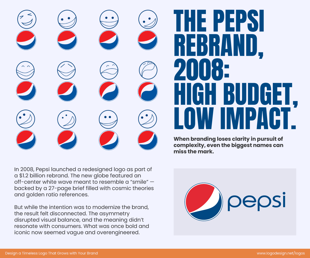
Pepsi’s 2008 rebrand that was a fail as it had very little impact
Always strike a balance between the brand identity vs. logo battle so they’re on the same side, not working against each other.
How to Future-Proof Your Brand Identity with Logos
If you want generations after generations to not only recognize your brand but also trust it, then you must prioritize a logo design that remains relevant no matter what decade.
Here are some simple ways to future-proof your logos:
1. Typography
If you were to observe evergreen logos, you’d find one thing in common in most of them: their simple typography and fonts. It is of no use to spend hours creating out-of-the-box typography when a simple font can do the trick and do it better.
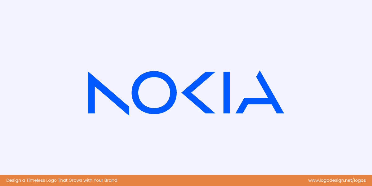
Nokia’s logo that is difficult to read
Take the example of Nokia, while the logo is just the name of the brand, the typography makes it extremely hard to read.
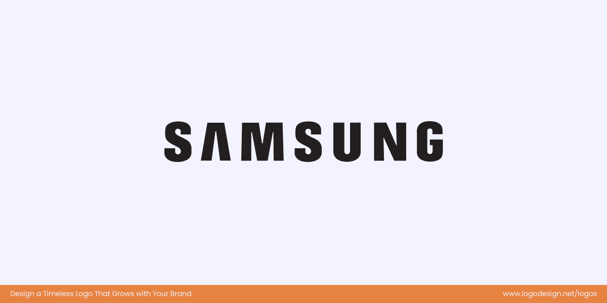
Samsung logo, that is easier to read and has significant spacing between letters
On the contrary, the Samsung logo is as simple as it can get. And we all know who wins that race.
2. Versatile Design
Keep in mind that your logo will be used anywhere and everywhere, so it is absolutely crucial to keep the logo design versatile. You will probably use it across platforms, on visiting cards and even letterheads.
A rule of thumb is to have three logo versions ready to go. You should have a primary version, a smaller and responsive version for when you are low on space, and one as a simplified icon.
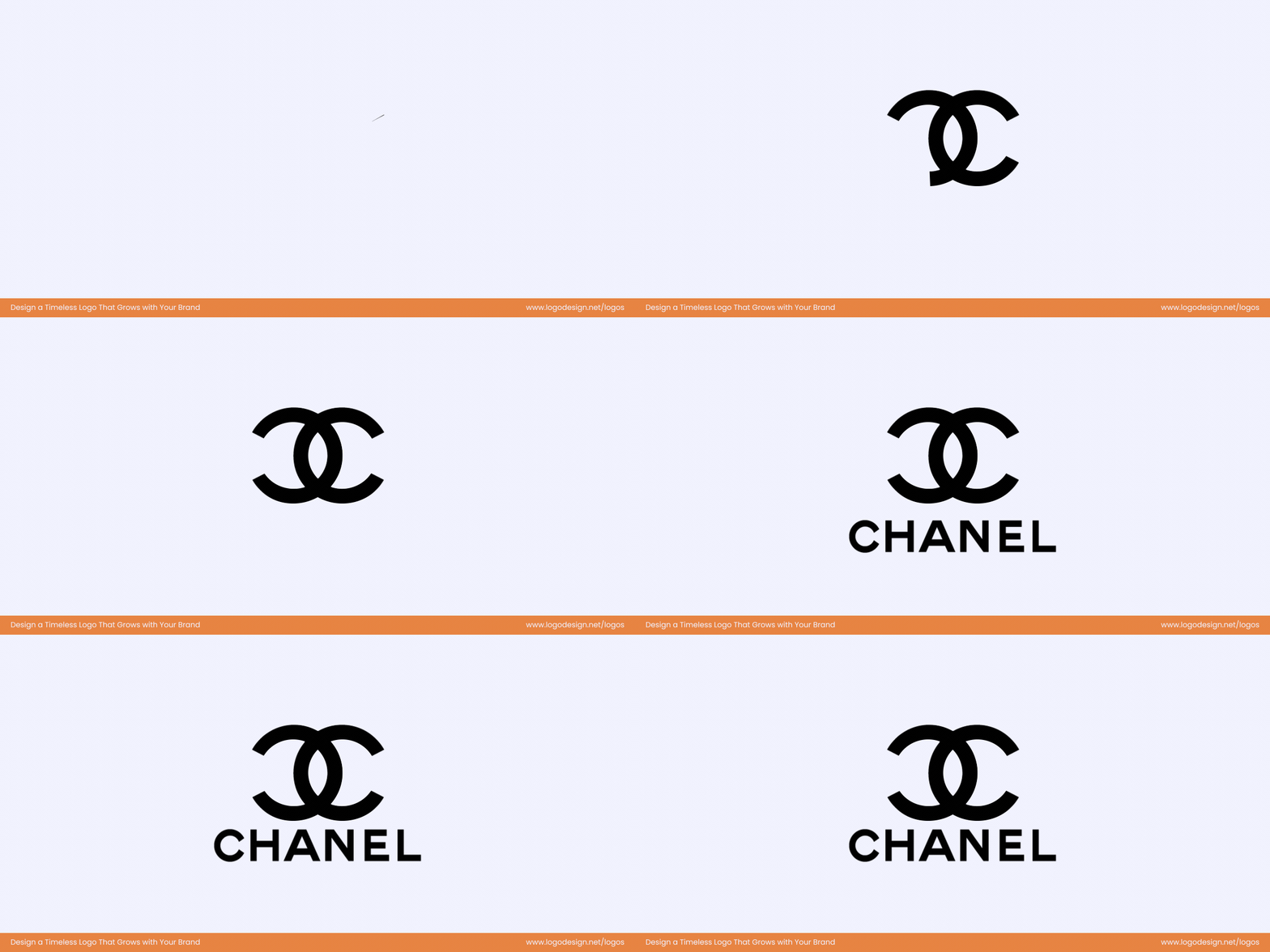
Smaller version fo Chanel logo with the complete brand name
The Chanel logo is one of the best examples of this. Their interlocking C-letter logo works independently and even with the complete brand name.
3. Brand Story
The whole point of a brand logo is to tell your brand story and you need to ensure that the logo reflects your brand’s story and true messaging. There are several ways you can do this, for instance, you can play around with negative space or add geometrical shapes to convey meaning.
The mountain icon in the Toblerone logo shows the iconic peak in Switzerland
Take the Toblerone logo, for example. The mountain in the logo’s center is the Matterhorn—an iconic peak in Switzerland. Within the mountain, you will find a hidden bear that belongs to the city of Bern, where the chocolate originally came from.
4. Consistency
Lastly, the most important thing when it comes to logos and other brand elements is consistency. The colors, the shapes and the typography should remain the same through and through. Inconsistent brand elements do not instill confidence in customers and thus are not taken seriously.
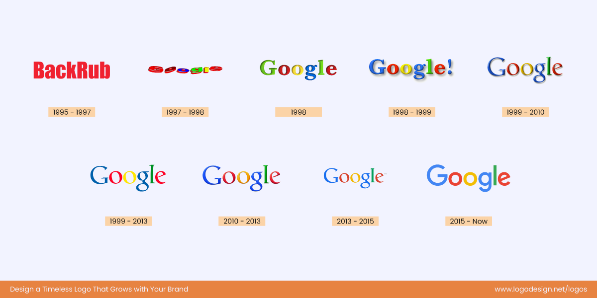
The evolution of Google’s logo, that started by the name BackRub in 1995
While some may argue that Google has updated its logo font over the years, it is also notable that the primary color sequence has stayed the same. This consistency has maintained the brand’s familiarity even with other changes.
Once you have implemented all of these suggestions, the only thing left to do now is to test, test, and then test some more. Logo designing is not just a one-and-done situation, but it takes a lot of trial and error. See what works, fix what doesn’t, and you will have a logo design that sticks out (not like a sore thumb, hopefully)
Timeless Logo Designs and What Makes Them Work
The smarter way to go about a logo design is to review and study what the greats have done over the years. Many companies that are age old have had iconic logos that are recognizable even miles away but what is their secret, what designing golden rules do they follow?
Let’s take a look at some of the greatest logos out there that have aged well and are as relevant as the first day.
1. Nike
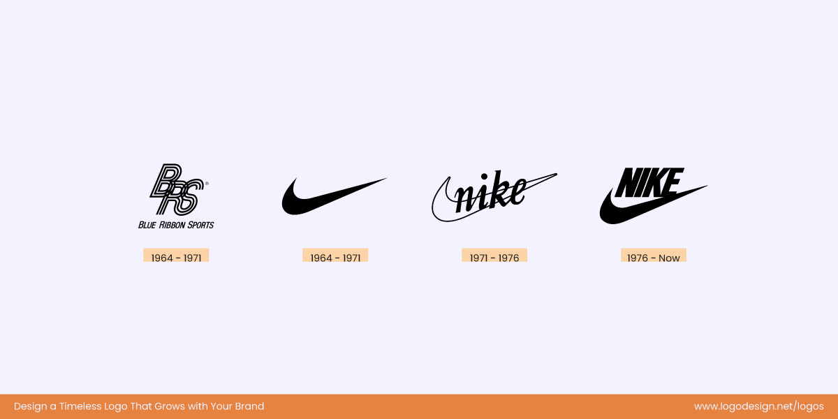
Nike’s logo evolution, maintaining the iconic Swoosh that was designed in 1971
The Nike logo history is like a bedtime story for most designers. The iconic ‘Swoosh’ was designed in 1971 by a graphic design student at Portland State University.
What Sets the Nike Logo Apart?
To put it plainly it is the simplicity that sets the Nike logo apart. No complex shapes, no trying too hard. Just a simple swoosh that breaks two stones with one design.
Swift tick and resemblance of the Greek Goddess’s wing, the Nike logo is one of the most recognizable designs all over the world.
2. IBM
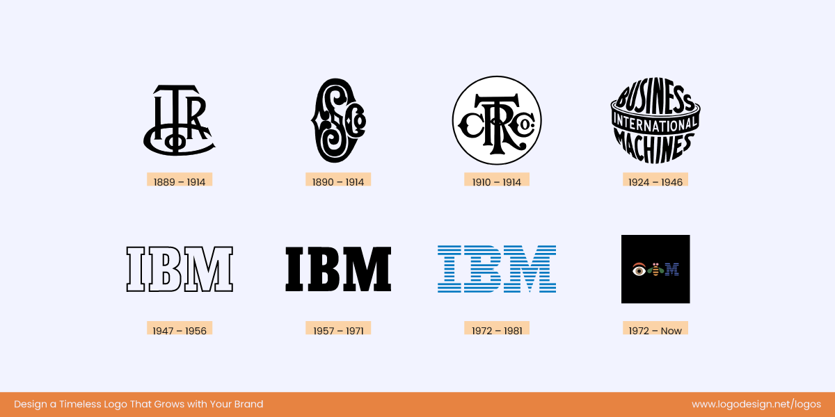
IBM logo evolution from 1889 till 2025
IBM existed when the other companies like Apple and Microsoft were just babies. The IBM logo evolution is iconic and an inspiration for designers of all ages. Paul Rand was the brain behind the first and the latest logo giving the brand a new life.
Here’s Why the IBM Logo Simply Works:
It’s readable. In a world of complex designs and typography that looks like a new language, the IBM logo doesn’t make you go cross-eyed every time you look at it. It is plain, efficient, and speaks volumes.
8 stripes for efficiency with clear, well-spaced letters. The logo works by continuing the legacy of technological advancements.
3. Apple
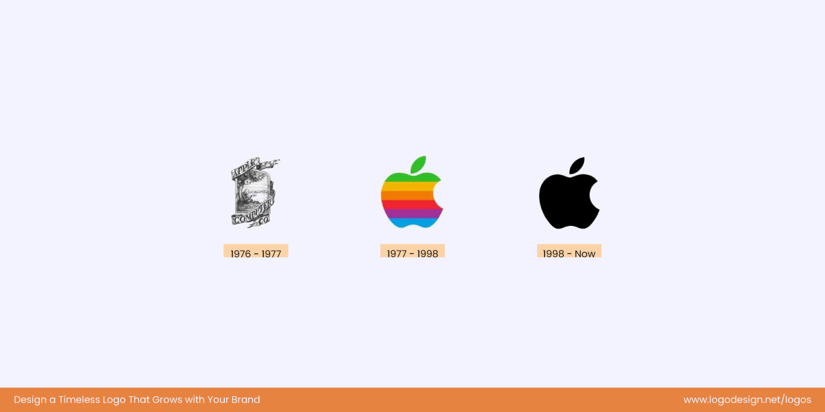
The Evolution of Apple from 1976, as the founder, Steve Jobs was on a fruit diet
If you think of a tech company, picturing an apple seems almost impossible. That’s the magic of Apple. Instead of cluttering the logo with geometrical shapes representing tech, they used a fruit.
What’s the Thought Behind the Apple Logo and Why Did It Work?
While there may be many myths and rumors about the logo, the fact is that there was no reason to use an apple. It was simply because Steve Jobs was on a fruit diet and thought the word Apple seemed powerful. You may disagree, but the logo has worked brilliantly.
Sometimes, you don’t need to pour your heart and soul into a logo; inspiration can even strike when you are craving a burger but have an apple instead.
4. Levi’s
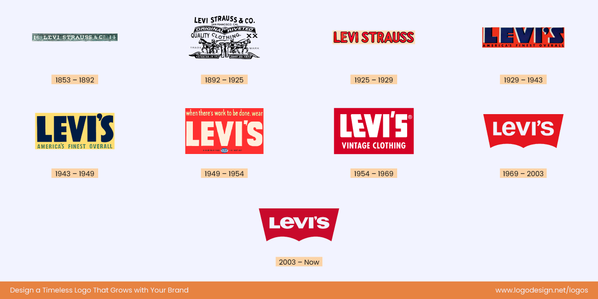
Levi’s logo evolution from 1853, keeping the logo modern throughout the years
A brand as old as Levi’s doesn’t always age well, but its logo continues to impress design enthusiasts. The original logo showed two horses trying to rip jeans apart by pulling from opposite sides. But the present logo is a lot simpler and continues the legacy of the batwing shape found on the pockets.
How Has Levi’s Logo Passed the Test of Time?
Clean, readable and versatile. The Levi’s logo passed the test of time by staying versatile. Not only does it encapsulate the brand history but it is also modern keeping up with the changing times.
5. Coca-Cola
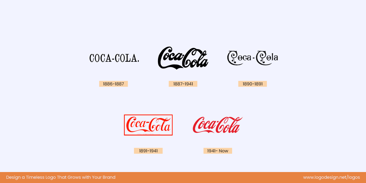
Coca Cola logo evolution from 1886, using a variety of typefaces
It is important to make good judgments when redesigning your logos. You should know what to keep and what to let go so your logo remains timeless.
The Coca-Cola logo is a testament to good decisions. Frank Robinson was the brain behind the logo and years later when Asa Griggs Candler bought the company, he was rehired and he kept the two capital C’s while changing the rest.
Has It Stayed Ageless?
The logo continues to work as it uses the timeless typeface, has a distinct identity, and stays simple despite growing and offering several products.
6. HP
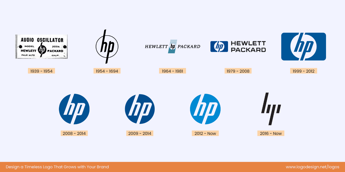
The HP logo evolution from 1939, showing a modern and minimalistic look
The HP logo aged like fine wine. While it was one of its kind back when it started, the logo is still modern and minimalistic. The colors, font and shape have stayed the same more or less and only got better with time.
What’s So Special About the HP Logo?
The logo is uncomplicated. Despite being an old company, the logo is elegant and modern-looking to compete with its newer competition.
7. CN
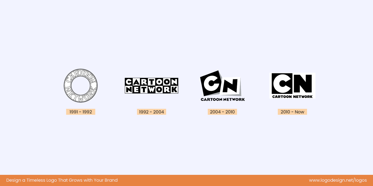
The Cartoon Network logo evolution from 1991, which didn’t move away from the original element
Cartoon Network has won hearts everywhere, not just with its cartoons but also its logos. Over the years, the logo has survived multiple iterations, but none of them have disrupted the brand image.
How Can You Still Recognize the CN Logo?
The logo aged better than most of us, and there is good reason why. The designers didn’t stray too far from the original elements, and that’s why we can still recognize the brand.
8. Chanel
Chanel kept the same iconic interlocking C logo from 1910 till date, to show a timeless appeal
The Chanel design is a century old. Yep, let that sink in. This is one of the biggest examples of a logo that isn’t just simple but memorable.
How Did the Chanel Logo Last This Long?
Because less is more, the logo is not out of this world; it is just the initials of the founder. The logo style reflects Coco Chanel’s own design, which makes it timeless and elegant.
9. Nestle
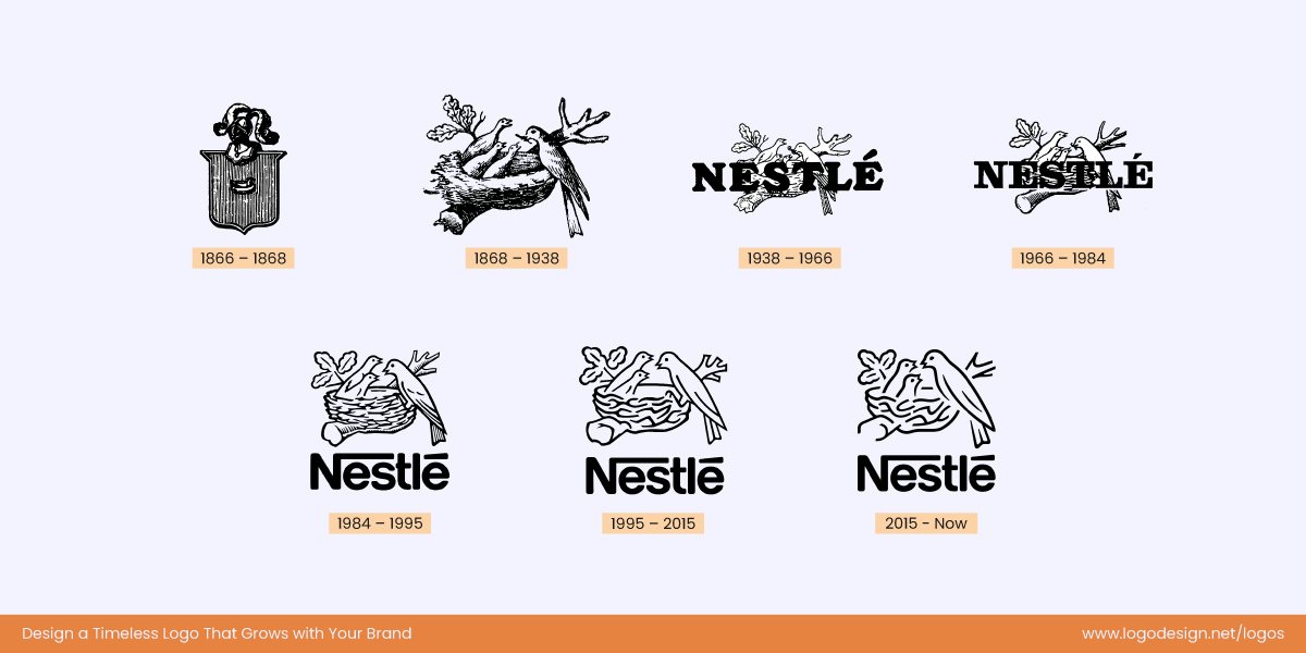
The Nestle Logo evolution from 1866, displaying the identity of birds feeing its babies
This flat logo design has been a clear depiction of the brand ideology and the back story. The name Nestle is German for nest and that’s what you can see in the logo. A mama bird is feeding its babies.
Does the Symbolism in Nestle Logo Work?
Yes, the mother bird feeding its offspring represents the brand’s commitment to nourish. Although the logo has changed over time, it has stayed true to its message with a sharper outlook.
10. McDonalds
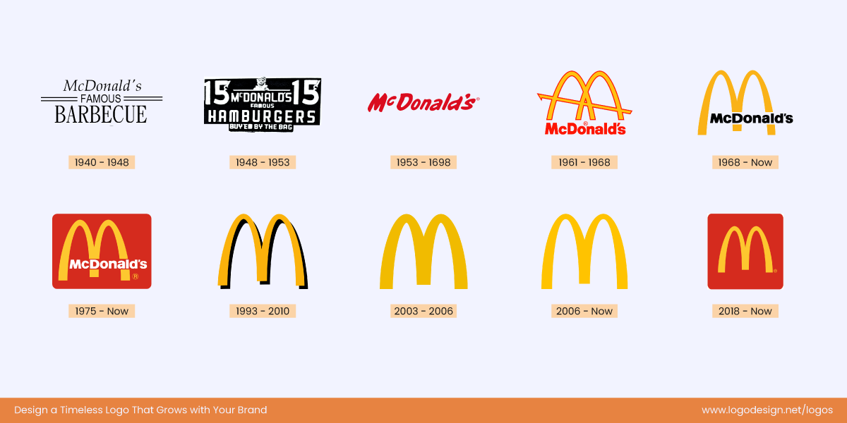
McDonald’s logo evolution from 1940, maintaining the golden arches
McDonald’s wasn’t always a fast food giant. It had humble beginnings as a drive-in BBQ restaurant. The first logo was simple, with the name and the product arranged in parallel lines. But what you see now is known as the golden arches. The arches came, they saw, and they definitely conquered.
Do You Recognize The Golden Arches?
Of course you do, who doesn’t? The reason we all recognize the arches is actually very smart. Not only do they represent the M in the name, but they are also a visual representation of the architectural design of the McDonald’s building. Some also say that the golden arches are the scrumptious fries McDonald’s is known and loved for.
These iconic logo examples are a great way to learn and understand how great logos come into being and are redesigned to stay timeless. Brand identity evolution is essential, and logos are an important aspect of redesigning to fit and appeal to newer audiences.
11. Heinz
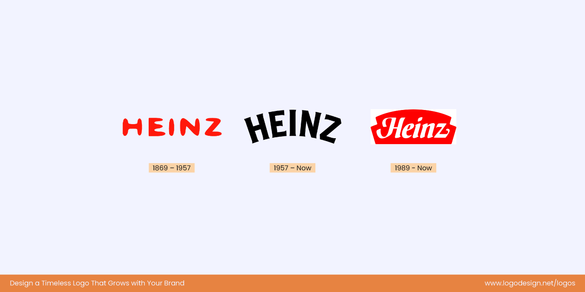
The three logo evolutions of the Heinz logo, using bold and clean typefaces
Heinz began its journey with horseradish and pickles before the ketchup made it world famous. The logo has remained consistent with its clean and bold typeface using the traditional ‘red’ color. The vintage feel of the logo has kept it timeless, reinforcing a decade and half of flavor.
No Flashy Logo, How Did Heinz Do It?
Heinz didn’t fall into the trap of flashy logos to stay relevant but chose to remain true to its roots. The timeless serif font has kept the company rooted in tradition.
12. Cadbury
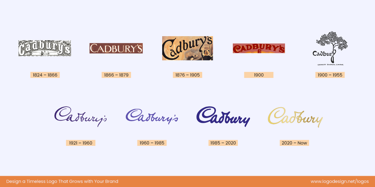
Cadbury logo evolution from 1824, showing warmth and familiarity
The Cadbury logo has been a point of reference for many brands. It is one of the most elegant logos, featuring William Cadbury’s signature. This only goes to show that you can never go wrong with authenticity. The shade of purple, now golden, has always been representative of the royal flavor.
The Sweetness of Consistency
The Cadbury logo has not experienced dramatic redesigns yet is relevant for today’s audiences. That’s because the logo designers built on tradition. The logo over the years conveys tradition, warmth, and familiarity.
13. Shell
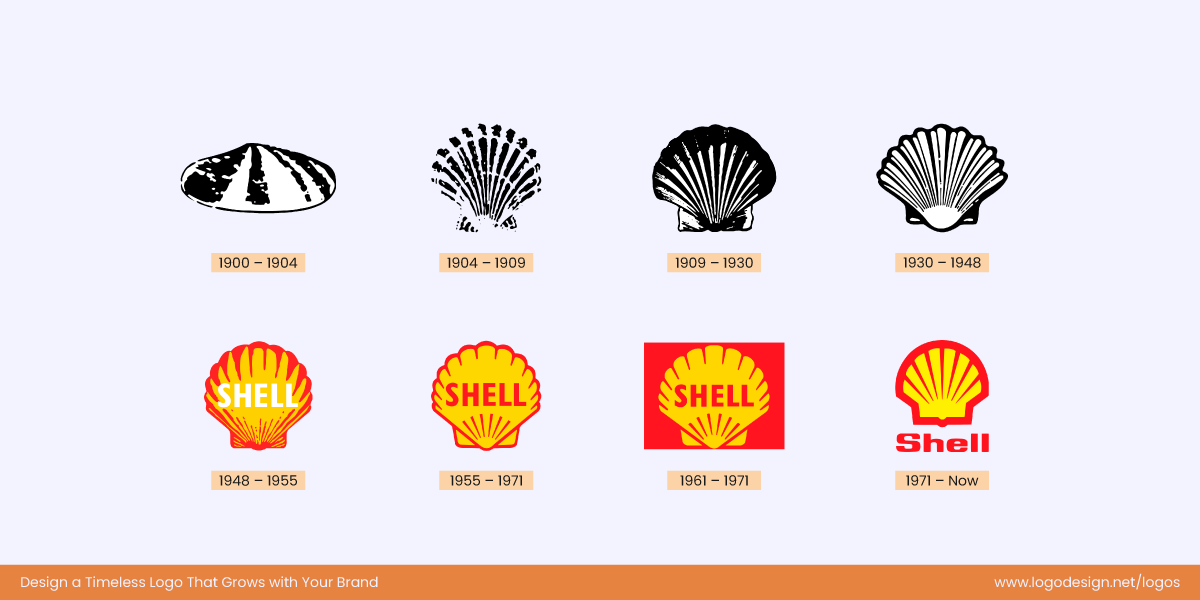
Shell logo evolution from 1900, that appeals to a worldwide audience
Shell began as a trading company that sold seashells. Hard to believe no? The very first logo was a hand-drawn sketch of an actual shell, which has now evolved into a bright red and yellow shell that the whole world recognizes.
How Did Shell Stay Relevant?
The Shell logo has been recognizable all over the globe. And to stay relevant to its target audience, Shell picked out colors that aligned with the Spanish flag so it could appeal to its local customers. The icon is now not just appealing to the Spanish community but is liked and recognized worldwide.
14. L’Oreal
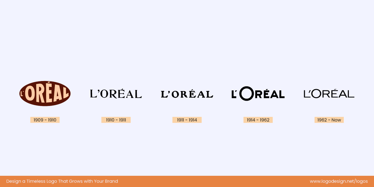
L’Oreal logo evolution from 1909 to display authority and legacy
The logo for L’Oréal is a simple as it can get. With a minimalist woodmark, clean lines, and adequate spacing, the logo reflects luxury at its best. The brand is very relevant for its audience today, and continues to deliver with top-notch products and polished branding.
Subtle And Simple Wins the Race
If you were to see the evolution of the L’Oreal logo, you would not find big changes in the design. While there have been tweaks, the logo’s strength remains its authority and legacy.
15. Tissot
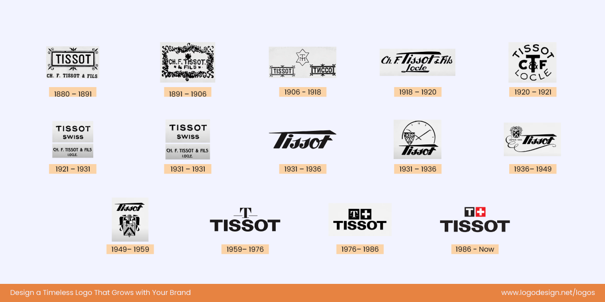
Tissot logo evolution from 1880, showing the Swiss flag and giving a timeless charm
Tissot has no reason to hide behind a complicated logo. The logo today is a timeless rendition of the legacy it has lived. Proud of its roots, the logo features the Swiss flag with a sans serif font, giving it a timeless charm.
Timeless Logo To Match The Timeless Watches
Tissot watches are timeless, and to match that, the designers have given the logo a fabulous makeover. The latest logo perfectly balances innovation with legacy.
16. Bacardi
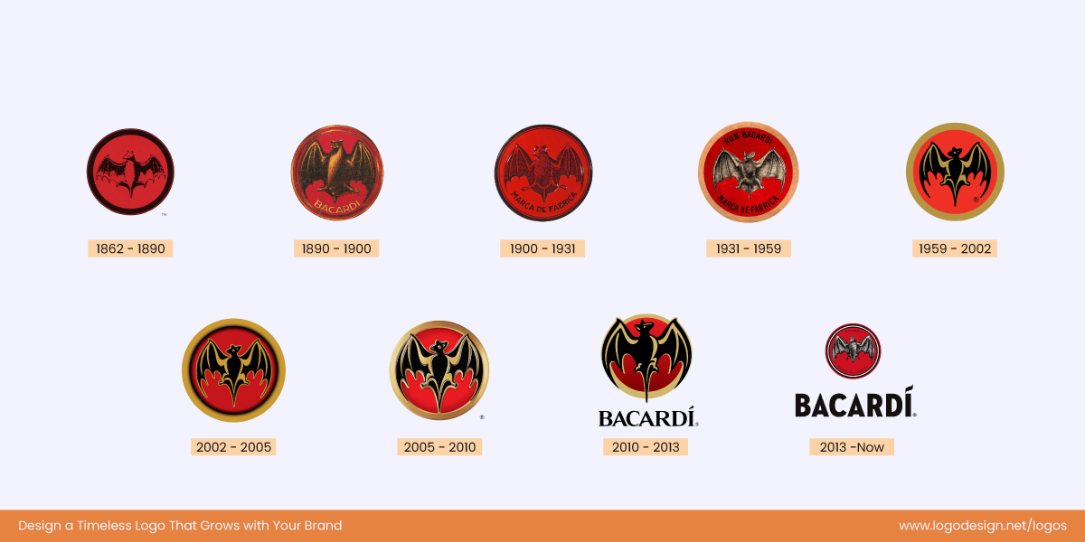
Bacardi’s logo evolution from 1862, with a constant bat symbol that represents good luck
The iconic bat has made a prominent appearance in the Bacardi logo. But this is not happenstance. The bat is an intentional part of the logo, representing good luck. Mrs. Bacardi spotted bats in the original distillery and thought it was a sign of good luck. This bat has continued to symbolize resilience and heritage, making it timeless. Over the years, the other parts of the logo have changed, leaving the bat as is.
Batman? Nope. Just Bacardi!
The Bacardi logo has paved its way to timelessness by changing the font, shape, and typography. However, the bat has flown through time, unsatched. This is the careful balance between evolution and tradition brands strive for.
So What Kind of a Logo Does Your Business Need?
This is a question only you can answer. Take a deeper look at your brand, its message, and how you want to stand out. A corporate identity design will help keep your logo and brand image in line by focusing on your brand values and visual elements.
A minimal design can do wonders for brands with a luxurious product or service. In the same way, flat logos exude simplicity while being highly memorable. We’d say simplicity is the way to go to ensure a timeless design.
Still on the fence about choosing the perfect style? Here’s how to pick the right logo type for your business.
If you already have a logo and want to breathe some life into it, successful logo redesigns are a great idea. Just stay on top of the logo trends to avoid so your logo is not lost in a sea of other designs.
While fads fade, a sustainable logo design wins the long race. This article shows how brands age well if their logos do. The choice is yours – evergreen or trendy?
