Flat is bold and clean. Gradients add depth and flair. One says timeless, the other says trendy—so which logo style tells your brand story best?
One of the most important decisions in modern logo design is whether to go with flat colors, clean, solid, and minimal, or choose gradients that are dynamic. This choice may seem simple, but it affects how your brand will be perceived for a long time.
This isn’t just an aesthetic decision; it’s a strategic one. Flat colors show simplicity, clarity, and timelessness. Gradients go for depth, energy, and emotion. Both can be powerful in their own way and work well in color theory in logo design.
However, the choice between flat and gradient can influence usability, accessibility, brand storytelling, and even how a product is experienced. So, let’s discuss how to make the right choice and pick gradients or flat colors that make an impact and help avoid common logo mistakes.
Flat vs. Gradient Colors: What’s the Difference?
Flat and gradient color styles are quite different and their choice depends on the industry or message you are looking to convey. It is important to understand how each style varies from the other to create a color palette that makes an impact on first look.
This will also help make sure that you’re not just learning about the color trends to follow, but making well-informed choices.
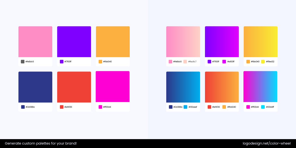
The difference between flat and gradient colors
Flat Colors vs. Gradient Colors |
|
| Flat Colors | Gradient Colors |
|
These include solid colors and hues without gradients or textures. They focus on clarity and efficiency by removing any elements that could distract from core shapes or typography. As screen resolutions change and user expectations shift, designers go for simplicity and content-first layouts. Flat design aligns with minimalist principles so such colors can be relevant for a long time. |
They combine two or more colors to create an effect that can show light, dimension, and movement. This style can range from subtle shifts between tones to bold colors. While flat colors have always been popular in logos, gradients have been on the rise since 2017. And not just as decoration, but as a way to bring out emotions and showcase brand personality. For social media app logos or music logos, gradient colors are a great choice for their visual appeal and digital flexibility. |
How to Pick Between Flat and Gradient Logo Colors?
Choosing the right brand color involves understanding color psychology. This means diving deep into choices that include flat and gradient colors. So, how do you pick one between them?
Brand values, industry standards, digital needs, and long-term scalability should drive the decision to use flat vs. gradient colors in logo design.
Here are some questions you should ask when deciding between flat or gradient logo colors:
• What is the brand personality I need to go for?
→ You have a choice between going for a modern brand personality (involving gradient) or a minimal one (that usually includes flat icons).
• Where will my logo mostly appear?
→ Ask yourself the question, if you are designing a logo that will appear on product packaging or digital assets?
• Do I need to go for a trendy logo or a classy one?
→ Gradients can give freshness to your logo, while a flat one adds stability and a longer appeal.
• Is my logo design too complex to understand?
→ If you add gradients in your logo, it can give a visual weight that makes them look thicker.
• Am I looking for consistent colors across devices and formats?
→ With flat colors, you can get higher control over color and better consistency.
• Am I going for simplicity in my brand identity?
→ If that’s what you’re looking for, using flat colors in your logo can give a clear brand identity.
• Do I want to express energy, innovation, or depth through my logo design?
→ By adding gradients in your logos, you can bring vibrancy and multidimensionality.
• What are my competitors doing?
→ Keep an eye on your competitors and decide whether using gradients or flat colors can help your brand stand out.
• Is visual accessibility really important?
→ By using flat colors in your logo, you can get a stronger contrast and clarity.
• Do I have the resources to maintain gradient visuals?
→ Using gradients might require more precision in the design across various branding materials.
Flat Colors in Logos: Why They Work
By relying on solid, unshaded color blocks, you can make sure that your logos remain legible and recognizable at any scale.
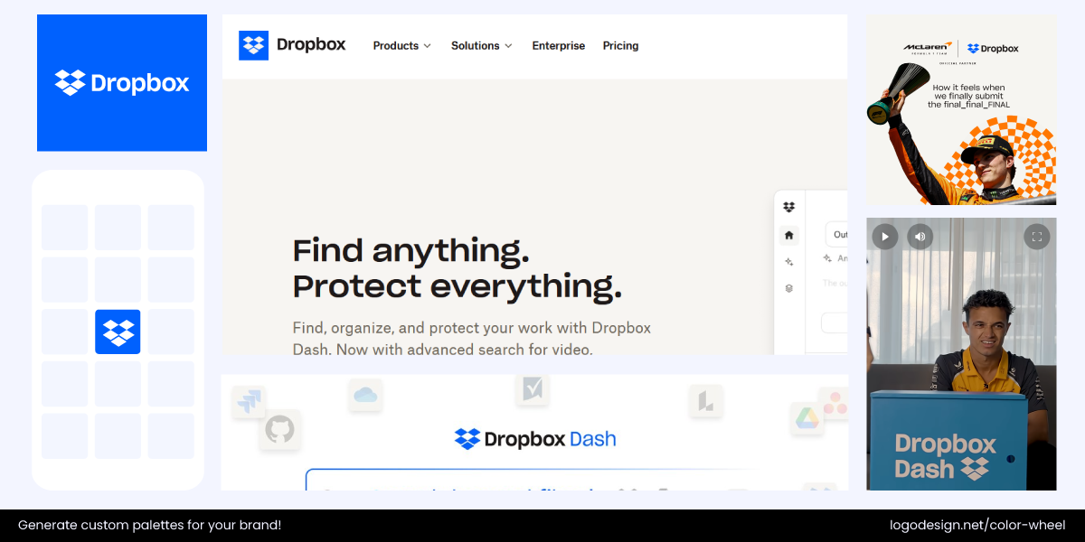
How Dropbox applies its flat logo across various platforms
For example, Dropbox’s logo uses a flat, geometric shape in a clean blue hue that works equally well on digital platforms and physical merchandise.
Flat colors also appear clear on print, embroidery, and signage, maintaining visual consistency across all mediums.
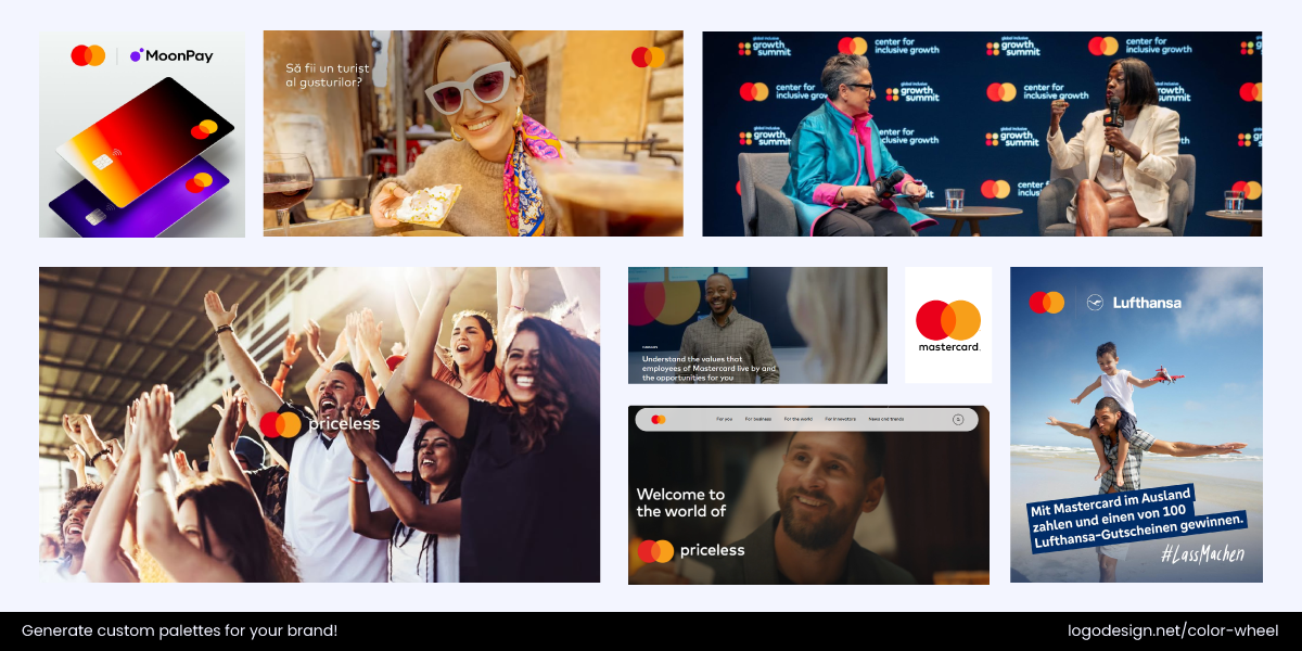
How MasterCard uses its flat two-colored logo across various platforms
It can be seen in brands like Mastercard, whose flat red and orange overlapping circles are easy to reproduce on everything from credit cards to digital ads.
These colors are considered quite timeless for their minimalist aesthetic.
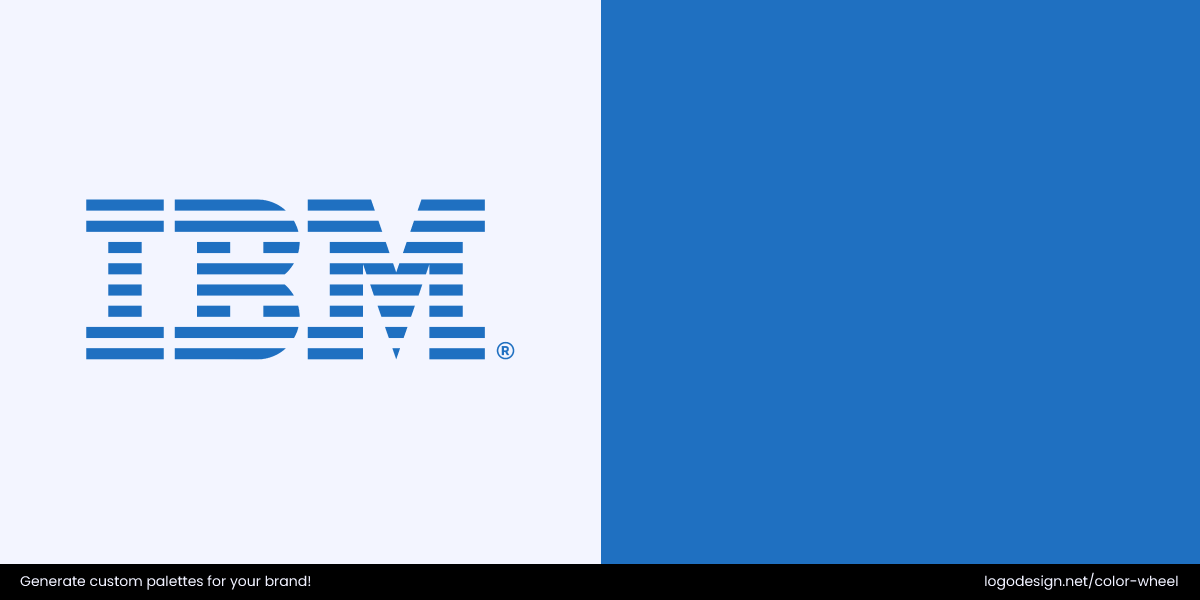
IBM uses a solid blue color to convey trust and professionalism.
IBM’s flat blue stripes have been effective for decades. Flat colors work with accessibility standards, providing higher contrast for users with visual impairments. This is very important for brands with a global or inclusive audience.
Flat colors are a good choice for:
- Traditional industries like law, finance, manufacturing, and education
- Brands with a conservative or professional tone that value legacy and clarity
- Startups focused on clean, modern minimalism
- Brands needing extensive print applications
Flat Color Branding That Stands Out
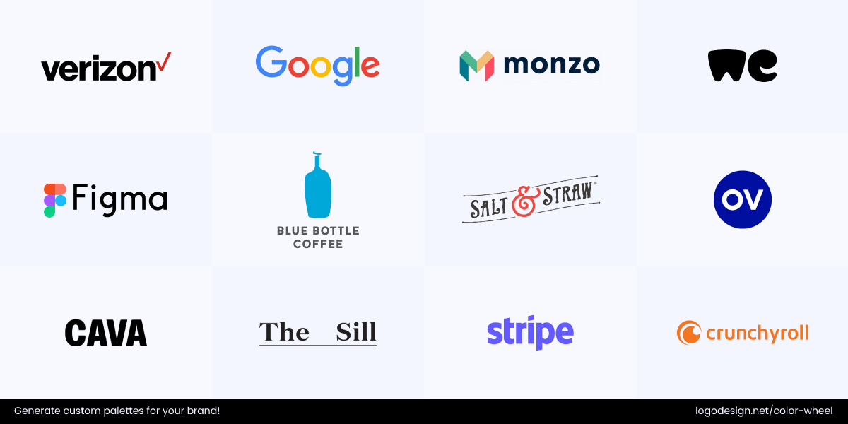
Brands Known for Flat-Color Logos
- Apple: The iconic, flat, bitten apple logo emphasizes elegance and precision, which match Apple’s business philosophy. With such a clean design, the logo easily adapts across different devices, packagings, and other platforms.
- Google: The flat, sans-serif wordmark Google logo uses the primary colors to show its simplicity and accessibility. The logo also makes the company look friendly and human, which is what Google wants.
- Monzo: The flat and geometric M logo illustrates modernity, transparency, and trust, all necessary traits for a digital-first bank. The simple marks and strokes make it recognizable and viewable on mobile apps, cards, and other materials.
- WeTransfer: WeTransfer’s flat wordmark, soft curves, and minimalist design equal a positive user experience. The unobscure logo design shows the brand’s dedication to helping.
- Figma: The flat shapes on the Figma logo resemble the UI components, which are critical elements for designers. The flatness in the logo represents legibility and versatility, responsive across web and mobile interfaces.
- Blue Bottle Coffee: Despite being extremely flat and minimal, the Blue Bottle Coffee logo usually stands out. The simplicity highlights a brand’s willingness to be simple yet traditional, emphasizing good coffee.
- Salt & Straw: Salt & Straw might have a handcrafted typography, but the logo remains flat and clean, which signals authenticity from a brand. One of the reasons they’ve opted out of a gradient on their logo is to promote a community-driven feeling.
- Outdoor Voices: OV’s logo design is clean and sans-serif, showcasing the brand’s modern, laid-back nature and lifestyle-driven approach.
- Cava: The minimalist wordmark and the flat orange dot signal a mixture of healthy living and Mediterranean warmth. The brand presents a clutter-free personality with the flat design, colors, and spacing.
- The Sill: A flat, serif wordmark logo that oozes sophistication, where nature meets modern living. Not having a gradient or additional imagery means the entire focus is on the logo, which can easily be embedded on physical packaging and digital media.
- Stripe: With a flat logotype and linear gradients, the clean Stripe logo displays trustworthiness, tech-seaviness, and simplicity, all the qualities that are necessary for a fintech company.
- Verizon: The flat Verizon logo features a red mark that is memorable and simple. The logo’s flatness also showcases the company’s versatile approach in logo and across media platforms.
- ChrunchyRoll: The Crunchyroll logo is flat, yet has the elements that make it culturally playful. The logo particularly appeals the anime fans through motion and minimalism, making it easy to use on print and digital platforms.
Gradient Colors in Logos: Why They Work
Unlike flat colors, gradients introduce a sense of movement and dimensionality that can make a logo feel more alive and engaging.
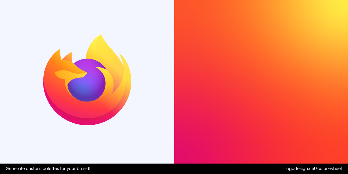
Firefox uses a warm yellow‑orange gradient to signal energy and motion.
If you look at it closely, Firefox’s logo has a gradient that symbolizes agility and innovation.
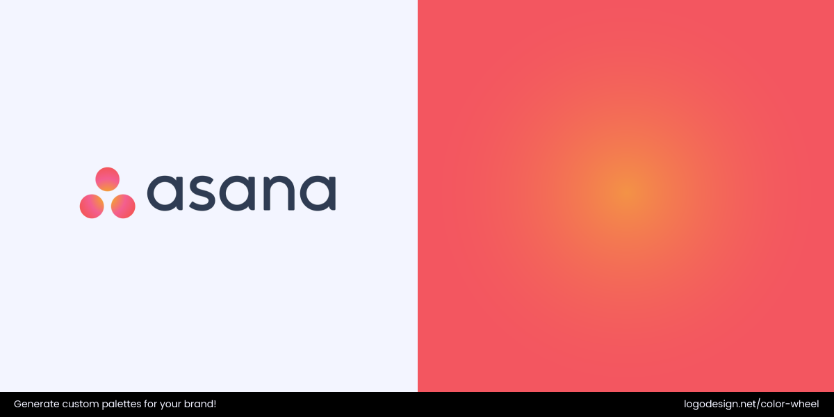
Asana uses a soft pink‑orange gradient to evoke warmth and collaboration.
Asana uses soft, multi-hued gradients to communicate collaboration and creativity in a subtle yet distinct way.
One key aspect of gradient colors is their ability to create a mood and bring out a strong emotional response. Like shifting from cool blues to warm oranges can instantly draw attention to a freeform gradient logo design with optimism and vitality.
Gradients also allow for greater brand distinctiveness in crowded markets by creating unique color blends that are difficult to produce again and visually memorable too. While they may require careful application and brand guidelines, gradients give logos a sense of innovation and storytelling that flat colors alone often cannot achieve.
Gradient colors in logos work well for:
- Tech startups and digital-first IT companies
- Creative and lifestyle brands seeking to convey energy and emotion
- App-based products and platforms of different sizes (like billboards, business cards, postcard designs, and more) that benefit from dynamic visuals
- Media, entertainment, and wellness industries where mood and personality are key
Brands That Make Gradient Work Beautifully
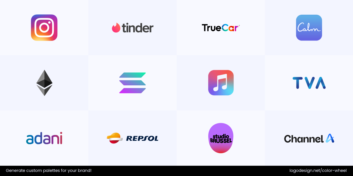
Brands Known for Gradient Logos
- Instagram (2016 rebrand): The (pink, purple, orange, and yellow) gradient used in the Instagram logo gives it instant recognition and an energetic feeling that is perfect for a social platform focused on storytelling.
- Adobe Creative Cloud: The Adobe Creative Cloud logo uses a gradient that involves colors like red, orange, and pink. This gradient shows creativity and versatility, as Adobe represents multiple tools.
- Tinder: The warm gradient in the Tinder logo evokes passion and an emotional connection, which is necessary for a dating app.
- TrueCar: A cool blue gradient adds modernity and a digital touch to this auto pricing platform, enhancing the viewer’s trust and reliability.
- Calm: The soft blue and purple gradient used in the logo matches the brand’s mission of illustrating relaxation, meditation, and better sleep.
- Ethereum: When Ethereum rarely uses a gradient, it emphasizes the blue and purple colors that display blockchain technology’s digital essence and multi-layered nature.
- Solana: Bright neon, green, blue, and purple gradients in the Solana logo give an ultra-modern feel and highlight the company’s mission of being tech-sevvy
- Apple Music: The Apple Music logo has a gradient involving pink and purple, showing the energy and dynamism of the company.
- TVA: Time Variance Authority of Marvel uses a vintage gold and bronze gradient that emphasizes time-traveling, a common narrative in the Marvel universe.
- Adani: The blue and purple gradient in Adani’s logo gives off a modern and approachable theme. This also signals forward-thinking, necessary for an infrastructure brand.
- Repsol: With a red, orange, and yellow gradient, the Repsol logo shows energy and evokes motion, perfectly aligning with what an oil and energy company would want to be represented by.
- Studio Brussel: The logos they use in different campaigns have a red gradient, showing vibrance that connects with youth and culture.
- Channel A: The A icon with a blue and teal gradient, the Channel A logo gives a futuristic appeal, along with a feel of being innovative and digital savvy, the attributes needed by a media brand.
Flat or Gradient? Tips to Help You Decide for Your Logo
With digital platforms changing every day and design systems becoming more dynamic, it is key to focus on the deeper role and psychology color plays in brand perception.
1. Define the Emotional Response for your Brand
Start by asking: What emotion should your logo instantly bring out? Flat colors are associated with feelings of clarity, confidence, and structure. They mostly represent brands that want to appear dependable, minimal, or legacy-driven.
Chase uses blue and black to convey trust, stability, and strength.
For example, Chase Bank uses a flat blue geometric mark to showcase trust and stability.
Gradient colors suggest an evolution, a journey, or a layered experience.
Apple’s iCloud logo uses a blue‑white gradient to suggest clarity and connection.
Apple’s iCloud logo has a cool, soothing gradient that visually conveys innovation, trust and security.
If your brand helps users transform, whether it’s through wellness, creativity, or tech, gradients can be a good choice. Do consider cultural associations with colors before making your choice, be it for flat ones or gradients.
2. Let the Medium Shape the Message
Don’t treat your logo in isolation, think about where it will live and move. Flat logos perform very well in static applications where simplicity is the key. Think print materials, embossed products, physical packaging, promotional products, vehicle wraps, or low-color formats like newspaper ads. Since they work so well in non-digital formats, they are ideal for brands focused on physical experience.
Muji’s maroon logo conveys simplicity, warmth, and understated elegance.
Muji, for instance, prioritizes flat and neutral branding to reinforce its minimalist products.
Now, gradient logos are digital-first and maintain their appearance for screens mainly. They look good on high-resolution displays, adapt to motion design and can be incorporated easily with layered interfaces.
Adobe Creative Cloud’s gradient logo blends red and orange to express creativity.
Adobe Creative Cloud has vibrant gradients that draw focus to its expertise in design. If your logo will be used in dark mode, app launch sequences, or product walkthroughs, gradients offer a sensory dimension that flat color can’t provide.
3. Match the Visuals to Audience Expectations
Flat colors may appeal more to institutional or traditional users who believe that minimalism shows seriousness. Take government, law, enterprise SaaS, or industrial B2B niches for example here. These audiences may think that elaborate or complex designs do not deliver value.
But younger, mobile-first users usually associate gradients with intuitive, expressive experiences. Gen Z will most likely trust brands that feel ‘alive,’ not static. This is why choosing colors that align with your industry is key to reaching the right audience.
The Mindtree logo’s pink‑to‑orange gradient adds depth, vibrancy, and modern appeal.
Companies like Mindtree use gradients to convey their expertise. If your audience seeks personalization, play, or progression, gradient visuals may align better with their expectations.
4. Consider How the Logo Will Change With the Brand
If you go with solids or neutrals, you don’t have to worry about your logo losing their relevance. Flat colors are easier to extend into icon sets, sub-brands, and branded environments without distortion. Similarly, choosing between a monochrome palette and a multicolor approach shapes how flexible and recognizable your logo will be—monochrome offers timeless simplicity, while multicolor can express diversity and vibrancy when used thoughtfully.
This is especially useful for architecture firms, research labs, or consultancies that grow slowly.
The IDEO logo’s black color adds strength, clarity, and timeless appeal.
IDEO uses a modular, flat logotype system that is adaptable across projects and for different clients.
For a brand that will introduce animations, motion design, or content-driven branding in the future, gradients can future-proof your identity.
The Tinder logo’s pink‑to‑orange gradient adds warmth, energy, and a modern, playful vibe.
Tinder is known for the use of gradients in its logo, website as well, making the CTAs stand out against the dark background. If you expect your brand to grow into product storytelling, in-app experiences, or immersive video, gradients can work well for you.
5. Pay Attention to Technical Limitations
While flat colors in logos are often lighter, easier to code, and more consistent in constrained environments (e.g., screen printing, embroidery), gradients are not challenging either. In fact, modern front-end frameworks, CSS tools, and high-resolution devices have made gradients more simpler to integrate anywhere.
The Microsoft Copilot logo’s blue‑green gradient reflects clarity and innovation.
Microsoft Copilot, an AI communication tool, uses attractive colorful gradients in contrast with a solid black Sans Serif wordmark, which load seamlessly across the website without affecting performance and page load time.
That said, gradients do require more details in a brand guide for your company. You’ll need clear rules for display, color stops, motion behavior, and contrast across devices and themes..Treat your gradient not just as a visual effect, but as a dynamic asset in your brand system.
How to Create a Gradient Logo Using LogoDesign.Net Logo Maker?
If you are looking for inspiration or to get a gradient logo quickly, Logodesign.net’s DIY logo maker makes it as easy as it gets.
Step 1: Add Company Details
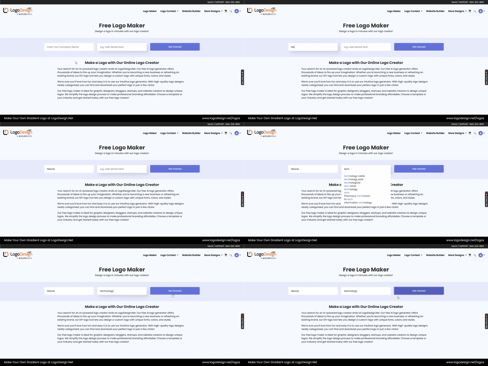
Enter your company name and industry to start designing.
Go to our logo maker tool, enter your company name, and select your industry.
Step 2: Choose Your Template
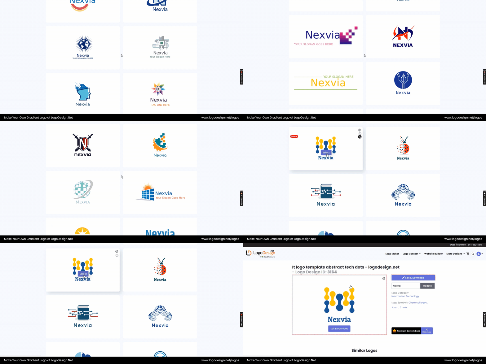
Choose a logo template that fits your brand. – Abstract Tech Logo Template by LogoDesign.Net
Browse the template gallery, and select a logo design that matches your industry and expertise. Click Edit and Download to edit the logo in LogoDesign.Net logo maker studio.
Step 3: Select Color Palette
To choose a color palette, Click Edit and Download to edit the logo in LogoDesign.Net logo maker studio. Change font, adjust text placement and proceed to edit the icon.
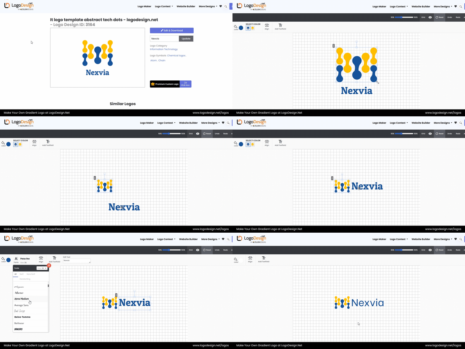
Customize your logo by tweaking the template, font, and layout.
Step 4: Apply and Edit Gradient Colors
Choose the icon or image in the drag-and-drop editor and select the color panel. Pick the gradient next to colors and add choose two colors to add the gradient. You can add the code or you can choose color directly from the panel. Adjust your choices until you get exactly what you are looking for.
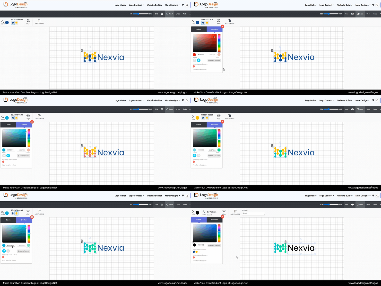
Add a gradient to the icon and fine‑tune the colors.
Fine-tune the gradient effect in the color panel from the given options. You can change the color scheme entirely or make changes to the existing one.
Step 5: Download High-Res Files
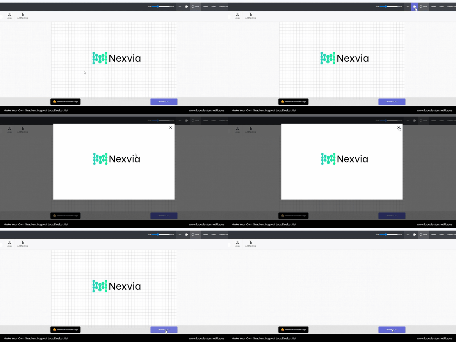
Preview your logo, then download it.
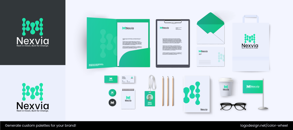
After your logo is ready, you can design custom stationery as well.
Once you are satisfied with the colors, move to download your files. Choose between the Free version or Paid version with high-resolution/transparent formats (PNG, SVG).
You can also get stationery including postcard, business card, business flyer, email signature, envelope or mockups to create a cohesive brand with a gradient logo.
Key Takeaways
- Flat color logos emphasize clarity, stability, and trust.
- Gradient logos communicate emotion, innovation, and evolution.
- Let brand strategy lead design.
- Consider the context of use.
- Design for your audience’s expectations.
- Think in systems, not as one standalone visual.
- Balance visual identity with technical reality.
