Monochrome logos speak in whispers while multi-color logos shout from the rooftops. But which logo style really wins your customers’ hearts?
When it comes to logo design, one of the first big decisions is color or the lack of it. Some brands go all in with a vibrant, multi-color palette, while others keep things sleek and minimal with a single tone. It’s a choice that seems simple on the surface, but it carries a lot of weight. The colors (or absence of them) in your logo say a lot about how the world sees your brand.
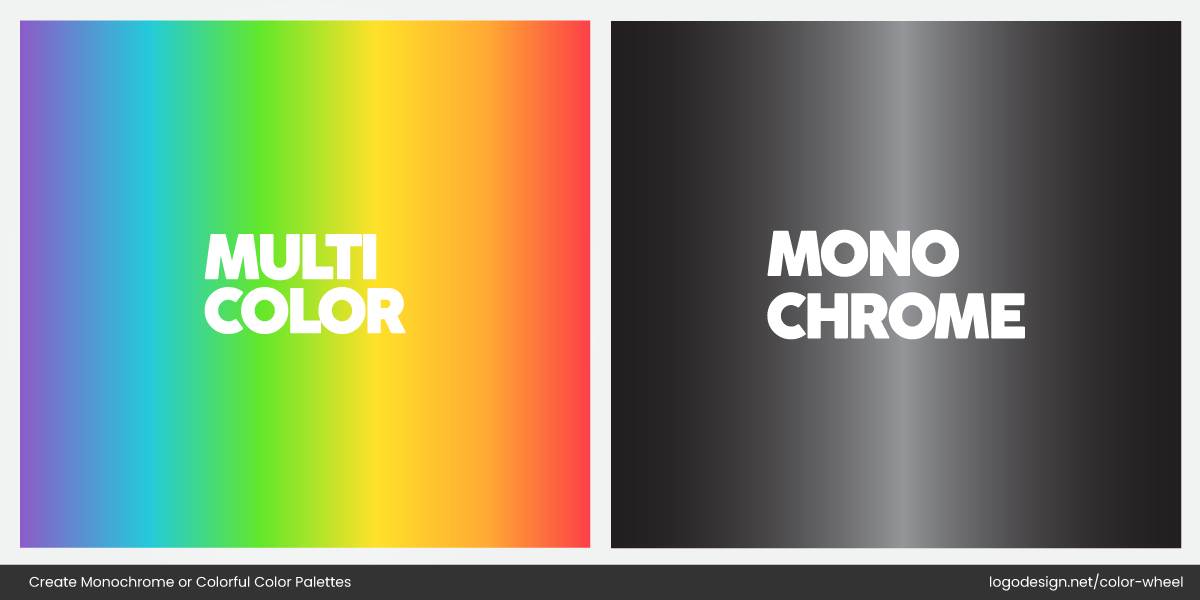
The difference between multicolor and monochrome colors
Sometimes, a bold black-and-white mark feels powerful and timeless, like Nike and Apple’s logos. Other times, a splash of color is exactly what a brand needs to stand out and be remembered, like NASCAR or eBay. Both approaches work, but for very different reasons.
Design trends come and go, but your logo’s color choice sticks around. And believe it or not, it can set the tone for your entire brand.
Let’s take a walk through what each style brings to the table.
The Battle Between Monochrome and Multi-Color Logos
There is no universal rule when it comes to logo color. The choices are grounded in psychology and purpose. In fact, color theory in logo design plays a big role in how your brand is perceived at first glance.
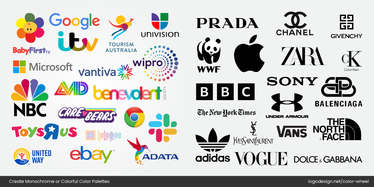
Some famous multi-colored logos vs. monochrome colored logos
Some logos rely on a single shade to create a sense of elegance, calm, or authority. Others use a mix of colors to express creativity, friendliness, or excitement. It’s all about what suits your brand personality.
What are Monochrome Logos?
In the debate of minimalist vs. maximalist design, monochrome logos fall firmly on the minimalist side—and that’s their superpower.
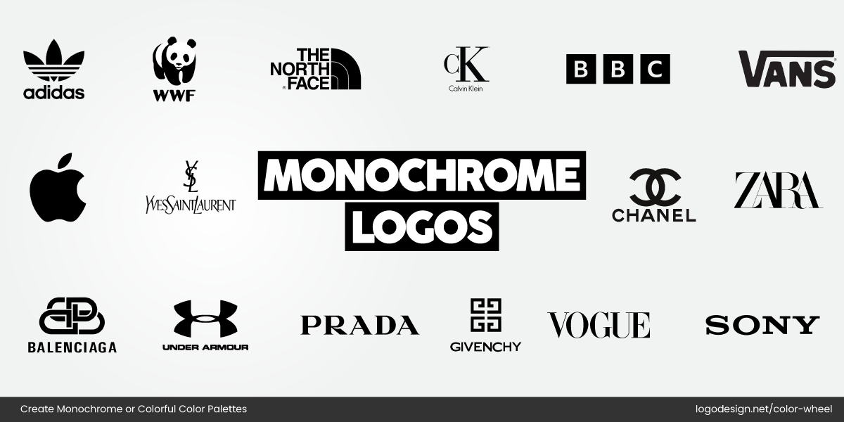
Examples of some monochrome logos of renowned companies
A monochrome logo uses just one color or shade, often black, white, or grey, to create a clean and consistent visual identity. It strips away distractions and lets the shape, typography, and concept do all the talking.
The New York Times logo using monochrome colors and blackletter-style
You must have seen The New York Times‘ blackletter-style logotype; it’s the perfect example of a monochrome logo.
The YSL logo using a monochrome design to show its style and legacy.
YSL (Yves Saint Laurent) also leans on a clean black-and-white design to reflect its legacy, style, and confidence.
Monochrome logos rely on form and concept, not color tricks, to leave an impression. They’re often the go-to for brands that want to look refined, serious, and timeless.
Now, let’s break down the strengths and potential limitations.
Pros of Monochrome Logos
Clean and Timeless Appeal
Monochrome logos don’t age quickly. They sidestep trends and focus on clarity, which gives them a classic feel.
Prada using a monochrome logo with a simple workmark to remain stylish
Prada, for instance, uses a simple black wordmark that has remained stylish across decades.
Highly Versatile
These logos work just as well on a billboard as they do embossed on packaging or stitched onto fabric.
WWF using the iconic panda on a monochrome logo to show their mission
World Wildlife Fund’s black panda icon translates effortlessly across all formats without losing its impact.
Budget-Friendly in Production
Using a single color reduces printing costs, keeps branding consistent, and makes sure you get a versatile logo that works everywhere, from billboards to business cards. This is especially helpful for startups managing tight budgets.
Sophisticated, Premium Feel
Black-and-white or single-color logos often carry a sense of refinement. Think of how luxury brands like

Givenchy using a monochrome logo to display elegance
Givenchy uses a monochrome palette to communicate exclusivity and elegance without saying a word.
Chanel using a monochrome logo with an interlocking lettermark
Chanel’s interlocking lettermark logo is also a great example. Learn how to create a C-letter logo here.
Cons of Monochrome Logos
Can Feel Too Restrained
For brands that rely on energy, fun, or emotional warmth, monochrome might feel too stiff.
Multi-colored Crayola logos with and without a background
Imagine Crayola’s logo in black and white; it just wouldn’t feel right.
Limited Emotional Expression
Color psychology shapes perception and often helps connect emotionally with an audience. A monochrome logo may miss out on evoking specific moods like trust (blue), excitement (red), or joy (yellow).
Risk of Blending In
In visually noisy spaces, a simple black logo can feel lost.
The Toy R Us colored and monochrome logo version
For example, if Toys R Us used a monochrome version of its logo at a family festival filled with bright visuals and playful elements, it might not convey the fun and energetic vibe the brand is known for.
What are Multi-Color Logos?
Not every brand wants to whisper. Some want to be loud, expressive, and full of life, and that’s where multi-color logos come in. These logos use two or more colors, either strategically placed or fully vibrant, to communicate a brand’s energy, personality, and values.
Unlike the restrained nature of monochrome, multi-color design often leans into emotion. It’s about grabbing attention and creating instant recognition through color psychology. That doesn’t mean it ignores balance or structure—it just takes a different route.
Some common examples of Multicolored logos
You’ll often see a multi-color palette in industries that thrive on engagement and emotion, like entertainment logos or childcare logos. BabyFirst TV and NBC News are great examples. For these brands, a splash of color isn’t noise, but it’s their identity.
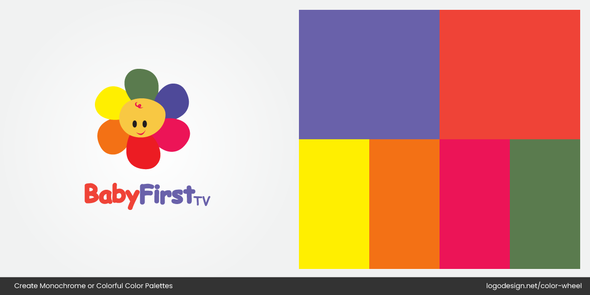
BabyFirst TV using a multi-colored logo for a playful theme
NBC using a multi-colored logo to show its identity
Let’s take a look at where multi-color logos shine and where they can fall short.
Pros of Multi-Color Logos
• Strong Emotional and Visual Appeal
Multi-color logos instantly catch the eye and elicit emotional responses.
Google using a multi-color logo to build curiosity and show accessibility
Brands like Google use primary colors to feel friendly, curious, and accessible, perfect for a brand rooted in discovery.
Instagram using a multi-color gradient in its logo to show creativity
Instagram’s gradient logo also stands out, evoking creativity and warmth.
• Perfect for Lively, Playful Brands
Multi-color is a natural fit for brands that target fun, energy, or youthfulness.
Tourism Australia using a multi-color logo to target a creative audience
Skittles using a multi-color logo to appeal to kids
Tourism Australia and Skittles use vibrant palettes that reflect creativity and childhood joy. With these logos, these brands target kids, creatives, and entertainment audiences.
• Can Represent Diversity or Multiple Ideas
When a brand needs to convey variety, inclusivity, or layered messaging, multi-color can do the heavy lifting. It is especially useful for platforms or services offering many features.
Microsoft using a multi-color logo to show its platforms and products
Consider Microsoft’s four-color window logo that showcases its wide range of products and platforms.
Cons of Multi-Color Logos
• Risk of Feeling Cluttered or Dated
Using a multi-color logo without designing it well is a common logo color mistake, as it can feel chaotic or overly busy. Too many hues without harmony can make a logo look amateur or stuck in a past trend.
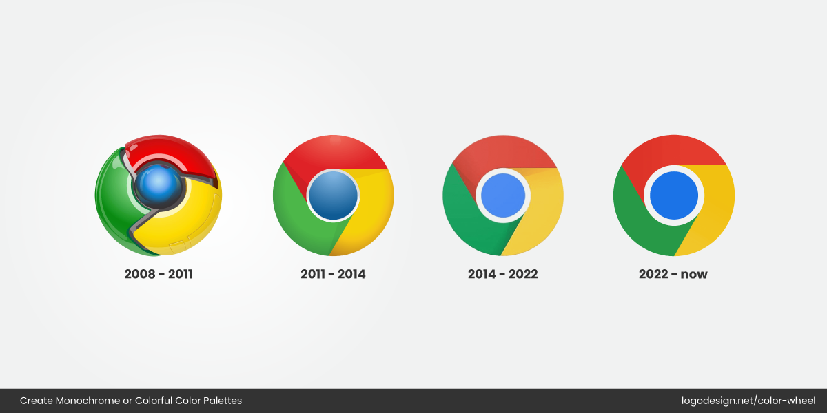
The evolution of the Google Chrome multi-color logo from 2008 to date
Early versions of the Google Chrome logo, for instance, were busy and overly shiny and were later simplified for clarity.
• More Complex to Reproduce Across Formats
Multi-color logos can be trickier to scale, print, or adapt across different media, especially if subtle color variations don’t translate well.
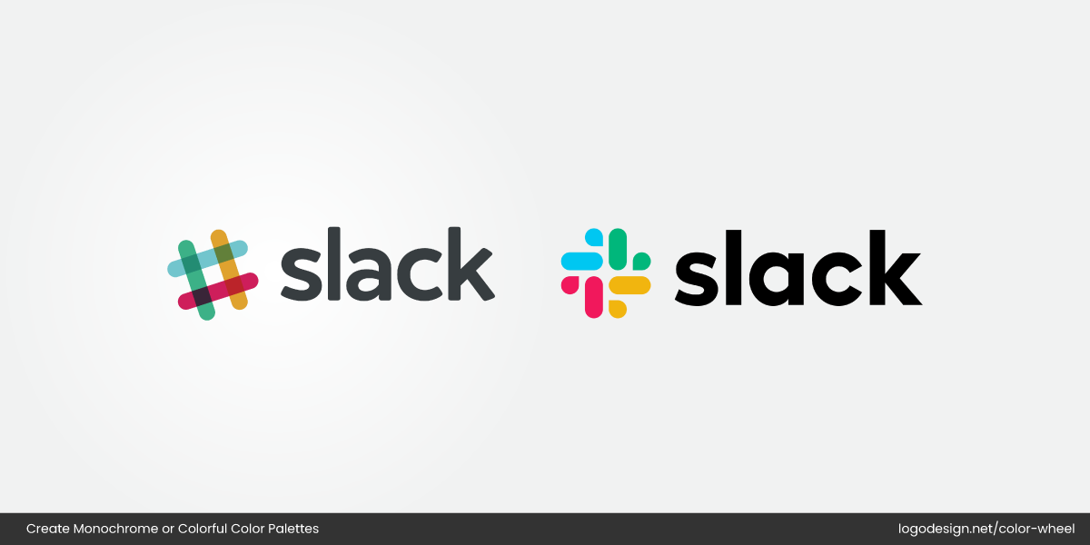
The transformation of Slack’s multicolor logo from having a high to low opacity in its colors
For example, Slack’s original multi-colored logo had printing challenges and was eventually redesigned into a simpler, more cohesive four-color mark.
• Poor Visibility in Monochrome Settings
If a logo depends heavily on color to be understood, it might lose impact when printed in black and white or used in minimal formats. Sure, minimal design has its appeal, but without contrast or structure, your logo design may fall flat.
Monochrome vs. Multi-Color Logos in Action
Some brands make their mark with just one bold shade. Others light up with a burst of color. Both can be indelible; it just depends on the story they want to tell. Let’s look at real-world logos that get it right, each in their unique way.
Monochrome Done Right
Balmain
Balmain using a monochrome logo to show boldness and confidence
Balmain’s all-black palette delivers a sense of structure, boldness, and high-end confidence. The stylized “B” paired with a simple wordmark logo strips away distractions and allows the brand’s fashion-forward attitude to shine. In a world of ever-changing color trends of logos, Balmain’s monochrome identity stays timeless, making a strong impression without relying on color.
Acne Studios
Acne Studio using a monochrome logo with a simple black wordmark to give a clean look
Acne Studios uses a simple black wordmark—lowercase, sans-serif, and unembellished—that reflects its clean, Scandinavian design roots. The monochrome logo feels modern and understated, letting the fashion take center stage. By keeping its identity minimal, Acne Studios’ fashion logo positions it as effortlessly cool and confident, proving that simplicity in logo design can be a powerful branding tool.
Asana
Asana using a calm coral tone in the logo for a balanced look
Asana’s logo features a calm coral tone paired with three simple dots arranged in a triangle. The minimal design reflects clarity, balance, and thoughtful structure—core traits of a brand built around productive workflows. Its circle logo and single-color palette keep things clean and modern, helping the logo stand out quietly in a space filled with busy branding.
Spotify
Spotify using a green tone to give a fresh, digital-first look
Spotify’s logo uses a signature green tone that instantly pops on screens. Their music logo’s single-color approach gives them a fresh, digital-first vibe while staying simple and scalable. Even without gradients or detail, the green wordmark and ripple icon make it stand out in app stores and playlists. So when it comes to flat vs. gradient logos, their logo is a proof that color alone can own brand recognition.
Dell
Dell using a blue-colored logo to show dependability in the tech world
Dell’s all-blue logo reflects dependability, logic, and trust, key traits in the tech world. With its simple, curved wordmark and confident blue tone, Dell proves how a single color can project clarity and professionalism without overcomplicating the design. Its minimalist yet modern tech logo is widely adaptable across packaging, screens, and hardware.
Multi-Color Done Right
Monday.com
Monday.com using multi-colored strokes to show a constant flow of activity
Monday.com’s logo features bold red, yellow, and green blocks to symbolize activity, flow, and collaboration. The vibrant colors bring energy to a space often dominated by sterile corporate branding. For a productivity platform built to simplify teamwork, the multi-color communication media logo makes the brand feel lively, approachable, and action-oriented—perfect for encouraging engagement and movement across tasks.
Wipro
Wipro using multi-color dots on the logo to signal innovation and connectivity
Wipro’s circular and dot-filled information technology logo uses various vibrant colors to symbolize innovation, connectivity, and diversity. As a global tech and consulting giant, Wipro’s multi-color identity reflects its broad expertise and human-centric approach to problem-solving. The dynamic palette positions the brand as modern and inclusive, while the clean layout keeps it future-forward.
Care Bears
Care Bears using a multi-color logo that shows cheerful energy
The Care Bears’ logo is full of charm and cheerful energy, reflecting its roots in playful, heartwarming storytelling. With soft rainbow tones and a whimsical typeface, it’s an ideal example of a multi-colored child logo that instantly appeals to everyone. The multi-color scheme reinforces the brand’s message of love, fun, and friendship.
The Benevolent Society
The Benevolent Society logo using a multi-color logo that shows care and growth
Australia’s oldest charity, The Benevolent Society, uses a gentle multi-color burst in its logo to symbolize community, care, and growth. The overlapping tones create a sense of harmony and shared purpose—everything an NGO logo design should represent. It’s welcoming, modern, and rooted in its values of support and social change.
United Way Worldwide
The United Way using a multi-color logo that shows community impact and unity
United Way’s logo combines blue, red, yellow, and white to reflect compassion, unity, and community impact. Each color plays a role, for example, blue for trust, red for action, yellow for hope—mirroring the organization’s work in education, health, and financial stability. Its vibrant, multicolor charity logo speaks to a wide audience and helps the logo feel human, inclusive, and purpose-driven across all platforms.
Each of these brands chooses its color strategy with intent. Monochrome works when simplicity and clarity are key. Multi-color shines when expression and energy take center stage.
When to Choose a Monochrome or Multi-Color Palette
As we’ve already discussed, there’s no one-size-fits-all answer when it comes to your logo’s color direction. What works for a luxury fashion house might fall flat for a children’s toy brand. The choice between monochrome and multi-color should be shaped by your brand’s identity, goals, and practical needs.
Below are key factors to help you decide:
When to Choose Monochrome vs. Multi-Color Logo Palettes |
||
| Criteria | Monochrome Palette | Multi-Color Palette |
| Brand Personality | Sleek, timeless, professional | Energetic, playful, diverse |
| Industry/Market Expectations | Law, finance, fashion, luxury | Tech, media, children’s products, creative agencies |
| Design Complexity | Simple, minimalistic designs | Bold, dynamic, layered designs |
| Reproduction Needs | Ideal for stamps, embossing, embroidery | Best for digital, large-scale, full-color formats |
| Scalability | Maintains clarity at any size | May lose clarity or contrast in small applications |
| Budget Considerations | Lower printing costs (one ink) | Higher printing costs (multiple inks or CMYK) |
| Branding Flexibility | Clean, easily adaptable to any background | Requires careful background planning |
| Emotional Tone | Trustworthy, authoritative, elegant | Friendly, expressive, innovative |
| Timelessness | Less likely to age or go out of style | May feel trendy or era-specific |
Brand Personality
Every brand has a vibe, and your logo should match it. If your personality leans toward calm, refined, or professional, a monochrome logo can communicate that with subtle strength.
Jack Daniel’s using a monochrome logo that shows strength, heritage, and mystery
Brands like Jack Daniel’s use simple color schemes to project elegance and control.
On the other hand, multi-color logos bring energy and warmth to the table.
Brands like Huawei use vibrant hues to reflect creativity, optimism, and personality. After all, colors tint emotions—so the shades you choose should reflect the feelings you want to inspire in your audience.
Industry and Market Expectations
Your industry often sets the tone. Different industries use color in logos differently. High-end fashion labels, law firms, architecture studios, and financial institutions usually prefer monochrome logos because they signal clarity, authority, and timeless design.
Calvin Klein using a monochrome logo to show elegance, simplicity, and authority
Hugo Boss using a monochrome logo that shows power, luxury, and confidence
Brands like Calvin Klein or Hugo Boss stick to simple black logos that project elegance and trust.
On the flip side, multi-color logos are common in industries where creativity and energy are key, such as media, education, wellness, or kids’ products.
Duolingo using a green-colored logo with a touch of orange to show growth and energy
Canva using a logo with a cool gradient to show creativity and clarity
Companies like Duolingo use bright green with colorful accents to feel fun and approachable, while Canva incorporates color gradients to reflect creativity and accessibility in logo design.
Target Audience
Who you’re speaking to matters. A mature, high-end audience might respond better to the restraint and sophistication of a monochrome logo. Meanwhile, younger audiences—especially Gen Z and families—tend to gravitate toward color-rich logos that feel engaging and relatable.
Other than that, culture shapes color choices in global branding. For example, the color white represents innocence and peace and is popularly used in healthcare and bridalwear. However, many cultures associate the same color with death and mourning. Thus, choose colors based on who’s on the receiving end of your brand’s message.
Versatility and Scalability
Monochrome logos are often easier to adapt across mediums—from billboards to business cards, postcard designs and embroidery to app icons. They lose nothing when scaled or printed in black and white.
Rimac using a monochrome logo to show power and luxury
Rimac’s black shield logo with the R mark is a perfect example.
While vibrant, multi-color logos may require simplification for certain uses, and can be more challenging to maintain consistency across formats.
Emotional Impact and Storytelling
Multi-color logos allow for a more emotional range. You can convey multiple ideas—diversity, innovation, excitement—just through color alone.
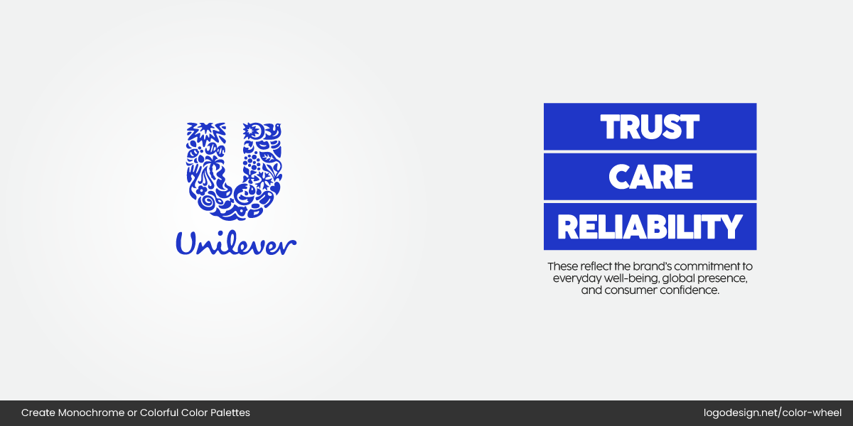
Unilever using a rich blue color in the logo to display trust and care
Unilever, for instance, uses a rich blue logo filled with symbols (leaves, hearts, suns), each representing a different part of its mission around sustainability, health, and well-being. The color and the details together tell a story.
Monochrome logos, on the other hand, often rely on form and restraint to speak volumes.
BBC using a monochrome logo to display authority and clarity
BBC’s black-and-white block logo, for example, reflects authority, neutrality, and global credibility. Its stark simplicity allows it to remain timeless without a single drop of color.
Key Takeaways
Whether you’re leaning toward bold simplicity or expressive vibrancy, what matters most is designing with intention. Create a logo that echoes your brand’s voice and connects with your audience.
- Monochrome logos offer timeless appeal, clarity, and versatility, which is perfect for brands that value elegance, control, or minimalism.
- Multi-color logos shine when emotional expression, energy, and storytelling are central to your brand.
- Consider your industry, audience, and personality before building your color palette.
- Colors evoke emotions—the right hues can shape perception before a single word is spoken.
- There’s no one-size-fits-all; the best logo color choice is one that reflects your brand’s truth.
