What is easier to remember: 82 or 19276? Same with logos. In a world full of visual noise, the simplest ideas often stick best.
Ever looked at a logo and felt like it was trying too hard? Too many colors, too many shapes, too much going on. Now, consider the red bullseye or a swoosh – our brains encode these logos in mere seconds. These clean and simple marks are easy to recall and even easier to trust. That’s quite the power of simplicity.
Simple designs, powerful brands.
One might associate simple with boring, but that’s not the case. Simplicity in logo design means smarter design choices that tell your story with clarity. Simple logos scale better, print cleaner, and feel timeless without needing constant updates. And when done right, they say everything your brand stands for, without saying too much at all.
In the following sections, we’ll unpack why stripping back is often the smartest move and how a simple logo can carry serious weight in building brand recognition.
The Concept of Simplicity in Logo Design
In logo design, simplicity means cutting out the extras and keeping only what’s necessary. A simple logo focuses on one strong idea. Clean shapes, limited colors, and thoughtful spacing all work together to create a design that’s easy to recognize and hard to forget. It’s the kind of logo you can spot on a business card or a billboard and still know exactly who it belongs to.
McDonald’s Golden Arches: simple, bold, and instantly visible.
Take McDonald’s golden arches, for example. They alone are enough to spark instant recognition. No need for words or complex symbols, their logo works just as well on a drive-thru sign as it does on a Happy Meal box.
Uniqlo’s logo: clean, minimal, and effortlessly recognizable.
Uniqlo’s square typography logo in a red box is also instantly identifiable. It reflects their brand: modern, straightforward, and strong. Nothing feels forced or overly designed.
So, when we compare minimalist vs. maximalist design, a pared-back approach often has a stronger impact. Simple logos don’t overwhelm viewers and give your brand some breathing room.
Watch this video to have a better understanding of simplicity in logo design.
What Is Simplicity in Logo Design?
Why Simplicity Matters in Logo Design
Logo design has come a long way from detailed and busy visuals to clean and straightforward ones. While complex logos might look artistic, too many details can make them hard to process. That’s why many brands have stripped away the extras in an attempt to make their company logos easy to process.
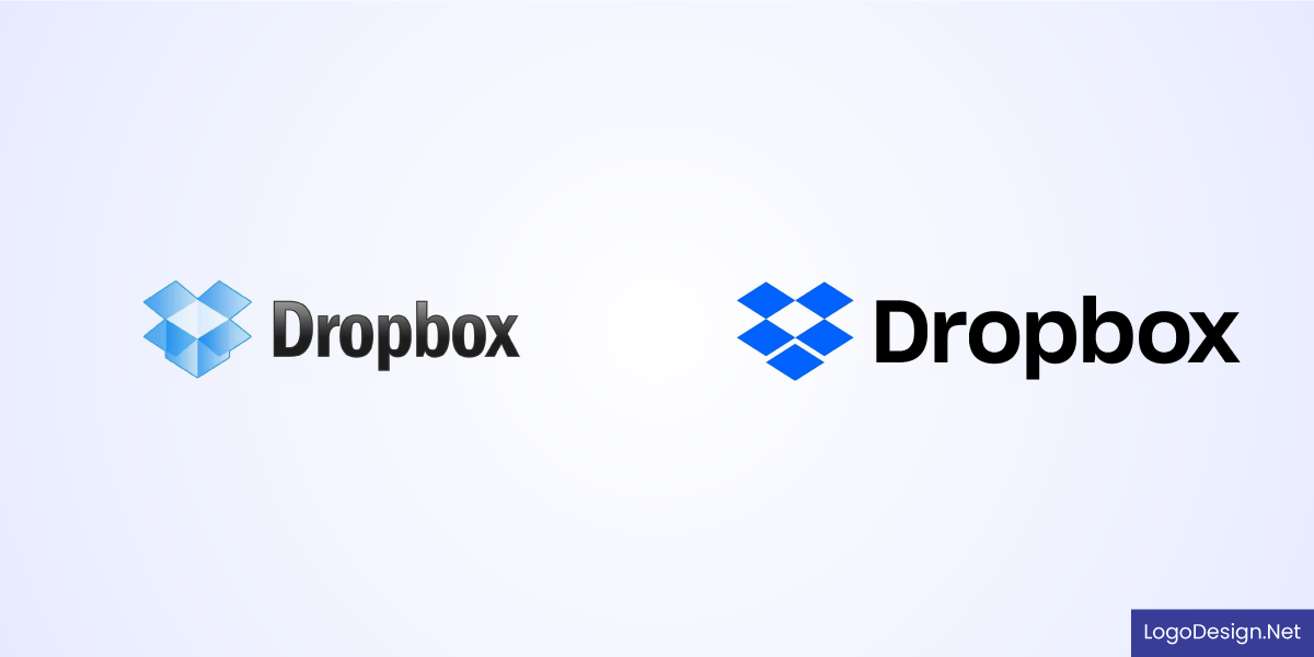
Dropbox – Simple box icon, clean and instantly functional.
Dropbox’s old logo also featured a 3D-style open box icon with more depth and gradients. What we see today is a newer, refined version with more clarity and scalability. It’s a perfect example of how simplicity doesn’t take away a brand’s personality but instead polishes it.
Here are some more benefits that a simple logo design brings.
Easy to Recognize
Recognition comes from consistency and clarity. If your logo is clean and simple, it’s easier for people to spot and remember.
Aesop – Understated elegance with quiet, typographic confidence.
Look at Aesop. Their understated serif logo feels elegant, but it’s not trying too hard either. It works perfectly across their entire brand, for instance, on bottles, ads, and storefronts, without ever losing its identity.
Memorable and Distinct
Being memorable doesn’t mean being loud; it means being clear.
Glossier – Soft, modern, and unapologetically minimal.
Glossier’s soft “G” logo feels modern and airy, but it’s distinct enough that you recognize it immediately. Instead of cluttering it with visual tricks, they stuck with a single shape that feels polished yet personal. That kind of minimalism leaves a stronger impression than something overdesigned.
Works in Any Format or Size
Your logo needs to function across everything from websites to packaging, social icons, and even stitched on fabric – something that’s pretty hard to do with an overly detailed logo. That’s why you must create a versatile logo.
Everlane – Honest, crisp design that mirrors its ethical ethos.
Most likely, you’re familiar with Everlane, whose logo keeps it smart with a simple sans-serif wordmark that scales effortlessly. It doesn’t rely on color or symbols, just clarity and balance, so it’s always legible – big or small, digital or print.
Stands the Test of Time
Trendy logos often need updates every few years. But if the design is clean and thoughtful from the start, it’ll stay relevant much longer.
Muji – No logo, no noise-pure, essential simplicity.
Muji is a great example. Their no-frills, minimal wordmark has barely changed in decades. It reflects quiet confidence, which shows that less can do more when done with purpose.
Looks Great in Black and White
A solid logo shouldn’t depend on color to be effective. Strip it down to black and white, and it should still hold its own.
The Ordinary – Clinical, stripped-down, and radically transparent.
The skincare brand The Ordinary does this well; its clean, minimal logo looks sharp whether it’s on a white bottle or a black banner. A simple layout and strong type choices are what make it stand out without needing extra flair.
Ways to Create a Minimalistic Logo
When logos like Daily Paper, Bang & Olufsen, and Oatly exist, you can’t really say minimal means bland. Just like these, great minimal logos are carefully thought out and built on an understanding of the brand they represent.
Daily Paper, Bang & Olufsen, and Oatly Logos: Playful type-led identity with activist energy.
If you’re aiming to create a logo for your business, here are some helpful rules to follow.
Know What Your Brand Stands For
Before picking colors, fonts, or the right logotype, step back and think about what your brand is all about. Is it bold and playful? Calm and luxurious? Your logo should reflect that vibe right away. This clarity also helps shape the look and feel of your logo so that it connects with the right audience.
Grove Collaborative – Clean, nature-inspired design with a modern touch.
Grove Collaborative, a sustainable home goods brand, uses a clean wordmark that quietly reinforces its eco-friendly mission.
Italic, a brand focused on affordable luxury, reflects its stripped-back, direct model with a sleek, no-fuss logo.
Use Simple Shapes and Lines That Attract
Who says you need complex graphics to make an impression? Even basic shapes like circles, squares, or clean lines can become surprisingly powerful when paired with the right message.
Figma – Colorful icon, intuitive and instantly recognizable.
Less truly is more, and the clever use of geometry in Figma’s overlapping forms is its perfect illustration.
Another great example is Milanote, whose logo combines simplicity with a creative edge that fits its visual workspace tool. Both designs are rooted in simplicity yet feel distinct and fresh.
Stick to Just One or Two Colors
Too many colors can clutter your logo, whereas using just one or two well-chosen colors can increase its impact. A limited palette keeps your logo design flexible and works well across various backgrounds and materials. Learn the color psychology to understand emotions typically associated with colors.
Blue Bottle Coffee – A single blue bottle says it all.
Blue Bottle Coffee has a standout restaurant logo you can never miss. The logo has a single blue icon of a bottle that’s quick to spot on everything from cups to storefronts.
Keep Your Fonts Clean and Readable
If your logo includes text, the typeface needs to be legible and on-brand, without unnecessary frills. A clean font can do a lot of heavy lifting in keeping the design timeless.
Drink Haus – Minimalist bottle, bold flavor branding.
Drink Haus, a low-alcohol beverage brand, uses a distinctive but minimal serif that catches the eye without being flashy. The font used keeps things simple while also showing the brand’s personality.
Utilize Negative Space Appropriately
Negative space is a smart design element for every modern logo. By sharing the space around or between elements, you can add depth and meaning without clutter. This approach keeps logos clean while giving them a clever twist.
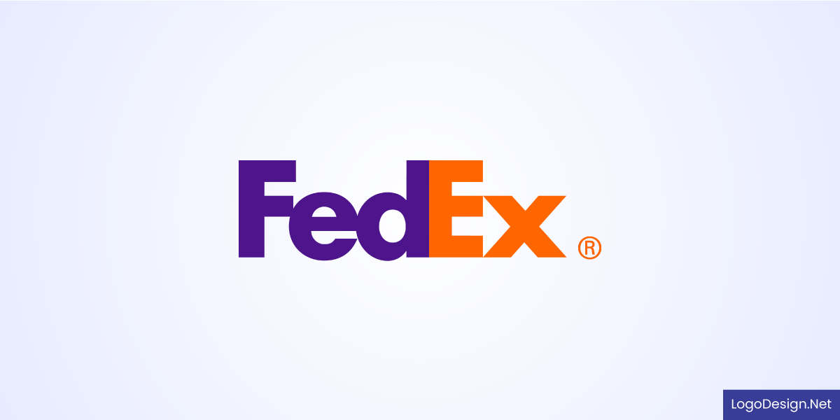
FedEx – Smart use of space—arrow hidden in plain sight.
The FedEx logo is a classic case. Tucked between the “E” and “x” is an arrow that subtly reinforces speed and direction without adding extra parts. It’s a good example of how negative space paired with minimal design can still carry a strong visual impact.
Keep Balance and Proportion in Check
Balance and proportion are what make a minimalist logo feel sleek and professional. Balance doesn’t always mean symmetry. Sometimes, an asymmetrical layout can look just as stable and intentional when the visual weight is distributed thoughtfully.
Proportion, on the other hand, ensures that each element, such as text, icon, or shape, has good visual harmony. When these two are done right, your logo won’t feel lopsided at all. Instead, it will feel grounded and naturally pleasing to look at.
Focus on Versatility, Not Details
While it’s tempting to add details, too much can blur your message. Your logo should work everywhere, from screens to packaging to signage. That means keeping details to a minimum so it scales without losing clarity.
Carhartt – Rugged simplicity built to last.
Carhartt’s curled “C” is an ideal example. The logo is simple but unique enough not to be mistaken for a different brand. Its versatility makes it easier to reproduce across print, web, apparel, and various other branding needs.
Industries That Can Benefit from a Minimal Logo
There was a time when logos were packed with symbols, shapes, and hidden meanings. That style had its moment, but today, things are different. With people scrolling fast and attention spans getting shorter, clarity wins over complexity.
Here are some of the many industries where minimalist logos can really make an impact:
Photography: Clean, subtle photography logos let your photos do the talking while still reinforcing your creative identity.
Spas & Wellness: A light, calming spa logo design gives off the peaceful vibe clients expect even before they walk in.
Fitness: Strong lines and minimal design reflect focus, movement, and drive in a fitness or gym logo, without being over the top.
Gaming: Simple, bold gaming logos cut through the noise and appeal to both casual players and serious fans.
Minimal logos fit the way we live and connect today. Many other industries are already making the shift, and for good reason.
Famous Brands That Prove Minimal Logos Work
You don’t always need a loud or detailed logo to leave a lasting impression. Some of the most recognizable brands in the world have gone the minimal route, and it’s worked brilliantly. Their success shows that when done right, simple can be powerful.
Apple

Apple – One bitten apple. Instantly iconic.
Apple didn’t start out with a sleek logo. In fact, its first version in 1976 was a busy sketch of Isaac Newton under an apple tree complete with a quote and an ornate frame. Fast-forward to today, and the clean, bitten apple silhouette is instantly recognizable everywhere. No words needed, just a shape that speaks volumes.
Louis Vuitton
Louis Vuitton – Monogram mastery with timeless luxury.
Luxury doesn’t have to scream for attention. The Louis Vuitton monogram is proof. Just two initials, designed in a timeless serif font, make up one of the most elegant and iconic fashion logos out there. Its simplicity adds to the brand’s high-end feel and it’s stayed consistent for decades.
Mastercard
Mastercard – Two overlapping circles, global recognition.
Two overlapping circles, red and orange, and a clean, modern typeface. That’s all it takes for Mastercard to stand out. The logo’s been simplified over the years, but those bold circles have always remained. It’s minimal, yes, but it’s also full of energy and instantly tied to the brand.
Closing Thoughts
At the end of the day, your logo doesn’t need to be extravagant to get noticed; it just needs to be clear and confident. Stripping back to the essentials can feel risky, yet it’s where real personality shines through.
If you’re launching something new or reworking an old favorite, give simplicity a chance. You might find it’s exactly what your brand has been asking for. While you do, make sure to watch out for these logo design mistakes to make a highly memorable logo.
