2025 proved that great logo design is about subtle brilliance. See how brands refreshed their look, refined their identity, and stayed instantly recognizable without shouting for attention.
Every year brings a fresh wave of rebrands, but 2025 stood out for a quieter, more thoughtful reason. Instead of chasing shock value, many well-known brands chose restraint. They refined what people already recognized, fixed what no longer worked, and adjusted their identities for a world that lives on screens of every size. The result was not a parade of dramatic makeovers, but a set of smart, confident logo transformations that respected brand history while preparing for the future.
What made these rebrands work was clarity. Logos became easier to read, simpler to scale, and more flexible across apps, packaging, and motion. There was also a noticeable shift in tone. Brands leaned into warmth, approachability, and personality without losing credibility. In several cases, long-standing symbols were not removed but given room to breathe, proving that familiarity still matters when handled with care.
This article looks at the best logo transformations of 2025. Each example shows how small, deliberate design decisions can quietly change how a brand feels. These logos don’t shout for attention; they earn it by getting the fundamentals right.
1. Amazon

Amazon’s 2025 logo transformation was subtle but significant. This was the brand’s first serious visual update in over two decades, and it was handled with restraint by design studio Koto. At Amazon’s scale, even small inconsistencies become obvious. The goal here was not to surprise people, but to bring order and warmth to a brand that touches almost every part of daily life.
The redesign focused on clarity and cohesion. Amazon needed a versatile logo system that could perform just as well on a phone screen as on a warehouse wall or a delivery van. The refresh tightened the brand’s visual identity while maintaining the familiarity customers trust. Nothing feels experimental. Everything feels deliberate.
• The Type System
Amazon introduced a custom global typeface designed to unify its entire ecosystem.
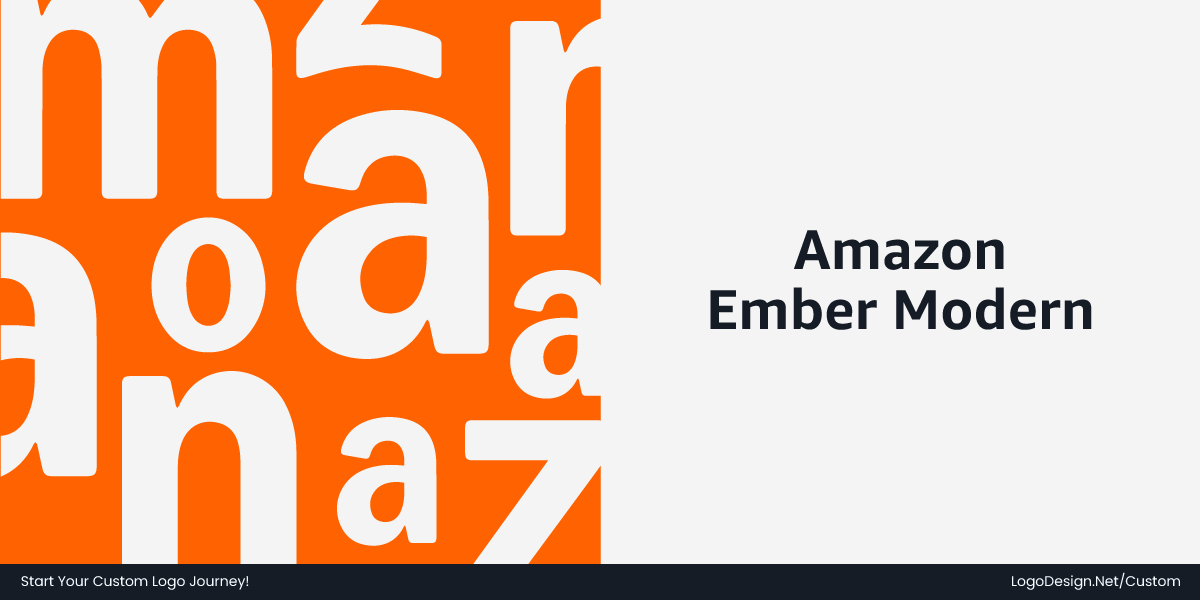
Building on Amazon Ember — the utilitarian font originally created for Kindle and UI clarity — the brand evolved it into Amazon Ember Modern, refining the letterforms to feel rounder, more open, and more expressive. The result improves readability at small sizes while giving Amazon a warmer, more approachable tone.
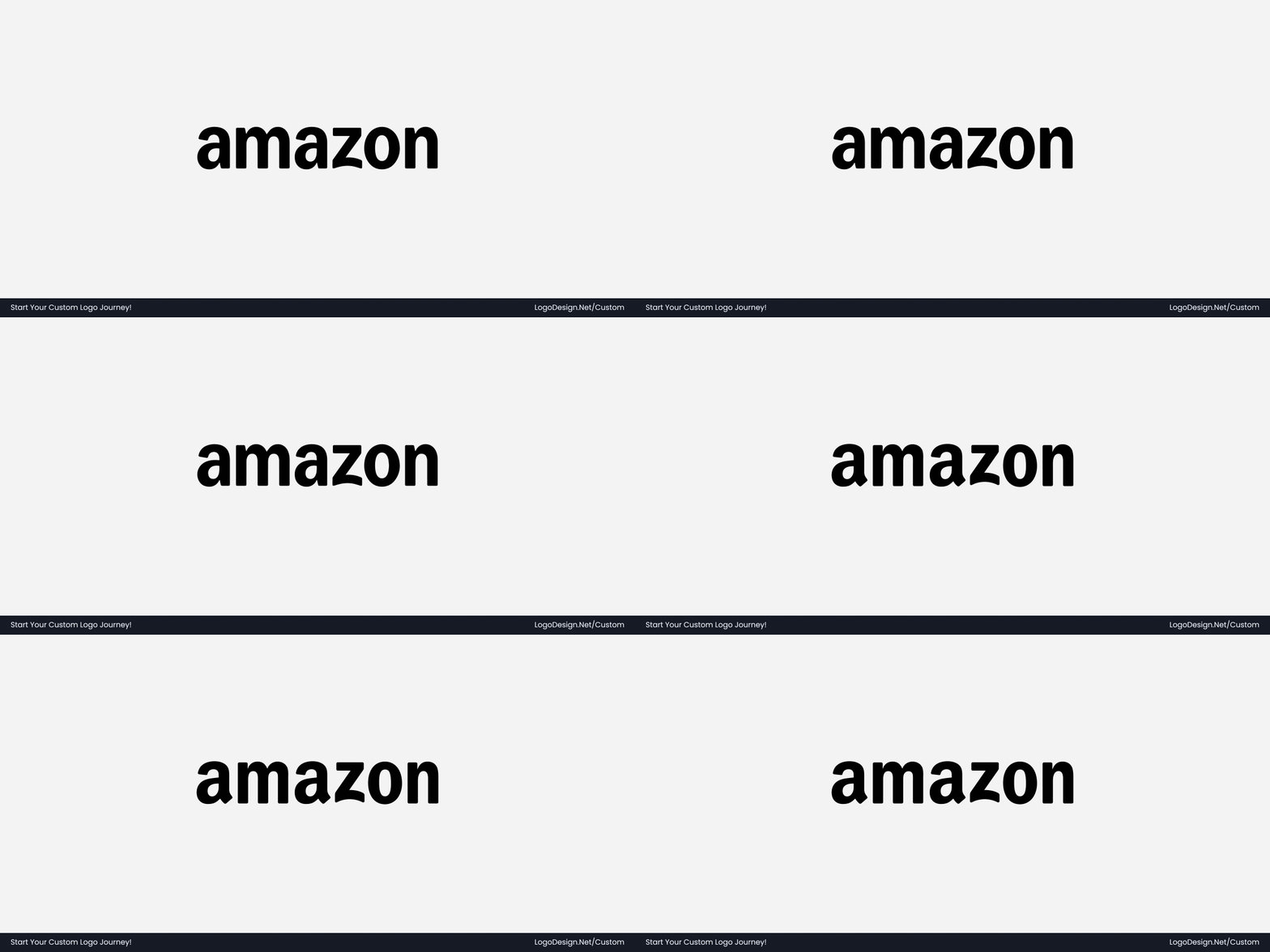
By extending Ember Modern to the logo wordmark itself, Amazon quietly aligned its typography, logo, and product interfaces into a single, cohesive system — a subtle but powerful move that makes this one of the strongest logo updates of 2025.
- Ember evolved from UI-first to brand-wide
- Softer curves, more open counters
- Better small-size legibility
- Logo and brand now use the same typeface
- One system across global markets
• Brand Colors
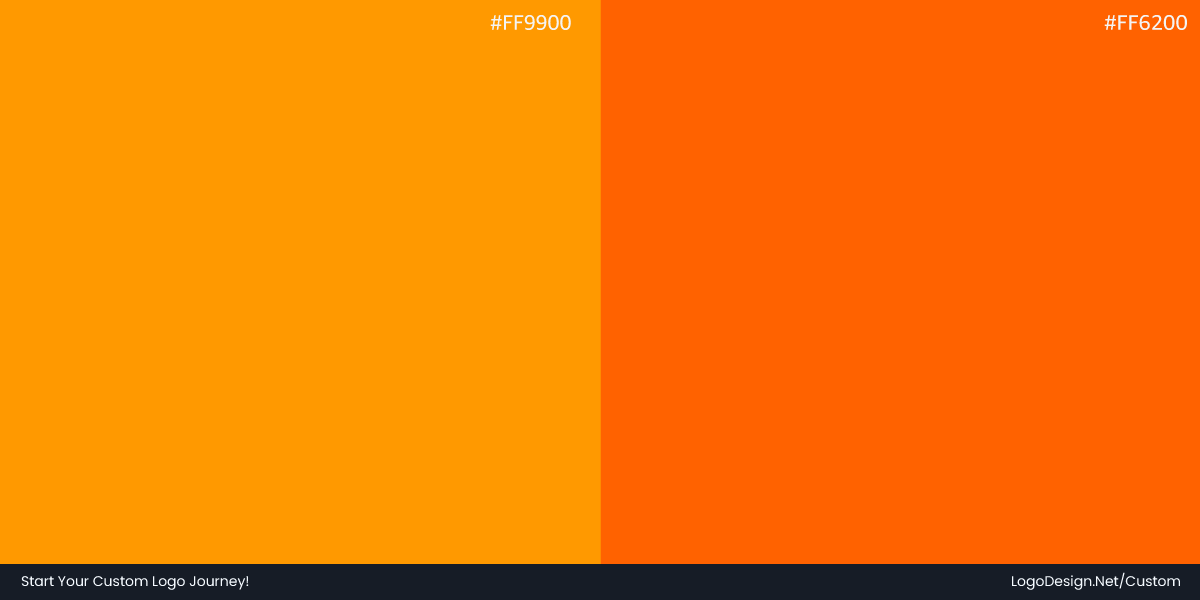
Amazon’s logo color was updated to a slightly darker, warmer shade of orange, bringing more warmth and presence across digital interfaces, packaging, and delivery vehicles. The refined brand color palette improves contrast and visibility while staying true to the brand’s recognizable identity.
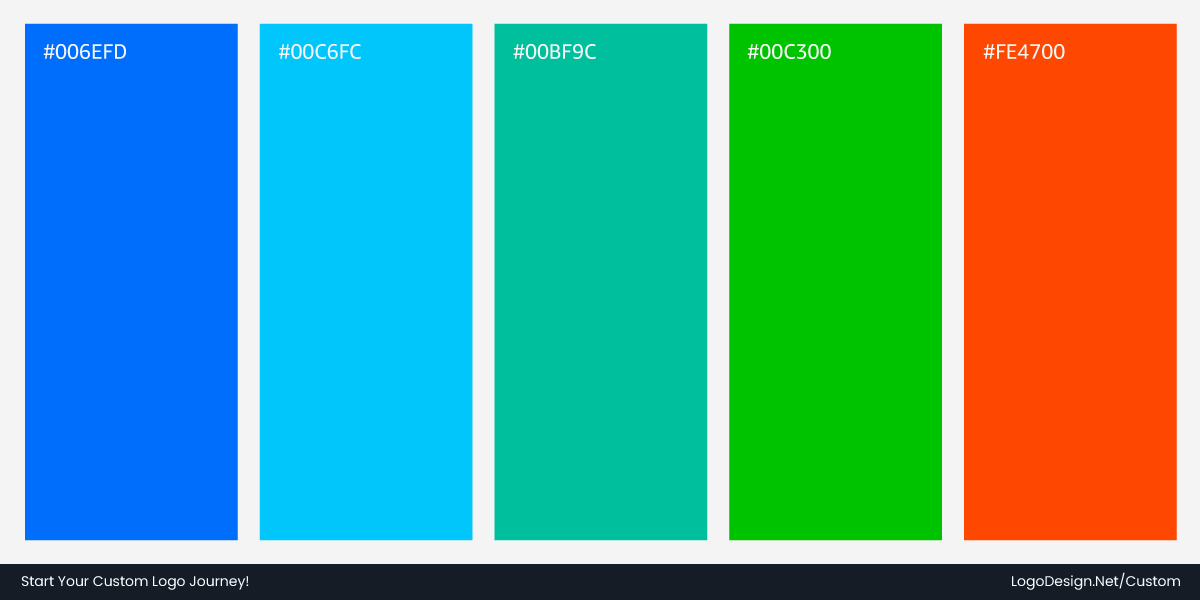
Beyond the logo, Amazon’s many sub-brands are organized into cohorts, each with its own purposeful color palette that feels distinct yet connected. Grocery-focused brands lean into fresh greens, healthcare-related services use turquoise-inspired tones, and Prime favors a saturated, digital-forward look, unified by the Smile Orange, keeping every part of the system unmistakably Amazon.
• Refining the Smile
The iconic smile remains the emotional anchor of the logo. Its shape and spacing were subtly adjusted to create a more balanced, confident feel. It now scales better across icons, apps, and motion without losing its character.
Takeaway: Built to Scale
Every adjustment in Amazon’s 2025 refresh was made with logo scalability in mind. From tiny phone screens to massive warehouse signage and delivery vans, the updated logo remains consistent, legible, and unmistakably Amazon.
This transformation demonstrates how a mature brand can evolve without losing its identity. By focusing on typography, color, and usability, Amazon demonstrates that thoughtful refinement can be far more powerful than dramatic change, proving that subtle, deliberate updates can strengthen a global brand at every touchpoint.
2. Walmart
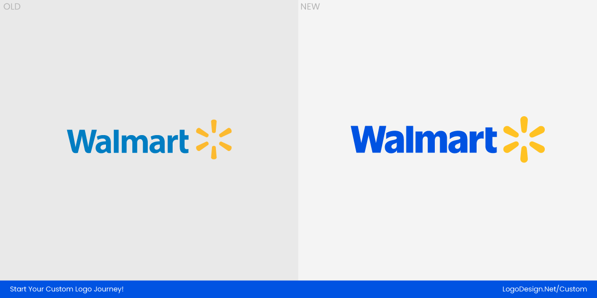
Walmart’s 2025 logo transformation followed a similar philosophy of refinement over reinvention. The brand did not try to distance itself from its past. Instead, it focused on modernizing familiar elements that had started to feel dated in a digital-first world. The update was about making the logo clearer, warmer, and easier to use across thousands of stores, apps, and touchpoints.
The redesign was created in partnership with Jones Knowles Ritchie and Walmart’s in‑house creative team, who together refined the wordmark, spark icon, and overall visual system.
For a brand as widespread as Walmart, consistency is everything. The previous identity worked, but it lacked flexibility and polish when scaled down for mobile screens or adapted for newer digital experiences. The 2025 refresh addressed these issues while reinforcing Walmart’s position as an accessible, everyday brand.
• The Type System
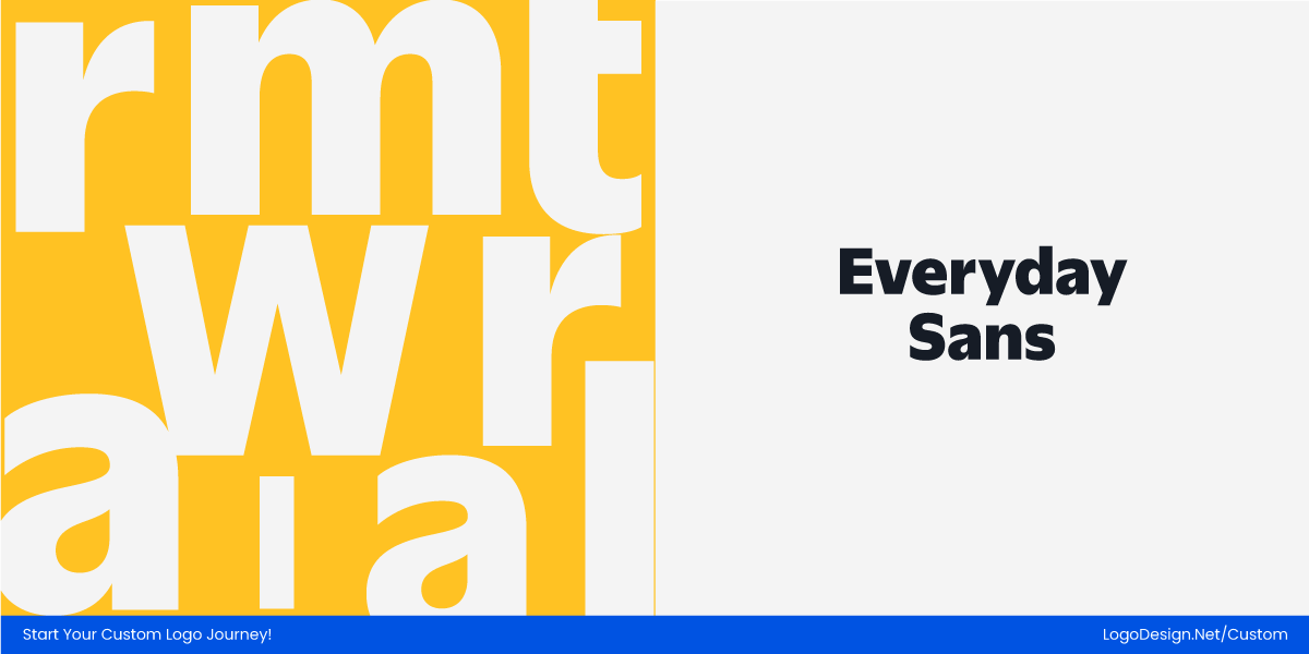
The Walmart wordmark was subtly reworked using a custom typeface, Everyday Sans, based on Antique Olive Black. The new font gives the wordmark a stronger, more balanced presence while remaining unmistakably Walmart.
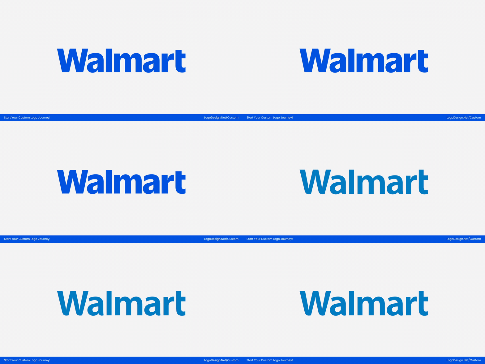
Every letter is crafted for better legibility at small sizes, smoother curves, and more even spacing, making it feel at home across digital interfaces, signage, and packaging. The Spark icon remains a separate visual element but works seamlessly with the wordmark to complete the logo system.
- Wordmark set entirely in Everyday Sans (no secondary fonts)
- Letterforms feel bolder and more balanced
- Improved small-size legibility for apps and UI
- Smoother spacing and curves for a modern look
- Wordmark and Spark icon are visually integrated
•Brand Colors
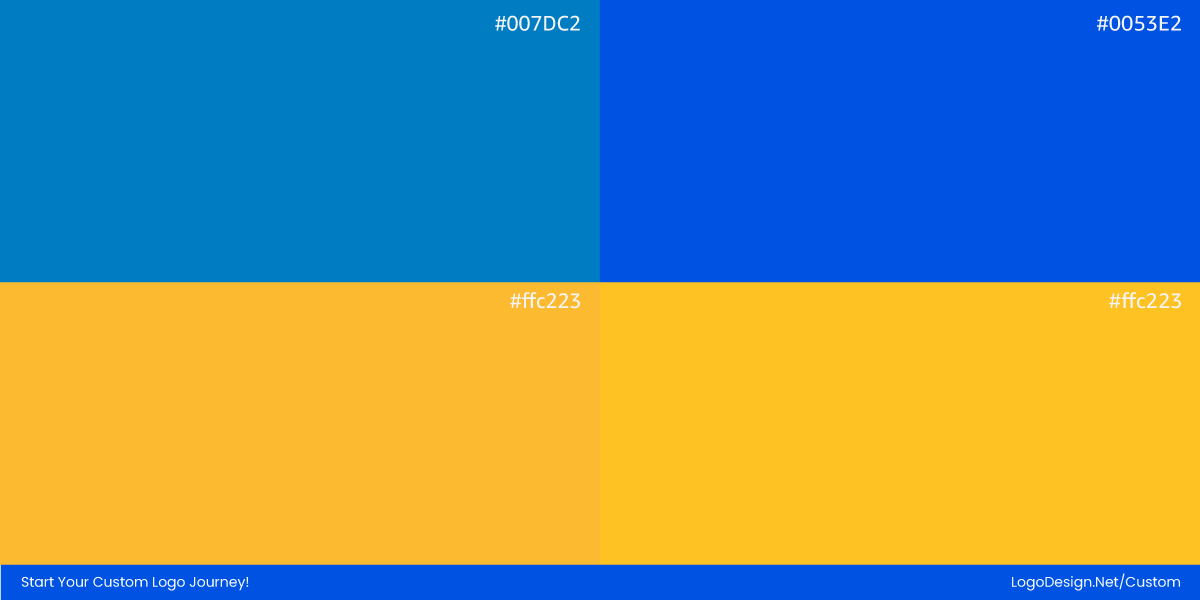
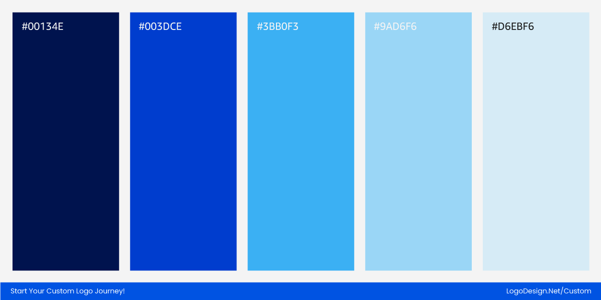
Walmart kept its signature blue and yellow, but refined its tones. The blue became slightly deeper and more consistent across platforms, while the yellow spark gained better contrast. These changes help the logo stand out more clearly on screens, signage, and packaging without straying from the brand’s long-established color identity.
• The Spark Symbol
The spark remains the most recognizable part of Walmart’s logo. In 2025, it was simplified and given more breathing room. The proportions were adjusted so it feels more intentional rather than decorative. This makes the symbol more versatile for app icons, in-store signage, and standalone use in digital products.
Takeaway: Everyday, Everywhere
Walmart’s 2025 logo refresh is all about being clear, friendly, and usable across every touchpoint. From app icons to store signage, packaging to internal systems, the brand now feels cohesive and intentional without ever looking forced.
The redesign proves that a familiar brand can modernize for a digital-first world while keeping its approachable, everyday personality intact. Thoughtful updates to logo typography, color, and the Spark icon make the logo more legible, flexible, and consistent — strengthening recognition at every level while staying unmistakably Walmart.
3. Mindbody
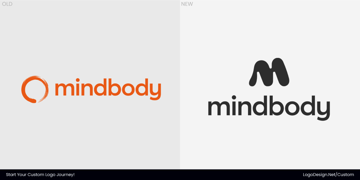
In June 2025, Mindbody updated its logo, which reflects a brand settling into its role as a long-term wellness platform rather than a simple scheduling tool. As the company expanded across fitness, beauty, and health services, its visual identity needed to feel calmer, more cohesive, and less utilitarian. The redesign was developed by the Mindbody Creative Team in‑house, capturing the energy, rhythm, and momentum the brand promotes across its products and services.
The update avoided dramatic shifts. Instead, it addressed small design decisions that had begun to show strain across mobile apps and web dashboards. The result is an identity that feels composed and intentional, especially in digital environments where the logo appears frequently and for long periods.
• The Type System
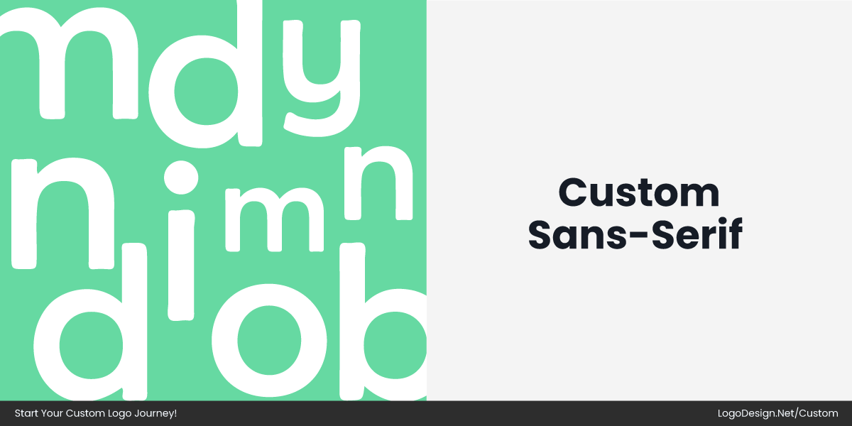
Mindbody’s updated identity features a custom in-house typography wordmark intended to feel calmer and more cohesive than the previous arrangement.
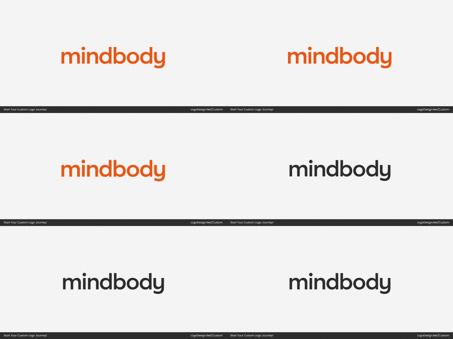
The new letterforms are rounded and balanced, designed to perform well in digital environments where the logo appears frequently, especially at small sizes. This softer, more natural typographic tone reflects the brand’s shift from a utility‑centric scheduling tool to a broader wellness platform.
- Rounded, friendly letterforms to reinforce a calm, approachable identity
- Improved character spacing for better legibility in app navigation and UI
- Designed to feel cohesive with the fluid “M” icon and overall brand system
• Brand Colors
The brand’s color palette was refined toward muted, wellness-focused tones. Cooler blues and soft teals became more dominant, paired with neutral grays to reduce visual strain. These colors create a sense of calm and trust while maintaining enough contrast for accessibility across screens.
• The ‘M’ Mark
The Mindbody symbol was refined to simplify its shape and correct uneven proportions, creating a cleaner, more harmonious “m” mark. The updated design feels lighter, more balanced, and more intentional, allowing it to scale gracefully across social media app icons, avatars, and in-product interfaces without losing clarity or definition. Subtle adjustments to curves and spacing make the symbol feel more fluid and dynamic, better reflecting the brand’s focus on movement and wellness.
Takeaway: Movement with Meaning
Mindbody’s 2025 logo update isn’t just a fresh look — it’s a visual expression of who the brand has become. After two decades evolving from a scheduling tool into a full wellness platform, the company wanted a symbol that reflects momentum, connection, and forward motion in every sense — from breath and heartbeat to business growth.
Rather than reinventing everything, the team focused on a logo mark that feels timeless yet purposeful, embodying energy and transformation while staying authentic to its legacy and audience. This refresh sets the stage for the next chapter in Mindbody’s evolution.
4. Eventbrite
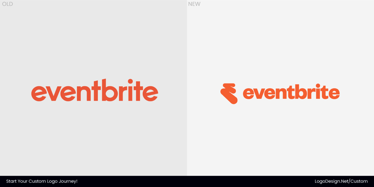
Eventbrite’s logo refresh revolved around tightening control rather than changing direction. The brand has always leaned into boldness and visibility, but its previous identity struggled to stand out in crowded digital spaces. With the logo appearing constantly across apps, tickets, listings, and promotions, even small design flaws became more noticeable over time. The update, developed in partnership with global design agency Buck, addressed those friction points without stripping away personality.
Instead of adding new elements, Eventbrite focused on cleaning up existing content. The redesign feels more disciplined, giving the brand a sharper presence while still matching the excitement of live events.
• The Type System
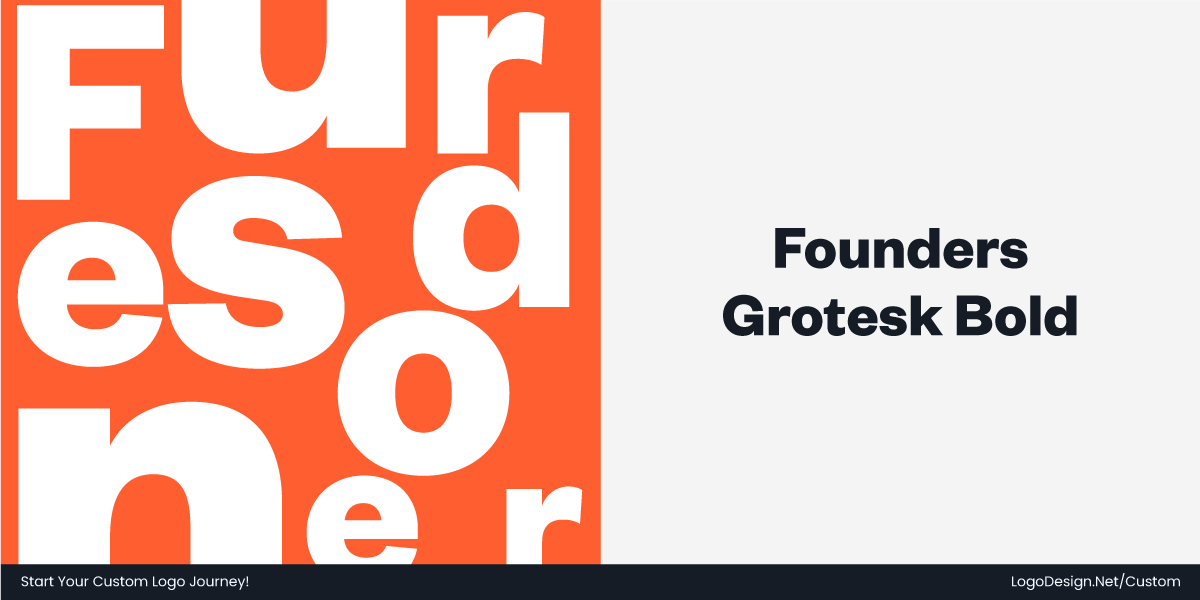
The Eventbrite wordmark was updated to use Founders Grotesk, a contemporary grotesque sans‑serif selected to give the brand a friendlier, more modern typographic voice.
In the new system, the letterforms are more open and balanced compared with the previous wordmark, which could feel heavy and inconsistent in tight digital spaces. Tightened spacing and refined weight distribution make the event company logo more legible at smaller sizes, especially on mobile screens and high-traffic UIs. Overall, the updated typography feels more cohesive with the energetic visual system and supports the expressive.
- More open and balanced letterforms vs. the heavier previous wordmark
- Tighter spacing improves clarity at small sizes
- Better suited for digital interfaces and diverse layouts
• Brand Colors
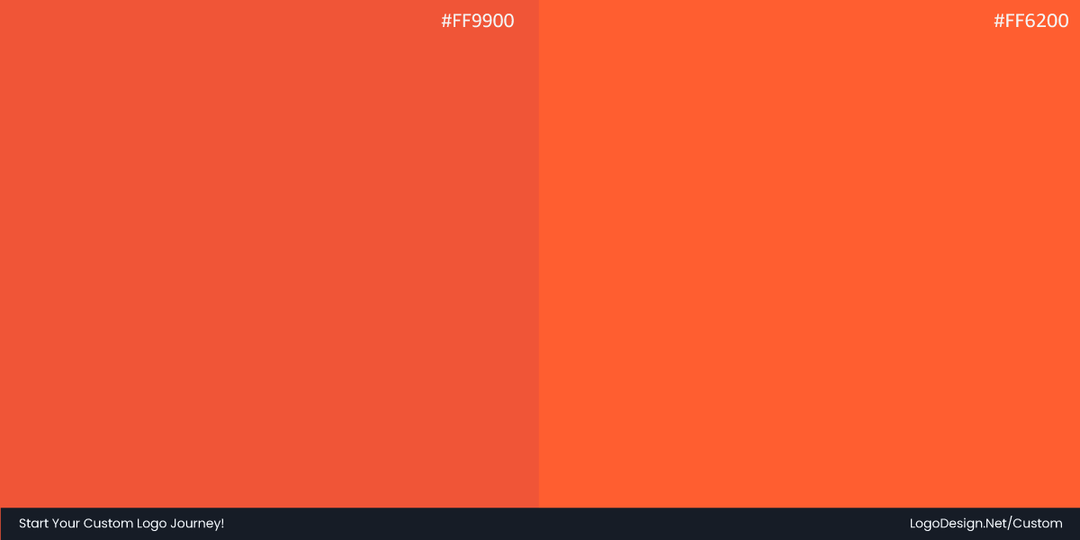
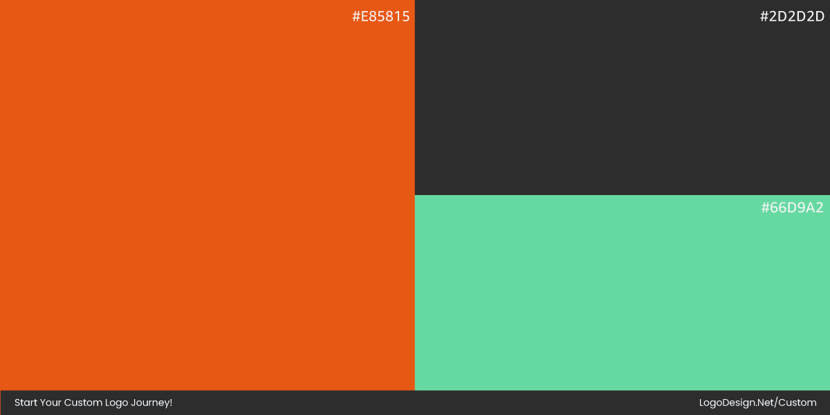
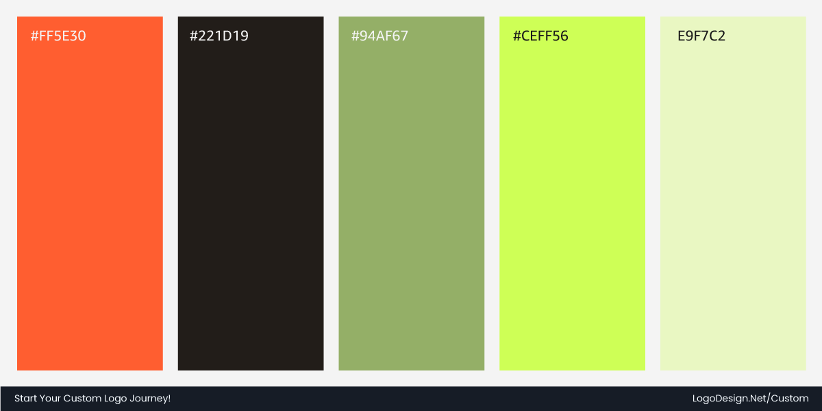
Eventbrite kept its recognizable orange, but refined its saturation for better screen performance. The updated shade feels brighter without becoming harsh, and it now pairs more consistently with dark gray and white backgrounds. These adjustments help the logo maintain characteristics across event pages, app interfaces, and promotional assets.
• ‘The Path’ Monogram
Eventbrite has introduced a new visual identity centered on a monogram called “The Path,” paired with an updated text logo. Rather than a static or enclosed symbol, the icon is open, energetic, and adaptable. Its brush-like strokes evoke the journey from discovering an event to creating lasting memories.
The symbol’s proportions were rebalanced and simplified to reduce visual clutter, allowing it to perform clearly at any scale—from app icons and social avatars to large-format signage. Together, the icon and wordmark form a more dynamic, intentional system that better reflects the vibrancy, movement, and energy of the live events the brand now champions.
Takeaway: From Tickets to Togetherness
Eventbrite’s 2025 rebrand isn’t just a visual facelift — it repositions the platform as a cultural hub for real‑life experiences, not just a ticketing service. The brand embraced movement, energy, and human connection at every level of its identity system.
The new logo, “The Path,” symbolizes the journey from discovering an event to making memories, and the expanded palette, expressive typography, and playful illustrations bring this emotional core to life across digital and physical touchpoints. Rather than distancing itself from its heritage, the redesign amplifies Eventbrite’s purpose — bringing people together — with a vibrant, adaptable system built for everyday use and inspired by the diversity of live events.
5. Bentley
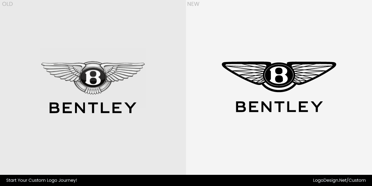
Bentley’s 2025 logo refresh was an exercise in restraint, guided by confidence rather than reinvention. As the marque prepares for an era shaped by electrification and modern grand touring, the identity was carefully pared back. The aim was not to modernize for effect, but to sharpen the logo’s symbol, which already carried more than a century of meaning.
The redesign focused on precision. Every line, surface, and proportion was reconsidered to ensure the emblem felt equally at home on a sculpted bonnet as on a digital dashboard. The result is a luxury car logo that feels cleaner and more assured.
• The Type System
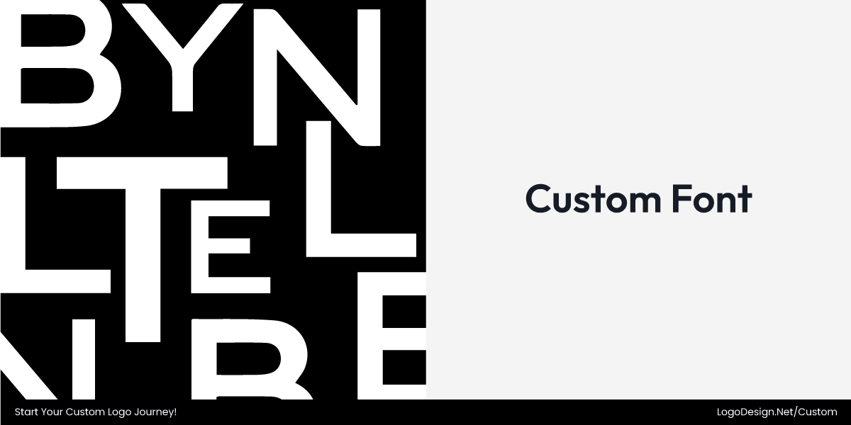
Bentley’s typographic approach remained largely untouched, reinforcing its respect for heritage. The iconic uppercase “B” continues to anchor the mark, staying faithful to the original letterform that dates back to the brand’s earliest years.
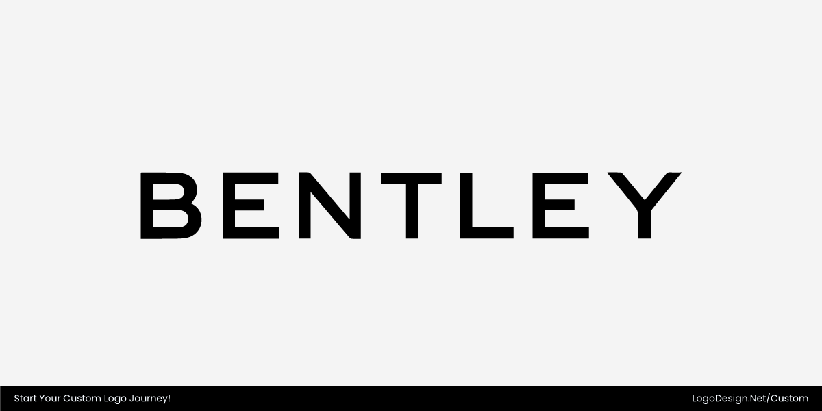
The surrounding wordmark still reflects a refined sans-serif style with subtle contours and restrained geometry, echoing characteristics of typefaces such as Bank Gothic or Sweet Sans, albeit with bespoke modifications.
• Brand Colors
Bentley stayed true to its minimal color palette of black, silver, and white—rooted in the neutral side of the color wheel—maintaining a sense of understated luxury. What remains distinctive is the continued use of color to signal purpose.
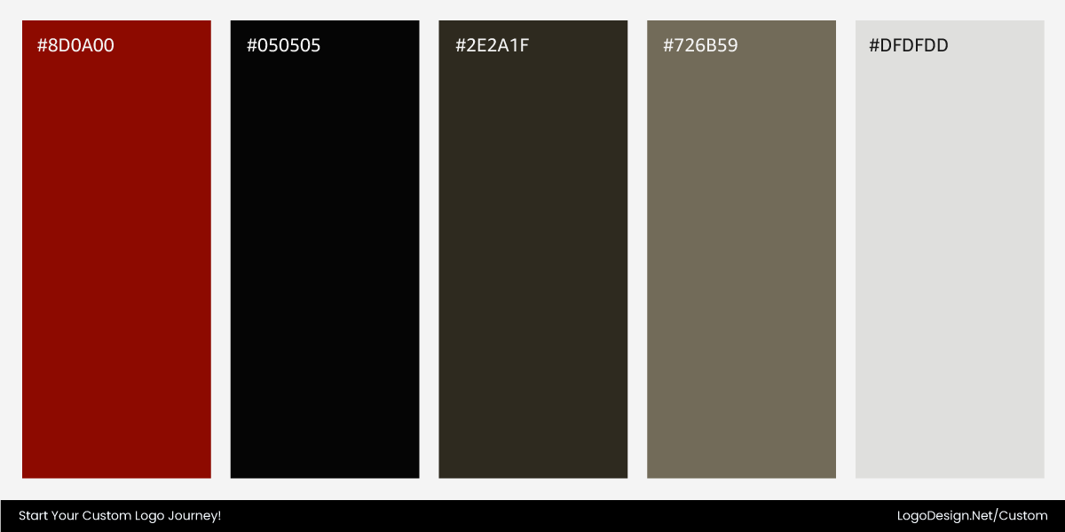
Red ovals denote exclusive road cars, green marks racing models, and black signifies the most powerful private vehicles. This system, in place since the early 1930s, remains unique in the automotive world and reinforces Bentley’s layered identity.
• The Winged B
The iconic Winged B emblem has been reimagined for 2025, with a focus on modern clarity, refined geometry, and a forward-looking expression. Bentley’s in-house design team, led by Robin Page, streamlined the mark by removing the lower feather detail and sharpening the wings into more angular, falcon-inspired forms, resulting in a cleaner, more dynamic silhouette.
At the center, the “B” becomes a jewel-like, three-dimensional mark with bevelled glass edges and a chamfered metal surround, designed to function independently as a standalone graphic. The update preserves Bentley’s heritage while introducing a more balanced and geometric logo system that is suited to both digital and physical applications.
Takeaway: Heritage, Refined for Tomorrow
Bentley’s 2025 redesign shows how a storied luxury brand can evolve by refining its heritage rather than reinventing it. For the first time in over two decades — and only the fifth update in 106 years — staying true to its legacy while preparing the brand for a modern future.
The refreshed badge streamlines the wings into sharper, more purposeful forms and elevates the central “B” into a jewel‑like lettermark that can stand alone across digital and physical applications. This balance of clarity, craftsmanship, and adaptability reinforces Bentley’s commitment to precision and luxury while signaling readiness for the next chapter of design, including electrification and new vehicle concepts.
6. Louis Armstrong Airport
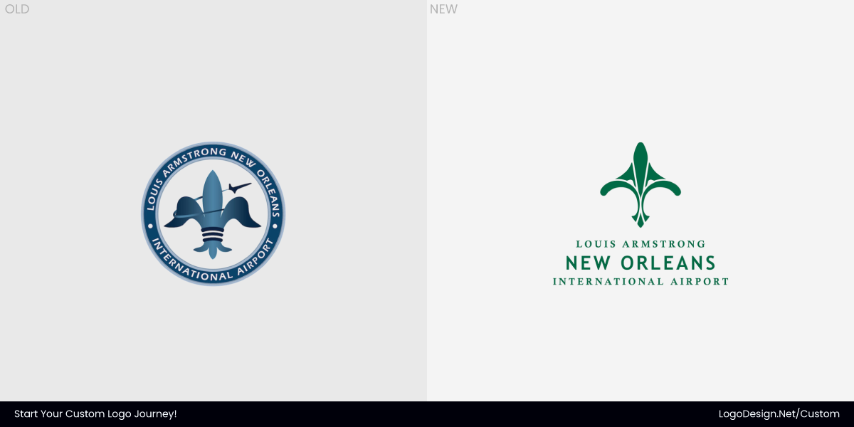
The early 2025 logo redesign for Louis Armstrong New Orleans International Airport was rooted in place and symbolism rather than trend. Unlike commercial brands focused on product or scale, an airport logo identity must convey civic pride, cultural meaning, and extreme functional clarity. The update — developed and led by design and architecture firm Gresham Smith in collaboration with the airport and community input — addressed all three by replacing a dated, generic mark with one that feels distinctly New Orleans.
The previous logo worked administratively, but it lacked emotional pull. It did not communicate arrival, movement, or the character of the city. The new identity shifts that balance, giving the airport a clearer voice while remaining practical for large-scale use.
• The Type System
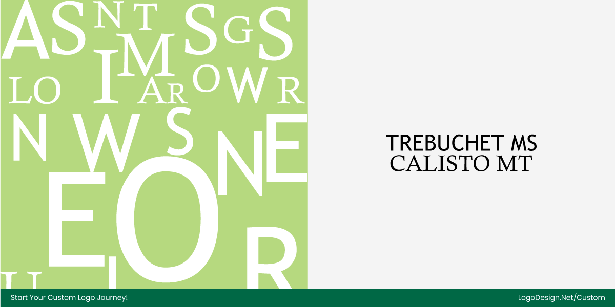
The wordmark establishes a clearer hierarchy by pairing a modern sans serif (Trebuchet MS) with a classic serif (Calisto MT) to balance readability and heritage. “New Orleans” is set in a clean, straightforward sans‑serif typeface to ensure visual priority, legibility, and a contemporary tone across digital and environmental contexts.
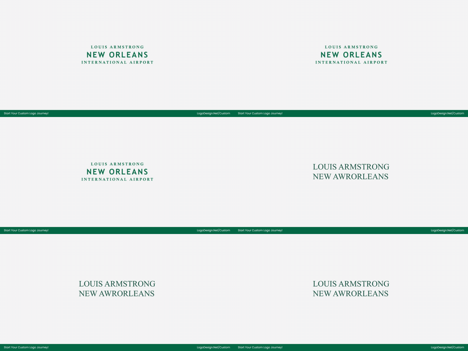
Supporting text — “Louis Armstrong” and “International Airport” — uses the elegant serif Calisto MT, nodding to history and formality without overpowering the primary name. This thoughtful typographic mix helps communicate both the airport’s modern global role and its cultural roots.
- Trebuchet MS used for New Orleans — clear, modern sans‑serif vs. serif for strong visual emphasis
- Calisto MT used for Louis Armstrong and International Airport — warm serif that references tradition
- Hierarchy refined so the city name reads first and most prominently
- Serif and sans pairing balances modernity with heritage
• Brand Colors

The updated color palette centers on tones uniquely tied to New Orleans’ landscape, architecture, cuisine, and cultural energy, giving MSY a visual identity that feels rooted in place rather than aviation clichés.
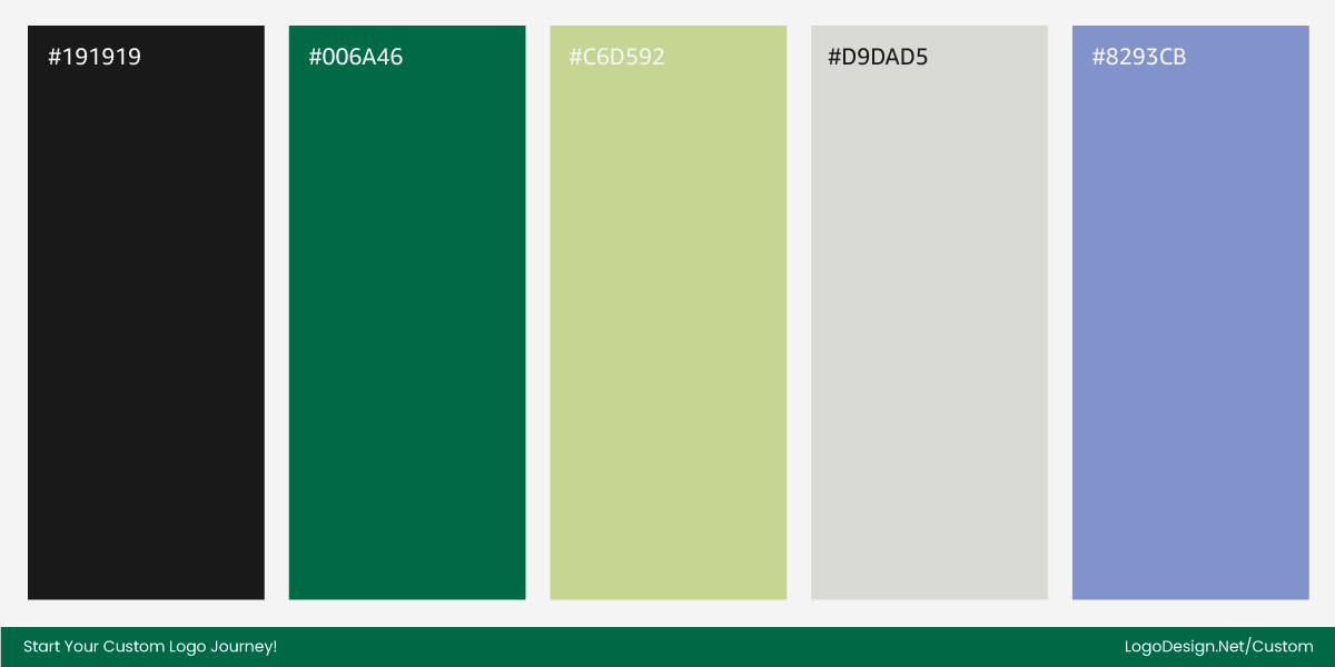
The primary hues include Julep (a rich, grounded green), Fresh Fern (a lighter botanical green), and White Willow (a soft neutral), which together evoke nature, historic ironwork, and the city’s verdant spirit. Beyond these, vibrant accent colors like Dawn (a warm blue), French Quarter Rouge (a bold red), Fleury Pink, and Beignet (a sunny yellow) draw from the city’s food, music, art, and festive character, expanding the brand’s expressive range while keeping each application distinctly New Orleans.
Importantly, the palette maintains high contrast in line with color theory best practices for wayfinding and accessibility across signage, digital interfaces, and printed materials, ensuring clarity in both functional and emotional contexts.
• Fleur-de-lis
The redesigned logo centers on a stylized Fleur‑de‑lis, reimagined as the “Plane de Lis” to reflect both New Orleans heritage and the airport’s role as a point of connection. Its upper form subtly suggests a plane taking flight, marrying local culture with movement and progress.
Beyond its function, the Fleur‑de‑lis carries layers of meaning—beauty, nobility, strength, and rebirth—that reinforce the city’s identity and the airport’s presence as a welcoming gateway. By combining cultural resonance with modern clarity, the mark communicates both pride of place and practical legibility in a compact, adaptable form.
Takeaway: Culture in Motion
The new logo shows how a civic brand can blend heritage and functionality. By transforming the Fleur‑de‑lis into a “Plane de Lis,” the airport conveys local pride, movement, and clarity in a single, versatile mark.
The refreshed design balances emotional resonance and practical legibility, making it effective across signage, digital screens, tickets, and wayfinding, while also reflecting the city’s vibrancy and welcoming spirit. It’s a thoughtful evolution that honors New Orleans’ identity while preparing the airport for modern, multi-channel use.
7. Austin
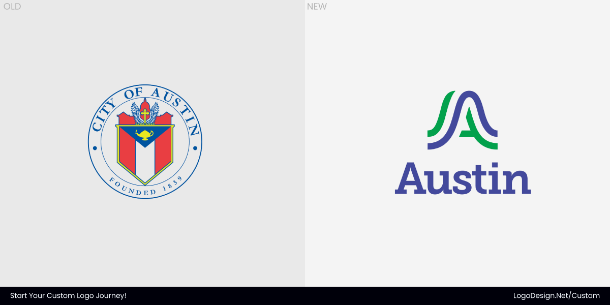
Austin’s identity update marked a clear break from symbolism tied to the past and a move toward a civic brand that feels current, grounded, and functional. The city’s earlier logo, rooted in a century-old coat of arms, carried historical weight but struggled to reflect a fast-growing, modern city. The new system shifts focus from ornament to structure, prioritizing clarity and long-term use across city departments. The new system — designed by Pentagram — shifts focus from ornament to structure, prioritizing clarity and long-term use across city departments.
At the heart of the redesign is a symbol built from the letter “A.” Rather than treating it as a literal initial, the form is shaped through broad, confident curves that echo Austin’s natural surroundings. The lines suggest rivers, rolling hills, and open land, connecting the mark to geography rather than cliché references to music or nightlife. This decision was deliberate. The goal was to reflect municipal responsibility and openness, not entertainment.
• The Type System
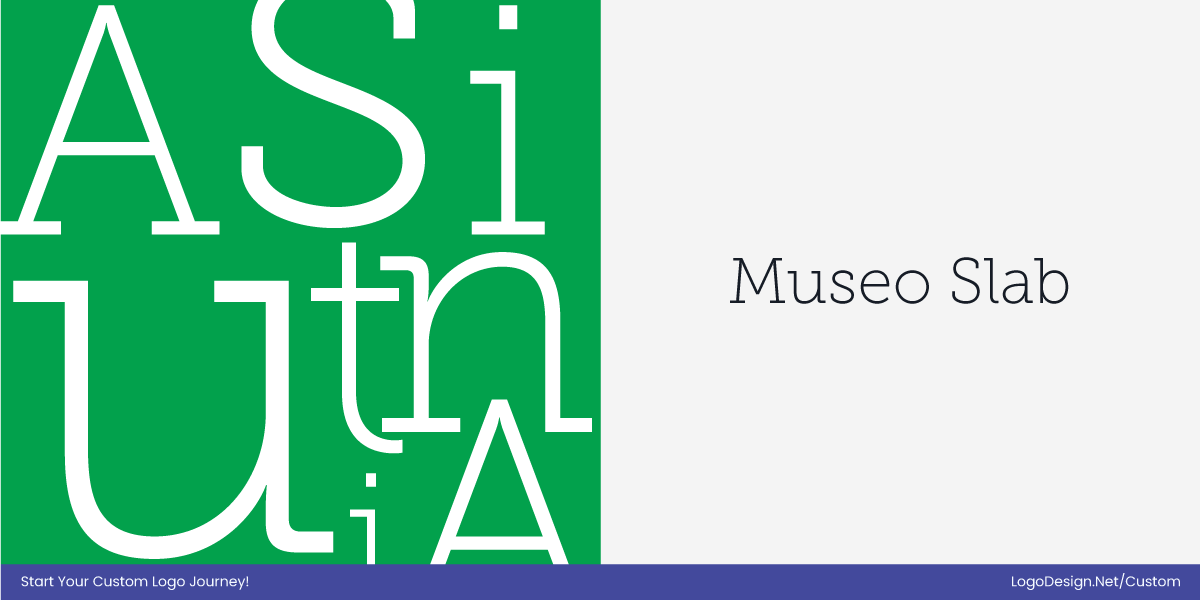
For the wordmark, Pentagram selected Museo Slab. The typeface brings a restrained, formal character that reinforces Austin’s role as an administrative center. Its slab-serif font choice adds stability and gravitas, while the clean letterforms keep the logo approachable.
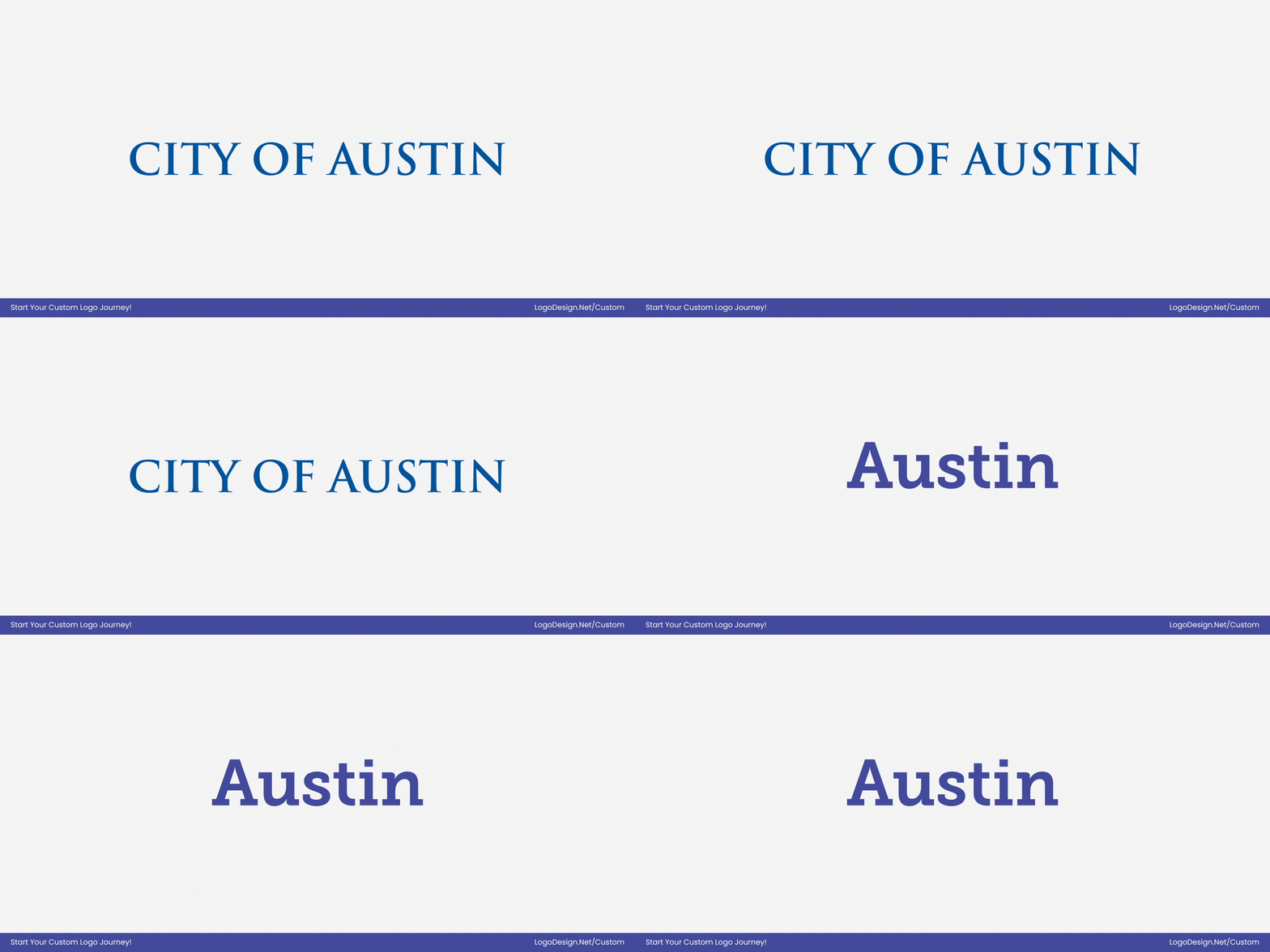
The typography intentionally avoids trend-driven graphic styles, favoring longevity and consistency instead.
- Typeface updated to Museo Slab
- Slab serifs add stability and authority
- Letterforms simplified for better legibility
- Trend-free design ensures long-term relevance
- Aligns visually with the new “A” symbol
• Brand Colors
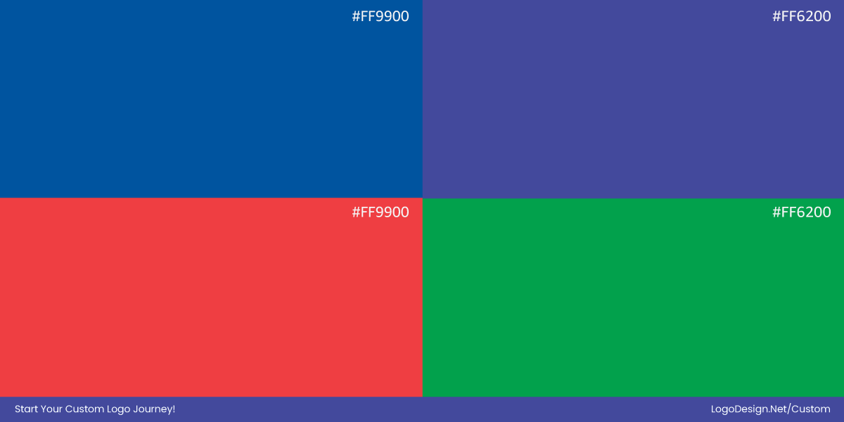
Austin’s color palette draws directly from the local environment. Greens reference the city’s parks and green belts, blues reflect lakes and rivers, and warmer tones nod to sunsets and Texas bluebonnets.
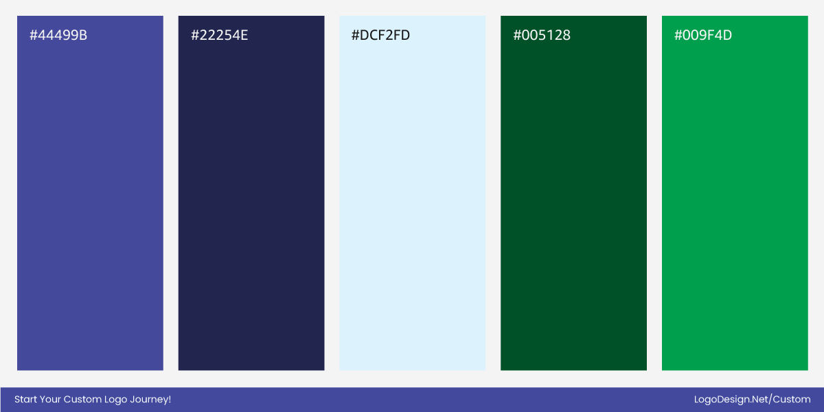
The update shifts from muted, traditional shades to brighter, more vibrant tones aligned with a fresh color trend, giving the identity a more contemporary feel. The colors remain natural and familiar, conveying warmth while maintaining clarity and contrast across digital, print, and environmental applications.
• Austin A mark
The new “A” mark represents a clear departure from Austin’s previous logo, which relied on a century-old coat of arms and ornate, historical symbolism. The redesign replaces those intricate details with a bold, architectural form that is simpler, more modern, and highly legible. Its symmetry and weight convey authority, while the curved edges soften the tone, striking a balance between official presence and approachability.
Unlike the old symbol, the new mark works seamlessly as a standalone icon, on signage, and across digital and print platforms, reflecting the city’s shift toward a functional, contemporary civic identity.
Takeaway: Modern, Rooted, Functional
Austin’s new identity shows how a city can move beyond historical ornamentation while staying true to its character. The new logo reimagines the city’s identity for a contemporary, fast-growing municipality. From the bold, architectural “A” mark to the Museo Slab wordmark and the vibrant, nature-inspired color palette, every element was updated for clarity, legibility, and cohesion.
The redesign balances authority with approachability, works across digital, print, and environmental applications, and replaces historical ornamentation with a system that is functional, adaptable, and grounded in the city’s unique geography and civic character.
8. Ribena
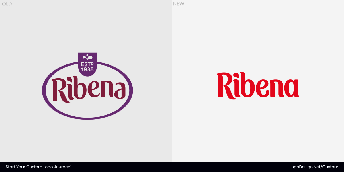
Ribena’s 2025 rebrand was driven by the need to sharpen recognition rather than reinvent the brand. As a long-standing household name, Ribena carries deep emotional familiarity, but that familiarity had started to blur on modern shelves. The update focused on making the brand clearer, bolder, and easier to spot, while preserving the sense of trust built over generations.
The redesign, led by Elmwood, approached Ribena as a living brand rather than a nostalgic one. Every element was reconsidered with retail performance and legibility in mind.
• The Type System
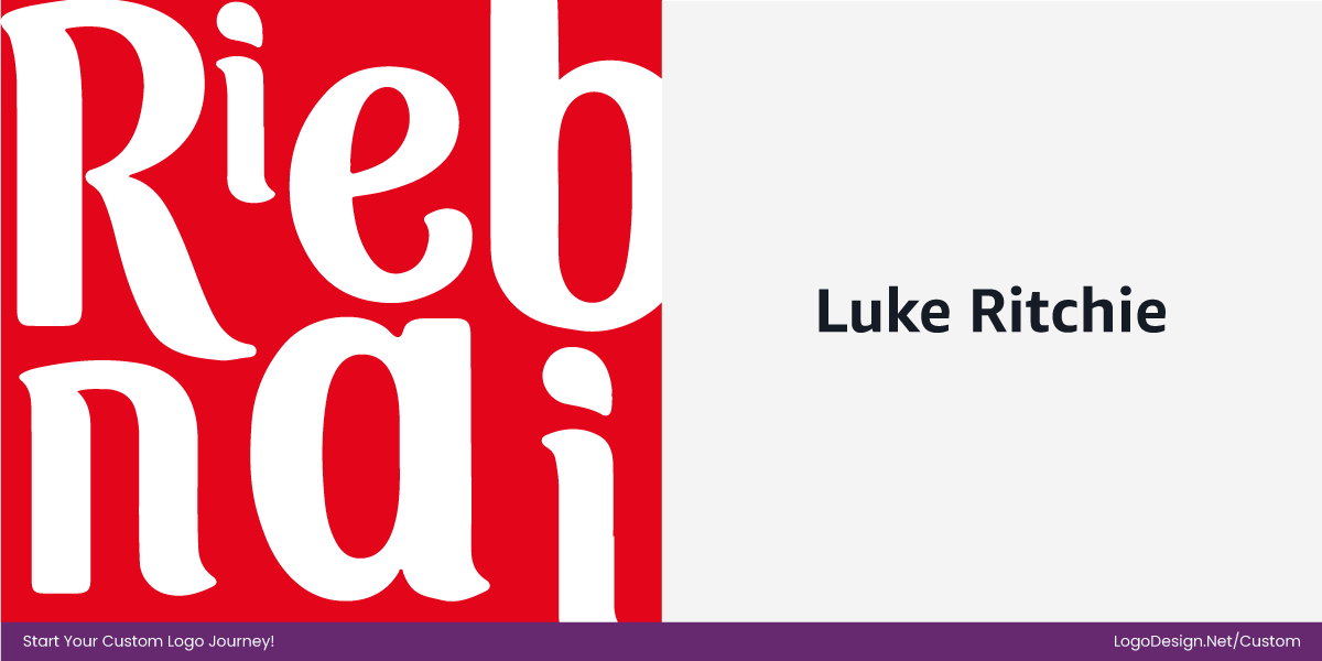
The most important change sits in the wordmark itself. Working with typographer Luke Ritchie, Ribena’s lettering was refined with a straight baseline and redesigned letterforms that feel plumper, more confident, and playful, matching the brand’s fruit‑forward personality.
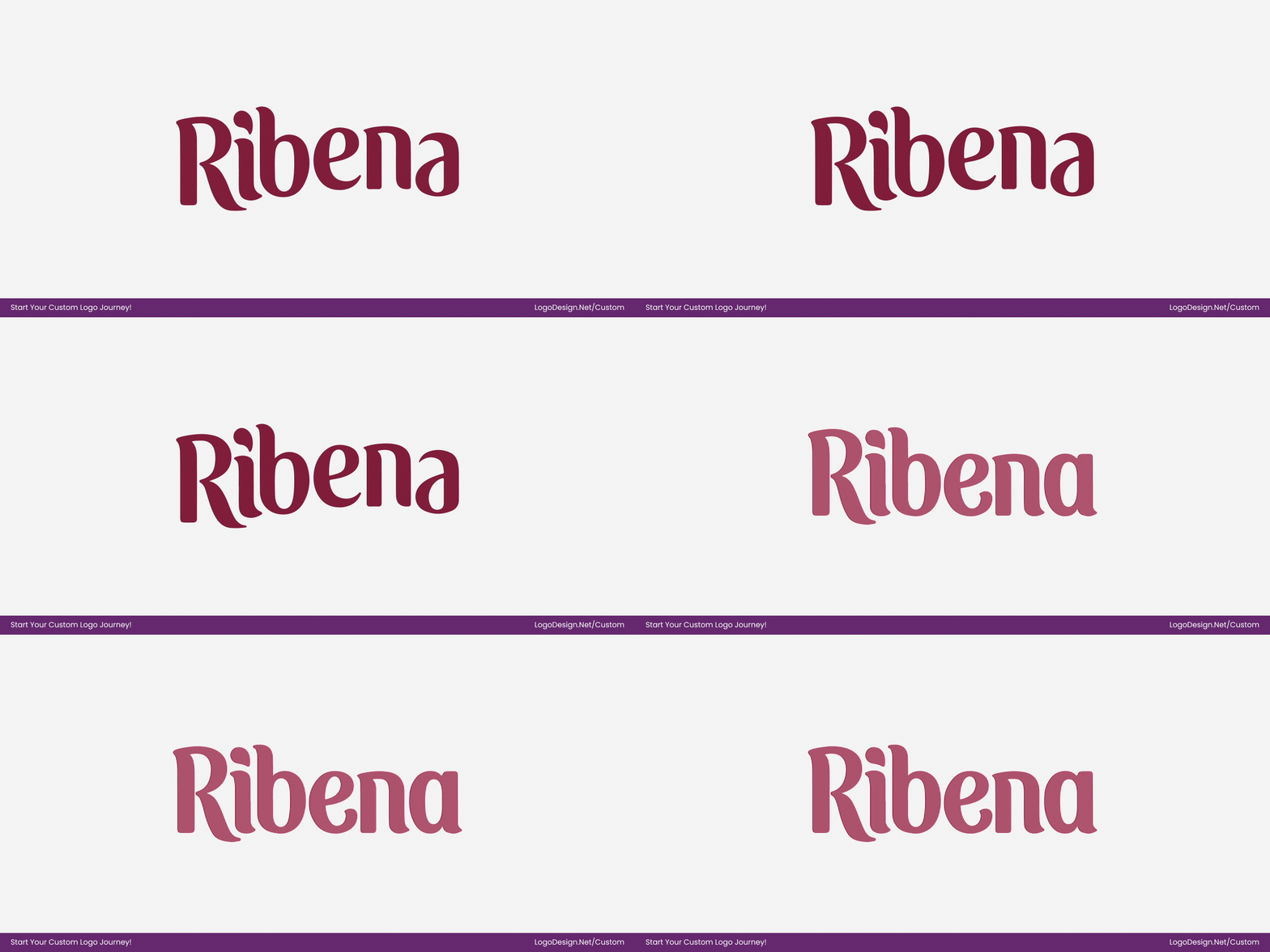
The strokes are smoother and more consistent, giving the logo a weight and rhythm that reads more clearly across packaging and digital use while feeling juicier and more energetic.
- Custom wordmark refined
- The straight baseline replaces the previous irregular flow
- Plumper, smoother letterforms for a juicier, more expressive look
- Playful flicks and fluid terminals improve personality and flavor cues
- Redrawn shapes increase clarity and shelf standout
• Brand Colors
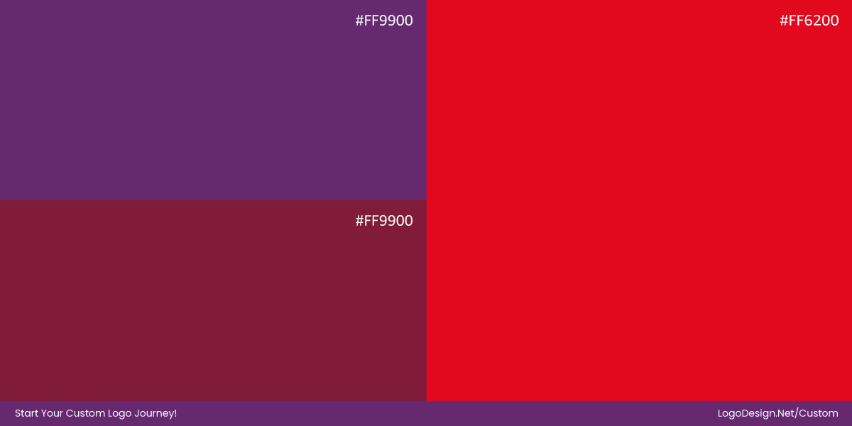
Ribena’s 2025 refresh updated the brand’s color palette while staying rooted in its deep purple heritage. The previous shades were darker and more muted, which sometimes felt heavy or subdued. The new palette introduces a bolder, more saturated purple paired with a bright, juicy red for the logo, giving the brand stronger visibility and a fresher presence across shelves and digital platforms.
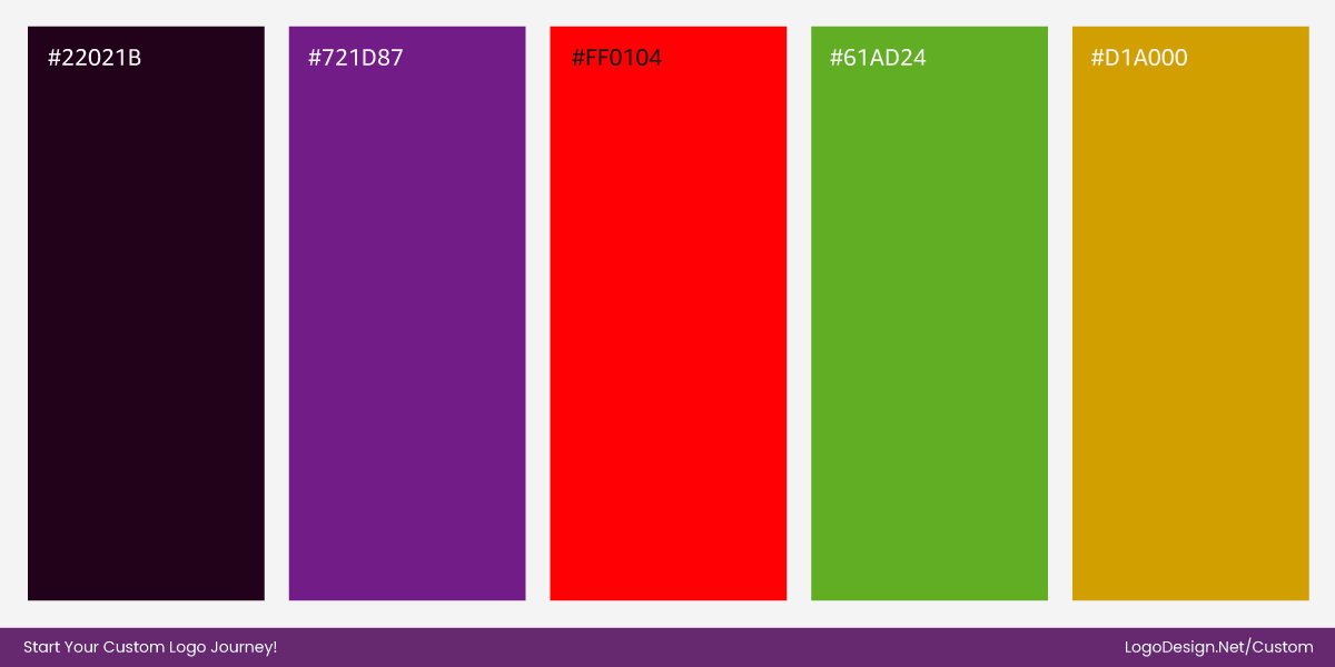
Supporting colors have also been brightened, creating a more playful, energetic feel that reflects Ribena’s fruit-forward personality. The updated colors improve contrast and clarity while maintaining a clear link to the brand’s blackcurrant origins, making the identity feel livelier, more approachable, and ready for modern retail environments.
• The Juicy Droplet
Ribena introduced a droplet icon to symbolize freshness, juiciness, and the brand’s fruit-forward nature, without relying on literal illustrations. The motif adds movement, personality, and energy to the identity and can be used independently of the full wordmark, making the system flexible across packaging, digital applications, and promotional materials.
It’s simple, fluid form scales well at small sizes while reinforcing the brand’s playful and approachable character, serving as a visual shorthand for Ribena’s flavor and heritage.
Takeaway: Juicier, Sharper, More Recognisable
Ribena’s 2025 refresh proves that a subtle, insight‑driven redesign can significantly elevate a heritage brand without losing its soul. Ribena re‑centred its fruit juice logo on consumer emotion and shelf performance, using extensive research to understand what makes the brand beloved.
The result is a look that feels brighter, more confident, and more distinctive, with a bolder red wordmark, plumper, more expressive letterforms, and a playful droplet icon that together amplify the brand’s fruit‑forward personality. Richer purple backgrounds, real-fruit photography, and gold accents tie back to heritage while giving the identity greater vibrancy and visual energy, strengthening shelf standout, recall, and perceived taste without undermining recognisability.
9. Snuggle
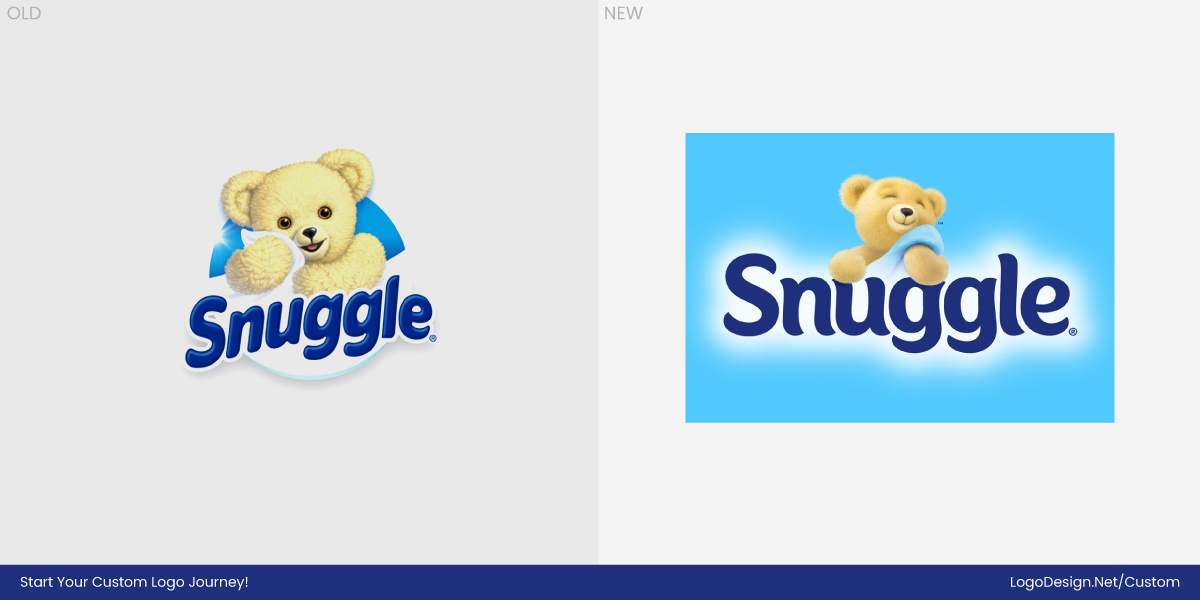
Snuggle’s 2025 brand refresh, led by Bulletproof, modernizes the brand while preserving its approachable, comforting personality. Historically, Snuggle relied on a soft, hand-drawn script and muted pink tones that emphasized coziness and familiarity. While this identity had served the brand well for decades, it had begun to feel dated, inconsistent, and less legible on crowded shelves and smaller digital formats.
Increasing competition in the laundry and home care category highlighted the need for greater shelf standout, stronger recognition, and a system that performs seamlessly across both physical and digital platforms. The redesign addresses these challenges by refining typography, brightening colors, and modernizing the bear icon—while maintaining warmth and giving Snuggle a fresher, more confident presence.
• The Type System
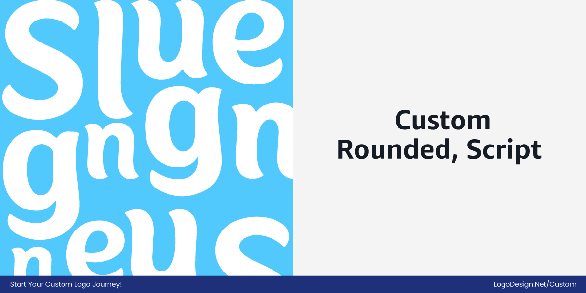
The old Snuggle typography relied on a rounded, playful script that felt friendly but could appear inconsistent or cramped at small sizes.
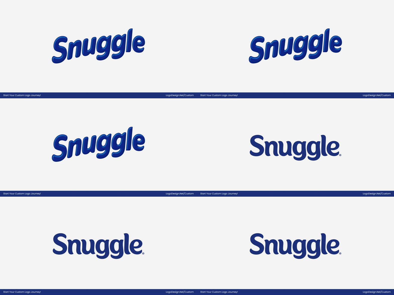
Bulletproof reimagined the wordmark with plumper, more carefully drawn letterforms that curve toward each other, creating a literal sense of “snuggliness.” In particular, the “nugg” section of the wordmark subtly hugs itself, giving the logo a satisfying flow that feels warm, approachable, and comforting. Overall, the refined curves, smoother strokes, and slightly wider micro vs macro spacing improve legibility while fully aligning the typography with Snuggle’s cozy, friendly brand personality.
- Smoother, more consistent strokes improve readability
- Slightly wider letter spacing enhances clarity
- Baseline straightened for visual stability
- Curved letters and hugging shapes reinforce warmth and approachability
- Playful flicks preserve personality and charm
• Brand Colors
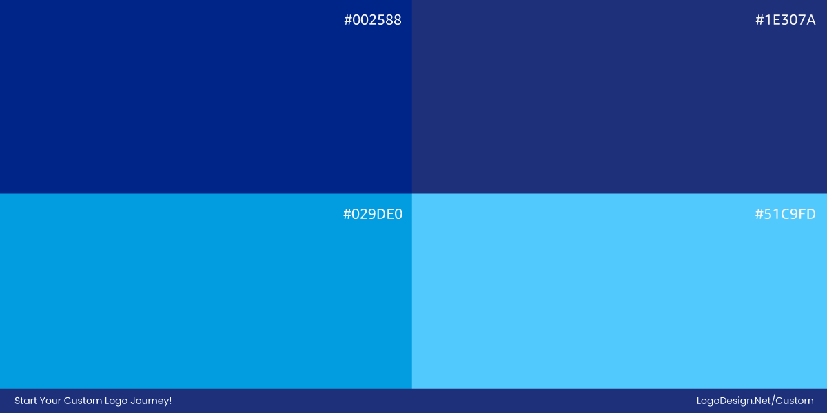
The previous palette relied on muted pinks and creams that sometimes felt flat on-shelf. The 2025 refresh introduces brighter, more vibrant pinks paired with soft neutral tones for balance, while subtle blues are used sparingly to complement the warm palette rather than compete with it.
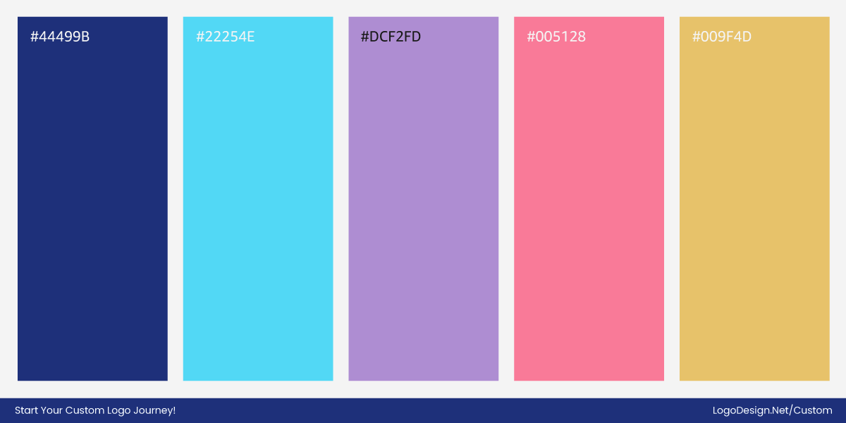
These blue accents work harmoniously with the pinks and purples across packaging and digital applications, adding depth and visual interest without undermining the brand’s cozy, joyful personality. Overall, the updated color system improves accessibility, shelf visibility, modernizes the look, and reinforces Snuggle’s comforting, approachable character.
• Snuggle Bear
The iconic bear was simplified and re-proportioned to feel balanced and flexible. The cleaner silhouette can scale across packaging, digital ads, and social platforms while maintaining a friendly, comforting presence. It represents care, softness, and approachability, aligning perfectly with the brand’s core values.
Takeaway: Comfort, Clarity, and Shelf Impact
Snuggle’s 2025 rebrand brings a fresh, modern energy while keeping the cozy, approachable personality at its core. After decades with a softer, more traditional visual system, the brand needed an identity that could perform on crowded shelves and smaller digital screens.
The update refines typography, brightens and balances colors, and refreshes the bear icon, making the brand lighter, more expressive, and more visually engaging. These changes strengthen emotional connection and functional clarity, helping Snuggle stand out from the competition without losing the warmth that has made it a household favorite.
10. City of Bristol College
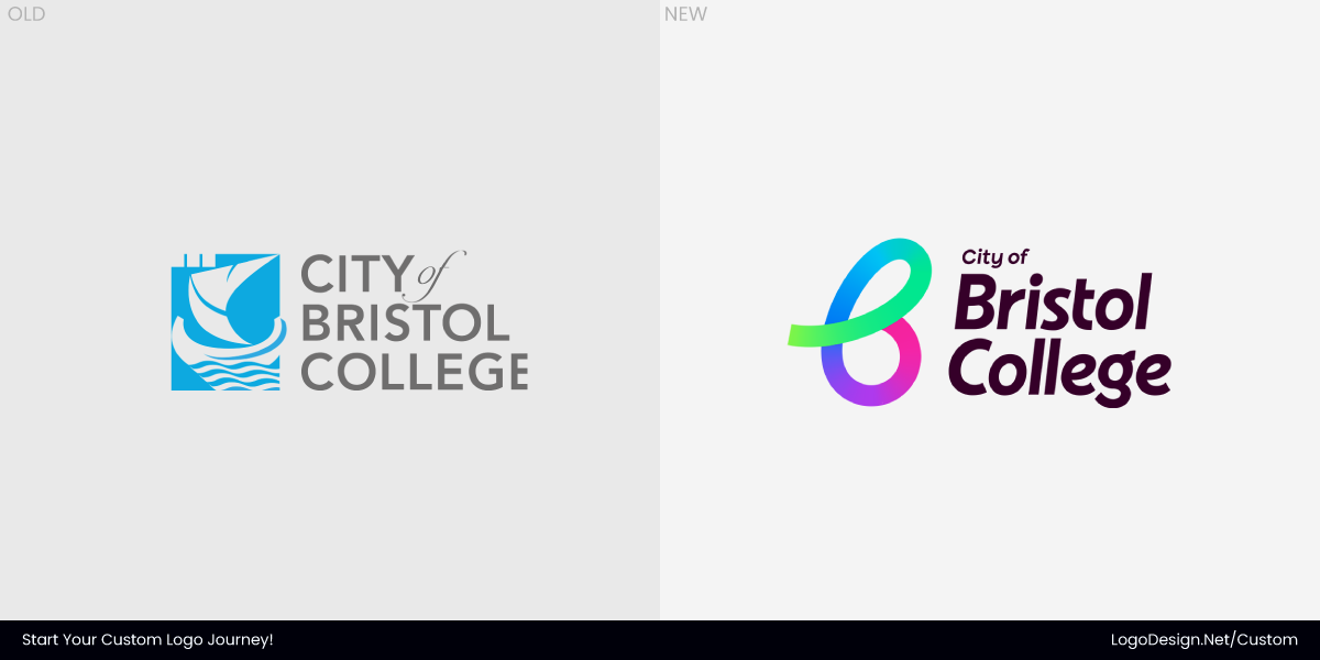
City of Bristol College has a long-standing history as a key educational institution in the region, serving diverse learners across vocational, academic, and professional programs. Known for its commitment to accessibility, inclusivity, and practical skills, the college has been a cornerstone of the community, helping students prepare for both further education and the workforce. Over time, however, its visual identity began to feel stiff and outdated, failing to fully reflect the college’s dynamic, forward-looking approach to learning.
The 2025 redesign, executed by Own Luck, addresses these challenges by creating a flexible, legible, and modular identity system. The update prioritizes accessibility and clarity while allowing the college to express its professional yet approachable character across signage, digital channels, course materials, and marketing. The new visual system is designed to adapt seamlessly to multiple contexts, reflecting the modern, inclusive, and future-ready ethos of City of Bristol College.
• The Type System
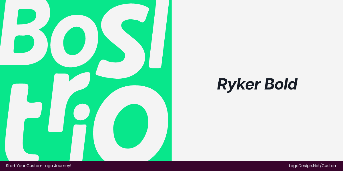
Previously, the college used a plain, all-caps sans-serif that felt rigid and heavy, lacking energy or personality. It conveyed authority but didn’t reflect the college’s modern, inclusive, forward-looking environment. The new wordmark uses Ryker in its oblique style, bolded for impact.
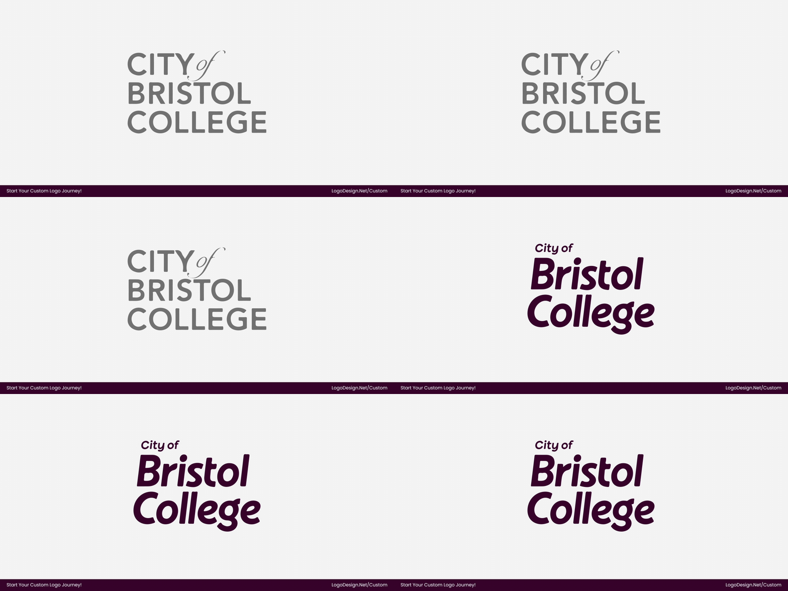
The oblique angle gives the letters a sense of forward momentum, while the bold weight ensures strong visibility and recognition across signage, digital platforms, and printed materials. The geometric letterforms feel structured yet approachable, reflecting the college’s inclusive, professional, and forward-looking identity.
- Wordmark is now bold and oblique, adding energy and visual emphasis
- Letterforms are more dynamic, reinforcing the “Where Next?” forward-thinking theme
- Spacing and proportions improved for better legibility across sizes
- Typography now feels modern, confident, and flexible, suitable for digital and physical applications
- Works cohesively across sub-brands, course materials, and campus signage
• Brand Colors
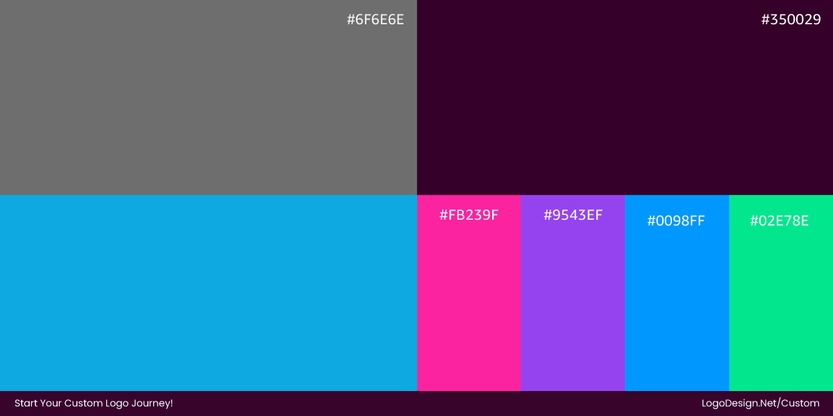
The updated color system is more confident and flexible. Vibrant blues and greens form the core, supported by high-contrast accent colors that can be mixed and scaled across applications.
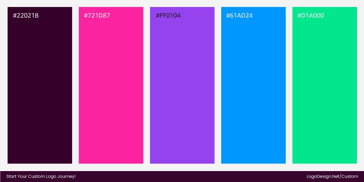
Rather than relying on a single dominant color, the palette is designed to adapt by context, helping departments and courses feel distinct while remaining recognisably part of the same college. This flexibility extends to the logo itself, which is designed to work with both flat and gradient color applications. The result is a livelier, more optimistic identity that better reflects momentum, choice, and progression, reinforcing the college’s forward-facing “Where Next?” message.
The Gradient Monogram
At the center of the identity is a custom “B” monogram, built from clean, geometric forms and finished with a dynamic free-form gradient. Rather than functioning as a decorative mark, the symbol acts as a visual anchor for the entire system, tying together typography, color, and layout. The use of gradients introduces depth and movement, helping the mark feel contemporary and expressive rather than static.
Previously, the brand relied almost entirely on a wordmark, limiting flexibility across applications. The new “B” monogram is designed to stand on its own and scale easily across digital platforms, signage, wayfinding, and social media headers.
Takeaway: Energy Through Structure
City of Bristol College’s rebrand demonstrates how a public-sector identity can be bold and expressive without sacrificing clarity or credibility. By introducing gradients, strong color contrast, and a confident typographic system, the brand moves away from static, institutional design toward a more vibrant, engaging approach. Importantly, this energy is carefully structured — the system is modular, scalable, and consistent, making it practical for real-world use across campuses, digital platforms, and communications.
The key lesson is restraint paired with expression. Rather than relying on decoration or symbolism, the redesign uses color, motion, and form to create impact. The result is a visual identity that feels contemporary and sparky while remaining functional, accessible, and easy to apply — proving that educational brands can be both serious and visually ambitious.
11. Coppel
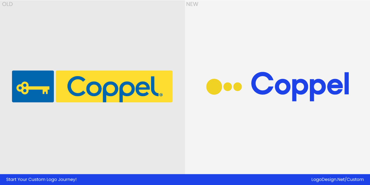
Coppel has been a fixture in Mexican retail and financial services for over 80 years, known for offering affordable goods, access to credit, and a strong local community presence nationwide. The company’s iconic “key” symbol has long stood for trust, inclusion, mobility, and the possibility of building a life and future with dignity.
However, as consumer behavior increasingly shifted toward digital discovery, omnichannel interactions, and faster retail experiences, Coppel’s historic visual identity began to feel less effective in conveying the brand’s evolving role.
To meet the needs of a more connected, tech-savvy audience and support a broader omnichannel growth and enhanced digital services strategy, Coppel undertook a comprehensive rebrand with Wolff Olins, The Juju, and Brands&People, modernizing its visual language while preserving the emotional essence that has cemented its relationship with millions of customers.
• The Type System
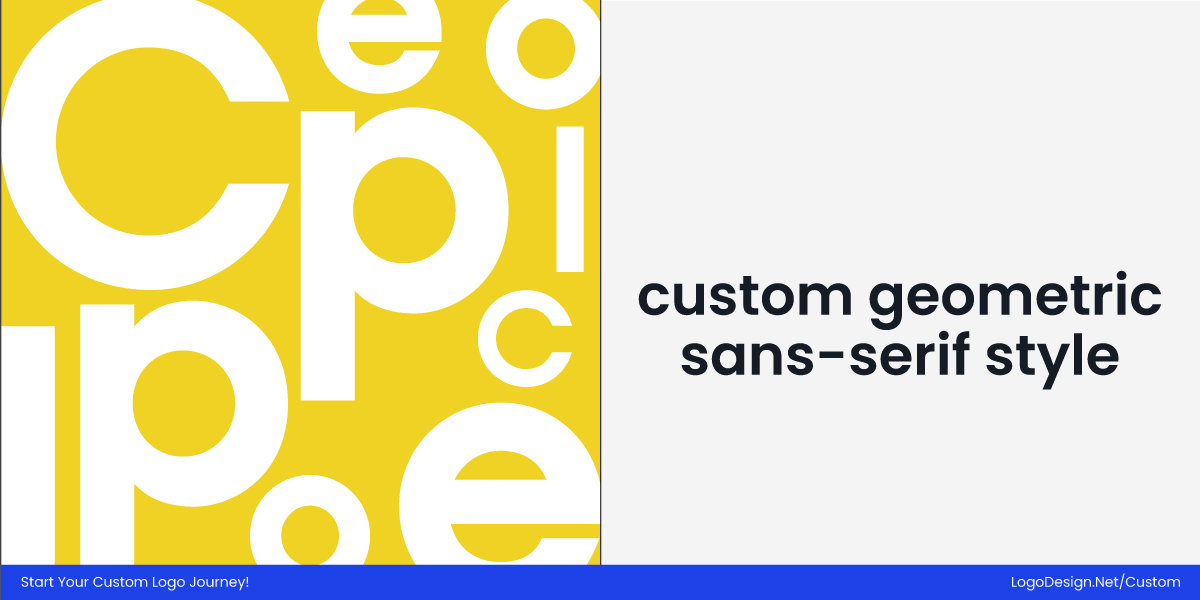
Rather than dramatically changing the wordmark, the redesign elevated and refined how the brand’s name and symbol function together. The wordmark is set in a custom geometric sans-serif style, designed specifically for clarity, simplicity, and digital performance. Its clean structure pairs seamlessly with the updated key icon, creating a lighter, more adaptable logo system for the Mexican restaurant.
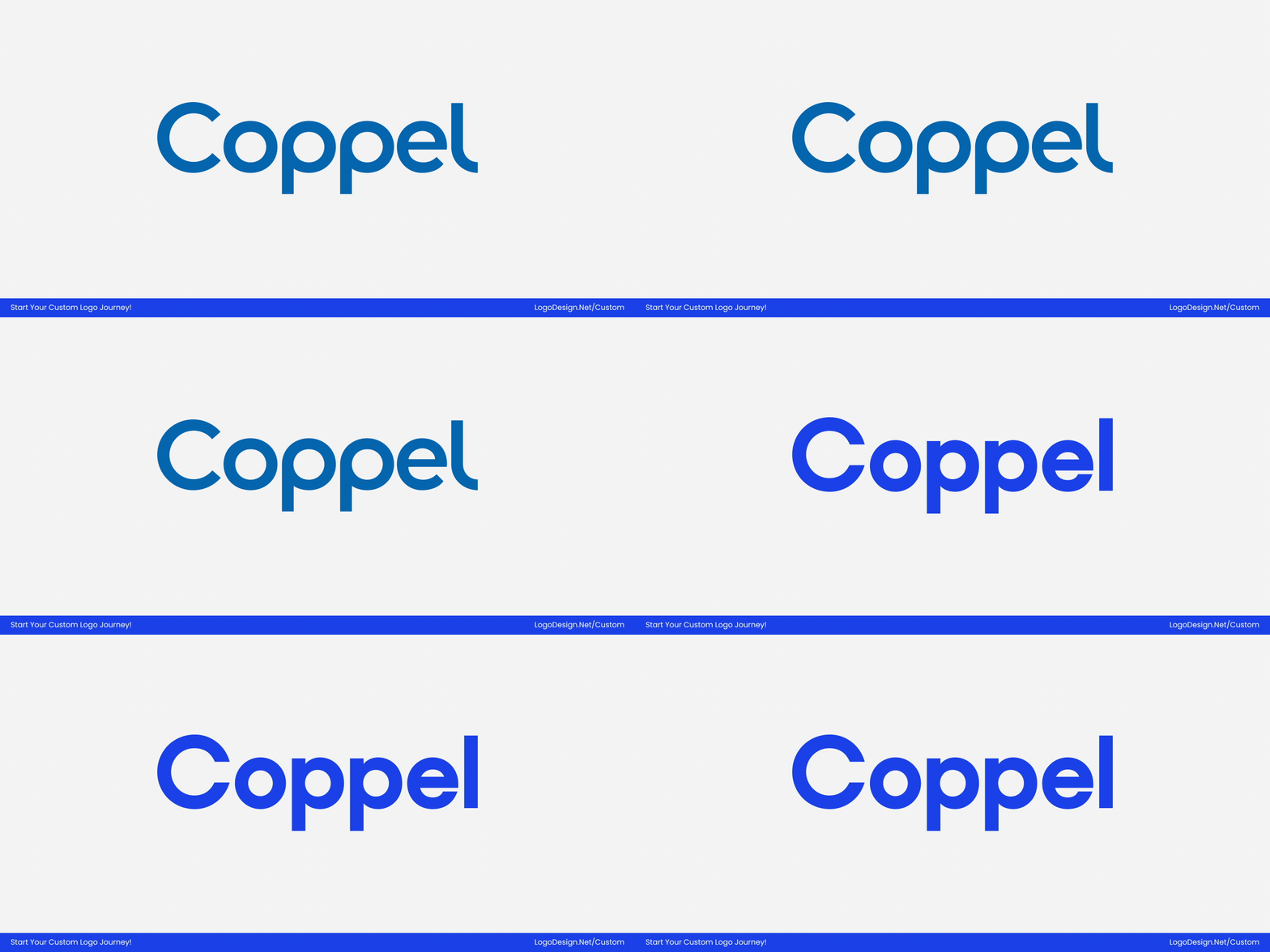
The geometric construction brings consistency and modernity, while subtle refinements to proportions and spacing make the typography feel more open and contemporary. Drawing on the psychology of shape, the close relationship between type and symbol creates a unified expression that feels familiar yet clearly optimized for Coppel’s omnichannel future.
- Shift to a custom geometric sans-serif for a more modern, functional tone
- Simplified letterforms improve legibility at small sizes and in motion
- Cleaner multiple shapes align in the logo with the geometry of the new key symbol
- Typography now prioritizes digital flexibility and scalability
- Overall wordmark feels pared back, lighter, and future-ready
• Brand Colors
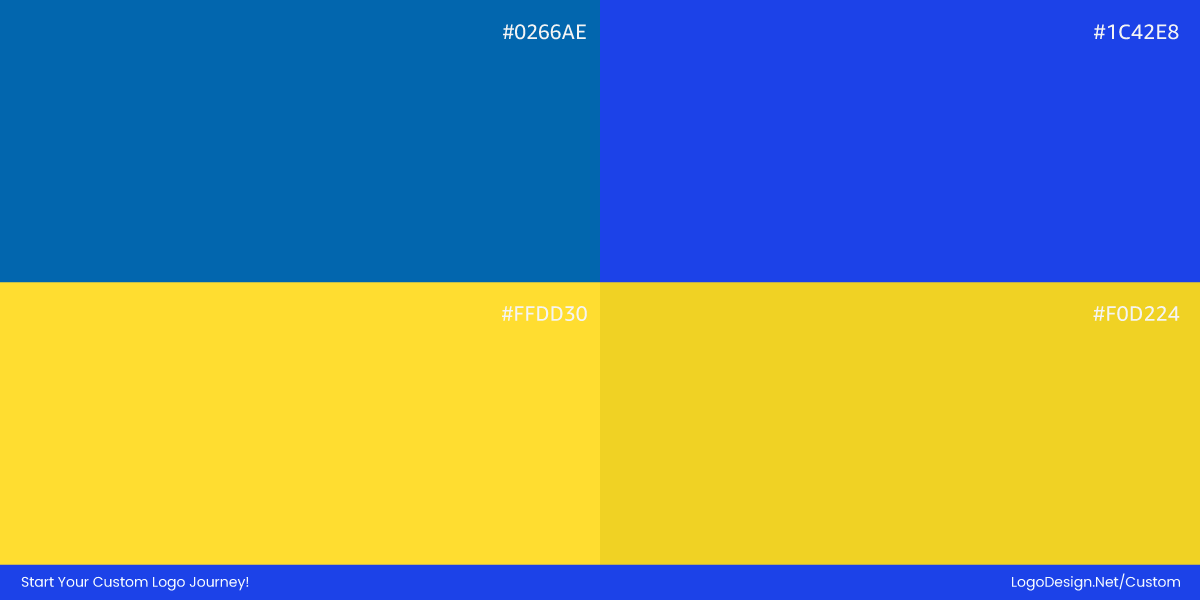
Coppel’s long-standing blue-and-yellow palette remains central, preserving the brand’s recognition and emotional equity. For 2025, the update shifts toward more confident, saturated versions of these hues, enhancing visibility both online and on physical assets such as storefronts and signage.
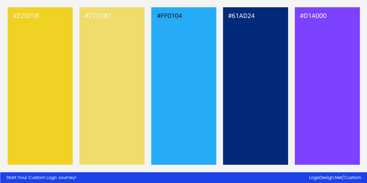
These richer tones help the brand stand out in crowded retail environments while also conveying a more energetic, contemporary feel. In digital contexts, the updated colors provide better contrast and adaptability, making campaign graphics, icons, and UI elements feel more cohesive and vibrant across all touchpoints.
• The Key Symbol
Coppel’s iconic key was refined into a minimalist, modular symbol, reducing visual complexity while preserving its core meaning. The simplified form is housed within a circular logo structure, giving the mark a more balanced, contemporary presence and improving its clarity across scales.
Less literal and more versatile, the key now functions not only as an icon but as a flexible design element that extends into patterns, motion, and environmental applications across the brand system.
Takeaway: Heritage Refined for the Modern World
Coppel’s 2025 redesign demonstrates how a heritage brand can honor its legacy while embracing future needs. By evolving its iconic key into a more minimal, modular form and pairing it with refined typography and richer colors, the brand positions itself as both trusted and modern. The new identity is built to work across everything from storefronts and packaging to apps and screens, making the symbol not just a logo but a flexible asset for omnichannel expression.
Coppel has kept the emotional heart of its story—connection, trust, and opportunities—while giving it a visual language that feels contemporary, confident, and ready for the digital age.
12. Humane World for Animals
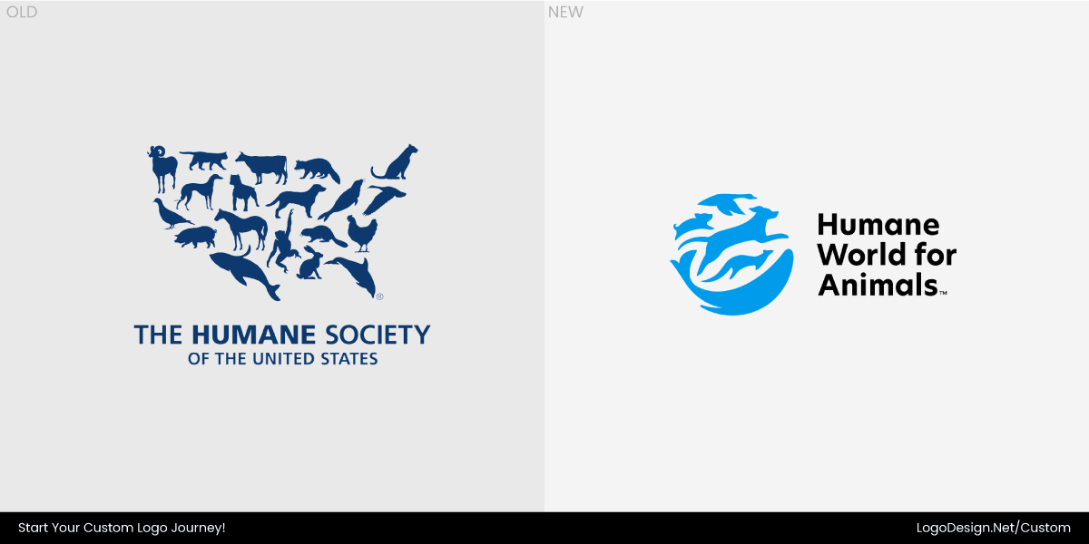
Humane World for Animals is a global animal protection organization dedicated to ending cruelty and suffering for animals worldwide. For more than 70 years, the organization — formerly known as the Humane Society of the United States and Humane Society International — has worked on issues ranging from rescuing animals in crisis to combating factory farming, animal testing, and trophy hunting.
Over time, the scope of its work expanded far beyond a U.S.‑centric or regionally focused mission, making the legacy name and visual identity less clear in communicating its international reach and interconnected advocacy for animals of all species. To better reflect this global mission, clarify purpose, and strengthen emotional connection, Humane World for Animals partnered with Lippincott to create a new brand system with a name, logo, and identity that convey both its heritage and its worldwide, forward-looking impact.
• The Type System
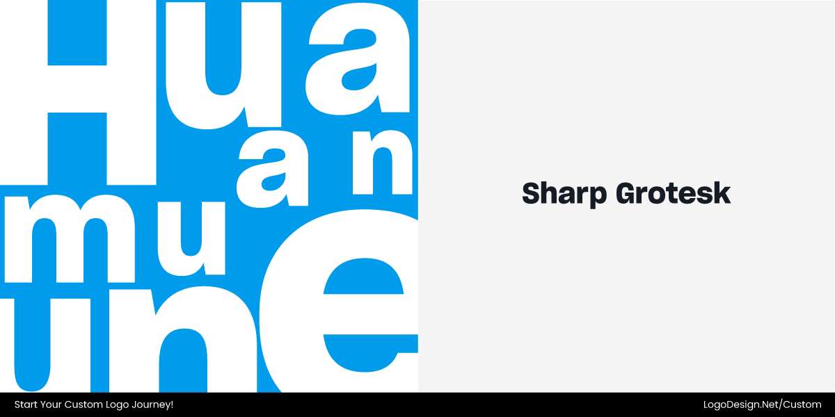
The old wordmark used a standard serif that felt institutional and distant. For the 2025 redesign, the brand adopted Sharp Grotesk — a bold, humanist sans‑serif with a strong presence and modern attitude — as the primary headline typeface. Paired with supporting text styles such as Noto to ensure readability across sizes, Sharp Grotesk brings a more assertive, contemporary voice to the animal and pet brand identity design, clearly communicating both urgency and care.
The geometric yet warm letterforms of Sharp Grotesk enhance legibility and make statements feel purposeful rather than passive, while its confident shapes help ground the organization’s bold mission. Compared with the old serif, which could appear overly formal or distant, the new typography feels more approachable, more expressive, and better suited to emotionally charged advocacy and global communications.
- Switched to Sharp Grotesk for headlines: stronger, more energetic tone
- Rounded, humanist influences improve warmth and accessibility
- Noto adds clarity for body text and multilingual contexts
- Letterforms optimized for screen and large formats
- Typography now balances authority with empathy
• Brand Colors
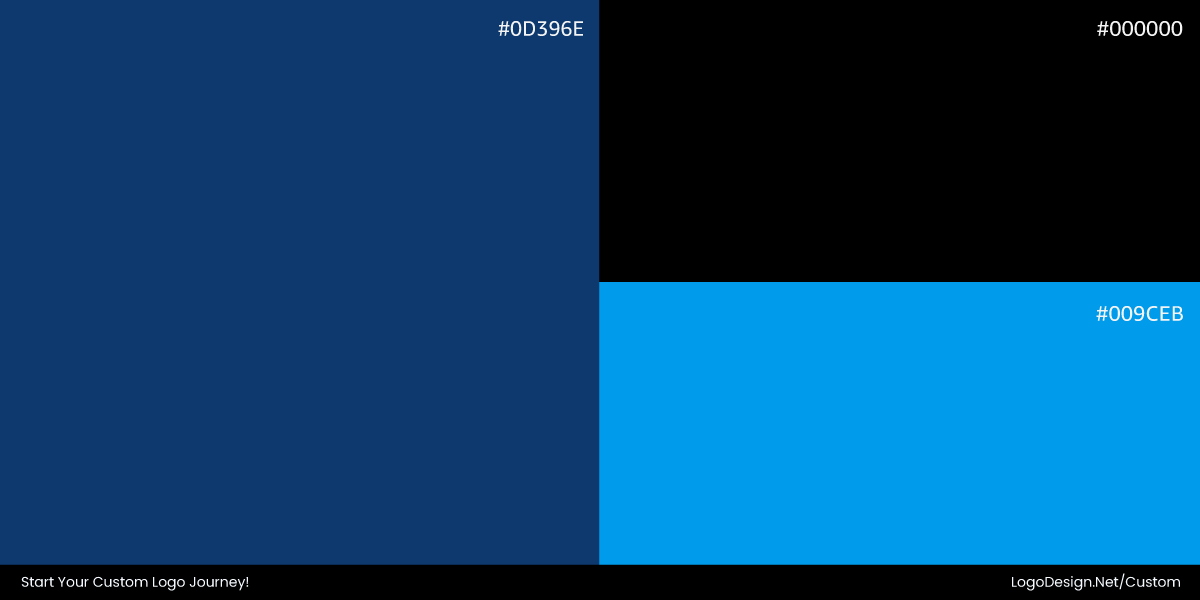
The previous palette was limited and muted. The new system pairs deep blues with warm accent tones, creating a balance of reliability and compassion.
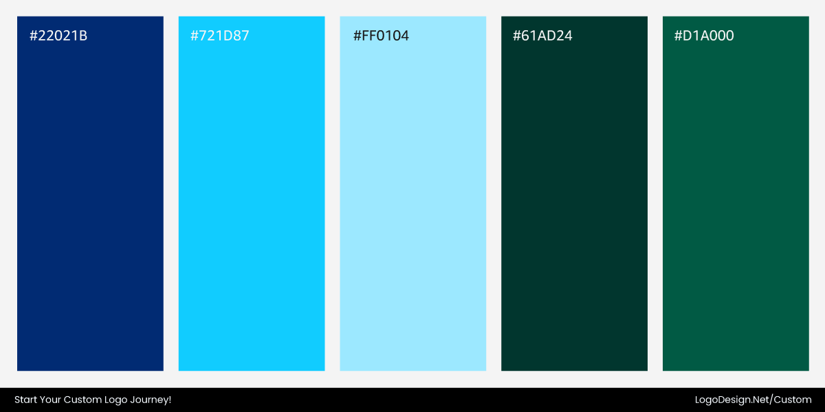
Secondary colors provide flexibility for campaigns and events. The updated palette strengthens visual hierarchy, reinforces brand mission, and improves recognition across digital and physical touchpoints.
• Paw-and-Heart Emblem
The emblem replaces a literal illustration with a simplified paw-and-heart mark. The new pet logo is scalable, friendly, and instantly recognizable, symbolizing the organization’s mission to care for, protect, and advocate for animals.
Takeaway: Caring, Clear, Recognizable
Humane World for Animals’ redesign demonstrates how thoughtful simplification can elevate a nonprofit brand. The updated typography, flexible color system, and emblematic paw-and-heart mark make the organization more approachable, consistent, and mission-driven, enhancing recognition and engagement across every touchpoint.
Notable Icon Updates: Subtle Shifts, Big Impact
Not every impactful 2025 brand update involved a full logo redesign. Some of the year’s smartest transformations were subtle, system-focused refinements that improved clarity, adaptability, and motion—ensuring globally recognized brands feel modern and responsive without losing their identity.
Microsoft – Evolving for Fluidity and AI
Microsoft’s 2025 icon refresh isn’t a dramatic logo rewrite, but it’s a quiet masterclass in system-wide cohesion. By softening rigid edges and introducing gentle curves, the icons now feel more fluid and approachable, reflecting the company’s pivot toward AI-driven, collaborative workflows.
Small simplifications—such as reducing the bars in the Word icon—enhance recognition at small sizes, while more expressive gradients make each app instantly distinguishable. This subtle evolution demonstrates how thoughtful refinements can modernize a brand without discarding decades of familiarity.
Google – Motion and Depth in a Familiar Face
Google’s gradient G update is another example of precision over reinvention. The core wordmark remains untouched, but the “G” icon now features smoother gradients that blend its four signature colors more naturally. This change enhances depth, responsiveness, and visibility in motion-heavy digital contexts, from AI interactions to app transitions.
By focusing on how the logo behaves across dynamic logo systems, Google shows that evolution isn’t always about a new shape—it can be about making a familiar brand feel alive, adaptive, and ready for a connected, high-resolution world.
Final Thoughts
These logo transformations prove that getting it right in 2025 was more about being thoughtful. The strongest rebrands did not chase logo trends or erase history. They fixed what felt off, clarified what mattered, and designed for how brands actually show up today. From subtle refinements to confident resets, each example demonstrates that effective logo design remains about balance, purpose, and usability.
If these rebrands sparked ideas for your own brand, that’s a sign. Maybe your logo just needs a smarter direction. Ready to create something that actually fits where your business is headed? Start designing your logo today.
