Can you recall a logo just by looking at a similar font style or typography? That’s what an impactful choice does. It makes your logo memorable for a lifetime.
Typography is one of the most powerful tools in a designer’s toolkit, especially when it comes to logo design. While color, imagery, and layout all contribute to a logo’s effectiveness, the choice of font can significantly impact how a brand is perceived.
Fonts do far more than display a company’s name; they convey emotion, establish tone, and shape a brand’s personality in just a glance. A well-chosen typeface instantly tells the audience whether a brand is formal or fun, luxurious or budget-friendly, modern or timeless.
The goal of this blog is to help you understand the rules of typography and help you choose the right font for your brand.
Let’s discuss in detail the process of picking out the right font that aligns with your brand’s identity, values, and target audience.
The Impact of Typography in Logo Design
Typography isn’t just a design element; it’s a language of visual storytelling. The typeface you choose for your well-designed logo communicates all you need to say about your brand without saying a word.
• Fonts highlight brand values:
A geometric, sans-serif font can showcase innovation and efficiency, perfect for a tech startup. While a choice of flowy, script font could convey elegance and femininity, ideal for a boutique or lifestyle brand.
• Typography influences perception:
Using too many font styles or mismatched typefaces in a logo can make it look unprofessional and cluttered—an easy logo design mistake to avoid. If you think about it, a relevant font could help build trust and credibility that lasts.
• Consistency in digital and print:
Good typography helps people connect with the brand across media like business cards, billboards, or social media. It is a must-have for consistent branding across digital and print. That’s what Soundwave Podcast ensured by using templates that are adjusted to differently-sized platforms.
Tone and personality are visible:
Is your brand modern or traditional? Playful or serious? Your font can answer these questions at first glance.
• Lasting impression:
With a creative typeface, you can make people think about your logo for a long time. It’s also easier for them to associate it with your brand. Take the examples of custom typefaces in logos like Coca-Cola, Google, or Disney here.
Types of Fonts in Logo Design
Typography plays a very important role in logo design. The right font not only communicates your brand’s personality but also influences how your audience perceives your business.
Here’s a breakdown of the main font categories used in logo design and when each is most effective.
Serif Fonts: Timeless and Trustworthy
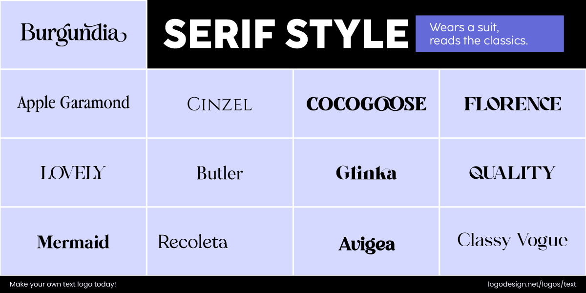
Serif Fonts that have small lines and end with letterforms
Serif fonts are characterized by small lines or extensions at the ends of their letterforms, called ‘serifs.’ These fonts have been used for years in finance logos or legal icons as they bring out a sense of tradition, reliability, and formality.
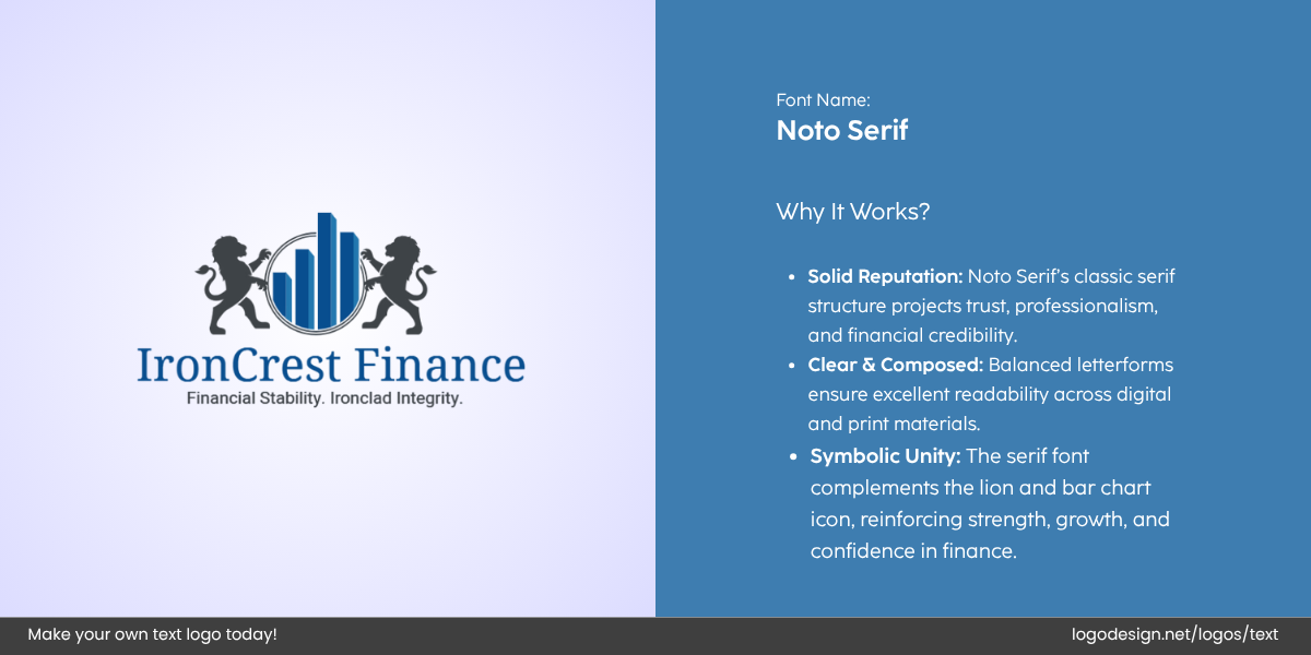
IronCrest Finance logo designed by LogoDesign.Net – Noto Serif
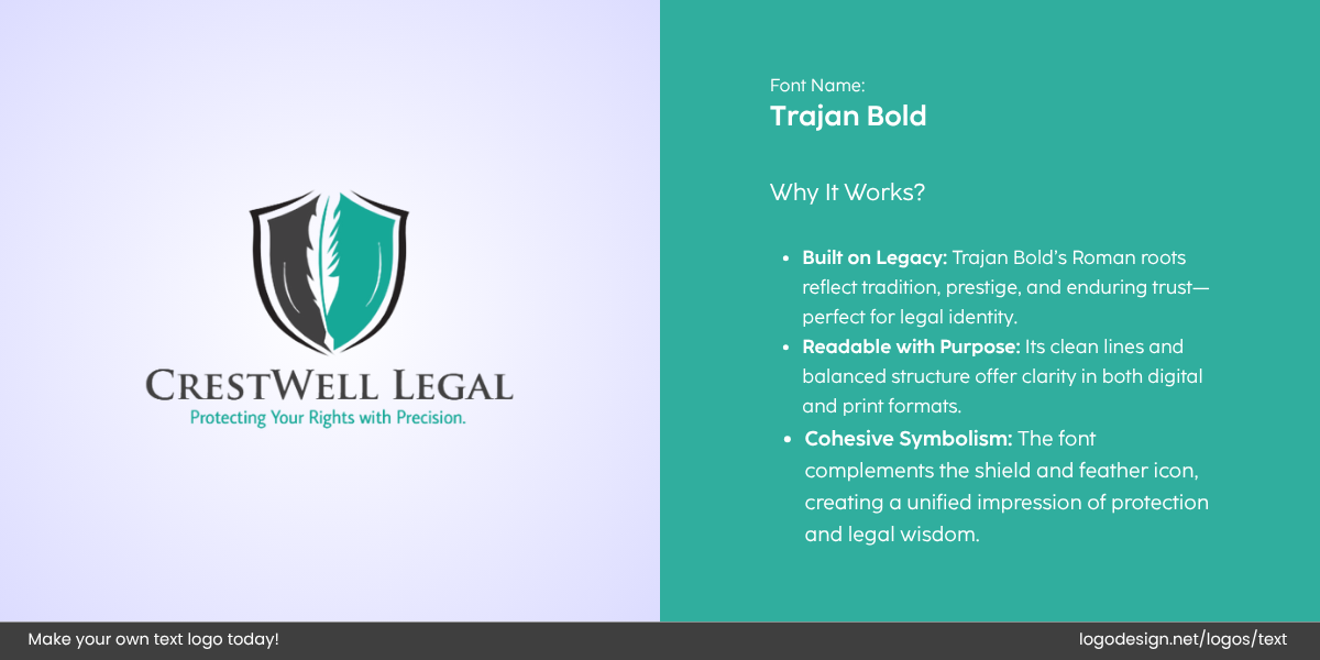
CrestWell Legal logo designed by LogoDesign.Net
The font styles are commonly associated with authority and stability. They convey a sense of professionalism and are sometimes seen as trustworthy and refined. Consider these serif fonts that you can choose for your logo:
• Old Style serifs
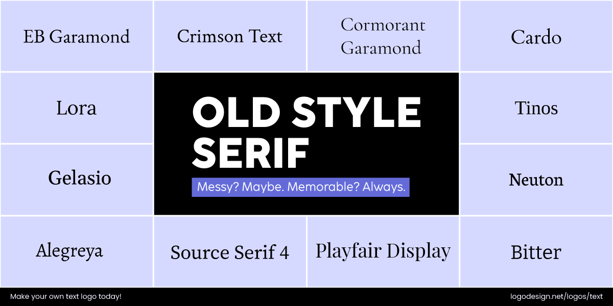
Old-style Serif Fonts come with low contrasts that feel traditional
With their rounded serifs and low contrast, they convey a traditional, approachable feel, often used by heritage brands like Garamond.
• Transitional serifs
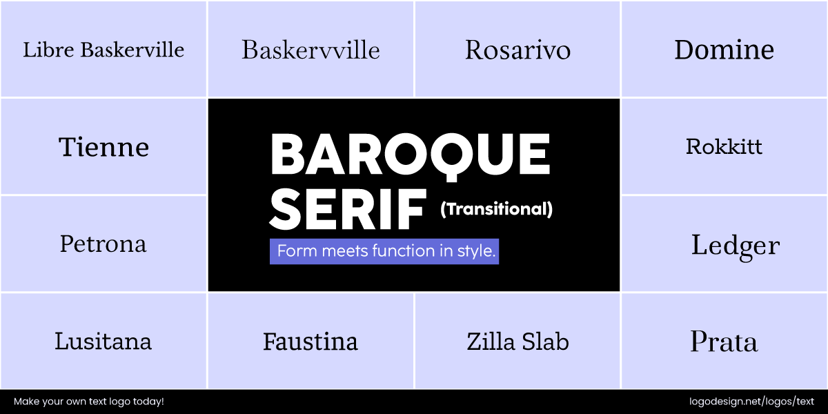
Baroque Serif Fonts have a higher contrast and a professional look
These strike a balance with more angular serifs and higher contrast, offering a refined, professional look, as seen in Times New Roman.
• Modern (Didone) serifs
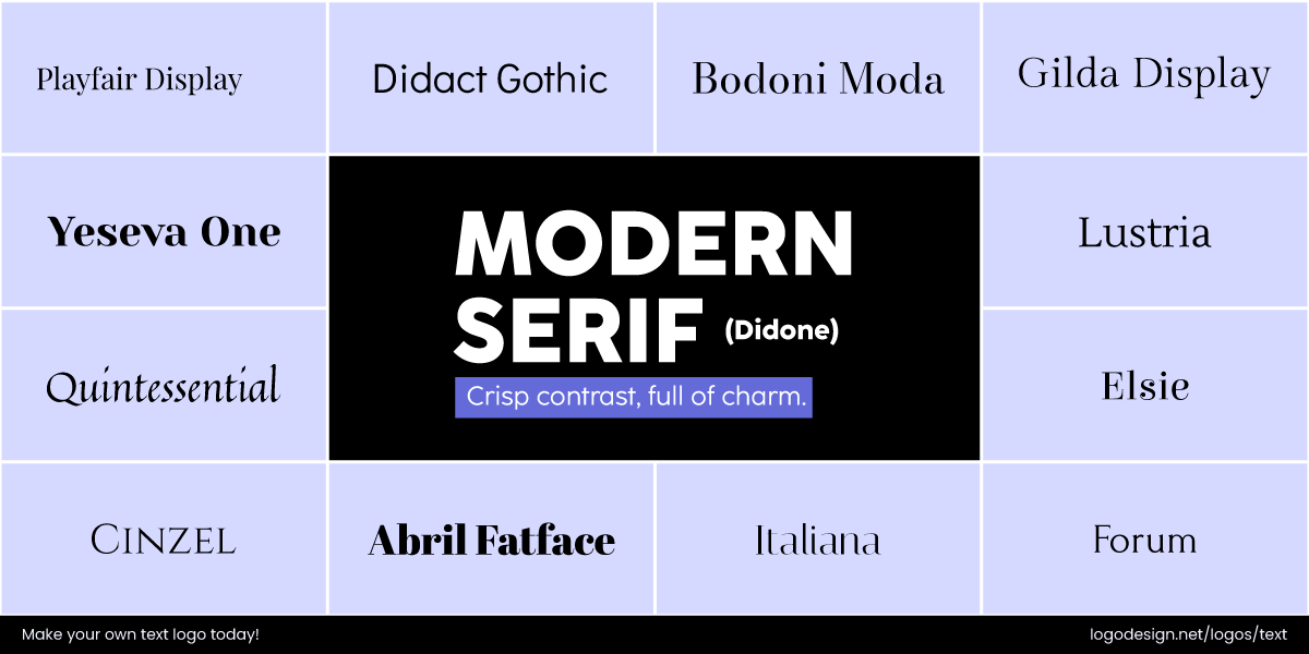
Modern Serif Fonts have balanced strokes and higher contrast
The fonts have a high contrast between thick and thin strokes, with sleek, angular serifs like Modern No. 20.
• Slab Serif (Egyptian)
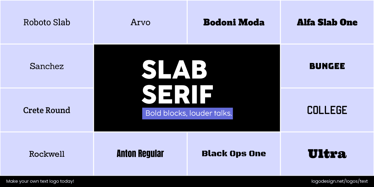
Slab Serif Fonts have bold strokes to show stability and strength
Such styles have bold, block-shaped serifs that convey strength, stability, and modernity. Rockwell has a strong impact with its structure and balance.
Brands that use Serif fonts in Logos:
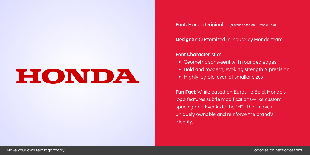
The Honda logo, designed from the Slab Serif fonts, with characteristics on the right.
- Honda: It has a Slab Serif font style that showcases strength and precision.
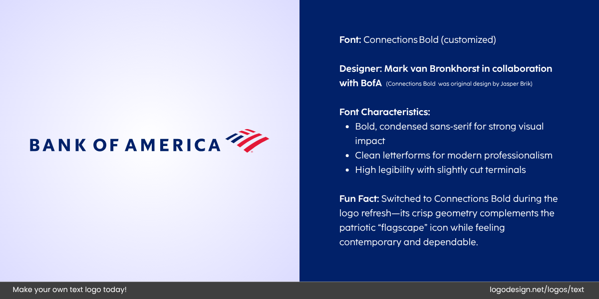
The Bank of America logo with the logo properties on the right
- Bank of America: The logo typography draws focus on trust and professionalism.
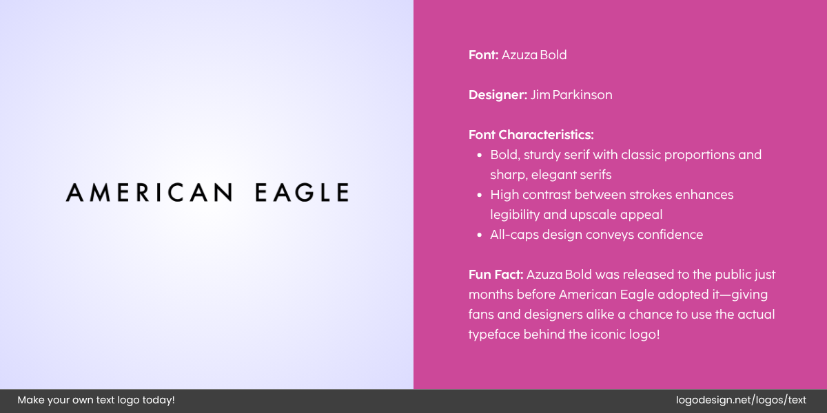
The American Eagle logo is designed from the Azura font, having equal letter proportions.
- American Eagle: It highlights a rugged, youthful image.
Sans-Serif Fonts: Modern and Minimalist
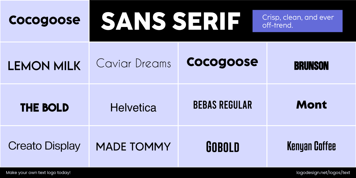
Sans Serif Fonts are simple, clean, and have modern aesthetics
Sans-serif fonts are without the small features found in serif fonts. They offer a clean and modern aesthetic and are easier to read on digital screens.
These fonts are simple, approachable, and highly legible. Logos in fashion, tech, or beauty commonly go for clean fonts. They suggest innovation, clarity, and a forward-thinking mindset. San serif font styles are perfect for brands looking to appear fresh, honest, and unpretentious.
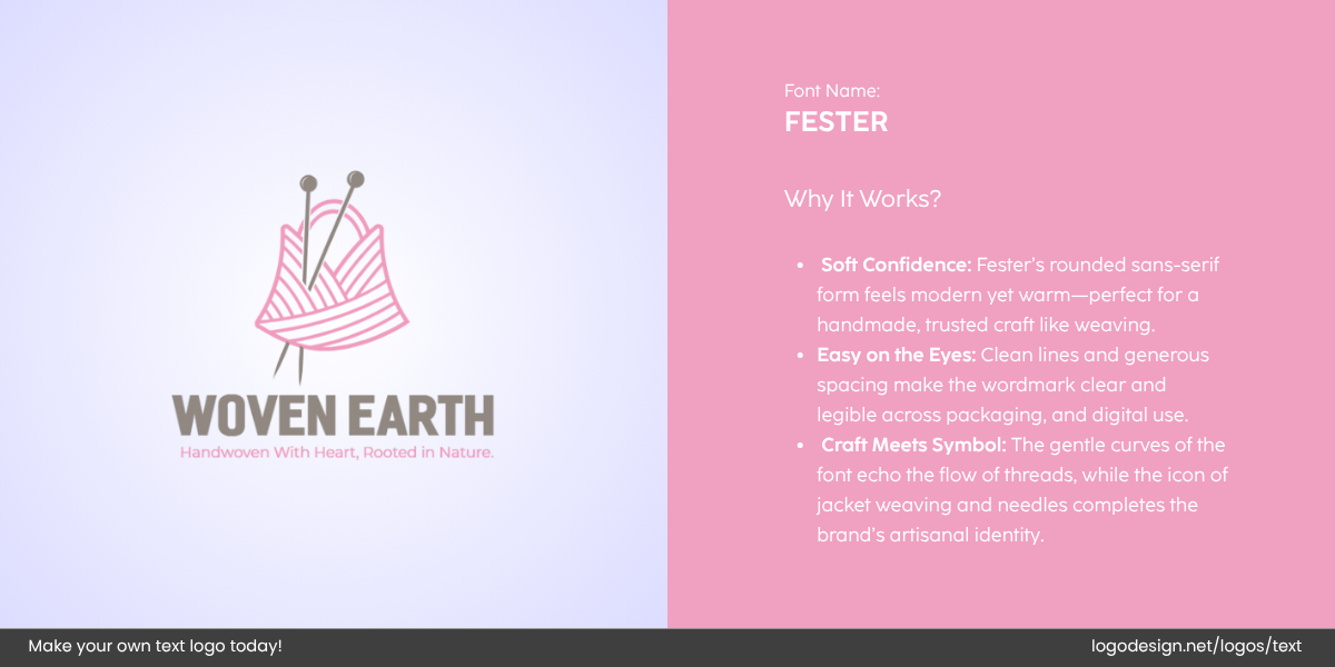
Woven Earth logo designed by LogoDesign.Net
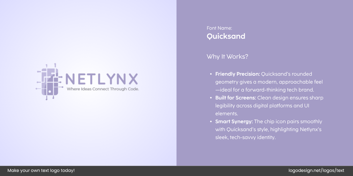
Netlynx logo designed by LogoDesign.Net
Here are a few examples of Sans-serif fonts that can work very well for businesses and be recognizable as well.
• Grotesque
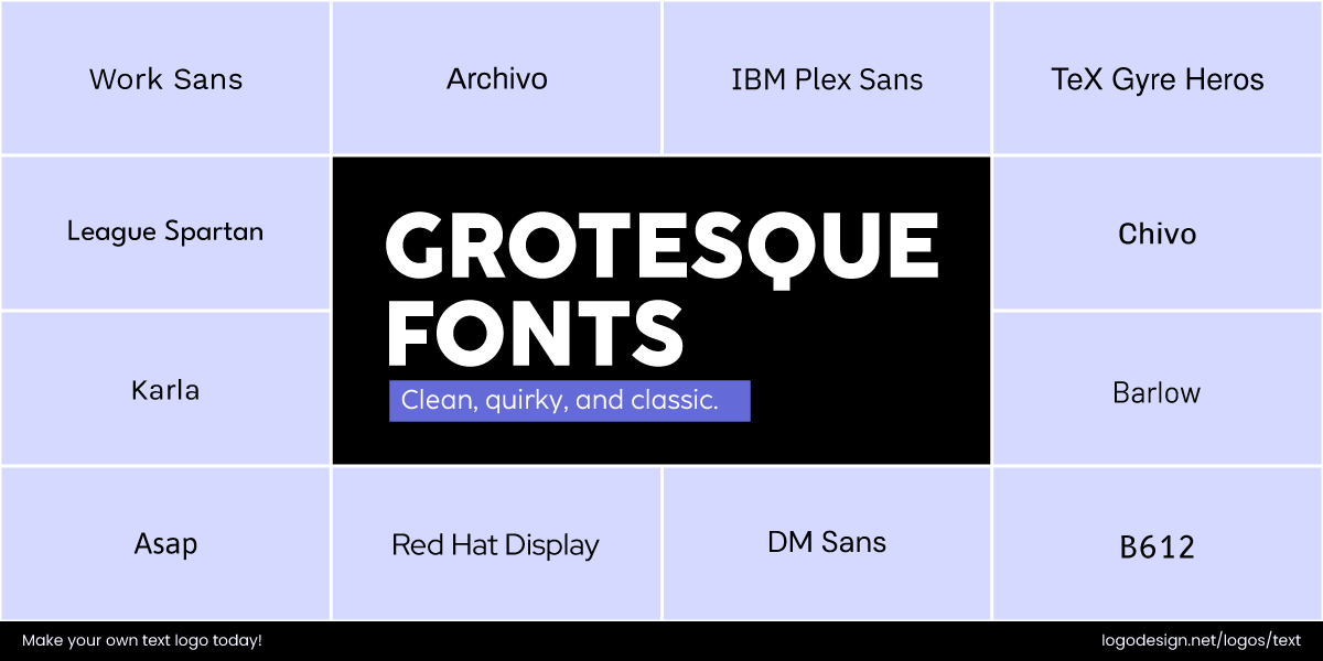
Grotesque Fonts have slightly irregular forms and a modern appearance
They are known for their slightly irregular forms and a modern appearance. Feels industrial and utilitarian, with a strong visual presence.
• Neo-Grotesque
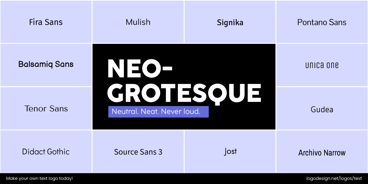
Neo-Grotesque Fonts have a clean appearance and modern shapes
It is one of the grotesque fonts, featuring clean, neutral, and balanced shapes. Common in modernist design due to its versatility and legibility.
• Humanist
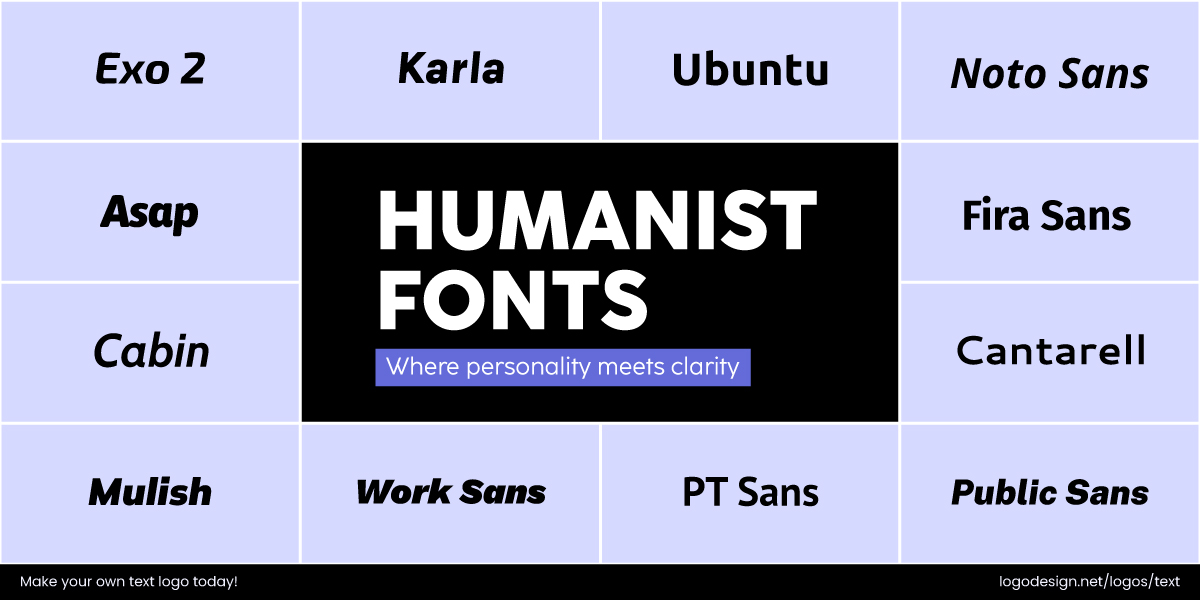
Humanist Fonts have a natural feeling and are easily readable
Inspired by traditional calligraphy and serif proportions, with natural strokes. Feels warm, friendly, and highly readable, ideal for body text and branding.
• Geometric
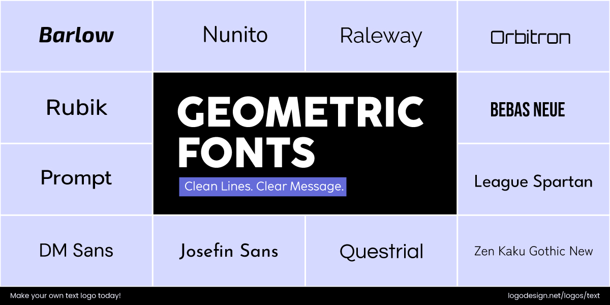
Geometric Fonts have a circular and minimalist look that shows sleekness and precision
Built on basic shapes like circles and squares for a minimalist look. Conveys modernity, precision, and sleekness with its styles.
Brands that use Sans-serif fonts in Logos:
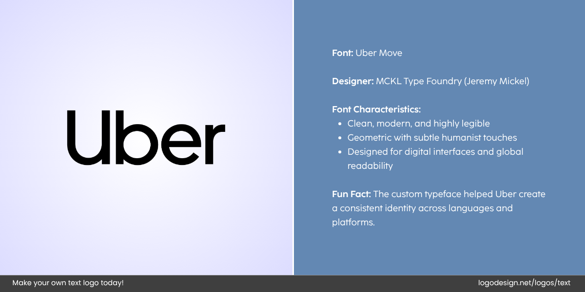
The simple Uber typography logo that uses a Sans-Serif logo with good use of negative space.
- Uber: Utilizes a minimalist sans serif logo to communicate sleekness and innovation.
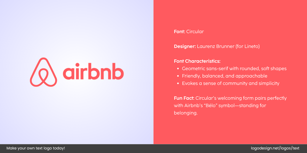
Airbnb logo that uses custom sans serif, with the red color showing friendliness
- Airbnb: The logo’s typeface is a custom sans serif, combining friendliness with sophistication.
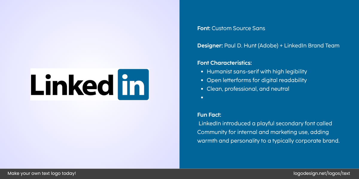
LinkedIn logo that uses sans serif fonts, and has the characteristics on the right side.
- LinkedIn: Uses a clean sans serif font to emphasize professionalism and accessibility
Script Fonts: Elegant and Expressive
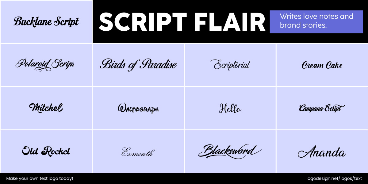
Script Flair Fonts have a handwritten feel to show a personal touch and creativity
Script fonts are similar to the style of human handwriting. They range from formal calligraphy styles to more casual, handwritten types.
Such styles add personality, elegance, and a touch of sophistication. Script fonts symbolize romance, creativity, or nostalgia, depending on their style. They are often seen in logos for event planners, art and craft brands, and luxury bed and breakfast services. But they should be used carefully in logos, as legibility is key.
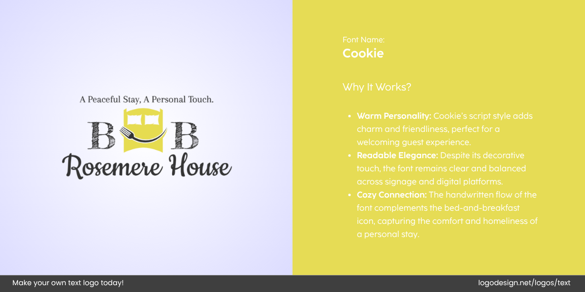
BB Rosemere House logo by LogoDesign.Net
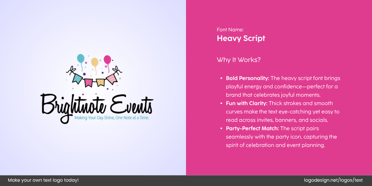
Brightnote Events logo by LogoDesign.Net
• Formal Script
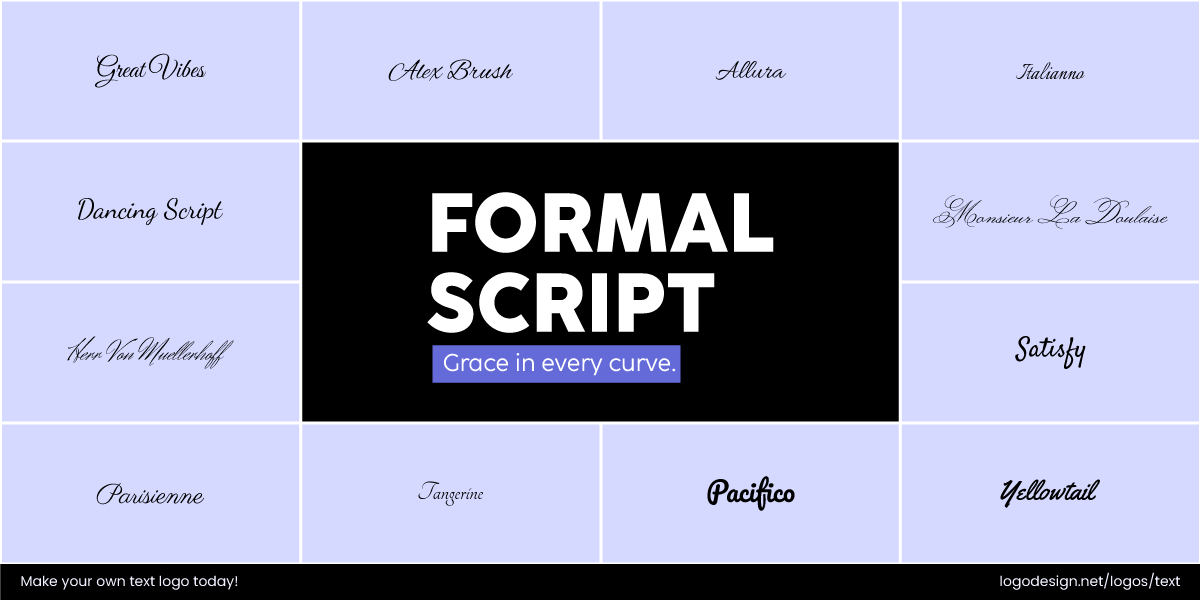
Formal Script Fonts have a sophisticated elegance and a handwritten feel
Elegant, sophisticated, and refined handwriting style, commonly used for invitations or formal documents.
• Casual Script
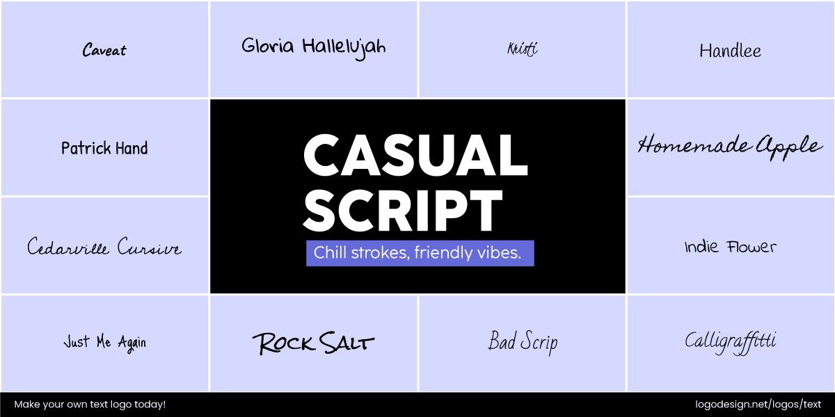
Casual Script Fonts have an informal and relaxed feel with natural curves
More relaxed and informal than formal script, with fluid, natural curves. It appears as natural handwriting most of the times.
• Calligraphic
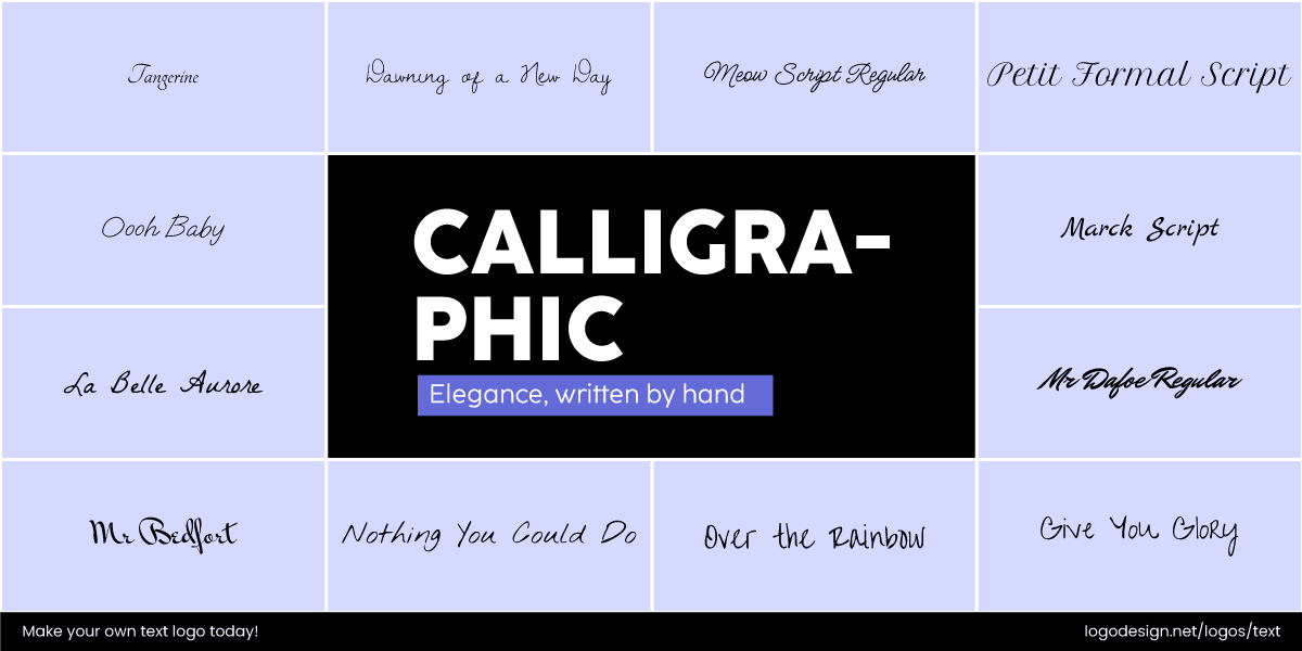
Calligraphic Fonts are stylized to get the reader’s focus on an important detail
Highly stylized and decorative writing, often associated with art. These styles focus on flows and complex details. Calligraphy in logo design is often used to convey creativity, elegance, and artistic flair.
• Brush Script
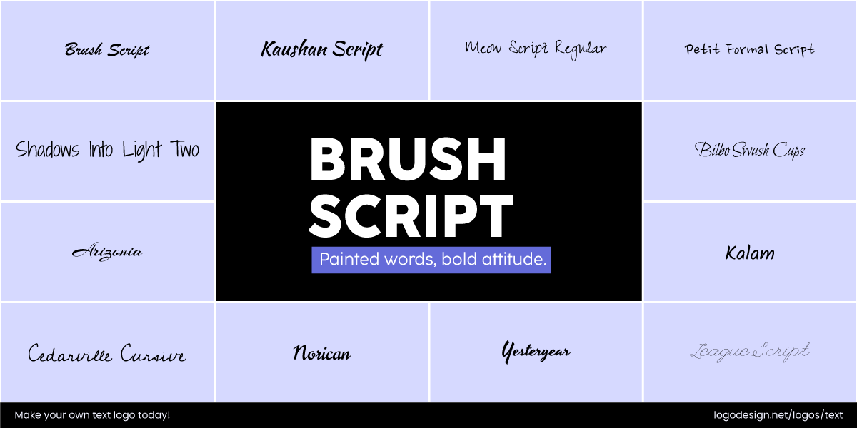
Brush Script Fonts create an informal and dynamic feel
Bold and expressive, the fonts look like strokes of a paintbrush. In design, they are used for a dynamic and informal feel.
Brands that use Script fonts in Logos:
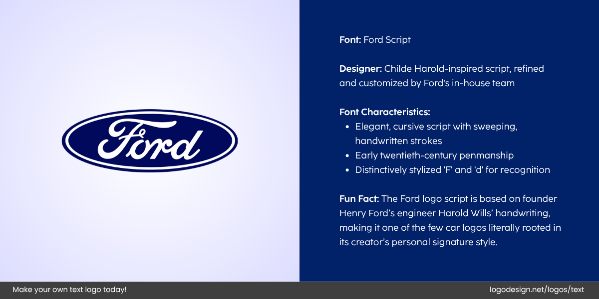
The Ford logo, that uses a brush scripts and handwritten stroke
- Ford: Includes a bold, classic script that conveys tradition, heritage, and reliability.
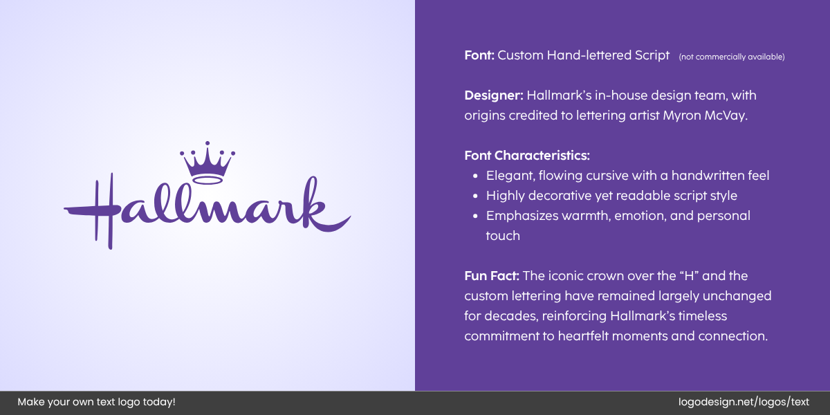
Hallmark logo with a custom hand-lettered script fonts with a crown giving a royal touch
- Hallmark: Uses a script font that conveys warmth, care, and sincerity, fitting for a brand centered around greeting cards and gifts.
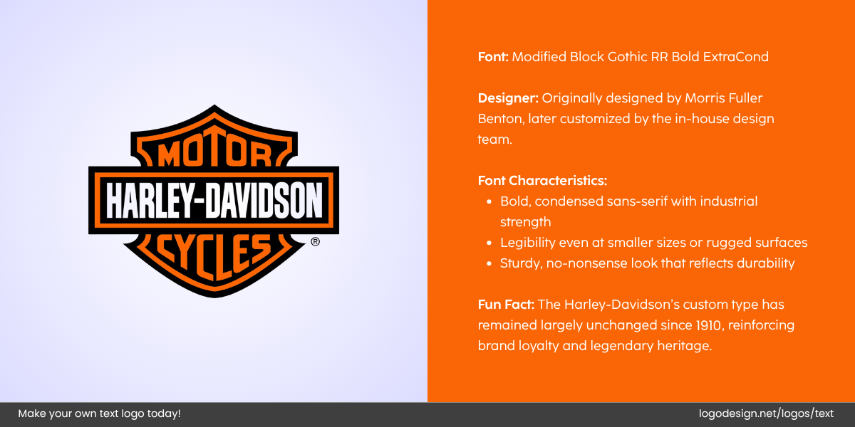
Harley Davidson logo that uses a black gothic bold font that’s largely unchanged since 1910
- Harley-Davidson: The script font in its logo highlights freedom and flexibility.
Display Fonts: Bold and Distinctive
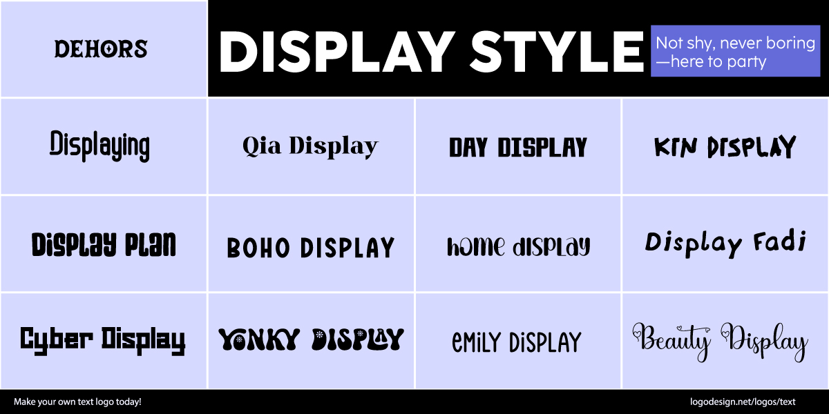
Display Style Fonts are uniquely styled to emphasize statements and quotations
Display fonts (sometimes called decorative fonts) are designed to make a statement. They are often unique, stylized, and less commonly used in logos across industries such as winery logos, convenience store, and tourism logos.
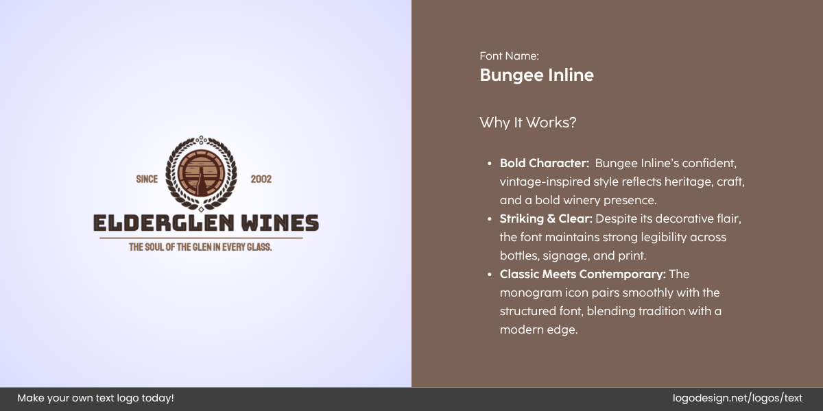
Elderglen Wines logo designed by LogoDesign.Net
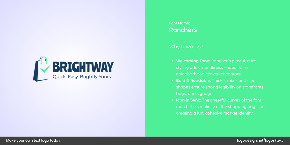
Bright Way logo designed by LogoDesign.Net
Such fonts draw attention and often express a unique aspect of a brand’s identity. They can be playful, dramatic, or cutting-edge, depending on their design. These fonts are best for brands that want to make a lasting impression or create an immediate impact.
• Retro
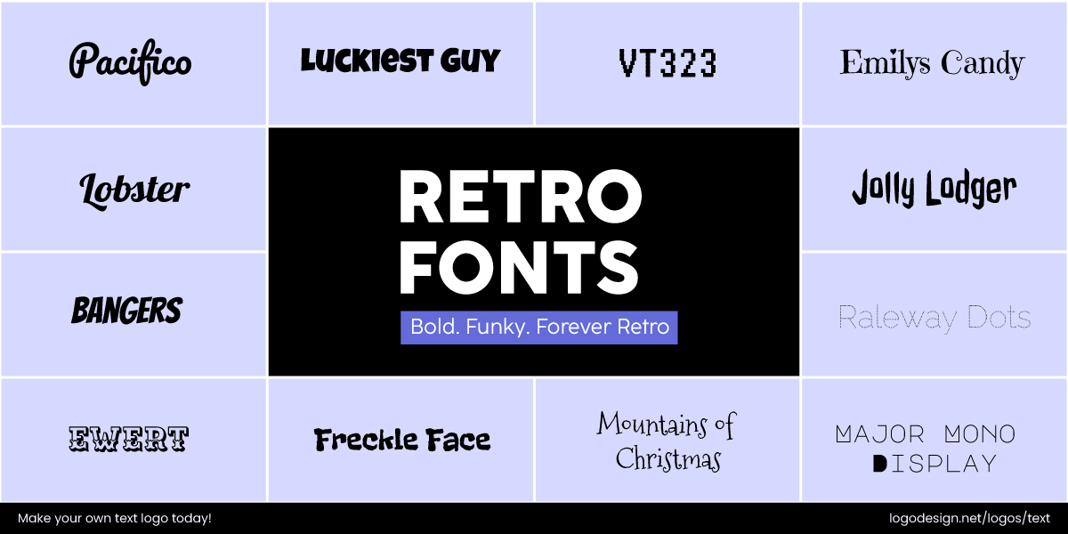
Retro Fonts give a nostalgic feel to build authenticity and trust
A nostalgic, vintage style that is inspired by the 80s, bringing out feelings of nostalgia, authenticity, and timelessness. Looking to capture timeless charm in your branding? Our retro logo guide can help you design with style and purpose.
• Grunge
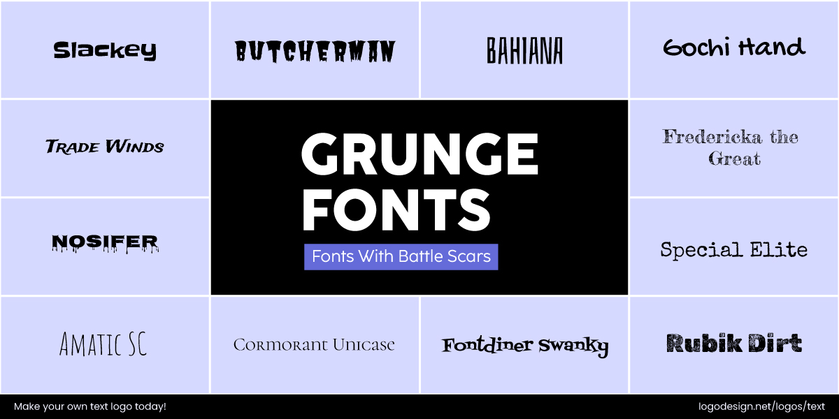
Grunge Fonts have a variety of textures to show a cultural feel
Rough, textured, and distressed fonts that convey a rebellious and edgy vibe. They are mostly associated with alternative or underground culture.
• Art Deco
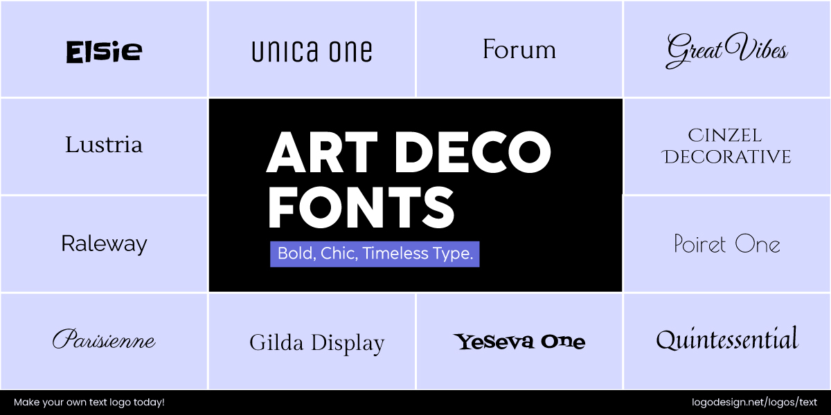
Art Deco Fonts combine bold lines to show luxury
A glamorous and geometric style with bold, symmetrical lines. You’ll find such styles being used to convey luxury and sophistication
• Cartoon
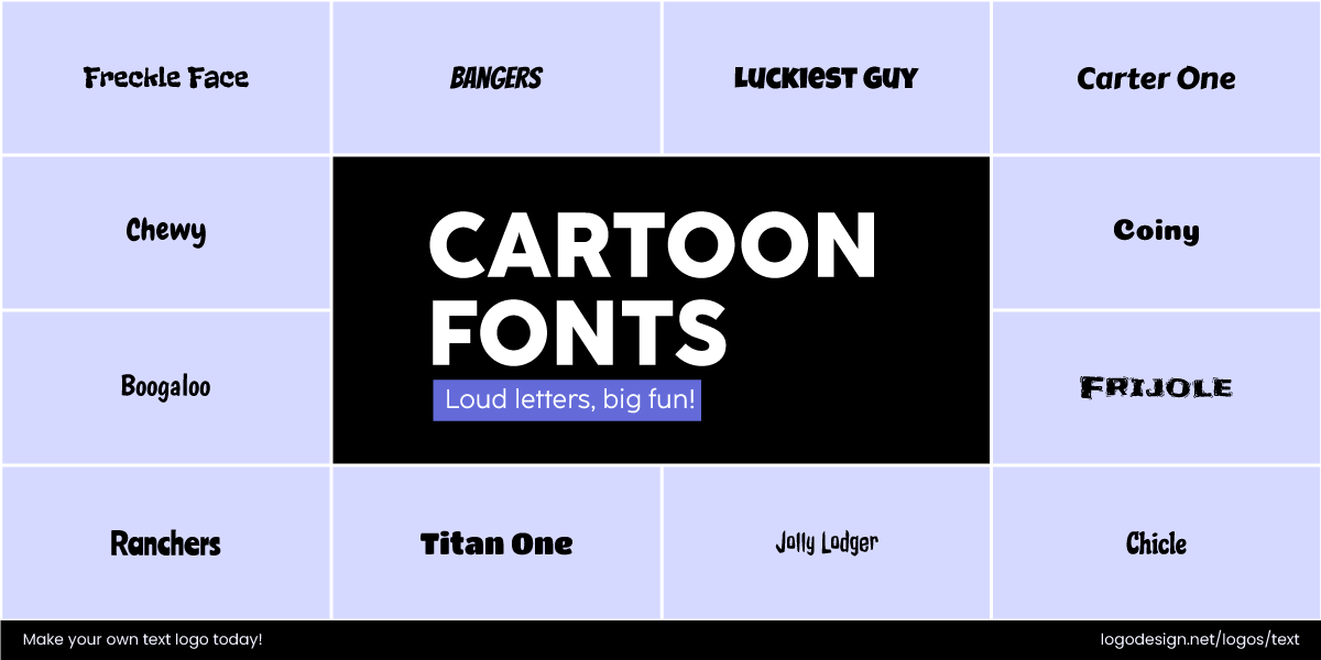
Cartoon Fonts give a playful vibe, often used in the entertainment industry
Playful, exaggerated, and fun fonts, sometimes bold and colorful too. Typically used for entertainment, children’s products, and informal branding.
• 3D / Layered
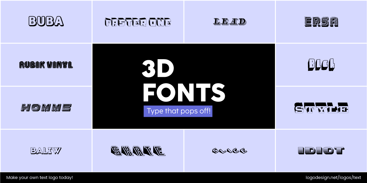
3D Fonts are used to display movement and effects
Font styles that give the illusion of depth or layers. They create a dynamic, eye-catching effect with a sense of dimension and movement.
• Hand-Drawn
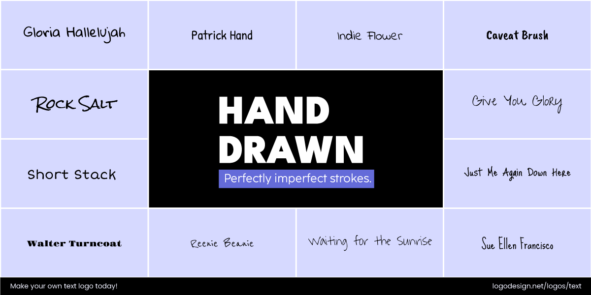
Hand-drawn Fonts show a personalized feel
Custom lettering that feels personal and unique, being used to give brands a creative or handcrafted feel.
Brands that use Display or Decorative fonts in Logos:
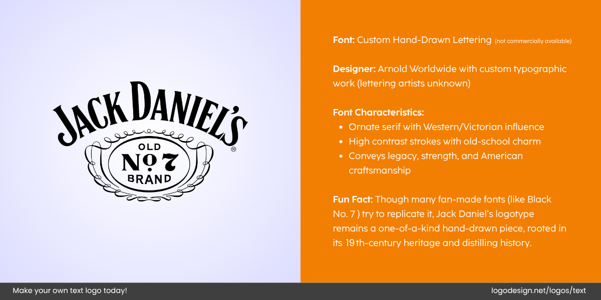
Jack Daniels logo, with custom hand-drawn lettering, and having the characteristics on the right
- Jack Daniel’s: The logo incorporates vintage-style serif typography. It creates a retro and timeless feel that connects to their long heritage.
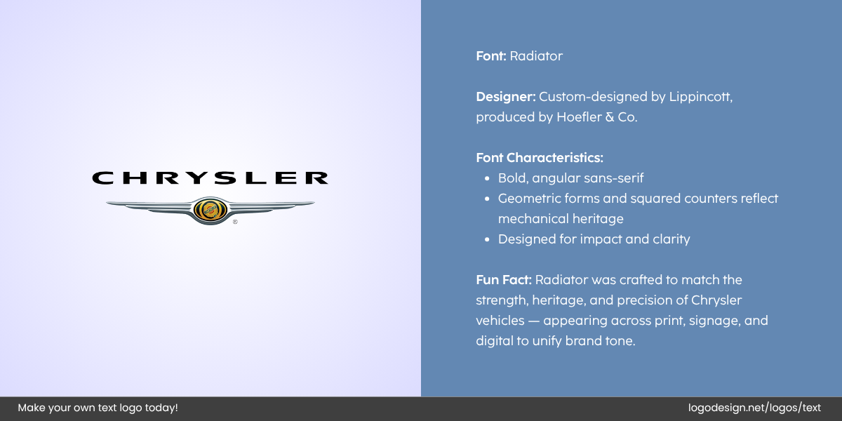
Chrysler Logo, an automobile manufacturer that uses a radiator font. It also has the logo details
- Chrysler: Its iconic logo reflects the Art Deco style, with sleek lines and symmetrical, bold fonts, showcasing luxury and tradition as well.
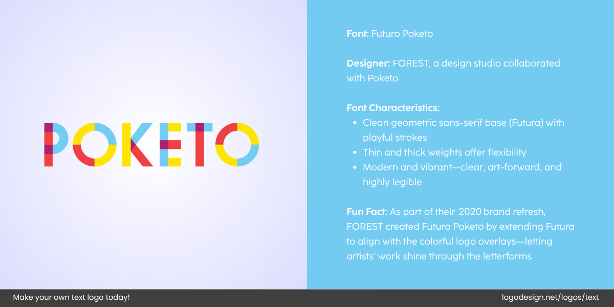
Poketo logo that uses various tiles of multiple colors in letter, using thin and thick letter weights.
- Poketo: The clean geometric logo using a sans-serif font, with the multiple colors showing creativity and playful theme
Custom Fonts: Crafted for Uniqueness
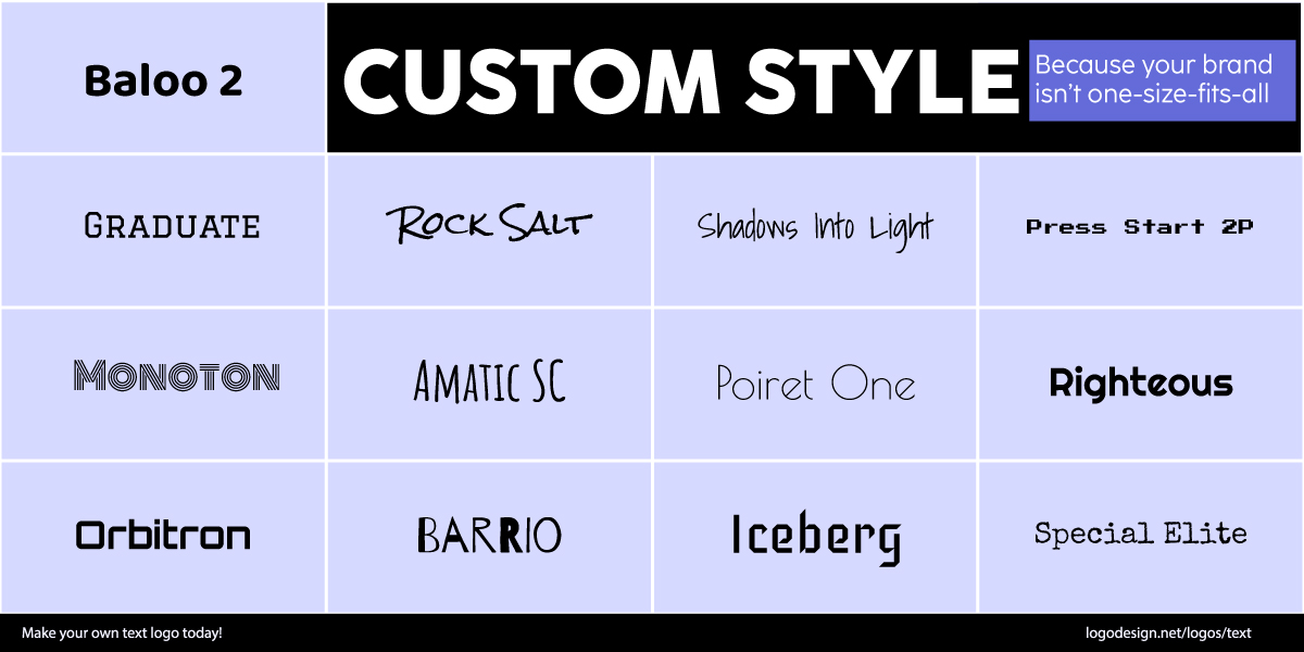
Custom Style Fonts are designed by brands for a more unique brand identity
When none of the existing fonts match perfectly with a brand’s identity or if a business wants to maintain maximum uniqueness, a custom font is the solution. Custom typography is created from scratch or changed to fit a specific visual style.
They help a brand make a statement in a crowded market and can become as iconic as the logo itself. This investment often pays off in brand recognition and exclusivity, particularly in sports and fitness, apparel brands, and media logos.
Tippy Toes Co. logo designed by LogoDesign.Net
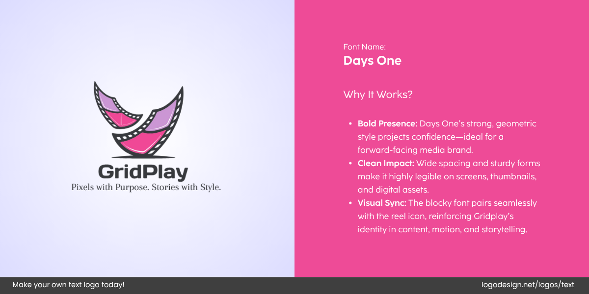
Grid Play logo designed by LogoDesign.Net
You can consider some of these font styles and add customization for a unique appearance and a logo that stands out in every industry.
Monospaced
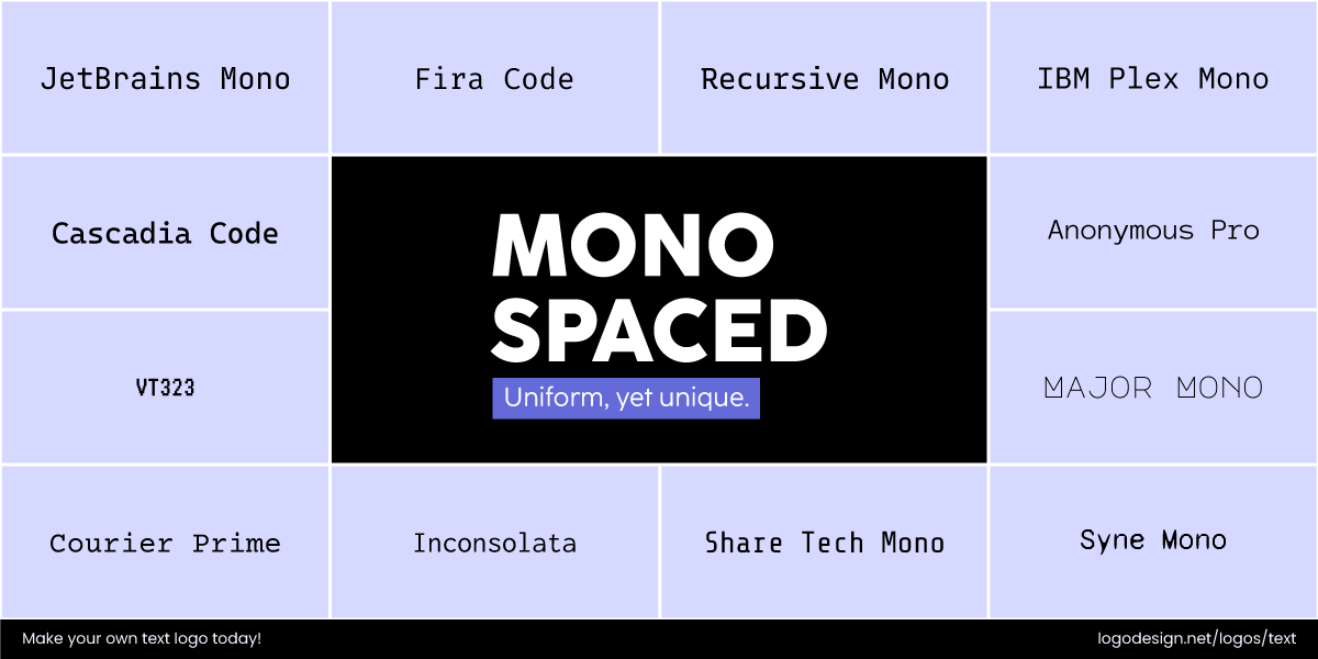
Monospaced Fonts take up extra space between characters to give a technical feel
A typeface where each character takes up the same horizontal space, creating a uniform look. Often associated with coding, typewriters, and technical contexts.
Typewriter
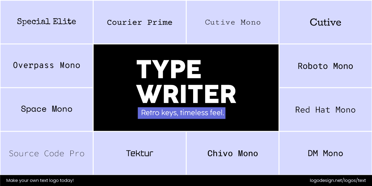
Typewriter Fonts feeling like the text is from a typewriter to give a nostalgic feeling
Is similar to the appearance of text typed on a traditional typewriter, often conveying a vintage, retro, or nostalgic feel.
Coding / Terminal
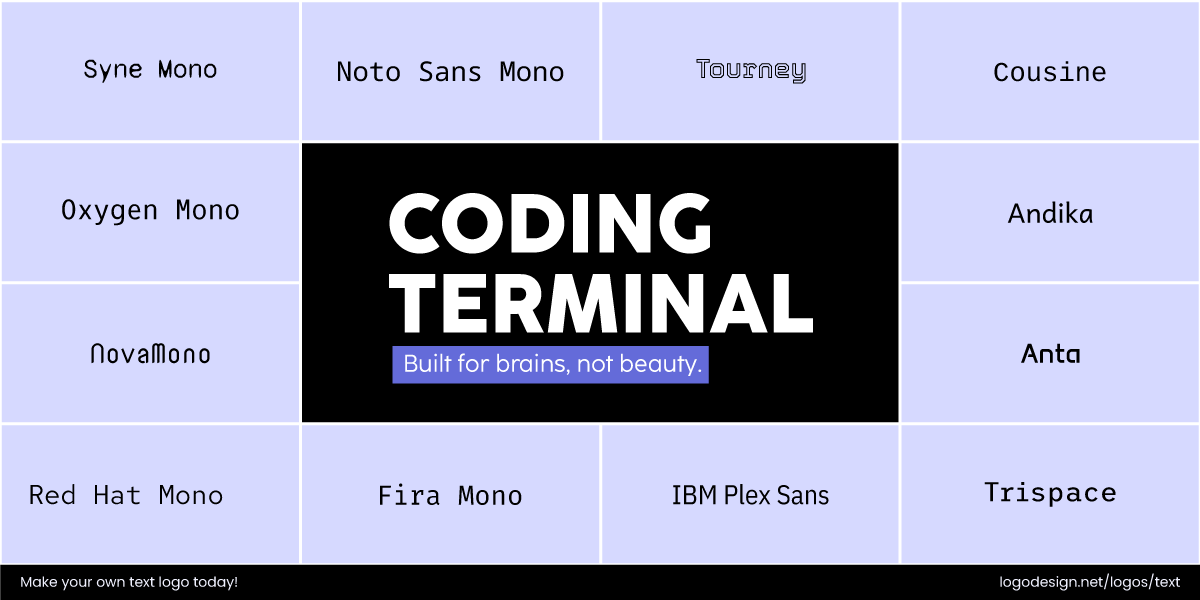
Coding Terminal Fonts gives a similar feeling to the style we see on Windows and software
A style of monospaced font that is typically used for programming and software interfaces. It is associated with interfaces or terminal windows.
Brands that use Custom fonts in Logos:
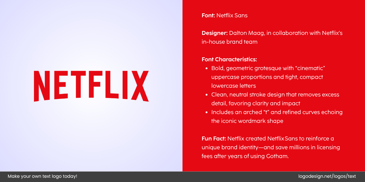
The Netflix logo uses a sharp, bold, red custom font, along with a subtle geometric grotesque
- Netflix: The wordmark has a custom typeface developed by Netflix to replace its previous font. This modern sans-serif font gives a clean and bold look.
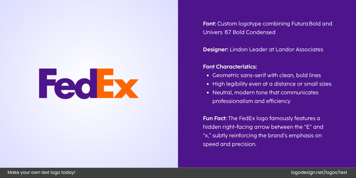
FedEx logo uses Futura Bold fonts and Purple and Orange colors to maintain consistency
- FedEx: It uses a clean, bold, and modern custom sans-serif font that conveys professionalism and reliability.
Blackletter/Gothic: Historic and Traditional
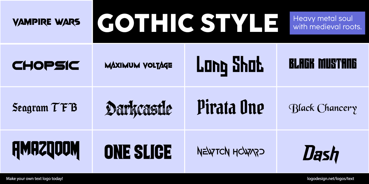
Gothic Style Fonts have heavy strokes with curved edges to show strength
With its bold, heavy strokes and curved edges, the font style conveys strength, seriousness, and gravity. It can give a sense of authority and also draw focus to a long-standing reputation. It’s perfect for businesses that want to reflect exclusivity or refinement. It’s perfect for businesses that want to reflect exclusivity or refinement, such as print and publishing logos, music logos, or high-end barbershop branding.
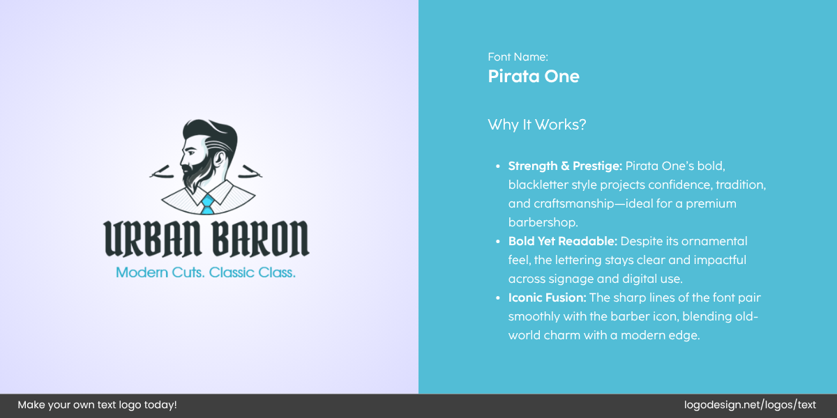
Urban Baron logo designed by LogoDesign.Net
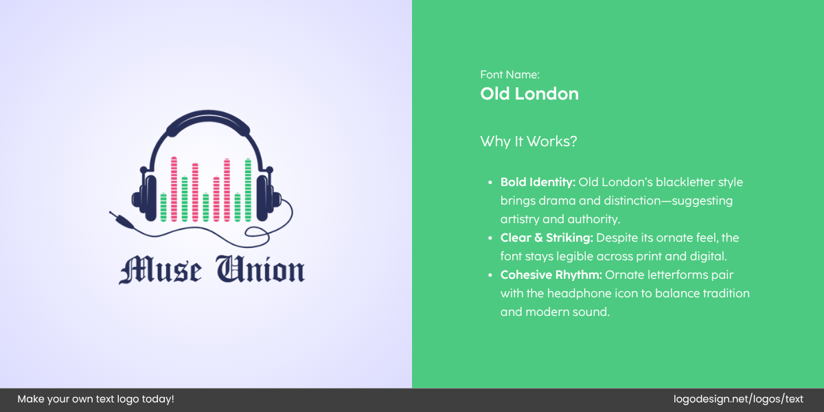
Muse Union logo designed by LogoDesign.Net
Blackletter can also add a timelessness to logos, conveying that a brand is both long-standing and reliable, like heritage brands or high-end services.
• Textura
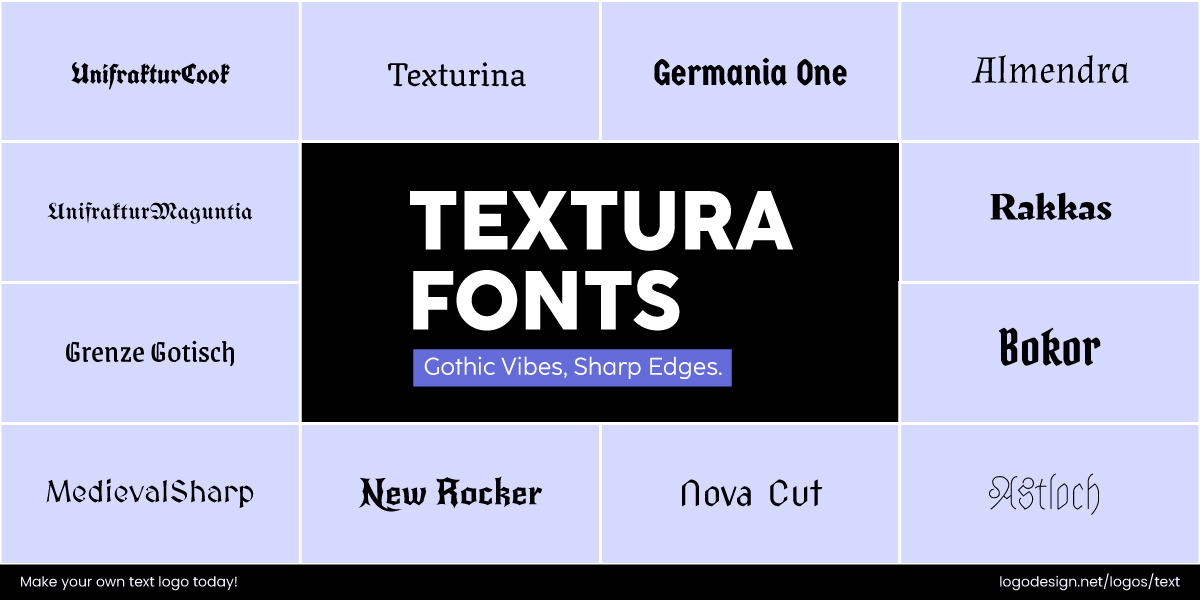
Textura Fonts have a decorative style, used for documentation and scripts
This is a very structured and decorative style, and you’ll find it being popularly used for formal documents or Gothic scripts.
• Rotunda
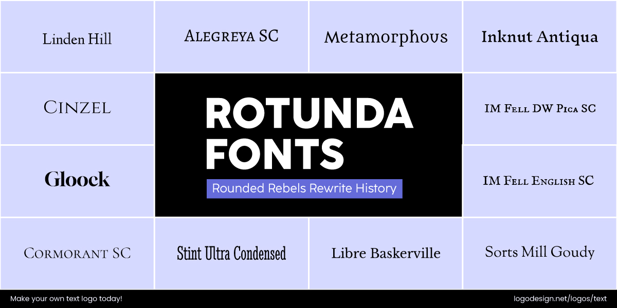
Rotunda Fonts have visible curves to show a traditional feeling
A more rounded form of Blackletter type, with visible curves and a slightly more readable style than traditional Gothic fonts.
• Schwabacher
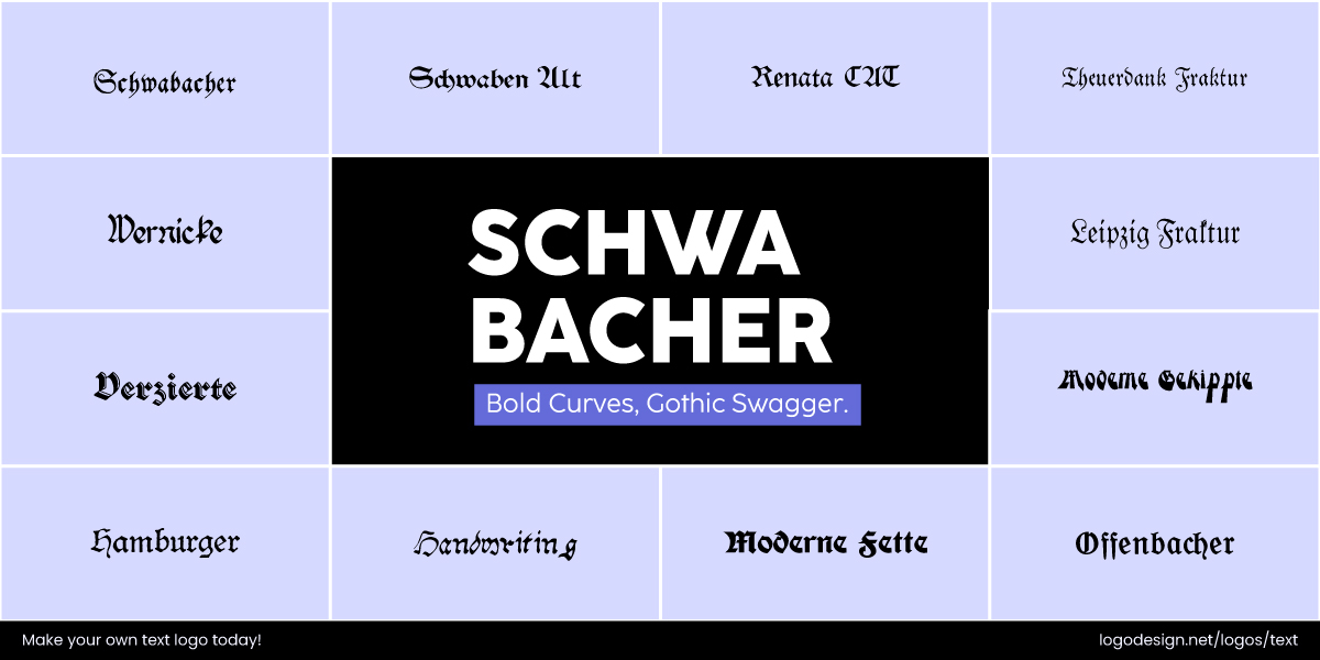
Schwabarcher Fonts are circular than most styles, used by brands to be more approachable
This appears almost circular, making it more legible and approachable than traditional Gothic styles.
• Fraktur
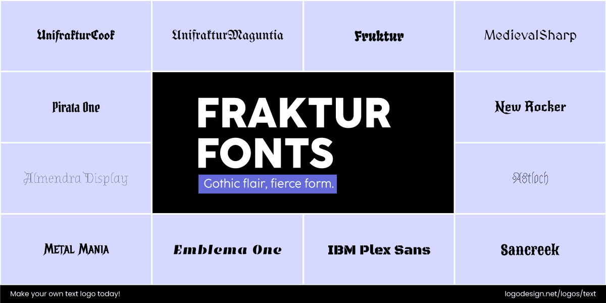
Fraktur Fonts have flowing strokes and give a traditional feeling
It features sharp, flowing strokes and has a decorative and traditional style. This type is less formal than Textura.
Brands that use Blackletter/Gothic fonts in Logos:
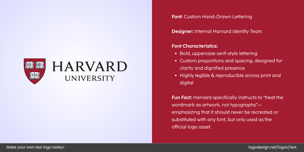
The Harvard University logo uses custom fonts with equal spacing that showcase sophistication.
- Harvard University: The style is used in the formal Harvard seal to draw attention to prestige and tradition.
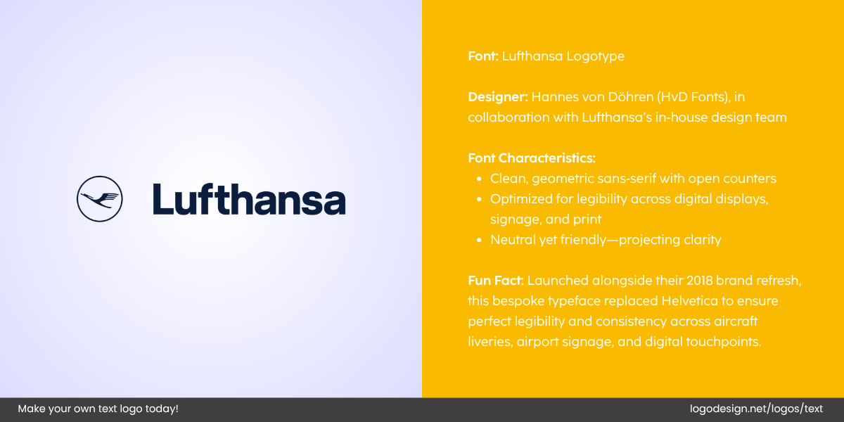
The Lufthansa logo uses a clear sans-serif font that’s compatible with different digital platforms.
- Lufthansa: Its logo font in their early branding symbolized heritage and national pride.
When you have chosen the right type of logo for your brand, you can decide on a custom or any relevant font style to bring the design together. If you go for the first option, keep in mind that custom fonts take a longer time and require expert typographic design and testing.
Factors to Consider When Choosing a Font
Typography influences brand recognition, emotional resonance, and even user behavior. That’s why selecting the right font requires more than just overall preference; it involves careful thinking.
Here are five essential factors to keep in mind when choosing a typeface that truly supports and enhances your brand identity.
1. Brand Purpose and Message
Your font should show your brand’s personality, tone, and values. Whether those are bold and modern, refined and timeless, or warm and approachable, the styles need to capture those.
Is your brand traditional or disruptive? Elegant or casual? For example, serif fonts like Garamond or Baskerville often feel authoritative and formal. They can work very well for financial or academic institutions. Similarly, geometric sans-serifs like Futura or Montserrat feel clean and contemporary, ideal for tech or design-led brands.
Fonts bring out a lot of emotional reactions. A handwritten or script font can feel personal and friendly, while a clear-cut typeface might suggest efficiency or urgency.
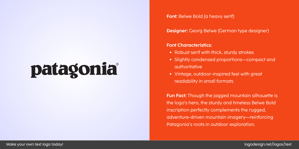
The Patagonia logo uses a bold serif font with thick strokes that delivers the brand message
Patagonia’s custom serif font appears natural and strong, for instance. It reflects the brand’s commitment to environmental sustainability and the outdoor lifestyle.
Different fonts appeal to different demographics. A children’s educational brand might use rounded, playful fonts like Comic Neue, while a high-end fashion brand may choose refined, minimalist typefaces like Didot or Bodoni.
20 Popular Logo Fonts & Who They’re Meant For |
|||
| Font | Style | Best For | Targets |
| Helvetica | Sans-serif, neutral | Tech, fashion, minimal brands | Modern, design-conscious audience |
| Futura | Geometric sans-serif | Architecture, beauty, startups | Sleek, contemporary consumers |
| Garamond | Old-style serif | Publishing, education, heritage brands | Intellectuals, academics, legacy lovers |
| Baskerville | Transitional serif | Editorial, luxury, law firms | Traditional, upscale, mature audience |
| Bodoni | Modern serif | Fashion, magazines, cosmetics | High-end, fashion-forward consumers |
| Montserrat | Geometric sans-serif | Startups, web design, apps | Digital-first, clean aesthetic seekers |
| Gotham | Contemporary sans-serif | Government, non-profits, media | Trust-focused, urban audience |
| Avenir | Humanist sans-serif | Health, tech, personal brands | Friendly, accessible, forward-thinkers |
| Raleway | Elegant sans-serif | Creative studios, lifestyle blogs | Chic, creative, style-savvy users |
| Playfair Display | High-contrast serif | Editorial, wedding, boutique brands | Elegant, romantic, feminine-leaning |
| Lobster | Script display | Food, crafts, personal brands | Informal, handmade-loving audience |
| Poppins | Geometric sans-serif | Tech, fintech, digital agencies | Youthful, global, modern professionals |
| Proxima Nova | Modern sans-serif | Social platforms, brands like BuzzFeed | Digital natives, millennials |
| Roboto | Neutral sans-serif | Apps, SaaS, educational platforms | Practical, mainstream digital users |
| Times New Roman | Classic serif | Newspapers, legal, academics | Traditional, conservative audience |
| Pacifico | Handwritten script | Bakeries, handmade goods, lifestyle shops | Casual, cheerful, artisanal-minded |
| DIN | Industrial sans-serif | Automotive, engineering, sports brands | Technical, masculine, no-nonsense |
| Copperplate | Serif with wide tracking | Finance, luxury, monograms | Sophisticated, formal, legacy-focused |
| Franklin Gothic | Bold sans-serif | News, politics, commercial brands | Bold, direct, information-driven |
| Clarendon | Slab serif | Western themes, law, retro branding | Rugged, heritage, Americana audience |
Tip: Test your font choice with your target audience so that it aligns with how you want your brand to be perceived.
2. Readability
Even the most stylish font fails if people can’t read it. Readability is crucial for viewer attention and accessibility.
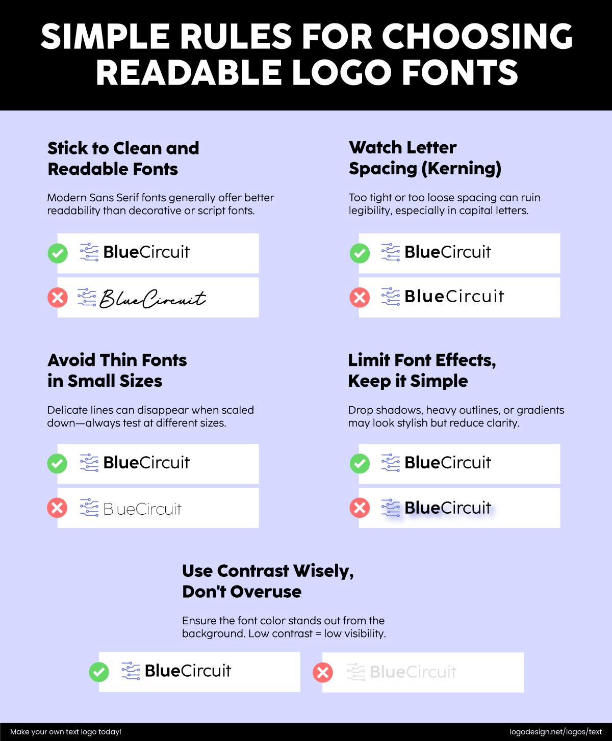
How to choose readable fonts for your logo
Make sure your font remains clear at all sizes, especially for small-scale applications like logos, footnotes, or mobile interfaces. A display font that looks great in headlines may become illegible in small text.
Fonts that are too thin or too tightly spaced may blur together or disappear when scaled down in different devices. Look for typefaces with strong contrast so they can work on neutral backgrounds or bright colors. Maintain good kerning (space between letters) as that will make your font appear readable in any size or resolution.
For body text, stick to fonts specifically designed for long-form readability, such as Georgia or Open Sans. For headlines or branding, you can be more creative or experimental.
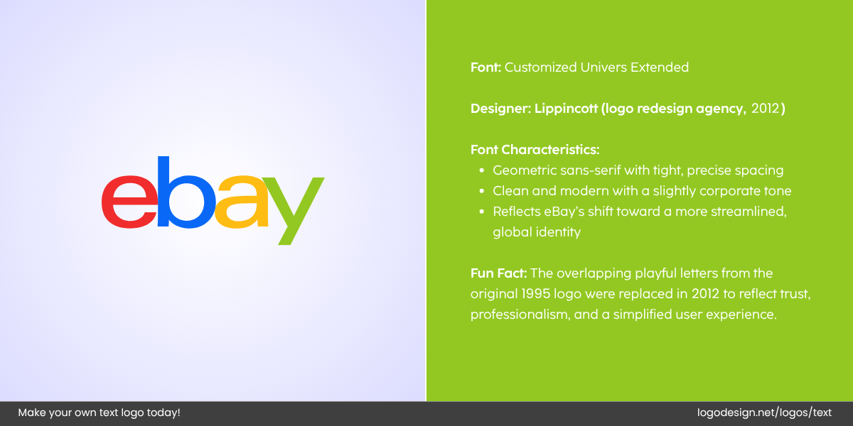
The eBay logo uses a customized font for a clean look to capture a global audience
eBay uses a simple, friendly sans-serif font called eBay Sans. The design is clear and easy to read across multiple platforms and on all screen sizes.
Tip: Always test your font choices on different screen sizes, backgrounds, and formats before finalizing them.
3. Versatility
Your brand font needs to perform consistently across a variety of formats and devices. This is especially important for brands with both digital and physical touchpoints.
It should look great on websites, mobile apps, social media graphics, printed brochures, packaging, signage, and presentations.
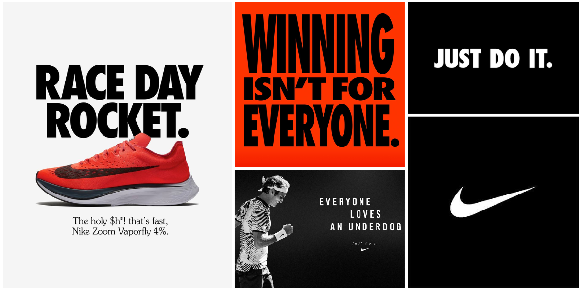
The document shows the branding guidelines of Nike, including logos and taglines.
Nike’s version of Futura Condensed is a bold, clean, and versatile font that works from apparel and store signage to advertising and digital platforms.
If you think about it, some fonts do not appear as they do on low-resolution screens or in different browsers. Opt for fonts with multiple weights (light, regular, bold, extra-bold) and styles (italic, condensed, etc.). This allows you to create a visual hierarchy and draw focus with consistency, allowing you to create a versatile logo and identity that works everywhere. Using a single, adaptable font family ensures design harmony across all brand materials, which helps build recognition and trust.
Tip: Try your font in mockups of common use cases (e.g., business cards, website headers, mobile buttons) to assess its adaptability.
4. Timelessness
Trendy fonts might be eye-catching now, but they may not last for a long time. A timeless font ensures that your brand stays relevant and credible over the years.
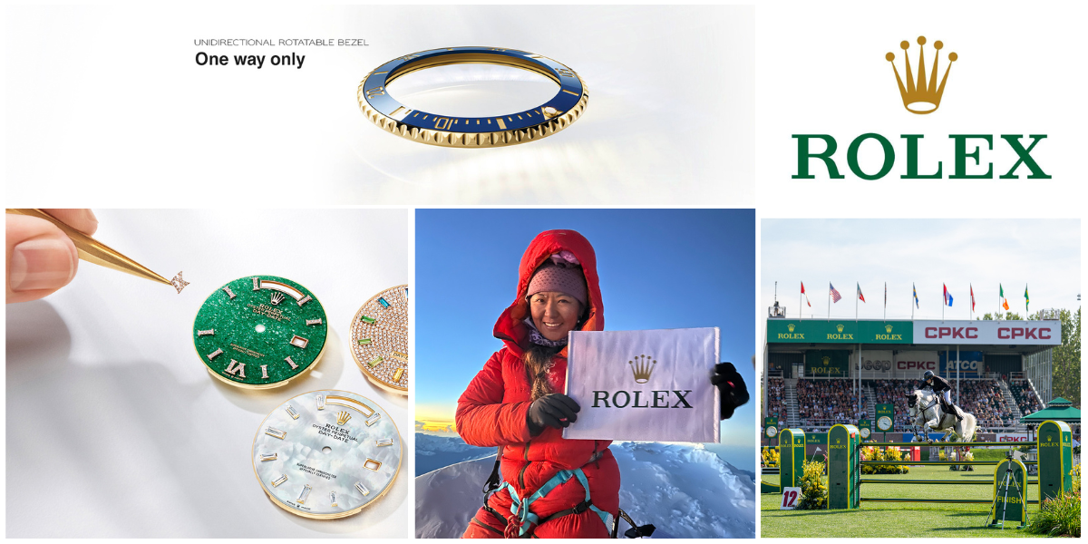
Document that displays the Rolex logo and other branding material | Source: Facebook/Rolex
Rolex’s custom serif font shows luxury and class, highlighting the brand’s connection to tradition and craftsmanship. The style is and will likely stay relevant for generations.
Fonts that reflect changing design trends (e.g., ultra-minimalist or overly decorative typefaces) can turn people away. Neutral, well-constructed typefaces like Helvetica, Gotham, or Proxima Nova are widely respected for their clean, modern yet enduring style.
Fonts That Have Powered Logos for Over 100 Years |
|||
| Font | Year Created | Type | Still Seen In |
| Garamond | 16th century (Claude Garamond) | Old-style serif | Publishing, education, premium branding |
| Baskerville | 1757 | Transitional serif | Universities, luxury products |
| Didot | 1784 | Modern serif | Fashion (e.g., Vogue) |
| Bodoni | 1798 | Modern serif | Fashion, cosmetics (e.g., Calvin Klein) |
| Clarendon | 1845 | Slab serif | Western/retro logos, law firms, outdoor brands |
| Franklin Gothic | 1902 | Sans-serif | News, industrial, strong editorial logos |
| Futura | 1927 | Geometric sans-serif | Tech, fashion, iconic brands (e.g., Supreme) |
| Gill Sans | 1928 | Humanist sans-serif | British brands, railways, arts |
| Times New Roman | 1931 | Transitional serif | Newspapers, corporate or institutional logos |
Rebranding is costly and disruptive. A timeless font reduces the need for frequent visual updates and helps build long-term recognition.
Tip: Ask yourself, ‘Will this font still look good in five years?’ If you are unsure, choose something classic and clean.
5. Legality
Fonts are intellectual property, so using them without the proper license can lead to legal trouble, especially in commercial or large-scale projects.
The following are some of the key types of licenses to consider:
- Desktop License: For use in local software like Photoshop or Illustrator.
- Web License: Fonts in websites (usually based on monthly traffic).
- App License: For embedding in mobile or desktop applications.
- Commercial License: For use in marketing, advertising, or merchandise.
- Open-Source vs. Commercial Fonts: Open-source fonts (e.g., Google Fonts) are free and safe to use for most purposes. Premium fonts from foundries like Adobe Fonts, Linotype, or MyFonts may require a paid license.
- Custom Fonts: Some brands commission bespoke typefaces to ensure uniqueness and exclusivity. While this is costly, it prevents copycat designs and ensures full legal control.
Tip: Always read the End User License Agreement (EULA) of any font you plan to use, and keep records of your purchase or usage rights. If your logo uses a customized font, ensure you have the proper licensing or permission, and consider securing copyright for the final logo design to avoid any infringement issues.
How to Choose The Right Fonts for Your Brand?
Typography is one of the most defining elements of visual branding. It sets the tone, conveys emotion, and helps build recognition. Choosing the right font is not just a visual decision; it’s a strategic one that can influence trust, credibility, and even conversion rates.
Here’s a detailed guide to selecting fonts that align with your brand’s identity and values.
1. Start With Your Brand’s Core Identity
A font should focus on who you are as a brand. Before looking at typefaces, keep these factors in mind:
- Brand voice (e.g., formal, quirky, bold, minimalist)
- Core values (e.g., trust, innovation, inclusivity)
- Brand personality (e.g., playful like LEGO, luxurious like Chanel, or disruptive like Tesla)
10 Modern Brands Using Typography to Reflect Their Personality |
||
| Brand | Logo Font | Brand Personality |
| Glossier | Helvetica Neue Bold (modified) | Minimalist, Approachable, Empowering, Youth-focused |
| Aesop | Optima | Sophisticated, Artistic, Intellectual, Calm |
| Mailchimp | Cooper Light (custom script) | Quirky, Fun, Friendly, Creative |
| Mejuri | Canela | Bold, Feminine, Modern, Elegant |
| Outdoor Voices | GT America | Energetic, Inclusive, Friendly, Outdoorsy |
| Eadem | GT Sectra | Empowering, Inclusive, Grounded, Insightful |
| Italic | Maison Neue | Smart, Disruptive, Transparent, Elevated |
| Figma | Inter | Innovative, Open, Community-driven, Friendly |
| Ritual | Maison Neue | Transparent, Pure, Thoughtful, Scientific |
| Everlane | Simplon Mono / Founders Grotesk | Honest, Minimal, Sustainable, Timeless |
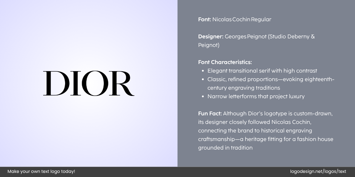
The Dior logo uses Nicholas Cochin fonts and high contrast display to get a luxury feel.
A high-end label like Dior uses elegant serif fonts (e.g., Didot) to evoke timelessness and class.
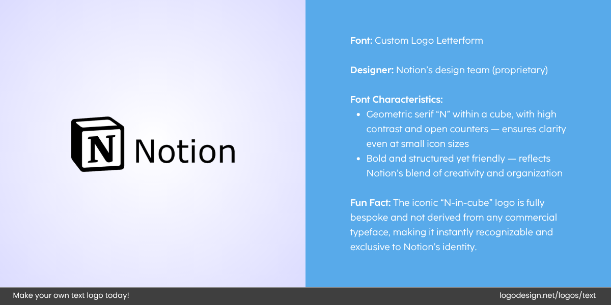
The Notion logo uses a custom font with the letter N in a cube illustrating creativity.
Similarly, in the tech industry, a brand like Notion uses sleek, minimal sans-serifs (e.g., Inter or Circular) to signal modernity and clarity.
Create a brand moodboard with imagery, textures, colors, and sample typography styles. Use it as a visual benchmark when evaluating font candidates.
2. Understand Your Audience’s Expectations
Fonts appeal to specific demographics and market segments. Your target audience’s preferences should impact your font choice.
- Younger audience (e.g., Gen Z): Often drawn to bold, expressive, and experimental typography (e.g., Neue Machina, Cooper Black).
- Professional or corporate audience: Prefer refined and legible fonts that convey stability (e.g., IBM Plex Sans, Source Serif Pro).
- Creative or artisan market: May respond well to hand-drawn or script fonts (e.g., Pacifico, Amatic SC) that feel personal and human.
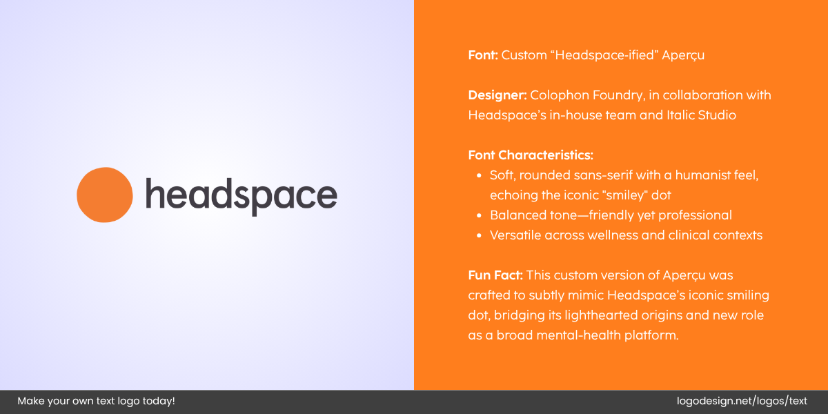
The Headspace logo uses a custom font with the orange dot symbolizes the iconic smiley
Headspace uses a soft, rounded sans-serif (e.g., Gotham Rounded) that feels calming and friendly, perfect for their wellness-focused audience.
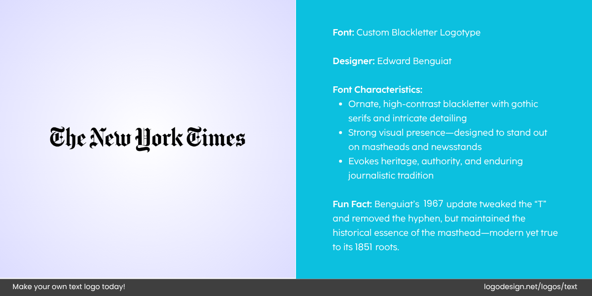
The New York Times logo uses a custom font showing a journalistic feel
Consider the example of The New York Times, too. They use a traditional serif (custom font similar to Cheltenham) to project authority, tradition, and journalistic integrity.
For choosing just the right font for your brand, run a font A/B test using social polls, ad mockups, or website heatmaps. This will help you get a clear idea of how different typography affects perception and engagement.
3. Choose Fonts for Functionality and Form
Balance style with usability in your font choice for your brand so that it lasts for years. Choose a font that looks good and functions well across all media and formats.
- Legibility at all sizes: Thin or ultra-light fonts may vanish on small screens.
- Contrast on different backgrounds: Fonts should be readable in both light and dark contexts.
- Character set: Does it include numerals, punctuation, or non-Latin languages you may need?
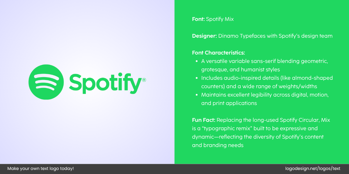
The Spotify logo uses a custom font with a symbol that showing what the brand is about
Spotify switched to Circular, a geometric sans-serif, because it’s stylish, highly legible, and adaptable for mobile, desktop, and marketing.
Don’t just preview fonts on a white background. Test them on mockups of your actual branding, such as websites, packaging, app UIs, and print materials like professionally designed business cards.
4. Look for Versatile Font Families
Choose font families with multiple styles since this gives you design flexibility while maintaining brand consistency.
You can create hierarchy (e.g., headings, subheadings, body text) and maintain visual cohesion across platforms (web, print, signage). It can also help you avoid confusion in logo design by mixing multiple unrelated fonts.
Examples of versatile font families:
- Roboto – Tech-friendly, available in many weights, great for digital interfaces.
- Montserrat – Bold, modern, and good for both headlines and body copy.
- Playfair Display + Source Sans Pro – A great serif + sans pairing for editorial or luxury brands.
Use Google Fonts or Adobe Fonts to preview how different font styles and weights interact in a system.
5. Limit the Number of Fonts
A strong brand identity doesn’t need dozens of fonts. Using two or three fonts max helps keep things clean and consistent:
- Primary Font: For wordmark or business name in logo (e.g., bold and distinctive)
- Secondary Font: For slogan or business tagline (e.g., neutral and legible)
- Accent Font (optional): For highlights or decorative text (e.g., script or all-caps display)
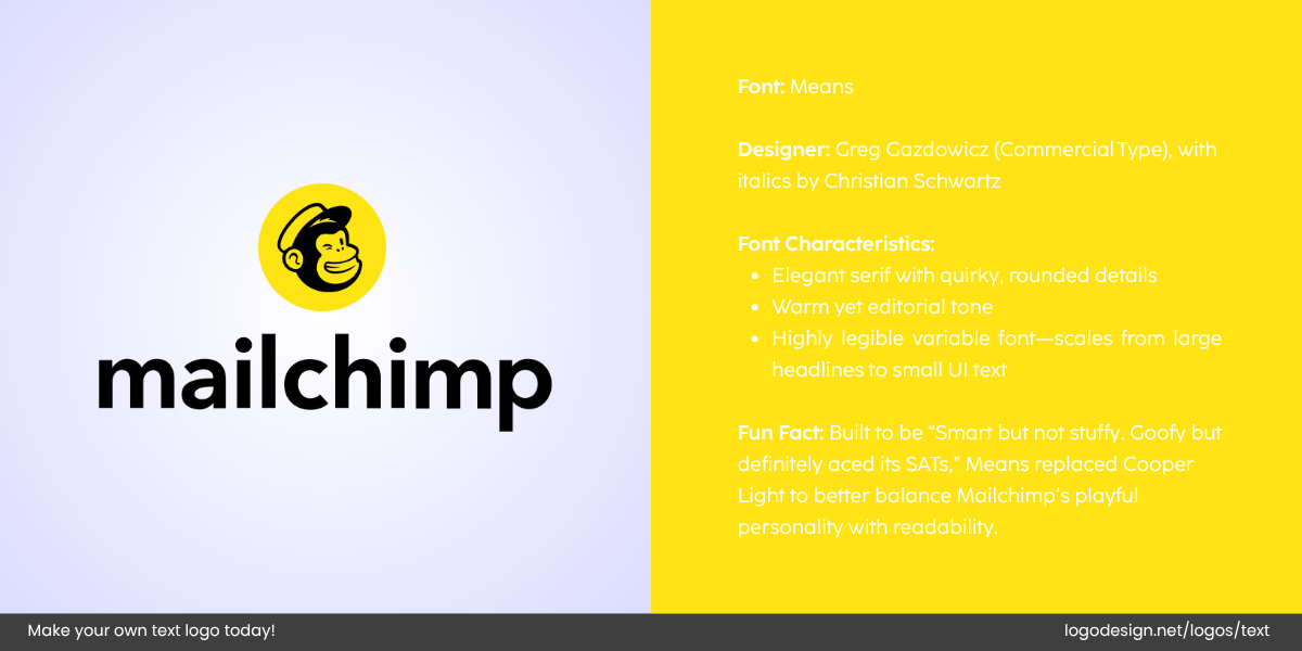
The mailchimp logo uses the serif font type and quirky details
Mailchimp uses a combination of a quirky, expressive logo font (Means Web) and a clean body type (Graphik) to reflect both their playfulness and professionalism.
Too many fonts dilute your brand’s visual authority. A limited type palette is easier to maintain across teams and platforms.
6. Check Availability for Legal and Commercial Use
Fonts are similar to software, which is why using them commercially without a license can lead to legal issues.
Here are a few aspects to check when choosing a font for your brand.
- Is the font free for commercial use?
- Does your license cover all formats (web, app, print, broadcast)?
- Will it scale with your business as your usage grows?
Google Fonts offers 1000+ open-source fonts free for commercial and personal use. But fonts like GT America or Aperçu require purchasing licenses, especially for websites or app distribution.
Always download fonts from trusted sources and save a copy of your license agreement.
Trusted Font Download Websites |
||
| Name | Free / Paid | Website URL |
| Google Fonts | Free | https://fonts.google.com |
| Adobe Fonts | Paid (via Creative Cloud) | https://fonts.adobe.com |
| Font Squirrel | Mostly Free (Commercial Use) | https://www.fontsquirrel.com |
| MyFonts | Paid | https://www.myfonts.com |
| DaFont | Free & Paid (Check licenses) | https://www.dafont.com |
| Behance | Free & Paid (Designer uploads) | https://www.behance.net |
| Creative Market | Paid (with some free weekly fonts) | https://creativemarket.com/fonts |
| Fontspring | Paid & Free (licensed) | https://www.fontspring.com |
| Envato Elements | Paid (subscription-based) | https://elements.envato.com/fonts |
| Lost Type Co-op | Pay-what-you-want (some free) | https://www.losttype.com |
7. Match Fonts With the Rest of Your Brand Elements
Typography doesn’t exist in a vacuum. Your fonts should work well with the logo style, color palette, imagery, icons, brand tone, and messaging.
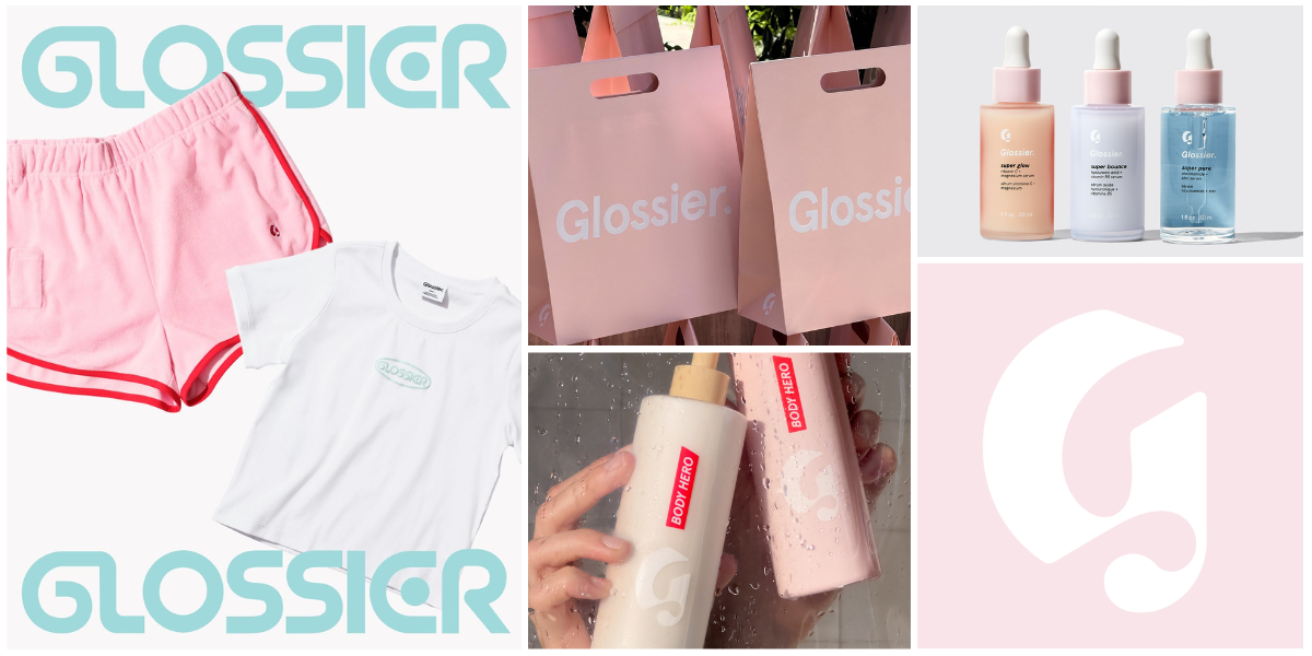
A Glossier banner with the branding elements logo, along with products. | Source: Facebook/Glossier
Take the example of one of the most popular beauty brands today. Glossier combines a clean sans-serif (Helvetica Neue) with a soft pastel color palette and minimal UI to reflect its sleek, inclusive, and modern brand.
Fonts can also balance your design elements and create visual hierarchy. If your logo has a complex design, a simple body font brings clarity. If your design is minimalist, a more character-rich font can add personality.
8. Create and Document Font Guidelines
Once chosen, formalize your typography choices into your brand style guide. Include font names, weights, and recommended sizes. Add use cases (e.g., headings, subtitles, UI label) and give clear examples of proper and improper use.
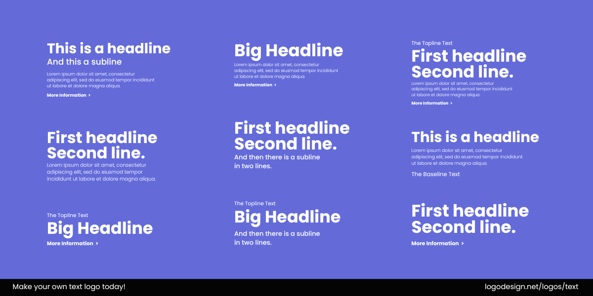
This is a guide that shows font guidelines to showcase the brand’s personality.
Audi style guidelines outline how their fonts should be used across all platforms, with pixel-perfect specs for headlines, buttons, and legal text.

The document font guidelines of Audi, that showcase the brand’s personality. | Source: Audi Style Guide
Tools like LogoDesign.Net allow you to save font styles as reusable templates for your team or clients.
Fonts help communicate your values, personality, and style while ensuring readability and consistency across platforms. Whether you opt for timeless classics or modern sans-serifs, the key is to strike a balance that aligns with your brand’s identity.
Free Logo Font Style Guide Template
Keep your branding consistent and professional. This easy-to-use template helps you define and document your logo fonts for clear, on-brand use everywhere.
Perfect for designers, startups, and creative teams.
By following the principles outlined here, you can select fonts that not only enhance your design but also resonate emotionally with your audience. Always remember, the fonts you choose are the voice of your brand in the visual world.
Key Takeaways:
- When choosing a font, consider the psychological impact it will have on your audience.
- Serif Fonts, Sans-Serif Fonts, Script Fonts, Display and Custom Fonts are used in logos.
- It’s essential that the font is legible at all sizes. Avoid overly intricate fonts or excessive detailing that might compromise clarity when scaled down.
- Test your font choice on various formats and backgrounds to ensure that it remains readable and impactful across all media, both digital and print.
- Use one primary font for the logo text and a secondary, complementary font for any tagline or supporting text.
- Maintain consistency across all branding assets. If you opt for an online logo maker tool, you can save and upload the font styles for every marketing collateral.
