SALES / SUPPORT : 844-232-4816
How to Create a Retro Logo Design Using Adobe Illustrator
With regards to the explanatory terms of the word "retro", nothing can elucidate in clearer description than our Wikipedia that goes as follows:
"--- a style that is consciously derivative or imitative of trends, modes, fashions, or attitudes of the recent past. It generally implies a vintage of at least fifteen or twenty years."
What actually "retro" is? "Retro" expresses an ancient style that was once popular and culturally significant, but has since faded from fame with the passage of time. It is a style that is heavily influenced by art deco --- a line graphic, symmetrical design with rich colors and clean surfaces.
Ironically enough, the primary reason underlying its resurgence among logo designers is its superannuation from the mainstream limelight since decades. Due to it being different and fetching back the nostalgic memories, retro style has geared itself into the present scene with a bang.
Retro and vintage logo designs are often considered as being outdated, looking old, unattractive and dull, but that is not true to any extent. While the medium might change, many of the old styles can come back into fashion with a higher ratio of acceptance. What’s really nice and encouraging about modern retro is that it works across a variety of mediums, adding a fun touch to print projects ranging from business cards to poster designs to party invitations.
Let's Get Started: The Practical Approach to Retro Logo Designing
It's time to learn how to create a retro logo design from a rough sketch to the polished execution using design software Adobe Illustrator. In this video, graphic designer Tarif Khan is demonstrating the step-by-step process of designing a logo with with vintage aesthetics. You'll find there are basically three levels of this video that include preparation, implementation and finalization.
To further help you with the tutorial, we’ve listed down the steps so you won’t need to constantly pause the video. Ideally you should watch the tutorial and then look back at the steps. So let’s plunge in.
Step 1: Prepare Your Art Board
Open a new file with the dimensions of your choice. A standard art board for a logo design is 500 pixels in width and height. Scan your sketch, in this case of the rocket man, and place it on the art board. Also to one side keep a rough drawing of the general look of the entire logo, as that’ll help you accurately execute the complete design on the software.
Step 2: Set the Layers Right
Create different layers to organize your work and to ease the process of logo designing. It’s best to name each layer with a word that defines what's in it. For example, the first layer will contain your sketch so name it "drawing" and the second will have your tracing so name it “trace”. We recommend you lock the layer of your sketch so that it stays in one place.
Step 3: Trace Your Sketch
Use the pen tool to carefully trace over your sketch. Make sure you're on your "trace layer". It'll be helpful to zoom in your work area by pressing Ctrl + on your keyboard. You can use the hand tool (space bar + mouse) to move around.
Once this is done, use the pen tool to start drawing. Make sure you set the "fill color" to none and the "outline/stroke" to a bright color for visibility. Create new 'art brush' with tapered tips by flattening an ellipse shape and converting the anchors on either sides of the pointed ends to 'corner'.
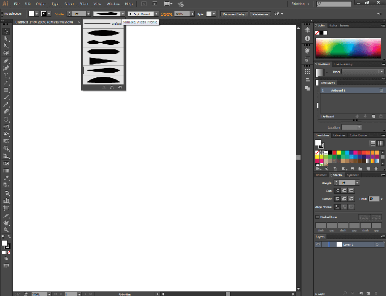
Fig 1: change the width profile of your lines to make them taper.
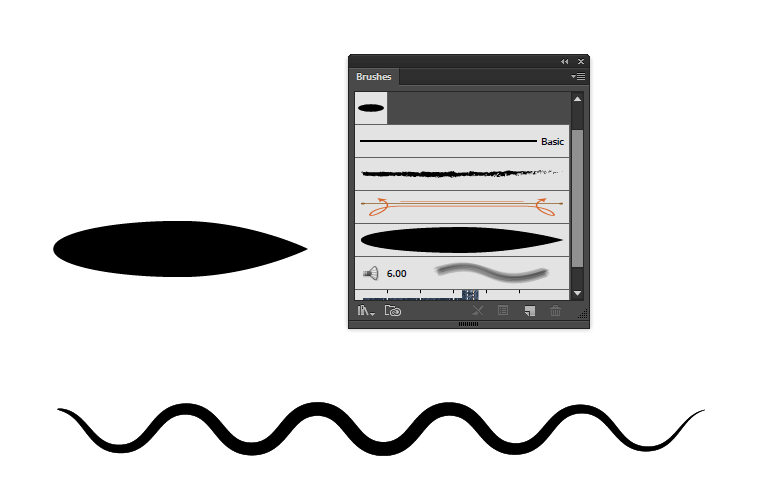
Fig 2: Use the brush panel to create your custom shape and apply it on the line for variety.
Once you’ve traced out the rocket man logo ( (as shown in the tutorial above), group all the elements into a new layer and name it “logo”. Don’t merge the drawing otherwise you won’t be able to add or remove anything later on.
Step 4: Design the Crest
As shown in the video, go back to your "drawing" layer and trace the rest of the parts of the logo that is the hexagon , the ribbon and the lines.
1st Shape: Hexagon Frame
To create the background shape, select the "polygon tool" from the tool bar, then drag and lift
your mouse to make the shape.
Go to the top bar → click on effect → select stylize → press round corners to open the window.
Set the radius to 4 and press okay.
Drag the shape vertically or rotate it and place it on the rough sketch. Change the stroke color to black and fill to none.
2nd Shape: Ribbon
Select a polygon shape again and create a six-sided shape. When you’re dragging, make sure you
press "shift" on your keyboard so the face of the shape is straight.
Use the "direct selection tool" to select three points of the hexagon on the right and press the
right arrow key to extend as much as required.
Use the "direct selection tool" and click the center point on each side. Press the left and
right arrow key to drag the point inwards.
Place the ribbon shape graphic on top of the hexagon frame as shown in the video above.
3rd Shape: Cone Shaped Brush
First you've got to make a new brush. Select the polygon tool and double click on the art board.
A small window will open. Set the number of sides to 3 to make a triangle.
Rotate the triangle to its side (90 degrees) and with the "selection tool" squish it to lessen
the width.
Open the "brush panel" by clicking on "window" in top menu bar. Now drag the squished triangle
shape to the panel. You’ll see some options in front of you.
Set the width to fix at 20%, colorization to tint, and direction left to right.
4th Shape: Cone Shaped Lines
Now create the horizontal and diagonal lines inside the hexagon shape and the ones on the side
of the ribbon. On each separate line apply your new "cone shaped brush".
To align the horizontal lines use the "alignment panel". First, in the "distribute spacing"
section, click on the drop down menu in "align to" and select "align to selection". Second,
under the "distribute object" section and after selecting all the lines you want to align, click
on "vertical distribute center".
To align the diagonal lines in the hexagon shape, use a "pen tool" and the "blend tool" to repeat the lines.
Now select all the elements of the logo (without the rocket man) and center align them.
5th Shape: Inner Hexagon Frame
If you see the rocketman matches logo there are two frames. To make the inner
frame, select the hexagon shape go to object in top bar menu → click on path → open the offset
path window. You’ll see a bunch of options, set the offset to -12 and miter limit to 4.
Step 5: Place It All Together
When you're done tracing all the different elements of your logo design, it is time to create the layout. Select each part of the logo and place it exactly in the way as you had imagined. Once everything is done, hide the sketch layer. You'll now see your drawing of the logo only. Bring the logo to the center of your art board and make it bigger for touchups.
Step 6: Outline for Rocket Man
When you place the rocket man over the rest of the logo objects, you need to create an outline in white so it looks the character is breaking through the frame. For this, go to object in top bar menu → click on path → select offset path. Color that into white.
Duplicate the white outline > Convert paths to outline > Cut the outline object > Lock all objects > Paste in front (ctrl + f) > Invert the outline > delete the internal shapes > Invert outline again.
You should a filled shape of the rocket man outline 1. This outline shape will be used to:
1. ‘Minus’ the both the hexagon shapes from the crest, the diagonal cone strokes. Essentially used to delete all the elements surrounding the rocket man.
2. It will also be used to ‘mask’ (ctrl + 7) the rocket man within the crest, so his legs don’t extend past the crest.
Step 7: Do the Touchups
In this step you can refine your logo design as much as you want. You can change the color, add a background, apply a texture, put a shadow, or any other detail.
Step 8: Label Your Logo Design
The last step is to add the logo name, i.e. Rocketman Matches. For this I’ve already selected a few suitable fonts. There you have the final logo.
Of course, there is a lot of room to improve its form. If you wish to have a taste of some of these improvements or have any suggestions, just post them in the Comments section. It is a learning resource in the form of a tutorial and you are whole-heartedly welcome to share your thoughts. That’s the end of it. Take care!
This concludes our tutorial which, in our slightest of opinions, would prove a milestone for all your DIY retro logo designing requirements. Further, you may head onto our website LogoDesign.Net for crafting great industry-oriented logo designs on your own accord. Just punch in the keyword(s) that you want and begin creating a FREE logo through our smart online logo maker tool.
We hope you’d have lots of exciting creative discoveries along the course, although crafting a worthy logo without the help of a professional designer is a tough call. But, totally trying it out would be worth the effort and energy. With our advice your creative endeavors are sure to pay off immensely.
Get Going with Retro-look Logo Design: Some Handy Tricks & Guidelines
As you decide on crafting your own retro or vintage logo or icon , the following essential pointers would be a great helping hand in letting you initiate with a firm beginning.
Select Appropriate Colors
In the world of graphics, vintage is usually represented by light, subtle shades such as green, brown, beige, light gray, etc. if your brand persona demands more saturated colors to be used, like orange, red or blue, these shades are to be softened as much as can be possible.
Select Suitable Fonts
A logo with retro design essentially means the usage of artistic typography. To meet the ever-growing needs of retro designers, the font designers have developed vast collections of retro and vintage letterings. Thus, a multitude of interesting and attractive typography options are available at your disposal for a great retro-styled business logo to be crafted.
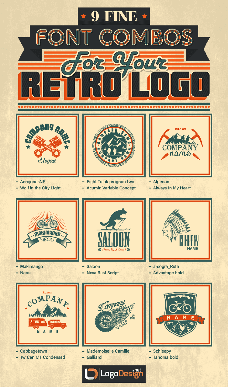
Play Around With the Visual Effects
In order to come up with an artistic design, the aesthetic use of shapes in logo, balancing noise through visual effects and layering is all too important. Let’s enumerate these in an understandable sequence:
The Geometrical Shapes
The geometrical shapes to be focused on are the circle logos, squares, rectangles, triangles, hexagons, octagons, etc. The appropriate choice of a certain shape encircling or surrounding your retro craft imparts true exquisiteness to your finalized retro logo design content.
The Additional Noise
Make your logo look old and scruffy deliberately by adding a noisy gradient to your design. Adding the noise feature visually 'sounds' great and infuses the vintage logo artwork with unbeatable appeal.
The Additional Visual Effects
Additional effects in retro logo such as sparkles, flares, luster and sheen would make your design stand out from others and appear less formal. Care should be exercised that the visual effects are not overdone and do go in sync with your selected retro font and icon.
Going the Retro Way: Benefits of the Vintage Style Speak Out Loud
Among a sea of benefits, we have chosen a few major ones for you to munch on.
Attention-grabbing
Since a logo with retro design effect is characterized by easy-to-understand shapes and relatively bright colors, it is instantly eye-catching for the visitors.
Fun & Light Style
A retro logo pattern is usually an imagery that offers fun on a lighter note owing to its usage of light, graceful style employing casual art strokes within an all-natural setting. The call-to-action capability of a vintage logo is awesomely high for some industries such as sports, beauty and photography logo design, etc.
Old Style with New Outcome
Although retro style graphic represents vintage value, the modern retro art is an artful amalgamation of the old heritage and the new trends, bringing out a perfect hybrid logo design art. Nowadays, hybrid retro art is the only way to go back to that wonderful time of our ancestral graphic designers. An ideal blend of the aesthetic glory of the past and trendy approach of the present makes retro illustration a fabulous progeny of the current times.
Modern Retro as an Evolutionary Design Species
Modern retro artwork is an evolution of some of the techniques that were made popular by flat design, particularly in terms of color, picture and iconography.
Easily Comprehensible
Some particular themes such as car and music logos are easy to work with and simple for users to understand and appreciate. The artistic work involved in retro logos for musicians is way too straightforward to avoid any ambiguity or confusion on the part of the audience.
One Design Says It All
Retro designs are often termed as nostalgic designs that arise feelings, awake memories and better manage to involve broad range of readers even although they don't really realize it. So, they generally present the ultimate fun of the unexpected to most of the observers.
Retro Logo Design Patterns: Who Requires Them The Most?
Speaking of the trades and businesses demanding and drooling for the vintage outfit for their logos, there are literally scores of them having a global presence. The biggest fans and lovers of such design craft are the trade and logistics logo creators, construction and rental businesses, hipster cafes, gastro pubs, fashion stores, recording studios, media production houses logos, barber shops, beauty salons logo designers --- you name it and the need is instantly borne. Using a retro emblem is the best way to say that you respect tradition and value your familial roots, in case you are running a business that is family-owned for quite some time.
The End: Marking Of a New Beginning
Sweet and subtle touches of modern retro knack can be observed everywhere and associated to our every emotion --- from our current fascination with larger-than-life superhero movies to remaining preoccupied in app games for hours that feature heavy pixelated interfaces. The fun eccentricity of this age can afford for stellar projects with certainty if you a peculiar feeling of association to these elements can be sensed within.
By Tarif Khan, Head of Design,
Connect with him via tarif@logodesign.net or
LinkedIn

