Ever wonder why car brands feel powerful, while beauty brands feel calm? That’s color doing the talking. Industries carefully pick colors that speak to you before you even read a word.
Color does more heavy lifting in a logo than most people realize. Before you even process the name or icon, your brain has already formed an opinion, just from the colors used. That snap judgment happens in a fraction of a second, which makes choosing the right color less about aesthetics and more about psychology, strategy, and industry smarts.
If you’ve ever noticed how healthcare brands feel calming, or how kids’ products instantly come off as playful, you’re picking up on the patterns businesses use to their advantage. Different industries rely on specific colors not just because they look nice, but because they work. Implementing the color theory in logo design triggers the right mood, speaks to the right audience, and reinforces trust, energy, luxury, or whatever message the brand needs to send.
That’s why color isn’t a final touch in logo design but rather a starting point. Let’s see how different industries use color in logos and why the right hue might just be your most powerful branding tool.
The Link Between Logo Color and Industries
Companies don’t pick colors on a whim. In fact, many run extensive tests to get it just right. Did you know that Google once reportedly tested 41 shades of blue for one purpose: to see which one people clicked on more. Sounds a bit obsessive? Not when you’re operating at that scale. Even smaller businesses follow the same principle: pick a color that speaks your industry’s language.
Over time, patterns have formed. You’ll notice industries tend to cluster around certain colors. It’s not because they’re all copying each other—it’s because color works like a shortcut. Colors tint emotions, set expectations, and tell people what kind of experience they’re walking into.
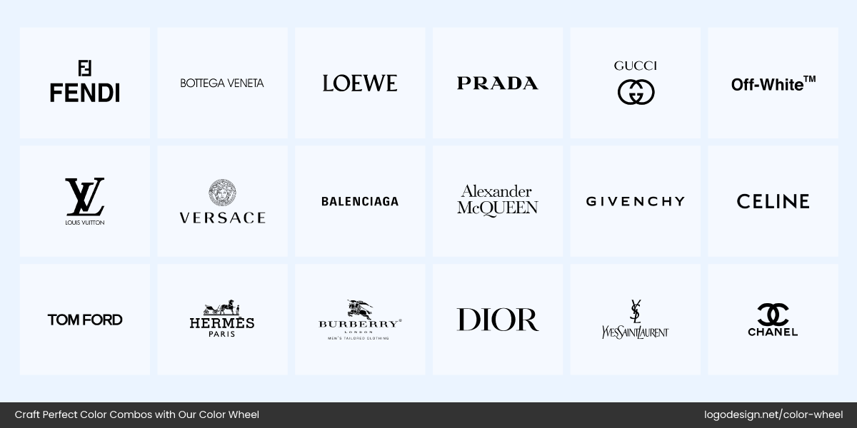
Luxury Fashion Brands with Black and White Logos
Take high-end fashion logos, for example. Think of Chanel, Prada, Gucci, Yves Saint Laurent, and Balenciaga. Most luxury brands lean heavily on black-and-white logos because black signals sophistication, minimalism, and timeless style.
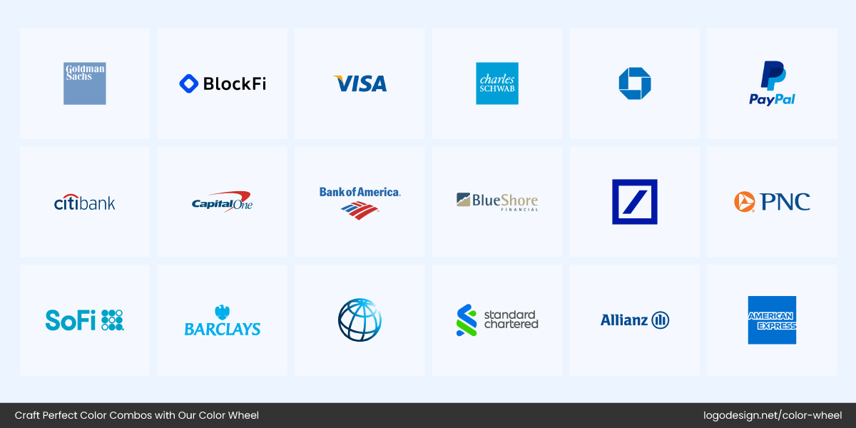
Finance Brands with Blue Logos
Similarly, the tech and finance industry logos tend to lean toward blue. Why? Because it suggests trust, security, and professionalism. Brands like Dell, PayPal, Visa, IBM, and Intel all bank on blue—literally.
And there’s real science behind these choices. Researchers Lauren Labrecque and George Milne found that color plays a key role in how consumers recognize and relate to a brand. It becomes part of the brand’s identity, just like the name or logo symbol.
In their study on the color differentiation in the marketplace, they found that blue appears in over 75% of credit card brand logos, while red dominates retail. This proves that colors at random is a logo design mistake you’d want to avoid. It’s strategic, subtle, and often subconscious. When you’re exposed to hundreds of logos every day, these color choices quietly help you sort who’s who.
Iconic Brand Colors by Industry |
|||
| Industry | Color Name | HEX Code | Emotions Conveyed |
| Food & Beverage | Coca-Cola Red * | #E41B17 | Excitement, passion, appetite, urgency |
| McDonald’s Yellow * | #FFC72C | Happiness, optimism, friendliness | |
| Pepsi Blue | #004B93 | Trust, calm, refreshment | |
| Cadbury Purple * | Pantone 2685 | Luxury, indulgence, creativity | |
| Retail & Home | Home Depot Orange * | #F96302 | Energy, warmth, affordability |
| Post-it Yellow * | #FFEB3B | Attention, clarity, joy | |
| Lego Red | #E2231A | Fun, enthusiasm, energy | |
| IKEA Blue & Yellow | #004B93 / #FFCC00 | Reliability, value, positivity | |
| Automotive | Ferrari Red | #FF2800 | Power, speed, passion |
| UPS Brown * | #351C15 | Reliability, stability, dependability | |
| John Deere Green * | #367C2B | Nature, growth, tradition | |
| CAT Yellow | #FFD700 | Strength, caution, visibility | |
| Logistics | FedEx Purple & Orange * | #4D148C / #FF6600 | Precision, innovation, urgency |
| DHL Red & Yellow | #BA0C2F / #FFCC00 | Speed, confidence, visibility | |
| Amazon Orange | #FF9900 | Action, enthusiasm, affordability | |
| Amazon Blue | #146EB4 | Trust, intelligence, simplicity | |
| Tech & Software | Facebook Blue * | #1877F2 | Security, connection, professionalism |
| Google Multicolor | Various | Diversity, innovation, curiosity | |
| Slack Aubergine * | #611F69 | Sophistication, creativity, depth | |
| Intel Blue | #0071C5 | Intelligence, trust, calm | |
| Luxury & Fashion | Tiffany Blue * | Pantone 1837 | Elegance, sophistication, exclusivity |
| Barbie Pink * | #E0218A | Fun, youthfulness, vibrance | |
| Hermès Orange * | #FFA400 | Uniqueness, energy, heritage | |
| YSL Black & Gold | #000000 / #D4AF37 | Prestige, mystery, opulence | |
| Media & Entertainment | Netflix Red * | #E50914 | Intensity, passion, urgency |
| Spotify Green * | #1DB954 | Vitality, growth, rhythm | |
| HBO Yellow | #FFD200 | Energy, brightness, excitement | |
| Oatly Blue | #3E537E | Calm, coolness, approachability | |
| Education & Publishing | NatGeo Yellow * | #FFD700 | Curiosity, learning, visibility |
| Oxford Blue | #002147 | Authority, intelligence, depth | |
| Penguin Orange | #FFC238 | Creativity, friendliness, stimulation | |
| BBC Red | #C91A22 | Urgency, emotion, authority | |
| *Trademarked and hold legal protection as part of the brand’s visual identity. | |||
What Colors Dominate Industry Logos? (and Why It Matters)
One of the golden rules to create a business logo is to match your design choices (especially color) to your industry’s tone, audience, and values. Colors are emotional triggers, and when used well, they tell customers what your business is about. That’s why you’re likely to notice recurring color themes.
However, other factors also dominate logo colors. Culture shapes branding color choices, for example, Red is associated with luck, joy, and celebration in Eastern cultures, while it represents danger or caution in others.
Let’s look at how this plays out and which colors dominate specific industries without relying on the same old logo clichés.
Construction
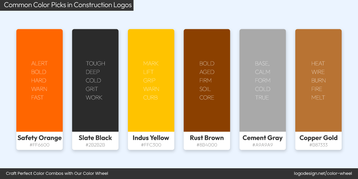
Common Color Picks in Construction Logos!
Yellow and dark blue are part of the construction industry’s DNA. Usually, construction logos stick to these two bold and dependable colors for various reasons. Yellow grabs attention fast. It’s the color of caution signs, hard hats, and heavy machinery, perfect for a field where visibility matters. Dark blue brings balance and adds a sense of trust, strength, and professionalism.
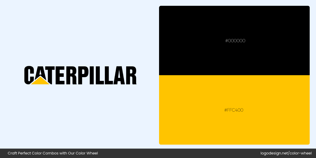
Caterpillar Logo and Color Palette
Brands like Caterpillar use yellow to reflect energy and toughness in their logos.
Turner Logo and Color Palette
Whereas, dark blue is used by Turner Construction, which gives off a solid and dependable feel.
Mortenson Logo and Color Palette
Mortenson, a national construction firm, also uses navy blue to convey its legacy.
The next time you’re wondering how to create a construction logo and which colors to use, you know your top picks!
Real Estate
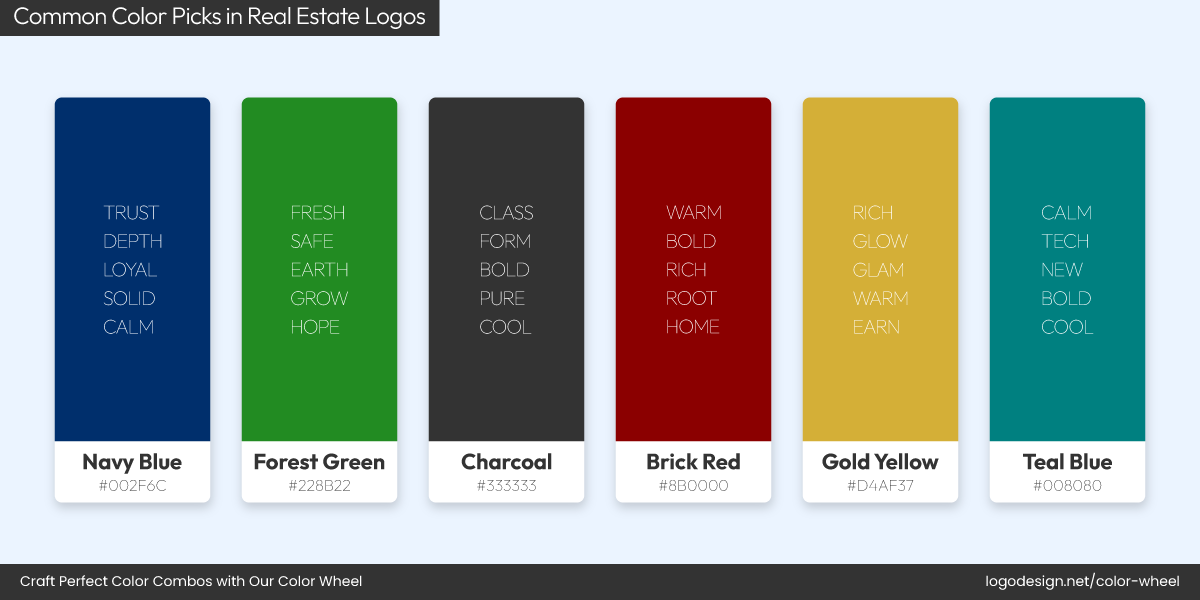
Common Color Picks in Real Estate Logos!
You know what’s one of the best tips to design a real estate logo? Visuals are everything, and color is a shortcut to trust. You’ll often see blue, green, and neutrals everywhere across the real estate industry because they feel stable, calming, and professional. Flashy shades aren’t common here, but rather those that exude dependability.
Better Homes and Garden Logo and Color Palette
Better Homes and Gardens Real Estate uses deep green to evoke growth and confidence.

Coldwell Banker Logo and Color Palette
Coldwell Banker, on the other hand, leans into classic navy blue for a sense of trustworthiness.
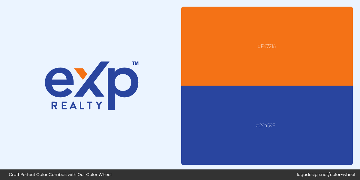
eXp Realty Logo and Color Palette
eXp Realty, with its bold blue and black combination, adds a modern edge to this tradition.
In a space where people make high-stakes decisions, these real estate logo colors communicate reliability and sell security before a sale.
Education
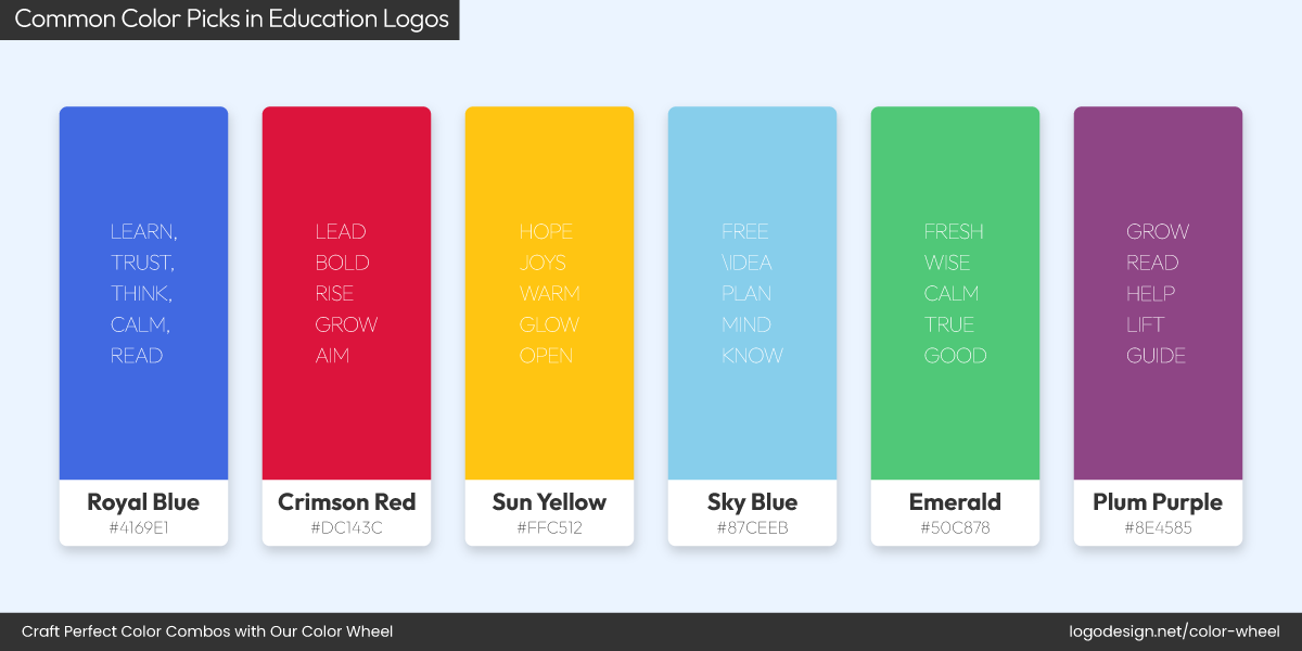
Common Color Picks in Education Logos!
Education logos are designed to feel trustworthy, aspirational, and grounded. That’s why deep blues, greens, and burgundies are such common choices. These colors evoke intelligence, tradition, and ambition.
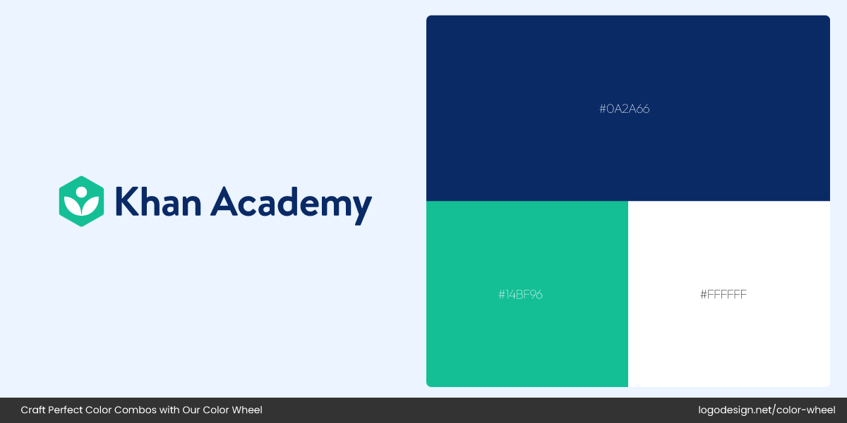
Khan Academy Logo and Color Palette
For a better idea, think of Khan Academy with its calming green symbol that reinforces growth and learning.
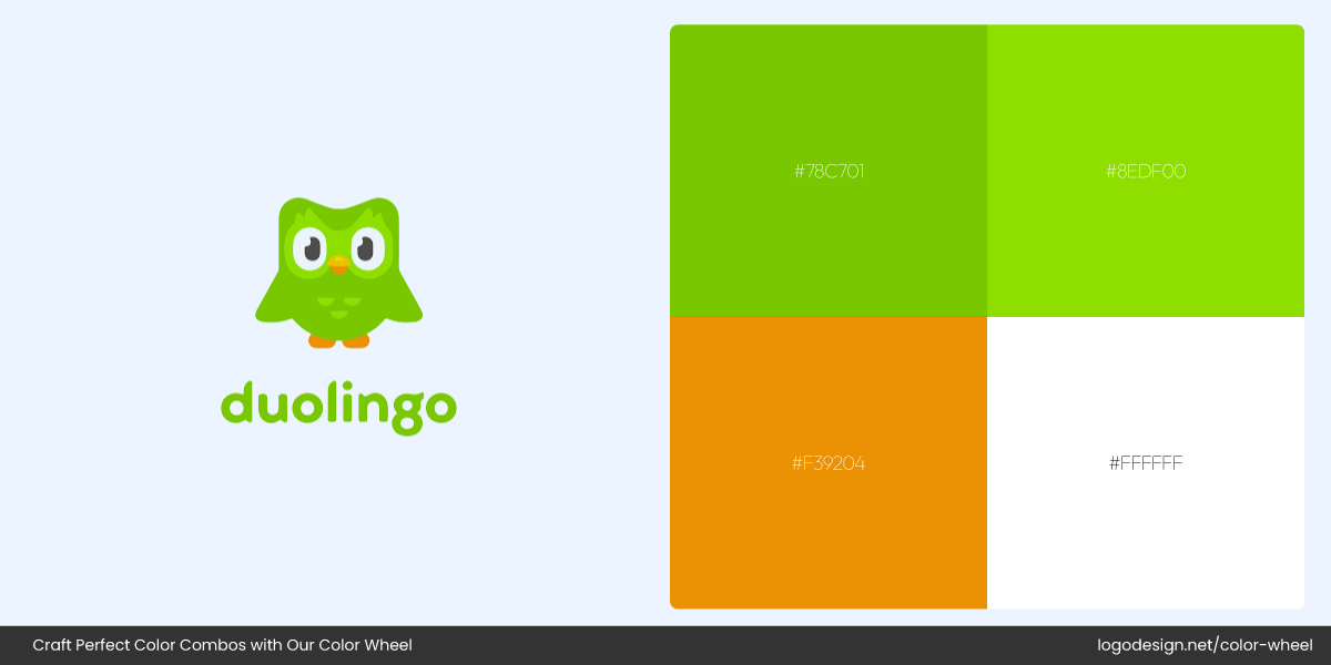
Duolingo Logo and Color Palette
Or Duolingo, which takes a fresher spin with its green owl that breaks the norm to make education feel fun and approachable.
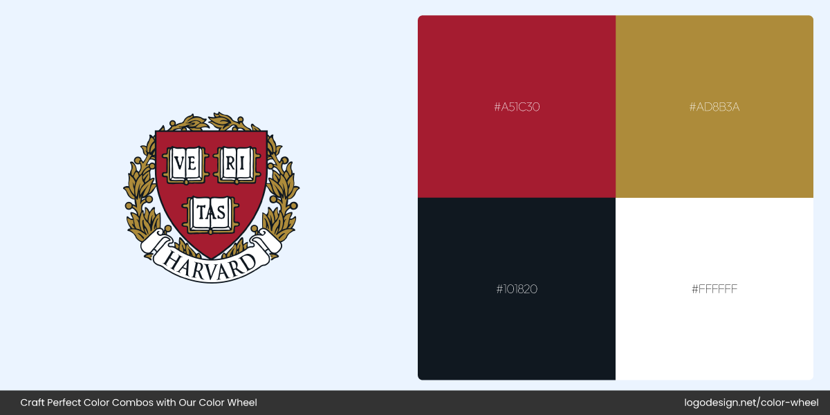
Harvard University Logo and Color Palette
Then there’s Harvard University, whose classic crimson logo speaks volumes about heritage and prestige.
Whether it’s a modern online platform or a centuries-old institution, you need a logo with a color palette that signals credibility, wisdom, and stability.
Gaming
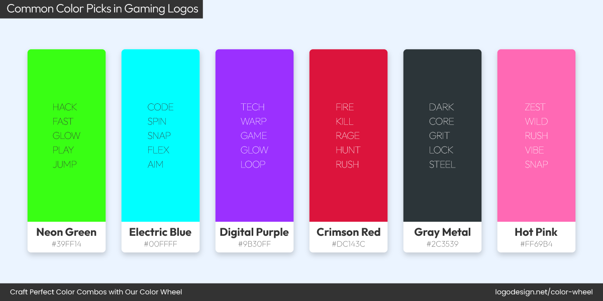
Common Color Picks in Gaming Logos!
Gaming logos are in a league of their own. This is an industry where neon purples, electric blues, blacks, and fiery reds dominate the visual landscape — and for good reason. These high-energy colors create excitement and immediacy, perfect for drawing players into immersive worlds. Flashy and bold is the name of the game here.
Twitch Logo and Color Palette
Look at Twitch, whose vibrant purple branding has become synonymous with streaming culture.
Razer Logo and Color Palette
Razer, with its neon green logo on a black background, delivers an edgy, tech-forward vibe that gamers instantly recognize.
Epic Games Logo and Color Palette
Epic Games keeps things bold with black and white, showcasing the power of simplicity in logo design.
Restaurant
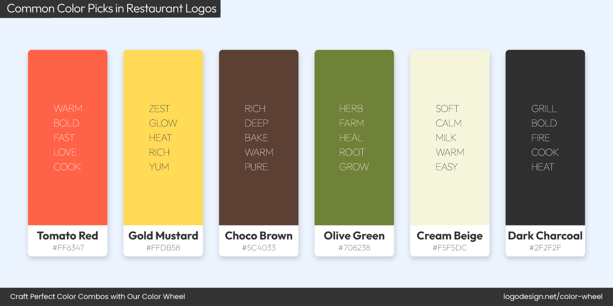
Common Color Picks in Restaurant Logos!
If there’s one place where color psychology shapes perception, it’s the restaurant world. Red and orange are appetite stimulants — they spark hunger, excitement, and quick decision-making. Earthy tones are also popular and give off a welcoming vibe. Are you a restaurant logo designer? Now you know why so many food brands lean into them.
Nando’s Logo and Color Palette
We’ve all heard of Nando’s and recognize its deep red and earthy palette that taps into tradition and flavor.
Booster Juice Logo and Color Palette
El Pollo Loco Logo and Color Palette
Moes Southwest Grill Logo and Color Palette
Similarly, Booster Juice, El Pollo Loco, and Moe’s Southwest Grill also use bold red, yellow, and warm orange tones in their restaurant logos.
Their logos not only look energetic and fun, but they also work truly well in food branding.
Florist
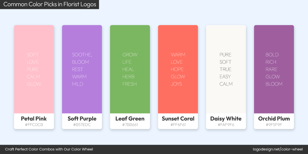
Common Color Picks in Florist Logos!
Florist logos tend to go gentle on the eyes, and it’s no surprise that florists often embrace pastels, soft pinks, creams, lavenders, and leafy greens. These shades communicate freshness, elegance, and emotional warmth — everything you’d want in a floral brand.
Bloom & Wild Logo and Color Palette
Bloom & Wild, for example, uses muted, floral pink tones and delicate typography to signal grace and simplicity.
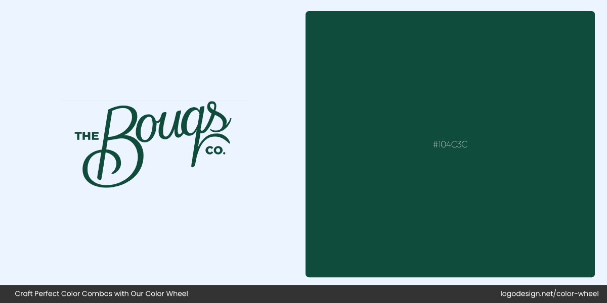
The Bouqs Co Logo and Color Palette
The Bouqs Co. features earthy greens and warm orange accents that hint at natural, farm-to-vase freshness.
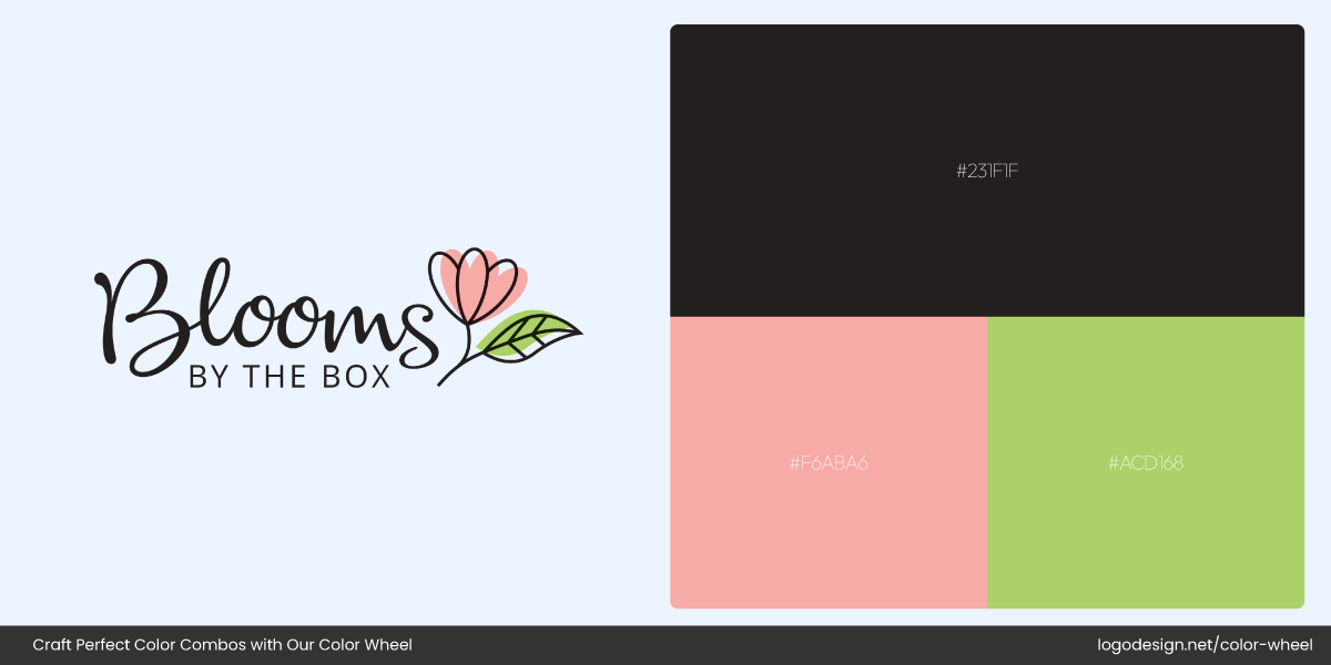
Blooms by the Box Logo and Color Palette
Even Blooms by the Box leans into a mix of cream and muted pinks to reflect modern, minimal floral design.
If you’re building a flower business, go for a palette that feels natural, nurturing, and beautiful.
Pet
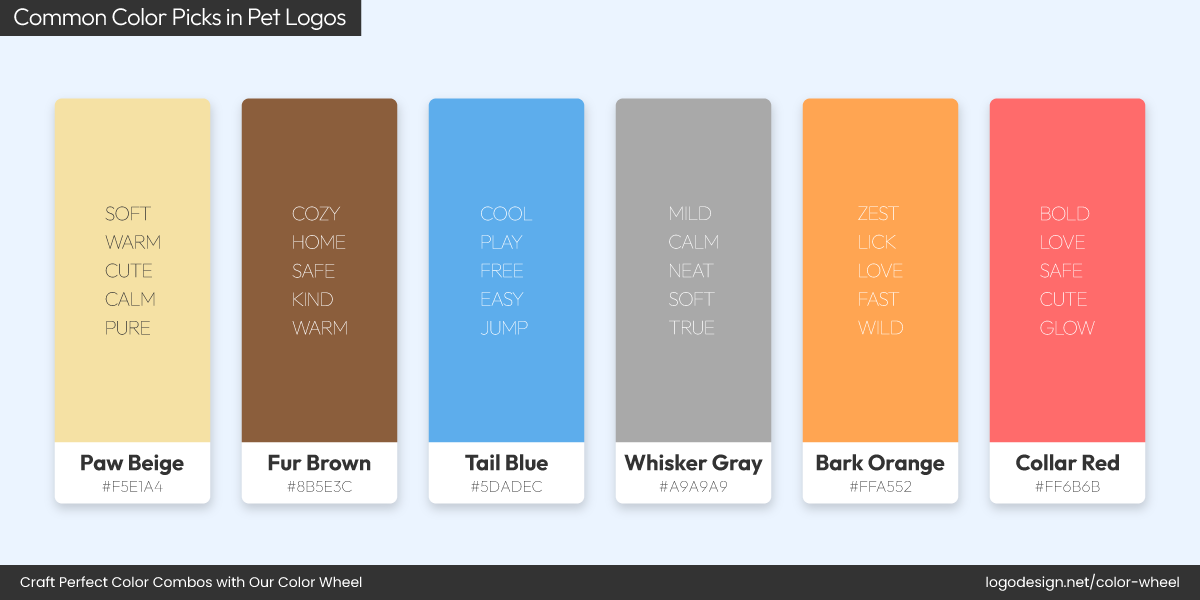
Common Color Picks in Pet Logos!
When it comes to pet-related businesses and their logos, colors often lean into the friendly, playful side of branding. You’ll commonly see soft blues, earthy browns, and cheerful oranges or greens to evoke comfort, trust, and energy. These color picks make people feel emotionally safe and connected, which is exactly how you want pet owners to feel.
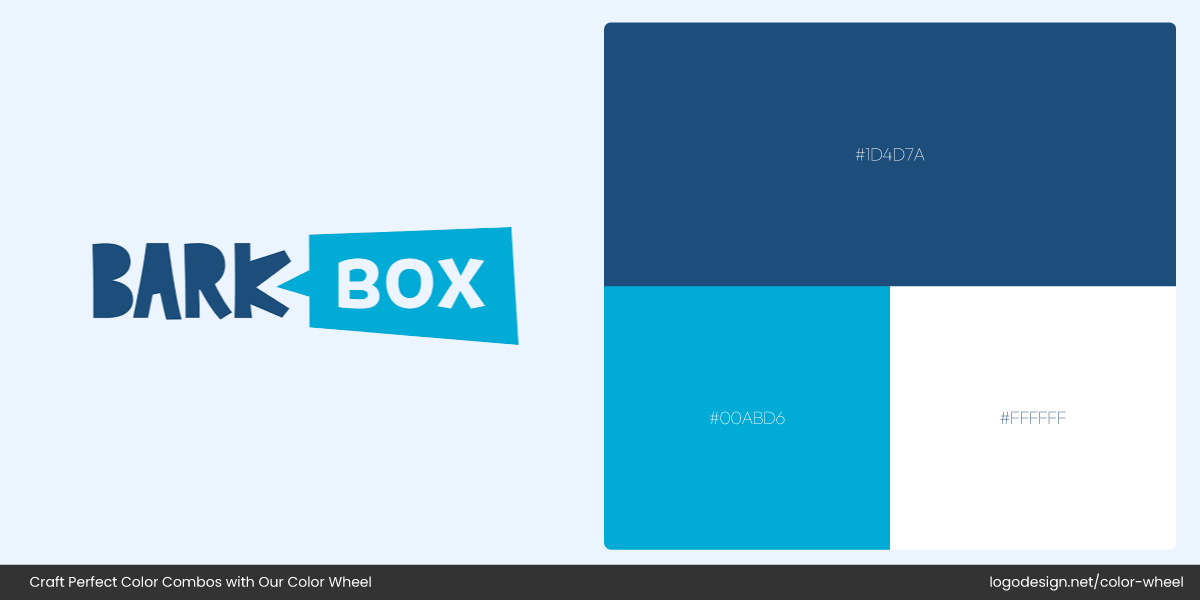
BarkBox Logo and Color Palette
Take BarkBox, for example. Their soft blue and white color palette gives off a calming vibe, great for a brand centered on care and joy.
Chewy Logo and Color Palette
Chewy also taps into blue tones, signalling trust and reliability in its e-commerce experience.
Freshpet Logo and Color Palette
And Freshpet mixes green and brown in its pet logo, suggesting natural, wholesome goodness.
The common thread? Approachable colors that help pet owners trust that their furry friends are in good hands.
Spa
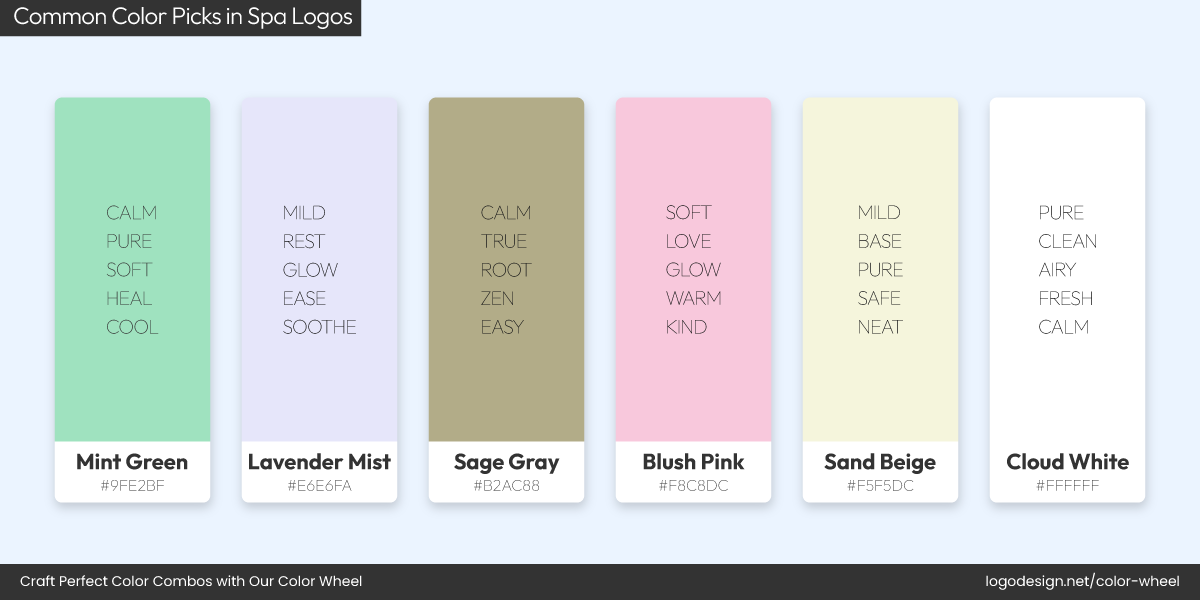
Common Color Picks in Spa Logos!
The spa industry exudes calm, clean, and a touch of luxe. This industry knows that building a color palette can be powerful. Brands in this space often use soft neutrals, muted greens, blush pinks, and creamy whites in their spa logos.
Milk + Honey Logo and Color Palette
Brands like Milk + Honey use warm beige and soft gold accents in their branding that perfectly align with the calm, luxurious feel of their spa experience.
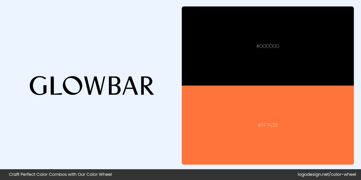
Glowbar Logo and Color Palette
Meanwhile, Glowbar leans into blush pinks and soft beige to signal softness and feminine beauty.
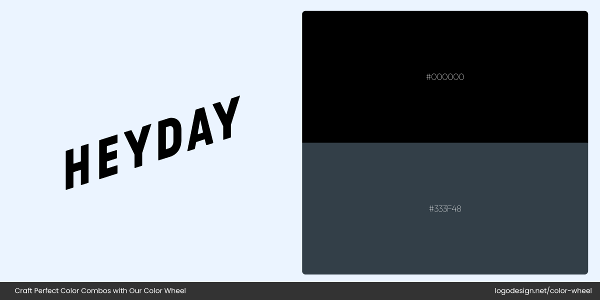
Heyday Logo and Color Palette
Then there’s Heyday, a modern facial studio, which uses soft pastels in its branding to reflect clean beauty and calm.
Across the board, colors and elements in the spa logo design are chosen to soothe, not shout — perfect for businesses promising rejuvenation.
Fashion
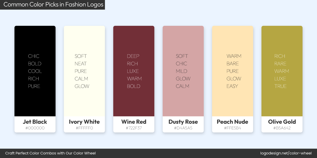
Common Color Picks in Fashion Logos!
As we’ve already discussed above, fashion logos often stick to sleek black-and-white logos. That’s because these colors are timeless, elegant, and versatile enough to adapt across runways and retail shelves. You’ll spot this across a wide range of high-end and boutique fashion brands.
Zara Logo and Color Palette
COS Logo and Color Palette
Other Stories Logo and Color Palette
For instance, Zara, COS, and & Other Stories all use a black-and-white palette. Because when it comes to monochrome vs. multi-color logos, monochrome hues exude class and restraint.
Other Stories Logo and Color Palette
Even smaller labels like Everlane stick to this minimalist approach. The idea is simple: the less distraction, the more focus on the clothes.
Black, in particular, communicates authority, sophistication, and premium quality, a consistent theme that brands consider when designing a fashion brand logo in a professional way.
Medical
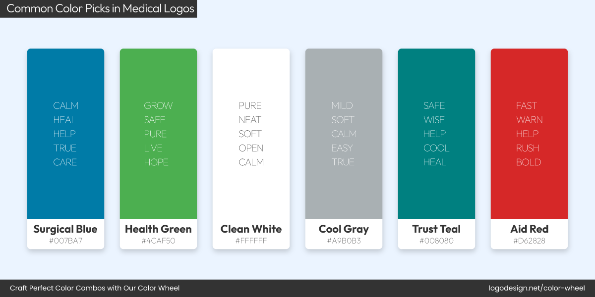
Common Color Picks in Medical Logos!
In the medical sector, color choices are focused more on reassurance and less on trendiness. This industry thrives on trust, cleanliness, and reliability, which is why blue and white dominate medical branding. Blue conveys professionalism and calm, while white communicates hygiene and safety. Together, they instantly establish credibility.
Mayo Clinic Logo and Color Palette
Mayo Clinic uses a classic deep blue in its medical logo, reinforcing its status as a long-standing, trustworthy institution.
CVS Health Logo and Color Palette
Similarly, CVS Health incorporates light blue and red but keeps the blue central in many of its services, like CVS MinuteClinic, to represent care and professionalism.
American Cancer Society Logo and Color Palette
The American Cancer Society also has a blue and white themed logo.
Fitness
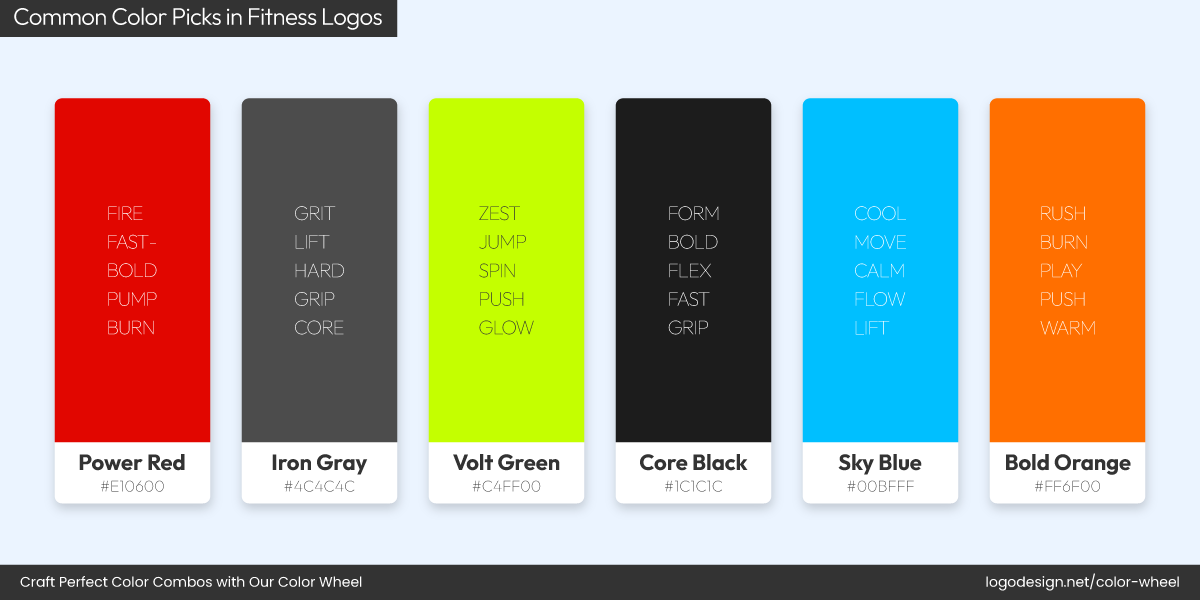
Common Color Picks in Fitness Logos!
Fitness brands don’t whisper, they scream. In a space built on energy, endurance, and motion, logos often reflect that intensity with bold colors like red, black, and yellow. These colors are aggressive, energetic, and adrenaline-packed—perfect for brands selling strength, speed, and movement.
Peloton Logo and Color Palette

Barrys Logo and Color Palette
SoulCycle Logo and Color Palette
Peloton’s sleek red-and-black logo instantly grabs attention and radiates fitness-focused action, ideal for a brand built on pushing physical limits. Barry’s nails it with its red-and-black logo, signaling power, style, and grit.
Gold’s Gym fitness logo pairs yellow with black to project strength and stamina. SoulCycle also features a yellow and grey logo that sparks positivity and a sense of balance.
Media and Communication
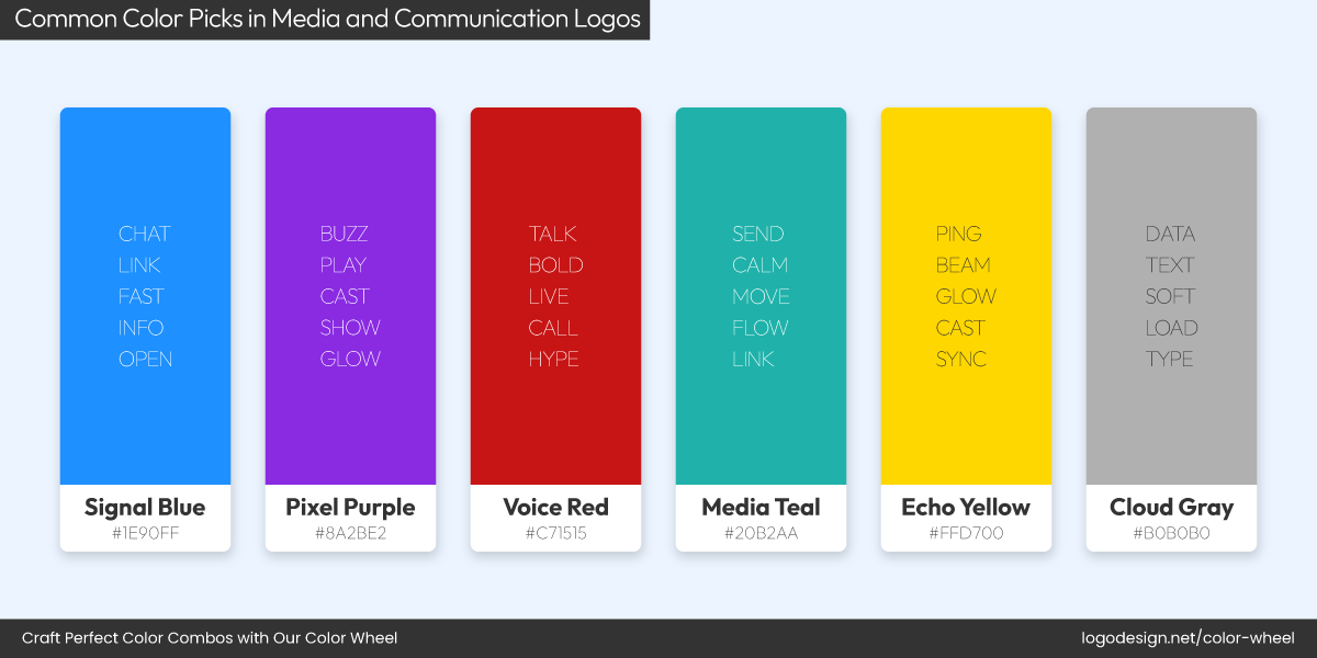
Common Color Picks in Media and Communication Logos!
In a world flooded with constant information, the color of a logo can make or break how a media brand is perceived. It’s often the first cue to credibility and tone. Thus, red and blue remain the go-to hues for communication and media logos.
CNN Logo and Color Palette
Red grabs attention, used in CNN’s logo, where urgency and boldness are key.
AT&T Logo and Color Palette
Blue, a symbol of trust and professionalism, is used by AT&T, reinforcing reliability in their services.
Commodore Logo and Color Palette
Even Commodore also features a large blue “C” with a smaller red shape inside.
These colors help media publications and brands stand out while signaling authority and clarity.
Auto and Transportation
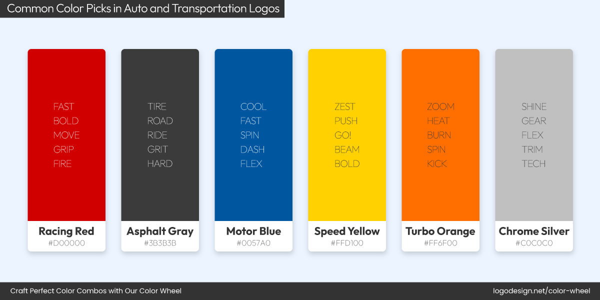
Common Color Picks in Auto and Transportation Logos!
In the fast-moving world of cars, trucks, and transit, first impressions matter, and color plays a huge role in shaping them. Black, silver, and deep blue are dominant colors in this industry, and often the popular choices when figuring out how to design auto and transport logos and what elements to include.
Mercedes-Benz Logo and Color Palette
Toyota Logo and Color Palette
Popular brands like Mercedes-Benz and Toyota use silver and grey in their logos to communicate precision, quality, and modernity.
Ford Logo and Color Palette
Meanwhile, Ford’s auto logo highlights its deep blue badge that builds trust and a sense of legacy. These bold hues help transportation brands convey the sense of movement and engineering excellence their customers expect.
Hotel
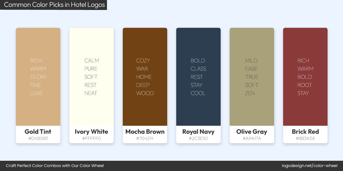
Common Color Picks in Hotel Logos!
From cozy boutique stays to sprawling international chains, hotel logos are heavily obsessed with two colors: blue and green. Blue communicates trust, calm, and hospitality, making it a favourite among big names in the hotel world.
Hilton Hotels Logo and Color Palette
Hyatt Hotels Logo and Color Palette
Hilton Hotels and Hyatt both use strong blue logos to appeal to business and leisure travellers.
Green Key Global Logo and Color Palette
Green Key Global, an eco-certification for hotels, incorporates both green and blue in its logo, clearly aligning with environmentally responsible lodging.
According to the psychology of colors in logo design, green brings a sense of eco-friendliness and natural exploration, which is exactly what the hotel industry needs to convey.
Investment and Finance
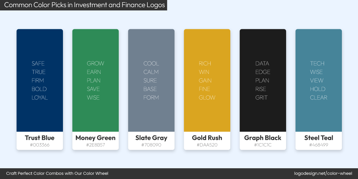
Common Color Picks in Investment and Finance Logos!
Money talks, but so do colors. In the finance world, logo colors are a handpicked strategy. The most trusted names in banking and fintech often turn to blue and green for obvious reasons.
Blue represents trust, security, and long-term reliability, precisely what you want in someone handling your money.
Chase Bank Logo and Color Palette
PayPal Logo and Color Palette
American Express Logo and Color Palette
Chase Bank, PayPal, and American Express, all of these use varying shades of blue to build that subconscious confidence.
Green, on the other hand, signals prosperity and growth. It’s why companies like Fidelity, TD Bank, and Robinhood embrace green in their logos to reinforce the idea of financial progress.
In finance logos, colors are calculated decisions rooted in consumer psychology.
Jewelry
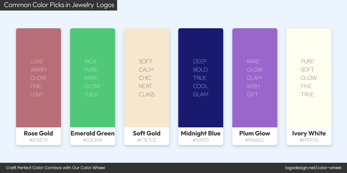
Common Color Picks in Jewelry Logos!
Talk about high-end elegance, and the colors that pop in the mind are black, gold, and deep jewel tones like rich red and royal blue. These hues are primarily the go-to palette for jewelry logos, suggesting timeless value, luxury, and sophistication.
Cartier Logo and Color Palette
Cartier, an iconic jewelry brand, uses a sleek red, gold, and black logo that signals its classic prestige.
Tiffany Logo and Color Palette
Tiffany & Co. is known for its robin’s-egg blue, so distinct it’s trademarked.
David Yurman Logo and Color Palette
David Yurman’s wordmark logo leans into sleek black and silver, aligning with a high-end aesthetic.

Bvlgari Logo and Color Palette
Another luxury brand, Bvlgari, also has a bold black serif logo that echoes its Roman elegance.
Cleaning
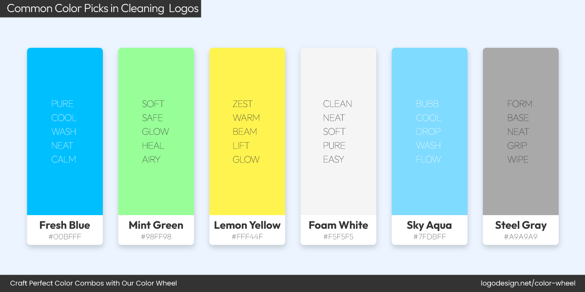
Common Color Picks in Cleaning Logos!
Cleanliness is often communicated visually before anything else, which is why whites, light blues, and greens are popular colors in cleaning service logos. These hues immediately suggest freshness, purity, and hygiene.
The Maids Logo and Color Palette
The Maids features a yellow and blue combination, with the blue reinforcing their promise of spotless results.
EcoClean Logo and Color Palette
Eco Clean, a green-focused cleaning company, keeps it simple with a blue wordmark logo, emphasizing eco-conscious cleanliness.
Green Clean Logo and Color Palette
Green Clean, another eco-friendly cleaning brand, incorporates green and light teal to highlight its natural approach.
These colors are chosen to convey cleanliness and reassure consumers about the service’s safety and effectiveness.
Entertainment
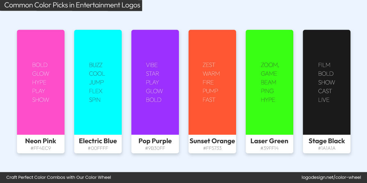
Common Color Picks in Entertainment Logos!
In the world of entertainment logos, playing it safe has never been the vibe. This industry knows boldness sells, and it knows how to design cool entertainment logos that reflect just that. You’ll spot vibrant reds, deep blacks, and electrifying blues leading the visual stage. These colors aren’t just eye candy; they capture energy, passion, and drama, which perfectly aligns with the industry’s core.
Rolling Stone Logo and Color Palette
Netflix Logo and Color Palette
YouTube Logo and Color Palette
Take Rolling Stone, Netflix, and YouTube, striking red logos are good examples. In a debate between choosing flat vs. gradient logos, they went for flat colored logo designs that demand attention and reflect urgency and excitement.
CBS Logo and Color Palette
Meanwhile, brands like CBS have long leaned on high-contrast black and white, giving their visuals an edge of timeless cool.
SiriusXM Logo and Color Palette
Warner Bros Logo and Color Palette
Blue, though used more selectively, brings in creativity and luxury, like SiriusXM and Warner Bros, who cater to niche, expressive audiences.
Beauty
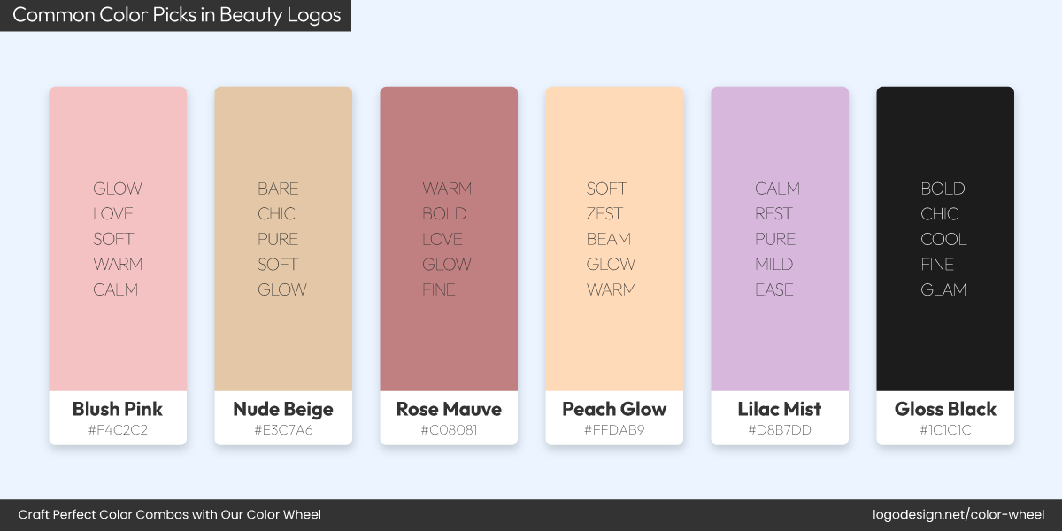
Common Color Picks in Beauty Logos!
Beauty brands know that how something looks is just as important as what it does, and their logos reflect that to a tee. In this space, soft pinks, muted beiges, earthy nudes, and minimalist black-and-white palettes dominate. These colors express elegance, calm, and clean self-care, exactly what beauty customers are after.

Herbivore Botanicals Logo and Color Palette
Take Herbivore Botanicals, for instance. Its soft pastel tones and minimalist typography echo the brand’s focus on natural, gentle skincare.
Typology Logo and Color Palette
Then there’s Typology, a French skincare brand that uses stark black and white for a sleek, no-nonsense beauty logo that mirrors its minimalist ingredients list.
Kinfield Logo and Color Palette
Kinfield, an outdoor beauty and skincare brand, opts for warm neutrals and soft green hues, blending wellness and nature into a calming aesthetic. Rather than chasing design and color trends, these brands build recognition by staying visually cohesive. The understated tones let the product (and the customer’s glow) take centre stage.
Photography
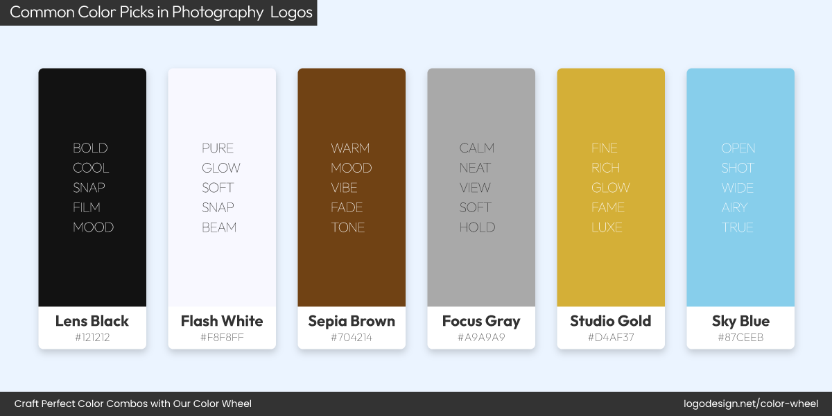
Common Color Picks in Photography Logos!
In the photography world, the focus is always on visuals, so it’s no surprise that many brands in this industry prefer black, white, and greyscale palettes. These neutral tones don’t distract from the imagery; their simplicity lets the work shine while giving the brand a professional feel.
Format Logo and Color Palette
Format, a portfolio platform built for photographers, uses a sleek black-and-white logo that reinforces clarity and gives the spotlight to the artists’ work.
Pixieset Logo and Color Palette
Similarly, Pixieset uses a minimalist, soft-grey wordmark that gives off a refined, approachable vibe, just like its clean user experience.
Negative Supply Logo and Color Palette
Then there’s Negative Supply, a brand focused on film photography tools, whose logo leans into classic black and white for a nostalgic, analog look that appeals to vintage-loving creatives.
These photography logo colors are subtle but strategic. They help logos feel relevant across digital platforms, business cards, postcards and watermark stamps.
Key Takeaways
If there’s one thing this deep dive shows, it’s that color in logo design is never random. From the calming blues of healthcare to the bold reds in restaurants, every industry leans on certain hues to communicate value, emotion, and trust. While trends vary, one thing stays constant: color shapes perception faster than words ever could. And while you’re at it, make sure to keep accessibility in logo design on top of your mind and design for everyone, including those with visual impairments.
So, understanding what works in your industry can help you make a logo that connects, whether you’re going classic, modern, or somewhere in between.
- Colors help convey industry-specific emotions and expectations
- Most industries favor one to three dominant colors in their logos
- Color psychology and industry trends often go hand in hand
- Newer brands often break color norms to stand out, whereas legacy brands lean on familiar tones
