SALES / SUPPORT : 844-232-4816
How To Create Construction Logos The Professional Way

Whether you have a large construction firm with many employees or a one-man handyman business, you need a logo. And not just any logo — a logo that is perfectly suited for your niche, whether that be home repair, carpentry, excavation, or large-scale construction.
Or any other type of construction logo, for that matter!
Before we get into the nitty-gritty of how to craft the perfect construction company logo for your business, let’s take a look at why it’s so important and what a well-designed logo can do for you.
Importance Of Construction Logo Design For Branding
Logos are important for a few different reasons, chief among them that your logo is the main identifier of your construction company.
Logos help your construction business to stand out from the crowd — and considering how many construction companies are in existence, ranging from small to large, that’s certainly a necessity! Some sources cite some 700,000 construction companies in the US, and that isn’t even including smaller freelance businesses that center around construction, such as architecture, excavating, carpentry, and supply.
In fact, you could count engineering and energy logos, auto and transportation logos, and even road construction logos as belonging to the same basic category as a home improvement logo.
Ultimately, the difference is generally to be found in the style and graphic choice for your logo — but we’ll get into that a bit more later on.
Your business logo is an important piece of communication with your target audience. Not only does it tell them your name and communicate your area of business, it can also highlight your specialty, skills, and even the personality that exemplifies your brand.
A company logo also often shows up on other materials, including marketing materials like business cards and company-branded products for employees, like t-shirts and sweatshirts.
So if you’re thinking ahead to finding free handyman logos for your business card design, or a place to design construction shirts with logos on them, remember that your logo needs to be versatile!
Logos aren’t the only element of branding, but they are an important piece of the puzzle. Branding includes every point of contact between you and your potential customer, from their first awareness of your company straight through to your follow-up after a sale and good customer service, and communication via letterhead design and envelopes.
But more often than not, the logo is the very first contact that you have with your target audience.
Why is it important to keep that in mind?
Building Your Logo From The Ground Up
Designing excellent construction logos requires more than just a superficial knowledge of what that type of logo might look like. It requires knowing your audience.
Really, designing the perfect logo for any market, not just construction, starts with research into your target demographic and your competition.
For your logo, you have the choice of hiring a graphic designer or doing the design yourself. Logo design isn’t something that should break the bank; it’s very realistic to have a logo designed for under a hundred dollars, using freelancers or crowdsourcing. If you want to use an established professional, you can expect to pay more.
However, if you really want to get your construction logo design, handyman logo, and home repair logos free of charge, then you can DIY!
Logos, like any branded materials, should draw the eye of the consumer. It’s much more cost effective to create a logo that is geared to catch the attention of your target audience, rather than a demographic that isn’t likely to hire your firm.
Let’s take a comparison between construction building logos and handyman logos as an example.
Difference Between Construction And Handyman Logos
A construction company is vastly different from a handyman contractor. As the owner or manager of one or the other, you know this, of course!
But your audience may not be entirely clear on which one they’re looking for. If they’re doing a small renovation on their house, they may think, “I need a construction company to do the work for me!”
If you’re a large company that specializes in building from the ground up, however, your bid for a small job like that would likely be over the homeowner’s budget — if you even put in a bid at all. It would be much more appropriate for them to look into a smaller company or even a handyman.
But if the homeowner doesn’t have much experience in this area, how can they tell without calling the companies and asking directly?
Logos actually play a part in this. The area in which a company specializes is a pretty basic piece of information, and it can easily be communicated by the design choices that are made.
For example, a building construction logo for a company that specializes in large-scale construction such as commercial buildings could use a graphic element like a simple line drawing of a commercial building, or a graphic of an excavator or a crane. These graphic choices would immediately and simply communicate the type of business.
A home improvement logo or handyman logo, on the other hand, might center the graphic on something smaller, like a farmhouse logo, or a hammer symbol, wrench, or other tool that suits the business.
The same type of logic would, of course, apply for other niches, such as logo for roofing construction company — a roof graphic would be accurate — or construction supply — a truck or van logo would work, or a wood or timber graphic for carpentry logo would accurately reflect the type of logo.
The main point of paying attention to this is that your construction logo symbol is an excellent opportunity to tell your audience about your company simply by the design choices you make. It’s marketing without marketing.
With that baseline, the next question is how to design a construction logo.
Let’s get into some specifics.
How To Design A Construction Logo Step By Step
Do you want to learn how to create a construction logo free? Well, good news — you’ve come to the right place!
Designing a logo can be simple — or it can be complex. It really all depends on what you want the finished product to look like.
Ideally, for a construction logo — and for many other types of business logos, including niches like handyman company logos and architect firm logos — simple is better. Simple logos are more memorable and easier to understand. Both of these factors make them more effective at boosting the branding budget of a business.
That’s just something to keep in mind for the overall effect of the logo, though — it doesn’t really qualify as a first step.
In fact, the true first step in logo design is something that we’ve already talked about: doing your research, knowing your area of expertise, and knowing your competition and target audience.
Step One: Do Your Research
This research is vital. Construction companies of all shapes and sizes face a hefty amount of competition in the marketplace, so it’s very important to ensure that your construction logo isn’t a copycat. It needs to stand out from the crowd, and you can’t afford to create a logo that looks too much like the logo of your competitors.
Before you start making design decisions, look up local competition and analyze their logo designs and overall branding. Make note of color choice, font choice, graphic style, and overall look.
You will likely notice a trend or two. That’s normal within marketplaces, as well as within logo design as a whole. It’s up to you whether you want to follow a particular trend or not, but it’s worth noting that too much bandwagon-jumping is likely to result in a logo that looks like every other logo out there.
If you want to follow a particular trend — such as a hammer and nails graphic, or a roof for a roofing construction company logo — try to give the designs an unusual twist, such as a hand-drawn variant on a classic graphic.
Now that you’ve got step one out of the way and you’ve done your research, what other elements go into making a great construction logo?
if you want to follow a particular trend — such as a hammer and nails graphic, or a roof for a roofing construction company logo — try to give the designs an unusual twist, such as a hand-drawn variant on a classic graphic.
Now that you’ve got step one out of the way and you’ve done your research, what other elements go into making a great construction logo?
What Elements To Include To Make A Construction And Handyman Logo Look Professiona
Nobody wants an unprofessional construction firm or a handyman who doesn’t seem to know what he’s doing. Keeping our houses in good shape — and in the shape we want them to be — is stressful, so it’s important to give your potential clients peace of mind right from the get go.
What makes a construction or handyman logo look professional?
Here are a few key design elements to remember
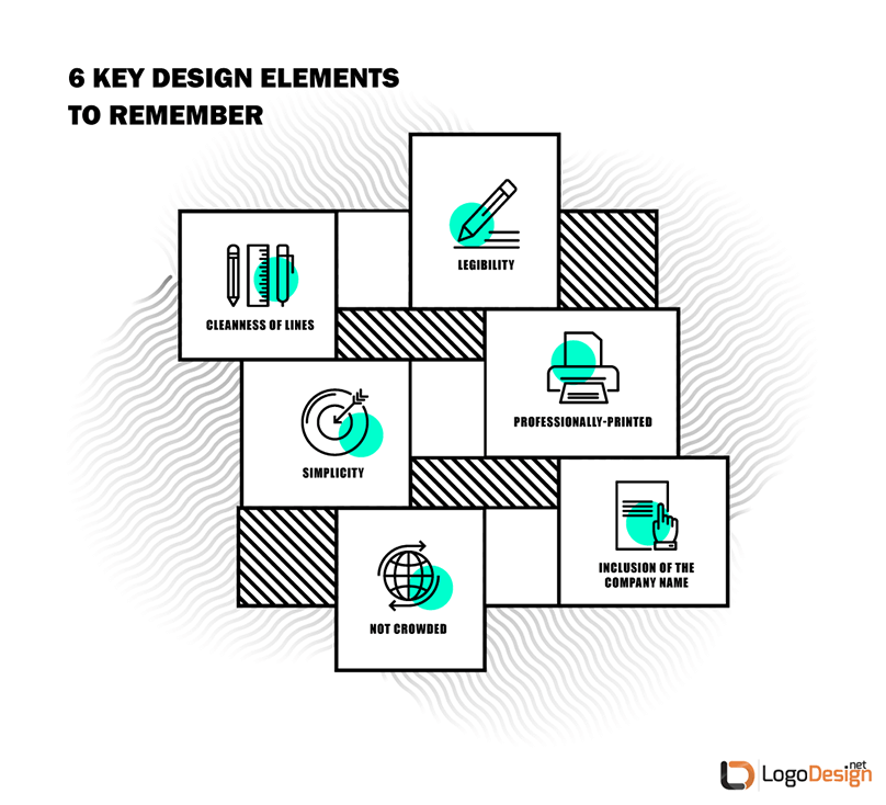
Some of these keys must be given attention at a later date, such as when you’re using printing services for business cards or wearable products. But since they are important down the line, it’s smart to keep them in mind as you’re actually designing the construction logo.
This will cut down on the trial stages once the design is ready to be tested out for feedback, and save time and effort — and maybe money, too.
What about specific elements that require design choices?
Let’s take a look a the following “big four”:
- Colors
- Font
- Type
- Graphic
Step Two: What Color Palette To Use In A Construction Firm Logo
What comes to mind when you think of a construction zone? Likely you think of brilliant highlighter colors, like orange cones and fluorescent green t-shirts.
Since those are the traditional colors for construction, it’s probably not too surprising that bright, bold colors are very popular among construction logos.
In terms of what is trending and why, here’s a basic breakdown of often-seen colors in the realm of construction.
Orange
Think of a construction supply company like Home Depot. Orange is an attention-getter because it’s a bright, strong color; but it isn’t quite as in-your-face as red. Orange is typically seen as a little softer and friendlier; at the same time, it definitely draws the attention and is symbolic of energy and vitality. This color works for home remodeling logos as well as construction supplies such as wood logos.
Yellow
Yellow is also a little less intense than red, but has a lot of the same qualities as orange. It’s bright, sunny, attention-getting, and is a friendly color, which is excellent for smaller construction companies like contractor logos, and handyman logos as well as large ones like the CAT brand logo. However, it requires a careful choice of background or contrast to ensure that it shows up well enough to be seen legibly.
Blue
Blue is a cool tone rather than a warm one, but it’s still often seen in home improvement, property management logos, and both residential and commercial construction. Blue is a soothing, calming color that encourages trust. Typically, the blues that are seen in the construction realm are quite bright, rather than dark or pale, which means that it still fits the “bold colors” trend like in the DPR logo.
This is an example of a trend that is helpful to the company. Bold colors get the attention of the audience, and they’re also so commonly seen in this marketplace that they’re practically expected.
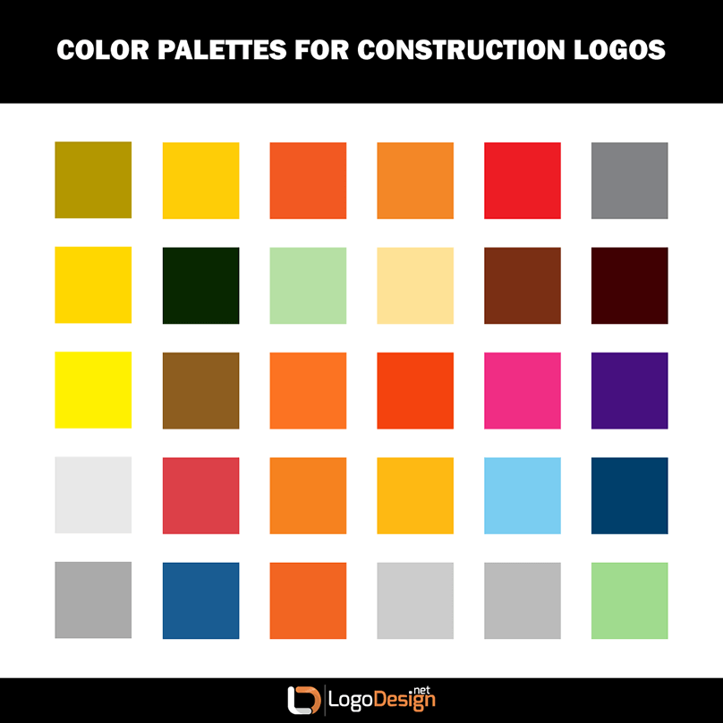
So if you choose to follow this trend, it could work out very well for the effectiveness of your logo. Just make sure to choose a tone or shade that isn’t identical to your competition’s color palette, and try to combine it with other, more unusual design elements.
Step Three: What Fonts To Use For A Construction Logo
What about font choice?
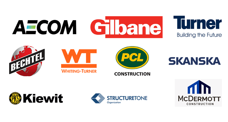
Most construction firm logos use the full name of the company within the logo. This type of logo, called a combination mark — more on that next — helps to build the name and reputation of the company. It’s especially helpful when the business is just starting out and slowly gathering customers.
However, for construction companies, it’s also a boost to building confidence and loyalty in your customers. Using the name of the company is so common in construction logos that it’s very rare to see anything other than that — so if you choose to use a graphic without including the name of your company, it may actually confuse your audience!
Legibility
Your font needs to be large enough to see; it also needs to stand out against the background clearly.
Readability
Readability is actually a bit different from legibility, though they are closely related. Not only must you be able to see the font, the individual letters need to be clearly discernible in a way that enables the viewer to read and understand what they’re looking at. This doesn’t mean that you can’t use a font with stylistic letters or even ligatures — but it does mean that you should do so carefully. Don’t sacrifice function for the sake of form.
Uniqueness
It would be easy to pick a simple, popular font and just stick with that — but then you run the risk of looking too much like a competitor. Make sure that your font choice isn’t identical or even too similar to others in your marketplace.
Appropriate to Business
Different font types have inherent qualities that make them better suited for different businesses. For a logo, it boils down to three basic types:
- Serif fonts are typically seen as traditional, established, and trustworthy.
- Sans serif fonts are typically seen as clean, modern, and simple.
- Script fonts are typically seen as creative, artistic, and elegant.
For most construction businesses, a serif or sans serif font choice is ideal, depending on the type of business. Generally speaking, a script font would likely be seen as too “off-brand” for a construction business. However, keep in mind that a script font may work in certain circumstances. For instance, for an architect or home renovation company logo that specializes in highly unique, personalized work may find that a script font accurately reflects the artistic, elegant personality behind the company.
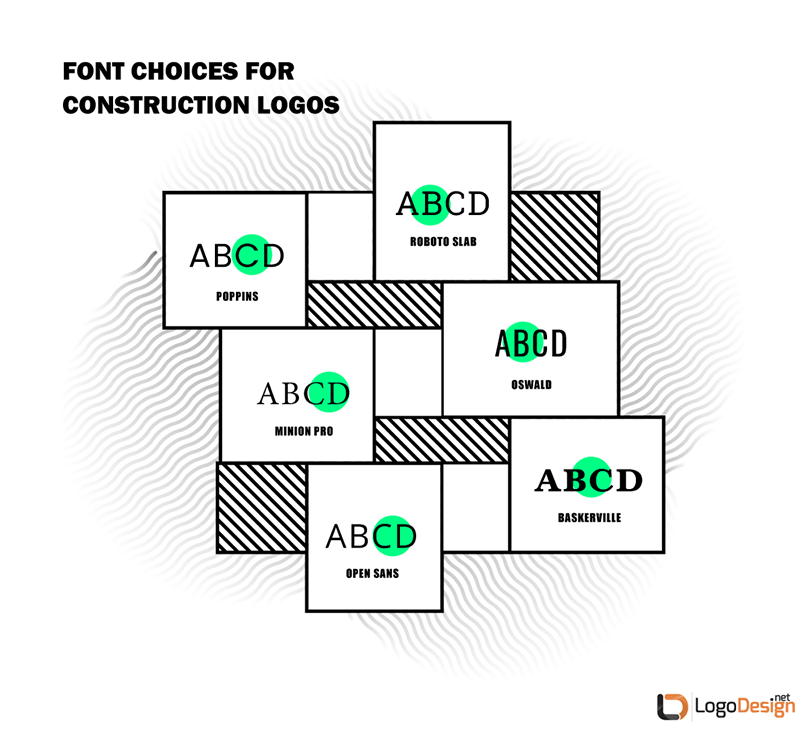
A few suggestions for excellent font choices for construction logos of all types include:
For most construction businesses, a serif or sans serif font choice is ideal, depending on the type of business. Generally speaking, a script font would likely be seen as too "off-brand" for a construction business. However, keep in mind that a script font may work in certain circumstances. For instance, for an architect or home renovation company logo that specializes in highly unique, personalized work may find that a script font accurately reflects the artistic, elegant personality behind the company.
A few suggestions for excellent font choices for construction logos of all types include:
Bolder, heavier fonts lend themselves well to construction logos. Keep in mind that most fonts come in a variety of versions, and can be used in their heavier, bolder format
Step Four: Choose Construction Logo Style
The next item on the agenda is choosing the style of logo that you want to end up with.
There are several different types of logos, but for the purposes of creating a construction logo, it boils down to just a few broad types.
- Name only
- Graphic only
- Name and graphic
Typically, a combination mark (name and graphic) is more commonly seen in the construction realm. This is a practical choice, since it helps to build name recognition while also including messaging about your brand personality and area of skill.
Name only logos, also known as logotypes or wordmarks, aren’t quite as popular, but they can still be used effectively.
Graphic only logos are more rare for this marketplace, and are not generally as effective at promoting the memorability of the company name.
Within these different types, of course, are subtypes that are seen by the way that individual elements come together cohesively to present a certain style.
A good example of this is a classic or retro logo.
Step Five: Professional Construction Logo Graphic Elements
Speaking of elements, the next step involves choosing a graphic that suits your company. What sort of construction logo image should you consider?
Unless, of course, you’ve decided to create a logotype or wordmark logo that simply comprises the name of the company. In that case, skip this part.
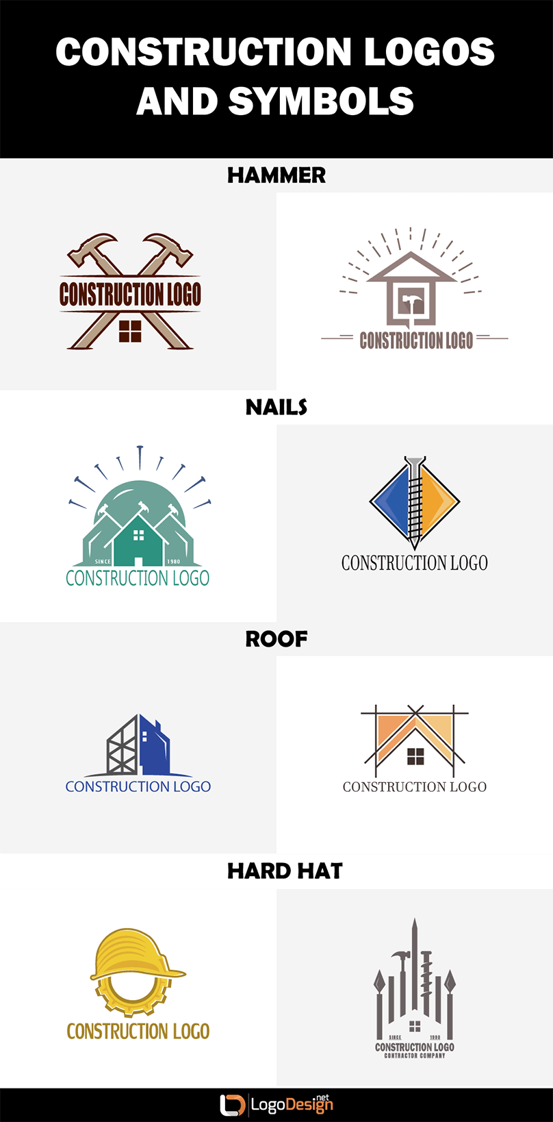
Certain elements lend themselves very well to construction logos. Here are a few examples, broken down by the type of company
- For larger commercial construction companies: a crane, excavator, or other large equipment. A helmet, caution cone, or other protective equipment. Steel beams, gears, or scaffolding.
- For smaller residential construction companies: Tools like hammer and nails, screwdrivers, wrenches. Houses, farmhouses, barns, and other structures.
- For construction supply companies: Lumber, tools, and delivery vehicles like trucks, cars, vans, and even planes.
- For handyman companies: Tools like hammer and nails, ladders, vans.
The type of business you run will also influence the style of graphic you choose. For a smaller company, you may choose a construction line logo with a line drawing of a house logo. For a larger company, you probably want something more polished than a simple line drawing.
Another practical consideration is the type of file; make sure that you design in vector and save your construction or handyman logo vectors, in order to make it as flexible and versatile as possible.
Step Six: Editing And Finalizing Your Construction Logo
Now that you have the first draft of your logo ready to test, it’s time to take it out for a spin. Present it to unbiased friends and family for feedback and opinions.
Once you’ve had someone take a look at it for you and make suggestions, try it out on the public.
Be aware that you may get negative feedback, and you may need to take the opinions of your target audience into account in order to appeal to them. If your logo design is simple, it shouldn’t be too hard to make little tweaks and changes here and there.
Above all, ensure that your finished logo design is:
- Legible
- Unique
- Memorable
- Versatile
- On-message
- True to brand
If you’ve got those keys covered, your logo design will almost certainly be a success!
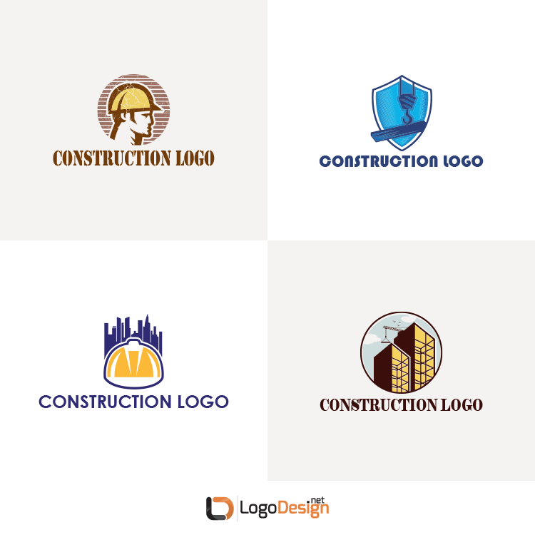
Best Construction Logo Samples
As you work through these steps, it’s helpful to take a look at a construction logo gallery of other logos to see what you like about them — and what you don’t.
Here are some free construction logos and construction company logo samples to peruse.
Combining a stylized house, tools, and a shield with a great color combination of orange and blue, this is a triple-hitter.
With a simple graphic of an excavator, this would be a good logo choice for a larger construction company
There’s a lot going on in this roofing logo, but it stands out as unique.
A unique and very descriptive graphic combines with a warm color palette for a good home repairs and renovations logo.
This article has been reviewed by Zaheer Dodhia, CEO and Brand Expert of Logo Design