SALES / SUPPORT : 844-232-4816
How to Design Home Improvement Logos with Simple Graphic Elements
Designing a home is a big deal. There’s a long, long list of individual elements that must be considered, and an even longer list of potential choices. It’s an endeavor that is both creative and functional. The completed project should reflect both the builder and the owner, and should be visually appealing and worthy of being lived in.
Designing a logo for a home improvement business or brand has a lot in common with the actual building of the house itself — but the stakes aren’t quite as high.
While every business owner wants a logo design that reflects his or her brand perfectly, there are so many choices that must be made, it’s easy to get bogged down in the details.
That’s why simple = best is a good rule of thumb for home improvement logo design.
Which Type of Entrepreneurs Need Home Improvement Logos
Of course, not all businesses that handle home improvement, renovations, and construction provide the same services. Many have their areas of expertise, and their logos should reflect that.
What kind of business owners might need a niche-specific like a home improvement logo? Here are several — but keep in mind that this is by no means an exhaustive list.
- Landscapers
- Construction and handyman companies
- Home insurance companies
- Roofers
- Electricians
- Plumbers
- HVAC installers and management
- Security system companies
- Property management
- Carpenters
- Painters
- Glaziers
- Architects
Home Improvement Logo
Any of these home improvement businesses — and others not listed here — will need a logo that helps potential customers and clients to identify the specialty of the company. A clear, recognizable home improvement logo design helps to draw customers to the business, and helps to ensure that there’s no confusion about what services the business offers.
For example, if someone is looking for a glazier, they wouldn’t call a company with a landscape logo; they’d look for a window logo, or something that identifies the niche that the company works in.
But it should be noted that there could be some potential for overlap within niches, depending on the graphic elements that are used in the design. As another example, a lock logo could be for a home security company, or for a locksmith who simply installs lock mechanisms in new homes. The same could be true of a door logo. Of course, some companies may offer a range of services, so a lock or a key logo could be ideal for any of these scenarios.
These examples show, however, why it’s important to use a combination of elements in logo design for clarity . Combine the graphic element, the name of the company, and even consider a tagline for the most effective messaging.
Landscape Logo
Even though there are multiple elements to be considered for a great home remodeling company logo, it’s still recommended to keep things simple.
Why Simple Is Best
In logo design, trends and styles come and go. But a recurring favorite style is simply this: simplicity.
Why is simple the way to go in logo design? There are a number of reasons.
First of all, simple design is easier for us to process. You want your simple logo design to make an impact as quickly as possible, and you want that impact to be positive. If a viewer doesn’t comprehend an element of the design, or if they just can’t understand it at all, you lose valuable time in which you could be making a good impression.
Secondly, the simpler the design, the more memorable it is. Memorability is an important factor in effective logo design.
A third reason is versatility. A renovation company logo will likely be used on a variety of marketing and branding materials, from the company website, to business cards, to employee t-shirts and sweatshirts, to the company vehicles, and more. A simple logo is easier to render in a variety of sizes, color variations, and on different materials and backgrounds. Simplicity helps to ensure that details aren’t lost in the shuffle. And, of course, professional logo designers make their home improvement logos vector files to keep the integrity of the design at any size. A raster file, such as a photograph, will lose integrity and become pixelated with size variance. SO you want to ensure that your home improvement logos images are all vectors.
There are other important considerations as to why you should keep your design simple, but those are the three most important for a home improvement logo design. Let’s get into some specifics.

What Simple Graphic Elements Should I Use To Design A Home Improvement Logo?
So what elements need to be incorporated into the design?
In the simplest terms, your logo should include four basic elements:
- Symbol
- Font
- Color
- Tagline
These are optional depending on the type of logo you choose — more on type next — but the combination of these four elements make for the most effective home renovation company logo.
Within these four elements, there is a plethora of choices. The best choice for a particular logo will depend heavily on the type of company, area of specialty, brand personality, and, of course, personal taste.
We’ll take a look at some of the most popular elements for home improvement logos, and why. Let’s start with the type of logo that is best suited for home renovation companies.
What Type of Logotype Is Best For Home Improvement Logo?
There are a few basic types of logo. Simply put, they include:
- Lettermark, wordmark, or monogram. This type of logo is strictly font-based, without a graphic element.
- Symbolic, abstract, or pictorial. A logo that falls under this category uses a graphic. The graphic can be a direct representation of the company or some aspect of its services, a symbol that signifies the brand, or an abstract mark that is designed to represent the spirit behind the brand.
- Mascot. Mascot logos, fittingly, use a mascot, such as Colonel Sanders for Kentucky Fried Chicken.
- Combination mark. These marks use a pictorial representation along with a lettermark, wordmark, or monogram.
Typically, especially for a newer company, professional designers recommend a combination mark. This allows the brand to establish itself both with the name of the company and the pictorial representation, enhancing name recognition. Later on, the company may decide to drop one or the other element and use a simple logo type rather than a combination mark. It’s a very versatile and adaptable choice for a new business.
Image: Lowe’s
Image: Home Depot
Home improvement companies often rely on combination marks — think of Lowes and Home Depot, for example, which both use combination marks. The versatility of this choice makes it a great option for a home improvement logo, regardless of the niche or specialty that the business operates in.
And it can be done quite simply, too.
Simple Graphic Elements for Home Improvement Logo?
We already mentioned the four basic elements that should be included within your logo design. The type of logo that you choose to design may change what elements you use. For instance, if you opt to go with a wordmark, you won’t need a symbol. And you may decide not to include a tagline, though they can be very effective.
Let’s take a look at some of the most on-trend, recommended, and popular graphic elements for use in a home improvement logo.
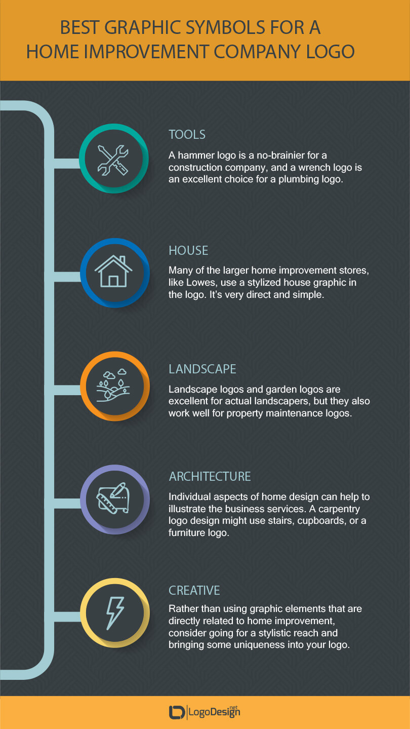
Best Graphic For A Home Improvement Company Logo?
Symbol — A simple home improvement graphic, either pictorial or symbolic, isn’t hard to find. Many home improvement companies use stylized graphics, often with only one or two colors, though we’ll get into colors in greater depth soon.
The symbol you choose will depend on the type of business you’re designing for. Here are some popular options.
- Tools Logo — tool graphics are great for a wide variety of home improvement companies. A hammer logo is a no-brainer for a construction company, and a wrench logo is an excellent choice for a plumbing logo. Hammers and nails are also good options for a roofing logo.
- House Logo — many of the larger home improvement stores, like Lowes, use a stylized house graphic in the logo. It’s very direct and simple, which helps to get the point across in branding.
- Landscape Logo — landscape logos and garden logos are excellent for actual landscapers, but they also work well for property maintenance logos.
- Architecture Firm Logo — individual aspects of home design can help to illustrate the business’s services. For example, a carpentry logo design might use stairs, cupboards, or a furniture logo. Glaziers might use a door logo or window logo design.
- Other — on the other hand, it never hurts to think outside the box. Rather than using graphic elements that are directly related to home improvement, consider going for a stylistic reach and bringing some uniqueness into your logo design. For example, an electrician logo might use a lightning bolt. A California HVAC logo uses ducks — which works both as a pun and as a cute mascot. We already mentioned a lock logo for a home security logo, but it also could work for a home insurance company logo.
Best Font Type For Home Renovation Logo?
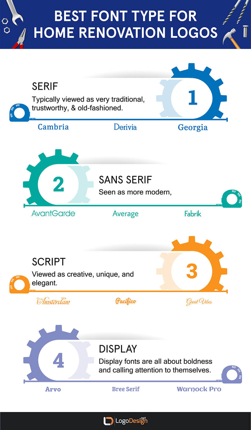
Font — There are a few main types of fonts, and they each bring a certain personality to a logo design. They can be broken down into the following categories:
- Serif. Typically viewed as being very traditional, trustworthy, professional, and old-fashioned.
- Sans serif. Seen as more modern, edgy, straightforward, and clean.
- Script. Viewed as creative, unique, and elegant.
- Display. Display fonts are all about boldness and calling attention to themselves.
For a home improvement logo, the choice of font style depends on the type of business that you’re designing for. Typically, sans serif or serif fonts are classic choices for companies that center on construction.
However, some home renovation companies pride themselves on bringing a unique set of services to their customers. So a script font, with its elegant nature, may work well for that particular brand personality.
Display fonts are bold — and bold can be good for a home improvement logo that uses a lettermark, wordmark, or monogram. However, if you’re using a combination mark, a big, bold display font could detract attention from the logo as a whole, and you may miss out on the effectiveness of the graphic. Additionally, some display fonts are modeled after technological sources, such as a binary-type font. These are rather cold and impersonal, and that sends the wrong message for a home renovation business.
Colors For A Home Improvement Logo?
Color palette — The colors that you choose have a lot to do with how memorable and effective the logo is. Designers often use color psychology to inform their choices; additionally, certain markets and niches see trends come and go, which can also influence the selection of color elements.
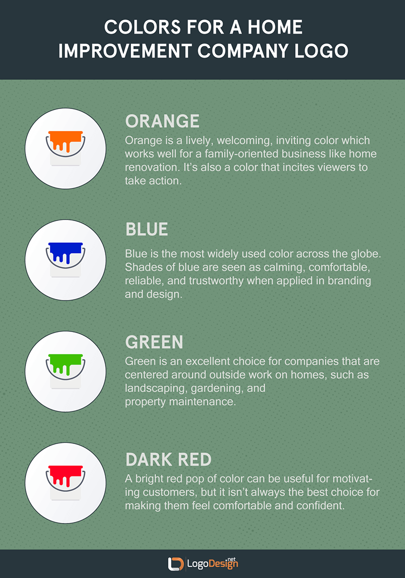
Typically, home improvement logos use colors like these:
How many colors should you use in your home improvement logo design? Professional designers recommend using between one and three colors in a logo design for any market, with no more than four at the outside.
Limiting your colors enhances the effectiveness of the logo, and keeps things simpler — which, as we’ve already discussed, makes for a more memorable, versatile, and all around better logo, regardless of the company behind it.
What Tagline Should I Use?
Tagline — Taglines, like beauty, are in the eye of the beholder. They’re not always in common usage for a company logo, but they can be incredibly effective.
We already mentioned how a tagline can really get the point across as far as what type of business the logo represents. Taglines like Roofing Trinity County Since 1993! and Get Your Ducts In A Row! make the business clear. It’s excellent messaging, and can enhance the other visual elements that you’ve chosen for the design.
Of course, there’s no rule that says you need to have a tagline. It really depends on the business, and the brand personality. Ultimately, developing a bad tagline is worse than no tagline at all. But taglines can be edited and changed, and if there isn’t one at this point, it can always be added later.
Taglines are an extra element to add to a combination mark logo, but they’re optional. They don’t need to be used in every instance of logo usage. And the font for them can be a different font from the name of the company, which helps the tagline to stand out. Typically, the tagline is rendered in a smaller point size, too.
What Tools to Use For Home Improvement Logo Design
Whether you’re a professional designer or an amateur with a goal, whether you’re designing for yourself or for someone else, you’re just like the carpenter or construction worker behind most home improvement companies: you need the right tools in order to get the job done.
Here are a few suggestions of what tools should come in handy for your design project.
For graphics: Sites like Logo Design have thousands of vector images to choose from. You can pay for the rights, download them, and incorporate them into your logo design.
For color choice: Coolors, Paletton, and more offer free color palette generator services to help you pinpoint the exact, perfect color combination for your logo design.
For font choice: Typewolf is a favorite source for font inspiration, with curated lists of some of the best fonts according to type, such as serif or sans serif. Google Fonts provides wide-ranging access to open-source font choices; be ready to get lost in the options if you go in without a good idea of what you’re looking for.
For design inspiration: A logo maker like LogoDesign.Net provides a wide range of remodeling logo ideas — as well as free home remodeling logos — for you to choose from, or just to browse for inspiration.
Home Improvement Logo Ideas
The best way to get some ideas for home remodeling logo designs is to look at designs that have already been put together, and see what works — and what doesn’t.
You can do that through home improvement logo makers, like LogoDesign.Net and others. Or you can go to sites like Behance and Pinterest for design inspiration. Finally, you can look through the competition, either locally or elsewhere, and see what trends they follow. Researching other home improvement logos shows you what you might want to include in your design, as well as helping you to figure out what doesn’t fit the brand behind the logo.
Creating a home improvement logo doesn’t have to be anywhere near as difficult and complicated as actually building or renovating a home. But there are plenty of choices! Take your time, make sure that the elements work well together — and above all, keep it simple.
Reviewed by Zaheer Dodhia, CEO and Founder LogoDesign.Net.
