SALES / SUPPORT : 844-232-4816
How to Create a Fabulous Law Firm Logo Design
Law firms thrive on their reputation for dependability, trustworthiness, and the ability to win cases. Word of mouth is a vital component of spreading that reputation — but how a law firm is branded also makes a huge difference in audience perception!
We’ve all seen cheesy commercials for legal representation, and while those might get the name out there, they certainly don’t do much to attract loyal clients.
The same is true of an unprofessional law firm logo. It might get the name of the legal counsel out there in the public eye, but if a legal logo is generic, poorly designed, or a lookalike, it won’t enhance the reputation.
As an article on Lawyerist noted, “Most law firm logos are poorly executed and are usually entirely text-based, quite often with one of a handful of popular fonts, which results in many firms believing that logos are not necessary for a law firm.”
But just because it is a common belief doesn’t mean it’s true! Logos and branding are important ways to identify your firm in the public eye, and build a relationship with your clients.
Lawyer logo design can be especially challenging because there are a few common elements that crop up over and over, which means that you have to work a little harder to make sure your law firm logo design stands out from the crowd.
But it’s definitely possible to do so, and this article will help you achieve that goal.
How to Start Designing Law Firm Logos
The first step of logo making is always doing your research. It’s vital to know and understand the motivation behind the brand, as well as the brand personality.
Whether you are creating a law firm logo for your own company or on behalf of a client, start by compiling answers to questions such as:
- Why was the firm formed?
- What values does it promote?
- What are the goals of the firm?
- Who are its competitors?
- Who is the target audience?
- Type of logo
- Graphics
- Font
- Color
All of these questions will help to provide a well-rounded view of the company. Market research on competitors and audience will also help to target branding efforts and conserve marketing resources, as well as avoiding a logo that looks too much like that of the competition.
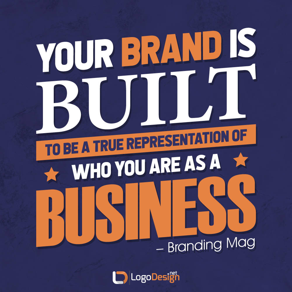
Branding is about far more than just the logo. As Branding Mag points out, “Your brand is built to be a true representation of who you are as a business,” which means that branding is “absolutely critical.”
Though this article addresses legal logo designs specifically, the design you create should wrap into other branding efforts, such as the firm website and social media. Everything from law firm slogans to law firm signs for a brick and mortar location should reflect the same inspiration behind your logo, and branded materials and marketing should be readily identifiable as belonging to your company.
Once you’ve got the legwork done on the inspiration behind your brand, it’s time to look at the specifics. These include elements such as:
Each of these elements present several options, and each option sends a certain message. For instance, you’re more likely to see a black and white law firm icon logo than one which uses multiple colors, and there’s a reason behind that.
So let’s delve into each individual element and some of the best choices for law logos. We’ll also include some real-world inspiration that might give you some fabulous lawyer logo ideas.
Top Type Of Legal Logo
Depending on who you ask, there are anywhere from three to ten — or possibly even more — types of logos. But which of those make the best logos for legal services?
When it comes to law logos, it’s unlikely that you will want to design a mascot logo, for instance. This type of logo is often used for companies that want to create an emotional link between the brand and the customer — you can find it employed frequently in companies that cater to families, in sports teams, and in restaurants logos.
That doesn’t really apply for a legal services logo.
Likewise, a common logo type is an abstract graphic logo — a famous example is the Nike swoosh. However, this type of logo is typically seen as more, well, abstract, and doesn’t lend the air of credibility and reliability that you likely want for your law firm logo.
That doesn’t mean you won’t ever see them, of course, but it may not be the top choice.
On the other hand, a few other types of logos might be just perfect for your company. Let’s break them down here.
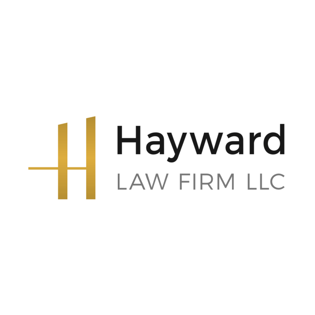
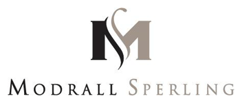
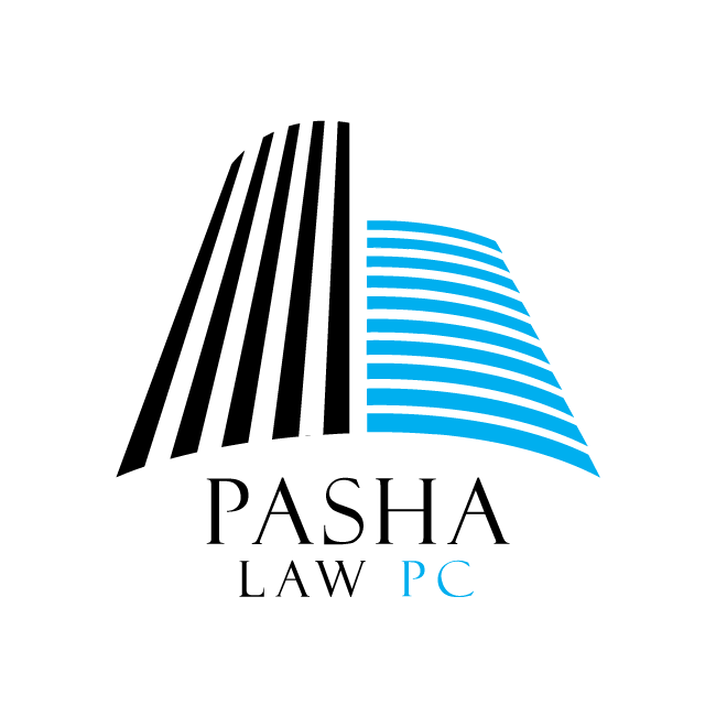
- Lettermark or monogram. These font based logos use the initial letter or letters of a company. They’re really ideal for a law firm logo, as law firms usually have multiple names included in their name. It helps with name recognition without the complexity of using the entirety of the firm name. These often use a unique font, as the design of the font really enhances the memorability of the logo.
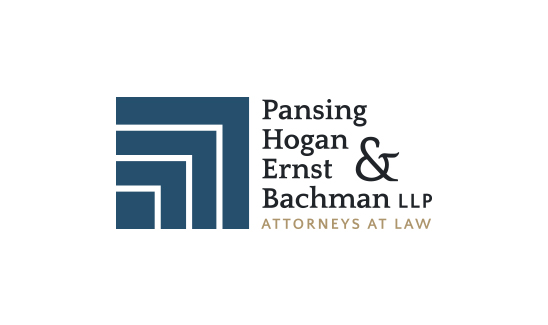
- Wordmark. In a similar vein, wordmarks are font-based logos. Instead of simply using a letter, they use an entire word or words. They work best for companies, brands, or firms with shorter names or with only a few words in the name. These are also excellent for building name recognition, and may use a unique or even a custom font.
- Icon. Iconic logos use a graphic to represent the brand. For law firm logo designs, these are usually representations of real-world things, such as balance scales logos, a quill pen logo, or a drawing of Lady Justice. Iconic logos are easier to render in small sizes, as they don’t lose legibility as quickly as a wordmark or lettermark; images also tend to make an impression in less time than words do, so iconic logos may be easier to recognize and remember, although they won’t promote the name of the firm as well as a wordmark, lettermark, or combination mark.
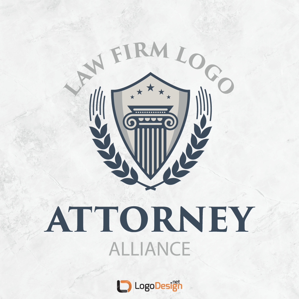
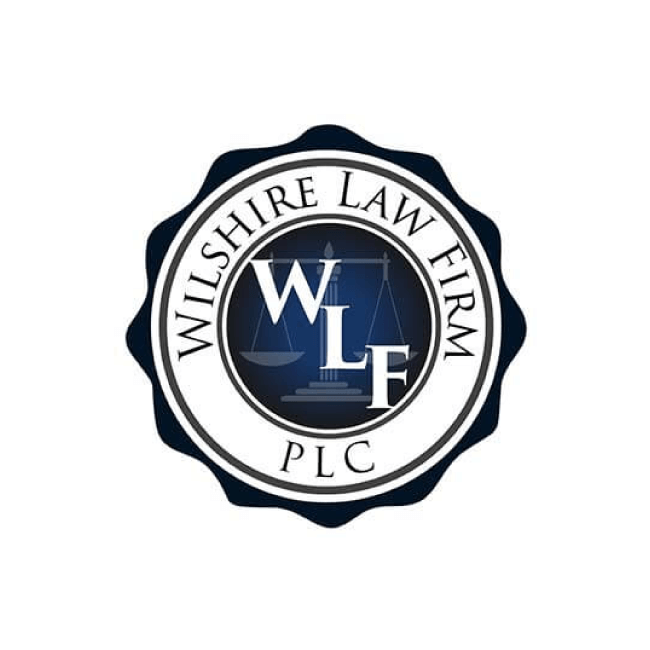
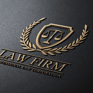
- Emblem. Emblematic logos use seals, banners, and crests, often in conjunction with the lettermark, monogram, or wordmark. Emblems are excellent for giving a logo a sense of tradition, importance, and gravity such as in courthouse logos. However, emblems don’t always scale down as well as some other types of law logos.
- Combination mark. Just what it sounds like, a combination mark uses two or more of the other types of logos in conjunction, such as an icon graphic along with a wordmark. This is a great choice, especially if your firm is just beginning to get started, as it combines the memorability of the icon logo with the name recognition of the wordmark as seen in a judge logo or political leader logo. It also provides greater flexibility, as you can use either one or both elements of the combination mark as needed. Later on, as your firm grows in recognition, you may choose to simply use the icon, relying on the reputation and impression that your law firm logo has already built over time.
Though there hasn’t been a lot of research done on the topic, it’s fairly clear from a cursory search of law firms that the most common type is a font-based logo, a lettermark, monogram, or wordmark. However, choosing a different type of legal logos could be a great chance to make your design stand out as unique, provided it fits in with the brand personality.
Best Graphics For Law Firm Logo Ideas
As mentioned at the outset, there are certain graphics that are typically associated with law firms, legal counsel, and other industries centered around courthouses. Really, you could create anything from a judge logo design, to a bail bonds logo, to an insurance logo, all using the same basic group of icons and imagery.
Here is a list of some great law firm logo images that could provide inspiration for your own design
Courthouse logo. A logo that uses a court building is potentially the most straightforward icon choice you could make. Lawyers do their work in courthouses; a simple drawing or silhouette well illustrates that. It’s easy to find generic courthouse graphics, but if you can design one based on your local court building, it elevates the hometown appeal of your firm and could even increase the sense of loyalty that your clients feel.
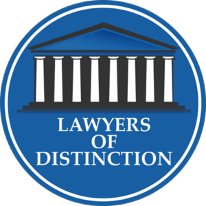
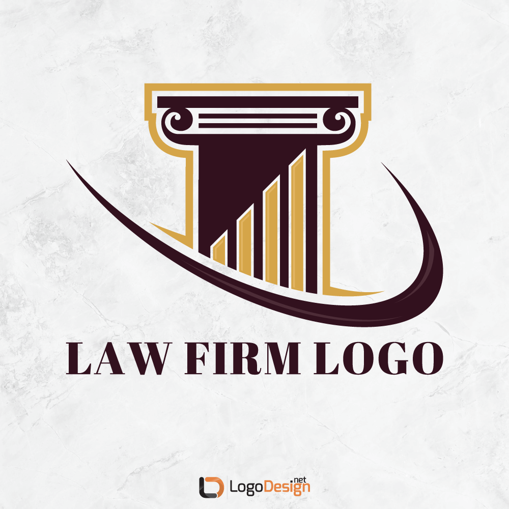
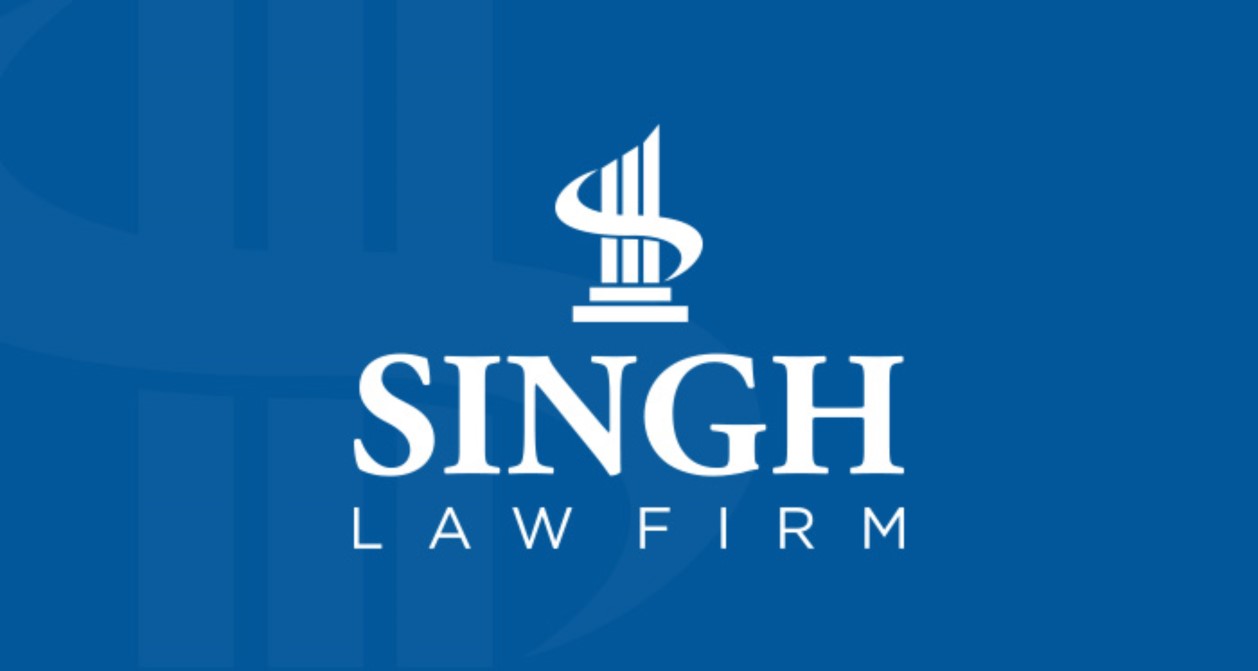
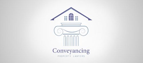
Pillar logo. A similar, but slightly stripped down, take on a courthouse logo. Using a simple silhouette or drawing of pillars or column logos — even if your local court building doesn’t involve those architectural statements — gives a very traditional feeling to a court logo.
Pen Logo. A classic fountain pen or quill pen also lends an element of trust and tradition to a legal logo; even though much of what happens in court is digital these days, we have yet to meet a lawyer who didn’t like an impressive pen.
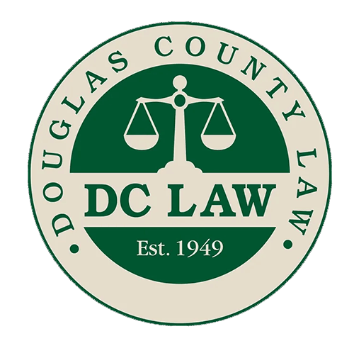
Balance scales logo. Possibly the most commonly used graphic to represent the legal element, the scales pop up in everything from law firm logo design to bail bonds logos to legal consulting logos, and beyond. This icon benefits from the “shorthand” aspect — if you use it in your logo, everyone will know that you’re involved in the law — but suffers from overuse, so caution is advised. If you’re going to use it, opt for a unique variation on the graphic, or include another unique aspect in addition.
Law book logo. A stack of books makes for a great iconic choice for a lawyer icon; even though research is often done online, we still associate libraries and thick tomes with the practice of law, so this is also excellent graphic shorthand.
Suit or tie logo. Yes, the courthouse is one place where suits and ties are worn more often than not. This may not have the best connotation, given that there are so many female lawyers practicing, too.
Briefcase logo. A simple, unique, and potentially very stylish choice for a law logo graphic, a nice briefcase is also very evocative of a law firm.
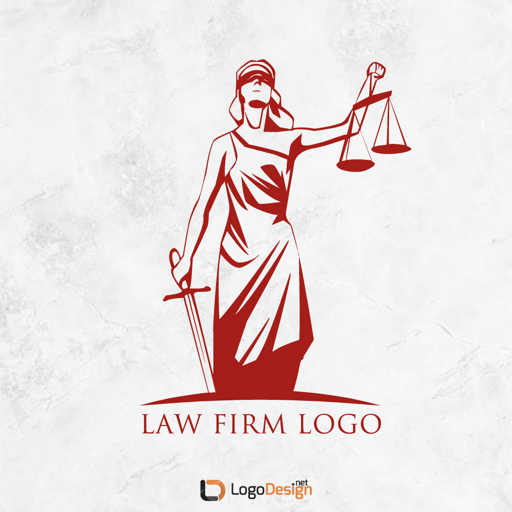
Lady Justice logo. Also commonly seen in logos for other aspects of the legal system, such as judge logos, bail bonds logos, and the like, a Lady Justice logo offers a lot of potential for a unique take on a classic icon.
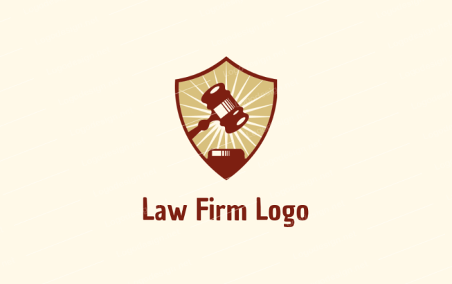
Gavel logo. Whether you want to call it a gavel logo or a law hammer logo, this is another choice in common usage. It doesn’t really offer a lot of scope for variation, so make sure to check for lookalikes among the competition before you choose this graphic.
Laurels. Laurels are traditional, respectable, and serious, as well as being ornamental. They’re sometimes used in addition to other elements, such as Lady Justice or the balance scales.
Top Font Choices For Law Firm Logos
As mentioned, wordmark and lettermark logos are more common among law firm logo designs than most other types of logo. So the choice of font is a vital concern, especially if you opt to go that same route.
Font choice isn’t just a matter of choosing what you like the best; as designers and researchers have found, there’s an entire underlying psychology of font that influences how we tend to react to certain type. Leveraging that psychology and those tendencies gives graphic designers a leg up on accurate messaging; in other words, if you choose the right font, you can actually help to “sell” the message of the law firm, such as trustworthiness and tradition.
The types of font most commonly recommended for law firm logos are serifs and scripts. Serifs promote a feeling of tradition, respectability, reliability, and stability. Scripts are unique, elegant, and can also lend a feeling of old-world values, which are all traits often promoted by law firms.
Along with those font types, law firms typically favor bold type, which gives a weight and gravity to the letters and tends to increase the importance of the logo in the mind of the viewer. Simply put, we pay more attention to things that are in bold font; the heavier the weight of the lettermark or wordmark, the more likely it is to attract attention and garner value.
And a combination of fonts — usually no more than two — is also recommended to provide maximum readability and visual interest to longer usage of written content. This depends heavily on the type of logo you are designing, however. For example, if it’s a lettermark or monogram, you should probably stick to only one font.
Here are some recommendations for font inspiration, via Typewolf:
Best Colors For Law Firm Logos
Like font choice, there is also a study of the psychology of color and how we tend to react to certain shades and tones. And just like with your choice of font, the colors you choose can heavily impact how your audience views your firm, based solely on your logo design.
Not only that, it can impact whether your audience tends to trust your company, even if they don’t have prior experience with it.


There are no hard and fast rules when it comes to color psychology for logo design . But the research that has been gathered indicates that individuals tend to react to certain colors in certain ways, based on age, gender, culture, and personal experience.
This means that, based on your target audience, you can predispose your legal clients to be more interested in your company, simply by choosing colors that will appeal to them.
Of course, this is balanced against the overall typical reaction to color. For example, the following colors may work very well for your legal consulting logo:
- Blue. Blues are seen as calming, traditional, trustworthy, professional, and reliable.
- Red. A counterbalance to blue, red is seen as active, dynamic, and energetic.
- Brown. Earth tones resonate with reliability, honesty, resilience, and dependability.
- Black. Powerful, sleek, classic, and formal, black is often used in a corporate professional setting.
Other colors can be used, depending on your brand, but these are definitely the most commonly used palettes in law, with blue and black being the most prevalent.
It’s also important to note that a restrained use of color is probably the most effective for your logo design. Too many colors, especially if they are bright and unusual shades, could give your company a sense of frivolity, which is not something that is generally wanted from a law firm.
How To Use A Law Firm Logo Maker To Create A Lawyer Logo Design
Once you have the basic idea of what you want your law firm logo to look like, it’s time to start looking at the tools to make your idea a reality.
If you have experience with creating lawyer logo designs, or if you want to do the whole thing from scratch, you could choose to sketch out your ideas and then use software such as Adobe Illustrator — or open source software like Inkscape or Gravit Designer — to put the design together. This is likely to involve some trial and error, but it does give you complete control over the design, from start to finish. Just make sure to create a law logo vector illustration, to ensure scalability and avoid pixelation.
If you would rather make things a little easier on yourself, you can opt to use graphic design tools like a logo maker — such as LogoDesign.Net — which cut out some of the legwork. You can still search for the perfect icon, font, and color choice, and create a custom combination that works perfectly for your firm.
Logo makers simply take care of a lot of the initial work for you. They also make it easier to compare different variations on the design, helping you to find the one that works best for your niche.
Speaking of niches, we’ve mentioned a few times that there’s a wide variety of industries that are all included in the “legal” blanket. But your particular niche may need a different type of logo than that of another niche. For instance trade law logos, financial law logos and property lawyer logos will greatly differ from each other.
What Is The Difference Between A Lawyer And Counsel Logo?
If you work in a certain niche, you’re likely to know firsthand the difference between variations and terms. But if you’re just designing a logo for someone in the legal profession, you might not know the ins and outs.
For example, legal counsel is retained by a company and works in-house, giving legal advice (hence the title of “legal counsel”). Lawyers work individually or with firms, and offer both legal advice and legal services to their clients.
That basis of knowledge may be reflected in the design for the logo. A legal counsel logo might be more likely to use a “people” graphic. On the other hand, since they usually work within a company, they might use a variant on the company logo, or they might not use a separate logo at all
What Is The Difference Between A Lawyer Logo And A Consulting Logo?
Lawyers are there for their clients, both in and out of the courtroom. They’re qualified to handle a larger range of services.
Consulting firms, or legal consultants, generally have the same training as lawyers, but usually their services don’t extend into the courtroom. Instead, they give advice outside of it, hopefully with the end result that the courtroom doesn’t have to be entered at all.

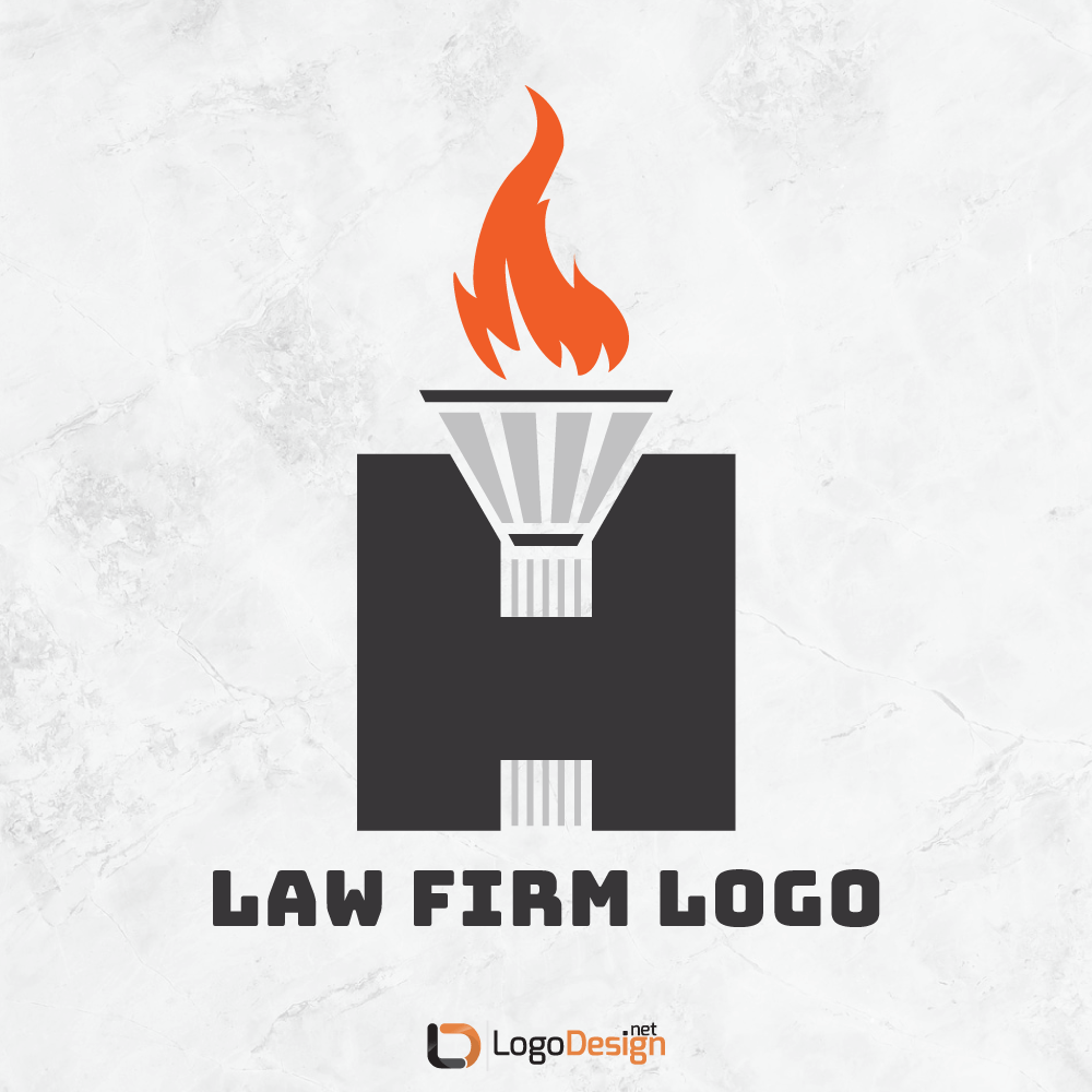
With that in mind, a consulting logo might not include traditional “legal” icons or graphics like a courthouse logo. But a Lady Justice logo, torch logo or another similar icon, is still appropriate to the niche.
How To Create An Insurance Logo For Legal Representation
Insurance law is a growing niche, not only because of the generally sue-happy nature of the American public, but because there are more requirements and qualifications for legal coverage now than ever before.
An insurance law logo represent personal injury suits, or similar niches would likely have a different feel than a more generalized law icon. Insurance law in particular tends to focus on damages to people or property, so the icon might be more specific for that aim.
For example, a firm that specializes in property insurance suits might use a house in the logo.
What’s The Best Bail Bonds Logo Inspiration?
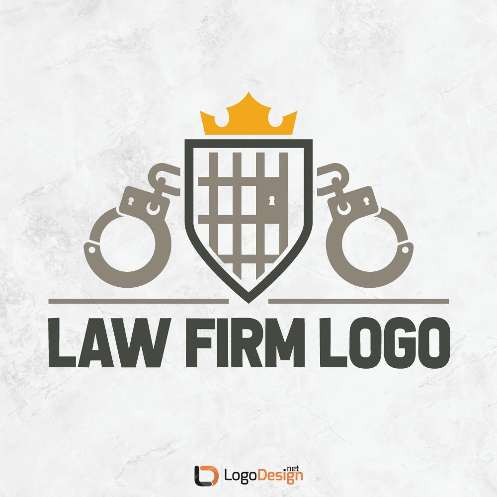
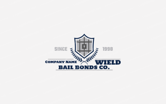
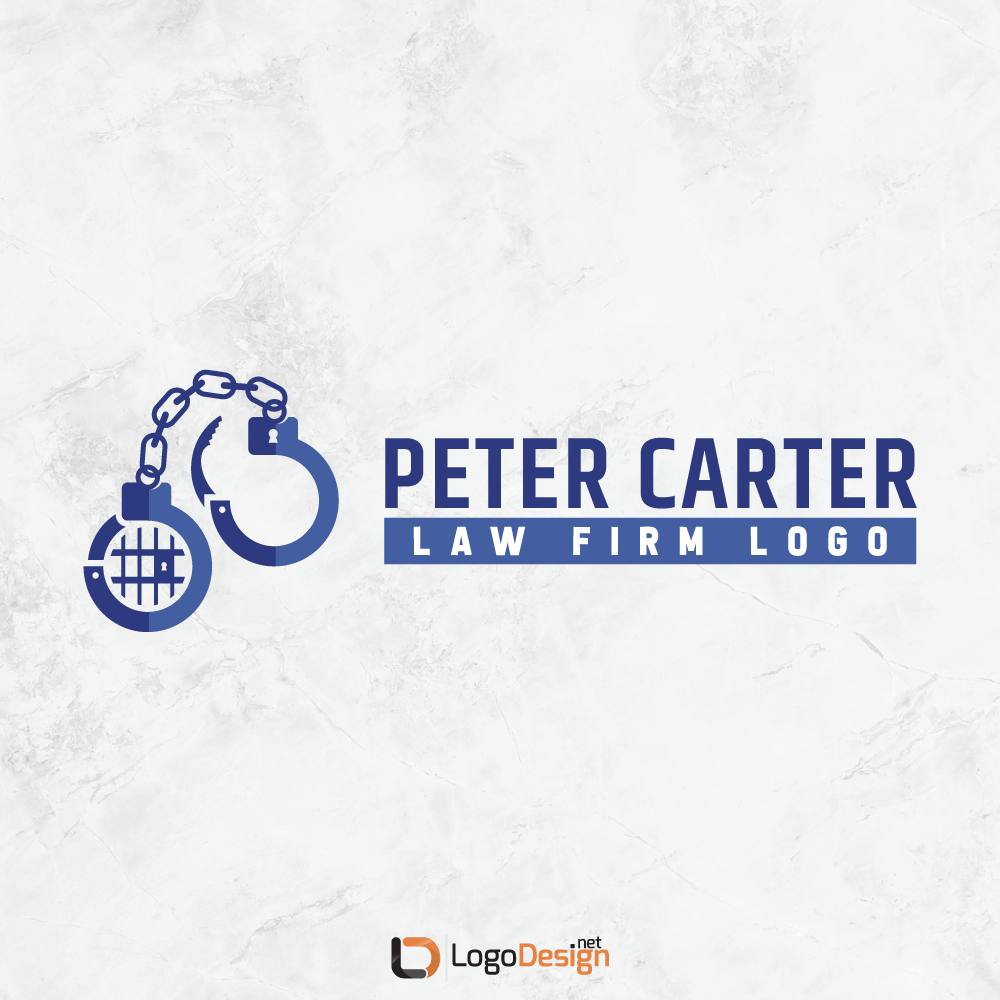
Another niche that is frequently found in the legal area is that of bail bonds companies. Again, these are much less likely to use traditional legal icons and graphics like Lady Justice, scales, and gavels. Rather, they’re more liable to use graphics that reflect their nature, like wings logos to represent freedom, or open handcuffs logos.
Bail bond company logos are also more likely to use a graphic in general, rather than simply wordmark or lettermark logos.
How Do You Create An Attorney Logo Like A Pro?
What if you need to create a logo for an individual attorney, separately from the rest of the firm?
This is a more rare occasion, but it may happen, especially if the individual attorney specializes in a certain area of the law. Working under the umbrella of the firm, they may wish to have a unique attorney logo to print on their business cards that reflects their abilities and services on offer.
If that’s the case, the same steps should be followed: analyze the personality behind the brand (or the individual), look at the competition, stay true to the goals and values of the attorney, and choose a font, graphic, color palette, and logo style that matches the brand.
It’s always recommended to look at existing logos within the niche for inspiration. You can also search for attorney logos on logo maker sites, and garner some ideas for attorney logos from that source.
What’s The Secret To A Fabulous Law Firm Logo Design?
Is there one “secret” to creating the perfect logo design for a law firm?
It’s really more like a recipe. The design needs to be:
- Unique
- Memorable
- Scalable
- True to the brand’s message and values
It’s also wise to make choices on elements that make use of:
- The psychology of color and font
- Graphic “shorthand” — images and icons that are closely connected with the legal field in the mind of the general public
Much like any other market or industry, the real key to a fabulous logo is to stay true to the brand’s personality. If your logo represents the brand accurately, it has done its job.
Written by: Zaheer Dodhia, CEO and Founder of LogoDesign.Net